
Don't wanna be here? Send us removal request.
Statistics
We looked inside some of the posts by evieadad-blog and here's what we found interesting.
Average Info
Notes Per Post
9
Likes Per Post
3
Reblog Per Post
6
Reply Per Post
0
Time Between Posts
5 days
Number of Posts By Type
Text
17
Last Seen Tumblr Blogs


Fun Fact
Tumblr is available in 18 languages.
Text
Assessment Task 3 ↪ FOUR
Artwork Inspiration
New Portraits by Richard Prince, Gagosian Gallery, 2014

New Portraits exhibits portraits of, by majority, girls in vulnerable, seductive poses taken from their personal Instagrams with most of them used without permission.
This artwork has been taken as inspiration by our group as when these images are placed in a different context of a public space (gallery instead of social media), the meaning conveyed is completely different. These images seem awkward, trivial and even funny.
Prince’s appropriation of images also displays the insensitivity we used in our publication.
Parkinson, H., ’Instagram, an artist and the $100,000 selfies - appropriation in the digital age’, The Guardian, 18 July 2015, https://www.theguardian.com/technology/2015/jul/18/ instagram-artist-richard-prince-selfies, (accessed 21 September 2017)
4 notes
·
View notes
Text
Assessment Task 3 ↪ THREE
Asset for our Cover Page/First Slide by Ben

Making our Instagram to make our stories on: www.instagram.com/wwrightnow

We are imitating a media publication by producing content that reflects on real issues in todays society and then by pairing it alongside our own daily inconveniences that we see as ‘issues’. As a result this shows our insensibility that we (first world generation millennials) have towards real topics. - Ben
2 notes
·
View notes
Text
Week 12
Unfortunately I was unable to attend today’s class.
Ben made a draft concept statement as follows....
“We are exploring ‘NOW’ as being a comparison and recognition of our insensibility to worldly issues that are flaunted across social media without further or deeper thought. While in juxtaposition, on a daily basis we share an insight into the smaller and irrelevant issues that we face, which in hindsight, conveys the relationship we share with a digital, social ecosystem. In running with our concept, we aim to reinterpret this act and/or feeling by displaying our publication through an Instagram story as it presents a professional, social aesthetic to cater towards an engaged and past audience.”
These are three stories that Ben and Kathy have made....

I have made two real world issue ones and two superficial...


0 notes
Text
Week 11
The week 11 topic was desire and we looked at that feeling as a motivational or driving force in the world.
We went down to the UNSW galleries to see the exhibition on anxiety. My group had planned to take photos of the work at times when a news story was published, in reflection of our concept, but this ended up being quite difficult. I didn’t take exactly 10 photos but I have curated them in chronological order to capture the story of my experience.


Our group spent some time continuing to brainstorm on last week’s ideas. We decided that it would be more subtle and effective if we didn’t just have a series of images that alternated between global issues and more superficial ones. We have resolved to post important events as Instagram stories, as this is a social media platform which is highly superficial a lot of the time. In doing so, we aim to represent the public’s desensitisation to worldly issues and additionally, the limited attention that we often pay to them, emphasised by the time limit on the story. Our spread will be 12 screenshots of Insta stories that we have created, documenting events relating to politics, global warming, natural disaster, etc.
0 notes
Text
Assessment Task 3 ↪ ONE
Group: Shereena, Evie, Ben, Cathy
As a group we began brainstorming the umbrella term of ‘NOW’.

Concept: We have become insensitive to greater worldy issues that we witness online or through news (example: Las Vegas shooting), as documented through our social media in a modern 21st century society where hashtags, emojis, and memes fuel online communication. — https://yesimbenprice.tumblr.com

Our goal: To create a 12 page ‘story’ (like instagram/snapchat) in which we will collate and produce into a fake story to convey our concept, by curating a series of documentations on 'first world issues’ vs 'real issue’. — https://yesimbenprice.tumblr.com

2 notes
·
View notes
Text
Final Work & Artist Statement
Major Work:

(The lid of the second jar from the left should be on but I took this photo before lighting the candle and showing the class how the flame dies out when the lid is screwed on, my apologies)
Artist Statement (729 words):
My major work explores the binary of normal/abnormal and the constructed perception of abnormality in the common population. Specifically, I aim to portray the stereotypical beliefs of mental disorders such obsessive-compulsive disorder, schizophrenia, bipolar, depression, anxiety and autism. I aim to provoke thought in my audience about how they have personally perpetuated stigmas, for example through the misuse of ‘OCD’ and ‘bipolar’ as adjectives rather than diagnoses. Even in the modern world, with the scientific understanding that we have, individuals with abnormalities are subjective to misguided assumptions leading to isolation and an identity defined by a single attribute. This is something I aimed to challenge in my work.
I initially chose the research question ‘Contemporary art and design often looks at the idea of constructed binaries, such as man/women, soft/hard, straight/gay, dirty/clean, organic/synthetic. Considering the history of these ‘pairs,’ how can art and design interrogate these binaries and offer new insights?’ and explored this very generally in the previous assessment. Researching French philosopher Jacques Derrida I became familiar with his notion of de-constructivism, which encompasses the idea that our understanding of a word is critically dependent on the meaning of it’s opposite and that one half is superior. I always intended to select a particular dichotomy for the major work so that I could make a strong, perhaps societal, comment. Due to my interest in psychology, the obvious route was to look at the difference between what is believed to be normal and what is considered abnormal. In support of Derrida’s claim, these constructs are conceptually contingent and ‘normal’ is superior.
The range of questions I posed on the topic somewhat fuelled my material experiments but it was these that facilitated the resolution of my final work. Looking for inspiration on Pinterest, I found a variety of works that I felt had a psychological or biological feel. I noticed that string and rope really effectively resulted in this. I conducted a few experiments employing wool, one of which involved unravelling the end of some knitting. The pattern of the knit resembled the cortex of the brain and the unravelled, spiral string look like half of a double helix. I went through the same process with glad wrap but it wasn’t nearly as successful in conveying a sense of abnormal functioning.
Taking another material approach to embodying scientific knowledge, I looked at how various levels of neurotransmitters/hormones are implicated in mental disorders and their treatment. I allocated a different colour to each and correlated low or high levels of serotonin, dopamine and norepinephrine with our current beliefs about the above mental conditions. Whilst this was effective and had potential with different mediums (e.g. dye instead of coloured paper) I didn’t feel like I was really ‘interrogating’ or ‘offering new insights’ as the question called for. This was a problem I had with the subsequent straw experiment but it fuelled thought on how the scientific understanding and public perception of disorders differ. My box experiment aimed to manifest and work through this where the box indicated entrapment while it contained biological features.
Exploring and challenging societal perception appeared as an important endeavour to me. Applying the content of my psychopathology notes I identified six disorders to represent. Multiple jars replaced the box and conveyed the rigidity of labels applied to those with mental illness as well as how trapped individuals would feel in their stereotype. It’s also indicative of the older categorical model of classification, which lacked in recognition of individual differences due to a spectrum of symptom severity and a diversity of symptom presentation.
Aside from the jars I allowed the materials readily available to me to solve the problem of symbolically representing each disorder’s stereotype. This included straws, paint, glass, candles, paper, tape and paper clips, some of which I had used previously in my material research. Some design came easily whilst others took some problem solving to be both conceptually and aesthetically successful. The range of sized jars in target conjured the idea of having one larger one that symbolised the ‘normal’ population and the superior half of the dichotomy. The lid of this is off, contrasting the freedom experienced by this group with the restriction felt by the minority. I initially had a diamond on top, but that appeared to replace the lid, and had ‘NORMAL’ written on the front, but took this off for greater subtlety.
Bibliography:
#colorcrushcreative palette challenge. (2017). [Blog] Jennyncolor. Available at: https://www.instagram.com/p/BVnj7iSFjR3/?taken-by=jennyncolor.
Black swipe night garden acrylic pour. (2017). [Blog] Acrylic Pouring. Available at: https://www.instagram.com/p/BVFWdXPAaou/?taken-by=acrylicpouring.
Chemistry of life. (2013). [image] Available at: https://medicalhumour.wordpress.com/2013/01/03/chemistry-of-life/.
Pinterest. (2017). ADAD Psych Art. [online] Available at: https://au.pinterest.com/eviedainton/adad-psych-art/.
Popartstudio.nl. (n.d.). Fotoview Pop Art Studio Online Image Effects. [online] Available at: https://popartstudio.nl/.
Turner, C. (2016). Jacques Derrida: Deconstruction. [online] Critical Legal Thinking. Available at: http://criticallegalthinking.com/2016/05/27/jacques-derrida-deconstruction/.
0 notes
Text
Major Work Development
I found some fairly plain mason jars with clear glass and silver lids at target. I got six of the same size but got another larger one and thought that could represent the “normal” population. This would reflect my research in the previous assessment about Derrida’s statement that each binary has a superior. I played around with the layout of them...


I began working on the transformation/customisation of each.
1. OCD
Noticing the variety of coloured straws on my floor I thought I could seperate them into colour groups and placed them in the jar that way.


2. Schizophrenia
I decided that broken glass would represent dangerous/violent tendencies well so I smashed a beer bottle with a hammer. I thought that green would be better than clear glass as it would be more prominent. I would have liked to stick some of the shards on the sides of the jar but the pieces ended up quite small and the sharp edges posed a safety problem.

3. Bipolar
I thought that simply painting half the jar white and the other black was a little simplistic and wouldn’t reflect common myths about the disorder. I decided I would place a candle inside (the light/flame symbolising mania) but screw the lid of the jar on meaning it would die out, symbolising a change of mood. I wasn’t sure how long the flame would stay alive for so I did an experiment to test and it took around 10 seconds.


The aesthetic of this jar looked a bit plain to me so I added black dripping paint from the top to emphasise the transition from happiness (light) to sadness (dark).

4. Depression
I decided that just painting the entire inside of the jar black would convey the stereotype of depression most effectively.

5. Anxiety
Anxiety was the one I found trickiest to come up with an idea for. I did previously want something weak but I didn’t particularly want a fragile structure to break on my trip into uni. I decided to scrunch many pieces of paper up as paper is a fragile and easily broken/manipulated material. The action could also be considered a nervous habit. The colours worked really well aesthetically with the coloured straws from the OCD jar.

6. Autism
Autism was another tricky one but I found this tangled string of paper clips and found this to be quite representative of cognitive deficits.

Again I found the design a little plain, especially in comparison to the other jars. I decided to bring in the ‘heartless’ stereotype and added red paint (blood) to the paper clips and inside of the jar. This looked much more interesting.

7. ‘Normal’
As for the representation of the “normal” population I tossed up between a few ideas but decided it should be relatively plain as to suggest that these people aren’t subjected to stigmatisation. I wanted the lid to be off so that they are symbolised as free and not restricted. I then played around with some simple features such as a perfect diamond on top and writing ‘NORMAL’ across the surface.

That is one potential layout or I could do...

allowing all the ‘mental disorder’ jars to be isolated and to revolve around the ‘normal’ one. I am also considering elevating the larger jar...

I think I’ll choose the first but not use the diamond and take off the ‘NORMAL’ label so the work is more subtle.
0 notes
Text
Major Work Development
Coming to the conclusion that I wanted to present the stereotypes of disorders I collated the material experiments I have done to come up with this final work idea.
I have chosen to depict OCD, Schizophrenia, Bipolar, Depression, Anxiety and Autism as I feel like they have strong stigmas attached to them.
1. OCD - obsessed with order/perfection
2. Schizophrenia - dangerous/violent
3. Bipolar - moody
4. Depression - lifeless
5. Anxiety - unstable and weak
6. Autism - stupid and heartless (lack empathy)
I would like to have a six jars, each representing the stereotype of a particular disorder. This would support categorical classification and contradict the current, more dimensional approach to diagnoses. Both aspects reflect the lack of understanding of these conditions in the general population, causing individuals with such disorders to feel isolated and stigmatised. The closed lid will portray constriction and I may even tie string/rope around them to perpetuate this further.
Brainstorming the material/aesthetic features:
1. OCD - objects perfectly situated/organised
2. Schizophrenia - knife or broken glass
3. Bipolar - half black, half white/yellow/bright
4. Depression - all black or water resembling tears or ash
5. Anxiety - something fragile or that could easily collapse
6. Autism - blood/bleeding or black heart or question marks
0 notes
Text
Week 8
In today’s class we looked at value and conducted an activity where we judged the value of works we made with under $5 of materials/equipment/etc. I used some coloured straws and sticky tape to create two neuron-like sculptures.

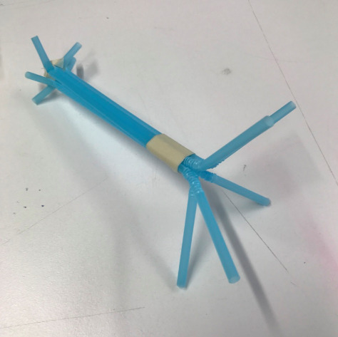


I made one blue and the other yellow to convey an incompatibility between them, representing how some mental disorders are thought to be caused by/ due to miscommunication between neurons in the brain. It was quite a literal exploration of my concept but I thought it was still quite valid. I thought the straws were an effective material to use, particularly as the ends can bend and therefore appear like dendrites.
Major work progress:
Discussing my project with Shereena and the definitions of abnormality I realised that it might be good to explore the stereotypical features of particular disorders rather than what the DSM-5 classifies them as. This also allows me to avoid being insensitive as I am representing societal stigmas. I can still use materials which evoke aspects of the brain/body and therefore somewhat convey psychologists’ present understanding.
Individuals are often restricted by the stigma of their condition so I came up with an idea involving biological features inside a box/confined area. Here is some documentation of my experiments inspired by Fenella Elms’s ‘Edges’ and Michelangelo Pistolleto’s installation posted on my Pinterest page.


With greater refinement I think this could be an interesting sculptural work, especially if the materials were quite dark and ambiguous. The paper appears again like the cortex of the brain and resembles a maze, but one that can’t be solved. I could even look at making a box into a cage or jail cell with deformed bodily features inside.
0 notes
Text
Week 7 (non-teaching week)
This week I decided it was important that I define exactly what about the binary normal/abnormal I was really looking at/exploring/questioning. I know this work is meant to be created through practice-led research but having multiple conceptual ideas is getting in the way of that for me right now. I am tossing up between:
1. At what point does something that is out of the ordinary become abnormal?
2. Abnormal and atypical qualities can be desirable
3. The changing definition of abnormality through history/over time - changing from being influenced by religious beliefs (possessed by the devil) to behaviourally focused and then to neurologically based
I am not too certain what would be best to explore though. I think the 2nd is what interests me the most but I don’t want to come across as saying that having a serious abnormality is a desirable thing or as thinking that mental disorders aren’t often extremely debilitating and difficult to live with.
One way I could do this is representing people with disorders as just being at the slightly more extreme ends of the spectrum. There is variation in traits in every population so it doesn’t make sense to categorise particular people as in this distinct, abnormal category just because they are more anxious than most or more sad than most (obviously disorders are more complex than that but just to convey my point). This also supports the current conceptualisation of disorders in the DSM-5, which takes a dimensional rather than categorical approach i.e. symptoms exist on a spectrum.
I was inspired by the image below and similar ones on pinterest which convey particular mental disorders and emotions as influenced by different levels of neurotransmitters and hormones. Whilst the underlying causes of many disorders are relatively unknown, psychologists know that particular neurotransmitters can be implicated. This also forms part of treatment, for example selective serotonin re-uptake inhibitors (SSRIs) are used to treat OCD, depression and anxiety as they increase serotonin activity on the post synaptic neuron. I was thinking I could have different test tubes or containers representing different mental disorders, with different levels of coloured liquids which each represent a neurotransmitter. This would support this spectrum concept - we are all essentially the same, there are just slight differences in our brain functioning.

Source: https://medicalhumour.wordpress.com/2013/01/03/chemistry-of-life/
I explored this idea with the materials I had available to me. I had hoped to use coloured dye for the neurotransmitters/dopamine as dropping small amounts in water can turn out quite amazing. I would therefore be representing people with atypical levels of these things as beautiful and unique individuals. Unfortunately I had very few dyes so I used coloured paper instead.
Dopamine = yellow
Serotonin = red
Norepinephrine = blue
From left to right: schizophrenia (high dopamine), anxiety (low dopamine), depression (low dopamine, serotonin and norepinephrine), conduct disorder (high serotonin) and OCD (abnormal serotonergic system symbolised through cut outs).


Some other ideas I’ve had:
1. Creating an electrical circuit which short circuits reflecting a dysfunction in the electro chemical messages sent through and between neurons
2. A pendulum which doesn’t work - imbalance
3. Fluid art - often looks quite biological and cellular with circular patterns.


Screenshots of Instagram pages - user’s names in photo
0 notes
Text
Week 6
This week’s topic was uncreativity and was about the ethics of appropriation/recontextualisation and plagiarism. It was really interesting to explore the binary of original and copy under this concept. For the class activity my group questioned whether a technique/process can be plagiarised, so we selected a picture of a person (I chose a portrait of Inka Williams) and repeated this image to create a coloured grid, like that of Andy Warhol’s ‘Marilyn Monroe’ using the website https://popartstudio.nl/. This was the outcome:

As for the ongoing project I’ve brainstormed some further abnormalities that occur in the body, that I could create a piece about...
- Mental disorders (problems in brain activity such as in the release of neurotransmitters such as dopamine, serotonin, oxytocin, norepinephrine and epinephrine)
- Genetic abnormalities e.g. Down Syndrome
- Amnesia (retrograde and anterograde)
- Other malfunctions in the body such as prosopagnosia (facial blindness - inability to recognise faces), cancer, false memory, binocular rivalry, colour blindness, hypersomnia, etc.
I have created a Pinterest board which collates some potentially psychology related pieces of art: https://au.pinterest.com/eviedainton/adadsart/. The material practice of these works have inspired many ideas about how to depict abnormalities symbolically. Many of the images employ string or fabric as I feel like this is a really good material representation of neurons/synaptic connections in the brain. I have done some experiments using similar materials to explore this...
1. I did a few experiments with a long knitted rectangle I had in my cupboard.

Firstly I folded it to resembled folded tissue in the body or other bodily features such as the golgi apparatus in the cell, taking inspiration from a few of the pinterest pictures on the above page.

I then just rolled it up in a circle, making it look like a cell of many layers, just playing around with the potential of this material.

I thought that the pattern of the stitch resembled the cortex of the brain so I decided I would unravel one end of the knitting, evoking a malfunction or abnormality.

I added some additional holes in the body of the material and furthered the unravelling.

I thought this was really quite successful and I could imagine a series of knitted rectangle with unravelled or destroyed sections.
2. I conducted a similar destructive process but with glad wrap.
I initially layered a few equal sized pieces of glad wrap...

I then pulled at particular sections to stretch the material and created a less flat surface.

Some bits tore but not as I had hoped - more round when I thought they would rip in long tears.

I thought perhaps the textured plastic would obscure a material or image behind it so I placed the sheet on top of my knitting, but it didn’t really do anything. Obscuring perfect things could be an effective way of resembling abnormality.

0 notes
Text
Week 5
As discussed in previous posts I am planning to select a more specific binary to work with, unless an idea comes to me for an overall representation of binaries. I was inspired by some of the glitch works from the first assessment which investigated glitches in the human body, for example genetic mutations, sleep paralysis and experiencing deja vu. I am majoring in psychology in my science degree so psychopathology is something I am really interested in. Having a mental disorder could be thought of as a glitch and reflects one of the binaries on my initial brainstorm list for question five: normal/abnormal. I think this would be a very interesting and effective concept to explore, if done sensitively.
In week 5 the class went on an excursion to the Museum of Applied Arts and Science but unfortunately I wasn’t feeling too well and missed it. Instead I looked at the powerpoint presentation for this week and last week and thought about how those themes could inform my major work.
1. Context and time
The definition of abnormality has been altered considerably across time due to the level of understanding of the mind and body as well as available scientific technologies. In my psychology classes I’ve learnt a lot about the history of psychopathology including changing perceptions, diagnoses and treatments. I would like to make a work that either reflects our current understanding or compares now to a very different time, for example the one of Freud discussed in the 2002 documentary series ‘The Century of the Self.’ Perhaps my work could be a video collating footage from old mental asylums.
2. Affect and body politics
This powerpoint made me question how I can challenge the stigma associated with a lot of mental disorders. Classification is a large contributor to stigmatisation but it is also necessary for treatment and for the law. I guess it’s all about viewing people as people, independent of their diagnoses or any deviations from what is considered normal. In one of my classes we also explored the point in which normal becomes abnormal and therefore the definition of this. For example you could be exceptionally intelligent and deviate from the average in that respect but it doesn’t mean that that’s a problem or abnormality.
0 notes
Text
Week 4
In this week’s class we submitted our posters for Assessment 1. We didn’t get round to everyone so I didn’t actually present mine but I really enjoyed the projects and ideas explored by those who did. We were asked to select a couple, from the three classrooms we looked at, that were particularly effective in our opinion and explain why. Here are my top three:
1. This poster was a response to the binary question and was a work that represented how your perspective can change your view/opinion of things. The use of lenticular printing was particularly effective in exploring this concept and I just thought it was a simple yet very successful work.


2. Another favourite of mine also explored the binaries question in a symbolic way. The two taps represent to halves of a binary but the water that comes out is a mixture of the two (hot + cold = lukewarm). It works like a venn diagram where the lukewarm water represents the grey area of opposing concepts.

3. This poster was a favourite of mine as it was a slightly humorous portrayal of a computer malfunction, responding to the glitch question. Typical errors were replaced with existential questions, which gave the computer life. I liked the reference to artificial intelligence and think that could be a very interesting avenue for the major work.

0 notes
Text
Artist Statement
My work is a response to a question that asks how art can interrogate binaries. I initially intended to choose a specific one such as man/women or organic/synthetic but due to subsequent discussions on the topic, decided an overall representation of dichotomous concepts would be more interesting. I investigated a French philosopher Jacques Derrida (b.1930) and his ideas of deconstructionism which articulate the complexity of meaning. He states that our conceptualisation of each word is largely dependent on its opposite (symbolised through the physical joining of words) but also that true definitions can never really be known. It is due to this that I developed a word search (symbolic of a search for meaning or truth) made up of a list of binaries I created. The dominant half in each pair is capitalised in my poster, representative of Derrida’s understanding that there is always a superior, for example darkness over light. This investigation was furthered through an exploration into deconstructionist art and architecture for example Robbie Roland’s ‘Collapse’ (2008) and Baptiste Debombourg’s installation ‘Turbo’ (2007), two works that that disassemble a found object/structure (chair and wall respectively).
I was inspired by text based works, such as a variety of those from the class powerpoint as well as those by Yale architecture students Michael Beirut, Benevieve Panuska and Jacqueline Kim (2003-2006). I liked how not only did the meaning of the words have significance but they became the dominant visual feature. I used comparable bold text and a limited colour palette in my work but the words are obscured by peripheral red letters, red netting and thick, black tape. The red and black colour scheme employed is similar to that used in much of the propaganda created in Mao’s 1960s Chinese revolution. I chose this historically significant colour scheme because it alludes to a reality where an established authority (in this case, history and perception) has dictated thought/understanding.
0 notes
Text
Assessment 1
I transferred my binary layout to my A2 piece of card with pencil but had to change a few things due to different proportions.

I was pretty happy with the balance of words and different sizes and thought it some what reflected these posters I came across that were produced by students at the Yale school of architecture (2003-2006). Michael Beirut and Benevieve Panuska’s work is found on the left while the right poster was created by Michael Beirut and Jacqueline Kim.

I then went over everything in black acrylic paint.

Red letters then followed.

I thought the use of black and one colour was effective. I decided it still looked too plain though and thought I would perpetuate the propaganda aesthetic, as this reflects the sort of unquestioned acceptance that one half of a binary is superior. I explored possibilities such as ripping up the poster and then sticky taping it back together or perhaps not in a rectangular form, reminiscent of deconstructionism, e.g. the practice of Robbie Rolands, exemplified in his architectural sculpture ‘Collapse’ (2008)

and Baptiste Debombourg’s installation ‘Turbo’ (2007).

Finding some red netting and thick black tape I thought that I could use these materials (and their colours) to impede on the writing, simultaneously deconstructing established concepts.

This really added an extra dimension and gave the poster some materiality. I hoped that the netting and tape would somewhat obscure the writing or distract from it, reflecting how definitions and binaries may not always be so clear.
0 notes
Text
Assessment 1
I have developed a list of binaries, which progress from black & white to right & wrong. Each pair is related conceptually to the subsequent one, indicative of how not only is our understanding of darkness, for example, dependent on our experience of light but it is enhanced by, and often used as a metaphor for, black & white or wrong & right. The co-dependency of these opposites creates a sort of “ecosystem” of conceptualisation. The binaries that are more provocative in nature or that I think should be questioned are in bold below and will be larger on the poster. Additionally the dominant/preferred half (words on the left) will be capitalised. While the perception of what is the superior term may change depending on how you look at it, I will choose the option that I believe would be more commonly accepted.
black - white
darkness - light
distinct - vague
representational - abstract
original - copy
scientific - artistic
proven - questioned
safe - risky
ordinary - unusual
rational - insane
special - diagnosed
accepted - scrutinised
free - restricted
clean - dirty
organic - synthetic
treasure - trash
valued - disrespected
man - women
straight - gay
right - wrong
Inspired by posters in the class powerpoint such as...

due to it’s simplicity and challenging of the concepts of man and women,

because of the variation in text size and monochromatic colour schemes, as well as

in light of is political nature, I began experimenting with text. I entertained a few options including having the ^bold in capitals instead of the words on the left, having those in red while the other binaries are written in black, using different fonts, etc.


With the first two I found that there wasn’t enough of the capital or red words and with the third that there wasn’t much purpose for having different fonts. I decided on the following...

As you can see, the two words in each binary are represented as dependent on each other due to their physical joining. These will be written in black acrylic paint whilst the gaps will be filled with letters (much like a word search) in red. The contrast of black and red demands focus and draws attention. Elements of this reminded me of Chinese propaganda for example...
Mao Zedong’s posters that were propagated during the 1960s cultural revolution which are both graphic and text based as well as politically charged.


0 notes
Text
Week 2
In week 2′s class the theme was collaboration and community, requiring us to split into groups and create a political poster. My group took our inspiration from the content of magazines, focusing on the over sexualisation of females. We cut out the best examples of this and created a collage of the selected images. We included single words and phrases, often placing them over the faces of the models, indicative of how they are reduced to being an image of ‘perfection’ or just a ‘beautiful’ girl. We placed it on a graffiti wall to convey how destructive this industry is and how, in a way, the girls’ natural beauty has been destroyed due to the heavy editing of the photographs.

In continuing to discuss our poster project, and in particular binaries, Bilijana introduced my group to Derrida and his concept of deconstructionism. He stated that the meaning of one word is critically dependent on its opposite and that this is the method through we define concepts. Additionally, in each binary there is a superior or dominant, for example black is the opposite black and white. This evident co-dependency is definitely something I wish to represent in my poster, and subsequent major work.
1 note
·
View note