
Don't wanna be here? Send us removal request.
Statistics
We looked inside some of the posts by f10ri222 and here's what we found interesting.
Average Info
Notes Per Post
1
Likes Per Post
1
Reblog Per Post
0
Reply Per Post
0
Time Between Posts
23 days
Number of Posts By Type
Text
17
Last Seen Tumblr Blogs


Fun Fact
The KCSC sent more than 20K requests to delete posts related to prostitution and porn to Tumblr from January to June 2017.
Text
Week 6-12
Animation Practice Trimester 2
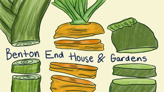
Live Project Benton End House And Garden - Food Learning
Research and Concept Development
This project was inspired by the legacy of Cedric Morris and the gardens at Benton End, where art, horticulture, and daily life intertwined. The brief was to explore food growth and gardening through an observational and artistic lens, with the end goal of creating a short animation sequence that reflected this natural rhythm.
I began by researching Cedric Morris’ life and planting practices, particularly his connection to vegetables and edible plants. Unlike ornamental garden studies, this project focused on the growth cycle of food I specifically chose to study carrots, leeks, and cabbages due to their strong structure and visual presence both above and below ground. Cedric Morris was known for planting vibrant, painterly gardens that blended function with beauty, and this ethos heavily influenced the tone and form of my animation.
Using real-life references and botanical guides, I broke down each vegetable into visual phases from seed to sprout to harvest which helped me develop concept sketches, tonal studies, and animation timing. I paid close attention to soil texture, leaf structure, and how each plant interacted with light and space.
Visual Development and Techniques
I began the visual process with sketches and tonal studies of the selected vegetables. Carrots were the main focus for my animation scene, so I created multiple studies of their roots underground, their foliage movement, and how their structure changes as they mature.
The animation was developed using tv paint, beginning with rough pencil like animatics and then cleaning up in layers. I focused on capturing the moment where the gardener pulls the carrot from the soil a simple action, but one that involved subtle timing, texture, and movement.
I chose to edit the animation with a light classical café-style soundtrack, giving the sequence a nostalgic and serene vibe almost like a memory or a moment in a garden sketchbook come to life. This sound choice reflected both Cedric Morris’ love for calm, creative spaces and the peaceful labor of growing food.
Reflection
The challenge was in balancing stylisation with botanical accuracy. I didn’t want the animation to feel too cartoonish, but also not overly scientific it needed to breathe with character. Finding that balance meant spending time observing real plants, sketching from life and references, and letting the animation feel grounded yet warm. Also was challenging working with a different style to what I would do but I made it work as the ain was for children mostly for this animation.
I also learned how important sound and editing are in setting the tone. Without any dialogue, the gentle classical music and earthy sound effects told the story alongside the visuals.
Areas for Improvement
Additionally, more time could have been spent on the lighting and color timing to reflect the mood of a day in the garden from morning light to golden hour. While the animation successfully shows the carrot being pulled, a longer sequence of the appreciation when she is holding the carrot also more detail it was kept very simple as I was working with the style of another artist however due to circumstances wasn't enough time for that.
Finally, I would consider incorporating Cedric Morris’ painting style into the backgrounds soft strokes, rich tones, and slightly loose renderings to pay further homage to his unique artistic and horticultural vision.


0 notes
Text
Week 6-12
Computer Generated Imagery – Maya Project Trimester 2
3D Character Design: Charlie The Sad Elephant
Research and Concept Development
The initial concept for this project began with a pair of animated bird characters named Duo and Pebble designed as a play on the phrase “two birds, one stone.” These two characters were created to be complete opposites: Duo being tall, scruffy, and sarcastic, and Pebble being short, round, and feisty. Their personalities were visually reflected through expressive, cartoonish details: Duo with a loose vest, oversized shoes, and unkempt tail feathers; Pebble with a cracked eggshell hat, puffed chest, and exaggerated waddle.
The long-term vision was for these characters to merge into a final boss design a two-headed bird creature with a body made of stone. This stone form symbolized their chaotic fusion, playing into slapstick villainy. However, due to the complexity of the merged design and technical constraints in Maya, it became extremely difficult to model and rig this concept. The dual-head setup, combined with a rigid, textured stone body, caused frequent geometry collapses, file instability, and texture application issues.
Despite this, the project remained anchored in the aesthetic of early Disney rubber hose animation, Cuphead, and Bendy and the Ink Machine all of which contributed to the exaggerated proportions, vintage cartoon style, and circus themes. These influences carried over into the final character that was eventually developed: a red circus elephant who embodies the same world and tone as Duo and Pebble.
Materials and Techniques
The final 3D character was built in Autodesk Maya using box modeling and sculpting techniques. Each part of the elephant from its oversized gloves to the drooping trunk was modeled in segments and later unified. I experimented with squash and stretch form and curved limb geometry to stay true to the vintage rubber hose animation style.
The intention was to create a felt-like texture to mimic old animation cells or plush puppet aesthetics, but applying materials in Maya proved technically difficult. The file often crashed during UV mapping or shader assignment, and the geometry itself began to distort during rigging, with parts of the model caving in or stretching unnaturally particularly in the torso and lower limbs.Animation was limited to basic posing and turnarounds, as any further rigging stressed the mesh too much without more time for retopology and weight painting.
Reflection
This project gave me a better understanding of the complexity behind creating stylized characters in 3D, especially when translating 2D animation-inspired designs into full models. While the final elephant character captures the spirit of a vintage cartoon performer, there were several limitations in execution that impacted the outcome.
I learned that cartoon simplicity requires complex planning, particularly when it comes to stylized form, squash-and-stretch rigging, and clean mesh flow. Maya’s power is vast, but I underestimated the time needed to test rigs, refine edge loops, and apply materials successfully. The process was frustrating at times, especially when dealing with crashes and unexpected mesh collapses, but it also pushed me to problem-solve under pressure.Though I wasn’t able to fully bring Duo and Pebble to life in this version of the project, they shaped the world and tone of the final circus elephant who now stands as a spiritual extension of that whimsical, chaotic universe.
Areas for Improvement
If I were to revisit this project, I would first spend more time on clean concept art and full turnarounds, which would give me better consistency during the modeling phase. Starting with more refined proportions would have helped maintain the “chubbiness” needed to stay on-brand with Cuphead and early Disney inspirations.On the technical side, I would prioritize learning more advanced UV mapping and retopology techniques before applying textures. Most of the issues with the file crashing stemmed from rushed geometry and shader conflicts. I’d also test shaders and materials in isolated files to avoid corrupting the base model.
Inspiration:


0 notes
Text
Week 1-6
Computer Generated Imagery Trimester 2
Hansel and Gretel GIF Animation Project
Research and Development
This animation project was based on the classic fairy tale Hansel and Gretel, reimagined through a whimsical and illustrative visual style. I drew heavy inspiration from artists such as Dilka Bear, Mabel Lucie Attwell, and Claire Fletcher. Each of these illustrators brings a unique softness and storytelling charm to their work, often combining childlike innocence with slightly eerie undertones a balance that felt very fitting for the world of Hansel and Gretel.
Dilka Bear’s emotional, doll-like characters with their wide eyes and muted palettes heavily influenced the character design. Mabel Lucie Attwell’s use of pastel tones, chubby-cheeked children, and vintage illustration style inspired the more nostalgic tone I wanted to replicate, while Claire Fletcher’s paper-textured, hand-drawn aesthetic guided my layout composition and props.
Materials and Techniques
The animation was created using Photoshop to build layered scenes and hand-drawn frames, which were then exported as GIFs. While the final output is digital, my intention was to preserve a tactile, storybook-like feel. Characters and key props were drawn on separate layers to allow for isolated movement, such as blinking, hand gestures, or blinking lights on the sweets and cake.
Due to time constraints and the complexity of frame-by-frame animation, I chose to animate in a GIF format using limited movement loops. This approach allowed me to keep the aesthetic consistent while still bringing life to each scene. However, animating in this way came with challenges particularly with maintaining smooth movement. The pace of the frames felt slow and somewhat static due to the difficulty in creating natural transitions without more time for breakdown frames.
Reflection
This project helped me explore the intersection of digital illustration and animation, especially within the context of adapting classic stories. I enjoyed building the characters and environments in a style that felt personal to me, but also clearly referenced vintage children’s book aesthetics. However, the transition from illustration to animation proved to be more difficult than anticipated. While Photoshop allowed flexibility in drawing, animating frame-by-frame without dedicated software made it hard to control timing and movement fluidity.
I learned that maintaining consistency across frames especially with detailed characters takes far more planning and layering than I originally expected. Despite the challenges, the project allowed me to experiment with digital storytelling in a format that still reflects analogue charm.
Areas for Improvement
If I had more time or a different medium, I would have loved to fully commit to a Mabel Lucie Attwell-inspired look, using soft pastels, aged textures, and a lighter print-style palette. While the digital format offered convenience and control, I feel that a more tactile, printed quality would have elevated the emotional impact.
Additionally, this story could have been especially well-suited for paper stop-motion animation, similar to the Sicilian Man project. The fairy tale tone and visual references would have matched beautifully with cut-paper characters, giving it a handcrafted charm and more physical presence.
If given the chance to revisit this project, I would explore that route combining layered textures, analogue materials, and slower, intentional animation to tell the story in a way that feels both nostalgic and timeless.
0 notes
Text
WEEK 1-6
Animation Practice Trimester 2
Stopmotion Project
Research and Development
In preparation for this stop-motion animation project, I undertook visual and contextual research to inform both the narrative and artistic direction of the work. The story is set in 19th-century rural Sicily, which required an understanding of both historical lifestyle and visual aesthetics of the time. Research included imagery of Sicilian farmland, traditional working-class clothing, and domestic interior spaces. This contributed to the authenticity of the characters’ environments and supported the emotional tone of the narrative.
Stylistically, the animation draws heavy inspiration from lino cut and woodblock printmaking. This medium was selected for its stark contrast, rough texture, and handmade aesthetic. By mimicking these qualities through paper cutting and thick black outlines, I was able to replicate the expressive edge of traditional printmaking within a stop-motion context. Sketch studies of lino-printed art and visual experimentation with bold silhouettes influenced the final character designs.
Furthermore, I examined visual storytelling techniques found in Italian neorealism cinema, particularly in their use of natural light, silent emotional cues, and subdued color palettes. This informed my use of a faded, filmic color scheme muted ochres, siennas, and off-whites to reflect a sense of nostalgia and emotional restraint.
Materials and Techniques
The animation was created entirely using traditional stop-motion techniques and physical materials. The primary medium was cut paper, with all characters, props, and background elements individually hand-cut using scissors and craft knives. Different types of paper were chosen for their texture and weight to reflect specific visual qualities .
Each frame was captured using a tripod-mounted DSLR camera, with consistent lighting setups to maintain visual continuity and minimize shadows. A flat, diffused lighting system was used to mimic natural sunlight and support the vintage, sun-washed aesthetic.The characters were designed based on a lino cut style, with bold black outlines and minimal internal detailing to create contrast and texture. These outlines were cut separately and layered to mimic the stamped look of lino or woodblock prints.
Animation was completed frame-by-frame, with minor adjustments made manually between shots to simulate natural movement. Post-production involved compiling the images in editing software, adjusting timing and transitions, and adding subtle ambient sound and music to support the emotional tone.The color palette was carefully limited to muted ochres, deep reds/browns, soft neutrals, and blacks to maintain the faded, historical feeling of early film and aged photographs.
Reflection
This project was both a technical and emotional exploration. The process of building The Light Between Us entirely by hand encouraged me to slow down and engage deeply with each frame. Working in stop motion required patience and precision, particularly when animating delicate paper cut-outs with subtle gestures and maintaining continuity between frames.
Conceptually, the project challenged me to convey an emotionally complex narrative through minimal dialogue and visual storytelling. The central themes unspoken love, societal constraint, and memory had to be communicated through posture, glances, lighting, and symbolic elements such as the barley stalk and the final portrait. This reliance on non-verbal expression helped me grow in my understanding of visual language and how to emotionally engage an audience.
Additionally, the story’s quiet sadness pushed me to be more vulnerable in my creative work. Instead of aiming for overt drama, I focused on subtlety and silence using light, movement, and atmosphere to speak where words could not. This shift deepened my appreciation for poetic, slow storytelling and how powerful simplicity can be when paired with intention.
Overall, this project allowed me to combine my interests in analogue techniques, narrative depth, and visual texture and it has set a standard for the kind of emotionally driven, handmade animation I hope to continue creating.
Areas for Improvement
While the project successfully captured the intended mood and aesthetic, there are several areas where the production could be improved, particularly in terms of materials and set construction.
One of the main limitations was the use of flat cardboard for the background environments, which at times lacked the dimensionality and visual layering that could have elevated the overall depth of the scenes. In future projects, I would explore creating multi-layered backgrounds using thicker paper or prepex (Perspex) glass sheets to create more defined foreground, midground, and background planes. This would allow for greater visual height and separation between elements, making the scenes feel more immersive and enhancing the illusion of depth within the frame.
Additionally, experimenting with raised platforms and shadow layering techniques could add more realism and interaction between characters and their environments. For example, having elements at varying heights would create more dynamic lighting opportunities and subtle parallax movement during camera shifts, adding richness to the visual storytelling.Finally, while the handmade aesthetic was a strength, a more structured approach to material selection using heavier stock papers for stability and lighter materials for flexible elements could have improved the ease of movement and animation consistency during production.
These insights will inform my workflow moving forward, as I continue to refine the balance between handmade authenticity and professional polish in traditional animation techniques.
Cultural and Artistic Influences
The visual and thematic elements of Sicilian Man were profoundly shaped by two key sources: the intricate woodblock prints of Japanese artist Fumi Yanagimoto and the rich queer history of Taormina, a town in Sicily known for its association with LGBTQ+ figures in the late 19th and early 20th centuries.
Fumi Yanagimoto’s work, characterized by bold lines, delicate textures, and a harmonious balance between negative space and detailed imagery, served as a significant inspiration for the animation’s aesthetic. Her woodblock prints often depict intimate scenes with a sense of stillness and introspection, qualities that I aimed to emulate through the use of hand-cut paper silhouettes and layered compositions in my animation. The tactile nature of her prints encouraged me to explore the physicality of materials, leading to a more hands-on approach in crafting each frame.
Simultaneously, the historical context of Taormina provided a narrative backdrop that enriched the storytelling aspect of the project. In the late 1800s and early 1900s, Taormina became a haven for queer artists and intellectuals, including figures like Wilhelm von Gloeden and Robert Hawthorn Kitson. Their presence transformed the town into a cultural enclave where expressions of queer identity could flourish, albeit discreetly. This history informed the emotional undercurrents of Sicilian Man, particularly the themes of hidden desire and societal constraints. By setting the story in a similar Sicilian environment, I sought to pay homage to this legacy and highlight the nuanced experiences of LGBTQ+ individuals during that era.
Integrating these influences allowed me to create a piece that is both visually distinctive and emotionally resonant, bridging traditional artistic techniques with historical narratives to convey a story that is deeply personal yet universally relatable.
Conclusion
Sicilian Man was a comprehensive exploration of handmade animation as a medium for storytelling, combining visual experimentation, historical research, and narrative depth. Through the use of traditional stop-motion techniques and paper-based materials, I was able to recreate a tactile, lino-inspired aesthetic that reflected both the era and emotional tone of the story.
The project deepened my understanding of visual symbolism and non-verbal communication, especially in how silence, light, and texture can convey complex emotions. Drawing from historical and cinematic influences, I aimed to create an atmosphere that felt intimate and timeless allowing audiences to connect with the characters through subtle, nuanced gestures and environments.Overall, this project not only strengthened my technical skills but also affirmed the value of analogue processes in contemporary animation practice.
References
https://inf.news/en/arts/51e152b7d4edfde4948e11f706143711.html


1 note
·
View note
Text
WEEK 6-12 -
Maya 3D
I think I did so much better than last year learning the program , although it still tricky learning things and it takes time i think im happy with everything for timing aswell id work more on my characters room but overall happy with everything and learning new skills i think also the teacher helped a lot this year


i think to make it better next time i would make the table set more of an environment add lights and things to make it look as it is a sale in ikea same with the characters room and challenge myself more with shapes that are harder to build then keeping it simple with the basic shapes
0 notes
Text
WEEK 1-6-
After Affects Motion Graphics-
I chose the book In Praise of Shadows-
Inspired by the japanese culture i decided to study the dance of geishas with that i wanted to narrow it down to it being a silhoutte cutout with the background i did the japanese flag however reversed the colours to give a night scenary the tradition it being outside highlights the authors argument on shadows and i made it to be outside with natural lighting amd scenary to support his argument and chose an old japanese soundtrack that matches the japanese tradition pretty straightforward.


research and moodboard inspiration
0 notes
Text
WEEK 6-12-
Lipsync Animation-


Looking in pinterest for references and the audio Nicking It i took the perspective as the two ladies gossiping and decides to use frogs i wanted to exaggerate their features and make it from a comedic stand point i think even matching the drinking glasses to their personalities and how they fit in them made it more fun.
With the outfits adding more persona where as the bug frog is in a tight revealing bikini and the other one in a bathing suit brings more character it was all in the moment when i drew them i did get some ideas from Pinterest but i just drew it in the moment and was happy with how they came out-
Also the voices were different pitch and the one that was lower and deeper i decided to make her more dramatic with filler and look crazy i just went all out i think also her being in a whiskey glass added more to her personality and how her being bigger and fitting uncomfortably in the glass adds to the humour whereas the skinnier one is more natural glam and inside a skinny margarita glass overall fun to work with-


Although I had no time to finish it it is very hard to work with tv paint especially animating frames i think i need to figure out shortcuts within the programme as it takes very long to work with it is what it is overall i think its alright for next time i would work animating to move the arms or the frogs legs moving up and down and animate the smoke so when the transition of jess's second pose comes the smoke is the transition effect then at the end i would go back to the first shot where they where both in frame and muffle their voices to blend it with the background noise then zoom out and blur the camera and fade it out black so it gives the tv show concept vibes.
0 notes
Text
WEEK 1 to 6-
Graphic Novel-


Based on the words funky, curious and 1960s Paris i decided to get some inspiration from films and real life events -movies like Amélie and photos from the 1960s student protest and did use them mostly as references for some panels in my graphic novel -
I wanted to experiment with monochrome but it different shades like cooler blue greys or warmer red greys in different scales to show the difference between my main characters and the people it was fun working with the grey scales as my main focus point was the two main characters and the surroundings around them would be silhouettes as they brung more drama and chaos to my story focusing on my character Amélie I wanted to make her ginger bob as a symbol to the story that colour i wanted to use it when action was happening and the readers can connect the dots between the panels and understand the story-
It is really detailed but i still loved how it came out it did take long to colour and add the shadows and little essentials here and there but overall im happy with the story
although when doing the poses of amelie she looks very cartoony i did end up deciding to make it a bit more realistic and didnt have time to change it however everything still is the same just the style changed up a bit
With the experiment with different styles i wanted to focus on texture and colour so Andy Warhol was one of my inspo and changing it from monochrome to bright saturated patterns and colour was fun to work with and the crosshatching style like Vincent Van Gogh and Da Vinci was one of my inspos also-
0 notes
Text

YOU HAVE REACHED THE END OF THE ANIMATION BLOG TRIMESTER 2 KEEPS SCROLLING DOWN TO READ THEM AND SCROLL FURTHER FOR THE ILLUSTRATION THURSDAY CLASS BLOGS TRIMESTER 2☺️
0 notes
Text
Week 10 & 11- After Effects
The Process-
First we experimented with images we had on a file to see how to demonstrate the moving images on a loop , then i had to plan what i wanted to do with my images so I designed my own houses , cars and things in the background like trees and a lampost then i will scan the physical sketches onto my after effects digitally and render them there-


after touched up the images on photoshop and turned them into pngs i uploaded them onto after effects then layed the houses out copy and pasted to look like a row of houses then the cars onto the road after making a new layer solid as a grey path the same with the dark blue sky then moved them into the positions i wanted them to be in after scrunched up some paper and made pngs of clouds moved them into their position also and the cat i added onto the roof jumping up n down with the pen tool with the sound i edited on capcut added busy street sound and music fading at the end as if its the cars radio also with the lampposts on photoshop drew a long rectangular shape faded yellow light then messed with the opacity to make it look like its flickering
0 notes
Text
Week 5,6,7,8,9- Walk Cycle in Adobe Animate-
The Process-
I picked the word child and angry then from there went to draw the portrait and character turn around

I wanted to exaggerate his head to his body proportion and add also big dino shoes onto him, with the walk process i think could be more of an angrier stomp but i will have to add symbols like hot steam coming out of his ears to show that he is angry then i created a loop with the walk i have 9 frames each i then add the face on top of the skeleton i created along with the clothes and the shoes then create a moving image like a gif-


0 notes
Text
WEEK 1,2,3,4- Maya 3D Modelling
The Process-


First I started with experimenting to with the shapes and how to make them 3D i did watch some tutorials on Youtube as it is hard to get around this programme. Then we had powerpoints also explaining to us each step of making our building .

watches youtube tutorial on how to make a mushroom house then experimented with the scales and shapes after that added colour texture and image patterns from safari with the light coming out the windows directional ans a latern hanging on top of the door ambient

0 notes


Text
Week 10,11,12- Puppet & Stop Motion Project-
Final Process-
Now i started to make the clothes for my puppet and hair i used my dads old shirt which ironically matches the one i drew for him which terry owned also for the sketching research and some old grey charcoal trousers and three magnetic buttons for the shirt , my mum did help with the sewing machine to stitch the shirt together did add a collar also, then for the air i used some blonde string and glued it around the head in a swirl motion for the base then after took the string apart cut it into small pieces and glued it one by one then used a black marker to highlight the eye bags and the sunken eyes and the depth of the frown-


Here are the sketches also for the puppet-


Now the Stop Motion Filming Process-


Used led lights turned of the main lights to get that stage atmosphere also zoomed the camera in to mainly focus on the puppet and the corner he was at thank god for Lulu my interior design partner for making the floorboard with magnet strip so the puppet could stand on its own when filming however some parts where he would fly off stage or stand i would have to zoom in closer so you couldn't see j was holding him it did take over two hours to film but i think it came out really well i did achieve the fast paced energy i wanted to showcase however i do think for next time not turning the camera every-time keeping it still so its smoother and clearer when the puppet is moving
i just focused on him playing around the studio
0 notes
Text
Week 7,8,9- Puppet & Stop Motion Project
The Research-
With the project we had to choose someone famous depending where you would spend your christmas , so i chose Coventry because thats where I live and everyone here knows who The Specials are they were a really famous 2 Tone band during the 70-80s era.
Who would communicate political and social issue during that time through their music . My chosen character for my puppet was on Terry Hall the lead singer of the band , so i researched into him sketched different still life drawings by watching his music videos or band rehearsals or concerts shows, then, the environment he was in as we are paired with a graphic design student who builds our set up place so i talked to my pair and we decided on what tone mood colour scheme and things i wanted to include so chose like an edgy underground music studio basement room , as it makes sense for terry aswell , then i used to experiments from trimester 1 where i did the two complimentary colours only using pen and pencils for his face shots then also did some fineline drawings of places in coventry he has been too which are mostly cathedrals-


The Puppet Making Process-
Then to get started with our puppet we used wire thin and thick, clay two different types ; milliput and polymer clay, also pliers drills and aluminium foil.
For the body we used the wire we twisted the arms and the legs then twisted the hips and the torso together then made a loop for the head, hands and feet, The used tinfoil for the head hands and feet , then i started molding the polymer clay for the head hands and feet and sculpted the face i wanted to exaggerate him and make him unappealing so i made a long pointy nose heavy eye bags sunken eye sockets with no eyes and a downwards big clown like frown with a sculpting tool-


After i did the same for the hands and feet i baked them and put magnets inside the bottom of the feet so it could stick to my stage when i animate it.Then i used the milliput to hold the elbows torso chest hips and limbs of the legs but still left some wire so it could bend- then we used foam we cut it a bit bigger than our puppets body shape then glued it together, i wrapped rope around the foam so it could form the shape and hold it in place after 30 minutes i took the rope off and started shaping the limbs to my preferred size it was more bulkier and thicker than i wanted it to be as my puppet was supposed to be thin but we worked with what we had so thats a tip for next time-

0 notes
Text
Week 4,5,6- Live Project 9 Trees-
The Process-
For this project i decided to go with Lizard Day and from that i researched lizards in the UK and trees that correlate to those lizards so it was a Steel Birch Tree and common lizards which hang around woodland or green lands some are in sands but thats different to my project so i stuck with those then did some sketch experiments with different coloured lizards and used fineliners mainly and water colour then i did the same for the trees-


After that i picked a fact from a website- Did you know? When lizard are being hunted they camouflage within their surroundings or shed their tail to distract the predator - So with this i got the idea to make a can you spot the lizards so i chose a woodland of steel birch trees and camouflage lizards into it then added the logo and a green border - i think with other lessons i had trying to balance the timing also it could've been better quality if it was done digitally but thats a tip for next time-

here i drew out each shot so u know where to place the lizards i didnt want to make it too obvious but i wanted to also so you could spot them-

here the final product with watercolour colouring pencils and fineliner to outline some edges of the illustration-
0 notes