Don't wanna be here? Send us removal request.
Statistics
We looked inside some of the posts by faradayb-fmp-y1 and here's what we found interesting.
Average Info
Notes Per Post
6
Likes Per Post
3
Reblog Per Post
1
Reply Per Post
1
Time Between Posts
13 hours
Number of Posts By Type
Text
17
Last Seen Tumblr Blogs


Fun Fact
Tumblr has 4 main sources of revenue.
Text
Overall FMP Evaluation:Part 3
FLOW MAP:
Initial idea generation:
Potential
Unfolding
Genesis

Turning point:
Significant
Noteworthy
Enigma


Research:
Interconnected
Relevant
Moving

Final outcomes:
Corresponding
United
Conclusion

For technical skills I have learnt during this course what is/how to create a Google sites page– so that I may present my work in a digital portfolio to be viewed publicly as if I were presenting them at a show. creatively I have learnt that an abstract piece of artwork can be tightknit and impressive in its simplicity- as shown during Hannah’s Thursday drawing lesson, when producing ‘scribbled’ portrait designs inspired by the artist Adam Riches.


From the initial ideas of my project proposal I have kept true to the statement that my final outcomes will be traditional pieces, created with alcohol markers and coloured pencils. I have also kept to the fact that I originally wanted there to be a narrative behind my peace and for said narrative to be directed to those my age and older so that it can be further contemplated.
My outcomes were created using my own taken photos as reference, I wrapped the objects within said imagery in different colours and lengths of wire- as specified during my Easter weekly evaluation. The wire acts as a motif that further connects my series of drawings together and is representative of both the artificial side of my topic as well as a metaphorical entity, that possesses an object, invading it to the core and growing from it like a parasite or symbiont. Part of a codependent relationship that grows together.
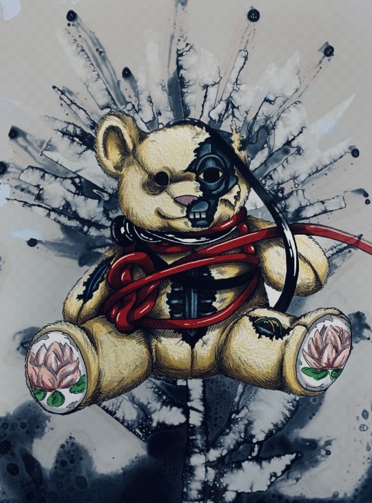
For a few of my drawings I developed them further, usually in a darker perspective, to help show a change within them. Such as the teddy bear design that showcases like colours and a sunny disposition,Whereas its counterpart comically named Robo bear has a more muted colour palette and red wires. The different tones give each piece tree own style and the difference in wire was a deliberate choice as the green had kinder connotations whereas the red had dangerous ones. The teddy bear being a symbol of childish innocence and the slow depreciation of it.


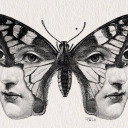
Others such as the three eye drawings show varying possibilities of control and decay. As well as the different angles the ‘infection’ can be conceived. A metaphorical loss of ‘sight’- I.e. how one perceives change and to what extent it can change.
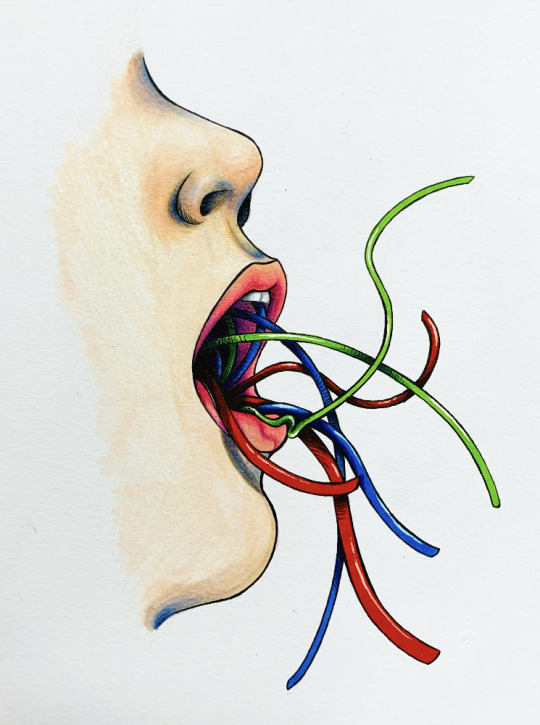
The two images of mouths spewing wires as well as the hand are representative of organic life-forms and how our dependence on technology has consumed, strengthened and destroys us. The snake slithering throughout the persons skull is symbolic of rebirth and transformation, highlighting inevitable change as well as a reference to the Ouroboros that I’d previously placed win one of my mandala designs.
The Coke can and the Chanel bottle I meant to show a driving force four technology to advance i.e. Chanel being a luxury brand that is sought after for personal use and the coke can being a popular drink brand, they are not Necessities they are driving forces as everyone wants something just for themselves to enjoy.
Every object was chosen for its own specific reason culminating together to show the different elements within my narrative of why and how the ‘unnatural’ elements within our world have occurred.
0 notes
Text
Overall FMP Evaluation:Part 2
Originally my narrative was going to be based around the possible reactions, perspectives and the grey moral areas that can occur when artificial intelligence is introduced to, and becomes part of modern society. I was going strong with this idea until I made this particular drawing:

It was this artwork that lead me on a different path from my original concept, after its creation I remember how significant it felt, how much I enjoyed working on it and how much I loved the results, however fro a long time I couldn’t pinpoint exactly what the story of the image truly was until much later. I’d continued with my original idea until I had a conversation with a friend regarding our FMPs and that’s when my newest narrative struck me. I realised that it was the significance of the artificial growing from the plant like a parasite or a new leeching species.
Now I am not only happy with the direction that my theme has taken but also my outcomes as I believe they came out as a cohesive set.
For a live end of year show I would either place my outcomes out on pegs/frames so that they are in a line and are clearly visible. With the original designs placed next to there more developed counter parts, so that the evolution from one outcome to another is neatly shown

If I were able to show my outcomes anywhere in the world at any time in history I would choose to go further back in time possibly to the Renaissance the industrial period, and dot them around the place randomly for people to find and contemplate over. The Renaissance as people would be very confused at the subject matter, possibly disturbed even and the industrial as the concepts are a little bit more understandable, almost like a prophecy from the future.

Words that describe my final outcomes:
Overwhelming
Infected
Possessive
Parasitic
Deception
Mutated
Macabre
Sequenced
Inevitable
If I were to pick a type of music to go with these outcomes I would choose something from a personal perspective/dark academia playlist as the overall aesthetic has a haunting, mournful tone that relates to the overall aesthetic of my outcomes, the background effects of rain are in reference to the presence of the environment, almost as if the world knows it’s changing and has to accept it as mother nature’s creations grow beyond what was thought possibly.
youtube
m.youtube.com/watch?v=c1BJ4U9cJFc
Overall my time spent developing this project was sporadic, though I did spend extra time during the Easter holidays getting ready to come back into college, so that I had a clear goals set for myself so that I could effectively get back into the swing of things and have a head start on my outcomes.
Mostly I work at my own desk or on my bed when creating outcomes for a project or I’ll go out to the main computer in our house and do some research or upload images from my memory stick after a Tuesday digital lesson.

0 notes
Text
Overall FMP Evaluation:Part 1
‘Artificial/Natural’
~~~~~~~~~~~~~~~~~~~~~~~~~~~~~~~~~~~
Originally when picking a theme for this topic I created three handmade mind maps of the different topics that caught my eye from the recommended subjects list. After creating and going through them I settled for my current flip-side topic of ‘Artificial/Natural’ as it had the largest range of or areas and possibilities to choose from, this meant there was far more leeway with where I could take the topic. less restrictive.
The most impactful artists that I have researched during this course would have to be:
Firstly, Myriam Tillson– I admire her disturbing soft-gore aesthetic as well as her ability to transfigure both objects and people into abstract versions of themselves, pushing the bonds of surrealism to help her to create a strong story within her works. Her works have influenced me to strive for those same fluid transitions from one physical subject to another within my artwork.


Secondly, Ryan Tippery– The scope of different textures he is able to produce are not only interesting but bold in both his mark making and execution. Tippery is able to create depth through the extent of his build up of lines and creates lines that follow the forms of his work. His pieces have motivated me to use crosshatching across all of my outcomes. To give them a stronger connection and style.


Thirdly, James Cameron– Creator of the blockbuster 2009 Sci-fi movie Avatar, this film has helped inspire my ideas for my narrative with its links to both sides of my chosen theme. As it introduces its viewer to both the modern, highly advanced yet polluted human territories as well as the primitive yet enchantingly beautiful Na’vi territories.


A piece of wider world research that has links to my project work would have to be the 2018 Adventure video game developed by Quantic Dream, known as ‘Detroit: Become Human’. As the game is set in a world where artificial intelligence are fully automated and adorn the appearances of humans, towing the line is between organic life-forms and created/cybernetic life-forms.


My concept behind my ‘Artificial/Natural’ topic looks towards the strangeness that the ‘unnatural’ (i.e. fabricated products/every day items) are a direct result of the ‘natural’ world (i.e. humanities creation), it’s the odd parallels and said ironic truth that draws me towards this idea. It is a odd thing to think about–that only the peculiar can come from the standard.
The materials i used for my final outcomes were alcohol-based markers and coloured pencils, as I have previously specified my inclination to use them within my project proposal. I’ve learnt that they allow a greater amount of control with both shading and the placement of colours, this was my biggest reason for choosing to use them as I wanted a sense of familiarity and understanding when working. Surprisingly whilst working on my artworks I found that placing the pencil down on paper first and then the marker second has better, less textured results as the ink helps to smooth out and refine gradients.
A piece of artwork that I feel has been the most successful during my FMP would have to be the redesigns of Japanese stamps I created in Thursday’s drawing lessons with Hannah, as I feel that they came out exactly as I had envisioned with a great amount of detail and are representative of my theme visually. Not only that but the process was incredibly enjoyable.
The story behind each of them shows how my thoughts where directed towards my newest narrative at the time. As the flower and phones full circle connection show a simultaneous growth, as if they are feeding off of each other and developing as one.
Where as the broken doll and the lily of the valley have a more contrasting relationship as the poisonous flower penates through its porcelain shell shattering it’s perfect visage to reach the sun.


2 notes
·
View notes
Text
Week 12: Evaluation
For this week I am ecstatic that I was able to finish my 10 drawings as well as my Google sites and a project proposal, not only that but I was able to squeeze in a few extra outcomes here and there along the way.
Out of the three outcomes that I’ve made for this week I believe that the first two I created, the basic one with wires criss-crossing it and the bloodshot eye with wires coming out of it, generally came out alright, however the grainy results in the shadows was definitely as off putting factor.
Though they were still a learning curb as I realised that I needed to put the ink from the marker down after I put the gradient of the coloured pencil down, as the markers help to cover up any exposed areas and help to soften the pencil.
The best of the three would have to be the guy that is filled with a multitude of wires, as it was hard to get it to look like both an eye without the actual iris I believe it came out readable.
It was an enjoyable journey when creating the wires inside of the socket that overlapped and circled each other as the attention I payed to lining them up was worth it in the end.
0 notes
Text
Week 12 : part 2
As an extra I also edited another hoodie with one of my outcomes as an print.I believe it came out well and I like the look of the design against the light purple colouring of the hoodie, it has a nice softening balance.

And finally these are all of my outcomes side-by-side together in their set of 10:
Seeing them lined up together gives me a great sense of accomplishment as not only have I finished them on time to a high standard but I also I feel as though I have achieved the desired effect of them all looking as though they belong together in there various developed stages.


Finally I paid them up to see how they would look displayed that way:


2 notes
·
View notes
Text
Week 12:
For this final week before our Monday the 10th assessments I worked hard on the final three different outcomes that would make up my full 10 piece set.Getting additional images for these three as well.
Instead of only creating two images that are developments of each other i instead made three as I wanted to make use of another one of my eye images.
Original:


Pencil Sketch:

Fine-liner:

Finished Piece:

~~~~~~~~~~~~~~~~~~~~~~~~~~~~~~~~~~~
Fine liner:
1.)

2.)

Finished Piece:
1.)

2.)

Out of these few the first one at the top I would say is my best outcome out of the three as the entire process was an enjoyable one and the outcome came out exactly as I hoped it would, detailed enough that the viewer knows what they’re looking at, easily recognisable for what it is.
The interlocking wires were a fun journey to create levels of depth, making it seem as if they go far down into the socket, perhaps even further into the skull.
My only complaint would have to be the grainy appearance the pencil created for the shadows, I believe this is due to me placing the markers down first and then the pencil, as the markers usually go over the top to smooth out pencil gradients.
This week I also worked on my google site portfolio, tweaking areas and adding all of the photos regarding my work.
1 note
·
View note
Text
Week 11: Evaluation
This weeks outcomes I believe came out nicely and I would definitely rate them as being some of my best work so far, the second more elaborate one being my personal favourite out of the two for its extra details and overall appearance.
I learnt from that very same second outcome to be mindful of where I place colours, as well as to make sure that I do not cross my lines into the wrong territories, i.e. putting a wire line into the side of the facial lines.
I also learnt how to edit and enhance images on a popular drawing app called Ibis PaintX That I then used to produce more outcomes with varying colours and backgrounds. The program is easy to use once you understand the rules and how to organise layers and there is especially helpful when placing down textures whether that be for fabric patterns or animal skin patterns.
0 notes
Text
Extras:


These are a few digital variations of the original drawing that I created with the guidance and help of a friend who introduced me to the program that made them, a popular drawing app called Ibis PaintX
I found it to be very useful and fun to use and experiment with, my favourite bonus was being able to easily add a scale-like texture to the snake as it would have taken ages to complete by hand.
Out of these numbers 1, 6 and 7 I believe are the best as one looks like a promotional poster, 6 embraces its horror aesthetic roots and the blue skin on 7 reminds s of the corpse bride from Tim Burtons stop-motion movie.
0 notes
Text
Week 11:
This week I worked on my Google sites again, I changed the black background to a dark red to match my tumblr account, changed and resized the fonts to make the page look professional.
As well as adding more imagery and changing parts of the format, also I moved and majority of my writing onto a different tab to avoid confusion.
For practical work I worked off of a few new images that I had taken, creating one solely based on the original and another that allowed my imagination to enhance and develop what was already there.
1/2.) Original:

1.) Line Work:

1.) Finished Piece:
2.) Pencil sketch:

2.) Line Work:

2.) Finished Piece:

I personally prefer the second version to the first as it has more intriguing components and detail. My favourite part being the exposed wires, teeth and gums that are on display due to the chunk taken from one side of the face.
Not only is this gory but it shows depth within the layers of the piece that insights the viewer to take a closer look, as if they are peering through a window to curiously search out the unknown.(Busybodies)
The addition of a snake was a spontaneous decision inspired by the feedback I got from one of my friends that I decided to add due to the colour similarity as well as the fact that it’s shape resembles that of the wires, It definitely adds an unexpected detail that makes it stand out from the other outcomes created so far once it has been spotted.
0 notes
Text
Week 10: Evaluation
Through my practical work of drawing the Coca-Cola can I have learnt along the way through improvisation that by using different colours when showcasing different tones of shadows I can create more complexities within my work.This also rings true when are used similar tones to read i.e. multiple shades of pink to show off the lighter areas.
Not only do I prefer this outcome for the techniques are used But I found that through the process of trial and error I was able to determine what would suit it best to really showcase it’s cylindrical figure.
As an extra for this week I created a ruff schedule That outlines the basics of what I will be doing, which helps me to set clear goals for myself to complete on most weeks. As well as showing my planning skills and initiative.
I found using Google sites to be a fairly straightforward learning process and was able to figure out how to add images through my phone using Google Drive. Though I had a few bugbears such as the program not allowing to much leeway when positioning certain images, Overall it worked fine.
0 notes
Text
Schedule:
I also created a rough outlining schedule for what I will be doing in the next few weeks leading up to our evaluations.
To help me to ease my thought process so that I have a clear overview of the goals set out for each week.

0 notes
Text
Week 10:

For this week I focused on creating another one of my outcomes, this one being an image I’d taken of a Coca-Cola can wrapped in wires accented with a flower. Personally I found this to be one of my favourites technically, as the tricks i used when colouring in this piece helped to create depth.
In the beginning stages of colouring in the can I found that it looked far too flat for my liking, so with a bit of improvisation I set about shading the can in different ways, not only for variation but also for realism. (Though I didn’t take the crosshatching style away as it wasn’t interfering with my process.)
Said methods being that for shadows that covered red areas are used brown alcohol markers as I did not have a darker colour of red on hand, and for the shadows that covered the white calligraphy of the brands name I used a grey alcohol marker, being mindful of the different areas so that I didn’t accidentally put the wrong colour in the wrong place.
For lighter areas are used multiple shades of pink pencil to highlight them in hopes that it would help to lighten and as well as help to pronounce the cylindrical shape of the object.
Original Image:

Sketch:

Line work:

(I also used a red coloured pencil when writing out the words on the can, as I thought a dark outline using a fine liner would be too harsh. My alcohol markers seeped around the pencil line work nicely hiding any gaps that might have occurred.)
Finished Product:

I also spent a time working on my Google sites file, Familiarising myself with the new format and writing out my introduction page explaining the direction I’ve taken for my outcomes.


0 notes
Text
Week 9 : Evaluation
A piece of research that is impacted my work this week would be the ‘five nights at Freddy’s’ piece that I did as the game gave me the inspiration to take my first bear design further, as well as providing me with inspiration for its composition through looking at the characters from this well known trilogy.
Overall I found this week to be a productive one not only did I get them finished to a high standard, But I also learned a new skill from Thursday’s lesson the Derek, at the time I didn’t think I was going to rate my flower outcome from that day, that it would end up looking strange as I hadn’t used the medium before and I was a bit apprehensive because of the chemicals, in the end I was proven wrong I’d definitely try making one again in the future if I have the chance to.
From the enjoyable activity of ripping and layering the tape to the anticipation of seeing the finished results it was a perfectly relaxing activity that had me pumped to draw for the rest of the day.
Independently I pushed my practical results by editing my work onto clothing items in different ways, as well asincorporating the flower as a background in my work.
As for solving practical problems i trued to both Incorporate the crosshatching style with the Chanel bottle during and keep it looking as clear and as pristine as I could, by paying close attention to where and how much shading I put in certain areas as well as tampering with other factors, although I think it helped I am not completely pleased with the pieces, it was definitely one of the most difficult.
My favourite piece of this week would have to handsdown be the Robo bear as not only do I feel it came out better than its predecessor I also have a penchant for darker characters, as they are far more interesting and elaborate.
0 notes
Text

Five nights at Freddy’s is a well-known American video game franchise created by Scott Cawthon, the series currently having nine games that over the course of time developed in its range of characters as well as both its story line and functions.
The first three of which being the games ‘basics’- for these the player assumes the role of an underpaid security guard of a local and well-known pizzeria, the objective is for the guard to survive a set amount of days until the clock strikes for the end of his shift.
The ones thwarting the players survival is the Pizzerias very own cuddly animal animatronics, which are in fact possessed by the souls of children murdered by the restaurants owner. Blinded by homicidal rage for what has befallen them, they spring to life loitering about halls and gutters waiting for there moment to jump scare there victims to an early grave.

By using security cameras to keep track of each animatronic as well as using diversion tactics, these are a few of the ways the guard may survive.
Both the Canon and fanon lore for the games are extensive. Giving internet users as well as gamers an enhanced experiences they uncover these horror games various tragedies.
Not only does the animatronic nature of these games villains relate to the artificial side of my topic but for this particular week are used their designs as inspiration for my Robo bear outcome. Particularly Freddie Fraz bears rounded jaw, blunt teeth and his disk shaped eyelids. As well as the revealed Endo-skeletons of the many other characters.

1 note
·
View note
Text
The rest of my Thursday I concentrated on completing another one of my outcomes this one being an adaptation and continuation of my previous piece.
Whilst the original Looks pristine, cutesy, and brand new, this additional design has a far more sinister, broken and grungy tone creating a lovely contrast between the two. I wanted the second version to be the polar opposite of its predecessor and as a way to allow myself to really push how far I could change its origins.
Original :

Pencil Sketch :

Line Work :

Finished Piece :

Additional outcomes:
I edited my robo bear onto the pieces I did earlier in Dereks lesson and gave it a dark filter to enhance it’s dreary appearance, originally I thought that the addition of a background would be overwhelming however I actually ended up liking this more than the original.
I took it a step further and edited them onto my friends hoodie after asking her to model for me. Personally I prefer the Robo bear on its own for the Hoody as the absence of a harsh line makes it look more realistic.


0 notes
Text
On Monday I worked on the Chanel bottle which was so far the most difficult one of the outcomes that I have yet to make and will probably remain so, as getting the bottle to look like glass and is to be see-through was a tricky ordeal. I had to be mindful of the different areas of the bottle. were the light hit as well as where the shadows ended up.
That wasn’t my favourite drawing so far It was still interesting to try to get the bottle to look a certain way. If I was going to attempt to draw a glass bottle again I would not use a heavy outline nor would I include crosshatching as I believe it gave the peace and unnecessary weight, however I kept it in for this piece as I wanted to have a consistent style seen in each one.
Original :

Pencil Sketch :

Finished Piece :


On Thursday sessions with Derek we were given an additional task- Which was to create a Marble/tie-dye affect during a photographic workshop.
Our bases being the brand- Keatmere, 8 x 10 photographic gloss paper ( the sheets where halfed so we could have a second try if we wanted to), Which would usually be used in a dark room to develop photographs, as soon as the pages where exposed to any kind of light source they became useless for their intended purpose.
Using masking tape we created rough outlines of imagery based on our topics, as mine was artificial/neutral I decided that my image should be a flower. Something simple with a minor amount of detail.
Ripping and cutting pieces of masking tape to create my image was quite an addicting process as I kept wanting to layer more pieces on top of one another.

(A tip that Derek gave us was to make sure that the tape was secure and as attached to the glossy surface as possible, to create crisp lines. We found that electrical tape was the most effective way to achieve polish lines.)
After masking out my flower are used a paintbrush to dab a developer solution over it, taking care to put more of the liquid in areas that I wanted to be darker and less liquid in lighter areas. Letting the developer soak in and settle into the glass paper only then did you move onto the next step.

Placing the paper in a tray of water and lightly shaking the tray to expel any excess, Then using a fixative solution, then going back to rinsing the finish product in water yet again.
(Do not peel off the tape, rub it off carefully to avoid damaging the surface.)

Finally I set the image aside to dry and continued with my work for the day.


0 notes
Text
Week 9 : back in college
This week was a very productive one as I started my Monday off by completing the bare illustration as well as moving onto create another outcome based off of one of my hand pictures.
Original:

Pencil Sketch:

Fine liner outline:
Finished Piece + Mini Line Art Video:

I decided to add a more crosshatch look to the drawing not I need to give it a sense of style but also to add additional emphasis on the fur texture.
Using a white gel pen I highlighted areas on the wires not only to separate them from each other but also to give I sense of dimension – i.e. Where the light was hitting.
Original:

Pencil sketch:

Fine liner outline:

Finished piece:

I made the artistic decision to make the hand appear more dull like as not only does it give the image that extra wow factor and pairs well with the wire sockets it also was my slight attempt at adding a bit of Miriam Tilsons creepy style.
0 notes