
farias94
24 posts
Don't wanna be here? Send us removal request.
Statistics
We looked inside some of the posts by farias94 and here's what we found interesting.
Average Info
Notes Per Post
11
Likes Per Post
9
Reblog Per Post
2
Reply Per Post
0
Time Between Posts
10 hours
Number of Posts By Type
Photo
15
Text
2
Last Seen Tumblr Blogs


Fun Fact
Tumblr has been providing a Korean-language service since 2013.
Photo

This is my transparency painting. I thought this one was the most problematic one lol. I tried to paint my bedsheets all crumbled up but could never get the gradation quite right.
2 notes
·
View notes
Photo

So this is my Opaque Oil Painting. I found this one much easier to work with than the Transparency one. Obviously because of working with opaque material is more intuitive (for me anyway) than transparents. This was also the first time i ever used oils, and I thought they were much thicker and richer in color than acrylics.
3 notes
·
View notes
Photo

Some of the work on glass actually reminded me of Damien Hirst’s The Physical Impossibility of Death in the Mind of Someone Living. No doubt because of the glass element.
1 note
·
View note
Text
Plexiglass Research Post 2
I never had heard about the use of plexiglass as a material to paint on before this class. Given glass’s properties, I guessed that it would give some unique opportunities and challenges. One of these challenges i found out about while doing the project is how many layers you need to make a solid color. I had to go over an area about 4 or 5 times in order for it to not be see through.
0 notes
Photo

Plexiglass Research Post 1
When researching Plexiglass art, I came across this piece by Cornelia Hagmann
I really liked how she encapsulated a human face in the glass, being almost covered with these “low res” flower images.
1 note
·
View note
Photo

When researching Discordant colors i came across the work of Neo Rauch. I really like how he achieves this unsettling almost ghostly feeling in his work by combining what looks like characters from historical paintings with this wash of almost psychadelic color scheme
1 note
·
View note
Text
Discordant Research Post 2
When I was doing this project, I had some trouble finding the right colors ot use and ended up painting over certain parts a second time with a different color. Eventually I settled on the ones in the painting. I don’t think i ever got the hues right, but masking was a fun exercise to try out. It does take some planning before hand to know which parts will be covered vs which won’t
1 note
·
View note
Photo

I thought Laura Owens was another artist that made good use of the masking technique. This work in particular i think is excellent. In addition to the masking and shadows adding texture to the work, Owens makes use of depth to make n almost 3 dimensional masking effect, using space as an element.
2 notes
·
View notes

Photo

I was struck by how similar Josef Albers’ lessons on color and color theory were to music. I don’t know so much about music theory but have played guitar for some years now and one thing that is commonly understood is that notes and chords only mean anything in terms of their relation to other notes and chords in a piece of music.
0 notes
Photo

I actually learned a lot during this process. Color is something I never felt I had a real grasp on. It was always a bit mysterious t me and I would find myself defaulting to using premade color schemes instead of fully understanding why colors worked.
0 notes
Photo


I love all of these artists’ work. The overlapping shapes and color choices adds dynamism, variety, and depth to their work while not being too overwhelming or offputting
0 notes
Photo

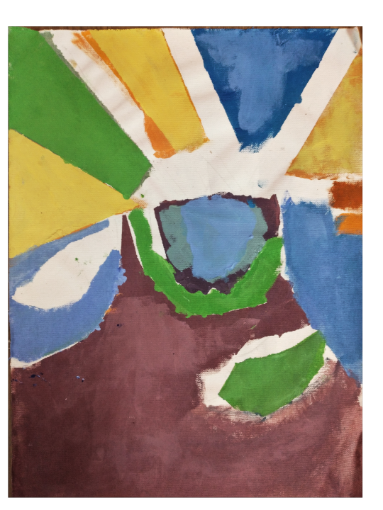
I knew a bit about Josef Albers before this exercise but it was only after completing these exercises that I got what Albers meant by colors being contextual, meaning that a color only means something in relation to another color.
I also came away with a more full understanding of discordant colors, which I wasn't familiar with before, and different levels of saturation. I did mess up on the 3rd excersise though. I don't believe the background color is a mix of the color inside of the two shapes. I underestimated how much paint I needed and ran out and could never really get the mix quite right again.
0 notes
Photo

Another artist that relates to this excersise who i thought was great is Sascha Breunig. I never heard of him before this class but I’m glad i found his work. I think his use of color and shape in this piece in particular gives a weird mildly disorientating effect, which I really dig
0 notes
Photo

Jeff Koons gets some hate but I actually like alot of his painting work. This one in particular was made by Koons in photoshop and was later painted by his assistants.
0 notes
Photo


For this I chose a cool color palette consisting of blues and greens for a subject matte of an african statue with cut out parts of 19th century american fabric designs. I had some trouble at some point with painting the african statue. I had similar problems to my fabric painting, where many of the areas seeme to blend together due to there not being enough of a distinction between midtones.
0 notes