
Don't wanna be here? Send us removal request.
Statistics
We looked inside some of the posts by fashion-editor and here's what we found interesting.
Average Info
Notes Per Post
2
Likes Per Post
2
Reblog Per Post
0
Reply Per Post
0
Time Between Posts
10 hours
Number of Posts By Type
Photo
15
Link
1
Text
1
Last Seen Tumblr Blogs


Fun Fact
The “We are the 99%” Tumblr blog became the slogan for the Occupy Wall Street movement.
Photo


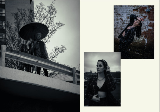
Here is my final magazine layout in a more 3D view. I created this illusion using Graphic Burger. This allowed me to insert my own images onto this already built photoshop file. I feel that the final layout looks a lot more realistic this way and is easier to imagine as a double page spread.
0 notes
Photo

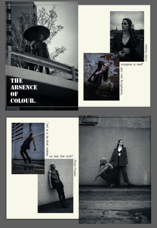
Here is my final double page spread from a flat point of view.
0 notes
Link
Here is my Pinterest research. This Pinterest holds my inspiration for fashion, hair, makeup, posing and magazine layouts for post production.
0 notes
Photo


here is the development of my final double page spread it started very plain however, when I took inspiration from an exciting magazine layout I feel that it really started to come together and look like a real editorial magazine. I feel that this is due to the use of framing and positioning of the photos.
0 notes
Photo

The font ‘Stencil Bold’ was the Popular font at the time of Guernica’s creation. I feel that this would work amazingly as its bold, legible and textured.
0 notes
Photo


Here I experimented with the title “lets paint a picture” to reference the fact that I was inspired by art. However, I feel that this came across as unimaginative and boring. I also selected the font choices due to legibly, reference to the time period that Guernica was made, and the context of a modern audience.
(MY OWN WORK SCREENSHOT)
0 notes
Photo

These are my final chooses for a double page spread. I personally feel that the the compositions work well together in terms of tones and limited colour use. I chose to use an off white with yellow undertones for the background colour, as yellow is a complementary colour to the blue tones in the images. over all I feel that this is a great base to work off of for the final finished design.
0 notes


Photo


Here are some magazine layout ideas that I have experimented with. I personally like the idea of having each double page spread consist of a page of just one model, and another page of both models together.
0 notes


Photo


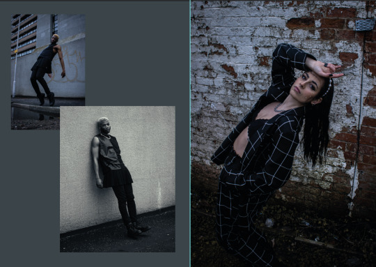
Here are some of the final images that I have chosen to experiment with for my final magazine layout. I decided to go for a black and white theme with a few photos incorporating muted tones to add variety. I also feel that upon reflection the photos with Micheal in black and white are not “bad” they just needed to be tweaked to accommodate for his skin tone. I also feel that the juxtaposition between his skin tone and Paulas skin tone, makes for a striking composition. I feel that if both models had a similar skin tone the composition would not be as effective. It also shows a level of inclusivity within the magazine and makes a wider audience feel represented.
0 notes
Photo


Here are some of my favourite compositions from vogue Italia. I love the use of texture in the garments and head pieces. The simplicity of the posing also adds a level of sophistication to the Images.
(PHOTOS SOUCED FROM juliahetta.com)
0 notes
Photo


Julia Hetta
Hetta is an editorial artist that truly inspires me. Here work has been featured in Dior magazine, vogue Italia, another magazine, Dazed and confused and many more. Hetta conveys so much emotion and depth within her compositions which I love. she often hides model’s faces; especially in her vogue Italia work, which I find breathtaking. I hold this Swedish photographer at such a high standard as I feel that most photo stores are conveyed through facial expressions. However, the fact that she can still do this with the absence of them is admirable to me.
(ALL PHOTOS SOURCED FROM Pinterest)
0 notes
Text
Guernica by Pablo Picasso

When we first got this brief I decided to print off all of the paintings that we could choose from and arrange them in am order of which I was the most drawn to. After a a bit of research on other artists I decided that the painting Guernica had the most room for development in my style of work. I really wanted to develop and expand upon my own personal style with this brief and highlight the range of my skill set.
My first plan of action before even researching the history of the painting was dissecting the painting. I looked for elements I could incorporate into my shoot or photo lay outs. So from this quick analysis of the painting I looked into shapes both geometric from its cubism descent, to organic images of smoke that would come the a candle that is displayed in the composition. From first sight of the painting I knew I wanted to use black and white or very muted tones to convey they tones in the image. I also considered using candle light to light parts of the models face however in student accommodation I feel that this concept was too risky do to fire directors. On the other hand, it would not have been as effective to do this on location. Elements such as wind or rain would have prevented my desired effect from taking place.
0 notes


Photo


Here is some more of Rondinone’s work showing his versatility in terms of his style. I particularly enjoy the moonlighting collection of the shiny black objects highlighted with a a strong, bright spotlight.
(PHOTOS SOURCED FROM ugorondinone.com)
2 notes
·
View notes