fashionthroughtimewithlucy
Fashion Through Time with Lucy
104 posts
Don't wanna be here? Send us removal request.
Last Seen Blogs
cultocinefilo
𝕮𝖚𝖑𝖙𝖔 𝖈𝖎𝖓𝖊́𝖋𝖎𝖑𝖔
ranger-jedi-knight
SuperBae
oswednesday
ERROR
saturnnn-lolz11
saturn . expo
thef155
fiftyfive
Text
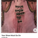
‘New Beginnings’ SS24 Commercial.
For my Unit 2 Commercial, I have explored different techniques which will amplify the effectiveness of my collection. I further research different music from both the 50’s and modern day to match the beat of my commercial edits, in which I have landed on a little less convention by Elvis Presley, a 50’s rock star. Through my commercial I wanted to emit the impression of a changing rebellious generation which was communicated both by the journey through the fabric and the song choice which was greatly dislike by most parents of this era.
youtube
0 notes
Text
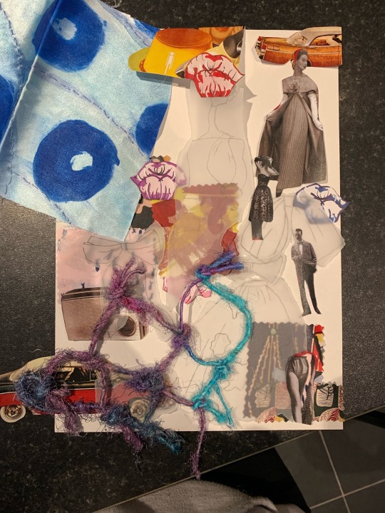
Finalised Mood Boards.

Here are my final mood boards, I have altered the arrangement whilst still maintaining the exact same idea for the two mood boards (draft 1 and 3) just to incorporate the lip theme with the swoosh. Along with this I design my press release based on my design boards layout to match the overall vibe of my portfolio. I really like the overall outcome of my design boards and mood boards as it hints at the perfect amount of colour whilst being toned down by the tracing paper so that my collection is the main focus and not my boards. I have altered my final press release slightly through adding only the three main swooshes collectively rather than all the college however still adding hints to keep the links between the two.
0 notes
Text
Mood Board Experimentation.
Draft 1
Here is my first design board idea, experimenting with different layouts to see which one best complimented my designs, I began by creating a monochromatic swoosh for my back drop which was inspired by the three main colours and trends that flowed through my twelve piece collection, I then began by cutting out pieces from my pre existing mood boards which helped me create these design to further maintain this flow through my portfolio.

Draft2
For my next experimentation of a mood board idea, I wanted to highlight the 3D effects that not only rang through my designs however through my book, and presented these in and among some images, again from my mood boards, furthermore, I felt the brightness and busyness of this design was too much and therefore distract away from my designs, therefore I decided to use tracing paper to add my own sketches which ultimately fazes out the back drops and tones them down.
Draft 3
For my final draft, I wanted to play around with the composition of layout of my image, I really enjoy the idea of using some of my favourite illustration work from this unit and incorporating some where on my boards, which I have done so here, meanwhile I also wanted my theme of large voluptuous lips to run through my portfolio therefore I have chosen to reference an essence of them through my design. Overall, I really like the overall outcome of this design however I feel a though it is too bust and colourful to compliment my collection.

0 notes
Text
Media Experimentation
Draft 24
From looking at an overview I my collection I realised the auburn orange would match the aesthetic of the rest of the collection and therefore decided to tone down this colour and settle for a more darkened grey colour which would fit the flow of this collection more. I have created this piece with watercolour, in which I began with a base colour first and then layered over this give more detail. Overall, I feel this piece matches in with the rest of my collection however the detailing of this garment could have been further improved.
0 notes
Text
Media Experimentation
Draft 23
For this next design I have chosen to stick with the theme of cherry red, furthermore in my previous draft design I stated I wanted to further research ways I could illustrate knitwear and that is what I have done and created this design. I created this design primarily using a a red felt pen and consistently creating these v-shaped lines the represent knitwear. Overall, I like how this design has turned out however I feel as though it doesn't fully emit the knit wear aesthetic I was hoping for, moreover, I also feel as though the lines could have been neater which may resolve this issue.

0 notes
Text
Media Experimentation
Draft 22
Based upon my dislikes toward my first attempt doing my media application, I decided to alter where I wanted to focuses my attention, therefore I have switched the detail from the top to the bottom as I feel I can get the most detail out of this garment compared with the the tiny detailed textures on the top half. For this reason I have decided to keep the top half of this garment simple, in which I have allowed myself to create a beautiful explosion of colour and depth, shadows and lightness in the flowing skirt. Overall, I really like how this design has turned out and how many trends I have been able to incorporate, cherry red and porcelain white.

0 notes
Text
Media Experimentation
Draft 21
Once again, as a result of looking at my collection as a whole it became to me of the inconsistency of colours through these designs, before these design could be finalised I wanted to make improvements and incorporate colours which haven't appeared as regularly as other, I feel as though this would really help my customer I match her outfits better. Therefore, in this design I decided to go a little more out the box and experiment with a cherry red trouser, in contrast I have paired this with a rigged shirt and sky blue accent bow. To create this design I have decided to improve upon my critiques of my last illustration, I wanted to enhance the depth and shadows around the 3D string, which I believe I have achieved, moreover I also wanted to make the top appear more rigged to compare closely with my reference photo. I really like this design, I really like the how the colours work together and I really love the effect which the media gives.

0 notes
Text
Media Experimentation
Draft 20
Whilst lining out some designs for my final collection, it became apparent that some of my colour schemes didn't match which would have resulted in a very blocky mixed matched collection which I didn't want, rather, I wanted to create a collection with similarities that would flow from one design to the next. Therefore, this design was created by matching together two colours which haven't appeared regularly enough in my collection, I also wanted to create this look to be on the lighter side and therefore decided to experiment further watercolour, as I also wanted to improve my seamless blends between the two shades. Overall, I really like how this piece turned out, the colours have worked really well together and the blend between the light and dark areas is really beautiful.
0 notes
Text
Media Experimentation
Draft 19
Based on the feedback I have received from my previous media design I felt that it was important to attempt this design again with the same media, as I believe I could make some improvements in the ways I have worked with this media. I began with a base of lilac watercolour, keeping with the trends of S/S24, furthermore, I then outlined the garment and natural cease with a darker tone and then blended this out with some excess water and a paint brush to create this finale, overall look. Overall, I really like how this design has turned out however I would like to work on my technique of blending between these colours as I still feel that there appears to be a harsh line between the areas of lightness and darkness.

0 notes
Text
Media Experimentation
Draft 18
For this next design I wanted to experiment with something different however, whilst still capturing the uniqueness and boldness of this design, due to the fact this design is eye caching I wanted to experiment with media application and colours to further enhance this illustration. Moreover, I wanted to try something different and out of my comfort zone, therefore, for this design I have attempted to create the same effect of depth and shadows but with fine liner and pro marker, the pro markers accent the areas of darkness whilst the cross hatching appearing on this illustration represent how the garment natural falls and creases on this pose. Overall I really enjoy the simplicity of this media application however I think the depths and dimensions haven't been fully captured in this experimentation.

0 notes
Text
Media Experimentation
Draft 17
To develop my knowledge on which media would be suited toward this design I wanted to experiment with something completely different to watercolour, something that would give a completely different effect therefore I have chosen to experiment with pro-marker pens, I really like the brightness that these pens allow you the create whilst also working really well with layering one another, which is how I created this design, I began with a base of the lightest shade of red and then progressed to the darker shades where they were needed to enhance to natural crease of this garment. Overall, I really like the effect that this media creates however going forward into other media designs I would like to also focuse the pens on the outer edges then blending it together.

0 notes
Text
Media Experimetation
Draft 16
For this next design, I wanted to really perfect the media application to enhance the beautify curvouse, figure hugging shape. In my previous design experimentation, I had stated that I really didn't like how the media applicated to the illustration turned out, I was unhappy that the affect of the media wasn't correctly presented and therefore moving into this design I wanted to really experiment and find a solution of how was best to approach this illustration, moreover, I also wanted to experiment with more medias, incorporating the ones I had used in Unit 1, as a result I have chosen to work with pastels and was inspired by a media design I had previously created although this time with pastels. Overall, I really like how this design turned out, the pastels really allowed me to blend between the colours and therefore creating the lightness in the centre of the shapes and darkness on the outer edges of the shape which is what I wanted to achieve.
0 notes
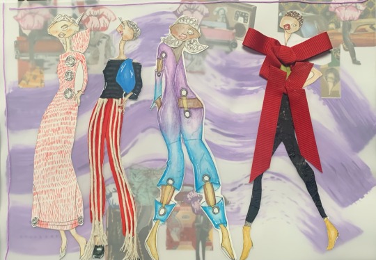
Text
Media Experimentation
Draft 15
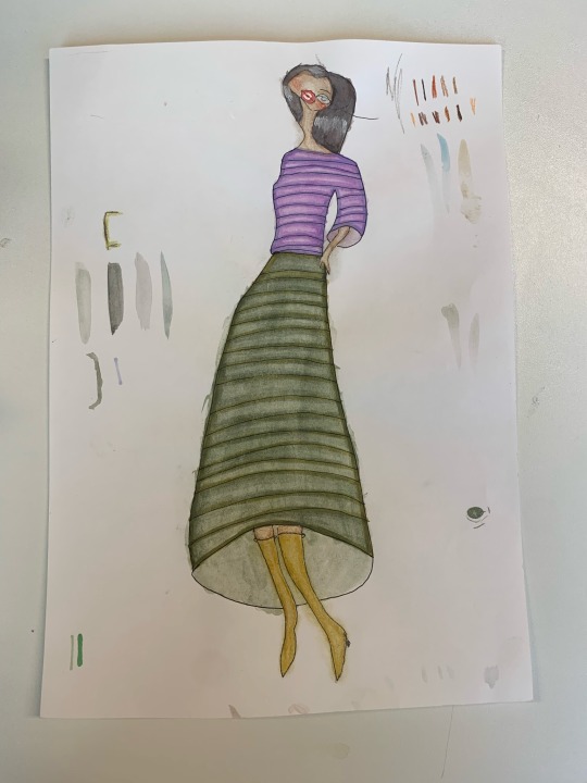
Here I worked on adding more depth to this design however, I also wanted to work on incorporating more college throughout theses designs and therefore started by adding black tissue paper down each leg, adding lots of texture to channel the movement of this garment, furthermore I also wanted to enhance the initial wow factor of this garment and therefore have added a large bow, I have also folded parts of the bow, to not only match the drawing but to enhance the natural creases of the garment.

0 notes
Text
Media Experimentation
Draft 14
To develop my knowledge on which media would be best suited for this design I have decided to experiment with pastels which would allow me to easily blend between the areas of lightness and darkness because although I really enjoy the first result of this design I feel as though the contrast of colours is to similar and therefore doesn't give the same effect. I began outlining the darkened areas of this garment and the blending them out to the lighter areas. For this design I haven't bothered to lay a base coat of watercolour because the pastels smug to easily and create a similar effect. I really like this design compared to the previous one because I think the garments shape is more enhanced.
0 notes
Text
Media Experimentation
Draft 13
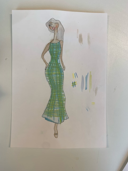
Based on my feedback from both my peers and previous experimentation, I wanted to use a different media to enhance the depth, therefore for this experimentation I began using a foundation of a flat sky blue colour and then built the dimensions and shadows through deepening the same colour over theses darker parts then with a coloured pencil created a smooth blend between the lightness and darkness. I really like how the 3D college feather affect turned out on my first design therefore I have decided to continue this through into my second experiment with this piece.

0 notes
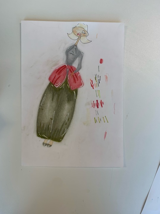
Text
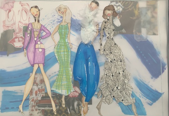
Media Experimentation.
Draft 12
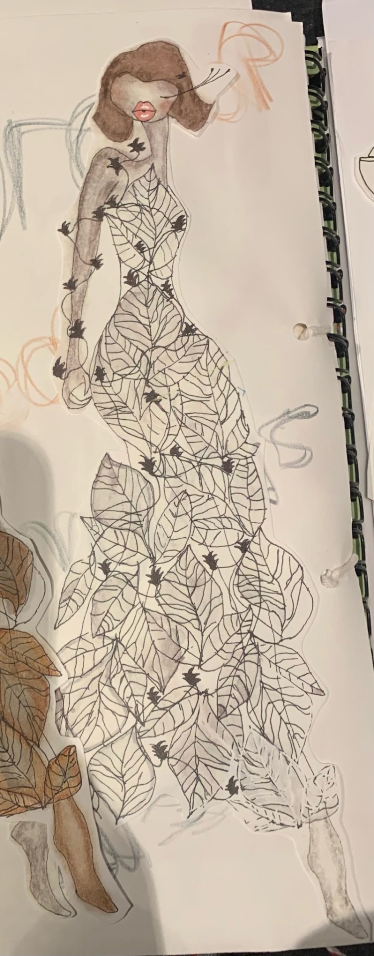
Here is my experimentation inspired by 1950's patterns, for this design I wasn't to sure which media would work best to really bring out the best of this design this was because of the intricate details between each leaf detail, therefore I wanted I experiment with a different range of media. However for this illustration this was created by a mixture of watercolour a coloured pencil. I began with a light base of grey watercolour throughout each and every leaf and the contrast this with a deep auburn orange colour, I think the contrast between theses two colours tones down the brightness of the orange colour which would overall match my collection better and would have a better flow to my collection.

0 notes
Text
Media Experimentation
Draft 11
For this design, I definitely wanted to experiment with different combination of media to achieve the correct texture for this design. As this design was inspired by my 1950's car mood board with the intention to also incorporate my S/S24 knitwear trend I knew I had to research and broaden my knowledge n how to create this knitted affect. Therefore I have used watercolour to create theses fine dashes which would generate the elution of a knitted garment, the blank spaces being the holes in-between the solid colour. Overall, I really like this design as a whole however I do not believe it represents the elution of knitwear, although I would really like to continue researching different ways I can achieve this affect whilst still working with the S/S24 trend of cherry red.

0 notes