
Last Seen Blogs
ithinkhesgaybutwesavedmufasa
baby, love, I think I've been a little too kind.

lashabe
La Shabe.

letuspublish
www.LetUsPublish.com

tongkolnyasar
Tanpa judul

vampireloved
archived
Text
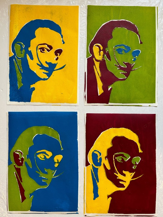
FA327
Silkscreen printing
@uob-funoon @uob @patriciabarakat
#silkscreen#silkscreenprinting#serigraphy#pop art#andy warhol#fa327#salvador dali#graphic design#art
4 notes
·
View notes
Photo


حقِيقَةُ الكَنزِ المَدفُون
هذهِ حكايةٌ عن رحلةِ الفيلِ فيلو للعثورِ على الكنزِ المدفونِ في بطنِ الغابةِ، والتحدياتُ المتعددةُ التي واجهها مع الزرافةِ زارا والفأرِ فرفور في طريقِهمْ، والتي تعلموا منها دروسًا مهمةً جدًا في نهايةِ رحلتِهمْ. يا ترى ما هي هذهِ الدروس؟ وكيفَ يمكننا الاستفادة منها؟
تحت إشراف: د.سماء الهاشمي
224 Art of Digital Illustration
8 notes
·
View notes
Photo


222 Principles of Graphic Design
Assignment 6
In this assignment we were asked to create a design following the principles of design, I did a design with different Proportions and an ad following visual Hierarchy.
0 notes
Photo

222 Principles of Graphic Design
Assignment 5
In this assignment we were asked to redesign a logo.
0 notes
Photo

222 Principles of Graphic Design
Assignment 4
In this assignment we had to draw on a picture taken by us, so I did a swamp creature swimming in the swamp.
3 notes
·
View notes
Photo


222 Principles of Graphic Design
Assignment 3
In this assignment we had to create a design using a barcode, I turned the barcode into a bed mattress and noodles in a bowl.
5 notes
·
View notes
Photo


222 Principles of Graphic Design
Assignment 2
In this assignment we were asked to create a typographic logo and I used the word “Bread” with the letter B as fresh-baked bread and and the word “Time” with the letter T as the clock bands.
4 notes
·
View notes
Photo


222 Principles of Graphic Design
Assignment 1
In this assignment we were asked to use an everyday object as a metaphor, I used a banana as an old telephone and lemon slices as bicycle tires.
6 notes
·
View notes
Photo

222 Principles of Graphic Design
Project 1: Analysis of poster/ad designs
The second advertisement
Elter Drugs Ad Campaign: An unwashed vegetable can become a deadly weapon.
The elements and colors used in the ad are balanced and in perfect harmony to one other, there is emphasis on the center and the simplicity of the design makes it very eye-catching and easy on the eyes, the metaphor used to turn a tomato into a bomb is very creative, fun and an intriguing idea to use, it makes to the viewer wants to see more, the spacing and value between light and shadow are very well placed, the font is good but the color used bellow (orange on red) makes it hard to read what’s written. And although the metaphor used is nice, the message the ad tried to convey using the word “weapon” was a bit overexaggerated, in my opinion, using the word “dangerous” alone is well enough and the letting the image speak for itself.
0 notes
Photo

222 Principles of Graphic Design
Project 1: Analysis of poster/ad designs
The first poster
PAN’S LABRYINTH MOVIE POSTER
The colors used are black, blue and white, basic but gives a sense of darkness and mystery, with the edges being black and as we move to the center there’s blue and then bright white right in the middle which makes the whole focus in the middle with a girl standing in the center and the big monster-like trees surrounding the bright light, the font used is very appropriate to the theme of darkness and mystery and the letters R and L seems to be joined with a tree branch as if the words are connected and intertwined with the realm and the font color is well contrasted on the white center. Overall, I think this poster is very appropriate and it matches the film well, it has a lot of depth and detail to it and makes the viewer intrigued to learn more about it.
0 notes
Photo

222 Principles of Graphic Design
Project 1: Analysis of logo designs
The second logo
IKEA Logo
IKEA has a very distinguishable logo design mainly because of the high contrast in color between the yellow and the blue that makes is instantly recognizable as the logo of IKEA, although its nice to have simplicity in a design, in my opinion the logo is overly simple and a little dull, other than the contrast in color its just an oval inside a rectangle, it does not have a lot of depth to it, With that being said I like the bold font used in the design, it gives more balance to the simple background and the color blue gives a sense of stability, trust and honesty.
1 note
·
View note
Photo

222 Principles of Graphic Design
Project 1: Analysis of logo designs
The first logo
Dunkin’ Donuts Logo
Dunkin’ donuts logo is very unique and distinguishable from other brands, its attractive use of contrast in color between bright orange and hot pink gives a sense of warmth and excitement and it catches the eyes from faraway. The space, shape, line and value create a perfect balanced harmony in which it is easy on the eyes. The font used is very appropriate, round and soft edges that fits very well with donuts.
1 note
·
View note
Text
222 Principles of Graphic Design
Project 1: Coverage of interviews
The second interview
Interview with artist Katherine Bernhardt
Bernhardt’s first ever encounter with painting was an oil painting she made in 9th grade, she described it as “messy”, and she did not really understand how the paint moved or worked, the only colors she had available were black, blue and white, and she did not understand how to make colors, shades or tones. So, it was difficult for her to paint a good picture.
Bernhardt’s transition from figuration focused on fashion models to abstract patterns based on textiles collaged with fabric to a pattern pop imagery happened naturally. “Work evolves” she said. She gets interested in different things.
She explained that things evolve naturally through interests, it can go from one thing to another, and you become less interested in certain things and fascinated with other new things. Katherine had always tried using images that she sees and make the dumbest or the funniest painting that she could.
Bernhardt believes that there are a lot of possibilities left in painting, and that people are inventing new things every day. “Painting and drawing is the basis of all art in the world, and it will always be like this, and it is always changing.” Said Bernhardt.
Link of interview: WM | whitehot magazine of contemporary art | Katherine Bernhardt Interview
0 notes
Text
222 Principles of Graphic Design
Project 1: Coverage of interviews
The first interview
Interview with artist Jean Michel Basquiat
Basquiat said that he was “pretty naïve” as a child, and a troublemaker, did not really participate much in school, he just drew on his desk and did not deal with reality much.
He explained how he wanted to be a cartoonist at first but changed to painting when he was around fifteen years old, and how he never thought about making money out of it.
He started doing SAMO (a graffiti tag developed by Basquiat and Al Diaz) when he was seventeen years old and in high school.
When asked what piece of art left a strong impression on him, he said that seeing “the Guernica” was his favorite thing when he was a kid and that he liked Rauschenberg a lot. His idols were mostly Rauschenberg and Warhol.
The first paintings Basquiat ever made were on windows he found on the street, and he used to sell postcards for a dollar.
Basquiat did not see himself as a graffiti artist because to him, graffiti seemed to be constricting with rules, and it was hard for him to work under these conditions.
He said he should not let what is around him affect his work but instead work with what he thinks.
Link of interview: Interview_Becky_Johnson_Tamra_Davis.pdf (barbican.org.uk)
0 notes
Video
youtube
222 Principles of Graphic Design
Project 1: Coverage of talks/lectures
The second talk
In this talk, given at a local TEDx event, Katerina Gregos talks about the important role contemporary art has to play in society,
She started by asking people to imagine a world without art and culture and explains how that world would be a very dull place devoid of imagination.
She explains the relations between arts and politics and how art is about a person’s views and freedom to act and express themselves,
And she goes on to explain the fact that it is very difficult to pinpoint what exactly is art and how it functions, describing how its beauty and value are ungraspable and its impossible to quantify and qualify how art affects those who see it, that art advocates difference and gives voice to the other, it highlights important ideas, problems and issues that are sidelined or silenced due to political or economic interests. Art changes the world in a micro level so its importance cannot be measured.
she states that if more people would engage in art, the world would be a better place and that artistic imagination and creativity are not added bonuses for society, but they are an essential part of what makes us human.
0 notes
Video
youtube
222 Principles of Graphic Design
Project 1: Coverage of talks/lectures
The first talk
In this talk, Aldar Academies Al Yasmina Academy student Carol Mokatash (Abu Dhabi) discusses abstract art, what it means to experience a painting and why an open mind is key.
She talked about how before the 1800s art was “dull and boring” because artists stuck to painting portraits by commissions and art was quite inaccessible and primarily for the rich.
And later, artists began experimenting with more abstract forms using things like composition, style, form and color to depict things that were much more subjective like mood and emotion.
She explains how as the years progress, artists began altering the reality into something more abstract and with time they felt less obligated to depict things as they appear, until we arrived at fully abstract forms that do not even make the slightest reference to the world around us, artists stopped painting with their eyes and hands and started painting with their souls, and viewers could connect to the art and feel like as they are walking through it and become sensitive to nothing but color.
Her last message to the viewers was to be open minded especially to the art we do not understand and who knows what we might find along the way.
0 notes
Photo


222 Principles of Graphic Design
Project 1: Coverage of exhibitions
The second exhibition
The “Inside/Out”
This exhibition was held on March 8, 2021 in The Contemporary Art Platform and is still ongoing, it showcases and honors the work of the extraordinary women artists in the Middle East. The various and dynamic pieces are built on exploring an exceptional range of mediums and themes that are aimed to shed light on the unique female perspective of the changes that had occurred within the region over the past two decades that include personal, social, and political aspects. Each artwork showcased includes something of a self-portrait about the artists personal experiences and the realities they live in, from landscapes to abstract forms, The artists create their own identities by withstanding assumptions and expectations made about the place of a woman in a society, they create artworks that expresses their reactions and criticism to the social injustices of existing local, national, or international state of affairs, they take control over how they would like to be perceived through their art and pursue to fuel the viewers’ emotions and bring attention to these ongoing issues in the world. And although the artworks are created from the artists personal emotions and memories, they allow and welcome different perceptions from the viewers reflecting on their artworks.
Link of exhibition: Women Artists, INSIDE / OUT (capkuwait.com)
1 note
·
View note