
Don't wanna be here? Send us removal request.
Statistics
We looked inside some of the posts by felixlestrangefmp2 and here's what we found interesting.
Average Info
Notes Per Post
18
Likes Per Post
13
Reblog Per Post
5
Reply Per Post
0
Time Between Posts
22 hours
Number of Posts By Type
Text
5
Photo
12
Last Seen Tumblr Blogs


Fun Fact
In 2020, 27% of US Tumblr users had an annual household income of over $100,000.
Text
Audience
-HORROR. I did intend on my comic being horror themed but due to the fantasy aspect added, this may no longer appeal to the average horror fan who enjoys werewolf movies like An American werewolf in London. There would most likely be a lot of graphic imagery and violence which would be heightened with the grim nature that comes with a villainous main character.
-DARK FANTASY. My comic is set in a medieval fantasy world with magic and perhaps over cool creatures like werewolves. This could appeal to those who enjoy dark fantasy as well as lovers of folklore and DnD.
-COMIC/ GRAPHIC NOVEL. Because my project is created for a comic in mind, the creation of these characters a long with a the eventual comic (if i was to continue), It would post likely appeal to people who read comics and graphic novels. Especially to those who read online as i can see my comic being more of a web-comic. This expands my audience as people have easy access to web-comics on top of this.
-WEREWOLVES. This is an obvious one, those who don't enjoy werewolves defiantly wont enjoy this comic. However maybe it may invite people in and make them like the genre more. My werewolves aren't too out there when it comes to regular werewolves
-AGE? I've been aiming for teenagers and young adults since they seem to be the type to enjoy graphic novels the most. I cant go too low of an age due to the fact this is a horror/ dark fantasy with ideally graphic/ violent imagery. Because of this there could be an age rating.
One thing to note is, books have different age ratings compared to a movie. The closest u may get is a parental advisory marked in the corner of the cover which could stop younger audiences picking it up and buying it. If the comic was to be posted online, there's not a lot the author can do to stop children from reading it. Depending on how graphic it is could as
-GENDER? Like lots of things, gender doesn't particularly play a role in my type of work. These type of horror stories aren't targeted towards any stereotypical gender role along with things such as “the male gaze”. This factor hopefully means more people would be interested in this comic idea.
------------------------------------------------------
Overall, my concept art and comic, if i was to ever expand on this project, would be targeted to a younger audience of teenagers and young adults who have a passion for supernatural horror with a fantasy like aesthetic.
0 notes
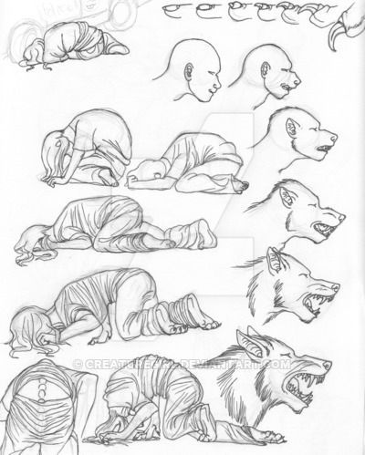
Photo


Finally i put it all together on a sheet and did simple red annotations.
Im pretty disappointed with this page as the drawings are very messy and really not what i was aiming for. You can see in some where i tried to be more detailed but it didn't work well as the anatomy is off and i just really don’t like how it looks. I also added some basic body sketches in the corner but even then they don't look great.
I do like some of the layouts however, despite being brain fried with art block near the end, i do think the earlier ones have some potential.
0 notes
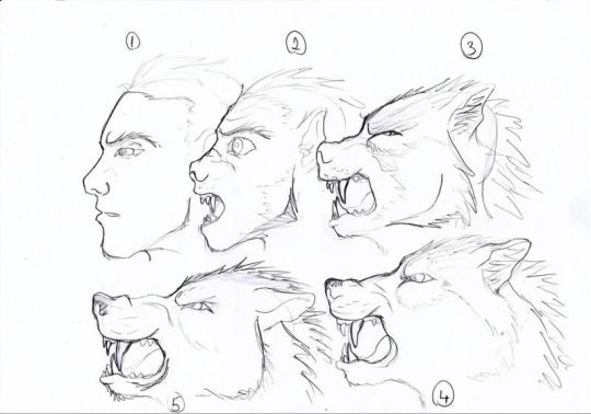
Photo


Next up i made 3 more page sketches.
In the first one i used the three box technique to show the change in the ear as well as two for the feet. I did have an issue with making the foot look human and the other one more animal. This is something to devlope in the future with more detail. I also used the change technique in the third one to show the new teeth growing through the mouth. This was inspired by some comics online but it was hard to draw.
This time around i tried to do more body shots apart from just the heads.
0 notes
Photo

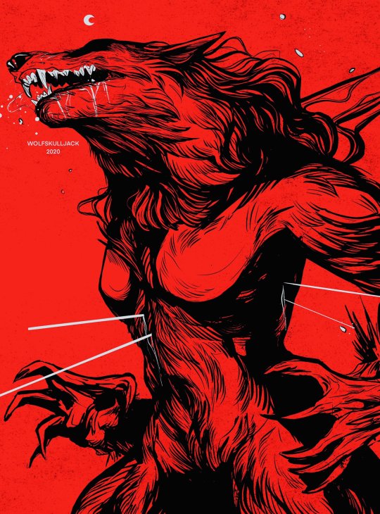


ARTIST RESEARCH: Wolfskulljack
https://wolfskulljack.com/
Michelle Harvey, aka WolfSkullJack, Is a UK based Illustrator that has a strong love for wolves. This bleeds into her work as she loves drawing werewolves as well as just wolves in general. On top of this she has worked for big clients such as the band Metallica who she has made posters and a hand full of limited merch for them.
As for her artwork, i really like it. I love the bold black lines paired with the use of dramatic shading and bold yet simple colours. For example, the use of red above is really cool and makes the werewolf stand out yet blend into the shadows perfectly. I also love the way she draws the fur as well as the expression these creatures make. I chose not to draw the fur within my line-art, but it i did id imagine it would look similar to this.
Overall i really like Wolfskulljacks work, this kind of style would look great as comic covers. However i dont have enough time to create a front cover which is unfortunate.
1 note
·
View note
Text
Week Review: 11
what did i do last week?
Last week i finally finished my werewolf character design sheet along with the artist research ive been putting off for a good while, however its finally done which is a relief. As for the design sheet, I'm very proud of it as it shows all the basic stuff i was aiming for. Unfortunately i don't think ill have time to edit it into one of those mythology folklore like pages which is a shame, but at least i have my main one completed and not rushed. I'm satisfied.
What am i doing this week?
This week i just need to clean up my blog and get the comic page sketches completed. The week after this will be me presenting all my work and making sheets so if i want to get my project done on time, i need to finish these comic page sketches by then.
So far i think I've done pretty well on this project and have somewhat remained on track to my original timeline.
0 notes
Photo


Today i wanted to start sketching up some panel ideas. I was meant to start it earlier this week but i still had some work to finish up on my character sheet.
For the panels i wanted to try do a transformation sequence since its one of the most interesting things about a werewolf and would look great illustrating it since theres so many ways.
I decided to do the regular comic layouts instead of the long paged web comic styled pages. This is because i want my pages to be busy and i prefer the A4 style in general.
Within the two sketches above, you can see i used 3 regular boxes to show the change of the eye. This is a technique i learned in one of my previous projects to show a clear change.
Another technique i used was setting the scene in the first box. This works better in the first one however as the person is reacting and then the transformation begin. In the second one theses a big jump. I also think both sketches need refining along with the emotion in the second one
0 notes
Text
WEREWOLF BACKSTORY

I've been really struggling with creating a backstory for my werewolf so i had to take some time to read back everything I've researched so far to get some information.
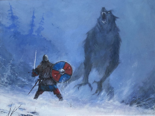
My first vital bit of inspiration I got was from the original werewolf post. I liked the link between witches and werewolves during the witch burnings so i decided to go ahead with this as my base. Id like to think that witches caused the creation of werewolves, either as a curse or to be made as a familiar of some kind were the werewolf would serve the witch.
From there everything seemed to fall into place, i liked the werewolf seeking vengeance on humanity because he was betrayed by him. This was inspired by the show Brand New Animal. I also liked some of the aspects from the werewolves from Harry Potter such as there tendencies to self harm.
Overall i wanted my werewolf to be some kind of tragic villain who slowly turns insane. I don't have much of a plot for him, ideally it would be cool for him to be the main character, this could mean we could see him grow and get some kind of ‘happy ending’.
0 notes
Photo
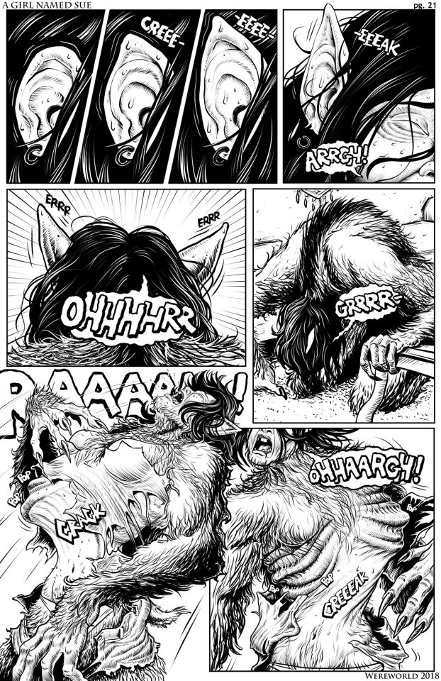

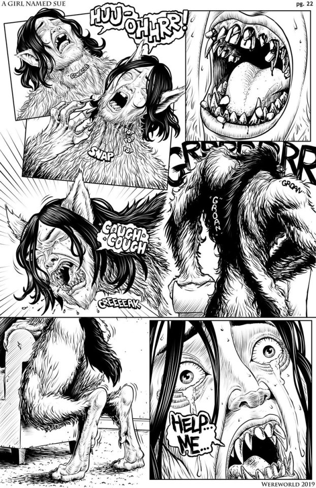
ARTIST RESEARCH: Wereworld
https://www.patreon.com/wereworld
https://www.deviantart.com/were-world/gallery/65394302/there-s-something-wrong-with-sue
Wereworld is a comic artist and illustrator that strives to create an amazing werewolf comic filled with horror, mystery, and suspense. They are heavily inspired by my an American werewolf in London a long with many other 80's and 90's horror flicks
They are currently working on a comic called ‘There is something wrong with sue’ which can be read on their deviant art. The story follows a girl named Sue who is cursed with lycanthropy and her journey to find the roots of her misfortune. I haven't actually read this comic yet but from the artwork I've seen already, i am amazed. Each panel is full of horror and life which is actually fairly disturbing to look at. It really brings out the horror and pain of a werewolf transformation as well as how scary it must have been for the character sue to undergo such a rapid change.
Due to these graphic pages ill defiantly look into them more to get inspiration for my own transformation comic pages. I love how each panel is layed out in a non regular way which could be a good way to represent the intense nature of the transformation.
Overall i really like what i see and i hope this will come in useful for my own work.
0 notes
Photo


COMIC RESEARCH: Night Class by Manda Schank (AMSBT)
https://tapas.io/series/Night-Class/info
Night Class is a Supernatural horror webcomic created by the artist Manda Schank. The story evolves around the character Reckless Quinn and his introduction to the supernatural world after meeting and befriending a warm-hearted werewolf named Shiloh.
Due to the comic being early in release, i don't have much to say about the plot but it seems interesting through what I've seen so far and its defiantly something id like to continue reading. One reason why i really like this is because of the art work. I like the bold thick black lines that are neither too messy or two clean, which is something i would like to achieve in my own work. On top of this the comic also has really nice lighting at times, especially at night were there's that nice yellow glow from the street lamps, this orange also works well with the cool dark blue tones of the night sky.
As for the comic panel layout, its pretty simple. Nice regular shapes which works well with the detail put into each one. I also like the use of the dark borders to fill in space behind each panel. I much prefer the back over white borders as it adds to the horror theme.
MANDA SCHANK
https://amsbt.artstation.com/
“I'm currently a freelance artist working in the game and comic industry. Character concept art + Illustration are my strongest aspects. I'm confident in realism + anime styles of art. I'm self-taught and have been working for various companies in the art industry since 2012. I annually participate in shows & conventions such as New York Comic Con, Chicago Comic Con and Dragon Con, among others.”
Manda Schank’s art work in general is really nice. In regular illustrations she renders really nicely and professionally.

0 notes
Photo


ARTIST RESEARCH: Jakub Rozalski
https://www.artstation.com/jakubrozalski
https://jrozalski.com/
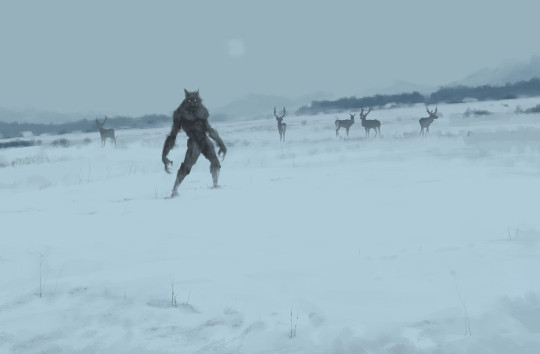
Jakub Różalski is a Polish concept artist, illustrator & designer who tends to go by the nickname Mr. Werewolf due to his beloved interest in the creatures. Over the years he has created many paintings featuring werewolves as well others inspired by history, folktales, myths, countryside, and wild nature. However I’ll be looking mainly at his werewolf pieces since it links back to my own project quite nicely.
First off, i really like his sketchy imperfect painting style. It works well with the atmosphere he's trying to create. As for how the painting are laid out, the werewolf is placed in a background were he isn't even the main focal point of the piece as there are other animals such as a dog or a group of sheep being in the foreground. It seems we are meant to be viewing the piece in their eyes while this werewolf remains ominous in the background.
Overall i find his painting really cool and i like the design of the werewolf he commonly portrays especially since they are pretty similar to the werewolf design I came up with.
His Painting Process
I wanted to make small note on how he paints his werewolves as he openly shared his painting process on his ArtStation account. Here u can see he uses a kind of blob method where he starts will large shapes that in a way roughly silhouette the thing he's trying to draw. Then on top of that he defines the shape by adding tones and shading. Finally he adds details such s the eyes and mouth. In Rozalski’s work he can get a way with being impact due to the placement of his werewolf in the piece. The blurriness and sketchy nature to the werewolf adds to the atmosphere.

17 notes
·
View notes
Text
Putting together the design sheet

Here is what my design sheet looks like put together. I used the main body, heads, shillohetetes as well as the transformation which is as planned. It was a bit of a struggle to get it all to look good together but I think it turned out well. The only notable change I did was switch the heads around so the front view was in the middle and the 3/4 angles were on the side. Despite being a small change, It looks a lot better .
As for colours, I stuck to the grey with blue tones since its what I think looks best with werewolf.
Overall I really like how it turned out. like I said I may revisit as I may also need to add a title. I also think the skin tone is too saturated and looks out of place on the grey background. Ill have to go back and change this.
0 notes
Photo


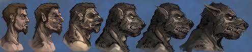
For the finial part of the character sheet, I just want to add some close up heads which I fined fairly important for character design sheets in most genres. These also work to show emotion and facial expressions along with better detail and a view from different angles.
Overall I really like how these turned out and its interesting to look at the difference between my initial sketch as well as the clean up I did when moving to digital the one of the left shows this the most and I'm very proud of it. The other two heads look a little off but considering the initial sketch, I made a great improvement on these.
On top of this, I decided to keep them on grey scale except the eyes. I didn't want to add too much colour to the character sheet so this should hopefully make it look more processional.
0 notes
Text
Week Review 10
What did i do last week?
Last week i made much progress on my character design sheet. I finalised my werewolf design along with a simple transformation sequence. Art wise i was very productive but i did however loose valuable time on research. I planned to do artist research but this has once again been pushed back a week. This is a little disappointing as i was meant to get this research done ages ago so i didn't have to worry about it and just focus on my artwork.
What am i doing this week?
This week I need to finish up the last bits of my character sheet by looking at some heads. Along side this i also need to start sketching out some comic pages since i only have two weeks left. I don't want to rush and not look into them properly since the comic side was a big part of this project idea. It wont be the end of the world if they don't turn out well as my werewolf design i great and I'm proud of it and its quality. The only thing that's missing is a name and backstory.
0 notes
Photo


For my transformations sequence, I decided to fit with the normal shift instead of the other version of the skin ripping away to reveal the wolf underneath.
As you can see, the initial sketch I did on paper didn't really work out. The faces looked off, the final wolf looked stiff as well as an overall lack of emotion. Because of this, I moved onto computer and shifted everything around. The first thing I did was add one more point second to last as I felt the jump looked too big so I added the in-between to smooth things out. Next I added more expression to each drawing and hopefully show the pain and fear from it. This didn't turn out supper affective due to the regular position of the head so it all looks kind of stiff.
After being satisfied with the transformation, I began colouring, first in grey scale then in colour. I do think the skin tone is off on both of these so this is probably something ill have to revisit soon.
0 notes
Photo
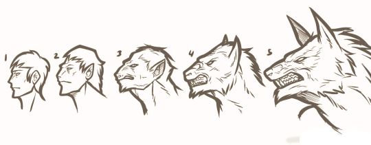


WEREWOLF TRANSFORMATION
Next I'm going to be looking at a short transformation sequence preferable of the head. This is then going to be apart of my character sheet as transformations are one of the most important things to a werewolf.
0 notes
Photo

Here I was thinking of how to present my werewolf and I noticed a lot of monster concept art has a hight reference next to it. I chose the person to be 5′6 since its based of my own current hight. I may change this hight to fit more with a typical average hight. Ideally I'm imagining this werewolf would be around 7 ft which is fairly average for werewolves.
0 notes
Photo


After completing my drawing, I decided to revisit the gradient maps since I like the effect they have. I really like how the blue tones work with the grey fur. Onto of this I also looked at the colour red but this was too strong and didn't have the kind of look I was going for.
0 notes