
Do you love Chip & JoJo as much as I do? Each week I recap their new episode and complete a ranking of all their impressive remodels!
Don't wanna be here? Send us removal request.
Statistics
We looked inside some of the posts by fixerupperblogger and here's what we found interesting.
Average Info
Notes Per Post
6
Likes Per Post
4
Reblog Per Post
2
Reply Per Post
0
Time Between Posts
4 months
Number of Posts By Type
Text
17
Last Seen Tumblr Blogs


Fun Fact
Tumblr has a low social media market share in South America.
Text
Fairytale Come to Life
Season 6, Episode 7
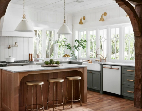
California Transplant Scores Light & Airy Cottage
Do all the Fixer Uppers this season feel like employees of Chip & Jo? While I enjoy the fact that we’re not going through the motions with unnecessary real estate and jumping right into design and remodel aspects, some of the clients feel a little disingenuous.
This home had so much potential from the beginning - the dormers and cottage style was just amplified by exterior paint, a gorgeous front door and some general sprucing up. I do like the way Joanna rearranged the interior spaces, making the kitchen a special cozy moment flooded with daylight and and dreamy details. The kitchen is definitely my favorite aspect of this home, but the lack of upper cabinets could prove impractical. However the combination of gorgeous windows, mossy cabinets, and white oak island might have style trumping functionality.
I think it was really interesting watching Joanna on staging day have an actual meltdown. I agree with her - I think they way they remodeled this home was so beautiful that when it came time for the staging - nothing could live up to the bones of the house itself. The living room just fell flat with decor as did the office. I did really love the arched reading nook in the primary bedroom as well as the board and batten and wood shelf detail.
The master bathroom was another shining moment with gorgeous windows and unique mirrors on swinging swivels, serving as both practical elements and stylish, unique touches.
While I think there are aspects of this home that feel like an absolute fairytale, something about the final staging and styling just felt a bit off and ultimately fell flat.
See where this sweet little cottage ranked!
0 notes
Text
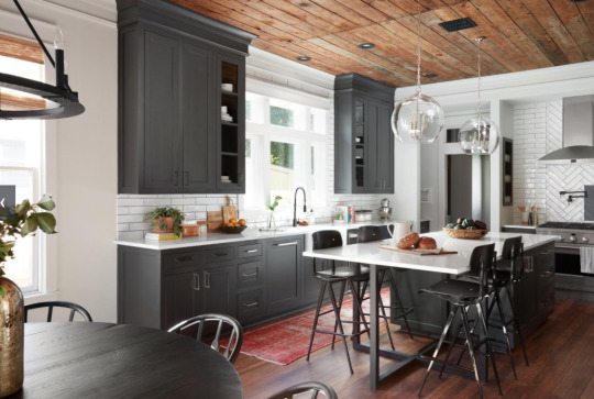
Old World Charm

Season 6, Episode 6
A Couple’s love for the Tuscan Style Shines Through
First, I just want to say how interesting it is we get no budget thrown out on this property for what the clients paid for the property or what they are willing to invest in the renovations - but I think we can all guess after watching the huge transformation and unique touches that this was a truly “no-budget” project.
The home’s exterior definitely had a blend of Mediterranean style with its stucco and arches, so I think it was smart, Chip and Jo leaned into this and really made it shine with fresh stucco, new paint, new windows (which made a huge impact), as well as the gorgeous stone detailing that really did feel like hundreds of years old.
I am so glad that Jo convinced the homeowners to keep the arches in the living room/foyer - it just makes so much sense with the tone of the rest of the home - switching to stucco was smart so the gorgeous stone fireplace got the attention it deserved!
I really love when Joanna goes for the European style, she creates these timeless homes with tons of character and I’m glad they decided to get rid of the floors throughout and modernize the space. The kitchen is stunning with the double islands - the only part I thought was a slight miss was the mural wall paper - I think if it would have had some Tuscan imagery or cypress trees, it would have fit a little more. But this range and gorgeous wood beam above the stove is modern luxury meets old world antique style.
While the laundry room is gorgeous, I’m not sure it fits with the mood of the rest of the home, but I do love all the green!
Then there’s the primary bedroom - bringing that same antique stone look into a feature wall was really smart, and again with the wood beams and wood floors - it just really warms the space up and balances the stone nicely.
The main bathroom, while spa-like, isn’t my personal favorite style. I think the hand-painted tile in the shower is beautiful but feels a little off color-wise as well as the backsplash tile color behind the tub. I do think the floor tile is beautiful and speaks to the Mediterranean style and original saltillo tiles that were previously in the home they couldn’t salvage. This overall just feels like a beautiful opportunity missed - while I do like the little patio space off the bathroom, it seems a little cramped - I think that was more of an exterior feature from the front, than a practical feature for use day-to-day.
Overall the transformation of this property is truly stunning! The couple expressed how much the Italian and Tuscan call-backs spoke to them and persuaded them to buy this home to begin with, so I think Chip and Jo were smart to lean into that calling and create a Mediterranean home that I’m sure was many times more expensive than a luxurious trip to Italy!
Check out where this European-inspired project ranked!
0 notes
Text
Haven Turned Home

Season 6, Episode 4
Emergency Shelter Becomes Inviting Refuge for Young Girls
I have really loved this season so far and how each episode has truly “welcomed” people home to Waco. But this reveal was a different take on the idea of a welcoming space. I love that Chip and Jo teamed up with a local organization that helps young girl seeking refuge in their community. They took a space that felt empty, lifeless, and honestly quite sad, and turned into a beautiful home.
Because this renovation had to keep in mind the privacy of the girls, we weren’t able to see the transformation, if any, to the exterior. If I know Chip and Joanna, I’m sure they transformed the exterior in some way, even if it was just updating and landscaping. Unfortunately we can’t see it, and that certainly hurts the overall effect.
However, the heart in this project was so evident. The special care Chip and Joanna took with create meaningful spaces throughout this shelter turned a once drab, clinical space into a true home.
Joanna had to be careful in creating a space for the girls that met their needs, but most importantly felt welcoming and safe. Since the home helps girls of all ages, she needed to create a truly timeless look. I’m calling this design scheme boho boarding school. The use of hunter green and mauve as well as modern detailing, cozy textures, and light-colored wood really married the feminine modern style with the coziness needed for a space like this.
Let’s start with the living room/entry way. Chip and Jo were really limited with ceiling height, but made it look so beautiful with the painted tin tiles as well as the leather sofas and big green fuzzy rug. The space is so inviting and the use of the window inside (which seems to be a design must this season) really creates a space that feels much more homey than the original look of the shelter.
The Dining Room is definitely my favorite space in the home. I love the dark color green on the wood paneling and the built-in storage - this room has that boarding school vibe. But with Clint’s huge modern table, fun dining chairs, mauve walls, and playful sayings on the wall - this room is just stunning. I particularly love the modern light fixture. It makes the space feel so elevated and sophisticated. These girls will feel like young ladies dining in this beautiful space.
The den/activity area is so practical. The room for computers, homework space, craft space, and a cozy nook for reading feels cohesive with the living and dining areas.
While we didn’t get to see all the bedrooms, I can imagine how unique they made each one with the cool color stories and unique sayings on the wall. The layered textures on the metal beds turn a space that could feel like a boring bunk house into a space that can adapt and grow as girls move in and claim their corners as their own.
Lastly, the backyard transformation looks like a park! I’m glad they were able to make the space way more low-maintenance for those working at the shelter, yet absolutely beautiful. Although this space is very large, we were unable to see any other transformations. I’m curious about bathrooms and kitchens, as those tend to be more expensive renovations...
This project was certainly atypical, but I really enjoyed watching Chip and Jo give back to their community in a way they are so well gifted. And at the end of the day, that’s what we are called to do. Do what we can with what we have for our communities. Check out where this project ranked (although this was a tough call because honestly this space was so unique).
1 note
·
View note
Text
Modern European Cottage

Season 6, Episode 3
First time home buyer gets first-rate charm
First, I am loving the new established model of this season. It feels a lot like season 5 when Chip and Joanna had a lot more say in the show. Now that this on their own network, we get even more of their flare. I really love that we don’t have to do the typical HGTV “let’s look at three houses” and figure out which one you want ordeal - that was always fake, and it felt fake, and Chip and Jo just aren’t fake. So I like that they’ve removed that component of the show and we just start with someone whose already bought a house - even if it was through Chip and Joanna’s real estate company. This is a design show, not a real estate show.
Second, I love a good reaction on this show. I mean, Chip and Joanna Gaines just redid your house on television - you should be losing your mind, and Nicole certainly did. So I can appreciate her response to the reveal.
For the exterior transformation, I love the painted creamy brick with the antique wood shutters. We are planning to do the white brick for our remodel one day, now I just need to convince josh the wood shutters are the right choice. I love the cottage-y look they add. While the copper gutters are pretty they don’t “sing” like I thought they would. And based on Chip and Jo’s conversation earlier in the episode I can’t image the cost. I do love the color blue on the exterior door and how they brought that into the home through the interior door colors and trim color. While I don’t personally have darker trim and lighter walls in my own home, I really love the style choice.
One bold choice in this home was the terracotta floors. I think it’s one of those design decisions that will split a lot of future buyers. Personally, I am not a fan. I think terracotta floors in one room like a mudroom or bathroom, but throughout the entire home is not my jam. Something about the color and the texture makes me feel like you’d be walking on mauve chalkboards. Makes me cringe.
The arch way is pretty and highlights the dining room but I don’t actually like the blue trim on it, I think it would be prettier with just the drywall.
I do love Chip and Joanna’s personalities shining through - they really do seem like they are enjoying themselves so much more this season. Like Chip clapping throughout the reveal... “Why am I clapping in every room?!” We don’t know Chip, but keep it up. We love it.
The kitchen feels so march larger and I love all the components and textures. It feels very European with the patterned tiles, antique doors, textured glass cabinets, vertical paneling, open shelves. It’s A LOT, but it works.
It was such a smart move to add the interior hallway/mudroom/pantry, so that the laundry room is now inside the home. Such a great practical space and perfect for resale.
For the master, it is very feminine. I love the arched built in shelves with the pop of mauve, and the wallpaper on the ceiling is beautiful. I’m fully on board the wallpaper trend - just not in my own house - ha! I also noticed that in the bedroom, they used wood flooring - I think that look should have been throughout the entire house.
But in the master bath, I actually really love the terracotta colored tile. I think it looks so much better in a small space and with the beautiful tile with hints of mauve throughout - it coordinates perfectly. I also really like the gold details - the sconces in particular are just beautiful.
See where this cottage renovation ranked!
1 note
·
View note
Text
Hits & Misses

Season 6, Episode 2
Magnolia Employee Gets a Waco Welcome
This week Chip and Joanna had the opportunity to renovate a home of one of their employees, New York City native, John. I love when Chip asks Joanna the one word she would use to describe him: “nervous.” I don’t know if that’s the word I would use, but his energy on screen is so fun. He is that high-strung, independent, big city personality that we never get to see on this show and that was a really cool change of pace. I also enjoyed the dynamic between him and the Gaines since they are obviously very close from working together at Magnolia.
The home certainly had good bones - the layout was funky, but the potential was certainly there! But for me this episode was filled with a ton of hits and an equal amount of misses.
The first miss for me was the exterior. I also feel torn when homeowners want to paint the brick on the exterior. I have a brick ranch myself and can appreciate the beauty of brick, but sometimes with the trim colors, windows, and shutters, painted brick just gives a more cohesive look. And for me, keeping the brick original just didn’t work. Maybe if they would have done a different color for the trim and gable, or maybe a different style for the shutters, but something was definitely off. I loved the front door and light fixtures outside, but everything else was a miss for me.
When you first walk into the home and see the home office - this is definitely a hit! Joanna has created this type of space before (most memorably for me in the Waco loft, Season 5, episode 15) but I am here for it. Home offices, now more than ever, are so vitally important and the way the metal and wood works together in this space perfectly highlights the window John most loved about the home. I love the artwork and sconces, the use of vinyl records as decor, and the walnut stained wood throughout the home - it’s probably my favorite stain color. It’s a blend of traditional and modern that really feels like a classic, masculine look.
Then the living room was a bit of a miss for me. While the room featured the other side of the beautiful office wall, it also featured a strange fireplace. I just did not like the color of the modern style brick. It was an odd putty brown that just stood out - and not in a good way. Because I’m a huge fan of this show I’ve got to point out a big mistake. While a TV in a Fixer Upper home is a rare sighting - this was not the first design to include one as Chip and Joanna stated. In Season 4, Episode 8, the living room featured a TV as well as when they renovated a home for the Baylor chaplain in Season 2, Episode 7. So just wanted to clarify that little detail!
I love the nods to NYC throughout, most notably with this particular print in the eat-in kitchen. I want! While we’re on the kitchen, this was a big win for me. Kitchens for the most part tend to feature painted cabinets in many of Jo’s designs, and if they feature wood stain, it’s never this dark. But I loved the clean lines of the walnut stained cabinets and the black pulls. Very masculine and classic.
Another hit for me was in the master bedroom. I really love adding character to walls with moldings and paneling. Again, I think this added a masculine touch painted in the dark navy. I also love how they hung the art right in the middle of the paneling - so clever. The smartest move was definitely swapping the closet for the master bath. Very good for resale purposes too! But the master bath design was a miss. While I literally laughed out loud when John pointed out the black terracotta (because of Jo & Chip’s “argument” earlier in the episode), the whole design scheme just didn’t work. While it utilized the same color schemes and wood stain as the rest of the house, it just felt too dark and drab for my tastes.
While this home renovation had a ton of hits I really loved, the misses brought it down in the rankings for me - check out where it ranked here!
0 notes
Text
Welcome Back

Season 6, Episode 1
Newlyweds’ First Home: Trash to Treasure
Fixer Upper is BACK! How fun to see a show so beloved by so many back on the air in a refreshing new way. To keep things seamless with the rest of the blog I am going to consider the Fixer Upper Welcome Home series a continuation of Fixer Upper and start here with what I’m considering “Season 6.”
With the switch to Magnolia Network, currently streaming on Discovery+, I expected a few changes to the aesthetic of the show - although for the most part things felt very familiar. Jo definitely went the more lo-tech route on the design meeting, instead of high-tech, which feels a little contrived, but not all together out of the ordinary.
For this first episode, the bold style choices of the homeowner definitely drove this episode. While the Scandinavian/mid-century style isn’t my favorite, I can certainly respect someone who loves color and an eclectic look. Joanna really tuned into what she wanted and ran with it.
The focal point for this home to me was the industrial window incorporated into the office and kitchen. I think it brings such an interesting twist to the space, utilizes something old, but in a new refreshing way, and creates a focal point for the home in a place you may not typically expect it. The kitchen as a whole is a beautiful design. While the open shelving certainly isn’t practical, I like that they incorporated some upper cabinets as well. The back splash is modern and clean and contrasts nicely with the wood on the ceiling and the dark cabinets. This look is bold - but beautiful. And the banquette seating area is a perfect way to have a large table and dining area still within the kitchen space - as they mentioned this is not a spec home anymore.
Some other highlights of this episode include quirky laundry room. We also keep our dogs’ “rooms” in the laundry room, so this seemed like a fun touch with the wallpaper. The front door and exterior transformation was absolutely gorgeous. They took a ho-hum red brick home and really transformed it into something classic that really anyone would love from a curb appeal perspective, which is important for resale down the road. I’m normally #teamshutters, but this home honestly didn’t need it with the way they transformed the windows from the exterior.
The Master bedroom and living room were simple, but not showstoppers, while the front foyer felt like the entrance to a bougie spa. The master bathroom was again a bold choice, but something felt just a bit off for me. I love green - and was all for Jo choosing to paint the ceiling. It didn’t feel like a cave at all, but something felt a little drab. I think for me the color of the tile didn’t work. Again, I love all shades of green, but I think a bright simple white (or something similar to the kitchen back splash) would have been interesting to see instead.
Overall, this first glimpse into a new world of Fixer Upper was a solid remodel. I mean, to think what they started with is quite remarkable! Of course, Chip and Jo’s onscreen presence is what makes this show so easy to gobble up, and why so many adoring fans feel like they have best friends in the Gaines. You can tell they are happy to be back on the show and they’ve had a season away to rest, reflect and recharge.
While I maybe wouldn’t want to call this place my own personal home, I certainly can appreciate the mid-century modern choices and eclectic style. Bold is better than bland any day. But for me, I could see me staying in this home for a long weekend getaway on a vacation, but it didn’t necessarily scream HOME. Also, I’m all about the homeowners’ responses, and I was a little let down, I feel like the homeowners should have been OVER THE MOON with how much this place transformed, especially since this is their FIRST HOME. Most people don’t ever experience a home this beautiful in their lifetime. But I feel like Jo really listened and hit the mark on her style - maybe they’re just a little reserved?
See where this trash to treasure rehab ranks!
0 notes
Text
Rockin’ Finale
Season 5, Episode 18
Fixer Upper Closes Out with Traditional Flip
As this series comes to a close, a season of my life feels like it’s coming to a close as well. I have loved letting Chip and Jo into my life, tuning in each season to Fixer Upper and traveling to Waco to witness all the Magnolia goodness at the Silos.
So this episode carries with it a lot of pressure. The weight of the last few years’ renovations and the promise of a stellar renovation for the series finale feels like it’s setting us up for disappointment, but I will try my best to recap this with all of that aside.
I really like that the final renovation of season 5 brings it back to the basics with a historic home with lots of wonderful character, but just needing the design magic of the Gaines. When they first start the demo and they’ve got original shiplap and 100-year old floors uncovered, this house has a lot of potential!
I do love how the last episode they show the family planting the magnolia tree - a rite of passage for all Gaines’ renos. Such a sweet touch.
The exterior is classic and sweet with it’s charcoal siding and front porch and the white picket fence is a charming touch.
As far as the interior, the shiplap definitely serves as great blank canvas for their eclectic style. I don’t think the dark bookshelves and original mantle jives with the rest of the style in the living room. The wood paneling on the ceiling is gorgeous in the dining and kitchen area, but the dining area is a little plain. The kitchen remodel is classic with the black and white colors, but the highlight was definitely the resorted original built in - I feel like they should have incorporated more wooden details and touches to break up that black and white.
The master suite is fairly simple, but certainly an improvement over the awkward half renovation that it began as. The master bathroom is beautiful, but the color of the hexagonal floor tile just misses for me.
Saylor’s room is so very sweet with the ombre wall and swing. It’s hard to miss on a little girl’s room. It’s perfectly boho.
The studio is probably my favorite part of this renovation. The coziness of the dark gray and wood sound wall is such an artistic statement. I also like the details of the vintage cameras and leather furniture. It looks like a really cool office space perfect for a rockstar.
I know I said I wouldn’t bring along with me all the emotions of all these seasons and the journey we’ve taken with Chip and Jo - but I am and I feel like it shows in where this reno ended up in my rankings. Sorry, y’all!
So until we get more Chip and Jojo in our lives because let’s keep it real, they aren’t finished, this blog will take a little hiatus. Thanks for joining me on the reality show renovation ride and listening to me ramble about two people I’ve truly grown to love and admire over the years watching Fixer Upper!
0 notes
Text
Breakfast Joint

Season 5, Episode 17
The Gains Add to the Empire with a Restaurant: Magnolia Table
Having visited Waco and experienced the Silos several times, it’s truly a Magnolia Empire. Chip and Joanna have brought so much life to the city of Waco, an otherwise yawn-worthy town along the trek from Dallas to Austin. So when this was the next renovation in Season 5, it certainly didn’t come as a surprise.
Joanna is a self-proclaimed lover of home cooking and has her very own cookbook, but to take the leap to restaurant, especially one of this size seems pretty daunting - even for the fearless Chip and Joanna.
Magnolia Table is definitely on my to-do list for the next time I’m in Waco. But from the sound of it, reservations and long waits are part of the experience. Granted, you know I’m down. Anything Chip and Joanna touch turns to gold and you just can’t go wrong with a breakfast spot.
Okay, let’s get into the renovation!
The old restaurant space was certainly outdated and the classic color combinations that Jo brought into the space makes it feel like the original diner it once was. The rod iron work modernizes the space and the breakfast bar (which I’m sure serves no alcohol) is quite simply gorgeous.
I do love the touches of leather throughout including the leather pouches for cell phones, so families can spend time together. Of course with Chip & Jo they have to be a little unconventional. But you know everyone eating there is snapping away pics of their biscuits and gravy to boast about on Instagram. Maybe then they’ll slip their phones away?
I also particularly love the outdoor waiting space and the take-away station. I like that they call it “take away” instead of “to-go.” Anyone who has been to Europe, knows this is more of a European turn of phrase, and I think Jo knows how to embrace that European style with a little Texas flair.
I think that is really what makes this renovation so impressive - not just the sheer scale of it - or the fact that it is a restaurant instead of a home - but that Joanna perfectly blended classic retro with European charm. Since the exterior boasted a clearly Mediterranean feel, there had to be a bit of that European influence, and I think the way she incorporates all of the styles it what makes her looks so “cool.”
Welp, butter my biscuit, y’all! I’m ready to head back to Waco for more Magnolia goodness, so put my reservation in the books, they’ve done it again and baited me hook, line and sinker! See where this renovation ranks on my rankings page.
0 notes
Text
Back to their Roots

Season 5, Episode 16
Sight Unseen Purchase Proves an Eclectic Gem
I’m not going to lie, this season has been a little bit of a let down. I was a little depressed going into it, knowing the Gaines would call this season their last. It’s been hard to get motivated and write my blogs each week knowing this show I��ve loved so much is drawing it’s final breath. I’ve been avoiding goodbye. But I’ve also been let down by some of the choices this season. It’s veered off course in various episodes in ways that were more headscratching than refreshing. The show is called “Fixer Upper” and there’s just been a void of that lately. But that all changed tonight - so I’m feeling inspired again!
This couple from Pakistan is moving back stateside after 17 years and they couldn’t have picked a better fixer upper project. They bought the home sight unseen which made the initial tour really unique. It almost felt like the final reveal on the first go around. The 100-year old house was full of character from the start.
This episode truly feels like a callback to season two or three when Chip and Jo were in their stride of taking true fixer uppers and transforming them into amazing homes. Miniscule budgets, dilapidated homes, true transformation. The bones of this house were screaming: POTENTIAL!!! The multiple fireplaces alone set this design up for a promising reveal.
I absolutely love the textures, colors, and play on Moroccan style that Jojo took this route. It was only fitting based upon the couples’ background in Southeast Asia to play off a worldly style with downhome roots. This design is both cultural and farmhouse and as the homeowners said, this home just “hit the mark!”
The library/office room was a total shock - was I not paying attention or did they not show the before on this one? Love this room and that greenish navy color is perfection both in this room and on the front door.
The master bedroom’s Moroccan elements, textures and eclectic style were the perfect combination of minimalism and assortment. The peacock art gave a quirky touch and the bathroom was both practical and fitting for this couple. Imagine living 17 years in a foreign country and returning home to the lavishness of even the most simple American lifestyles. I can’t imagine the culture shock they’re experiencing, so I can appreciate Jo’s design choices for more reasons than one.
I think it was smart to leave the family room open to the dining area (unlike the original design which called for antique doors flanking the fireplace). The kitchen and dining area is super warm and sort of retro meets antique. TEXTURES GALORE: rugs, chairs, accents!
The kitchen is a lot of wood. While it’s more than I would prefer, it does add some warmth over the original design.
I certainly love eclectic style myself, so this particular design really spoke to me. This family has seen the world and they’re ready to come back to Waco, but all of the elements of their background feel right at home in the space.
To see where this renovation ranks, check out my Rankings page!
0 notes
Text
Lofty Goals

Season 5, Episode 15
Chip & Jo Take On a Non-Traditional Reno
The theme of season five has certainly been non-traditional renovations. From new construction to personal projects, this has been quite the season for stepping outside of the box. Chip and Joanna continued that trend with this interior remodel of a downtown loft.
Because this is a condo, this episode already lacks from the exterior transformations that often make these remodels so remarkable. The limited space inside also limits what Chip and Jo can do to the space.
While I like to open concept, focus on the view from the large windows, and modern aesthetic, this remodel just falls a little flat. The kitchen with its lack of storage space seems really impractical and the glossy black backsplash just screams 80s style, and not in the right way. The metal island, while industrial, is a little too “back of the house kitchen” for me, and the fireplace is modern, but lacks a lot of character.
The best aspect of the loft renovation is the glass and metal wall feature that separates the main living space with the office/guest room. Although I think they could’ve gone black instead of white to make it extra cool - and there were already a ton of black details to play off of.
I also think this one was hard to evaluate because the cost seemed so high for such a small space. I understand it’s downtown property, but still it seemed pretty pricey.
This is definitely a departure from Chip & Jo’s normal work and that really stifles by comparison, but check out where it ranks!
0 notes
Text
Wide Open Spaces
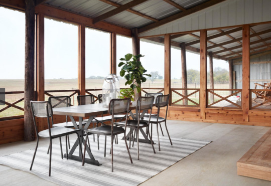
Season 5 Episode 14
Veteran Challenges Chip & Jo’s Ability to Create a Home
When Stephanie and TJ first reveal this property to the Gaines, it was hard to imagine this barn transforming into an actual home. This truly felt like a pole barn. It was fun this episode watching the ways in which Chip took TJ under his wing and showed him a thing or two about “farm living.”
When Chip and Jo revealed the home to the dating couple, it really is impressive the way they made this space feel homey. The exterior, I feel like they did the best they could. It certainly still has a “barn look,” but the bright white paired with the wood accents creates a more homey feel. The screened in porch is the highlight of this home. It added tons of livable space for the couple and is certainly a practical space for entertaining and enjoying the beautiful farm views.
The couple only had $40K to contribute, but thankfully, Chip and Jo were able to pool some resources from the community, because everything that had to be done with this property - I can’t imagine what all went into it!
While the space is small inside, they really took advantage of the space they had, relocating the living and kitchen areas. The black accents and countertops are an interesting diversion from the typical Magnolia bright white spaces. The laundry/catchall area is super functional, it’s again tight, but a good use of the space. This space feels super masculine, which I think is fitting for a former Marine.
The highlight for me is the master bathroom. I love the gridded glass which is not only functional for TJ, but just beautiful. The double shower, wood cabinets, and hexagon floor tile is the perfect combination.
While this home is small in interior space, the perks are the exterior views from the patio and screened in porch.
Spoiler! The ending may or may not have made me cry. Gotta love a good proposal on the screened in porch. See where this barn to home remodel ended up ranking!
0 notes
Text
Empty Nesters, Full Project

Season 5, Episode 13
Dream Home Built From the Ground Up
While this couple had their heart set on a fixer upper from Chip and Joanna a new build was in the cards, and this project was going to need a lot of character injected in since it was new construction.
From the moment Chip and Joanna revealed their home, you knew this couple was going to have a sweet reaction. I couldn’t have said it better myself, the “established European cottage” look feels so homey and inviting from the exterior.
From the brick details, pergola over the garage, sage shutters, stucco exterior, and wood details, the exterior of this home is truly one of my favorites. I really love this style as well and think that cottage look is just classic and traditional and truly will never go out of style.
The healthy budget of $300K definitely went a long way with this project. The great room space is beautiful, and even though it’s quite neutral with paint and decor, the wood beams and wood detailing on the fireplace adds a lot of character and charm.
Also, now that everyone has seen a double island, why wouldn’t we want a double island in our kitchens? Lots of space to gather and prep - and that copper sink and the gas lanterns really do steal the show. I’m a big fan of green so the sage cabinets not only offer a ton of practical storage, but they also break up the neutral color pallet, I also like how they carried the color into the vintage doors as well as the rest of the interior doors throughout the home.
This classic and traditional look is hard to beat in both the bedroom and bathroom. And the quirky kids room might be my favorite corner of the house. The reading nook, grass rug, wood stools and chalkboard make this a perfect playroom for grandkids.
Although this wasn’t a remodel per se, this design really hit a homerun, so see where it fell in my rankings!
1 note
·
View note
Text
In Bloom

Season 5, Episode 12
Family Garden Project
I love a good project on the Gaines' farm. But this also feels like sort of a cop out since it's not really a fixer upper but just a project at their house. But I will take any time with the Gaines in the final season...
I will say I love the layout and idea for this. I have a black thumb, but the appeal of a garden is so dreamy. Of course Joanna is a self-proclaimed “Plant Lady” and if you’ve been to Magnolia, much of the landscaping looks like this design as well. I also think this plays in really nicely with Joanna’s children’s book, “We Are the Gardeners.” Again, if I didn’t have a black thumb myself I would probably own this book and read it to Paxton, but it just feels a little disingenuous.
As they start to break ground, Chip makes a good point when they are in the construction process: Jo loves a challenge. Whether she's making a new house look old or an old house look new!
I do love this episode because of all the involvement with the kiddos. They are just precious.
The reveal on this is certainly unique because it's just their family. One thing I would love to know on this project in particular is the time it took to transform this space. Because this garden is gorgeous! Like almost too perfect. I know they have a team of people that make this look stellar, but still. Knowing the amount of time that went into this project would be fascinating.
The space is super unique. I love the exterior shingles - it gives that total cottage feel. The sink area and cabinets are gorgeous and the antique doors and windows are so beautiful. But I'm not sure about the fireplace. I guess it makes it feel like a cozy cottage but I'm not totally sold on it. I think it was a smart design choice of Chip’s to give the fireplace “hips” as it I do think it makes it more cottagey.
See where this project ranks on My Rankings page!
3 notes
·
View notes
Text
Booorrring.

Season 5, Episode 11
Big Budget doesn’t always mean Big Reveal
I’m not going to lie, I definitely let the families influence my impression of the renovation. If the family is boring or seemingly unappreciative, it’s really hard to jump on board the renovation. I’m also not a fan of big budgets. I often think the bigger the budget, the less impressive the renovation.
Let’s just jump straight to the reveal, which goes over like a wet fart. First, I love how they brought the kids in for the reveal to TRY to add a little more energy. I think the parents say less than 10 words during the reveal. Poor Joanna is really having to dig deep to fill the air... seriously it’s just so quiet - AWKWARD! And this house is really beautiful but the lack of reaction just makes all of the pretty design choices fall flat.
I do love the big open living and kitchen space with the white oak beams. I also really love the two-sided cabinet that is open to both the kitchen and sunroom. But the sunroom to me is a strange addition, I’m not crazy about the flooring I think, because something about this space feels off. The best part of this home is probably the exterior, although again, the fountain feels like a strange addition. Actually the best feature is the beautiful tree in the front yard - something Chip and Joanna had no changes to.
For as much money that went into this renovation, the reveal is just so lackluster. And the backyard space is definitely the strangest. The porch is a great space, but it doesn’t have the typical outdoor dining or living space that Chip and Jo tend to feature in their designs. Why no furniture? Just a big empty space? Couldn’t they have at least staged it? Very odd.
This renovation was certainly beautiful, but very very very boring! See where this transformation ended up in the rankings.
0 notes
Text
Happy Tears

Season 5, Episode 10
Deserving Family gets Touchdown of a Makeover
The final season of Fixer Upper really did go out with bang. Chip and Joanna kept adding to the star power with this episode and featured former quarterback Tim Tebow and family he wanted to remodel a home for. This family had two children in wheelchairs, so Tebow and the Gaines wanted to create an ADA friendly home that did no skimp on style.
The bones of this house were perfect for a family that needed wide open spaces and large rooms. The fact they started with a nearly empty floorplan allowed Chip and Jo to create their own vision and allow for plenty of space for the boys.
The catchall room that serves as the main foyer is a unique space that wouldn’t necessarily work for every family, but for this one - it was a great addition. The practical desks for the boys and the catchall table in the foyer really would be a practical space for a busy family.
I loved the kitchen in this home. The ADA friendly sink for the boys as well as the table attached to the island created spaces for the whole family. I also really loved the backsplash - it was a perfect blend of traditional and quirky. My favorite room of the home was probably the boys’ bathroom - agan super practical but full of great design choices - included the metal sign, lighting and lockers. I also really enjoy when Chip and Jo design children’s rooms. They are always the perfect blend of stylish and playful.
Of course the backyard was the wow factor for this home with the help of Make a Wish. The backyard was beautiful and a space the boys could play in normally. The use of concrete and bridges and turf really kept the boys’ interests and abilities in mind. You could truly tell they felt at home in the space and that definitely makes the space seem like a perfect renovation for this family. See where this sweet remodel ranked!
0 notes
Text
Small but Stellar

Season 5, Episode 9
Jimmy Don brings something extra special to this episode
Who doesn’t love Jimmy Don on Fixer Upper? We obviously love his collaborations with JoJo, and his metal decor. But revolve a whole episode around him? Just perfection!
I love the premise of this remodel. Jimmy Don wants a tiny house on his property revamped for his 21-year-old son. The one bedroom one bathroom “home” was bare bones and ripe for a remodel. Jimmy Don was really determined to make the elevation of this home look different. And changing the roof line took this place from a barn to a modern house.
I like that they decided to surprise Jimmy Don’s son with the design and this was definitely an episode filled with collaboration and guest appearances. We not only got Jimmy Don for demo day and his touch on the cabinet doors, but more metal working from another friend of Chip and Jo’s to create the showpiece of the home - the staircase! This staircase was definitely a labor of love and muscle - but it was the showstopper! Besides the change in roofline, adding in the large windows and this staircase made the largest difference in the remodel.
I really liked the blend of modern and masculine. It seemed to fit a young bachelor’s aesthetic. I especially like the windows opening to the porch off the kitchen. Seemed like a practical use of the space. I also loved the metalwork on the stair railing/headboard. That was a cool concept that translated well.
There were just two things about this remodel that missed for me. While the large windows are absolutely gorgeous - they are really impractical. I can’t imagine trying to sleep with all that sunlight pouring in. Hopefully Jimmy Don’s son is a farmer and wakes with the sun most days anyway. The second impractical part to this remodel was the lack of bathroom upstairs. There’s clearly plumbing and ample amount of space for a bathroom, since the laundry room was in the walk-in closet. I just wonder why the only bathroom in the house is downstairs next to the kitchen. Imagine showering, then walking up that beautiful staircase in the buff with wet feet in front of that giant window. I guess the Holmes don’t have many neighbors nearby to peek in - but still.
One of my other favorite parts of this episode had nothing to do with the remodel - but was a sweet moment with Joanna and the girls. Since the remodel was taking place in Crawford, home of the Bushes, Joanna decided to make a visit to the Bush ranch and purchase some trees from Laura Bush. I seriously love her! She is just so precious and classy and was a great addition to this episode.
See where this tiny but mighty remodel ranked!
0 notes
Text
Cramped Cottage

Season 5, Episode 8
Tight Quarters Outweigh Style
Chip and Joanna created a stylish space this episode, but the space felt very small. It was hard to imagine a family of four in this space. With a budget of $200K, I feel like the Gaines could have found a better property for this family.
I do love the kitchen space and think the choice to have the oven the focal point and move the plumbing to the island might have been an expensive one, but a smart one. I especially love the door leading into the teeny tiny office.
The living room looks especially cramped. I’m not sure if the furniture is the right size, and while the antique piano sign is unique, that space is awkward with the off-center fireplace. I do love the cellos as art in the living room!
The exterior choices seem a little bland. Obviously this couple loves traditional style, but sometimes traditional comes across as boring.
I do think Joanna made a good call eliminating the arches, because that did make the already small dining space feel even smaller. I do think the dining space looks very elegant. The ceiling feature was especially impressive, but again maybe too large for the space?
Check out where this small home reveal ranked!
0 notes