Last Seen Blogs

cgamoss
moss.
the-human-sharpie
sharpie

stfusilas
silas henry

po11ybius
Creative Whiz-kid
lilu-the-almighty
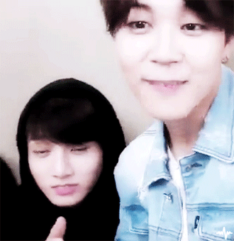
Kiss, Kiss, Kiss the Go-Goat!
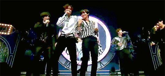
Photo


icons
like or reblog if you save ♡*
© jincollors
don’t repost, please
1K notes
·
View notes

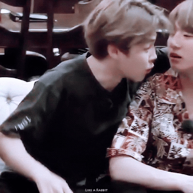

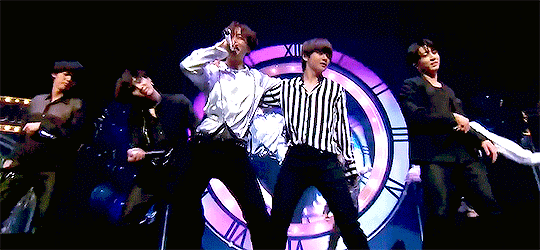
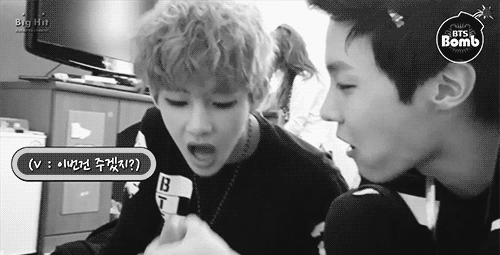
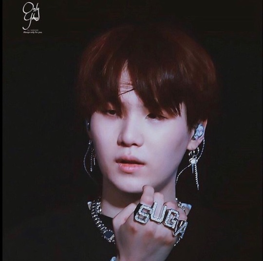
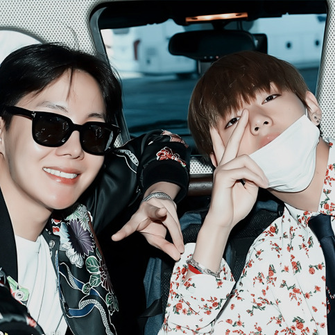
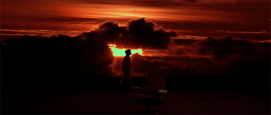
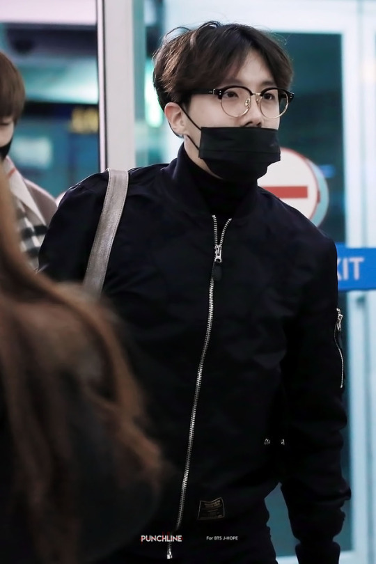
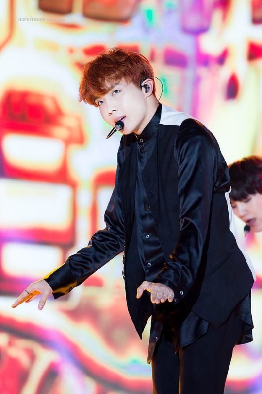
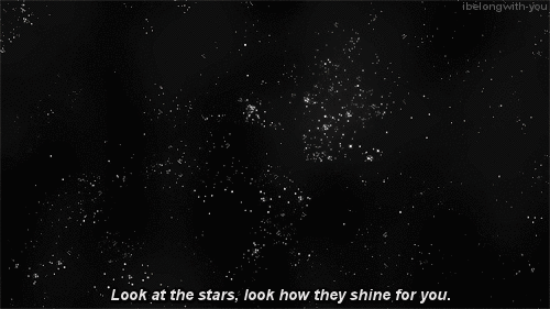
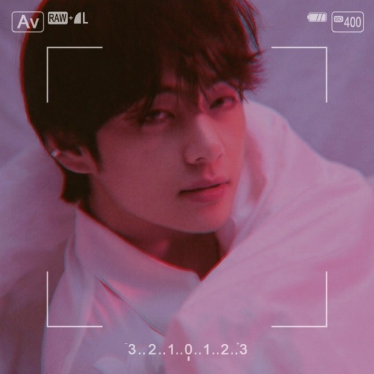
Photo
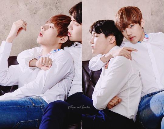
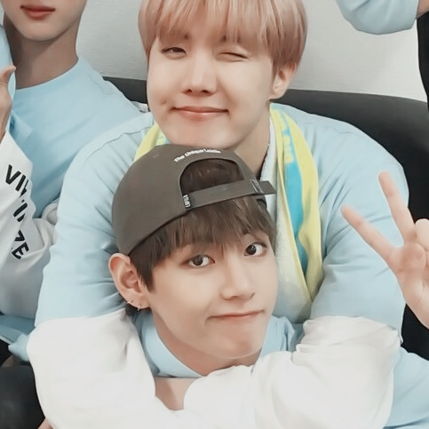
Stand by my side.
Please stay by me.
Please don’t lose your hold on my hand …
♫ VHope - Hug Me [Cover] ♫
89 notes
·
View notes
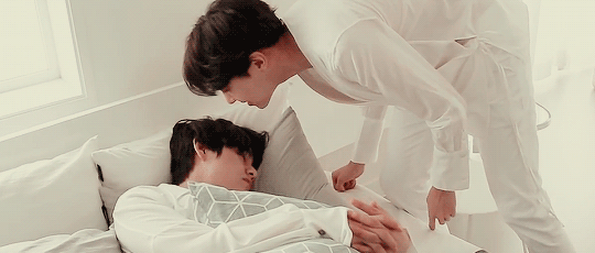
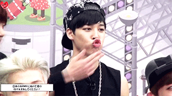
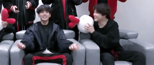
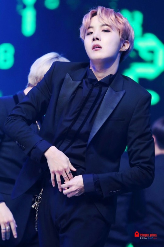
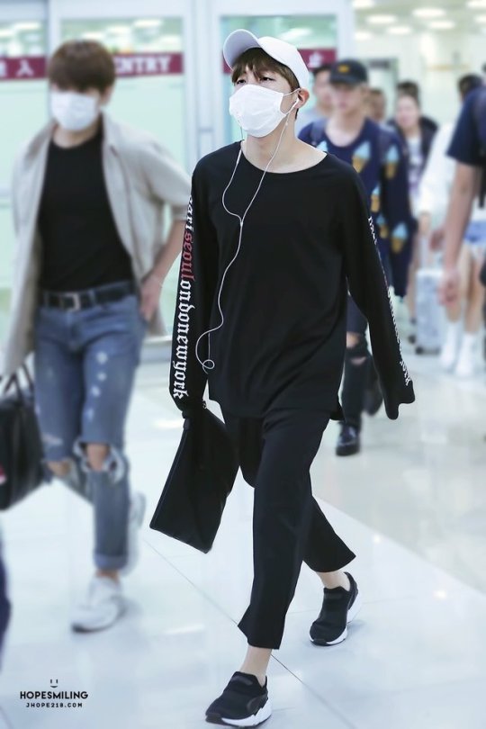
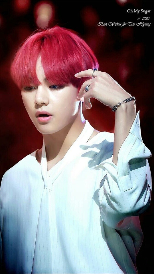
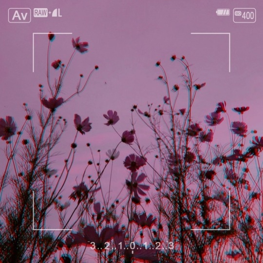
Photo


shit. i just realized twitter changed the icons to circular ones. ah, too late to remake it now.. but i shall keep that in mind for the future. sorry, everyone.
399 notes
·
View notes
Text
Tips for Illustrators (and other artists too!)
I’m an illustration major at MICA (please check out my blog here as a way to support me for making this post!), so this is catered towards what I learned in my illustration critiques and from professional illustrators. I think these tips can go for other artists too, though!
None of these are things that work all the time, but they’re general “rules” I’ve been taught. You can break them, just know why you’re doing so! These are just things I copied from my critique notes, so most are general tips I’ve heard and copied down.
General
Enjoy what you’re working on, but be okay with changing it.
Anatomy, and accurately trying to portray it, is really important.
Time and space can be portrayed through focus and distance.
When working digitally, make some of your own textures (traditionally) and scan them in. Adding them into a picture adds an element of your own hand and makes your work stand apart from other digital work.
Contrast is a great thing.
Saturation is a great thing, especially in watercolor (soak that brush with pigment!).
Your style should never draw an obscene amount of attention to itself; it should just work fluidly.
Consider what medium(s) work best for your idea.
Cover your paint palettes (particularly reusable ones) to make sure dust doesn’t get in the paints.
Spin the page when you’re working. The time is takes to do that will show some major improvement in your art!
Use dark watercolor and then a light colored pencil on top, never the other way around (it will look muddy and ruin clarity).
Make sure to sometime pin or place you piece far away and step away so you can see the whole composition (or zoom out a lot digitally).
Consider the genre and audience of what you’re working for (and if it’s yourself, then you’re your own audience!).
Illustration is a branch of fine art, don’t forget that.
Fantasy art usually needs a lot of high detail.
Coloring
Pick an overall color palette to work in, then add in other colors as needed.
Complementary colors (ones opposite on the color wheel), when placed next to each other, can pop an object forward or draw attention to it. (Think of a red ornament on a green Christmas tree).
Designate the shadows to be either warm or cool, and the highlights to be the opposite. Stay with this throughout the entire picture.
All colors have a warm and a cool hue (cool and warm blues, cool and warm oranges).
The more saturated a color is, the more it will pop forward in the picture plane.
Don’t use colors right out of the paint tube.
When making a shadow, tint the color with the complementary tone (it makes it a little more grey).
Colorizing backgrounds lines makes them recede in a colored image with line art.
Blue and pink tones are great for use in skin tones.
Flats need to be fairly differentiated colors.
Drawing
The reference should never be an excuse for a misleading or awkward pose. You have the artistic license to alter an awkward pose and not just draw from a photo.
With scratchy or textured line art, find some places of solid black too, to allow the eye to rest (or where you want something to pop out).
How you render all the elements of the picture is what makes your own individual style.
When something is illuminated, it should be the brightest part of the composition.
Anything with a straight angle (like the corner of a room) has one wall/side being lighter in value than the other. There is a crisp distinction.
Sometimes adding more lessens the strength of the image.
Fabric folds are crisp, if they’re too soft they’ll look like clay.
Line heaviness and weight can determine depth.
Anatomy/Characters
Anatomical consistency is very important.
Inside of the mouth is usually dark.
Show character motivations with actions and poses.
You can crop a face or figure to set a mood.
In any and every picture, pay special and close attention to the hands, feet, and face.
Learning musculature, even if you use reference, will help you create the body you want for your character. Understand the human form…it’s easier to alter if you understand it in the first place.
To pop a figure forward, add a little bit of rim lighting (great with backlighting).
Composition
Avoid spots where a line or shape comes really close, but doesn’t cross, the edge of the paper. This is called a tangent and tangents are bad (they suck the eye into just that one spot and stop the composition).
Nothing in the picture is accidentally there, it is all drawn by you, so make sure everything has a conscious placement.
Don’t crop anything that shows essential character expression (including essential parts of the pose).
Never crop a figure at a joint (it makes the limb look amputated unintentionally).
Consider how you show detail with smaller characters…what are the essential characteristics?
Shapes of color or tone can make great framing devices.
For the most part, render the foreground with more clarity than the background…you want atmospheric perspective to be used to make it look like it’s receding.
Line heaviness/weight can combat (in a good way) any very dark areas.
When the character breaks a border (shape, line, panel etc), it shows dominance.
Make the shape of your negative space visually interesting.
“Cornerstops” are great. They are a compositional element that visually blocks your eye from running off the corner of a page.
Shadows can be a great compositional element.
Narrative Illustration (Portraying the narrative)
It is a successful illustration if the story is told.
Use every element of the image to tell the story.
Sometimes you have to take out elements you love for the sake of storytelling.
Think of images as being fast/slow, quiet/loud. What techniques portray these senses for you, and why are you using such techniques? What areas of the picture are slower and faster, why those areas?
Indicate how lavish or simple a place is by the details you choose to include in the background.
Don’t make it obvious that you “curated” the picture; it should look natural.
Cover illustrations don’t always need big and bold text, as long as there’s a strong narrative being portrayed.
Something mid action carries the narrative better than pre or post action.
You should be able to tell a story without relying on text.
Sequential Art (Comics, etc)
Color between panels can draw the eye around the page.
Big jumps in narrative can add humor and excitement, just make sure to think of why you are having the jump there.
When starting a sequence, make it obvious where you start (establishing shot; biggest to smallest, etc).
Make sure panels can read as separate images even if you took the gutter away.
Smaller panels are frequently used for faster/quicker actions.
Removing the background in certain panels allows the scene to be read faster; you only need one background per page (unless the scene in the background is changing).
Style, readability, and timing are key things to keep in mind.
Does the punch line/climax happen at the right time on the page?
Before planning a page, ask yourself: “How much time is elapsing between the first and last panel?”
Consider panel shape and size.
The composition, and where the eye flows inside every panel, informs where the eye travels to next…compositionally lead the eye from panel to panel.
The more panels you have, generally the more time goes on.
Don’t rely on speed/action lines to make things dramatic.
Give word bubbles a little breathing room.
When doing a graphic novel, you’ll usually have to redraw the first few pages since the characters will come more naturally to you by the end pages.
There is a design element to sound effects.
Digital Art (Mostly Photoshop based, but some are general tips)
Before printing, you usually want to switch your file to CMYK (though save a file in RGB too). Print at 300 dpi.
Before printing, you can up the brightness, saturation and contrast until it just starts to look awkward. You’ll learn the best settings for the printer you print at.
Don’t place digital textures anywhere. Consciously arrange them.
Don’t overrender. Digital art tends to be the most successful when it feels less digital than someone would expect.
If your color scheme doesn’t look cohesive, you can use a fill layer of one specific color to unify everything (Layer->fill layer). Lower the opacity to around 15-30%.
16K notes
·
View notes


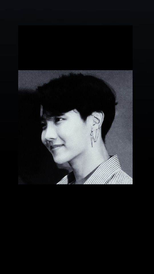


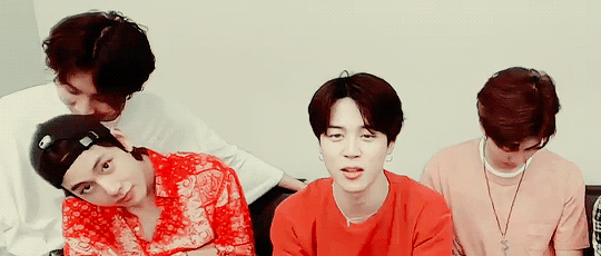
Photo

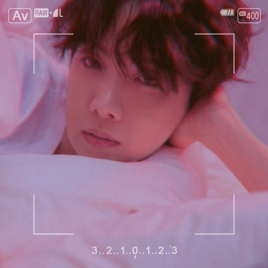
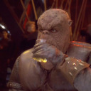
ʏᴏᴜ'ʀᴇ sᴜᴄʜ ᴀ ғᴜɢɪᴛɪᴠᴇ, ʙᴜᴛ ʏᴏᴜ ᴅᴏɴ'ᴛ ᴋɴᴏᴡ ᴡʜᴀᴛ ʏᴏᴜ'ʀᴇ ʀᴜɴɴɪɴɢ ғʀᴏᴍ.
357 notes
·
View notes