Don't wanna be here? Send us removal request.
Statistics
We looked inside some of the posts by flutteronetutorials and here's what we found interesting.
Average Info
Notes Per Post
0
Likes Per Post
0
Reblog Per Post
0
Reply Per Post
0
Time Between Posts
2 days
Number of Posts By Type
Text
17
Last Seen Tumblr Blogs


Fun Fact
Premium Tumblr themes are available from anywhere between $9 to $49.
Text
How to handle device orientation changes in Flutter?

Introduction
In Flutter, handling device orientation changes allows your app to adapt its user interface and layout based on portrait or landscape mode. By supporting different orientations, you can provide a seamless user experience across various devices and screen orientations. In this tutorial, you will learn how to handle device orientation changes in your Flutter app.
Content
To handle device orientation changes in Flutter, follow these steps:
Step 1. Import Package:
Import the necessary packages in your Dart file:
Step 2. Set Preferred Orientations:
In your main method, set the preferred orientations for your app. You can specify whether your app should support only portrait mode, only landscape mode, or both. In this example, we set the preferred orientations to support both portrait and landscape modes.
Step 3. Handle Orientation Changes
To handle orientation changes, you can use the OrientationBuilder widget. Wrap the part of your UI that needs to respond to orientation changes with OrientationBuilder, and use the orientation parameter to determine the current device orientation. In this example, we adjust the crossAxisCount property of GridView.count based on the current orientation. The grid will display 2 columns in portrait mode and 3 columns in landscape mode.
Sample Code:
Output:

How to handle device orientation changes in Flutter

How to handle device orientation changes in Flutter?
Conclusion:
By following these steps, you can handle device orientation changes in Flutter and adapt your app's UI and layout based on portrait or landscape mode. Ensure a seamless user experience by supporting different orientations and providing an optimized layout for each orientation in your Flutter app. Read the full article
0 notes
Text
How to implement staggered view in Flutter?


staggered view in Flutter
Introduction
A staggered view is a layout pattern that displays items with varying sizes and positions, creating an interesting and dynamic visual layout. In Flutter, you can implement a staggered view using the flutter_staggered_grid_view package. This tutorial will guide you through the process of implementing a staggered view in your Flutter app.
Content
To implement a staggered view in Flutter, follow these steps:
Step 1. Add Dependency:
Start by adding the flutter_staggered_grid_view package to your pubspec.yaml file. Open the file and add the following dependency: Save the file and run flutter pub get to fetch the package.
Step 2.Import Packages:
Import the necessary packages in your Dart file:
Step 3.Build Staggered View:
Create a StaggeredGridView widget to display the staggered view. Specify the crossAxisCount property to determine the number of columns in the grid. Additionally, you can customize the item count, item builder, and other properties based on your specific requirements. Customize the item builder to define the UI for each item in the staggered view. You can also adjust the staggeredTileBuilder to set the size and position of each item.
Step 4.Add Desired UI Elements::
Enhance your staggered view by adding any desired UI elements inside the item builder. You can include images, text, buttons, or any other widgets to create visually appealing layouts.
Sample Code:
Output:
staggered view in Flutter
Conclusion:
By following these steps, you can easily implement a staggered view in Flutter using the flutter_staggered_grid_view package. Build dynamic and visually appealing layouts with varying item sizes and positions, providing an engaging user experience in your Flutter app. Read the full article
0 notes
Text
How to implement ExpansionTile in Flutter?


How to implement ExpansionTile in Flutter
Introduction
The ExpansionTile widget in Flutter allows you to create expandable and collapsible list items, providing a convenient way to display hierarchical information. With ExpansionTile, users can expand or collapse a tile to reveal or hide additional content. In this tutorial, you will learn how to implement an ExpansionTile in your Flutter app.
Content
To implement an ExpansionTile in Flutter, follow these steps:
Step 1.Import Packages
Import the necessary packages in your Dart file:
Step 2.Build ExpansionTile
Create an ExpansionTile widget within your Flutter widget tree. Customize the properties of the ExpansionTile based on your requirements. The key properties to set are title, children, initiallyExpanded, and onExpansionChanged. Customize the title property to display the main title of the tile. Add child widgets within the children property to include any additional content that should be revealed when the tile is expanded. Adjust the initiallyExpanded property to control the initial state of the tile, whether expanded or collapsed. Handle the onExpansionChanged callback to perform any actions when the tile's expansion state changes.
Step 3.Add Desired UI Elements
Enhance your ExpansionTile by adding any desired UI elements inside the children property. You can include images, text, buttons, or any other widgets to provide rich and interactive content within the expanded view of the tile.
Sample Code:
Output:
How to implement ExpansionTile in Flutter
Conclusion:
By following these steps, you can easily implement an ExpansionTile in Flutter to create expandable and collapsible list items. Use the ExpansionTile widget to display hierarchical information and provide a user-friendly interactive experience in your Flutter app. Read the full article
0 notes
Text
How to Add an Action Slider Button in Flutter?


How to Add an Action Slider Button in Flutter
Introduction:
In Flutter, an action slider button is a user interface element that allows users to perform actions by swiping or dragging a button horizontally. It provides an intuitive and engaging way to trigger actions, such as marking an item as complete or deleting a list item. In this tutorial, we will learn how to add an action slider button in Flutter using the action_slider package and explore different customization options.
Content:
To add an action slider button in Flutter, follow these steps:
Step 1.Create a new Flutter project:
Ensure that you have Flutter installed on your machine. Open your terminal and run the following command to create a new Flutter project:
Step 2. Add the action_slider dependency
Navigate to the pubspec.yaml file of your Flutter project and add the action_slider dependency under the dependencies section: Save the file and run the following command in your terminal to fetch the package:
Step 3. Implement the Action Slider Button
Navigate to the lib folder of your Flutter project and open the main.dart file. Replace the existing code with the following implementation: In this code snippet, we import the action_slider package and utilize the ActionSlider widget to create our action slider button. Customize the container's appearance, such as background color, size, and content, as desired. Implement the necessary logic inside the onSlideStarted and onSlideCompleted callbacks to handle the slide events and perform the desired action.
Step 4. Run the App
Save the changes made to the pubspec.yaml and main.dart files. Execute the following command in your terminal to run the app: Conclusion:
Sample Code:
Output:
How to Add an Action Slider Button in Flutter
Conclusion:
Congratulations! You have successfully added an action slider button in your Flutter app using the action_slider package. By following this tutorial, you learned how to implement a customizable slider button and handle slide events to trigger actions. Feel free to explore more features and options provided by the action_slider package to enhance the functionality and appearance of your action slider button. Read the full article
0 notes
Text
How to Add SliverAppBar with Pinned TabBar in Flutter?
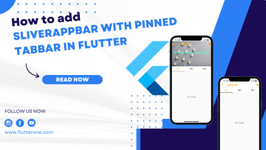
How to Add SliverAppBar with Pinned TabBar in Flutter
Introduction
In Flutter, a SliverAppBar with a pinned TabBar is a powerful combination that allows you to create a flexible and interactive app header. The SliverAppBar provides a collapsible header that adjusts its size based on the scroll position, while the pinned TabBar offers a set of tabs that stay visible at the top. In this tutorial, you will learn how to add a SliverAppBar with a pinned TabBar in Flutter to enhance your app's navigation and user experience. Content: To add a SliverAppBar with a pinned TabBar in Flutter, follow these steps:
Content
Step 1. Create a new Flutter project:
Ensure that you have Flutter installed on your machine. Open your terminal and run the following command to create a new Flutter project:
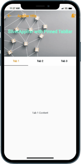
Step 2. Implement the SliverAppBar with Pinned TabBar:
Navigate to the lib folder of your Flutter project and open the main.dart file. Replace the existing code with the following implementation: In this code snippet, we define a Flutter app that utilizes a CustomScrollView with SliverAppBar and SliverFillRemaining. The pinned property of SliverAppBar ensures that it stays visible at the top while scrolling. The TabBar and TabBarView are wrapped inside a DefaultTabController to handle tab navigation
Step 3. Run the App:
Save the changes made to the main.dart file and execute the following command in your terminal to run the app:
Sample Code:
Output:
How to Add SliverAppBar with Pinned TabBar in Flutter
Conclusion:
Congratulations! You have successfully added a SliverAppBar with a pinned TabBar in your Flutter app. By following this tutorial, you learned how to create a flexible app header with scrollable tabs, enhancing the navigation and user experience. Experiment with different configurations to customize the appearance and behavior of your SliverAppBar and TabBar as per your app requirements. Read the full article
0 notes
Text
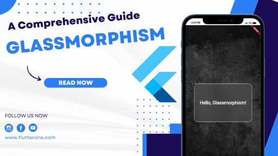
Exploring Glassmorphism in Flutter App Designs: A Comprehensive Guide
Introduction
As app design trends evolve, glassmorphism has emerged as a popular choice for creating visually stunning user interfaces. This design style mimics the appearance of glass or translucent surfaces, adding depth and a modern touch to app designs. In this comprehensive guide, we will explore how to implement glassmorphism in Flutter app designs. We'll cover the essential techniques, provide step-by-step instructions, and include example code snippets to help you get started. Let's dive in and bring a touch of elegance to your Flutter apps!
1. Applying Background Blur
To achieve the glassmorphism effect, we start by creating a blurred background. In Flutter, we can use the BackdropFilter widget combined with the ImageFilter.blur function to create the blur effect. Wrap the desired widget or container with a BackdropFilter widget and set its filter property to ImageFilter.blur. Adjust the sigmaX and sigmaY values to control the intensity of the blur effect.
2. Adding Translucency
Translucency is a key component of the glassmorphism effect. By adjusting the transparency level of UI elements, we can create the illusion of embedded glass surfaces. In Flutter, you can achieve translucency by setting the alpha value of the Color used for the UI elements. A lower alpha value (e.g., 50) makes the element more transparent.
3. Applying Gradients and Glow Effects
Gradients and glow effects add depth and dimension to glassmorphic designs. In Flutter, we can utilize the Container widget and BoxDecoration class to apply these visual effects. Experiment with linear or radial gradients and adjust the colors and stops to achieve your desired effect. To add a subtle glowing appearance, include a box shadow.
4. Consistent Styling
To ensure a cohesive glassmorphic design, it's crucial to maintain consistency throughout your app. Use a consistent color palette, shadow intensity, and blur effect. This consistency enhances the overall user experience and reinforces the glassmorphic theme.
Sample Code
Output
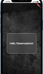
Exploring Glassmorphism in Flutter App Designs A Comprehensive Guide
Conclusion
By implementing glassmorphism in your Flutter app designs, you can create visually appealing and modern user interfaces. We've explored the key techniques, including background blurring, translucency, gradients, and glow effects. Remember to maintain consistency in your design choices to provide a cohesive user experience. Now, it's time to bring your Flutter apps to life with the elegance and depth of glassmorphism! Read the full article
0 notes
Text
Exploring Neumorphism in Flutter App Design: A Guide to Creating Modern Interfaces

Introduction
In the world of Flutter app design, Neumorphism has gained popularity for its unique approach to blending realism and simplicity. This design trend creates visually appealing user interfaces by using soft shadows and subtle gradients to mimic physical objects on the screen. In this comprehensive guide, we will explore Neumorphism in Flutter app design and learn how to implement it to create modern and visually appealing interfaces. Get ready to bring a touch of elegance to your Flutter apps!
1. Understanding Neumorphism
Neumorphism, also known as "Soft UI," is a design style that takes inspiration from skeuomorphism and flat design. It combines realistic elements, such as shadows and highlights, with minimalistic aesthetics. The goal is to create interfaces that resemble physical objects, giving them depth and a tactile feel.
2. Applying Neumorphism in Flutter
To create a Neumorphic design in Flutter, we'll focus on two key aspects: shadows and gradients. 2.1. Shadows Shadows play a crucial role in Neumorphism by adding depth to UI elements. In Flutter, we can achieve this by using the BoxShadow class. Adjust the color, blurRadius, and spreadRadius properties to create the desired shadow effect. 2.2. Gradients Gradients are another important aspect of Neumorphism that help create a realistic appearance. Flutter provides the LinearGradient and RadialGradient classes to define gradients. Experiment with different colors, stops, and directions to achieve the desired effect.
3. Simplistic Elements
One of the defining features of Neumorphism is its simplicity. To create a Neumorphic look, avoid complex shapes and stick to clean, minimalist designs. Utilize basic Flutter widgets such as Container, Card, or Button and focus on subtle shadow and gradient effects.
4. Consistency and Balance
Maintaining consistency and finding the right balance are crucial in Neumorphism. Keep a consistent color palette, shadow intensity, and gradient style throughout your app to create a cohesive user experience. Be mindful of the contrast between foreground and background elements to ensure readability.
Sample Code
Output

Exploring Neumorphism in Flutter App Design A Guide to Creating Modern Interfaces
Conclusion
Neumorphism offers a modern and visually appealing approach to Flutter app design. By leveraging shadows, gradients, and simplistic elements, you can create interfaces that blend realism and simplicity seamlessly. We've explored the key techniques, including shadow creation and gradient usage. Remember to maintain consistency and find the right balance to achieve the desired Neumorphic look in your Flutter apps. Now, it's time to unleash your creativity and design stunning user interfaces! Read the full article
0 notes
Text
How to Handle and Resolve Text Overflow Issues in Flutter Apps

RenderFlex and Text Overflow in Flutter
Flutter provides a powerful layout system that allows developers to create dynamic and responsive user interfaces. However, sometimes we encounter issues like RenderFlex and text overflow, which can affect the visual presentation of text elements. In this comprehensive guide, we will explore RenderFlex, understand the concept of text overflow, and delve into multiple examples and techniques to effectively handle and resolve text overflow issues in Flutter apps. By the end of this guide, you'll be equipped with the knowledge to create visually appealing and well-structured text layouts in your Flutter applications.
Understanding RenderFlex and Text Overflow
What is RenderFlex? RenderFlex is a flexible layout widget in Flutter that automatically adjusts the size of its child widgets based on available space. It enables dynamic layout behavior, ensuring that widgets can expand or shrink to fit the available space. Text Overflow Issues Text overflow occurs when the content of a text widget exceeds the available space, resulting in the text being clipped or truncated. This can lead to an undesirable user experience and make the text content unreadable or incomplete.
Resolving Text Overflow Issues
1. Text Wrapping One common approach to handling text overflow is to enable text wrapping. By wrapping the text within the available space, you ensure that the entire content is displayed without being clipped or truncated. Example: In the above example, the softWrap property is set to true, allowing the text to wrap within the available space. This ensures that the entire text content is displayed without overflow. 2. Text Truncation In situations where wrapping is not feasible or desired, you can truncate the text to a specified length and provide an ellipsis (...) to indicate that the text has been truncated. Example: In the above example, the overflow property is set to TextOverflow.ellipsis, which truncates the text and adds an ellipsis at the end. The maxLines property is set to 1, limiting the text to a single line. 3. Expanding Parent Container If the text overflow issue persists despite text wrapping or truncation, you may need to expand the parent container to accommodate the entire text content. Example: In the above example, the Container widget is given a width of double.infinity, allowing it to expand horizontally to fit the text content. This ensures that the text is displayed in its entirety without overflow.
Conclusion
RenderFlex and text overflow are common challenges faced when dealing with text layouts in Flutter applications. By understanding RenderFlex and employing techniques like text wrapping, text truncation, and expanding parent containers, you can effectively handle and resolve text overflow issues. Remember to choose the appropriate approach based on your specific layout requirements. With these techniques in your toolkit, you'll be able to create visually appealing and well Read the full article
0 notes
Text
Exception Handling in Dart: A Comprehensive Guide to Error Handling in Dart

Introduction:
Exception handling is a critical aspect of any programming language, and Dart provides robust mechanisms to handle errors and exceptions. In this comprehensive guide, we will explore the techniques and best practices for effective exception handling in Dart applications.
Understanding Exceptions in Dart
What are Exceptions? Exceptions represent abnormal or unexpected occurrences during program execution. They provide a way to handle and recover from errors in a controlled manner. Types of Exceptions in Dart Dart has a hierarchy of exception classes that allows for classifying and handling different types of exceptions. Some common exception types include: - Exception: The base class for exceptions that are not related to the language or system. - Error: The base class for errors that are related to the language or system. - Custom Exceptions: Developers can define their own exception classes to represent specific types of errors.
Exception Handling Techniques in Dart
Using try-catch Blocks Try-catch blocks provide a way to handle exceptions within a controlled scope. The syntax for a try-catch block is as follows: You can catch specific types of exceptions by specifying the exception type in the catch block: Let's take an example of dividing two numbers and handling a potential FormatException: Output: In the above example, the int.parse() function can throw a FormatException if the input strings are not valid numbers. The try-catch block catches the exception and handles it by printing an appropriate error message. Throwing Exceptions To throw an exception explicitly, you can use the throw keyword followed by an instance of an exception class. For example: Let's use the validateAge() function to check the age and handle the exception: Output: In the above example, the validateAge() function throws an Exception if the age is less than 18. The try-catch block catches the exception and prints an error message. Handling Uncaught Exceptions with Zones Dart provides a concept called "zones" for managing asynchronous operations. Zones also enable capturing and handling uncaught exceptions. Here's an example of using a zone to handle uncaught exceptions: Asynchronous Exception Handling Exception handling in asynchronous code follows similar principles. You can use try-catch blocks with async/await or handle exceptions using Future callbacks. Output: In the above example, the fetchData() function simulates an asynchronous operation and throws an Exception if it fails. The try-catch block handles the exception and prints an error message.
Best Practices for Exception Handling in Dart
Be Specific with Exception Types When catching or throwing exceptions, it is best to be as specific as possible with exception types. This allows for more targeted exception handling and improves code readability. For example: Handle Exceptions at the Appropriate Level Handle exceptions at the appropriate level in your application. Catch exceptions closer to where they occur if you can handle them effectively. Otherwise, propagate the exception to higher levels for appropriate handling. Graceful Error Messages and User Experience Provide meaningful error messages to users when exceptions occur. Customize the error messages based on the exception type to provide relevant information and guidance to users. Maintain a smooth user experience by gracefully handling exceptions and providing appropriate feedback. Unit Testing Exception Handling Write unit tests to validate exception handling scenarios. Test different code paths to ensure exceptions are caught and handled correctly. Unit testing exception handling code helps maintain code quality and reliability.
Conclusion
Exception handling is an essential aspect of Dart programming, enabling you to gracefully handle errors and exceptions in your applications. In this comprehensive guide, we explored various exception handling techniques and best practices in Dart. By mastering exception handling, you'll be able to write robust and reliable Dart code. Remember to handle exceptions appropriately, provide informative error messages, and ensure a smooth user experience. Happy coding! Read the full article
0 notes
Text
How to show or hide a widget based on a condition in Flutter?

Introduction:
In a Flutter app, it's common to display or hide widgets dynamically based on certain conditions. This allows you to control the visibility of widgets and provide a more interactive user experience. Whether you want to show or hide a widget based on a boolean condition or any other condition, Flutter provides you with the flexibility to achieve this behavior. In this step-by-step guide, you will learn how to show or hide a widget based on a condition in a Flutter app. Additionally, you will create a button that can toggle the visibility of the widget dynamically.

How to show or hide a widget based on a condition in Flutter?
Content:
1. Set up a new Flutter project:
Ensure that you have Flutter installed and set up on your machine. Create a new Flutter project using the following command in your terminal:
2. Implement conditional widget visibility:
In the Dart file where you want to implement the conditional widget visibility, import the necessary packages: Inside the build method of your widget, define a boolean variable to track the visibility of the widget: Next, create the widget that you want to conditionally show or hide: Finally, use the Visibility widget to conditionally show or hide the widget based on the boolean variable:
3. Implement a button to control widget visibility:
Inside the build method of your widget, create a button widget that can toggle the visibility of the widget dynamically:
4. Use the conditional widget visibility in your app:
In the Dart file where you want to use the conditional widget visibility, import the necessary packages and add the visibility widget and button widget to your widget tree.
5. Test the conditional widget visibility:
Save your changes and run the app using the following command in your terminal:
6. Observe the conditional widget visibility in action:
Upon running the app, you will see the widget initially visible. Pressing the "Toggle Widget Visibility" button will dynamically show or hide the widget based on the visibility state. The visibility of the widget will be updated dynamically as you interact with the button.
Sample Code:
Output:
How to show or hide a widget based on a condition in Flutter?
Conclusion:
Congratulations! You have successfully learned how to show or hide widgets based on conditions in a Flutter app. By following this step-by-step guide, you now have the knowledge to implement conditional widget visibility and create a button to dynamically control the visibility of a widget. Utilize this technique in your Flutter app to create interactive UIs that adapt to different conditions and user interactions. Read the full article
0 notes
Text
Understanding and Resolving the "Incorrect Parent Widget" Error in Flutter | Flutter Error Handling

Introduction:
Welcome to our Flutter error handling series! In this article, we will unravel the mystery behind the "Incorrect Parent Widget" error that you might encounter during Flutter app development. Understanding this error is crucial for building reliable and well-structured Flutter applications.
Understanding the "Incorrect Parent Widget" Error in Flutter
When working with Flutter, you may come across an error message that says "Incorrect parent widget." This error occurs when you try to add a child widget to a parent widget that does not accept or support it. It is important to grasp the concept of widget relationships and ensure compatibility to avoid this error. Common Causes and Solutions Cause 1: Adding a Child Widget to a Widget That Doesn't Accept Children In Flutter, certain widgets, such as Text or Icon, cannot have direct children. If you try to add a child widget to these types of widgets, you will encounter the "Incorrect parent widget" error. Let's take a look at an example: To resolve this issue, choose a parent widget that accepts children or reevaluate your widget hierarchy. Consider using a widget like Column or Row to properly structure your layout. Cause 2: Nesting Incompatible Widgets The "Incorrect parent widget" error can also occur when you nest incompatible widgets. Each widget in Flutter has specific requirements for the type of child widgets it can accept. Mixing incompatible widgets can lead to the error. Let's see an example: To fix this issue, make sure to use compatible parent-child widget combinations. Review the documentation of the parent widget to understand which types of children it supports. Adjust your widget hierarchy accordingly to establish the correct relationships. Cause 3: Incorrect Widget Placement or Usage Incorrect placement or usage of widgets can also trigger the "Incorrect parent widget" error. Placing a widget in the wrong context within the widget hierarchy can lead to this error. Let's examine an example: To rectify this issue, ensure that you place widgets in the correct context within the widget hierarchy. Review the documentation and understand the intended usage of each widget. In this example, the Text widget should be placed inside the body property of the Scaffold. Best Practices to Avoid the Error To prevent encountering the "Incorrect parent widget" error in your Flutter applications, follow these best practices: - Read the Documentation: Familiarize yourself with the documentation of each widget to understand its compatibility and usage guidelines. - Plan the Widget Hierarchy: Plan and design a clear and well-structured widget hierarchy before starting your development. This will help you avoid incompatible nesting and incorrect widget placement. - Test and Iterate: Regularly test your app's UI and functionality to catch any errors or issues early on. Iterate and refine your code as needed to ensure a smooth user experience. By applying these best practices and understanding the causes and solutions, you'll be well-equipped to handle the "Incorrect parent widget" error and build robust Flutter applications. Conclusion: In this article, we delved into the "Incorrect parent widget" error in Flutter and explored its common causes and solutions. We emphasized the importance of understanding widget relationships, choosing compatible parent-child combinations, and placing widgets in the correct context. By following best practices and gaining a deeper understanding of Flutter's widget-based approach, you'll be able to tackle the "Incorrect parent widget" error with confidence and build exceptional Flutter applications. Stay tuned for more Flutter error handling tips in our upcoming articles! Read the full article
0 notes
Text
How to implement a QR scanner using Flutter?

Introduction:
QR code scanning is a popular feature in many mobile apps, allowing users to scan QR codes and retrieve relevant information or perform specific actions. In Flutter, you can implement a QR scanner to enable this functionality in your app. QR codes are commonly used for various applications, such as product promotion, ticketing systems, authentication, and more. In this step-by-step guide, you will learn how to implement a QR scanner in Flutter using the qr_code_scanner package. By following this tutorial, you will be able to integrate QR code scanning functionality into your Flutter app and leverage the data retrieved from scanned QR codes.

How to implement a QR scanner using Flutterr

How to implement a QR scanner uusing Flutter
Content:
1. Set up a new Flutter project:
Ensure that you have Flutter installed and set up on your machine. Create a new Flutter project using the following command in your terminal:
2. Add the qr_code_scanner package:
Open the pubspec.yaml file in your Flutter project and add the qr_code_scanner package as a dependency: Save the file and run the following command in your terminal to fetch the package:
3. Import the necessary packages:
In the Dart file where you want to implement the QR scanner, import the necessary packages:
4. Implement the QR scanning functionality:
To implement the QR scanner, define a QRViewController and a QRView widget. Set up the QRView widget to display the camera feed and handle scanning events. Here's an example:
5. Navigate to the QR scanner screen:
In your app's navigation flow, navigate to the QR scanner screen when the user triggers the QR code scanning feature. You can use a button or any other user interaction to navigate to the screen.
6. Process the scanned QR code data:
In the _onQRViewCreated method, the scannedDataStream stream provides the scanned QR code data. Update the scannedData variable with the scanned QR code value and display it on the screen or process it as per your app's requirements.
Sample Code:
Output:
How to implement a QR scanner using Flutterr
How to implement a QR scanner uusing Flutter
Conclusion:
Congratulations! You have successfully learned how to implement a QR scanner in a Flutter app. By following this step-by-step guide, you can now integrate QR code scanning functionality using the qr_code_scanner package in Flutter. QR code scanning is a versatile feature that can enhance various applications, enabling users to quickly retrieve information or perform specific actions. Leverage QR code scanning in your Flutter app to provide a seamless and convenient user experience. Read the full article
0 notes
Text
How to Store Data Locally in Flutter using Shared Preferences

Introduction:
Storing data locally is a common requirement in mobile app development. In Flutter, you can use the Shared Preferences package to easily store and retrieve key-value pairs locally on the device. This tutorial will guide you through the process of implementing local data storage using Shared Preferences in Flutter.

Store Data Locally in Flutter using Shared Preferences
Content:
1. Create a new Flutter project:
Before we begin, make sure you have Flutter installed and set up on your machine. Create a new Flutter project by running the following command in your terminal:
2. Open the pubspec.yaml file:
Once the project is created, navigate to the root directory of your project and open the pubspec.yaml file.
3. Add the shared_preferences dependency:
In the pubspec.yaml file, add the following line under the dependencies section: Save the file and run flutter pub get in your terminal to fetch the package.
4. Import the necessary packages:
To work with Shared Preferences, import the following packages at the top of the main.dart file:
5. Implement the data storage logic:
Inside the main.dart file, define a SharedPreferences instance and implement the logic to store and retrieve data using Shared Preferences. a. Initialize SharedPreferences: Create a method called initSharedPreferences() to initialize the SharedPreferences instance: Call this method at the beginning of the main() function: b. Store data using Shared Preferences: Create a method called storeData() to store data using Shared Preferences. For example, let's store a user's name: c. Retrieve data using Shared Preferences: Create a method called retrieveData() to retrieve data using Shared Preferences. For example, let's retrieve the stored user name:
6. Use the data storage logic in your app:
In your app, use the storeData() and retrieveData() methods to store and retrieve data respectively. For example, you can update the app's UI based on the stored user name.
7. Run the app:
Save the changes and run the app using the following command in your terminal:
Sample Code:
Output:
Store Data Locally in Flutter using Shared Preferences
Conclusion:
Congratulations! You have successfully implemented local data storage using Shared Preferences in Flutter. By using the Shared Preferences package, you can easily store and retrieve key-value pairs locally on the device, enabling you to save and retrieve user preferences, settings, and other persistent data in your Flutter app. Start utilizing Shared Preferences to enhance the Read the full article
0 notes
Text
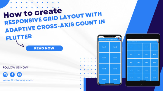
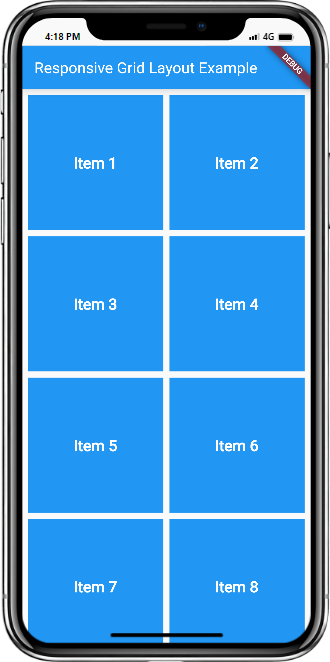
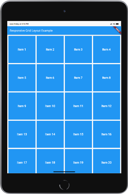
How to create a responsive grid layout with adaptive cross-axis count in Flutter?
Introduction:
A responsive grid layout with an adaptive cross-axis count is a powerful technique in Flutter for creating dynamic and flexible grids that adjust based on the screen size. This allows your app to provide an optimal user experience on various devices, accommodating different screen sizes and orientations. In this step-by-step guide, you will learn how to create a responsive grid layout with adaptive cross-axis count in a Flutter app. By following this tutorial, you will be able to build a grid that automatically adapts its column count based on the available screen space, ensuring a visually appealing and user-friendly layout.
Content:
1. Set up a new Flutter project:
Ensure that you have Flutter installed and set up on your machine. Create a new Flutter project using the following command in your terminal:
2. Implement a responsive grid layout:
In the Dart file where you want to implement the responsive grid layout, import the necessary packages: Define a stateful widget for your grid layout: In the GridView.builder widget, use SliverGridDelegateWithFixedCrossAxisCount as the gridDelegate to define the initial cross-axis count.
3. Determine the adaptive cross-axis count:
To make the grid layout responsive, you need to determine the adaptive cross-axis count based on the available screen space. You can achieve this by utilizing the MediaQuery class. Add the following code inside the _ResponsiveGridState class: Modify the crossAxisCount property in the SliverGridDelegateWithFixedCrossAxisCount widget to use the adaptive count:
4. Customize the grid items:
Inside the itemBuilder function of GridView.builder, build your grid items based on the index. You can use widgets like Container, Card, or any other desired widget to represent each grid item. Customize the appearance and content of each grid item based on your app's requirements.
5. Use the responsive grid layout:
In the Dart file where you want to use the responsive grid layout, import the necessary packages and add the ResponsiveGrid widget to your widget tree.
6. Test the responsive grid layout:
Save your changes and run the app using the following command in your terminal:
7. Observe the responsive grid layout in action:
Upon running the app, you will see the responsive grid layout with the adaptive cross-axis count. The grid will automatically adjust its column count based on the available screen space, providing a visually appealing and user-friendly layout.
Sample Code:
Output:
Mobile and Tab view
Conclusion:
Congratulations! You have successfully implemented a responsive grid layout with an adaptive cross-axis count in your Flutter app. By following this step-by-step guide, you have learned how to build a dynamic and flexible grid that adjusts based on screen size, ensuring an optimal user experience on various devices. Utilize this technique in your Flutter app to create visually appealing and user-friendly layouts that adapt to different screen sizes and orientations. Read the full article
0 notes
Text
How to create a circular countdown timer in Flutter?

Introduction:
A circular countdown timer is a visually appealing and interactive component that displays the remaining time in a circular format. It is commonly used in Flutter apps for various purposes such as countdowns, timed activities, or progress tracking. In this step-by-step guide, you will learn how to create a circular countdown timer in a Flutter app. By following this tutorial, you will be able to incorporate a visually appealing and interactive timer in your app, enhancing the user experience.

Content:
1. Set up a new Flutter project:
Ensure that you have Flutter installed and set up on your machine. Create a new Flutter project using the following command in your terminal:
2. Add dependencies:
Open the pubspec.yaml file in your Flutter project and add the following dependency: Save the changes and run the following command in your terminal to fetch the dependencies:
3. Implement the Circular Countdown Timer:
In the Dart file where you want to use the circular countdown timer, import the necessary packages: Create a CircularPercentIndicator widget to display the circular countdown timer:
4. Customize the Circular Countdown Timer:
You can customize the appearance and behavior of the circular countdown timer by modifying the properties of the CircularPercentIndicator widget. For example, you can change the radius, line width, progress color, or add additional widgets inside the center property.
5. Test the Circular Countdown Timer:
Save your changes and run the app using the following command in your terminal:
6. Observe the Circular Countdown Timer in Action:
Upon running the app, you will see the circular countdown timer displayed with the specified radius, line width, and progress color. The remaining time will be shown at the center of the circular timer. You can update the percentage and remaining time based on your app's logic.
Sample Code:
Output:
Conclusion:
Congratulations! You have successfully created a circular countdown timer in your Flutter app. By following this step-by-step guide, you have learned how to implement a visually appealing and interactive timer that enhances the user experience. Incorporate this feature into your Flutter app to provide a visually engaging way to display countdowns, timed activities, or progress tracking. Read the full article
0 notes
Text
How to Implement Dark Mode in Flutter

Introduction:
Dark mode has become a popular feature in modern app design, providing a visually appealing and comfortable user interface for low-light environments. In Flutter, you can easily implement dark mode to give your users the flexibility to switch between light and dark themes. This tutorial will guide you through the process of implementing dark mode in Flutter.

How to Implement Dark Mode in Flutter
Content:
1. Create a new Flutter project:
Before we begin, make sure you have Flutter installed and set up on your machine. Create a new Flutter project by running the following command in your terminal:
2. Open the main.dart file:
Once the project is created, navigate to the lib folder and open the main.dart file.
3. Import the necessary packages:
To work with dark mode, import the following packages at the top of the main.dart file:
4. Implement dark mode:
Inside the main.dart file, implement dark mode by following these steps: a. Declare a global boolean variable: Add a global boolean variable called isDarkMode at the top of the main.dart file: b. Define the main function: Inside the main.dart file, locate the main() function and modify it as follows: c. Create the MyApp class: Define the MyApp class, which extends StatelessWidget: d. Create the HomeScreen class: Define the HomeScreen class, which extends StatefulWidget:
5. Run the app:
Save the changes and run the app using the following command in your terminal:
6. Toggle dark mode:
Observe the app's user interface and the floating action button. By tapping the button, you can toggle between light and dark modes.
Sample Code:
Output:
How to Implement Dark Mode in Flutter
Conclusion:
Congratulations! You have successfully implemented Read the full article
0 notes
Text
Flutter Layouts: Understanding Rows, Columns, and Containers

When building user interfaces in Flutter, understanding how to use layouts effectively is crucial. Rows, columns, and containers are key widgets that help structure and arrange the elements in your UI. Let's dive into each of these widgets and explore how they contribute to creating flexible and responsive layouts.
Containers
A Container is a versatile widget that allows you to customize its appearance and layout properties. It provides a way to contain and arrange child widgets within it. Here's an example of using a Container to create a colored box with centered text inside: In the above code snippet, we define a Container with a specific width, height, and background color. The child property contains a Center widget, which centers the child text within the container.
Rows
A Row widget allows you to arrange its child widgets horizontally in a row. It automatically sizes and positions its children based on available space. Here's an example of using a Row to display two buttons side by side: In the above code snippet, we create a Row and define two ElevatedButton widgets as its children. We add spacing between the buttons using a SizedBox widget.
Columns
A Column widget is similar to a Row, but it arranges its child widgets vertically, stacking them on top of each other. Here's an example of using a Column to display a title, subtitle, and an image stacked vertically: In the above code snippet, we create a Column and add a Text widget for the title, a Text widget for the subtitle, and an Image.asset widget for the image. We use SizedBox widgets to add spacing between the widgets.
Conclusion
Understanding how to use Rows, Columns, and Containers in Flutter layouts is essential for creating well-organized and responsive user interfaces. By combining these widgets effectively, you can achieve flexible and visually appealing layouts for your Flutter apps. Experiment with different properties and explore additional layout widgets to further enhance your UI designs. Happy coding! Read the full article
0 notes