
Don't wanna be here? Send us removal request.
Statistics
We looked inside some of the posts by fmp-alex-stewart and here's what we found interesting.
Average Info
Notes Per Post
1
Likes Per Post
1
Reblog Per Post
0
Reply Per Post
0
Time Between Posts
2 days
Number of Posts By Type
Text
16
Link
1
Last Seen Tumblr Blogs


Fun Fact
After the announcement of the deal with Yahoo!, there were 170K signatures of unhappy Tumblr users petitioning to prevent the sale in 2013.
Text
Experimental Development of Aspects and Aesthetic of Art
WhenI started sketcjng I felt sure that I wanted the characters in my story to be from an ancient civilization. The Myans where still fresh in my mind and there were videogame-based rumers about a Mesoamerican themed game in the works - more on that elsewhere.
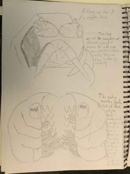
I wanted to draw an authentic body composition, even though I did not have much experience with realistic free-hand drawing of human subjects. Consequently I ttok longer than I would have liked. Since I had shown interest in parasytism, I drew and impresionist shot of the hand zoomed up close clasping a small pocket of water. Not too easily seen in that puddle, is giant bacteria. I thought of an alternate means of sacrifce if Mesoamerican got something out of being twisted from the inside by an organism - I hadn’t thought of what way that would be though.
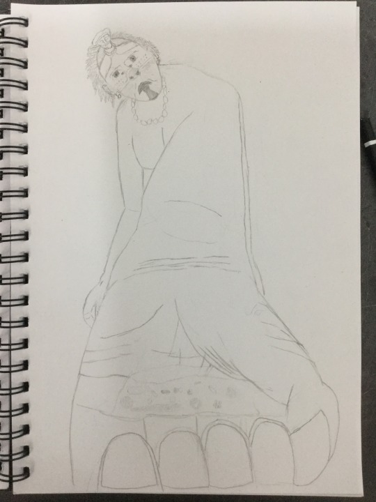
Ascension was a theme that I wanted to incorporate on the get-go - as seen with the picture on the left. I decided to artistically represent this by only allowing the tp halve of the Mayan’s head to be visible, filling the A4′s bottom halve. I drew the vibration waves with repeating lined strokes with different levels of pressure for light and dark disparity. Their path wavered and ran paralle with each other. Also representing the spirit, the vibration waves started from the forhead, as that is where the middle eye is said to be located.
When I was provided with photocopies of manikin art pages, I likened to ones that reminded me of plot points that I was thinking about. The drawing on the left looks the man is throwing a torch and the right one looked like that it was contorting from a supernatural ailment.
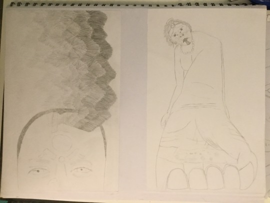
I due to spending too much time drawing, I was not confident about getting my story across with the time I had remaining. That’s why I decided the first depiction I drew of these thematic warriors was going to be used to create one of my final digital pieces. Thusly I used a lot of time yet again making sure not to make mistakes and I wasn’twilling to use thick brush strokes - particularly since it was going to be transfered digitally
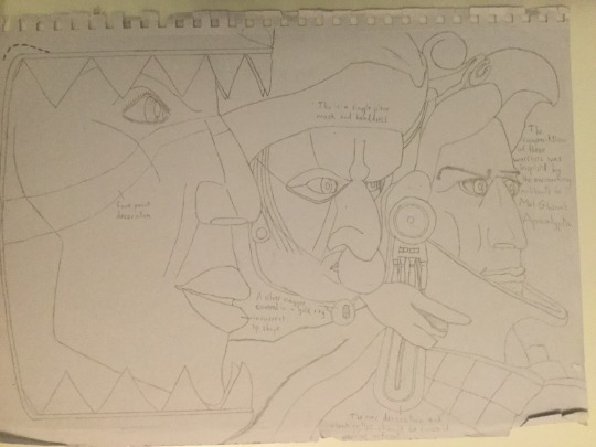
simplply for background perspective, I re-drew that same warror subjects used for one of my final art pieces - only I presented a different orientation. This time I did use thick, dark lines with quick strokes and I have to say, while it was quick, it still looks nice. Even if the quality of the final piece had been mitigated by using this sketch, I could have gotten much more final pieces completed with a commendable finess, all the while completing the impression of the story the art was meant to present.
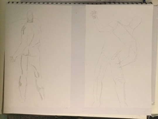
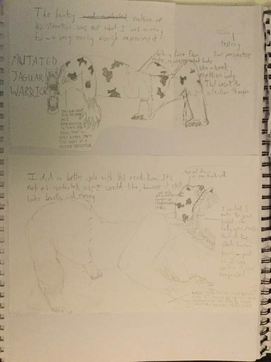
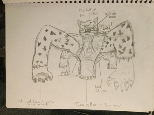
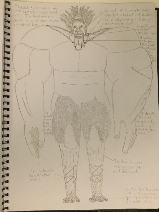
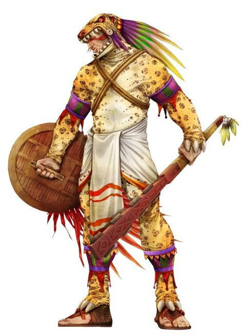
The most fun concept of all that I truly regret not creating a final piece for, is the notion of warriors becoming mutated based on the persona of their strengths.
The warrior wearing the jaguar costume for instance, becomes angular due to a contortion of the limb joints, making it prone to pouncing at inhuman speeds - just like a big predator cat would.
This mutated warrior has only a little of his eagle uniform sitting on his obscenely muscular body, the entirety of the physique carries the likeness of territorial birds ,but of nothing specific. Mind you, I did envision the shape a rooster while comparing that to extreme body builders. I also thought of how the strength, of say, a swan’s wings, are strong enough to cause serious harm.
I decided that I wanted to incorporate Aztec symbols into my art in some way and found out, via internet pages, what the symbols for house, death and movment looked like. I gave the symbol for death an alternate orientation.

0 notes
Text
Composition of Scenery and Land Marks
https://t.umblr.com/redirect?z=https%3A%2F%2Fwww.gamasutra.com%2Fblogs%2FArioBarzan%2F20160121%2F263988%2FHow_Dark_Souls_concept_art_may_have_deep_ties_to_its_environmental_design.php&t=YWRjNzg0YjY1YzI3NzlhNDE4NzllMWFlYmM3MzAwOTczNTliODY2Niw0VUpielV0Yw%3D%3D&b=t%3AXSpKdXtX4psdDL-foJJRtQ&p=https%3A%2F%2Ffmp-alex-stewart.tumblr.com%2Fpost%2F185338002689%2Finspiration-by-dark-souls-concept-art&m=1
0 notes
Text
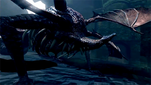
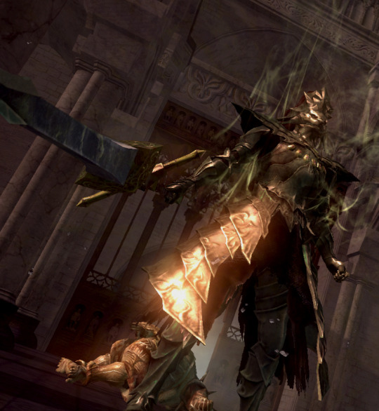
Inspiration by Concept Art and In-Game Models for Dark Souls and Bloodborne
The concept pieces and captured in-game models are all created by From Software.
Dark Souls
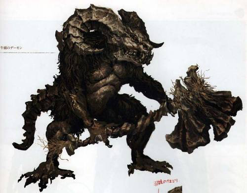
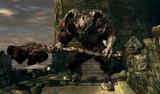
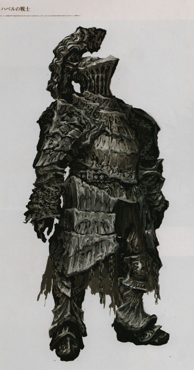
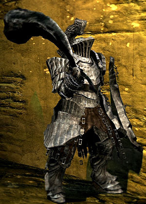
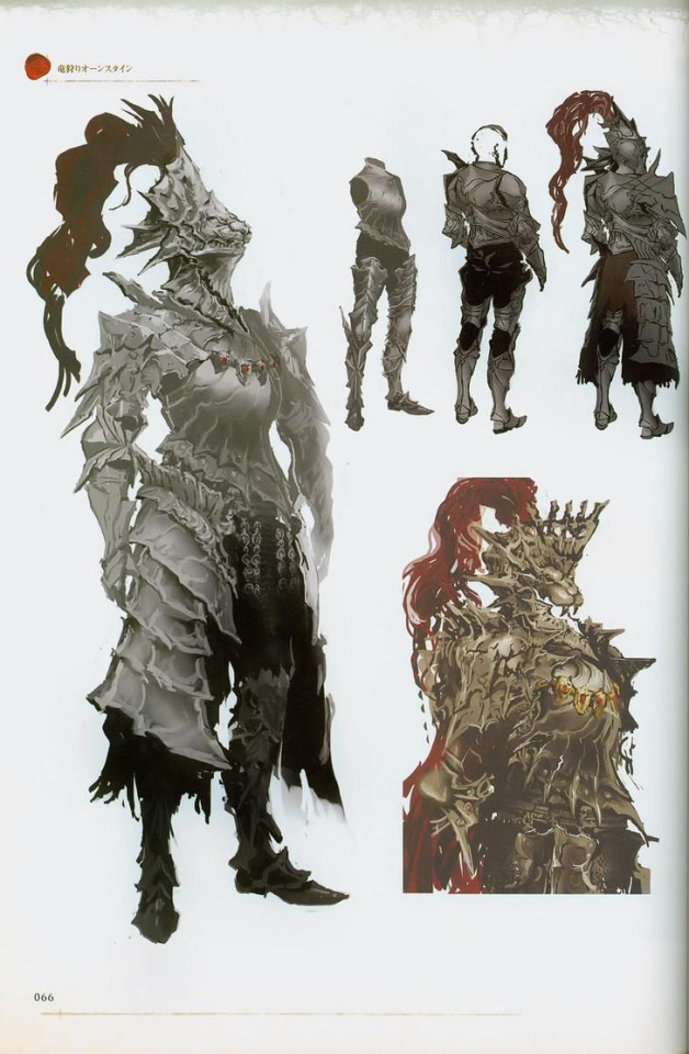
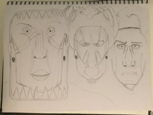
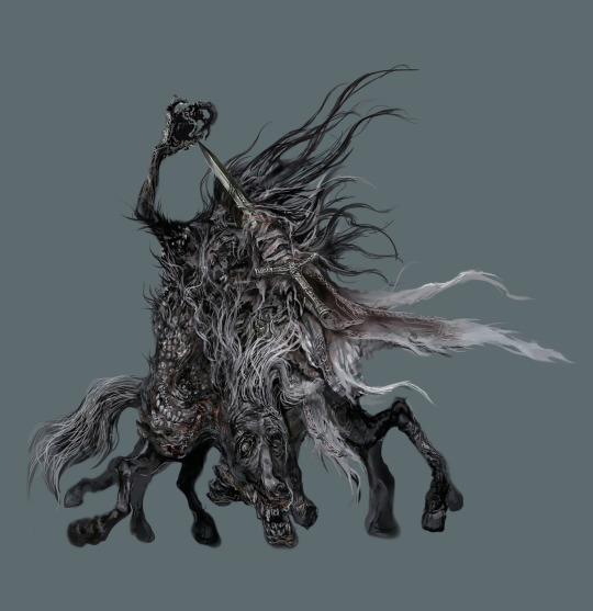
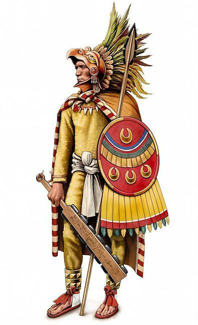
When I was sketching my Aztec warriors in human form, I captured characterisation and distinguishing textures between them. The object of it was to implicate strengths and orientation of style. This was both a form of inspiration by this presented art and something very relevant to the Aztec culture. That was rank and honour - honour of which, differed from how we define it today. The two knights posses different themes; one, seemingly of stone like hardiness and the other, courageous and of prestige. This art, in part, along-side varying garb of Aztecs depicted on Pinterest was the source of inspiration for the human renditions of the warriors.
Bloodborne
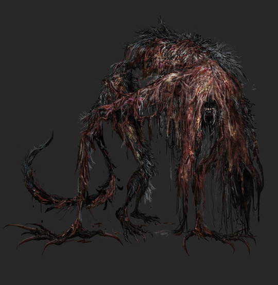
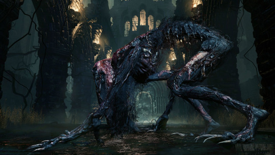
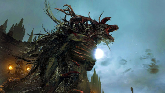
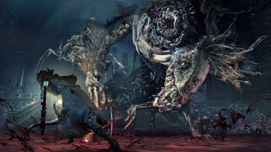
The monster like mutated forms of my sketched Aztecs carried much more inspiration from some of the highly creative monsters of Bloodborne. This goes for the first of the Bloodborne and Dark Souls images - the blood-starved beast and the gaping dragon, respectfully. Both were turned into the way they are because of their hunger. I decided to tie degenerative transformations such as these with characterisation of the warriors. Each mutation of the different Aztecs depicted is based on what strengths they adhered to. This may seam odd since, authentically, strength of character has no effect on parasitic body transformations. For my story however it was the supernatural affect of the ascendence that ‘cursed’ the warriors. The sketch of my mutations are meant to be more thematic and ironic rather than authentic.
0 notes
Text
Aztec Life and Culture
http://www.aztec-history.com/ancient-aztec-religion.html
[Aztec culture was a rich combination of the cultures of the peoples that made up the Aztec empire, including the Mexicas. Hundreds, even thousands of years of tradition influenced the way people lived in the society.]
[Social classes in Aztec culture]
[There were two main social classes in Aztec culture. First the nobility or pilli, then the common people or macehualli. Each of these was further broken up into groups of people that had quite different lives.]
[There were also slaves, which were generally well-treated. Slavery was not hereditary - the children of a slave were free. There were ways for a slave to gain freedom, such as purchasing it.]
I was interested in the two paragraphs above as it shows the curious combination of abundant segregation and overall respect for slaves.. It makes me think of how confident and powerful the Aztecs felt about themselves, considering that slaves were generally treated well and their owners did not over indulge with intimidation. For animation or specific renditions of high ranking Aztecs, I would try to depict them as enthusiastic and unfazed by most things.
[Growing up Aztec]
[The Mexica people of the Aztec empire had compulsory education for everyone, regardless of gender or class. In the end, people in the Aztec society were generally well educated, though boys received a wider education than girls.]
[Girls were taught how to run a home, cook, and care for a family, but they were also taught things like crafts and ways to economically run the home. In this way women had a lot of power in society, though it was behind the scenes.]
Very fascinating. The compulsory education and the unsung power of women during the era. Considering that religious figures ranked highly in Aztec culture, it is likely the power granted to women was a forward thinking means of counter acting the otherwise one sided and bloated masculine presence of warriors, which in-turn would have created harmonious fertility processes. The sway and influence the leaders, as well as their religion had boundless sway over the populous. Speaking of religion...
[Aztec life was permeated by religion. The cycles of the calendar and rituals associated with it to keep nature in balance and appease the gods were a big part of Aztec culture.]
Ancient Aztec religion hymn: Huitzilopochtli is first in rank, no one, no one is like unto him: not vainly do I sing (his praises) coming forth in the garb of our ancestors; I shine; I glitter. ~The Hymn of Huitzilopochtli (trans. by Daniel G. Brinton)
[Ancient Aztec religion was a complex interaction of gods, dates, directions and colours. It seems that most of the preoccupation in the religion had to do with fear of the nature, and a fear of the end of the world.]
One way to control chaos is to make the ‘solution’ to the inflammable fear benefit the system that controls the people. Sacrifice - to appease the God that decides whether the populace lives for another day. This frenzy and twisted sense for wanton violence is something that was acted in the Mayan themed movie Apocalypto. I would like to capture the insane fear and euphoria of depicted subjects to really give off that sense of human...or inhuman unease. [By the time the Mexica's Empire (Mexica is the proper name for the tribe at the heart of the Aztec empire) was at its height, the political and religions systems were in close interaction. The actions of the ruling classes and common people can be best understood if we look way back to the Mexica understanding of the creation, or rather creations, of the world. Because the religion was a mixture from various peoples, there are variations. We'll give a general overview here.]
0 notes
Link
I wish I had been enthusiastic to practice creating something worthy of final pieces of my project. Too much time had already passed however and I didn’t have the confidence to learn and adapt quickly. Even though the video makes it look incredibly easy, the process is obviously sped-up for the video.
I definitely want to get stuck in heavily with Mudbox as well as other 3D creation applications such as Cinema 4D and perhaps Unity.
0 notes
Text
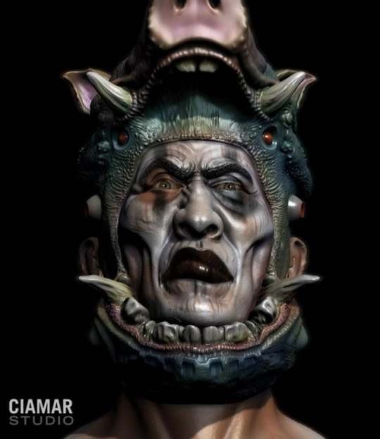
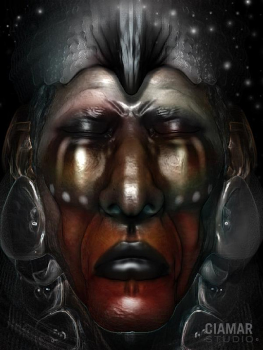
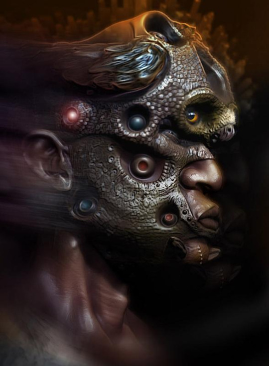
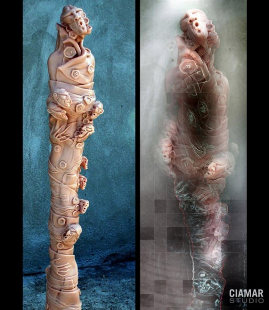
Marcia K Moore - Mudbox Artist
http://webneel.com/webneel/blog/creative-digital-mudbox-sculptures-ciamar-studio
[Sample]
[Marcia K Moore is a florida based sculptor who works from her studio – CIMAR STUDIO. Her creativity in digital mudbox sculptures have won her praises from both national and international art collectors. She is true professional who is extremely talented in Painting, Photoshop, Mudbox and Digital visualizations. Before she became a full fledged sculptor, she was a teacher at Albuquerque New Mexico Art Center and still continues to share knowledge with the students as a hobby. In this post we have included creative Digital Mudbox sculptures by Marcia K Moore.]
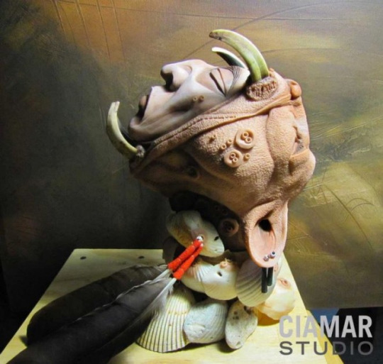
I think of death gods and spiritual possession when I look at the image below.
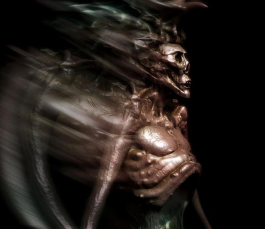
I have considered the idea implementing advanced technology for ancient civilizations within future art of mine, but have not considered the integration of aliens in my work, as of which, this creature below appears to be. It is not inconceivable for ancient deities to be represented as aliens for a story or game. I would have rather have just spent more time likening any advanced technology to an ancient civilization of focus, tying those together with my personalized lore and mythology, which in turn would completely flesh out the identity of characters that I use for my art.
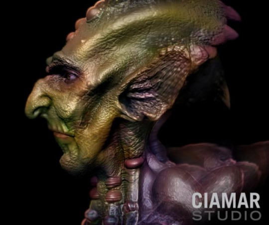
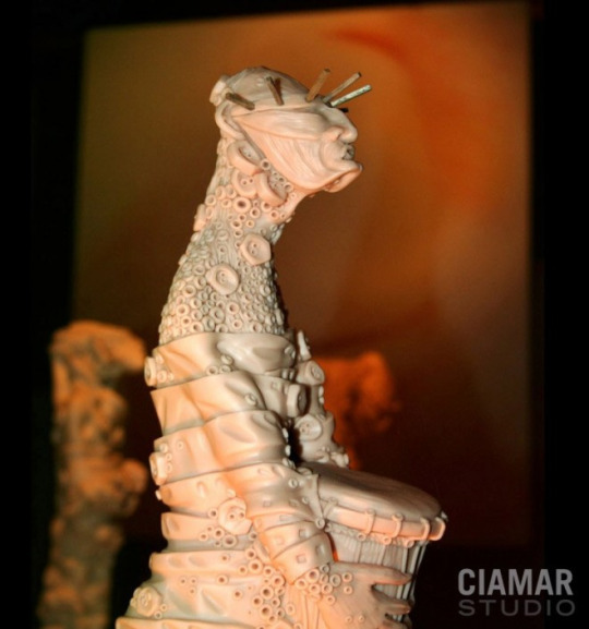
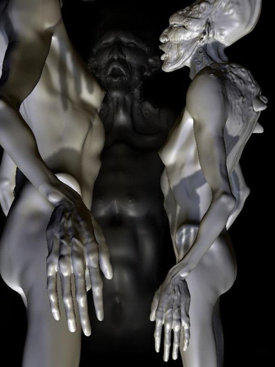
I’m enamored with the impressionism of the humanoid subjects. This is because of a somewhat simple to understand composition of shapes that make up face details one might want to take inspiration from in some way. That only leaves some playing with the colours and textures to finalize the look. Both the attire and face shapes in the first three images for instance, gives them a Mesoamerican look. Although for Marcia, that may have been an inherent visual for the impressionist design choice of the characters rather than a heavy emphasis on the choice race.
0 notes
Text
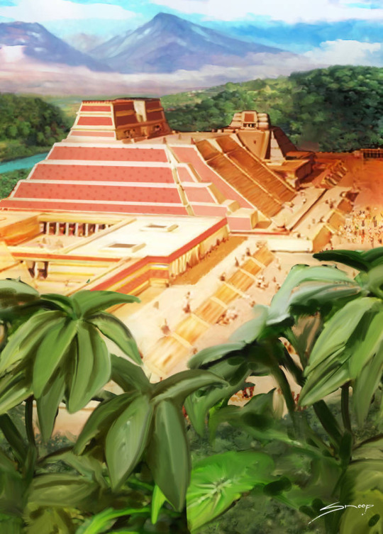
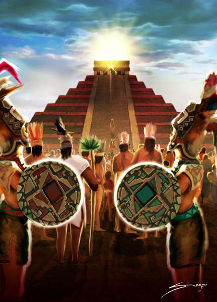
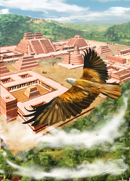
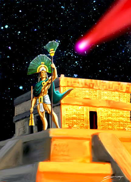
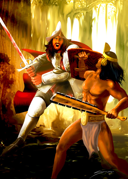
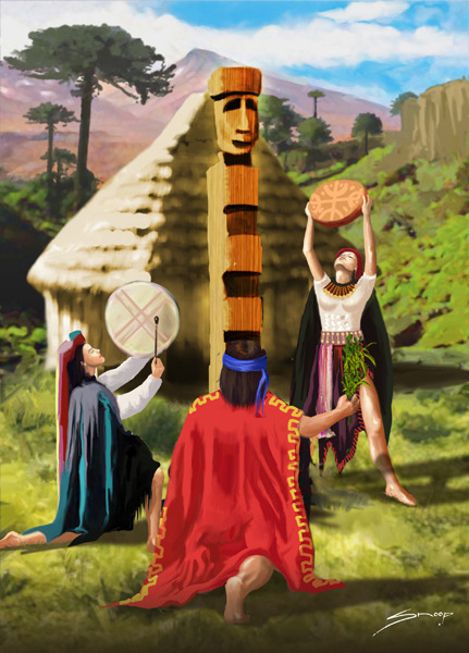
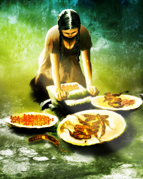
JCSnoop Deviant Artist
[Sample text] none of the images are mine.
Across all of the gathered art of JCSnoop, there is an absence of strong dark lines dividing the depicted subjects and individual peripherals. However, just looking at these, I remember that concept art is not just defined just by expressive wavering variations of line thickness. Splashes of colour that help bring out the shading and reflective light of all subjects present characters, objects and locations that the artist shows with emotional attachment. I personally am intrigued to imagine what it would be like to explore and interact with the subjects depicted.
[Templo Maya]
[FUENTE DE LA JUVENTUD]
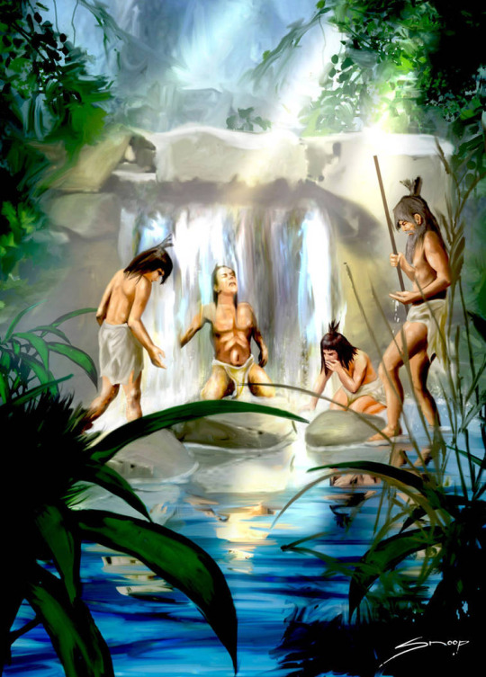
The rest of the illustrations were made by JCSnoop for the trading card Myth and Legend for SALO S.A.
[CHICHEN ITZA]
[Tenochtitlan]
[Fuego en el cielo]
[HERNAN CORTEZ]
[TOTEM]
[CEBIL]
I thought about the scant relevance that food is given in Action-role-playing-video games. There are survival games that make you harvest supplies to cook food, but I don’t think it is necessary for a feature like that to be made into a core aspect of game play to be relevant. I say this because most survival games look boring. Furthermore, if there is a way to flesh out food and it’s background lore in more action orientated games, I think it would be something like what From Software did with their Dark Souls games. The character you play as would know longer require food due to the fact that they are a particular brand of undead/’ashen one.’ I don’t know what I would do to implement food into my game without it being paramount to my characters existence.
0 notes
Text
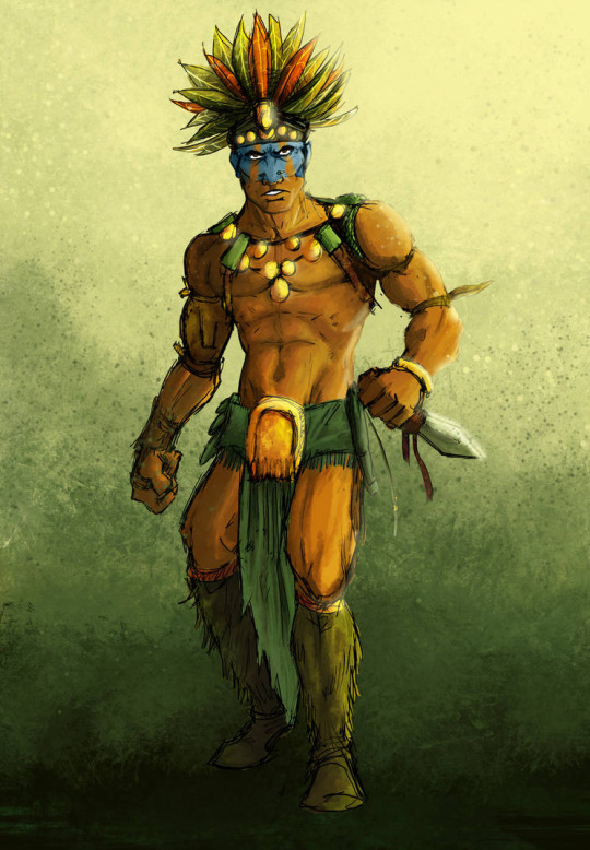
Deviant Artist AzadX
"We feel free when we escape - even if it be but from the frying pan to the fire" -- Eric Hoffer
[Concept for an Aztec Warrior]
[Concept for an Aztec Priest]
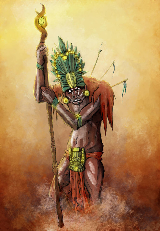
[Concept for an Aztec God] [Xipe Totec - The flayed one. God of the shedding of skins. God of seedtime. The elemental force of rebirth]
The use of lines and colour for these pieces of art would make good concept art for a video game. In particular, like how the Aztec god had more emphasis on it’s colour and lighting than the lines.This made it glow with mystical power, appropriate for a god. There seems to be a dependency on how subjects being connected to the mystic arts for their form to flow in an expressionist way. That is the lines and colours. The styling of the clothing a peripherals are not bloated or exaggerated, like say, in World of Warcraft.
1 note
·
View note
Text
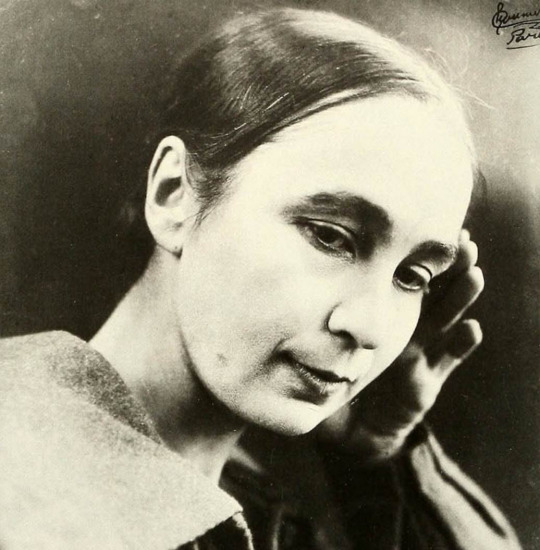
Natalia Goncharova
https://www.britannica.com/biography/Natalya-Goncharova - a non secure site.
[Innovative Russian painter, sculptor, and stage designer who was a founder, with Mikhail Larionov, of Rayonism(c. 1910) and was a designer for the Ballets Russes.]
[Segmented text]
[Goncharova’s paintings were heavily inspired by Russian folk art, popular woodblock prints(lubki), and medieval icons. She also experimented with Cubism and Futurism during that period. It was as a synthesis of those movements that Goncharova and Larionov], her life long partner, [conceived of Rayonism in 1912, an approach that sought to portray in two dimensions the spatial qualities of reflected light.]
https://www.theartstory.org/artist-goncharova-natalia.htm
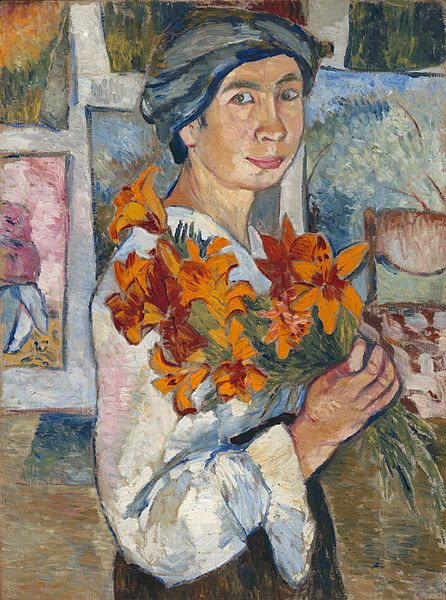
[Flowers recur throughout Goncharova's career, standing as the moment of the present, not for a time of growth or that of demise, but instead for life's incredible force of now. Flowers are a much repeated subject for modern artists, with Vincent Van Gogh and Piet Mondrian being two of the most notable examples. Whilst Van Gogh chose the sunflower as his signature bloom, Goncharova identifies instead with lilies. She also painted a Rayonist picture of lillies in 1913. The lily has long since had religious associations as the flower of chastity, as presented at the annunciation of angel Gabriel. This, however, was always a white lily and Goncharova chooses an orange alternative perhaps making reference to her own sexual experience. It does though seem important that the lily is a religious flower, for with intentions akin to those of Gauguin when he painted himself as The Yellow Christ in 1889, Goncharova also humbly presents herself as a spiritual figure on earth.]
To me the boldness of the flowers and how they stand out is a testament to the respect that Natalia has for nature. Furthermore her she was out going about her identity and the inspiration of powerful womanhood, something that these upfront orange lilies also signify.
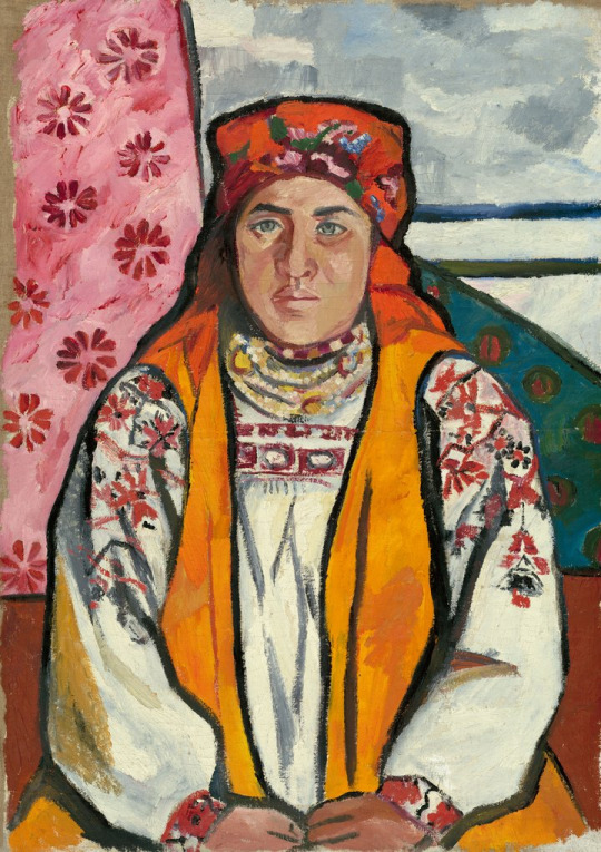
This one image is provided by the Tate Modern website.
I included it because I really liked the strong line work as well as the fact this simplified 2D effect does not detract from the impression of detail and life. Also I think that the style presented here by Natalia Goncharova, is one of the most suitable compositions for concept art, a career path that I am aiming for.
http://marlenelowden.com/bcd7/
[Her paintings portrayed peasants at work, cutting hay, shaving ice, washing, and weaving. She gave her subjects, mostly women almost religious statue and strength. She paired the secular with the religious and was criticized for it.]
[WWI began. She served in the army and was influenced by her travels to Rome and to Spain, where she met Picasso. After the war she continued to work with ballet and theatre productions and kept up with her painting.]
[During World War II she traveled and designed for ten ballets in South Africa.]
If there is a humble or tribal picture I find I’ll link it to the above text
Her later work is an exploration of abstraction, including a series dedicated to the Russian satellite, Sputnik.
[Quote: “ Decorative painting? Poetic poetry, musical music. Nonsense. All painting is decorative, if it adorns, beautifies.”]
0 notes
Text
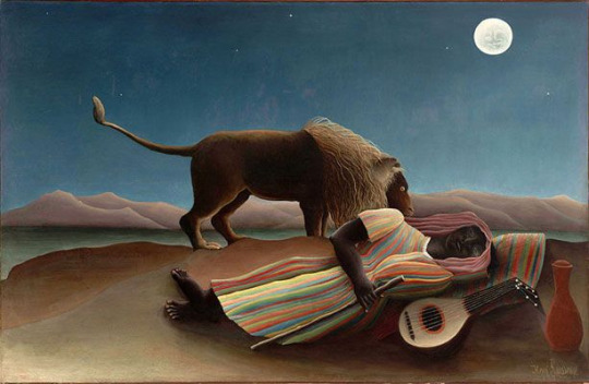
Henri Rousseau
https://www.theartstory.org/artist-rousseau-henri.htm
A french painter of post-impressionism.
[He was an average student, aside from receiving distinctions in music and drawing. Henri Julien Felix Rousseau became a full-time artist at the age of forty-nine,]
Quote by Henri - ["When I step into the hothouses and see the plants from exotic lands, it seems to me that I am in a dream."]
[Segmented sample text]
[Although he had ambitions to become a famous academic painter, Rousseau instead became the virtual opposite: the quintessential "naïve" artist. Largely self-taught, Rousseau developed a style that evidenced his lack of academic training, with its absence of correct proportions, one-point perspective, and use of sharp, often unnatural colors. Such features resulted in a body of work imbued with a sense of mystery and eccentricity.]
[This quality resonated with modern artists such as Picasso, who saw in Rousseau's work a model for the sincerity and directness to which they aspired in their own work, by drawing inspiration from African tribal masks and other "primitive" and traditional art forms.]
[Rousseau's best-known works are lush jungle scenes, inspired not by any firsthand experiences of such locales (the artist reportedly never left France), but by frequent trips to the Paris gardens and zoo.]
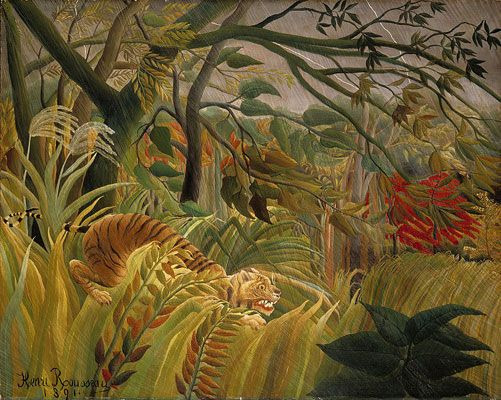
What I really like about Henri Rousseau’s work is the way that the impressionism is vibrant to the point that the subjects come to life within their respective atmosphere. Take for instance the painting - Surprised! Tiger in a Tropical Storm. I automatically visualize the intense swaying of the leaves, branches and grass due to their level of abbreviation, as well as the intensity of the tiger’s glare. This makes me want to create computer art with similarly subdued colours.
More and more of these artists are inspiring me to utilize a humble artistic approach for strong effect. The only difficult decision I have at this point is whether or not to employ art with a strong emphasis on dark lines. As I am aspiring to become a concept artist, I ought to take more inspiration from artists who employ lines with wavering degrees of thickness and emphasize the use of lines in my work. Perhaps I will mesh Henri Rousseau’s style of colour with James Ensor’s use of lines for my art as I progress forward.
0 notes
Text
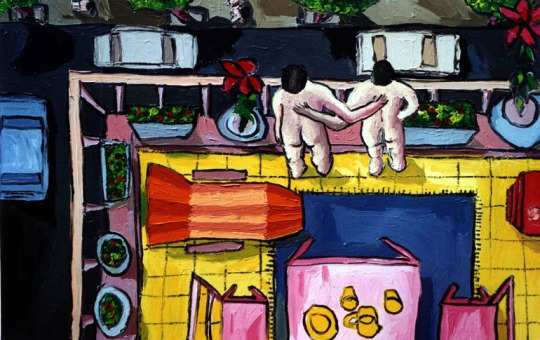
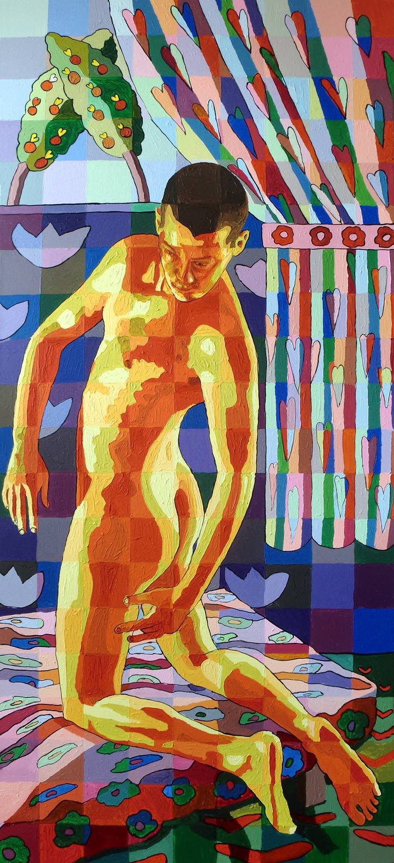
Raphael Perez
https://www.saatchiart.com/raphael
[Born in 1965 in Jerusalem, Raphael creates and lives in Tel Aviv IsraelPerez`s creations deal with the subject of homosexuality. He puts a strong emphasis on single-sex families, pride parades, soldiers, male birth giving, portraits, male nudity, as well as male, female and heterosexual couples.characterizing gay relationships and love as they are expressed in everyday life.]
From the images copied from the website linked, I found that his use of line and colour differs within gatherings of different art styles.
Below, the naive nature of of how Raphael depicts his subjects is seen more in pictures with lots of people in them. That can be discerned in the different ways people are depicted as unrealistic in form.
Exaggerated postures, wonky archaeological structures and carefree use of colour and shading gives this lighthearted visual a ‘children's picture drawing�� kind of vibe. Of course there is quality in the consistency of diverse yet self contained areas of colour. [inherently unrefined line work. Aside from that all the work
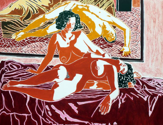
The line work here is inherently unrefined, yet highly detailed. There is a varied, if deceptive range of shading, even though there is no heavy contrast. The degree to which colours are played around with depends on the area of the picture. The foreground contains the colours, but the further back in the scene you look, the colours are applied less accurately. The logic of lighting applied here retains the trend of naivety.
The line work in particular reminds me of the drawings by Aztecs.
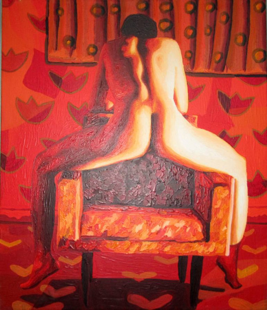
Here, the white lines blend well with the strong lighting, giving a sense that the light is reflecting everywhere and permeating the surface of all subjects present. Furthermore the sections of sheen on the hair and sheets is a natural opposite to dark shading, which is usually present in Raphael’s pictures. Said shading simply consists of a base preset colour for a dark room here.
The uncanny playfulness is shown in square formations defined by colour patches. This isn’t immediately notable on the person who’s neo-impressionist depiction is divided in squares by skin colour pallets.
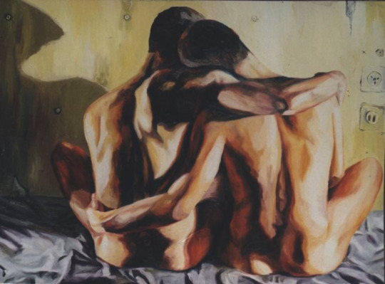
Here is proof of some of his more realistic work, only with mere hints of colour applied with an impressionist’s style.
This image reminds me of Aztec symbols. That’s because the style of the subjects do not make them as distinguishable as subjects in most other artwork. These abstract bipedal-looking beings appear to be viewed from sideways-on, which also adds to this.
0 notes
Text
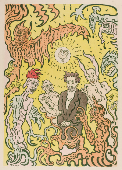
James Ensor and his Art Style
He was a Flemish painter engraver writer and musician. James painted realism, impressionism, neo-Impressionism and Expressionism art work.
Below are some of his works using those styles.
Impressionism
Neo-impressionism
His style consists of a playful use of lines and colours that define the subtle aspects of the depicted subjects.
https://www.theartstory.org/movement-expressionism.htm
[Sample text] [Expressionism emerged simultaneously in various cities across Germany as a response to a widespread anxiety about humanity's increasingly discordant relationship with the world and accompanying lost feelings of authenticity and spirituality. In part a reaction against Impressionism and academic art, Expressionism was inspired most heavily by the Symbolist currents in late-19th-century art. Vincent van Gogh, Edvard Munch, and James Ensor proved particularly influential to the Expressionists, encouraging the distortion of form and the deployment of strong colors to convey a variety of anxieties and yearnings.]
0 notes
Text
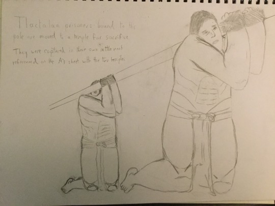
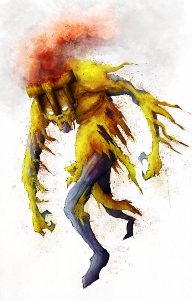
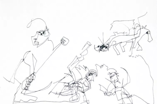
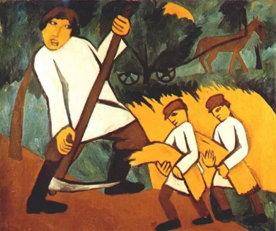
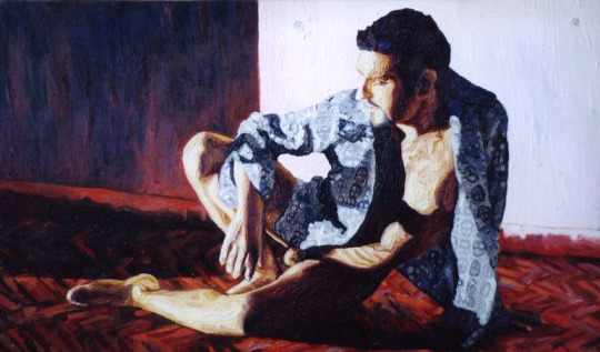
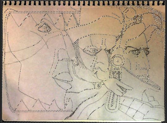
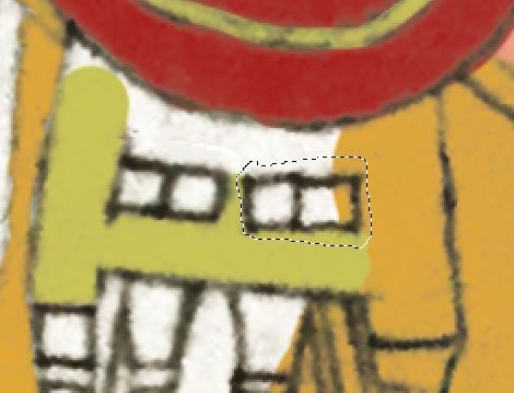
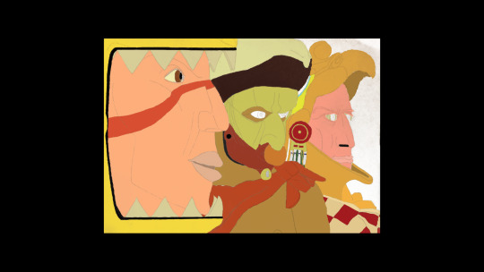
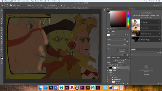
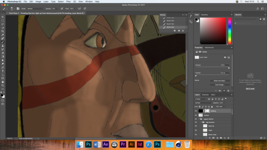
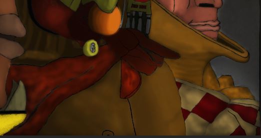
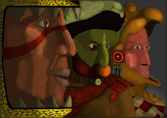
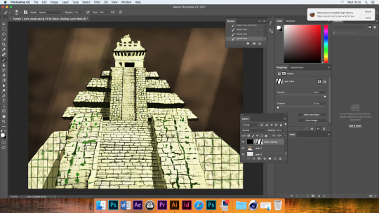
Prowling Warriors Piece
Subjects Captured
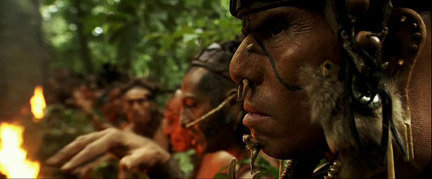
The way these Aztec warriors were captured mimics the way Apocalypto shot military Mayans sneaking up on villagers. It’s a tense shot where I can solely animate a flickering light source for good effect which was one of the reasons I chose to use the drawing to create this piece.
I really struggled to get the pencil lines to stand out using the colour levels feature due to the photography capturing less than ideal light sources. This left some irksome shading. Following the colour level alteration, adding more black and white disparity to the contrast feature, my Quick Selection tool was still thrown off from solely capturing the lines of my art. The persistent shading kept getting picked up too.
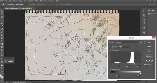
There was a trick that helped somehow. After using Quick Selection as best as I could and filling the lines with black, I dragged those over to a fresh Photoshop file. This mitigated the level unwanted shading.
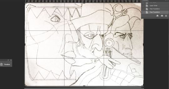
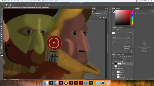
Past Methods
The use of the Magnetic Lasso Tool to make perfect layer masks was redundant due to the lines fading in places and not being so easily picked up. Also, tracing would have been a needless use of time due to my increased reliability in erasing mistakes and painting in corrections.
Tactic In How to Erase Effectively
The bigger any given coloured section is, among other sections, the better it is to have that higher in the layers panel. That way you only need to correct blemishes of the large spill of colour and you can splash with the majority of the lower level colours with less concern for correction - due to how inaccuracies are covered by content above it. All the while, there is less switching between layers to fix mistakes.
On my drawings there were perspective based mistakes. I corrected these using the Lasso Tool and the Free Transform Tool
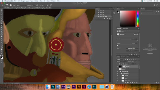
I would only feel content replacing any drawing lines with digital ones if the lines looked as authentically faded. The Dry Brush Tip Light Flow for the paintbrush was the way to go.
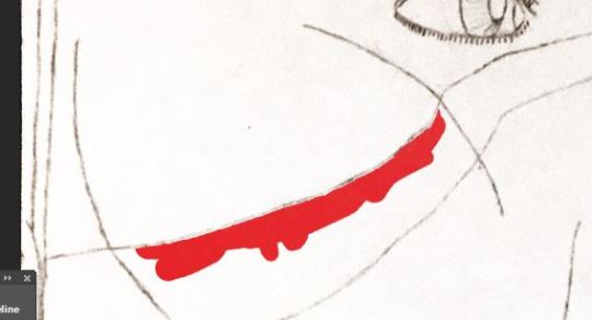
I realized that the composition of my drawing did not entirely make sense. This was due to the drawing of the scarf belonging to the right warrior. It’s visual extended left to the point where there would not be enough room to complete the middle warrior details. That’s why I erased the colour and lines where appropriate and created new ones.
The choices of colour referenced directly, the Pinterest pictures with the very warriors being created.
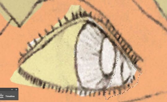
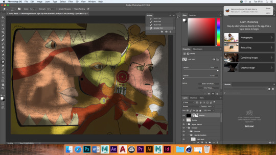
As you can see below, removing the visibility of the drawing lines gives this ethereal energy to the subjects. The only issue is that as of the moment, without shading, there is too little sense of depth. I would also need to create fresh eye brows for the warrior on the right as those where defining characteristics of the drawing and therefor this final piece.
Shading and Lighting
After giving all individual areas their base colore, experimentation was done on a separate layer to see what means of applying lighting and shading was easiest to grasp, and also quick too. Initially, I tried equipping a soft edged paintbrush tip with black paint, set to low opacity. This allowed me to stroke subtle shadows within the face and clothing shapes. However I remembered that the environment captured was going to primarily be dark. Therefor, in such a place where shadow is omnipresent, it makes more sense to plaster the spare shading layer with a black Paint Bucket. After lowering the layer’s opacity to 41%, I give it a layer mask and made strokes on it that where opposite in contrast. Touching on areas of the face that where going to be lit by a torch, there where fewer areas to tweak than their would have been if I had continued applying lots shade to an already lit picture.
On the layer mask for lighting effects, I messed around briefly with a Mixer paint brush. It was to see if any effects could be put to good use. I had no firm idea of how to integrate it in a seemly manner however, so I left the Mixer brush alone.
(I won’t leave the cross out feature in) Upon testing the lack of drawing lines again, I see that it would have benefited me to save the quick selection of the hand drawn lines. That way I could have simply lowered their colour to the gray of the remaining ‘photographic’ shade. Instead, the stark white of the background showed through the line shaped gaps.
I give all the hand-drawn lines a lighter.
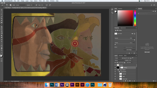
Thoughts on Warrior Piece so far
I have applied a 3D effect with the use of the shading alone. But I think I can still get that heavy contrast between light and dark just by altering a the contrast slider. This would thematically suit the story because there are supposed to be torches held out in front of the warriors faces at dawn.
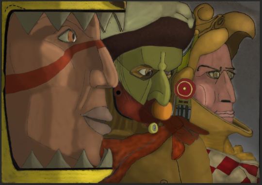
I consider this a form of stylized neo-impressionism as I have used semi-effective shading effects while retaining the lines for both the outlining and subtle facial features. It seems awkwardly implemented for the cheek bone of the right-side warrior however. I could have erased that line, with the only negative effect being it would have left that lack of sync with the gray shading in the hand-drawn lines-layer. I considered treating that as a battle scar for that ‘eagle warrior,’ but it also would have been awkward if an implicated scar just so happened to curve over the cheekbone exactly where the light was meant to rest on.
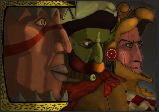
Checking with a tutor, it was made apparent that the lip structure of the predator-cat-warrior was not authentic. Furthermore there wasn’t an impression of the created lip’s right side curving around the face, out of view.
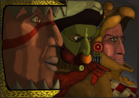
Without the lines their is a nice sense of impressionism, however I think that is better for a visual of wide scenery than a close-up of subjects. That’s because the finer details which would not be up-close details are made as an ‘impression,’ for a lack of closer detail. I could have settled for this unlined, impressionist style if I had applied more intricate shading on the whole, as well as fine tuned the edges of the colour so that they did not leave little white gaps. As was the case last year, time pressure was an issue and the main reason for this.
0 notes
Text
Mudbox Experimentation
I tried this some time ago...but it didn’t work out.
My aim was to see how speedily and artistically I could create a 3D model of a Meso American in Mudbox, with their attire made in Cinema 4D.
What you see here is an accident involving what I think was the ‘binding’ sculpt tool. I liked how it looked though, as there are genuine historic accounts of practices that promote extra growth of the skull. People believed this made them smarter. I’ll get back to who in due time.
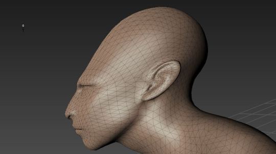
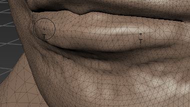
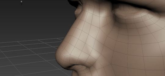
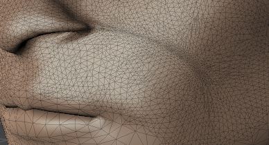
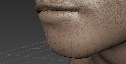
Upon transferring the Mudbox sculpt to Cinema 4D, the textur became metal-like. Had I been more confident with the shape crafting facilities of Cinema 4D and Mudbox, I would have fixed this issue.
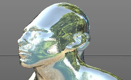
I really like how the shape of the head was taking form, particularly what kind of structure is formed when a rounded head ware is worn on a subject with regiment induced head growth.
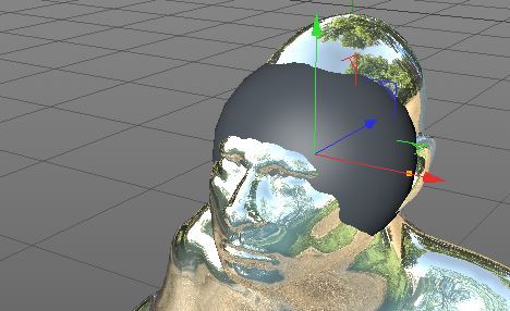
In hindsight, I may have spent far less time on shaping the face if I had referenced sketches of a Meso American’s face. That said, I was repetitious of delving into technology that I simply couldn’t grasp effectively enough, primarily due to a lack of practice. This was an interesting experiment and I wish to delve into 3D art in the future to come up with gritty realistic models in the future. The reason for that is due to my adoration of highly detailed collector edition figurines of characters and items from video game franchises.
0 notes
Text
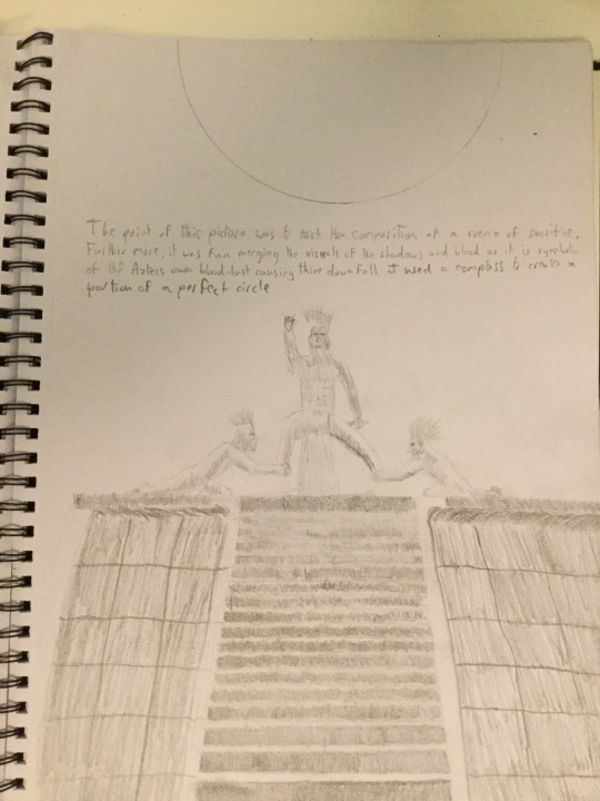
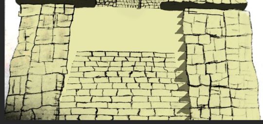
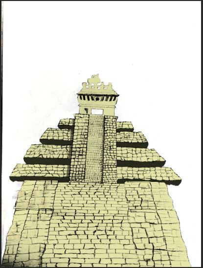
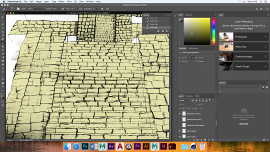
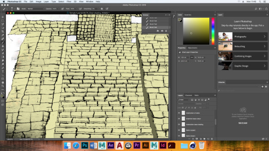
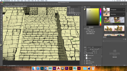
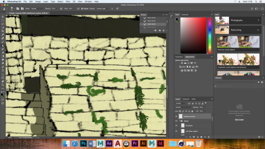
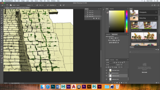
Aztec Temple Piece
I knew that I wanted to create something that delved into a fantasy aspect of Aztec culture - a temple, in this case. The cultural reference would be the mass sacrifices of freshly harvested human hearts. The fantasy aspect is that temples serve a highly spiritual purpose - it allows people to commune with their higher elves.
In the case of my story, communion can allow someone to alter the metabolism of their own race in the entirety, causing certain behavioral traits to be rejected violently by the body. This comes in the form of parasite eruptions and mind control induced berserk rage. The requirement however, is for the participant to align their spiritual vibrations to that of pure energy, dissipating in the process.
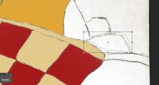
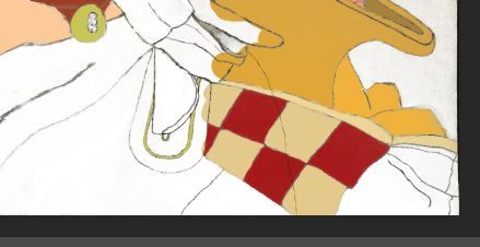
Below is my hand drawing, having been converted to Photoshop and made to heavily contrast with a white background. This was done via a combination of using the colour-levels-feature as well as the quick selection tool. With the stark dark lines remaining, they will keep the form of the temple bold along with the ensuing vibrant colour.
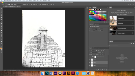
I hadn’t decided what the sky was going to look like, only that I wanted my temple to be hit by a strong light. The reason; the lines that I have drawn are of an impressionist style and their capacity to compliment subtle lighting and shading was questionable. That was why I decided to have very dark shading, so that even the cracks and crevices can be made really dark, making them stand out and exposing the details more clearly. The base colour I chose for the sun coated parts, was based on the image that I referenced for drawing the temple.
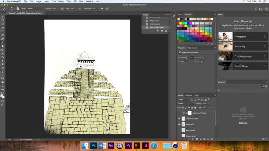
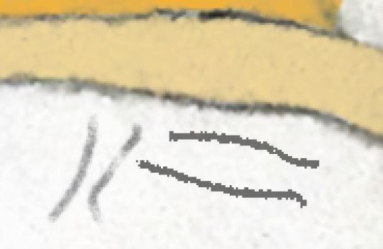
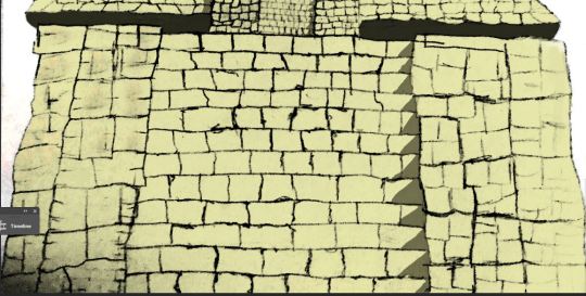
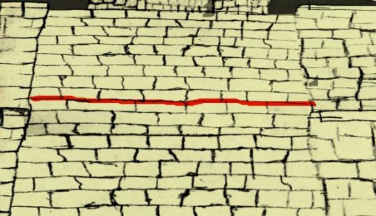
It was pointed out by a tutor that these stairs lacked a sense of depth. The recommendation was to divide the stair drawing from the rest my lines using a Lasso Tool, before using the Free Transform Tool to squish and distort that detail. That was then copied and resized to fit authentically with itself.
0 notes
Text
Love, Death & Robots
For each episode of Netflix’s Love, Death & Robots, there is what seems to be a fruit machine style spin for three random symbols. The chosen three represent the story of the episode.


0 notes
Text
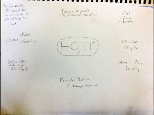
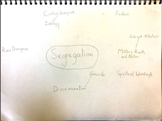
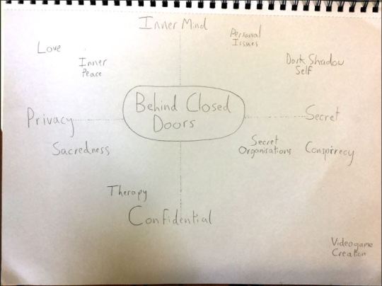
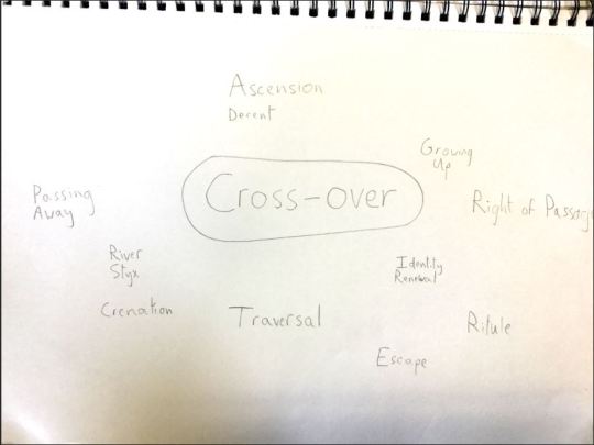
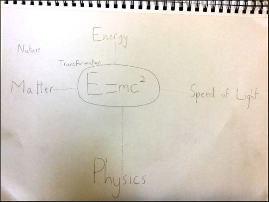
Spider Diagrams
Each of the spider diagrams represented one of the 5 chosen themes that inspired research and artistic creation. More ideas branch from those and where more easily focused on more easily focused on.
0 notes