
Don't wanna be here? Send us removal request.
Statistics
We looked inside some of the posts by fmp10-ns and here's what we found interesting.
Average Info
Notes Per Post
1
Likes Per Post
1
Reblog Per Post
0
Reply Per Post
0
Time Between Posts
2 days
Number of Posts By Type
Text
17
Last Seen Tumblr Blogs


Fun Fact
US Tumblr user growth rate is estimated to slow down to 4.1%.
Text
Character sheets
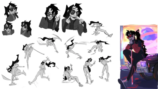
For the final part of this project, I designed the character sheets. I made six in total.
Before I actually started the sheets, I made some detailed renders for them. I’ll admit that they’re not the best, especially in terms of how I executed dynamic perspective, but I made these pretty late into the project so I couldn’t do major altercations.

Then I started to lay out the sheets. I wasn’t quite sure sure if I should include the wedding outfits for Nour and Asterios, but It’d degrade the quality of the main outfit turn arounds and would look out of place with the other characters, so I made a separate sheet for the two outfits. After that idea, I needed to figure out the right layout to fit the rendered and turn around versions in. I went for something akin to the 4th sketch. I managed to make both boarders work but the rendered characters had to be either warped or downscaled to fit in.


Then I went wild with my artist staples, cause if I couldn’t do it for the characters why not for the character sheets? I added in a gradient and patterns that correlated with each character. I also added in descriptions for the top part of the turn around boarder since this is the only way to showcase personality, story and character names. I did keep the boarder blue for all characters so your eyes are drawn to it first, but I made the backgrounds for the turn around different so nothing blended into the background too much.


As for the wedding outfit sheet, I did the same thing but with a boarder that could fit both turn arounds. I also added a frame just for a more regal look and made the whole thing grey to fit the wedding theme.

0 notes
Text
Poster
So…The poster. This took me 10 hours due to the line art and that makes me want to cry.
Anyways, I wasn’t inspired by any actual movie posters because I really didn’t feel like doing the research (I already did a ton for the characters alone let me have this) so I just came up with something. The ideas stage was super barren and nothing went past a proper sketch, until I stuck with the falling idea. Why falling? It’s about falling deeper into a pit you can’t escape from and represents death. The fact that I did these poses without reference is comical though, and I constantly forgot details because these designs are insane.
For the colours, I decided to take the base characters and use the gradient tool to give them a specific palette related to the sun and moon. I think this was a good choice in terms of ambiguity and representing day and night without any of the actual motifs.
As for the other elements, the boarder is one I found on Ibispaint’s free gallery and altered; the square look just made sense for Egypt and Greece, and I coloured one part gold and one part silver for…You already know. The background was hard to figure out because I didn’t want it to distract from the characters, but I also wanted it to have some complexity so I went with a dulled out skybox.
The font…It’s weird that a FONT had so much emphasis in this entire project and I still don’t know why. And I bet you thought I’d choose a font that looks stereotypically Greek/Egyptian, but that’s corny. I ended up going with a font called Tupo Vyaz mainly due to how the V looked and it being a very readable font. For the colour, I made the font bronze to contrast


0 notes
Text
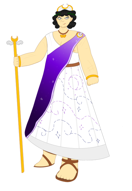
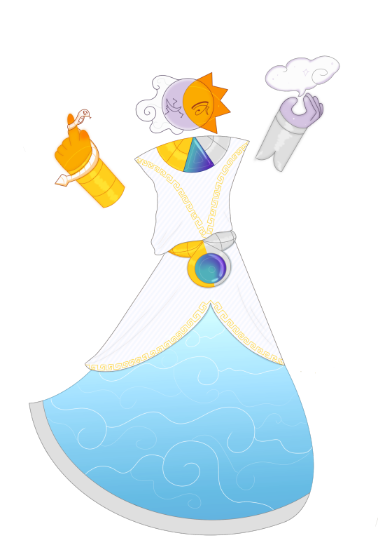
Character design: Biplexus
The final character I designed was Biplexus, the fictional god of the sun and moon cycle. The reason why Biplexus is fictional is because I felt like creating an entirely new god would not only let me stray away from needing to being entirely accurate to both Greek and Egyptian history, but also it’s an interesting concept and story. Their name is Latin and is a combination of “Bi”, meaning two, and “Plexus”, meaning intertwined, so Sun and Moon intertwined, so solar eclipse.
Now, the way I portray godhood is…Unconventional. You'd think I'd go the route of portraying them as a human, but I didn't and never do when it comes to drawing fake gods. It's because portraying gods as humans, well, humanises them, and Biplexus is barely human besides being humanoid and having human thoughts. They are an element, a protector, someone who simply wants to keep time moving and is nonchalant otherwise.
They don’t even have a moodboard, I simply took outfit elements from both Ancient Greece and Egypt to make up their outfit. In initial sketches, I wanted their outfit to be split between the sun and moon parts, but I decided on combining elements instead and only splitting the use of gold and silver. The gem they have on the necklace and hip piece is Alexandrite, a gem that changes in colour based on lighting, with blue in daylight and purple in iridescent light. I couldn’t fit in much Selene motifs because she really isn’t anything special in comparison to Ra, so I had to turn to the generic geometrical Greek pattern…Unfortunately.
Their face has two different eyes, with the sun having the eye of Ra and an outline of a bird, and the moon having a cloud and constellations on their eyes.


That’s Biplexus. It’s funny that this is one of the simpler designs in this project (Damn you Nour and Neferure…), but with more freedom, they were extremely fun to design and draw.
0 notes
Text
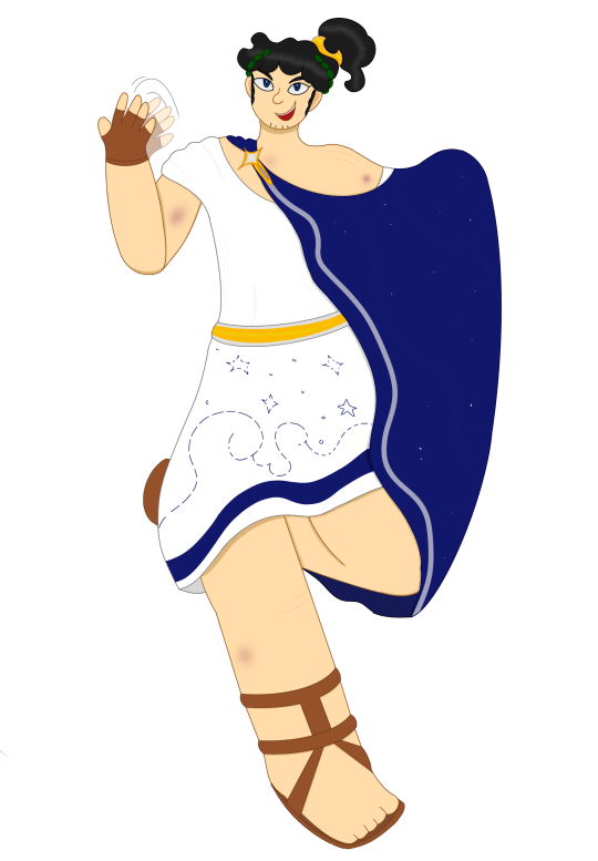
Character design: Fengari
The near final character I designed is Fengari, the ruler of the Duskura kingdom. As someone who does not care for older unfashionable men, trying to make Fengari fit my vision was hard. I didn’t even give him a backstory or anything to help out with anatomy and the such, but I ended up settling on how he used to be a dangerous yet smart hoplite who lost his tendencies after becoming an emperor and father. Neferure does still have a brash nature on some occassions and pride in her accomplishments but Fengari not so much. His name is a literal translation of the word “Moon” in Greek and is also the name of a mountain.
Once again I chose to reference a board I had overall.

I’ll admit that Fengari is the least inspire and interesting of the designs, but considering his humbleness and laid-back nature, that’s kinda expected. He originally was meant to have a chiton with sleeves, but I decided against it because it kinda made him too frumpy. His chiton hangs on the opposite side of Asterios’ and is less loose, portraying a more in-line nature. His main colour is purple to represent royalty and he uses Asterios’ blue in one of the patterns on his chiton. His chiton and chlamys both have more complexity.
Another thing is the masculinity aspect which…It’s not that I’m bad at designing masculine characters, but I thought making Fengari look soft with light battle scars made sense for him.
I gave him two gold bracelets and a single ring purely for accessories showcase, and his necklace has wings on it in reference to Selena’s travels through the sky. Speaking of Selene, his moon piece is larger, has stars on it to connect to Asterios and is a comb rather than a hairclip.


So that’s Fengari. I kinda skimped out of him in honesty, but eh. Every character design project is gonna have a weakest design.
0 notes
Text
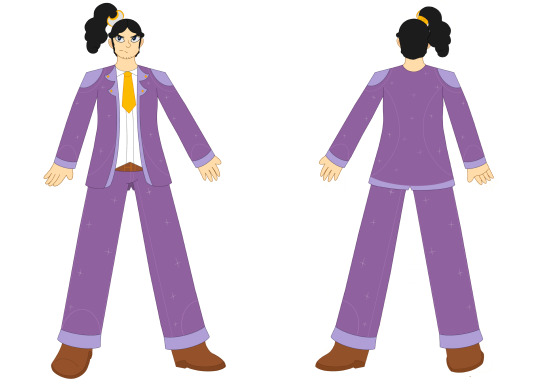
Character design: Asterios
The third character I designed was Asterios, the prince of the Duskura kingdom and another protagonist. He’s similar to Nour in that he’s the opposite of his Kingdom’s general culture, being more rowdy and adventurous compared to h more streamlined and peaceful ongoings of Duskura. His name is Greek and means “Star” and has roots in mythology.
The moodboard is once again done only for historical reference.

Asterios was simpler to figure out compared to Nour and Neferure. With the art style established and Ancient Greek fashion being far simpler and focused on convenience, he was a walk in the park. Picking out the appropriate outfit was the hard part. Ancient Greece has a ton of different clothing pieces that can be used with different purposes. Overall, I decided to choose this traveller's outfit from a book on Ancient Greece, which consists of a chiton and chlamys, as I felt it represented Asterios' nature. The chlamys is by far the most striking this on this design to due volume and how dark the colour is with the rest of the pallets, and it also connects to the chiton. Since Ancient Greeks could embroider designs into the clothing, Asterios has a design with clouds and stars, and Fengari will have this too. I really wanted to use a ton of silver to contrast Beamia's reliance on gold, but gold was also heavily used in Greece, but I still think it fits as people see the stars and moon as either yellow or white. His main accessories are a star-shaped fibula, his head wreath, cheirides (which are leather gloves that were only worn for work and have no documented appearance so I made-do, and I think they fit him very well), and most importantly, his moon-shaped hairclip, a reference to Selene's headpiece.


His wedding outfit has similar incept to that of Nour's. His outfit really didn’t have that much reworking, but both versions contrast his original outfit as true with Nour, though his suit looks far more modern than Nour’s gown. His hair is also more tied back and has a larger hair clip. I might still do some altercations on both designs, but only slight ones.
I also intended for the wedding outfits to make the two more mature visually…And yeah, Asterios looks older here for sure.


0 notes
Text
Personal history research: Marriage culture (Historical + Current)
Ancient Greece
In Ancient Greece, most marriages were arranged by either the family of the bride and groom or the father, or any associate man, of the bride. The parents would pick brides and grooms based on factors like skills and fertility, and also consider political factors such as alliances with the family of the couple or business expansions. While most girls would be married in their teens, men would marry in adulthood.
The two most documented cities, Sparta and Athens, had different standards of weddings. Sparta was most focused on public image and childbearing rather than the actual relationship of the couple, and you could face charges if you married too late or in an unstable manner. If the couple could not have children, the wife had the right to marry another man. This was established so the city could have a thriving and strong population. Athens on the other hand was less strict. As long as the bride and groom were both single and born as citizens of the city, they could get married as the children would also be Athens citizens. Those who were not born in the city would not have their wedding officiated.
Weddings would take place in the Winter due to Hera, the goddess of marriage, being associated with the season. Athenian wedding celebrations would last 3 days with separate events: Proaulia, the day where the bride would spent time with female relatives and give gifts to the gods, Gamos, which fears the day the marriage happened and would start with rituals, one that consisted of a nuptial bath the bride would do and offerings from her and groom to the temple before being wed, and Eqpaulia, a day of celebration and gift giving. Spartans, on the other hand, would make the brides look like men and plan with the groom when he could sneak into a room she was in and carry her to bed, a cycle that was meant to happen often.

Ancient Egypt
In Ancient Egypt, emphasis on love and person comfort was expected from both sexes, primary the women but the men were also considered, and marriages weren’t seen as a big deal. Certain families would try to connect their brides and grooms together for solidarity, but a lot of couples, mainly poor ones, would decide to move in together as a show of marriage, but there was still stuff like contracts for annuity and offerings for the bride from the groom as a show of affection. Considerations of linage and affection made sense due to how short Ancient Egyptian lifespans were.

India
One of the most well known things within Indian culture is the importance of weddings. Due to the vast culture of the country, different states, religions and castes celebrate wedding in ways traditional to them. Hindu weddings are the most documented and well know, primarily due to their colourful and maximalist nature and the fact that families will spend a good fortune to make the wedding perfect and to sustain those invited, in which the guest list goes up to the hundreds.
The pre-wedding event starts with Kanyadaan, in which the father of the bride "Gives away" her to the groom. Then there's Panigrahana, in which the bride n groom hold hands in front of a fire to signify longevity and new beginnings. Then there's Saptapadi, the par where the marriage happens the the two say seven vows/promises so their marriage prospers. There's also some more down-scale ceremonies like Mehndi, a ceremony where henna is applied to the hands and feet, usually of the bride’s, as decoration, staying close to tradition and for anti-stress benefits.
Arranged wedding are still common in India, though they've been falling out of popularity, due to the connection idea and that in a wedding so expansive, everything has to go exactly as planned.

0 notes
Text
Personal research: Ancient Greek fashion
General clothing
In Ancient Greece, clothes were more designed for practicality rather than showcasing power. While there are a lot of different clothing pieces, the most common pieces were the chiton/peplos, himation and chlamys, which went over both garments as a cloack. The clothes you wore however determined your status, for example, the cento, a garments made from stitching various fabrics together, was worn by the poor and slaves, while the Xystis was worn at festivals an by powerful people. Certain clothes were exclusively worn by people from different cities/countries, like the Aphabroma, which was worn by Megarian women. While most clothes came in a single hue, which also determined status, people would also embroider designs into their clothes.

Accessoires
The most common accessory was the fibula/porpe, a clasp which held clothes in place alongside belt and sashes. In footwear, the Greeks has a lot of options, but most would wear sandals made of leather, though more tough shoes and boots would be used of certain jobs and harsher weather conditions. In hats, the men would wear them for protection while the women would wear them for decoration or holding their hair up. There was also Cheirides, fingerless gloves worn for work.


Make up/Jewellery
Make up was used by men and women in Ancient Greece to enhance a natural, fair yet pristine look. They would primarily use natural resources for make up, such as using vermillion for rouge, but the concept of make up as we know it was quite stabilised, including perfumes and oils.
Jewellery was the most common way to showcase wealth. the wore the usual; earrings, brooches, necklaces, bracelets etc. Both silver and gold were valuable, but gold seemed to be the more popular choice, and other gems such as peals would be included in necklaces. Jewellery would often depict images in relation to gods and would be passed down to a newer generation in a family.

0 notes
Text
Personal research: Selene
Selene, also known as Mene, is the Ancient Greek God of the moon. She is the daughter of Hyperion and Theia, and sister to Helios, the God of the sun, and Eos, the goddess of dawn. Before being adapted into Greek mythology, Selene was known as Meh and was portrayed as male, though this changed in Ancient Greek due to how gendered terms worked and the moon was referred to with feminine terms.
Selene is often portrayed as a beautiful woman with wings, which most interpretations opt out of mentioning or showing due to lack of interest in her as a goddess, and a crescent moon over her head. Her pastime was spent riding over the heavens in her chariot similar to her brother Helios.
As stated, Selene as a goddess was somewhat unpopular and was overshadowed by the other female gods. In most stories she amounted to a one-off or side character, though she did have popular stories to her name, such as the story of her affair with a mortal named Endymion, the son of Aethlius who was punished by Zeus to eternal sleep due to being in love with Hera. despite her lack of relevancy in the pas, she has become more recognisable and iconographic mainly due to her crest headpiece, and is intertwined with the Roman goddess of the moon, Luna.


0 notes
Text
Project ethics
So, ethics….I can’t speak in the sustainability side of things because I’m not using natural resources at all. I use my IPad for basically everything art related only use a computer for stuff like Photoshop. It’s why I bought one in the first place, cause drawing on tiny phone isn’t good enough, and I sure as hell ain’t using AI cause I’m not supporting something that’s actively messing us up further than ever before. Cultural ethics on the other hand? Ohhh boy, when your project centers on two different historical cultures, you’re gonna have something to say.
I already stated my idea from the project stemmed from nowhere, and that is true since I barely care about history, but that doesn’t I won’t put the effort in. It’s hard with this kind of project though because there’s a basis in reality and fantasy simultaneously, so I needed to figure out wether I was taking away too many cultural factors to replace with the “It’s fantastical” excuse. The clothing for the characters was by far the most important thing to nail down, and it’s something I’ve seen designers not consider much at all, even if their concept centres on history. Usually they just lean into stereotypical depictions without much variation. And DON’T get me started on artists using cheap Halloween costumes as reference for historical clothing.
But as you know, I’ve made mood boards purely to document historical clothing. When it came to Nour and Neferure, taking creative liberties with them without going too far in the “costumey” or “impossible for the time period” was somewhat tricky, but I really wanted the both to look royal and beyond the scope of the kingdom’s inhabitants. I know that sandles weren’t commonly worn by Egyptians nor did gauzes have any other colour than white, but it completes their look and makes them unique…And Asterios and Fengari? Thank god the Greeks were practical because being accurate with them was super easy.
The characters’ fashions for this project aren’t 100% accurate mainly to signify that Beamia and Duskura aren’t the actual Egypt and Greece and that they exist in a fictional world similar to Earth. It’s also why Biplexus, the god the two kingdoms worship, is entirely fictional and doesn’t look human and why the sun and moon aren’t personified like in Egyptian and Greek mythology. I still did consider historical factors for the characters though, mainly how Hatshepsut, a female pharaoh, was a warrior before taking rule, which inspired Neferure’s story, and how Fengari was a Hoplite before becoming an emporer as gladiator fighting became outdated in the Classical period of Ancient Greece, which is the period Duskura takes primary influence from…Though if this project were to ever go beyond this scope, I’d definitely include some of the more controversial things from history. Not everything per say, but some important factors that would make both kingdoms look flawed as the story progressed.
0 notes
Text
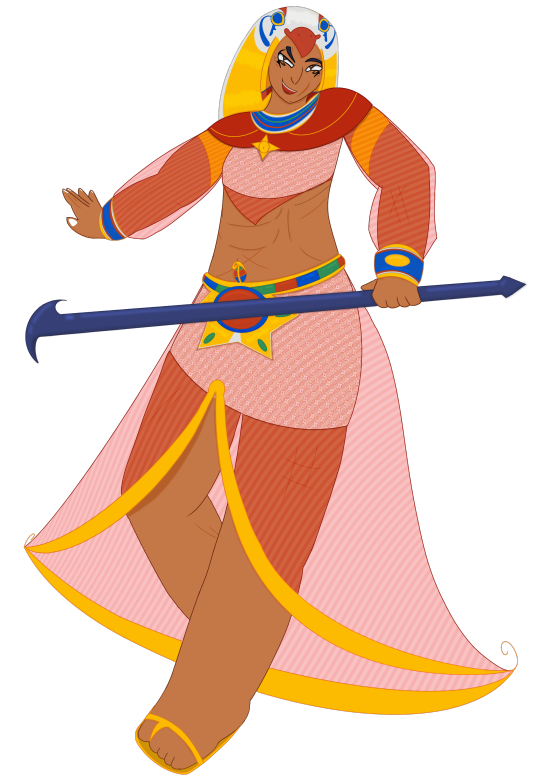
Character design: Neferure
The second character I designed is Neferure , the pharaoh of the Beamia kingdom and mother to Nour. As I said in Nour’s development, Neferure more fits into Beamia’s colourful culture and is more adventurous (Even being a warrior at one point before becoming a pharaoh). Her name is an Egyptian name meaning “Beauty of Ra” and was also the name of a princess in the Eighteenth Dynasty (Though this has no coronation to this character).
Her moodboard has less going on compared to Nour’s, but I already out all the important references in Nour’s board, so I chose to reference that one overall.

Neferure’s overall outfit composition is similar to that of Nour’s, but in my more grand sense and heavier use of red, orange and gold, as well as more imagery associated with the sun and Ra. The contrast motif is VERY imbedded into this whole project if you couldn’t tell.
While I did not use her initial sketch, I only used the initial sketch for Nour, her design stayed fairly consistent through and through, with the colour choices once again being the main culprit in her design taking a while to finalise. Neferure’s clothes are similar to that of Nour’s but with far more Ra and Horus connections, from the falcon nemes, her headpiece, to the bigger accessories to the sun disk on her hip piece. Even her gauze has a tail at the end to resemble feathers. She’s trying her damn hardest to prove to Biplexus that she is royal to them. Her design is also a lot more complex for obvious reasons. I’ll also mention the geometric patterns here since I didn’t in Nour’s post; they only have this so their kalasiris didn’t feel barren, and with Neferure, her gauze has a stripe pattern since stripes were associated with wealth. Nour has these too but not to Neferure’s extent.
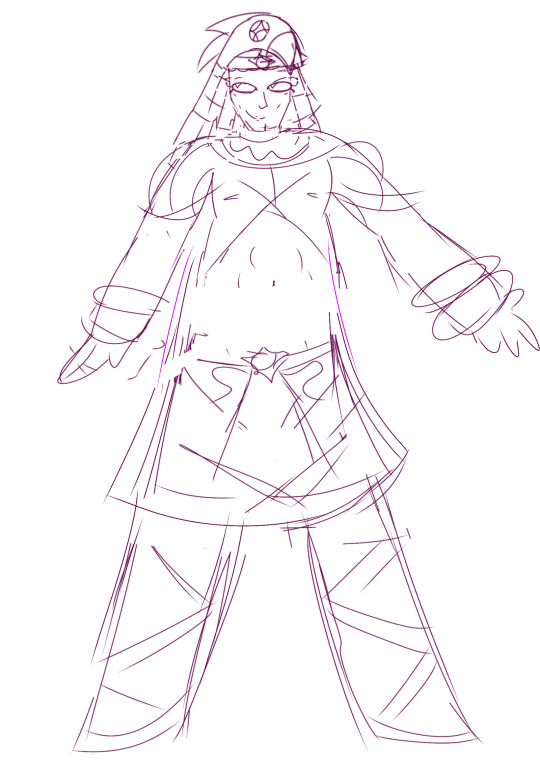


For the body, I used this reference of olympic champions, and if you’ve studied body muscle there’s a chance you’ve seen this image. It’s a really good presentation of different body types and how they’re related to the Olympian’s specialty. In this case, In chose to reference Tara Nott for the weightlifting aspect. Neferure spent a lot of time fighting in deserts, I think she’d have worked a bit of muscle up. I’ll admit that the way I draw muscle isn’t very well showcased as finding a balance between looking regular and not too over-exaggerated is kinda a hassle in a style that has rectangular arms, but I tried.

If there’s one area where Neferure was complex though it’s definitely consistency. She had a ton of reworking I had to do, and I would redraw her entirely if I could. In a flat art style, polish is EVERYTHING, but with a design as complex and experimental as this one I couldn’t really go back. There’s a chance I’ll add some stuff once I get to the characters sheets though.
For some reason, I’ve come to really like Neferure. I think it’s just because she’s the most maximalist design I’ve ever made and I like the personality I’ve given her, but unfortunately drawing her was low-key hell.

So that’s two of the most complex designs out of the way. Every other character should be easier to deal with.
0 notes
Text
Character design research: Over the Garden Wall
Over the Garden Wall was a cartoon series created by Patrick McHale for Cartoon Network, and it’s regarded as one of the best and most creative cartoons of the modern era. Here I’ll be looking into the character designs of some of the characters.
Starting with Wirt and Gregory, our protagonists. Wirt is the older brother, so his main idea was to make him look mature and cautious. His hat looks a gnome hat, fitting into the fairy tale setting, and his poncho resembles a pea coat, which were worn by navymen, which sorta ties to Gregory’s old design, but were a common coat back then. The two garments are contrasted in colour but ultimately are dull in tone, and they’re both triangle shaped. The way triangles are used in this design are used to represent maturity and being sharp-eyed. Wirt also wears overalls to show that he’s not as mature as he thinks he is.
Gregory, being the younger and carefree brother, has more of a silly appearance. He wears a kettle on his head, which is unconventional compared to your usual saucepans for headgear and fits his head-on nature. He also wears overalls, but he has a sachel as opposed to a coat, and they’re more puffy and short to show youthfulness alongside his rounder features. He also uses green to contrast the red in Wirt’s design.
I can’t comment on the Frog, but I can comment on Beatrice. She’s standard cartoon bird hair, but I like how pastel her colour pallet is and how her humans forms looks due to it. The dress even has layers to represent how her wings have two shades of blue.

Onto the Woodsman. With his dark clothes, axe and lamp, he comes off as mysterious and possibly dangerous, but his features are rounded out and slightly squarish, which in shape language represents protection and trust. The lamp and how it’s a deep bronze colour also stands out, as it should as it’s very important to the Woodsman’s character,

I’ll also mention some of the one-off characters, like the Pumpkin villagers from the first episode. The clothes and general culture of the villagers is reminiscent of Amish villages of the past, which also kinda explains the cult-like behaviour they exhibit. They also look scary with their hollow eyes and mouths, even when they emote they just look unnerving. Then there Enoch, this tall figure propped up by vines with a head that isn’t quite a pumpkin. It’s nonsensical and unfamiliar, bringing out the best qualities of the show’s horror.

I also want to bring up Endicott and Margueritte, purely because I love character duos with heavy contrast. Endicott looks clueless and frumpy with how his jacket is unbuttoned except for the button at the top, how large the collar is and how his bow tie isn’t in place. The use of red here is to represent wealth as his design is based on Victorian aesthetics and red was a rich colour. Margueritte is the opposite if him, she’s a lot more put together and elegant, her outfit and accessories are better coordinated too. Her outfit uses blue to contrast Endicott and as a reference to a Marie Antoinette painting.

I will admit that makes Over the Garden Wall special aren’t inherently it’s character designs, but it’s atmosphere and backgrounds. Seriously, the backgrounds in this show are another level of breathe-taking and the premise really makes this show work. But the designs aren’t bad, not at all, and they fit the world perfectly in their simplicity and historical clothing.
0 notes
Text
Character design research: Overwatch
I was asked to look into Overwatch’s character design. While there unfortunately are no characters who are Greek, there are two who are Egyptian. I’ll also look at two random characters. I’m also only looking into the first game since that one has the superior character designs.
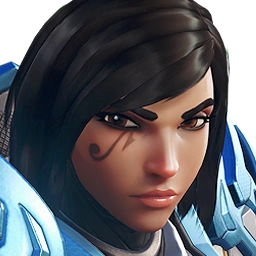
Pharah
Pharah, real name Fareeha Amari, is a hero who descends from another hero in the team, that being her mother Ana Amari. She is of Egyptian and Canadian descend and is a dedicated warrior who bounds to protect the world from chaos as her mother did. Pharah’s main connections to Ancient Egypt come from her Udjat, or the Eye of Horus/Ra, which connects her to the powerful Ancient Egyptian gods, which is why she’s known as Pharah as Pharaohs had close connections to the sky gods, and also means protection. Her armour is mainly blue in with gold accents in reference to Horus due to the sky connection . Her helmet resembles a falcon head, and this most likely is in reference to Horus/Ra’s depiction in murals.

Ana
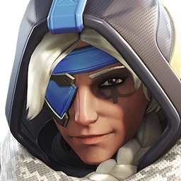
Ana, full name Ana Amati, is one of founding heroes of Overwatch and was bound to protect her world after serving in the army during the Omnic Crisis as a sniper. She is of Egyptian descent and is Pharah's mother.
Ana, like her daughter, bears the Eye of Horus, and it was significant enough to get the nickname “Horus”, though it’s on her right eye while it’s on Pharah’s left and faded with age. Her attire is based on apocalyptic media, especially media set in deserted places. While it has no ties to Ancient Egyptian culture outside of that, it does have a similar colour palette to that of Pharah’s armour, though more dulled out for the aged and torn look, to show a closer connection between the two.
Cassidy
Cassidy, real name Cassidy Cole, is a hero who’s entire role revolves around him being a cowboy: He grew up in Texas and learnt how to take aim at a young age, and as an outlaw, will do things on his own terms.
As many Overwatch characters do, Cassidy takes a traditional conceit/ old school motif and makes it futuristic, and futuristic cowboy is not a concept that’s executed quite like this. The post-apocalyptic look is perfect for a cowboy, and the amount of rusted hues and dark colours, even to red poncho, the main standout piece, being effected, are really good touches. The blue is there to show the futuristic tech all characters have and to outline his gear.

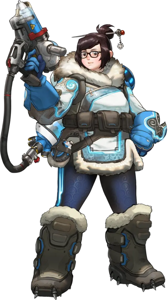
Mei
Mei, real name Mei-Ling Zhou, is a hero who works as a climatologist, mainly in cold climates. She is of Chinese descent and dedicated to preserving the environment and will fight to protect what remains of nature with robot sidekick, Snowball.
Her design is primarily focused on winter clothes, primarily those used in climbing harsh terrain like mountains. Her boots are large with spikes at the bottom, her gloves are large with a good grip, she has a sachet with a water bottle and her furry coat resembles a qipao. Her pallete uses blues and whites to resemble a snowy sky, She also has a few patterns, a harmonious one on her leggings and a geometrical one on her coat that resembles snowflakes.
I’ll admit that I don’t really care for Overwatch’s character designs. They have really interesting concepts and ideas, but their executions are just not something I’m interested in. It’s a personal preference, but I get why the game is popular for the characters alone; They’re stylish for their setting, varied and memorable due to that variety.
0 notes
Text
Research: Character composition sheets
Here I’ll look into a few character sheets from artists from The Rookies and Art Station to gain ideas for how my composition sheet should look.
This a character sheet created by Sirena Mesa for the character of Reed. It has all bare composition essentials: A rendered version of the character, an expression sheet, a turn around sheet and even clothing layers outlined in grey and front and back view for the head accessory. The main issue with sheet is definitely the turn around. The third pose is cute and works, but the first and second are asymmetrical and overlap. Usually for a turnaround you want the character to have a static pose so features are easier to see. I’d also make the rendered version of the character is a bit bigger so your eyes are drawn to it first.

This is a sheet for Cassian by Jae Ramirez. I included two sheets, the main character sheet and the expression sheet. The main character sheet includes two rendered version of the character, one without dot gradient, some sketches of her turn around and back with a coloured sketch and weapon sketches. I feel like the sheet is a bit barren, but your eyes aren’t overwhelmed and everything is superheated properly. I do think however that art styles with more rendered and complex shadows and lighting could really benefit from a colour palette swatch or a flat coloured version of the character, even if the design is simple in principle. Plus I think a proper back view of the outfit would be beneficial. The expression sheet though is really fun and showcases a lot of dynamic poses and emotive faces.

This is Feesh by Sabrina Sentoso. This sheet has the privilege of being wider compared to most sheets, allowing for better spacing of everything. The rendered version of the character are were your eyes aren’t overwhelmed drawn to first and it’s also where you can see the back view and accessories. The further part of the sheet however that isn’t common in character sheets: Concept renders. And with these is a flat coloured version of the final design. I’m not sure why the concept renders were included since the other two characters from this project don’t have them, but I can imagine them being reused for background characters and the such.

This is a sheet for Strawberry Saul by Sketches of Shay. This sheet is super fun and expressive, from the three poses shown to the expressions on the right and more detailed versions of the most important accessories. Usually expression sheets are left as sketches or could use more liveliness, but the expressions here are very well captured. However, while this is a sheet for the artist’s personal use, it lacks a few details a character sheet would need, mainly that there’s no turn around and flat version of the character’s colour pallete. But outside of that, this sheet is very well made.

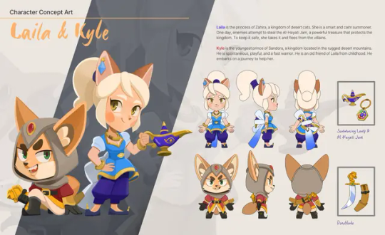
This is a character sheet for Laila and Kyle by Ji Sunny. This is fairly standard turn around fare, with the characters in flat colours in their turnouts with the accessories in a similar style and the rendered characters at the side. Simple is best here. As for expressions, there’s this promotional piece that show more aggressive expressions. I think it looks good all things considered, especially in composition, but I think the expressions could’ve been a bit more exaggerated.

This is Hor@ngi’s character sheet by Knight Zhang. Her turnound sheet is pretty barren since only one pose is fully coloured in, except the ribbon at the back and the shawl, with the other coloured in white most likely for personality showcase. The lack of colour could be just due it not being necessary since the colours are flat enough to understand, and the different views are comprehensible, but the ribbon and shawl being blank is a strange choice. The pose sheet however is gourgous. It’s fun, expressive and energetic. I think posing sheets like this work especially well if your character is athletic or in a hero shooter.


This is the character sheet for Rin Torra by Trent Kaniuga. I think the most interesting thing about this sheet in particular is the different outfits/outfit variations, the first sheet to have this based on what sheets I’ve chosen, and that this sheet is vertical rather than horizontal, giving a cleaner cut between the more important parts of the character and the less important part. Otherwise, this sheet has everything you can need, including the front and back view and an expression sheet. I also like the accessories found in the sachet, it’s a nice detail.

These are the sheets for See Saw McGaw by Christina Cornett, and I say sheets because this character has more than one for different things rather than including everything in one sheet. I picked two of these sheets though, those being the rendered design and turn around. This is the first of these character sheets to have a moodboard interestingly enough, and a heavy one at that explaining every little detail, including the way the chains are drawn and even the back view from one of the other sheets as reference for an emblem. Also, the first usage of a swatch colour palette. It’s about time we got one of those. The second sheet I chose is the posing sheet since it was more complete to the turn around sheet, and it does it’s job well. It’s not super dynamic, but it perfectly represents the personality and fighting style of this character.


These are the sheets for Adeline Margaret by Khai Woon. This character also has multiple sheets for a lot of different things, including outfit and weapon variations, but I picked out the most important ones. The rendered version of the character comes with a moodboard too, a fairly standard one, but it represents the detailing well. The turn around sheet is also very good, showcasing all the important elements. I don’t have a problem with the art itself as much as I have a problem with how the sheet is presented. The background is a red textured one, which is quite distracting with how the flat colours are used here and end up dulling them out on the character. The sheet does use a flat white colour for the outfits and such, which is helpful and does draw your eye to the art, but the background should’ve been duller or darker. Otherwise a cool sheet.

The final sheet is for Harold Greywulf by Jia Yuu. This character also has multiple sheets and once again I’ve chosen two, with the turn around and expression sheet. The turn around sheet is perfectly good, rendered in a flat style, there was already a colour pallete swatch on the other sheets, and one of the side views included a version without the coat to outline details hidden by it. The expression sheet is fairly standard but it’s definitely the way I would go around making one: A front view, a side view and four expressions.


0 notes
Text
Research: Artist research (Poster design)
Heinz Edelmann
I was asked to looked into Heinz Edelman after comparisons to my work…I do see it, but the comparison I think is just a byproduct of me taking inspiration from 2000’s artists, who took inspiration from 1950-70’s art including Edelman’s work. Heinz Edelmann was a German-Czechoslovakian freelance illustrator and designer, and his most well known work is for the art direction of The Beatles movie Yellow Submarine.
Edelmann definitely has an interesting style. While he did have all sorts of stylisations, some more realistic than others, his work still pretty psychedelic regardless. The inconsistent proportions and depth, strange designs and the way things blend together is super visually interesting, and based on what I’ve seen, Yellow Submarine very much embraces the psychedelic angle. It’s a style that manages to look unpolished but fulfilling and expressive.


…And now I think I know why you thought my art looked similar to his. These proportions are very close to how I stylize them. Paul straight up looks like a character I’d design here.

I also thought to bring him up in this post specifically because he has worked on a few posters.
This poster was made for the German rerelease of Ladykillers. If you ever wanted a black comedy crime film to instead look like a horror, then here’s a great execution of that. Everyone here, including the clueless Mrs. Wilberforce, looks terrifying with their pitch white eyes and dark shadows and how the suits of the criminals are pitch black and surround the old women… It’s very effective at grabbing your attention though.

This poster is for the French film Metropolis. The most striking thing about this poster is definitely the colour contrast. The pale blue and yellowish hue of the buildings help contrast the red and more 3D letters for the title (Though I think the red could’ve used better contrast). The letters also align with the way the buildings are facing.

And of course, the German poster for Yellow Submarine. Colourful, hectic, confusing. It’s the most perfect representation of that movie you can get and would definitely catch you eye wherever you were.

Saul Bass
Saul Bass was an American graphic designer and film maker. His graphic design work, primarily for movie posters, is extremely well known and referenced often in pop culture. His style is extremely minimalist, with his posters mainly containing a single item or figure in an angular silhouette with a single coloured background and visual spectacle, with the title on the bottom in a usually angular font. It’s a real contrast to a vast majority of movie posters, especially nowadays, but that’s what makes it iconic.
There’s not much I can comment on otherwise. Everything flows together nicely and it doesn’t try to overwhelm you while telling you what the main motive of the movie is.


Lyndon Willoughby
Lyndon Willoughby is an American illustrator who has made artwork for many prolific companies and projects.
One thing Willoughby likes to do is implement silhouettes to depict a scene or be used as a prop, such as in this Fantasia poster where a large violin is used to represent a rock while also having the silhouettes of different Disney characters through magic, which is coloured white to contrast the darker hues used. The violin also blends in with the pitch black instruments at the bottom through a gradient. It’s more straightforward compared to some of his poster, but it’s still a really good one.

My favourite poster of his has to be Speed Racer poster, and it shows more of his usual style, looking like paint on a canvas. The way the colours are blended together and drawn as if the track was painted with an angled sash brush, with the track and colours becoming to detailed as they’re closer to you is gorgeous and represents speed perfectly. The holographic effect is also amazing.

Then there’s this poster for James Bond. I like how this poster looks like a magazine advertisement for a watch and looks akin to 70’s advertising and graphic design. The red draws you to the top image, and the hand painted look is cool and also contrasts the blockiness of everything else and even the look of the more realistic look of the watch.

0 notes
Text
Character design: Nour
The first character I completed for the FMP is Nour, the princess of the Beamia Kingdom and a protagonist. Nour is the antithesis to all other characters in all ways, from design philosophy to art style, so she took a REALLY long time to finalise.
Her personality is to contrast that of her mother, Neferure, and the entirety of the Kingdom that is full of busy work and energy. She’s soft-spoken, calm and prefers to be alone, so I wanted to reflect that with her design while still keeping in the sun and Ra motifs, as well as the sharp nature of Ancient Egyptian art. Her name is an Egyptian named meaning “Light”.
Fun fact: This is I think the only time in my life where I had to make a moodboard for any designs ever. A lot of my character designs just manifest into existence and have a ton of establishment, such as personality, motifs and general clothing style, but since I don’t draw a lot of historical clothing, I had to compile everything into one place for convenience.

Rather than her representing the sun, she represents a clear day sky. Light blue is a colour that is associated with innocence and tranquility, hence its heavy use here and to contrast with the sharper colours of the gemstones, gold and silver. Her outfit is heavily based on clothes worn by actual Egyptian pharaohs and royalty but with a princessy twist, mainly in the puffy sleeves and how her gauze is a parted so the top is more flowy. Her Ra motifs come through in her headpiece, which is the snake seen in Ra’s sun, and her eye makeup, which resembles the Eye of Ra which is something Neferure will also share. The colour palette was easy to figure out (I’ve been told I’m really good at palettes), but the detailing not so much. Since Ancient Egyptian outfits, especially for royalty, have a lot of complexity, I had to simplify or omit certain details based on how they looked and if they cluttered the design.
The outfits for these characters aren’t 100% accurate to what Egyptians or Greeks actually wore, but that’s by design. The setting is a fantastical one, but I still wanted to lean close to my actual inspirations, just not all the way.


Her wedding outfit on the other hand is in reference to modern Egyptian wedding attire. I couldn’t find much info on this topic in terms of Ancient Egypt, and you can certainly tell that based on the altercations I did, so I went for the modern look since it’s still fitting and represents the two kingdoms turning over a new leaf after the marriage. But I also wanted her wedding outfit to oppose her main outfit. Rather than being carefree and elegantly soft yet detailed, her wedding outfit is more simple yet threatening, with all colour except for the gemstones' gone and replaced with cream, white and silver. This change not only looks more akin to modern African wedding dresses, but it also has narrative purpose: Nour doesn't want to get married, so she's forced to wear a dress that she didn't decide on and will die in. When that's your situation, you're going to be extremely jaded...Hence the expression change too. There's no joy behind those eyes.


I also did the back views for each character + outfit, but there’s a high chance I might alter them, just to see if everything fits together as it should because certain patterns don’t seem to. Doing these back views did help me alter the proportions though.
About the art style...We were asked to "Diversify" for the portfolio, so I went with a more realistically proportioned style, and this style had multiple adjustments to be more and more proportional, which you can especially see with the legs. I love chunky stylised legs, but they didn't really bode with the rest of the anatomy so I had to alter them a TON before landing on something that looked natural enough. The eyes and head sizes could've been scaled down, but the way I see it, the face and eyes are the most expressive parts of the body, and it's why lot of cartoony art style amplify it. Plus when I tried to give her smaller eyes, they looked...Off Also the lineart is more clean and coloured specifically to match different areas (I opted out of my usual double-layered lineart technique for simplicity's sake).
So that’s Nour. She took me ten million years to complete but she works.
0 notes
Text
Personal history research: Ancient Egyptian fashion
General clothing
The most common fabric for Ancient Egyptian clothes was linen due to its lightness, and was made via spinning the fibres from a flax plant. Clothing made from animals, such as wool and silk, were considered impure and were only worn by the rich or royalty.
For varieties in clothing, the shenti was the most common and looks similar to a loincloth, and was worn primarily by men. Women would more often wear a kalasiris, a long dress with straps, and it could represent one's class based on the dress' length and details like embroidery and jewels.
The only footwear available were leather sandals, and those were only worn during special occasions or when feet could get hurt.

Make-up
Within ancient history, Egyptians were the ones who most commonly wore make-up thanks to the development of embalming.
For eye make-up, kohl, an eyeliner made from stibnite and galena, and eyeshadow made from malachite were both used, with red lipstick made of ochre used mostly amongst women. These products would be mixed with animal fat to keep preserved in compacts. Henna was also used for the hands and nails.
Egyptians would also wear wigs due to lack of hair maintenance. Most people would save their hair off to get rid of lice, and the wig was a hair substitute and protected the head from the sun.


Jewellery
Jewellery was big in Ancient Egypt, and many people had at least one piece of jewellery from necklaces to earrings to pendants. These would mostly be made of gold as it was the skin of gods, though richer people would also include precious stones like lapis and ruby. Those who couldn't afford these jewels would make their own beads from pottery clay. and often these metals and clay would be placed on the same jewellery piece. Silver was also highly desired as it came from Asia.
Jewellery would often include imagery of gods or related to gods, with the symbols made with a mix of clay and jewels and being centre pieces.

1 note
·
View note
Text
Personal history research: Ra
Ra is one of the Gods in Ancient Egyptian mythology, and he is by far the most powerful one. Due to his association with the Sun, one of nature’s most powerful vessels, he has been said to be the first Pharaoh in Ancient Egypt and the ruler of all parts of the Earth, including the sky and afterlife. He is also associated with order and kingship. Ra’s appearance in pop culture is often depicted via Ra-Horakhty, a merging of Ra and Horus, the god of the sky, who shares a very similar status and power to Ra, but in association with other Gods, Ra is portrayed as a red dot sometimes surrounded by a golden snake.
Ra has a few myths to his name, the most well known one being about his daily travels in the sky and afterlife along the Nile on his boat, the Solar Barque, with other gods to make the sun rise. Apophis, a considered rival of Ra due to representing darkness, would try to kill him and his crew, but ultimately was defeated so Ra could proceed.
Ra’s an existence as a God was vital to Ancient Egypt. His cult was started around the second dynasty, and at the fifth dynasty his name was fully embodied into the culture of Egypt, with pharaohs referred to as “Sons of Ra” and building structures in his honour. Other worshipping practices included writing texts about his myths and singing hymms.


0 notes