
Statistics
We looked inside some of the posts by fmp10blaire and here's what we found interesting.
Average Info
Notes Per Post
0
Likes Per Post
0
Reblog Per Post
0
Reply Per Post
0
Time Between Posts
2 days
Number of Posts By Type
Text
17
Last Seen Tumblr Blogs


Fun Fact
Tumblr.com rank in the US is 25.
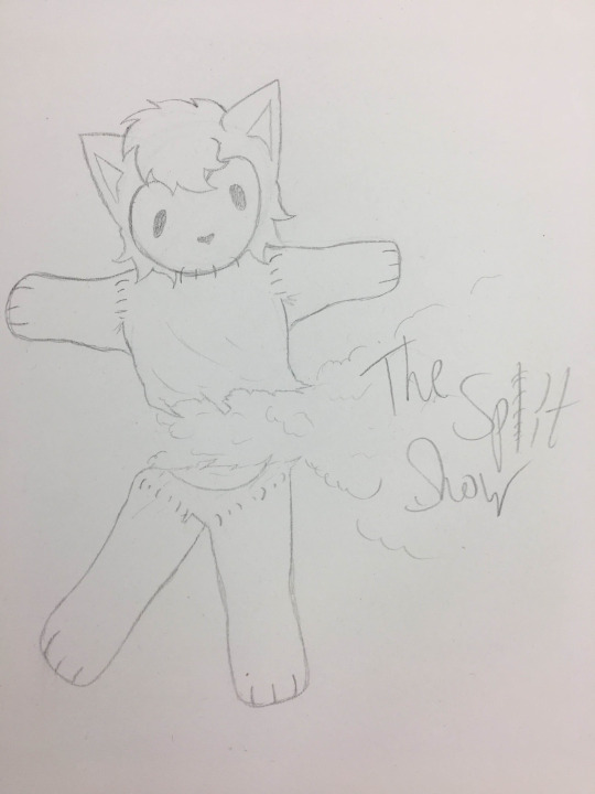
Text
The Finalised Split Show Episode
The finished version of The Split Show episode, now up on Youtube available for watching.
youtube
0 notes
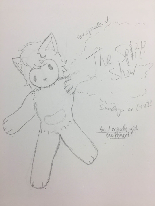
Text
The Final Poster Design(s)
Along with Josh having suggested using the BBC Logo (altered to BBT).

This poster was my second favourite, created as the alternative after the original, however it comes with the issue that it doesn't exactly promote the show.
It fits the overall vibe of the premise, being that you have to be resourceful and that sewing is a very useful skill following the war-time, however it just lacks the overall context of the show itself.
Imagining myself as an outsider, if I saw this poster on its own I wouldn't have came to the conclusion that it was meant to promote a cartoon about sewing projects, it just looks like cartoon propaganda, so I'd decided to not use it.
But before creating that, I had the main design, which was done after having tweaked some of the cotton to make it appear more realistic and changing the composition of the original sketch.
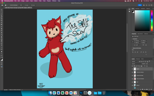
Though it's now gone through a noticeable change with the inclusion of the official TOY FACTORY logo and including a promotion for the DVD to fill the gap.

Much better.
0 notes
Text
Creating a DVD Pt6


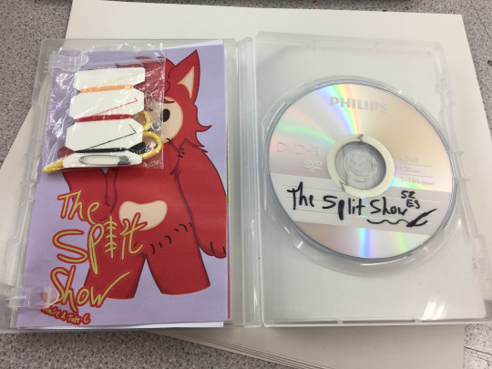
The DVD Booklet is now finalised and the video has been ported onto the disc!!!
0 notes
Text
The Split Show Survey
When starting out on my project I had created a survey (for kids and parents) to understand the target demographic for my project, along with gaining an understanding on how accessible media is and can be for people.
Though I hadn't gained a lot of results (about 4 responses per survey), I still consider it a good point of reference.
The Kids' Survey


The Parents' Survey


0 notes
Text
References for the Final Poster


I tried to go for a balancing act of vintage/retro cartoon posters and just very bold cartoonish ones, though I'm not sure how well this translates into my renditions, as my style [for the show] isn't exactly very retro looking.
0 notes
Text
Sketches for the Final Show Poster
Sketches done by my teacher to give me a general guide and/or idea.


^ This one I particularly liked and will be incorporated further on.

And ones done by me, incorporating elements from both Josh's sketches and my own experimentation.


^ This one was inspired by a Daffy Duck reference which I'll cite in the next post.
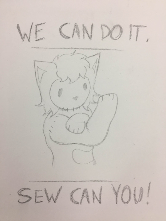
And this one parodying the 'We Can Do It!' war poster.
0 notes
Text
The Ethics of My Project Pt2
Which brings me to my next point of reference.
Controversial TV Personalities
// Mentions of Sexual Misconduct and Assault, Abuse [Against Minors], Paedophilla
Sherry Pie
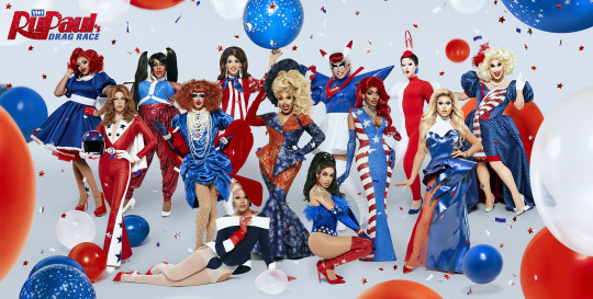
The full Season 12 Promo Banner featuring Sherry Pie (far right end).
Joseph Gugliemelli, known onstage as Sherry Pie was a contestant of Season 12 of the hit show RuPaul's Drag Race, who was infamously disqualified pre-airing and post-filming of the season due to sexual misconduct revelations.
In 2020 a post had came forward stating that Joseph had catfished the writer and persuaded them into sending sexually explicit content with the guise of being treated as an audition onto a broadway show, preceding this seven other men would come forwards to discuss their experiences.
In response, Joseph released a statement on Facebook expressing sympathy and regret for his actions, however VH1 and World of Wonder (the production company for Rupaul's Drag Race) released a statement stating that Sherry Pie would be edited out of the aired episodes of the show and would not progress to the finale (which was scheduled to film later in the year but was postponed due to the Covid 19 Pandemic) - they would also go on to donate the 5K that Sherry had won during a challenge to The Trevor Project.
The subsequent result of his disqualification had led to a major shift both in the show's format and the fandom, as this had prompted major discussion about WoW's responsibility with even considering Joseph for the season, along with the storylines of the season having been altered, likely resulting in a change in winner (just my opinion).
Dan Schneider
Of Nickelodeon, was a producer of a few of the network's most popular shows, such as Henry Danger, Victorious, Sam and Cat and iCarly.
In 2018, Deadline released an article discussing the decision for Nickelodeon to split from Schneider and cease production on the show Game Shakers.
Though entirely speculation, sources at the time said that the split had came from concern with Schneider's behaviour towards the actors and staff, but the publicity-safe statement had stated that they were simply parting ways and had wished each other the best.
Though in 2021 it was disclosed that the decision was made by ViacomCBS, following an internal investigation due to Schneider's problematic and abusive behaviour.
Schneider has also received criticism for his alleged 'foot-fetish' which was made apparent due to the constant theme of feet in his shows and posts made on social media.
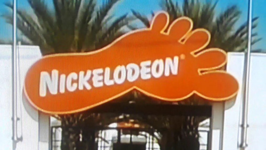
And in 2024 the documentary series 'Quiet on Set' had released, detailing a more in-depth analysis and highlighting testimonies on Schneider's behaviour, prompting scrutiny and a lawsuit from Schneider who claimed it was accusing him of sexual misconduct against children (despite the documentary containing nothing of the sort).
Rolf Harris
An Australian Musician, Painter, Actor and TV Personality, Harris's career came to an implosive end due to the convictions of him having sexually assaulted four underage girls.
During the Yewtree Operation (which was sparked preceding the eventual release of "Exposure - The Other Side of Jimmy Savile", several other high-profile figures were also convicted, mainly Max Clifford and Stuart Hall.)
He'd faced twelve charges and he was found guilty of each of them, having been sentenced to only five years but gaining release after three years with parole.
Liz Dux (the lawyer for the women who came forward) had responded to this, stating that:
"What he did was damage young women's self-worth, their confidence and for some of those women, he affected them deeply for the rest of their lives.
It should certainly affect the way he's treated when he applies for early release – he hasn't understood the severity of his crimes. This letter* was clearly written by a man who has contempt for his victims and is utterly unrepentant. Far from being reformed by his time in prison, it seems to have fed his perverse sense of indignation and his arrogance is undiminished. If it is the case that a parole board can't take this into account it is totally wrong. Harris has caused those he abused great harm, and by writing this letter, he continues to cause them harm."
*The letter being song lyrics written by Harris, and sent to one of his friends during his time in detainment, being cited as highly abusive.
Harris went on to die in 2023 by the suggested cause of neck cancer.
And likely the most notable, and horrible of them all.
Jimmy Savile
Sir James Wilson Vincent Savile was a TV Personality primarily known for his extensive career on The BBC Network, attributed for the shows 'Jim'll Fix It' and 'Top of the Pops'.
He worked under The BBC for over 40 years, and during his time he had faced a sea of allegations against him that were all silenced for one reason or another, having assaulted and committed non-consensual acts against underage persons (primarily girls).
There has been massive amounts of evidence in regards to his allegations throughout his lifetime, with even his own auto-biography having cited that he'd committed 'improper sexual conduct'.
Along with the former Sex Pistols and Public Image LTD Vocalist John Lydon stating that he'd love to kill Savile for his hypocrisy, regarding that he's "into all kinds of seediness that we're not allowed to talk about", and this was edited out of the broadcast.
He'd go on to expand, saying "By killed I meant locking him up and stopping him assaulting young children... I'm disgusted at the media pretending they weren't aware."
In 2009 he had an interview with his biographer wherein he'd defended Garry Glitter's case of being in possession of child pornography, stating:
"Gary has not tried to sell 'em, not tried to show them in public or anything like that. It were for his own gratification. Whether it was right or wrong is, of course, it's up to him as a person."
This interview wasn't released until after Savile's death.

Preceding Savile's death in 2011, the Newsnight programme had begun an investigation into the case of Savile, which was scheduled to be aired but was blocked in place of a tribute to Savile's work and time with The BBC.
This prompted massive backlash with many stating that, even in death, The BBC was still trying to guard the reputation of Jimmy Savile, and this came to a head in The Pollard Review.
(Feel free to read through it).
The Pollard Review, executed in 2012, was an internal investigation by Nick Pollard into the circumstances of the documentary being scrapped in order to solve the answer of whether or not the decision was biased.
In my opinion, the answer was very vague (whether intentional or not), but there was one quote from the ITV which solidifies it in my mind.
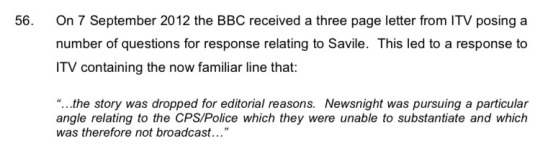
The ITV would then go on to release their own documentary, 'Exposure - The Other Side of Jimmy Savile' in September 2012.
And in March 2013, Her Majesty's Inspectorate of Constabulary reported that 214 of the complaints that had been made against Savile after his death would have been criminal offences if they had been reported at the time.
Perhaps one of the biggest tragedies of Jimmy Savile's life is his death, and I mean that very lightly, he deserved it sooner.
But it's just depressing to note that, even though I'm scratching the surface of the surface in regards to his crimes, that because of his death he's essentially gotten away with all of his wrongdoings without having to ever reconcile or face any punishment, which is also the fault of the organisations that bent so far to protect him and failed to protect the victims of him.
Institutional Protection is a very real issue and it's been an extremely problematic thing since the beginning of time, and because of this Savile was able to get away with this for so long, and it's frustrating.
But it's for reasons like this that we can recognise the faults and go forwards to do better.
0 notes
Text
The Ethics of my Project Pt1
The common ethics and grounds for making a TV Show, vary depending on the station and TV Show.
Children's television is up there among one of the most tight things to monetise, which is due to the fact that the priority lies in keeping the kids safe and happy and the same goes for the parents, as they also try to keep their kids safe and happy.
The main driving force for this, in my universe, is the PPCM (as mentioned previously, the People for the Protection of Children's Media), which had much more of an involvement in the creation and monetisation of The Split Show upon the events of Unaired.
So through a hypothetical standpoint, the main priority for creating my show is ensuring that there's no offensive content that might be misinterpreted or weaponised, such as misuse of a religious symbol or a weapon.
Along with that, there has also been implementations of censorship and precautions for ensuring that children wouldn't be exposed to graphic content, like the watershed, originating from the Television Act of 1964, wherein adult programmes would only begin showing beyond 9pm.
Along with precautions and measures, there's also the Ofcom Government Office (Office of Communications for the UK), and their primary job is to regulate television broadcasts, radio, mobiles and the postal services.
Their code mostly prioritises that minors who may consume media are protected against media that infringes their rights or may cause harm, though their other policies also cite that certain shows (i.e the news) must remain fair and unbiased when discussing certain topics (politics and religion), to allow consumers to form their own opinions and beliefs.
Though, there is an argument to be made about the sanctity of these priorities, essentially how much do these production companies really care about the children they claim to protect and place at the forefront, and how much do they simply just care about profiting, even if it means placing them at risk.
0 notes
Text
Research Pt18
LAIKA Studios

Based in Hillsboro, Oregon, LAIKA Studios is a production studio that centres primarily around stop-motion animation movies utilising clay models.
Weirdly owned by the co-founder of Nike (yes, the sports shoes), Phil Knight, the studio only covers up to 6 films, with its most notable titles being Kubo and the Two Strings, Missing Link, The Boxtrolls, Paranorman and of course, Coraline.
With the name being inspired by the first ever Soviet Dog to be launched into space, the studio had initially started out as Will Vinton Studios, however it was struggling financially until Knight had decided to adopt the company, also recruiting Henry Selick (Director of The Nightmare Before Christmas) and Travis Knight, his son.
And in 2009, the studio had made history when they released their cult-classic film, Coraline.
The movie went on to receive a nomination for the Academy Award for Best Animated Feature, a nomination at the BAFTAs for Best Animated Feature, a nomination for the Golden Globe Award for Best Animated Feature Film, and eight nominations at the Annie Awards, winning three, for Best Music in an Animated Feature, and Best Character Design and Production Design in a Feature Production.

And it's honestly no wonder why.
The movie has a wonderful and beautiful aesthetic to it, but it's also one of the most unsettling kids movies I've ever seen.
Along with it being able to brand itself for its iconic button-eyes, seen in characters like the Other Mother, and having Keith David voice the cat.
The other mother also has a very creepy and slender appearance, attributed to the fact that she's made almost entirely from wireframe, whereas most of the other characters are well rounded and built with sculpt.
But I digress, they have other movies too.

Paranorman, released in 2012, is a very ridiculous zombie-movie with a bunch of caricatures and tropes, but done in an ironic way.
Also being able to tie it back to witches, the main antagonist Agatha is actually a young girl who was hunted in a trial and exacts vengeance on the town.
And there's also The Boxtrolls.
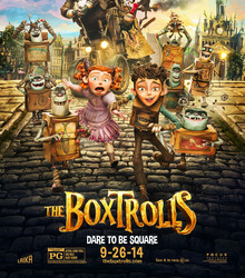
We don't talk about The Boxtrolls.
0 notes
Text
Research Pt17
Concept Art
is a medium of art practice that's used to generally provide a concept, be it for a game, movie, TV Show, product etc.
It's typically used as a pitch, though it can also be used to gain a general idea for how something is intended to look, say a character or a prop, and it's for this reason that concept artists are so important to the industry.
Dating back to the 1930s, Walt Disney was one of the first attributed people to coin the term concept artist, having hired Mary Blair to design concepts for Cinderella, Alice in Wonderland and Peter Pan.

Concept art can also be used as a process of elimination, for example two designs could be drawn, and the commissioner would pick one of the two and potentially provide notes on how to improve/expand upon the drawing, creating a more clear image on the final product.
0 notes
Text
Research Pt16
DVDs and VHS
No, not the extensive history of DVDs and VHS, more simply just some cover art and decorations that have been made for them throughout time.
Now, being born in the 70s (VHS, not me), but more popularised in the 80s into the early 90s, Video Home Systems have had a fairly long history before being fazed out and replaced by Digital Versatile Discs, though it comes around as DVDs have now been fazed out and replaced by Streaming Services.

Though most box art, atleast from a simple Google search, seems to be mostly lost, as most of the box art I was able to find shows simply just horror movies.
Or perhaps horror movies were much more common on VHS? Who am I to say.
Regardless, the art style of these old movie covers tends to border on realism, opting for very bold colours and blended backgrounds that just really push that 80s vibe.

I don't know how to describe it, it just looks 80s.

The formatting is also fairly similar too, specifically on the cover wherein it highlights all of the actors featured and a few other credits.
DVDs aren't too far off from VHS, being the sort of foster child of the format.

Though in the new age format, there's a lot more requirements and specifications to be listed on the box, ranging from the expected age ratings to the DVD specifications itself.
Language, colour, video format, runtime, special features (which are very commonly featured on DVDs, you don't get that on streaming services) and the synopsis.
DVDs for TV Shows are typically a bit different, though they more often follow the same general basis, except for maybe listing the episodes.
0 notes
Text
Finally Editing the Video
Oh this took years off of my life.
Using CapCut seemed like it was going to be a very easy process for video making, as its a software I had fair knowledge and experience in, however this couldn't have been further from the truth.
To start out, I of course opened a new file and began dumping all of the art I'd done into it, starting out to animate the logo and use keyframes to animate Split and Recovery's hands moving back and forth.


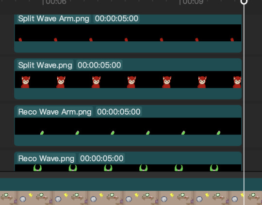
Which was fairly simple.
The entire process of creating the video was all, fairly simple, as all it had required was layering the background, desk and sprite, along with adding in the video footage of me creating the mini plushie itself, but simply sped up to save time.
However, throughout the creation process of the video, it became fairly apparent that things were going wrong, and I wasn't sure why.
Issues ranging from the playback skipping clips in the preview, files not being found or deleted, sometimes even the video refusing to export.
I was about to abandon hope, or at the very least CapCut, until I had came to the realisation that none of it was CapCut's fault at all, it was OneDrive.
OneDrive kept uploading my files to the cloud as soon as I didn't touch them, and I had to keep resyncing the files and OneDrive itself and that's what caused the issues and frustrations, so it's very easy to say that I will not be using OneDrive for this sort of project ever again.
Now after having created the full video, it became a pretty fair decision to me that I'd remove the vocal track and instead opt out of just using subtitles instead.
And then, finally having the end credit for the video (which I'd mostly ripped inspiration from the SpongeBob End Credits), I figured that I had to have an extended version of the intro song, which I'd made with relative ease, as it simply follows the pattern of repeating the jingle.

So despite all the hardships and trials, I think I did fairly well creating this episode for simply being the one person creating every asset from scratch, though I'd be lying if I said I didn't feel as though it was almost missing something.
Perhaps it's just the extensive real-life footage of me sewing filling a lot of space, but I'm definitely proud of my project, and proud of myself.
I'm happy with it.
0 notes
Text
Research Pt15
(Modern) Horror Games
Poppy Playtime
Poppy Playtime is a 2021 Indie Survival/Mascot-Horror Game produced by Mob Entertainment and formerly directed by Isaac Christopherson.
Like many of its predecessors, the game has received backlash for using the common trope of having the 'mascot-horror' element, wherein a game often revolves around a character (typically a mascot of a company or franchise) and uses them as the driving force for horror.
Because of this, the game has also received criticism for appealing to children, despite it being rated a 12-16.
This is used to play on peoples' fears of animatronics, toys etc.
Despite this, the game has spawned a cult following, receiving its fourth chapter in January of 2025.

Chapter 1 of the game centres around the titular character, Poppy and Huggy Wuggy (seen above), however in newer editions, the focus has shifted between characters, from "Mommy Longlegs" to "Catnap and Dogday", my personal favourites.

One main criticism that I can definitely understand is that, often times, mascot-horror seems to be a very easy ploy into simply having a marketable character, as it's one that would be easily recognisable or replicable.
Regardless, I do think the overall aesthetic of the game is interesting, and the character design is pretty cool, though I am biased towards Catnap and Dogday.
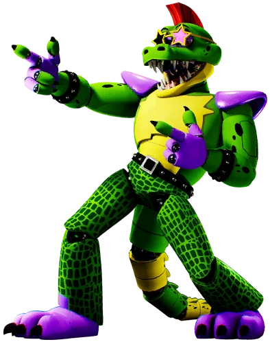
Five Nights at Freddy's (2014)
Oh boy here we go.

Five Nights at Freddy's, commonly abbreviated to FNaF (or FNAF) is an Indie Point-and-Click Horror game created by Scottgames (Scott Cawthon) and was the first ever game of the franchise to be introduced.
Spanning an extensive series, ranging from but not limited to: spinoffs, sequels, prequels, DLCs, a musical, movie (soon to be movies), additions and of course, the lore, the game has gained a cult following and pop culture infamy.
Returning to the previous point of mascot-horror and its perceived problems, though it's hard to definitively find the root of it, FNaF has been cited as the earliest instance of mascot-horror [being used in a game setting], as it takes elements of things such as Chuck'e'Cheese and McDonalds.

The game overall has a very uncanny, 90s restaurant aesthetic to it, as it takes place within Fazbears Pizzeria (referring to Freddy Fazbear, seen in the centre image above), and the animatronics especially look unkempt and rigid.
However in the newest FNaF Installment, Security Breach, the characters have a more polished and modernised appearance, one that's been criticised for being too 'sanitised for children'.

That being said, Monty's the best character.
Bendy and the Ink Machine
Bendy and the Ink Machine, released by Joey Drew Studios in 2017, with the subsequent chapters released up until 2018, along with Bendy: The Dark Revival releasing in 2022.

Cited by TheMeatly, the idea for the came had came to his desire to create a game wherein the world felt like you'd stepped into a sketch, but during the brainstorming and sketching for this game, he'd decided that it needed a monster to inhibit it.

The name for Bendy had came during a typo for porting the Blender model.
However during development, due to Meatly's lack of coding knowledge, he'd adopted Mike Mood to bring the game to life.
The design of Bendy itself is akin to vintage cartoon characters like Mickey Mouse or Oswald (see Research Pt13) along with the game adapting a very vintage, swingy vibe to it, as seen in the environment and technology of the projectors and ink machine itself.
The game also incorporates other characters comprised of ink, such as Alice Angel, Sammy Lawrence (a devoted follower to The Ink Demon), Buddy Boris and a few opponents.
Amanda the Adventurer
Amanda the Adventurer is a psychological horror* game created by MANGLEDmaw Games and was initially released in 2023.
*The game isn't actually cited as a Psychological Horror but I like to say it is one.
The game takes heavy inspiration from educational children's TV Shows, specifically Dora The Explorer, and it follows the antagonist Amanda and the deuteragonist Wooly.
The game has an interesting method of interaction, in that the protagonist (Riley) must solve a variety of puzzles to unlock new tapes of the Amanda Show, along with answering some of her questions.
There are a few secret answers you can give to Amanda's questions, prompting breaks in dialogue and sometimes unlocking another story path.

The initial demo of the came follows a much more uncanny version, with the models looking rigid and gross, for lack of a better word.

However newer renditions of the game, and the second game (released in 2024) have further polished this issue and have expanded upon the overall lore and gameplay aspects.
0 notes
Text
Research Pt14
Doll Makers
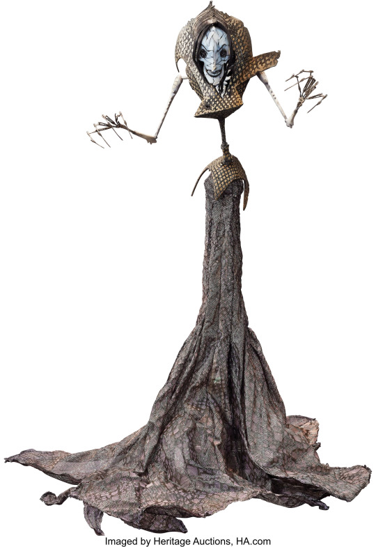
Jim McKenzie
McKenzie is a model maker and director, known for his sculptures and paintings that "depict surrealist wonderlands occupied by highly saturated characters."
Creating his works seems like a very extensive and meticulous process, as he fills the base in with a sort of mouldable foam or sponge before covering over it with 'Magic Sculpt Resin', as seen in his project "The Scarecrow".
As described, his works do have a very hyper-realistic appearance to them, which only adds to the uncanny-valley aesthetic, and they look very professionally made.
He's also dabbled in animation, having created a watercolour artwork for Tim Burton.

Amanda Louise Spayd
Spayd is an artist and designer centred in Ohio, known more infamously for their art collection titled 'Dust Bunnies'.
The blog can be found here, though I think it might be discontinued or abandoned.
The dust bunnies are a collection of plushies with clay-made faces and big, beady eyes.
I feel as though the intention is to be making the bunnies have a vintage, innocent appearance, akin to a doll, but whilst also maintaining that uncanny factor.
The creatures also noticeably have big buck teeth, which are hopefully fake, and they're akin to the fluggler dolls.
Monster High
Monster High is a series of dolls that were conceptualised by Garret Sander and his twin brother Darren Sander in 2007, when Mattel had filed the trademark to the name 'Monster High'.
Inspired by the likes of macabre creatures in pop culture and the gothic fashion trend, the two had began their venture into branding their own series of dolls, with Darren creating the slogan "[Where] Freaky Just Got Fabulous".
The first line of dolls began in 2010, incorporating six characters which were each respectively inspired by famous horror characters, ranging from The Creature of The Black Lagoon to Dracula and Cleopatra.
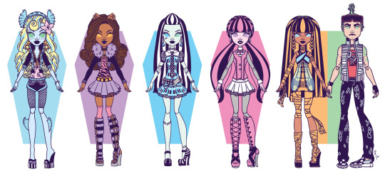
The dolls, also in a stark contrast to Barbie (see Research Pt3) have a lot more articulation, having joints from their elbows and knees to their wrists and ankles, allowing for more free-form playing.
There are also incorporations into the series inspired by pop culture, such as Wednesday Addams (of Addams Family and Wednesday) and Lady Gaga.

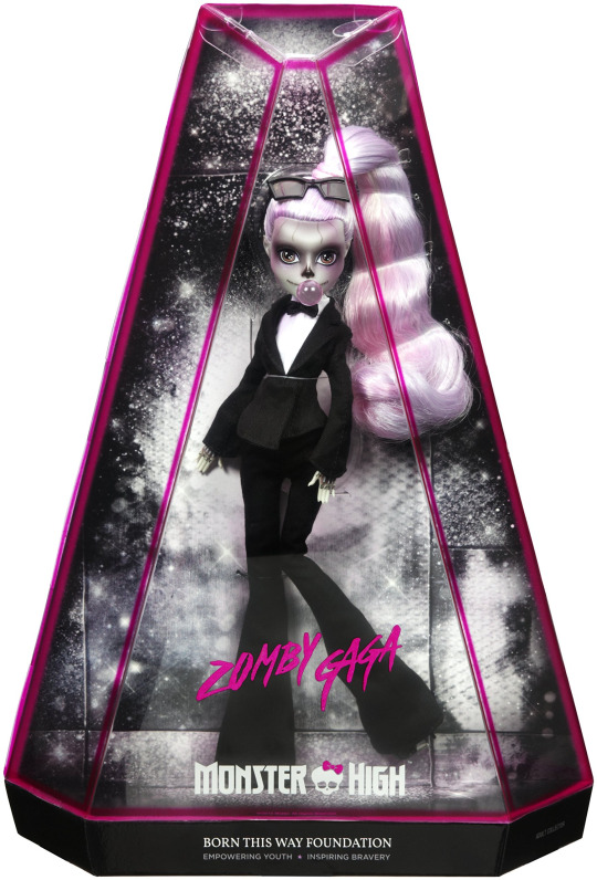
The dolls overall just have very unique designs, and the way they're incorporated into an actual 3D product, that's made for kids no less, reeks of quality, atleast to me.
As we've seen with sustainability in the modern era, brands are growing sloppier with the way they create their products, opting out of using more refined materials in exchange for using ones that are cheaper to produce, which is easily very disappointing, but understandable from a business standpoint.
And a doll a friend made for my birthday, using the base of a Monster High Doll.
(The wings were put on the right way during creation, I accidentally broke them and put them on upside down).


0 notes
Text
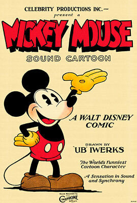
Research Pt13
Vintage Cartoons/Shows
Oswald the Lucky Rabbit
Oswald the [Lucky] Rabbit is a character originally created by Walt Disney and Ubbe Ert Iwerks in 1927 for Universal Pictures.
He is the main star of several short films that were created under Walt Disney Studios, however Universal had eventually taken over the creation and rights to the character in 1928.
Cited by Walt Disney himself, he'd stated that he wanted Oswald to appear younger and more vibrant with his character, being "peppy, alert, saucy and venturesome, [while] keeping him also neat and trim." and through that they had began to explore the method of 'personality animating'.
This could also be attributed to the existence of films, during this time period, being silent, due to the limited technology of the time - so through the movements and general flexibility of his design, highlighting his personality and utilising physical comedy.

A random fact is that given that the copyright placed on Oswald expired in 2023, it's been announced that he is going to star in a movie directed by Lilton Stewart III titled 'Osward - Down the Rabbit Hole'.
A release date hasn't been given at this time.
Betty Boop
Created by Grim Natwick at the request of Max Fleischer (of Fleischer Studios), Betty Boop premiered in 1930 in the short film Dizzy Dishes, wherein her design was starkly different from how we know her today, as she was designed as an anthropomorphic poodle-like character.
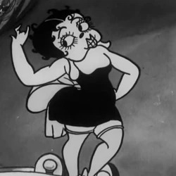
Boop's design incorporates fashion that is inspired by flappers of the 1900s, who were often described as raunchy women who would dress and act promiscuously and dance to jazz music.
(Cite back to Research Pt2 for public reactions of these sorts of people).
This had likely contributed to (I use this term very lightly) the sex appeal of Betty Boop, as in the more commonly known design she has a sort of submissive and ditsy demeanour.

Her dress is short and her body proportionate, along with her eyes often being drifted off to the side as if to display a playful or shy attitude.
She almost reminds me of Jessica Rabbit (of Who Framed Roger Rabbit?), though Mrs Rabbit has a more upfront and catty persona.

Dolly Daisy - Hearts and Flowers
Hearts and Flowers is a 1930s short film created originally by Warner Brothers Pictures as part of their Vitaphone Varieties Series.
Directed by Howard Moss, who is attributed as having been one of the earliest stop-motion animators, the film depicts two young boys who try to win over the heart of a young girl, presumably Dolly.
The three dolls, along with other side characters have a very uncanny appearance to them, which I can likely just attribute to their features being very disproportionate and beady.

Along with having a looked over character, presumably African American, being repeatedly run over by the two boys for a punchline, which is very for its' time.

Along with that, the film reel was created using a 35mm print, which would have deteriorated over time, but the reel was only rescued by Mark Kausler who had created a reduction 16mm reel.
0 notes
Text
Research Pt12
'Charley Says'
is a Public Information Film produced by the Central Office of Information and broadcast in the United Kingdom from the 1970s to the 1980s.
Created by Richard Taylor using Rostrum Camera, Charley Says was created by a sort of stop-motion method using what I imagine is individual pieces of paper making up the assets of Charley and Tony.

However this often does come with the negative side-effect of the animation looking awfully uncanny.

Tony and Charley have very jagged movements that seem akin to the animation style of South Park, and whenever they talk their mouths unhinge, especially seen with Charley (the cat).
The 6 episodes that there are each follow the motif of being informative safety films to children, discussing topics like not playing with matches or falling into water.
However the means of which they do this is by using Charley as the silent narrator - as silent as he can be, of course, as he speaks through a manner of 'meow' noises as voiced by Kenny Everett - and he's the one to suffer the consequences of having boiling water being poured onto him, as I imagine (even for its time) the Central Office wouldn't want to depict Tony being in any harm.

'Inside No. 9'

(alternatively known as Inside Number 9) is a black comedy anthology show that aired on BBC 2 and had ran for 9 seasons, ironically.
The show doesn't follow any consistent format, with each episode containing an entirely new cast of actors and characters, however each episode does contain themes of comedy, horror and of course, its own twist.
Along with that, each episode and/or location seen within the episode is linked by containing the Number 9 somewhere, ranging from a lot or house number and so on.
That brings me to the halloween special the show had premiered in October of 2018,
Dead Line

Following the plot of a haunted studio lot, Dead Line is a very interesting episode, especially in its formatting as it plays with the fourth wall in such a subtle and meticulous way.
Having convinced viewers, and likely even the BBC, the episode was promoted as a live broadcast of the show, however soon things would begin going wrong and the show would be interrupted by frequent audio cuts and technical difficulty announcements from Becky Wright.
That was likely the most intimidating thing to me, as ever since I was a child I always found the liminal demeanour of those announcements to be very unsettling.

However the episode would continue with what is best described as a scrambled storyline, as it often pans between live footage of the actors behind the scenes, to a rerun of a previous episode of the show, and an episode of Paranormal Activity, providing us context for the haunted studio.
Only after the beginning to middle of the episode did I feel that the plot had sort of plateaued, before slowly beginning the descent of becoming a bit predictable.
The format itself is great, don't get me wrong, but I just feel as though the overall editing and horror elements of the episode seemed almost like a crappy YouTube analog horror, which you wouldn't exactly want from a television show of that calibre.
0 notes
Text
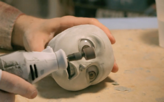
Creating a DVD Pt5
On the quest for giving myself more things to do, and to prolong the video editing for as long as possible to give my classmates a fighting chance of catching up, I have decided to set myself out to create a booklet for inside the DVD Case.
Now when approaching Kyrstie about this, I had mentioned how I knew what the outside covers were going to look, but I just had no idea about the contents.
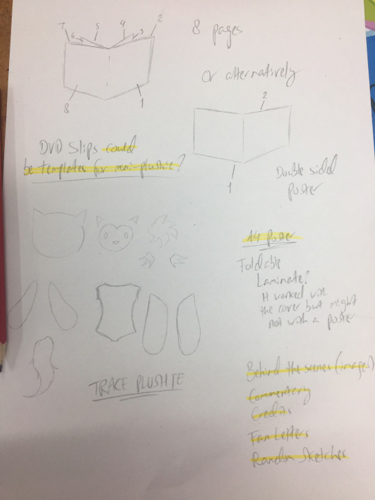
So she helped me brainstorm some ideas.
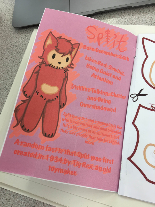
The first one being that the inside of the booklet should incorporate little information sheets on the characters, which I was open to, and the rest of the pages would have some sort of activity sheets, which I thought would be cool.
And the final page would be some sort of promotional material for the plushie (or other merchandise).
So I started drawing.


Of course these were just very simple sketches for the basic format.
I wanted specifically a page to also incorporate the template for the plushie itself, as the DVD was planned to be sold separately from a 'make your own mini' kit, however this didn't come to fruition and will just be combined with the DVD Kit.
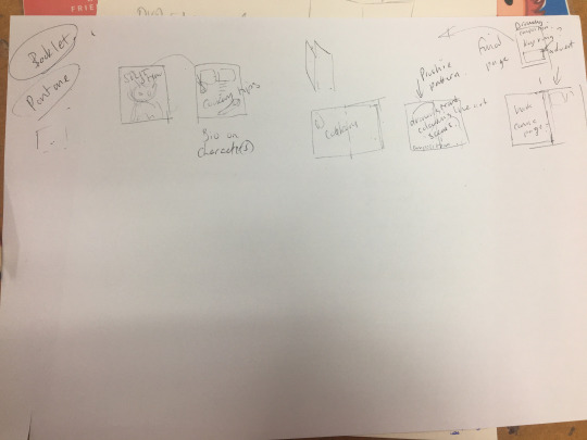
Though as I was drawing the cover for the booklet digitally, I just didn't exactly like where it was going, as all the activities just seemed a bit redundant.
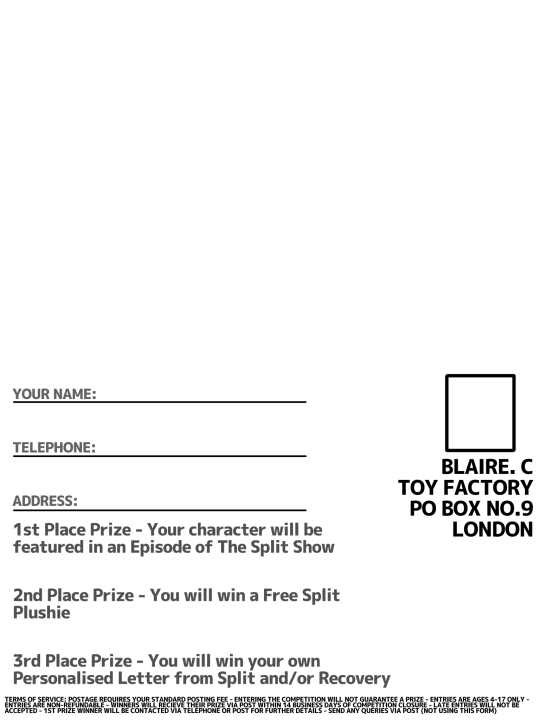
So I had decided that I would instead decide try to squash it down to simply just the two bios about Split and Recovery, the template and the competition entry.


The template having to atleast been sketched accurately by tracing the original plushie.

And once I had the digital pages all together, I'd printed it.
And I forgot to get photos, so take my word for it, it didn't look good.
Well, it did look good, but the cover was severely lacking as it didn't have a background, and it kinda gave off the vibe of looking really cheap.
However, the info sheet had to be tweaked too, adding a background to it, but this had unfortunately gotten a bit butchered during printing.

So once I'd added a background to the cover (along with fixing the formatting) and had printed it off once more.


The only issue I can see is gluing the pages together, as using a pritt stick does make the pages look a bit crinkly, but at this point I'll take anything I can get.
So next up is just printing off the info sheet.
0 notes