
Don't wanna be here? Send us removal request.
Statistics
We looked inside some of the posts by fmp2ocatherinek-g and here's what we found interesting.
Average Info
Notes Per Post
1
Likes Per Post
1
Reblog Per Post
0
Reply Per Post
0
Time Between Posts
17 hours
Number of Posts By Type
Text
17
Last Seen Tumblr Blogs


Fun Fact
Tumblr is used by 21% of adults online aged 18-29 years.
Text
The environmental impact of comics
Much like any other book there is an elements of waste that comes from creating a product like this...
0 notes
Text
Looking into my audience
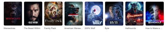
I think my comic fits into the genres included in the best comics of 2024 as a fair few of them look to be quite dark and explore similar themes to what Iv'e included in my story. There are also a good few films that have came out this year/last year that focus on werewolves and other creatures. I think my audience would be people who enjoy gritty and slightly dark crime dramas as well as the aesthetic of the 1930-50's (like fallout).
0 notes
Text
Speech bubbles
Speech bubbles are a really important and integral part of a comic and can be used as a tool ,along with the image, to convey a character's emotion or how they are saying their dialogue. This site highlights the many different bubbles, gives some examples and explains what there used for/ what they represent.
0 notes
Text
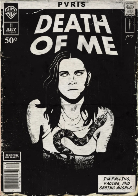
Adding the text and other details onto my poster
Much like how I picked the font for the dialogue in my comic, I went onto Defont and looked through the different styles of font they have. The categories I looked at where "Destroy", "Horror" and "Distorted" as I knew I wanted the title to have a ruff/ sketchy feel.
Font ideas:
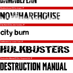

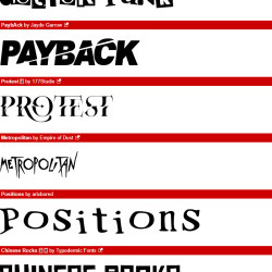
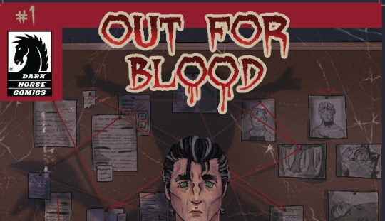
This is the font I went with and I found it in the horror section. It's name is quite ironic as my project has heavily referenced werewolves/ lycanthropes but that not the reason why I chose it. I like the jagged and uneven outline on the letters and how the tips of the letter go into a sort of point. What I didn't know was that Dafont has this feature that lets you preview the your text in that specific font so I was able to see if my title would fit before I even download the font.


This is what the font looked like when I had just typed it onto the cover. To add the font I had to move from Clipstudio Paint (which is were coloured the illustration) to Photoshop because for some reason I couldn't import the font into the Clipstudio program and use it.

The solid black text was quite hard to see on the cover so tried out ways to make it look more unique and add colour. I first thing I tried was highlighting the o's in blood at then decided to do that to all of o's in the title but it looked stupid so I got rid of it.

After that failed attempt, I made the whole title red and added a thick stroke to it to help it stand out and to give it that vintage/old comic look. I also added blood drops on the o's just for some unique flare as well as a gradient for more visual interest.


Once I had finished modifying the font, I started adding all the extra details that would make this illustration look like an authentic comic. I first started by creating this sort of boarder on the top of the cover as I've seen it on some of comics I've looked at. The Dark Horse Comics logo was then added it because I thought my book would be the kind of thing that company would publish. I next added an issue number in the corner as well as a bar code (which I found on the internet) and finally, my name.

After getting some feedback on how title obscures The creatures shadow, tried moving the text so it doesn't but I didn't like how it looked so I just raised the shadow layers opacity to make it a little darker and stand out more.
0 notes
Text
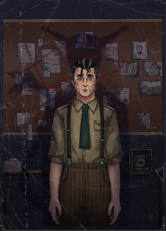
Colouring the illustration
Once the drawing stage was done I moved onto colouring. I had an idea that I could do the cover in grey scale/ black and white as an ode to the noir detective aesthetic I've lent into whilst working on this project however, despite liking how the flats looked, when I got to actually trying to render using the limited shades I had livable, I didn't like how it was going so I changed to using Hayze's usual colour scheme.


With Hayze back in his original colours, I started rendering each section of the drawing. I actually used a different shading style (that's more like my usual one for this cover) than the one in the comic as I thought I could get away with giving this illustration more detail/depth this way as its one image apposed to multiple scenes. This shading style has a softer look to it and uses more colours than the one used for the comic however I've still implemented areas of harsh shadows like in the pages. I don't think the different approach I used makes the cover seem disjointed from the pages and I quite like the change as it means I'm able to show off my characters in a slightly different way to how they are seen in the comic.


After I had finished rendering Hayze I moved my attention to the evidence board behind him. I hadn't really planned out what would be on each piece of paper but I knew that I wanted to have pictures of the crime scene and victim along with some mugshots of potential suspects on the board. I didn't want to physically write out each sheet of paper so I just squiggled on them to make it look like writing however I don't know if that will become an issue when the poster is printed in an A2 format as it may make the documents look weird.

When adding detail onto the pictures I didn't want to over do it so I opted to just add blood along with some light shading where needed.

Examples of evidence boards:


Now that both of the key elements of this drawing are done, I can now create this pieces atmosphere through lighting and by adding in Hayze's shadow which is in the shape of The Creature. First, I drew out the shadow's outline then filled it in with a blue colour, turned the layer mode onto multiple and lowered its opacity. With the layer mode now on multiply the blue colour I started becomes darker. I also blended the edges of the shadow with Gaussian blur to lessen the harshness of the shadows outline. To give the illustration more of an eerie feel as well as making the overall scene look darker I put a multiply layer over the whole drawing, rubbing out areas I wanted to keep relatively light with a soft eraser.


The last thing I added to the drawing was a vintage/weathered paper texture that I found on google. Once I had copied and pasted the image into the document all I had to do was resize it to fit my canvas size and lower the pictures opacity. I was going use layer modes on it but none of worked so I didn't use one. Because I had lowered the layers opacity the texture dulled slightly so I went in and traced over some areas to make them stand out more.


0 notes
Text
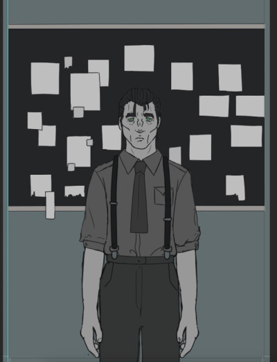
Starting my poster
I first started by sketching out the characters pose, being sure to mend the anatomy mistakes that were in the pencil drawing. From there, I built up the character by adding on his features and outfit. I also drew out the evidence board behind him however I didn't add any details as I wasn't sure on how much would be seen when the piece is zoomed out. Just to get an idea of how all of the components of the cover would look together, I added The Creatures shadow and roughly wrote out the comic's title (I will be using a font for it in the actual cover).


With everything sketched out it was time to clean up and refine everything and create what will be the illustrations "line art". In this part of the process I fixed any of the mistakes I missed previously and just check that I'm happy with how everything looks.

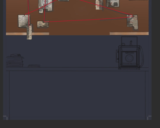
After working on the colouring for a while, I went back into the sketch layer and added in a table that had Loretta's camera on it along with some other extra objects. I was advised to do this as a way of filling some of the blank space that was behind Hayze as well as helping me to incorporate Loretta (in some way or another) into the cover illustration. I had came up with this idea for a cover design right at the beginning of the project so I hadn't even thought about adding another character into the story yet but I'm glad I could easily incorporate something that relates to Loretta as she is one of the main characters.

When sketching the camera, I used the one I had drawn for a comic page as a reference.


0 notes


Text
Adding the sound effects
I had planned to hand write all of the onomatopoeia's for these pages as I thought if I used a font it would look to stiff and not dynamic enough. For the word "flash" I new I wanted it to have some sort of outline (which I did by adding a stroke effect) but I wasn't sure on whether to make it white with black lines or black with white lines. In the end, I went for the black with white lines as it stood out form the scene as well as added some contrast to the bright atmosphere surrounding it.


I tried a similar thing with the "crunch" I added in the first panel however when the lettering had a black outline, it was really hard to see what the words actually said when zoomed out so I just left them white which helped them stand out more.


Although this is technically a character's dialogue and I could of done it using the same font I used in the previous page, I knew I couldn't get the look I wanted with a pre-made font. I wanted to portray the creatures victim as being petrified but confused at what is happening to him through how messy the "ahh" are however as the the string of letters gets to it's end I wanted the size and font to change to show the reader that the character is almost too stunned to speak or that hes just realized his fate and there is no escape. I tried two slightly different alterations of this just to see which one fit the best.


0 notes
Text
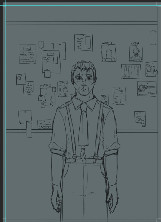
Poster design sheet
On this sheet I was experimenting with different designs and compositions for my poster. I knew that I wanted to have Detective Hayze positioned in front of a evidence board but there were multiple ways I could set that scene out. I was originally going to have him facing the board with the shadow of The Creature kind of creeping up behind him but I thought the idea would look better if Hayze was facing to the front with the shadow being cast behind him, alluding to the fact the he is the beast who has being killing all of these people.

This is a more refined sketch I did of the design I chose and it will be what I use as a base in Photoshop.

Examples/inspiration:
I thought looking into vintage comics and how they are set out would be a good idea and help me gain inspiration for my front cover. Seeing a variety covers ranging form Sci-Fi to Horror showed me how I can implement era appropriate elements (boarders, weathering, ect../) within my own as I think the vintage look would complement my story and characters.


0 notes
Text
Adding the dialogue to my comic pages
With the comic pages done form an illustration stand point, the last thing I needed to add to them is the dialogue and speed balloons.
These are the fonts that are available on Dafont under the subheading "comic":


I found that there was a good range to pick from under this tab with there being fonts for sound effects as well as other fun fonts however this was the one I ended choosing. I went with it because it reminded me the classic comic book font I'd seen used in multiple books. I also liked how it still had some of it's own character despite it being a pretty straight forward looking font.

Before I got to adding in the speech balloons, I typed out and roughly positioned each characters dialogue (which I took form the page script I made) to where it was supposed to be. This gave me an idea of where each balloon should go as well as how the page would flow now that there was text on it. I put the text in white so it was easier to see against the panels however I was never going to keep it that colour.


With the text practically sorted out, the last this to do was add the speech balloons. In the beginning, I wasn't sure on how I was going to tackle making the balloons but a quick look at some tutorials really helped. The video linked below was the one I followed and the method I used to do my balloons.
youtube
Here I was comparing the look of a balloon made with Photoshop's circle tool and one which I had done by hand. I found that the one made using the circle tool looked too "perfect" and uniform and I preferred the slightly jagged and more organic look the drawn one had.

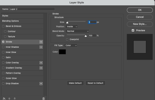
How I made the balloons was actually pretty simple. All I did was use a round brush to create a circle-like shape that fit around what was being said in the scene and to get the black border around the shape, I used the stroke effect and set it's thickness to 5. From there I was also able to add on the tails to balloons. Overall, this method was extremely straightforward to use and I really like the effect it gave my speech balloons.


One of the ways I made the speech look more interesting as well as helping with the overall tone of whats being said was by making certain words within the sentence bold. Although the font I was using had it's own bold version, I wasn't working for some reason so I got advised to copy and paste the words but instead of leaving them directly over the top of one another I should move the top layer ever so slightly so it overlaps the original font. These words being in bold helps show the reader that there's some emphasis being put onto them either in the way the character is saying them or simply because I want to bring the readers attention to them.


0 notes
Text
Norman Saunders
Saunders is an illustrator know for doing the art for many different trading cards like the Mars Attack’s cards, and cards for Civil war news. He also created paintings that were shown in "Pulp" magazines. Most of his cards and illustrations depict scenes of action sometimes along with violent imagery which is what I think characterizes his pieces. His style is quite unique and I like his use of bright, saturated colours in his paintings as I think it emphasizes what is happening in the art piece ad helps create a believable atmosphere within it. What I think sets him a part form other artist the most is his subject matter and what he paints as, at the time, not many people were used to seeing such graphic images on cards especially the ones on the WW2 battle cards as they have horrendous acts of violence and war on them. In his other works, because of their size, you can see the texture and brush strokes in the painting much easier which gives a nice organic feel to his art. Much like his card designs, these paintings also carry similar dark themes.


0 notes
Text
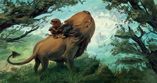
Tim McBurnie
McBurnie's illustrations are very well thought out and atmospheric which I think is partly down to the colour palettes he uses in his pieces. I quite like his style and the muted tones he uses for his characters and scenes along with the added texture his sketchy line work gives the piece as it just elevates it and makes it more visually interesting and unique. As for his comic pages, they all have a nice composition that cleanly tells the scenes narrative without the reader potentially getting lost within the panels themselves. The illustrations within the panels also seem well thought out with none of them seeming too crowed or confusing and with some, you don't even need dialogue to understand them.


0 notes
Text
The Pinkertons
youtube
Pinkerton ,formally known as the North-Western Police Agency, is a private investigation and security agency that was founded in the US in around 1850 by Cooper Allan Pinkerton and attorney, Edward Rucker. This video goes into how the organisation gained popularity as well as how it's work force grew threw the years. It also delves into the darker side of the agency and the controversial actions they took part in some of which included harming and killing innocent workers/people. These violent out bursts caused the Pinkerton's to be denied entry to certain states.
The Pinkertons in media:
The main character in the Bioshock game series, Booker DeWit, is a Pinkerton and got a reputation for ending labor strikes by using extreme violence.
Red Dead Redemption 2 includes the Pinkerton National Detective agency within the games story line.
"The Pinkertons" is a Western period TV drama that features stories based off of actual Pinkerton cases from the 1860s.
1 note
·
View note
Text
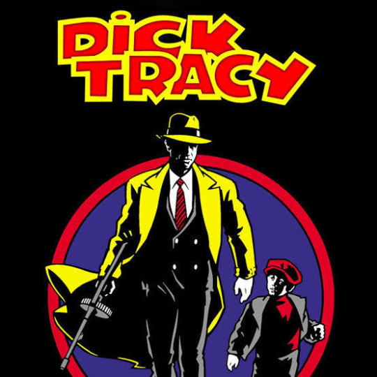
Dick Tracy
"Dick Tracy" was a action-adventure crime comic strip originally written by Chester Gould and published in newspapers all across the US in 1931. The main character was based off U.S federal agent Elliot Ness who was involved in the take down of notorious gangster Al Capone. The opening/background of this story was that Tracy joined the police force after his girlfriends dad got murdered by robbers. Despite the instant popularity the strip gained, it wasn't immune to backlash and the more negative opinions journalists had, with some saying it was "too violent". Since then, the comic has hand many installments in which Tracy finds himself in new situations, acquiring new gadgets (like the iconic two-way radio watch) and getting new sidekicks. It's been continued by different writers and artists after Gould stopped writing and drawing it in 1977. Dick Tracy and the world that surrounds him also found it's way into all sorts of different styles of media like radio, books, TV/film and animation. Dick Tracy's radio debut was in 1934 on NBC with it having a long run, finally concluding in 1948.

0 notes
Text
Murderers/serial killers
Randall Lee Smith:
Smith murdered hikers Robert Mountford Jr. and Laura Susan Ramsay ,who were both social workers from Main, on the Appalachian Trail in 1981. He plead guilty shortly before his trial started and got sentenced to two concurrent 15 year terms however he was released on mandatory parole in 1996 after serving 15 years. This decision was met with a lot of backlash and anger form the victims family as well as the hiking community. In 2008, Randall attempted to kill Scott Jonhston and Sean Farmer on a fishing trip less than two miles from where he killed the two hikers. After a befriending the two men over dinner, without warning Smith started shooting them, hitting Soctt in the neck and back and Sean in the head and chest. Both men survived their injuries and Smith was caught by police after trying to escape the day after in Jonhston's truck which he crashed.
Son of Sam (David Berkowitz):
Berkowitz committed eight shootings in New York between 1976 and 1977 which lead to the death of 6 people and leaving 11 wounded, his weapon of choice being a .44 Special Caliber Bulldog revolver. He eluded the biggest police manhunt the city had ever seen but left letters mocking the police, stating that he would be back. He was finally arrested on the 10th of August 1977 and confessed to all of the shooting however he claimed to be obeying the orders of a demon who was in the form of a black dog called "Sam" however he later reviled that that story was a hoax. David was sentenced to 6 consecutive life sentences with a chance of parole after 25 years. In the mid-1990's now a converted evangelical Christian, Berkowitz amended his confession now saying he had been a member of a violent Satanic cult which had arranged those incidents as ritual murder.
Harold Shipman:
Also Known as "Dr. death", Shipman was and English GP who was estimated to have killed 250 victims over 30 years (1975-1998). He killed his victims (who were also his patients) by giving them high doses of diamorphine. He would then sign the death certificate of the recently deceased putting the cause down to something like old age so it wouldn't be debated as well as falsifying medical records saying that the patient had been in poor health. Shipman also forged the victims wills, making him be part of them so he was able to inherit the victims money/ estate. He was convicted of murdering 15 of his patients on the 13th of January 2000 and sentenced to life imprisonment.
John Wayne Gacy:
Gacy ,also known as the "Killer Clown", was an American serial killer and sex offender who raped, tortured and killed at least 33 young men and boys. He committed his crimes in his ranch style house and would lure his victims in and trick them into wearing hand cuffs as part of a magic trick. Then he would rape and torture them and finally kill them through asphyxiation. 26 of his victims bodies buried within the crawl space in his house, 3 were buried elsewhere on his property and 4 were discarded into a river. Gacy was arrested on the 21st of December 1978 and was executed by lethal injection in 1994.
0 notes
Text
Crime/detective media
True Detective:
This Neo-noir anthology crime drama created by Nic Pizzolatte had has a total of 4 seasons with each one including its own self-contained narrative and a new cast who we follow through various settings. Season one is set in Louisiana where a pair of sate police detectives peruse a serial killer with links it the occult. Season 2 is set in California and follows 3 detectives and a criminal-turned-businesses man as they investigate a series of crimes they think is linked to the murder of a corrupt politician. Set in the Ozarks, season 3 follows 2 Arkansas sate police detectives as they investigate a crime involving two missing children. The 4th season, True Detective: Night Country takes, place in Alaska where an investigation regarding the sudden disappearance of a team of 8 researchers gets underway.
youtube
Fargo:
Fargo is a 5 season series based on and heavily influenced by the 1996 film of the same name (directed by Joel and Ethan Coen). Much like True detective, the seasons have separate story lines and a different cast however there are some elements (like cahracters) that bleed into the other stories. The stories in Fargo are primarily set in the American Midwest,Minnesota, but the time periods where the story takes palace ranges form being in the some what present day (2019) to the 1950's. Although every season follows a different event, they all share themes of dark humor, crime/organised crime and murder.
Dexter:
This crime drama TV series ran from 2006 to 2013 spanning 8 seasons not including two spin-offs, Dexter: New Blood (2021-22) and Dexter: Original Sin (2024). Set in Miami, the show follows Dexter Morgan who works for the Miami Metro Police department as part of the forensics team, specializing in blood splatter analysis. Morgan leads a sort of double life however, as a vigilante serial killer who uses his own "moral" code to hunt down and kill criminals who have some how dodged/ been inadequately punished by the criminal justice system. Each season follows on from the last but there is usually one main case per season along with some other minor ones that pop up.

Sweetpea:
Sweetpea is a British dark comedy-drama that focuses on Rhiannon Lewis, a young woman who is constantly looked over and ignored in her daily life leading her to developing a strong resentment for everyone who ignores her. After the tragic loss of her father and the return of her high school bully, Julia Belkingsop, Rhiannon's life becomes extremely difficult with one unfortunate event happening after the next. All of her pent up anger and emotion finally escapes however and leads her to gain a taste for murder.

0 notes
Text
Elizabeth Short (a.k.a Black dahlia)

Short was brutally murdered, with her corps being found the morning of January 15th 1947 in a vacant lot in the neighborhood of Leimert Park. Her body had been severed in two at the waist and drained of blood giving her a white complexion. Elizabeth also had several cuts on her body including on her face, thigh and breasts with areas of flesh being entirely cut away. Since the body was recovered and an extensive investigation was started the LAPD had over 150 suspects however none of them were ever arrested. This case was widely publicized by news papers due to the gruesome nature of the crime and with the increase in attention from the media came many theories and speculation about who Elizabeth "really was" with journalists circulating rumors that Short was a prostitute or a lesbian. The nickname "Black Dahlia" was given to Short ether from the journalists who had been covering her murder or it was given to her in mid-1846 by staff and patrons of a drugstore in Long Beach.
0 notes