Don't wanna be here? Send us removal request.
Statistics
We looked inside some of the posts by fmpheidiwatson and here's what we found interesting.
Average Info
Notes Per Post
0
Likes Per Post
0
Reblog Per Post
0
Reply Per Post
0
Time Between Posts
10 hours
Number of Posts By Type
Text
17
Last Seen Tumblr Blogs


Fun Fact
If you dial 1-866-584-6757, you can leave an audio post for your followers.


Text
Figuring out how things split from each other


And adding a little more detail

Added colour!
0 notes
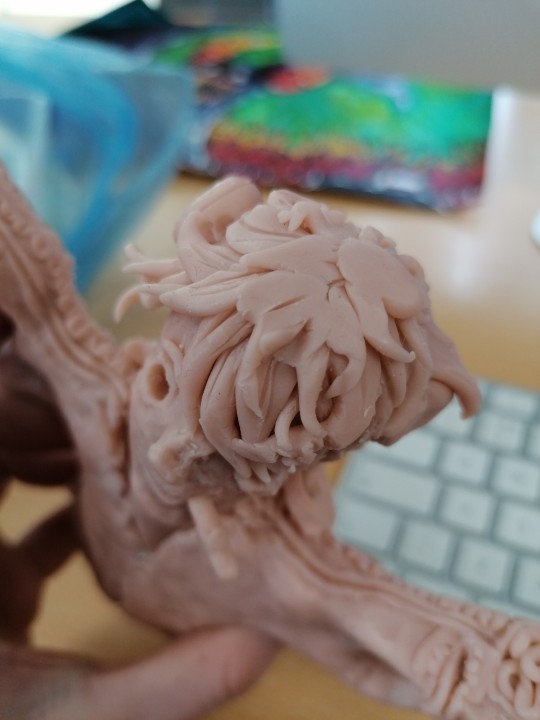
Text
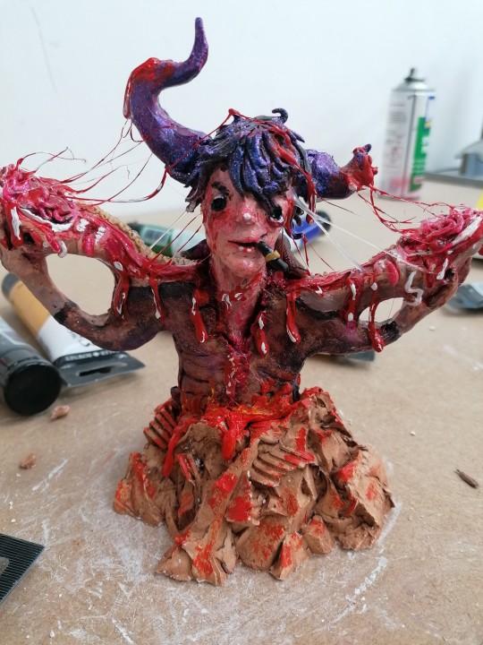
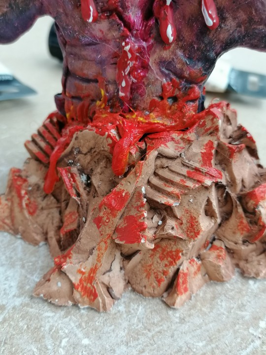
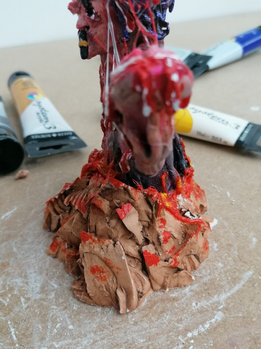
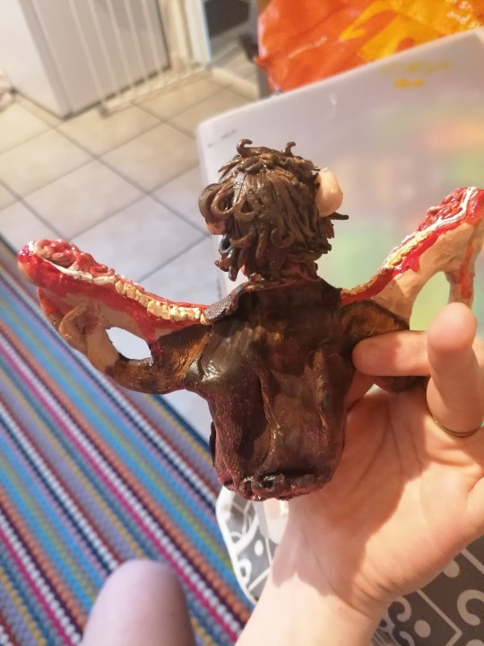
The finished model with a base that kyrstie lovingly made! To create this base you have to use clay and stab it with a knife to get a pointy negative mould, then fill it in with plaster of Paris and carefully pull away once dry. The base isn't painted, and that is the natural earthy colour when you pull it out of the clay-i just dry brushed some blood splatters in there to fit the aesthetic of my model.
0 notes
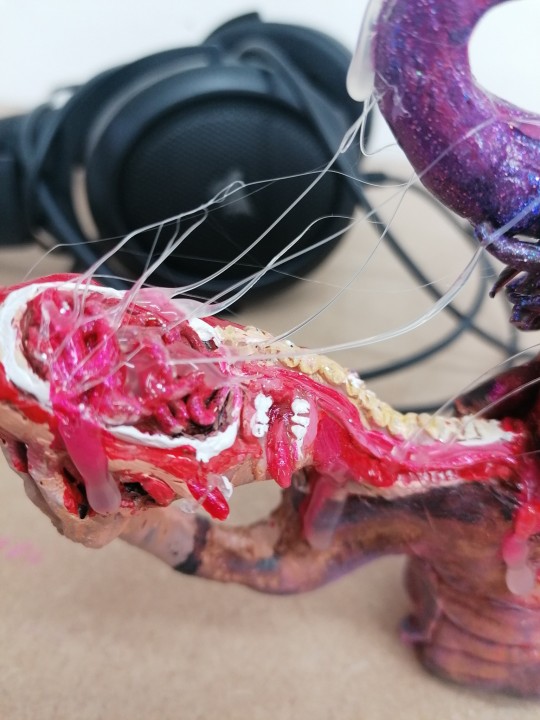
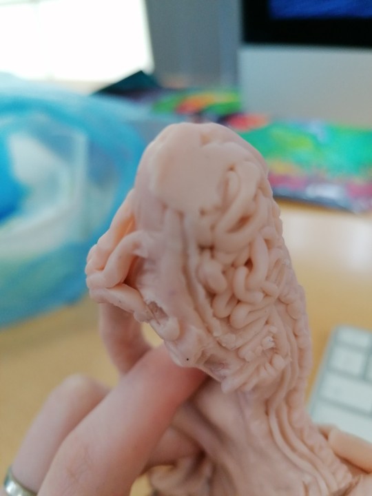
Text

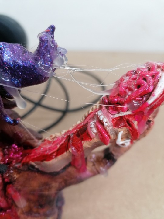
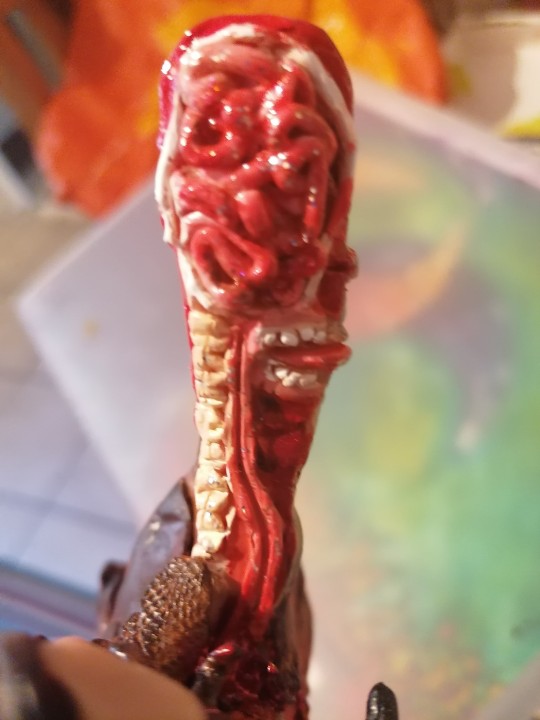
I added strings of "brain goop" or "head saliva" by drawing beads of hot glue across the model slowly and blowing on it to cool it in that position as I went, and I think it turned out quite realistic. The only issue I have is that hot glue doesn't dry clear, which was my desired effect. To overcome this issue I will paint it red to look like brain goopy blood.
0 notes
Text
Very very very quick draft of what I want to make for an animation but I left it very last minute- I do not aim on finishing this as next week is hand in week, so I only have the weekend to create this.

This is an animation based on the model I created. Alot of skin ripping and graphic bits, but this is very basic and rough.
0 notes
Text
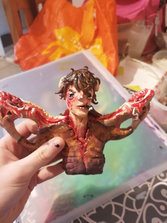
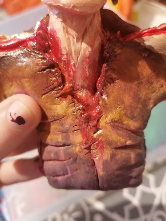
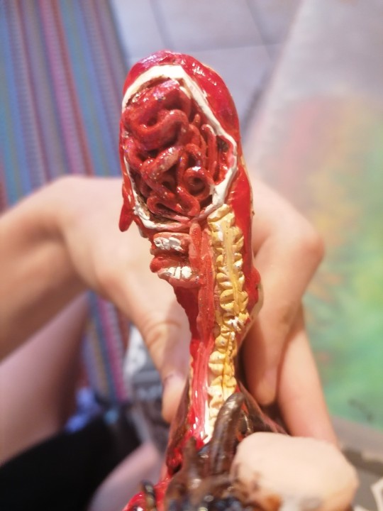
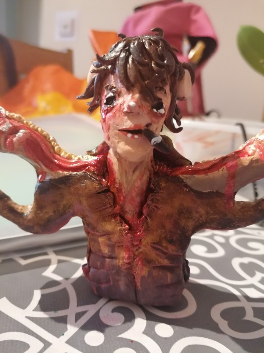
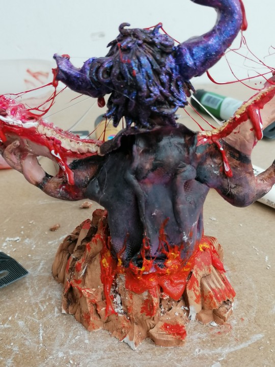
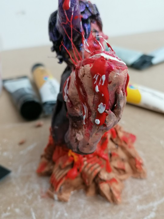
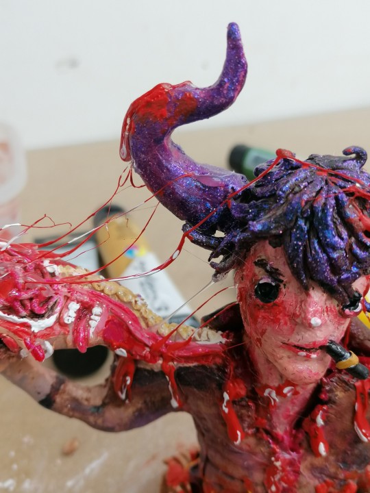
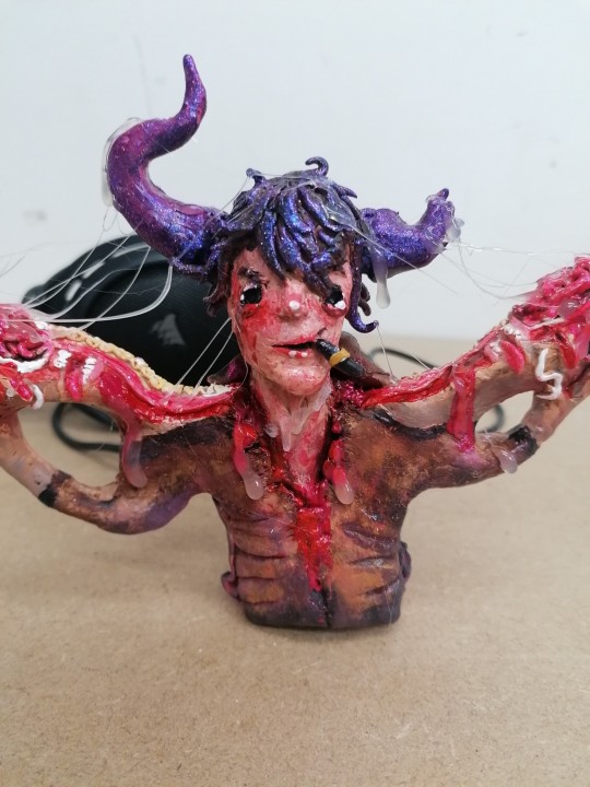
I repainted my model and added shadows and highlights, and also some glitter and gloss with the materials I had at home which just happened to be nail varnish. I know this isn't the best for models but it did the job-the only downside I found was that it took forever to dry, so whoever I wanted to continue painting I constantly smudged the paint and had to redo it. I think it looks alot more vibrant but I'm still not overly pleased with it- it just doesn't resemble my sketch at all. I can't seem to get the paint job right and the model was created quickly so there are lots of bumps and cracks in it.
It's face looks like the girl from hereditary.
0 notes
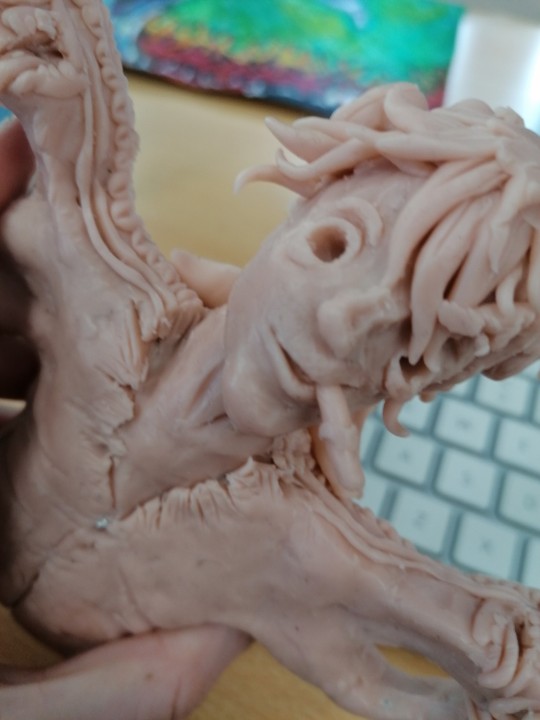
Text
Human anatomy
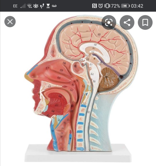
This is one of the references I used to create the inside of my split head.
0 notes
Text
Acrylic vs watercolour model paint
When painting your model you always want to use acrylic paint instead of watercolour as I found out from the previous project - and have not made the same mistake since. Watercolour does not dry on super sculpey and turns into a gloopy mess.
0 notes


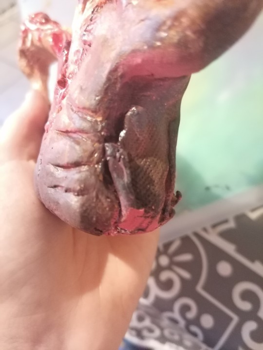
Text
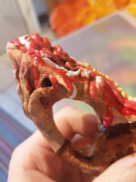
Damages to my model in transport
While transporting this model to college it suffered some minimum damage. the nose was flattened completely but I managed to resculpt it, but there are still quirks to the hair and split head that I need to work out. This has caused me to fall behind schedule and I don’t know if I'll be able to pull myself back from this in time to finish this model, which is a real shame. I will be working tirelessly over the weekend to try and fix, bake and paint this model, even though it is not of the quality I wanted, I really would like to see some colour on this.
0 notes
Text
Comparing my illustrations


I actually do favour the first illustration I created a bit more; I think the colours work nicely together and everything feels a lot more smooth and comfortable, whereas the second is a bit hectic and all over the place. The first illustration was in the style of Dan Hipp and I am much fonder of the way that turned out.
What have I improved on? I believe I've improved on my time management skills as I was able to complete this in a day instead of two. Although I prefer the first illustrations I created, I have also improved on working on criticism I receive instead of brushing them aside.
What else can I improve on? I think this is a massive learning curve to trust my own instinct. Although I can take feedback I don't always have to act on it, as in this case I prefer what I was doing beforehand.
0 notes
Text
Sea Stacks

I had to look at sea stack to reference the stack my tattoo parlour was sitting on, but I don't think I managed to get it quite right even with kyrstie’s help.

The shape looks okay, I just think the colouring is a little off.
0 notes
Text
PROGRESS

Here, the watercolour image has been transported into photoshop and I was just playing around with cutting out the background and filling in the blank spaces. I redrew the stack of where I wanted the tattoo parlour to go ( slightly higher and smaller so it further engages the monster) and figure out what I could do to improve the painting.

Unfortunately I forgot to take screenshots of the progress, but first of al came touching up parts of the monster. I re-outlined the whole thing in black, touched up the lines on the body and used blue highlights to contrast against the skin.
I smudged the background and used an artistic filer to make it brighter, and for the flames downloaded a brush to make it a little easier as I didn’t like the ones I drew before- they looked too cartoonish.

This isn’t much different, I just used a slight colour dodge on the shading of the monster to make it look more hit on by the light of the fire.

I added a person!

I will possibly redraw the house and stacks the feedback on it wasn’t great.
0 notes