
Don't wanna be here? Send us removal request.
Statistics
We looked inside some of the posts by fmpollieenever-blog and here's what we found interesting.
Average Info
Notes Per Post
0
Likes Per Post
0
Reblog Per Post
0
Reply Per Post
0
Time Between Posts
4 days
Number of Posts By Type
Text
17
Last Seen Tumblr Blogs


Fun Fact
Tumblr is available in 18 languages.


Text
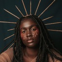
Final evolution.
Final evolution.
Concept and progression
This project, being our biggest and most important, made me want to push my abilities and therefore try new things to make my shoot out of my comfort zone, something I rarely do if I can avoid it. To begin with I knew I wanted to shoot more of a portrait led project with chance to shoot in the studio as well as on location depending how I wanted the shoots to come out. My idea for the project came around after discussing with a friend how dreams (and nightmares) are so easily forgotten and yet when something triggers the same or similar dream again the feeling is almost identical. So, from there I wanted to try and recreate the common nightmares people have and don’t seem to talk about or remember to well until it is experienced again. With this idea being simple and easy to work with I begin thinking of how I could incorporate the idea of familiarity yet leave the shoots slightly abstract. I didn’t like how the thought of being obvious with my shoots, which left me feeling bored and uninspired, it seemed to avoid this I needed to look for inspiration and avoid the first thoughts I had in terms of planning a shoot. I feel the shoots I did fit well with this idea even though some of them I’m not as pleased as I’d hoped for. The final picture I have selected for the summer show was shot on one of my practice shoots and not even from an actual pre-planned shoot which I had hoped would be better. I think this was because I shot without a clear image in my head of how I wanted it to look and I let the shoot just flow without trying to control it too much or go to over the top. The image below represents anonymity in dreams and connotes the idea of evil with the red smoke.
This project started off with the idea to recreate the themes in dreams and nightmares with some contextual side to it as I went along. But as I started shooting and editing my work I felt it was all moving very quickly and with my bad time management, felt it was more important to edit and finish up shoots I had started than to start doing something else on top of what I had already done. I knew this would make me more stressed as I would have twice the amount of work to do, which wasn’t all practical based. This meant I didn’t really have the contextual written work or influences I’d have liked to get along the way. Also, this is a negative thing to come out of the project I also feel it meant I could follow what was more important to me, a more personal project than something I felt forced to do. Because of this, I do want to try more portrait, model based work in the future in this style as I found it fun to as well as to edit. The use of drastic colours and the smoke does create a very bold, eye catching image which I don’t tend to have when I shoot landscapes.
The main thing I’d change if I were to shoot this project again would be my time plan. I failed to make a detailed one and one I knew I’d stick to. Photography to me is something I love to pick up when feeling inspired and if forced I always feel my work reflects that. I would say at least half of my project was forced as I felt the time slipping away from me whilst only having a few shoots. This did make me force out more ideas and create a very detailed image in my head of how I wanted my shots to look like which helped in the long time from the editing side. If I were to shoot my final image again the main thing I would be paying attention to is composition, to me there is a little bit too much negative space to the left-hand side of the model and but cropping the image it either looks to narrow or badly shot. I think this is due to using the smoke grenades for the first time properly and trying to compose that correctly and getting the shots I wanted, I ended up forgetting the rest of the image.
Research
When researching into horror styled photographers and projects people have done I found a large percent used violence or gore to create a darker, creepier atmosphere and this was something I didn’t want to do. I came across Joshua Hoffine whose work was a bit more of how I wanted my final images to look. He didn’t use the graphic gore in every shoot and this helps make the viewer create their own scenario within the shot. I found it easy to first think of how I wanted my shoot to look then decide how I wanted the model to look and where I wanted It to be based. This first, almost sketched idea made me ignore the composition and style based things when thinking of what I needed to include in the shot. Lighting wise I wanted to try some styles like Joshua Hoffine but felt once I had shot a few times in natural light that this was how I was going to do all of them. Looking back, I think I would try at least one shoot with studio lighting just so I could have experimented more.
Blog wise I feel I could have done more researched and evaluated how this effected my work and thought process as I felt most of my ideas came to me randomly through the day or at night whilst the research would have had an impact to this it wasn’t ever when I was sat writing on my blog. This meant I ended up missing out stages of progression and tried to recap back as I was blogging in the day or at college, usually this meant a while after the idea had come to me.
Problem solving
The main problem I came into when doing this project was shooting in jpeg. Something I never do and have no idea why my camera kept going into that mode. The first time this happened I assumed it was due to being very cold and I must have turned the dial by accident and not realised. This was okay as I went out and reshot the next week. Unfortunately, didn’t like the outcome of that second shoot anyway as the first seemed to look a lot better. The next time I did this it seemed my camera kept going back to this setting by default unless I had accidently changed it again. To this day I don’t know but it’s not done it again, only when needed on these shoots. I reshot these two and changed were I felt needed without a huge problem. Luckily my favourite shoot which ended up being my final image was shot on raw. and had no technical problems during it.
The only other thing I feel I have had to overcome is the time management I had throughout this project. It being so much longer than previous ones, I made good progress to begin with and felt a slight downhill as it got started and had to pull myself out of that to carry on shooting and researching else I knew I’d get stuck with little work done and I’d have to do loads last minute. This fits with my planning stages at the beginning of the project, knowing I can’t keep to a time plan like that I started a basic layout that I knew if I swapped around and changed as I went It would work better for me. But as the project went on I started to move away from it as I felt it was stopping me from experimenting and taking my own route for my work.
Practical skills
From the beginning, I knew there was lots to learn for the style I wanted and that was how I wanted this project to go. A learning curve and a big push to try something new for me. It started off with basic editing of bold colour in photoshop and colouring in with layer and mask to create the tones I wanted. Removing things and replacing objects in photos became something I was doing a lot for my photos and that was a test of my skills and practice as if I don’t feel my work is as best as I can do, I end up hating it. The worst thing I felt when editing my work like this was seeing unnatural lines where the brushes had effected the image a little too much in certain places and not being able to do anything about it as that was the extent of my photoshop skills.
After a few practices and shoots it felt more natural to me which helped when doing it in mass on shoots I wasn’t sure which image I looked the most. I was also new to Tumblr when starting this project to that took some time getting used to the flow of the website and how to customise your page to how I wanted it to look. Luckily it wasn’t hard and I didn’t come into any issues where I know other people have when using Tumblr. The reason I started off doing something different in almost all senses is because I felt this big project shouldn’t only be something I want to do but it should also be something I grow as a photographer when doing creating a diverse portfolio at the end. As long as I was going to enjoy doing it from start to end I knew that’s what I wanted to do, didn’t matter what the actual concept was. Although I am happy with what I chose and ended with.
Evaluation and reflection
I had evaluated once I had shot and edited my work in most cases, but looking back I know that I could have done more for it and expended myself a lot more. This is something I definitely regret when writing my blog. From the colours chosen and composition used could have been wrote about a lot more. It’s something I’ve always struggled with when writing as to me it’s not something I think about in black and white it’s just something I’ll do on the spot without thinking into it like I would write about it. All refection was done on my blog other than what was in my head but I did try to keep that down on there as it was always something to do with previous shot work. In some cases, I would go back and write little bits on my work as I felt at that point I had a vailed feeling towards this where I could write about it without just being negative.
I don’t think my overall evaluation skills were the best they could be and I also don’t feel this effected my blog to much as there was still a good amount where I felt I had the most emotion towards my work. Some shoots where done to fill the box and not to be how I wanted them to look
Presentation
From the beginning of this course I have been worried to do the final presentation as my bad social anxiety makes me feel extremally nauseous and faint at even the thought of having to stand at the front of the classroom to talk about my work. I found it very hard when preparing my work knowing it was going to be up at the front of the class but as I was making a PowerPoint I knew if I had memorised a few parts to it I could go off my memory but also use the images on the board as ways to change the way it was going if I went off on a tangent. When it got to the presentation I found it hard sitting waiting as I was the second to last and it meant I had to be there whilst everyone else was doing there as my nerves were building up. But whilst up there it was okay and I felt okay by the end of it, the build it is always worst in my experience and that sort of situation is my worst fear but after doing it I knew I didn’t have to do that again and could get on with my project without any issues.
I feel my blog goes along quite well and shows my progression from the beginning of this project to where I am now with my final image up in the summer show. But know if I were to evaluate further on each post it would go together a lot better. I have posted each stage of my work which I think has an almost step by step guide of how my work improved and changed ideas throughout which I like. The end result showing final images is a good way to end it in my opinion. I am also pleased with my final image even though I planned to have a series printed where it could almost tell the story its self, now it’s just a single cool looking image without much context. I know this isn’t always a bad thing but as I wanted my work to have a story behind it from the beginning this was a bit annoying at the end when I had edited the others and felt it would drag my work down as they weren’t as good in my opinion. The message is still there in a sense but I know with the others as a set it would show the meaning a bit better. This isn’t a huge problem because this can be seen as a single image as well now without the others and the viewer can create their own story if wanted. By artist statement next to it at the show will also help with the concept to those who want to see it through my eyes.
I am presenting my summer show work on a 5mm Foamex board which in my opinion looks much better than if I were to hang my work in a frame. The boarder of a frame I feel would definitely take away from the actual image and almost make the image seem further away. I wanted my work to jump off the wall with the strong contrasting colours and bold lines, this on the Foamex floating off the wall I feel shows this off well and doesn’t take away from it at all. If I was to do this again I’d spend more time editing my work as only after printing did I realise the lines along my work which stand out quite a lot on the print but also don’t matter to much as these are cracks in the floor and almost look intentional. Just something that after so long doing, just bugs me.
Character development
This project has brought out a new sense of responsibility in myself I think, with having to organise my time, models and working schedule this has made me see the importance of being more responsible of myself. This also links with my drive for working well and efficiently towards this project and work at home. In terms of college I feel I met all deadlines well and in time without too much stress as I tried to deal with them either as soon as we got them or when I knew we still had time yet I could still complete other bits of work beforehand. I put a lot of effort into this project and spent a lot of time trying to get it exactly how I wanted it to end out. The presentation is exactly how I wanted it when I decided to use one single image. I had to push from the beginning when I shot a lot of my work in jpeg which at first really annoyed me and started to make me give up on giving as much effort as I was towards this work. Planning a shoot at the weekend when I could get other people involved and then getting home, starting to edit and realise it was in jpeg was very frustrating.
Meeting the proposal
My whole project and final images fit the proposal I wrote which to me is a good sign of keeping persistent with my work. This could be one reason I like my final images and they don’t fall to far from my original ideas. I enjoyed editing these and shooting as it was something I wanted to do from the beginning and not something I almost forced myself into from choosing a bad idea which didn’t leave me with too much room. The best parts where actually having fun experimenting and shooting these instead of finding it calming like I normally do. Other than finding out they went wrong which was by far the worst part of this project. Spending all the time organising it and finding out it went wrong was irritating.
When talking to people about my work, college students, friends and family were all saying similar things about how their favourites were the bold coloured, strong contrasting images which is one reason I carried on editing and seeing what I could do with my final picture. I agree with this as a single image it creates a bigger shock factor which to some people is the only way to get their attention when it comes to photography. I loved creating this image so getting positive feedback was great.
Time
I feel there was more I could have done and understand this now looking back at my work but at the time whilst doing it I felt I was doing okay. This is the calculated average time I spent on my work.
- Research - 40
- Shooting - 25
- Editing - 50
- Blogging - 160
- Planning - 28
- Practising - 20
- Total – 323 hours.

0 notes

Text
Budget
re

Installation £2
Business card £10 - This price is based on www.moo.com, 50 business cards done at a good quality means when someone sees my work with them along side it shows a better professionalism overall. Hopefully this can up the first impression of my work and prints.
Mounting £30
Ill be printing my work onto foamex as I really like how this looks and feel with my images it would look a lot better than in a normal frame.
Printing £14
I will print one A3 and two A4 prints, my A3 is shot in portrait so will sit to the side of two landscape A4′s, I like how this looked on photoshop when I did a mock up and think this will look best for presenting my work.
Travel £20
Overall I haven’t need to travel to far by myself or pay as when friends have gone on shoots I have managed to join and pay a little in petrol, this means overall I have only really spent about £20 for traveling to location. As most locations I shot at were out in the middle of nowhere or away from train and bus stops it meant I had to find another form of transport and getting lifts was the best way of doing so.
Props £50
This includes all my masks, smoke grenades and bits brought for this project, I have used them in all my shots but one so feel they were worth the pay if it has helped bring out the eerie look to my work.
Mean -£107.82
Median - £85
0 notes
Text
Final shoot image

Im not pleased with this shoot as it didnt come out anyway near how I wanted it. The whole image has a very bright and happy feel to it even with playing with the contrast, curves and tones. I spent a long time editing away the skin and now feel it was pointless as this no longer represents the concept behind it and doesn't work side by side. Id like to try this again but shoot somewhere which could tell the story more or somehow make this look a lot darker and creepier.
0 notes
Text
Last shoot editing.
Upping contrast and making this image darker hasn’t had the effect I had hoped it might, further editing makes it clear I can’t use this for a final image and that I really don’t like it. I feel the overall narrative to this shoot was lost and that if I were to print it along side my others it wouldn’t fit in at all.
I feel the overlaid image of the dirt has helped to add a darker atmosphere but it still looks very simple and to clean. I have learnt from this to either practice shooting in a style i'm not sure about or to plan how I want to it to look over editing and not just to shoot to get the images exposed and composed correctly.
Im not happy with how this turned out so will not be doing anything more with it. I am going to carry on editing it when I can to try and make the best I can with what I have.

0 notes
Text
Anonymity.
This shoot, even thought it was a practice is still my favourite and boldest. I wanted to make sure that if I were to like them I could use for something. This is where anonymity comes in, the faceless, or unknown is a huge thing in nightmares as a lot of people when dreaming of something terrible tend to see the person or thing without a face.Some people believe this is to do with a loss of identity or the feeling of being out of control of who they are.
Composition wise I feel this is the best I have shot and leaves no questioning what it is or how it fits. The simple use of the smoke grenade added a huge overwhelming sense of power and professionalism I feel. The bold contrasting colours fit perfectly with the theme and it would be perfect for a centre, big print.

0 notes
Text
Third shoot edit.
After putting the images together its clear it's not creepy or even slightly in the style I want. I am going to have to try different colour schemes, laying textures and colours over to make a darker, horror style image.
It was easy to get the effect I already have, mainly just lay masking, selecting and erasing to make the skin and body disappear. The hard part is now to make the overall photo look like the others and fit my project.

This is the sort of effect I wanted, the original image which inspired me I couldn’t find but this fits in the same style. The lighting in this shot is a lot more professional and crisp compared to how I wanted my final shot to look, the background also plays a part in this but didn’t think of that when shooting the first shot.

0 notes
Text
Shoot three.
This shoot contact sheet is different to my others as the shoot needed four pictures to work, overall the images aren’t grungy or dark enough for my shoot so will need a lot more post editing to make the horror feel become more clear.
I like how it worked out as the images work well to create the effect I wanted, they just aren’t in the style I need. I also missed out on shooting the jumper by itself so I can’t separate the back from the backing photo.

0 notes
Text
Presentation for summer show.
This is the first layout I wanted to try for presenting my shoots in the summer show, my favourite photo biggest, possibly A2 and two small, A4 at the side. This will provide a slight variety to my shoot and show more of the story behind them.
I want to print all my photos in gloss as this will create a nice shine bringing out the smoke and bright whites in the photos. All will be printed on the same paper with same qualities to make sure they prints themselves all fit together well.

0 notes
Text
Powerpoint.
Presenting this powerpoint was something I have been wanting to put off doing as I hate public speaking and showing off work to anyone. I found preplanning the talk and knowing what was coming helped and knowing where my project was going, shoot and location wise etc.
The powerpoint consisted of artists who inspired me the most, practice shoots and my first actual shoot. I then explained further how each shoot went, how I did it and where they were shot to give an overall understanding to my project. The first shoot which was done in jpg helped me explain and expand the talk a bit for my first actual “falling” shot.
If I were to do this again I would probably true to expand more from the beginning to help let the presentation flow and make sure I don’t explain everything from the beginning. I felt It went okay and will have helped for future public talking.

0 notes
Text
Mike Perry exhibition.
Mike Perrys land and sea. My first thought of the exhibition was that it looked very clean and professional. The use of the same frames made the whole first floor very even taking any distractions away. The overall effect of this made the exhibition look very well thought and delivered.
I like the how in the first room all the images were level and with the same background.


0 notes
Text
Second shoot, Drowning.
This is the second time I have shot for the category “natural disasters”, my first idea was to shoot with fire. This went very wrong as it was uncontrollable and became hard to make it flow how I wanted. After shooting that and editing I realised I had shot in jpg. meaning that photoshoot was a waste and had no point in editing more.
I changed my idea a little to show the nightmare of drowning, which can also still be linked into the natural disaster ( 540 people year die from drowning in the uk). I began shooting with the intention of having water leaking from the eyes and mouth, which as i began shooting I realised this would be a lot hard than I expected. The mask sank to quickly and the water looked to clear when shot like this. I started shooting whilst dropping the mask from the height of the bath to create the effect of the mask naturally sinking past water level.
The original colour of the water was a deep blue which made the effect of deep sea and overall created a dramatic image. I didn’t like how the blue took away from the image and didn’t portray the eerie, horror style I was trying to create. I then played around with selected colours and found that this black and white effect looked far better with the strong contrasts and the juxtaposition of the negative space and the dark, empty water surrounding it.

0 notes
Text
Unedited drowning.
This is the unedited, raw from my shoot which I chose to shoot in colour to begin with. I don’t like how the colour takes away from the narrative and idea behind this image, this is the main reason I put it in black and white, something I dont normally do. The dark blue was how I wanted it to turn out but after post edit I now feel it takes away from actual reasoning, something I can’t let if I want my images to work in a series.

0 notes
Text
Second shoot contact sheet.


I began this shoot with the thought that the mask would float, enough so that I could see the water through the eye, possibly coming through a little. Once I put it in water I realised it would be a lot harder as this mask sank to the bottom making a very dark and unclear image. The image I have used to edited and use for the final piece was taken just as the mask sunk below surface and had some motion across the whole image.
0 notes
Text
Second shoot thoughts.
After this shoot I have realised what I can and do throughout the ideas stage and thought process might not be how I want or shoot the actual images, depending on how the whole process goes.
I want my next shoot to be similar style and simplistic but a very heavily edited one, the idea of disappearing or having someone close to you leaving. I want to create the look of clothes floating, no skin or person in them. Something which will start off as a basic portrait but be heavily edited and warped. I will be uses colour, probably but after this last shoot I don’t want to shoot with the idea of using either, just to keep it generally good for both.
0 notes
Text
New Second shoot prep and shoot editing.
For this shoot, drowning, I wanted to create something a little more surreal or abstract, something without people in but shows the same meaning. I decided I wanted to use a plain, white mask which wouldnt distract from the whole image and would be visually easy, something you don't need to work out what it is or what it signifies.
I started off wanted to create a blog like effect to be pouring out the eyes and mouth whilst against a black background but thought it was a fairly simple and wasn't very original. So I began to look into and think about the use of food colouring in a bath full of water to show the mask “drowning”. Imagining what colours would work well and how they would look. After this I looked into bath colouring for kids, something which wouldn’t stain or leave a mark as this wasn’t a bath just for the shoot.
I filled the bath with enough water to cover the mask and a little extra so it could look deep, added two blue and a orange which made a nice dark, sea like colour. Shot and edited without an issue, only thing which didnt sit right with me was the overall colour and look, not very horror like. I switched the colours around and played with hue and colour masks.
Black and white looked much better than anything in colour, the strong juxtaposition from the mask to the deep black water looked much more like how I had imagined, and therefore a lot more creepier.
0 notes