Don't wanna be here? Send us removal request.
Statistics
We looked inside some of the posts by francesgraphicdesigncca and here's what we found interesting.
Average Info
Notes Per Post
0
Likes Per Post
0
Reblog Per Post
0
Reply Per Post
0
Time Between Posts
2 days
Number of Posts By Type
Photo
4
Text
10


Fun Fact
Tumblr posted its first advertisements in May 2012 and subsequently earned $13M in revenue.
Photo


Unit 5 Professional Presentation, Frances Loftus https://drive.google.com/file/d/1-8nit9_m2uAGWSNIIJuTcvUKaKQgIyMz/view?usp=sharing
0 notes
Text
Key Reference from Blog
Ann Coxon, Briony Fer and Maria Muller-Schareck, Anni Albers, exhibition catalogue, Tate Modern, London 2018.
Anni Albers 1899-1994 (2018) [Exhibition] Tate Modern, London 11 October 2018 - 27 January 2019
Banksy (2006). Wall and Piece. Century, London.
Bauhaus-Archiv and Rössler, P. (2017). bauhaus.typography. Knesebeck Verlag, Berlin.
bauhaus now #2: Where Does the Future Take Space (2018). Bauhaus Association, Berlin.
Bennett, A. (2006). Design Studies: Theory and research. Princeton Architectural Press, New York.
Bennett, A., Eglash, R., Lachney, M. and Babbitt, W. (2016) Design Agency: Diversifying Computor Science at the Intersections of Creativity and Culture, In Revolutionizing Education through Web-Based Instruction, IGI Global, pp. 35-56.
Bennett, A. (2012), Good Design is Good Social Change: Envisioning and Age of Accountability in Communication Design Education, Visible Language, 46.½, pp. 66-78.
Burrill, A. (2021). Anthony Burrill. Available at: www.anthonyburrill.com [Accessed: 29 October 2021].
Collins, P. (2020). Artworks. Available at: http://www.petracollins.com/
[Accessed: 20 March 2021].
Collins, P. (2015). Babe. Prestel/Random House, New York.
Collins, P. (2020). Gucci DIY. Available at: http://www.petracollins.com/
[Accessed: 22 March 2021].
Collins, P. (2020). Selfie Series. Available at: http://www.petracollins.com
[Accessed: 18 March 2021].
Droste, M. (2006). Bauhaus. Taschen, Berlin.
Friger, F. (2014). Tate Introductions: Klee. Tate Publishing, London.
Muir, G and Dziewier, Y (2021). Andy Warhol. Rizzoli International Publications, New York.
Nicholas Fox Weber, The Bauhaus Group: Six Masters of Modernism, New Haven 2011, pp.341–415.
Nicholas Fox Weber and Pandora Tabatabai Asbaghi, Anni Albers, exhibition catalogue, Solomon R. Guggenheim Museum, New York 1999.
Nowness (2018), Photographers in Focus: Petra Collins [Online]
Available at: https://youtu.be/wVA4RWwQivQ [Accessed: 20 March 2021].
Offill, J. 2020, ‘Weather Report: Art and the Climate Emergency’’, Tate Etc. Issue 49 - Summer 2020, pp.44-50.
OliviaRodrigo (2021) good 4 u [Online Video] Available at: https://youtu.be/gNi_6U5Pm_o
[Accessed: 1 November 2021].
Original Bauhaus - The Centenary Exhibition (2019 - 2020) [Exhibition] Bauhaus Archiv / Museum fur Gestaltung, Berlin, 6 September 2019 - 27 January 2020.
Strand BookStore (2017), Petra Collins | Coming of Age [Online] Available at: https://youtu.be/d_Q6t92z71w [Accessed: 22 March 2021].
True Cost (2015), Andrew Morgan [Documentary], France: Untold Creative; Life is My Movie Entertainment.
0 notes
Photo


He was encouraging enough to show us that progression in his presentation to our class. How can you not be inspired by “Work Hard and Be Nice to People”? Word to live by. I also like his work on the side of the building “You & Me. Me & You.” The nature of the display is perfect, the way he brings that positive message in such a cool way into a neighborhood. Also I really enjoy listening to his presentation and his experiences at university, his personal life, and the way he worked his way up in the graphic design industry. He’s an inspiration!
0 notes
Text
Anthony Burrill

It was great meeting Anthony on-line, because I actually researched his work while I was in my Foundation Year at Camberwell. So I was already a fan of his designs, which are really simple, bold messages that keep his audience thinking and on their toes. I also love using Wordpress, which is the main tool for his designs. It allows me to play around with words and messages and to make a statement on the page. There is a great sense of freedom when you are designing a poster on Wordpress. I think you can see that in Burrill’s work. I admire the way his work improved over the years, from the time he was a student and as he grew as a professional designer.

0 notes
Text
Week 3: Fridays Workshop Moodboard

For my artists, I chose Anni Albers, Petra Collins and then some of my own work. I like this type of assignment because I like to put my designs next to the artists that I admire and the ones that are having the most influence over my work at the moment. I knew straight in my head which artists to pick.
Anni Albers
Firstly, I was inspired by Anni Albers’ weaving patterns. I find both her art and her personal story very interesting. I went to her exhibition at the Tate Modern, Anni Albers 1899-1994, in October 2018 and have been inspired by her ever since. Specifically, I find her skillful combinations of colours and patterns extremely beautiful. She had an amazing life and a huge influence on art.. The specific nature of her color choices interact with her geometric patterns - lines, squares, and triangles - creating amazing combinations that fascinate me as a young designer.
Again, the Bauhaus school acts as an inspiration. Annie was part of the movement when she was younger, living in Berlin, but then being forced to flee in 1933 due to the Nazis. And her move to the US brought her closer to the influences of pre-Columbian weaving. Her graphic images are interconnected with these ancient patterns that will stand together forever.
Petra Collins
Another artist that has influenced me is Petra Collins, who is a Canadian photographer. I feel very comfortable with her work, and try to take some of the inspiration into my own designs. Collins experiments with colour schemes to better reflect the mood of her photographs. She often brightens photos when editing to emphasise colour contrast and create a more dramatic image. She also uses mixed media to create an aesthetic affect together with her photographs, which I think is particularly effective.
In my designs in this assignment, I also experimented with using coloured paper for the lighting effects, and my hand to create visual effects for the images in order for the colours to overlap. As I’m learning, I want to become better with a variety of techniques, including the use of Indesign, to develop a sense of understanding for my subject, and produce work that combines my personal creativity.
0 notes


Text
The Grid Workshop

I did my own grid on Indesign. At first I found it quite difficult to do everything with straight lines. On Indesign, I learned how to press on “Pages” in the top left corner, to make a straight line. I wanted it to look simple and not complicated, so people could see my grid. At the tip, James was showing us images of grids, and I just wanted to keep it simple.
I found the lesson really useful as a graphic designer for books and magazines. I find them very usey to use in this presentation, and in my work overall. I chose my favorite light pink for the color. On Indesign, the programme has a really good layout which provides a border around the page. That was my guide to do the rest of the layout. Indesign is so good for layout, a great tool.
0 notes
Text
Week 2: Fridays Workshop

I really focused on patterns for my Zine. When I’m in a creative mode, I just let it flow and don’t think too much about my specific influences, or more formal ideas. So at times it can be tough to explain afterwards exactly what this pattern or another really “means.” I like to create and let others interpret what they see.
But I do like to express how I create art. So for these patterns I used my iPad again, and I’m really enjoying using my iPen for design work. It really feels like I’m drawing on paper, but the digital image gives me a high variety of brush tools to use on the app. And it’s also a much richer design palette.
0 notes
Text
Week 2: Workshop

Procreate is the app I used for my Zine. Since I’ve started my second year, I’ve used it a lot and it’s helped me improve my work. Once I started to play around with it, I realised how much it helps me make good decisions about my designs. It's a combination of factors, like color choices and control and variety of brush tools. experimenting with all these factors helps me design something that is very personal to me.
I wanted to use the same color theme for the group of patterns. So I like the way green, neon blue and pink worked together in a series, and then used them across the various designs.
The images result in a 3-D type of expression that jump off the page. And there is also a scarf type aspect to the designs.
I'm using very basic shapes through the Zine: circles, cones, grids intersecting lines. My designs tend to build on basics. These are really the foundations of what makes me feel comfortable as a designer. I don’t like anything too difficult
0 notes
Text
Week 1 - References:
Droste, M. (2006). Bauhaus. 2nd ed. Berlin: Taschen.
Bauhaus-Archiv and Rössler, P. (2017). bauhaus.typography. Berlin; Knesebeckverlag.
bauhaus now #2: Where Does the Future Take Space (2018) Berlin: Bauhaus Association.
Bauhaus Archive Berlin, Museum of Design
The Bauhaus Collection
0 notes
Text
My Poster

I gave the background a light-cream tint to provide more texture and compliment the brighter pink-to-red designs on the page. I just played around on the iPad, and discovered these flat edges and the floating arrangement that really highlights my name design. Bauhaus emphasises simple shapes in much of its graphic designs, and I love to keep it simple too, using universal symbols like these floating edges.
0 notes
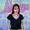
Photo

So I started by searching for a typographic that represents my interpretation of this classic Bauhaus style. (What was the font and size?) And I wanted to create a new vision for my name in this format. I used my iPad with my electronic pen. It was the first time using my new devises for a workshop assignment and I was very happy with how easy they are to use. I’m also tying to be original and create my own style within the Bauhaus influence, so I played with the letter arrangement of my name and the letter sizes. I’m very happy with that aspect of my design.
0 notes
Photo


I really welcomed the chance to create a poster that represented “me” as a graphic designer, “Who Am I?” with a design that would become the cover page for my Personal Practice assignment deck.
My biggest inspiration in terms of graphic design is the Bauhaus movement. An important event for me was a trip to Berlin in 2018 and time I spent at the Bauhaus Museum. I’ve been taken ever since by the way in which Bauhaus speaks to my sense of style, it’s use of typography, shapes and textures.
I’m learning better understand how to use typefaces and fonts, like sans-serif that is used a lot in Bauhaus prints, asymmetrical images and negative space. Bauhaus started in 1919 in Germany, but I think the style is still very modern and global after 100 years.
0 notes

