
Don't wanna be here? Send us removal request.
Statistics
We looked inside some of the posts by froixartblog and here's what we found interesting.
Average Info
Notes Per Post
1
Likes Per Post
1
Reblog Per Post
0
Reply Per Post
0
Time Between Posts
6 days
Number of Posts By Type
Text
17
Last Seen Tumblr Blogs


Fun Fact
In Q3 of 2020, 31% of US users access the Tumblr app daily.
Text
Artist Research: Ryoji Ikeda
Ryoji Ikeda is an artist and musician from Japan. I discovered him when researching for Open Studio: Time. He creates audiovisual works that are interested in data and digital aesthetics.
youtube
I've become heavily interested in concepts of 'Noise' and trying to condense a large amount of noise into a visual work. I've conceptualized it as "trying to concentrate the universe into a single point", and what that might look and sound like.
youtube
Whilst Ikeda's work is often very abrasive, both sonically and visually, it can also be meditative and even when the viewer submits to it. I've been making lots of work with video projecting, and want to try making code-based visual artworks, similar to Ikeda does.
youtube
Im trying to learn the program 'Cables' and 'Pure Data', as well as reaching out to friends who know how to code, to see if I can put together something that is incorporates code and sound, and how they can interact with and potentially break each other.
0 notes
Text
[2025] Year 2, Semester 2, Week 4: "Dance Across the Sky, Mother Maria"
This was a collaborative work made by me and Lucy. She called me and asked if I wanted to experiment with picture frames.
after distressing the frame heavily with hammers, nails, rotary tools, saws, and other implements of distressing, we then put the frame together and decided on what image would go in there.


We decided on ^ these two images as they both contrasted heavily in terms of ethereality and verisimilitude, but whilst still pertaining to the theme of motion.

This was the final composition we decided on for the picture. I wanted the smaller image to feel disruptive of the bigger one when i edited them together. Me and Lucy plan to do more artworks like this, experimenting with the picture frame as an art object, and putting some of the many photos we've taken to use.


0 notes
Text
[2025] Year 2, Semester 2, Week 4: "Process Pill Channel 03"
This piece is an iterative, collaborative work build off of my week 1 work "The Gift".
In the work, The Gift is installed on a plinth against the wall, whilst a stop motion looping video projects onto the wall, over the work. An ambient audio work I made plays from speakers to the sides of the plinth.

The video art that played against the plinth was a stop motion work i made by removing the contents from the plastic bag, placing them in different arrangements.
youtube
The audio that plays throughout the piece is an ambient work I made, that contains audio from the other 2 planned channels of video for the collaborative work.
1 note
·
View note
Text
[2025] Year 2, Semester 2, Week 2: "Enemies of Love"
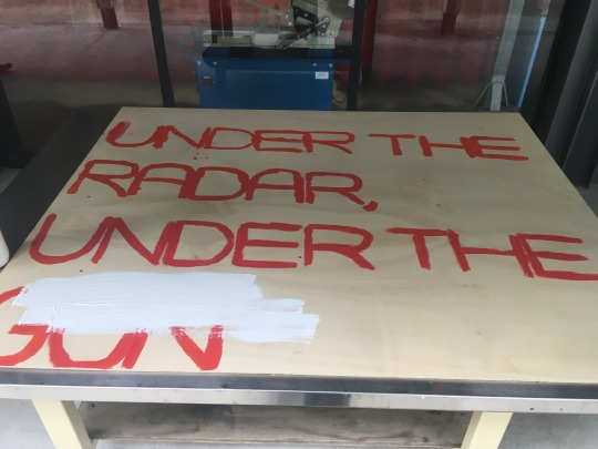
I have been slowly building up the materials to use for this artwork since the beginning of last semester. The idea of a street sign with duct tape on it first appeared in my work "Under the Radar, Under the Gun", Where it received positive feedback, so I decided to build off the idea.

To collect the materials for this artwork, I would keep my eyes out for street signs that had fallen or were close to falling. I would then return to the location at night and pluck them from their location, pulling them off their post or sometimes having to carry the whole post home.

Conceptually, I was interested in how, through my actions, I was picking away at the urban decay of my surroundings similar to the way you would pick the rot out of a ruined tooth. These signs, which are so important to the infrastructure of travel, have become useless, so I have taken them. Still, the process remains illegal.

The work is called "Enemies of Love" because in a way, these tonnes of instructions that are imposed upon us as member of society begin to erode at our soul over time. The road signs themselves are not the issue, but they represent the volume and prevalence of instruction in our lives, bright, reflective, harsh. I have covered them in tape to try and block it out, but still, it shows through. We don't understand how tight the walls of our consciousness are, Until we brush up against it.

0 notes
Text
[2025] Year 2, Semester 2, Week 1: "The Gift"
This artwork slowly came together over the semester break. I had been collecting nonstandard cigarette packages (the ones without the warnings) and taking various medicine boxes that would've normally been thrown out, both mine and some from family members to fill out the space (however their names are censored out in marker).


The title "The Gift" is supposed to be darkly humorous, both playing on the idea that the illnesses and afflictions that require medicine are "gifts", surprises/offerings from outside forces. I also thought there was a meaningful juxtaposition between the cigarettes and the medicine to be trapped within the same container, tightly compacted. The alternative meaning of "The Gift" is much simpler; a plastic bag filled with rubbish would be a bad gift, that would insult the recipient. one of my favorite visual aspects of the work is how the opaque plastic bag blurs out the objects as they get further away from the edge of the bag. It gives a cool depth of field effect, and makes it look like the packages that are visible are sort of pushing against the edge of the bag.


Due to spacial constrictions in the gallery, me and Lucy McGoldrick ended up merging our two works, which were both made of found objects that would otherwise be treated as rubbish, collected and displayed in the gallery space.


Whilst entirely incidental, the colour and height of the plinths of the individual works end up increasing the intensity of dialogue between the works. I can't speak on the meaning of Lucy's work entirely, but the object of her work being a receipt for strawberries and tiramisu contrasts heavily with the psychiatric medicine and cigarette packages in mine. In this way, these works can be seen as representing divergent lives, or perhaps two sides of the same one.
To expand on these works, a full installation including video art is being developed. These ideas, and the process of their making have much more to offer artisticly.
0 notes

Text
!!!!!!PARTITION!!!!!!!!!!
THIS IS A PARTITION POST, EVERYTHING BEFORE THIS POST IS FROM SEMESTER 1 2025 AND PRIOR, EVERYTHING AFTER IS SEMESTER 2 AND ONWARDS!!!!!
0 notes
Text
[2025] Year 2, Semester 1, Week 11: "Bastards"
This artwork started with me experimenting with ink on paper, just painting whatever came to mind.

I was listening to the song I Cut My Hands Off by Mount Eerie at the time, in which the line "I send them off" repeats in the background, which is why its written there. I really liked the portrait on the bottom right, (which i made to upscale that smaller one on the left) but I wanted to reproduce it without the other pictures hanging about. After a couple of failed attempts on A2 canvas, I realised that something artistic was happening, so I kept painting them.
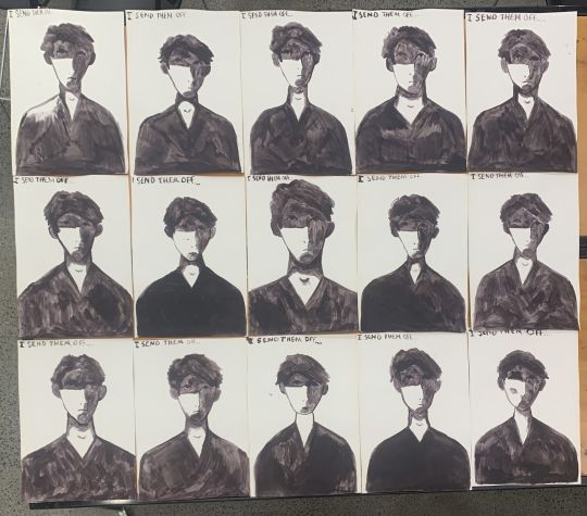
I ended up painting 15, with none being close enough to the original portrait to satisfy me. This was ok though, because the more the merrier. I kept the "I send them off..." text, and placed it at the top of the portrait. I wanted it to read kind of like a SNES-era RPG game's flavour text, like I had painted the 'bastard', and, unsatisfied with my results, I sent them away.

^ example of RPG game flavour text, but in 2nd person instead of 1st person
When critiquing the artwork, people noted how they started to pick apart the individual portraits, in a kind of "spot the difference" type effect. People also said that the quantity of the portraits dehumanised the individual, evoking ideas of military conformity. I'm glad the work gave off this effect, and would like to make many more "bastards", not only in pursuit of the perfect portrait, but because I think the greater number of portraits, the more evocative the artwork.
0 notes
Text
[2025] Year 2, Semester 1, Week 10: "...In a Silent State..."
This work started with me painting with ink on a piece of wooden board. I had recently been listening to the song I Punched Through the Wall by Quickly, Quickly. In the final chorus of the song, he sings the line "And so I ball up my fist/For another hit" but I misheard "For another hit" as "in a life you hate". I thought that sounded cool, so i wrote it on the wooden board I was experimenting with, and then came up with a few more lines off of the top of my head.

Realising I was on to something with this improvisational poetry, I abandoned the wooden board for 3 pieces of A2 paper, which I set out to fill with a single flowing piece of poetry. I tried to follow a rather rigid rhythm and rhyme structure, rhyming each word only twice before moving on.

I would block out words that I messed up, because I wasn't really worried about it looking perfect, as this was as much a writing exercise as it was an artwork. The large block in the 2nd panel is because I wanted to move on from a subject because I had run out of words, but I didn't know how to transition out of it.

Installing it vertically is best because it reads like an scroll, and there is no confusion between adjacent reading as one long sentence left to right.
0 notes
Text
Artist Research: Joshua Citarella
Joshua Citarella is an artist and internet culture researcher based in New York City. His work focuses on politics in the online sphere, often zeroing in on niche political ideologies that have arisen as a result of the internet. His works are often highly conceptual, and have a strong sense of irony and humour to them.

^ airBNB Housing Solution: Remain on your Lower East Side Apartments Fire Escape in a Hanging Tent while Guests Pay Off your Month's Rent, 2017
His work helped shape my piece "Shut Up", as it is built off of the back of internet culture, is highly referential, and is a conceptual piece.

^ Choose Your Future, 2021
Citarella's best work to me is his e-deologies, A series of works inspired by finding complex, niche political ideologies online and turning them into flags, essentially bringing them into the real world. he goes into it deeper at about 14:25 in the lecture below, but watching the entire video best illuminates how he operates as an artist.
youtube

^ e-deologies, 2021

^ e-deologies V, 2025
You can see the rest of them on his website.
Joshua Citarella's practise has showed to me, as a decently online, very political young person that there is a way to incorporate politics into my art, inspiring pieces such as We Refuse to Die and my window commission. I hold an extreme level of caution when it comes to incorporating internet culture and memes in my art, and generally uphold that they remain separate in my work, but Joshua Citarella's work has demonstrated to me that there is a potential for tasteful and conceptual methods of doing so that extend beyond simple novelty and humour.

^ Aspire and Inspire: A Custom Painting of You as A Soldier Returning Home to Your Kids, 2017.
0 notes
Text
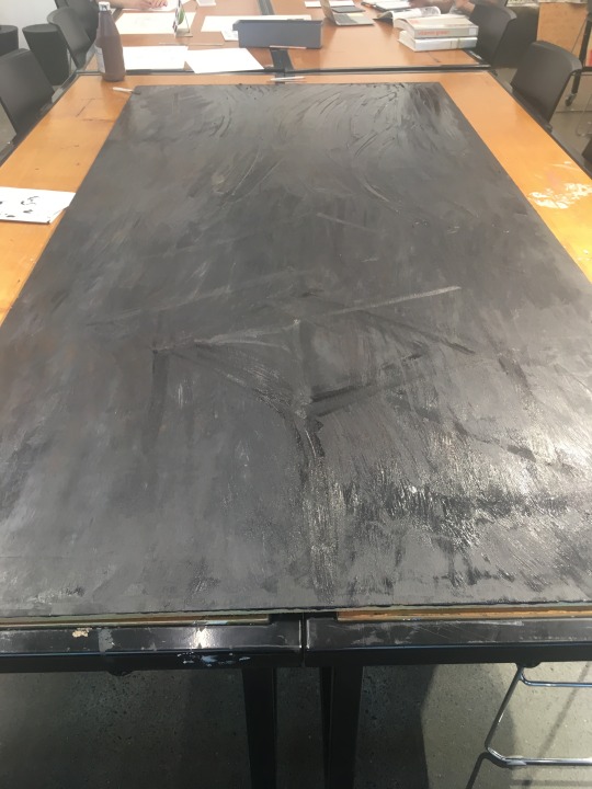
[2025] Year 2, Semester 1, Week 9: "Unlit Hallway"
With this painting, I was inspired by the death of Pope Francis. I wanted to do a painting that captured the dark mood seen in paintings such as Francisco Goya's "Black Paintings". The artwork is made from acrylic paint on a 1.2m x 2.4m wooden board.

Man Mocked by Two Women by Francisco Goya, 1820-1823 ^
Although I'm not especially religious, Pope Francis' death felt meaningful to me because he seemed like an especially kind and meaningful person.

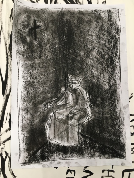
Pen & Charcoal Sketches ^
I originally conceived of the painting as a Frank Auerbach style portrait, but as I worked on the background of the painting, I realised that it had more potential as a more realistic atmospheric piece. Plus, I didn't have the oil paint necessary to achieve the "sculptural" effects of his portrait work.

^ Head of E.O.W. IV by Frank Auerbach, 1961


Painting the background & reference image ^
For the furniture in the painting, I was inspired by the furniture that was in the room Pope Francis lived in. He deliberately chose to stay in a guest room in the Vatican, and the simplicity of the furniture struck me.

^ Picture of Pope Francis' room in the Vatican

^Painting in process
After painting the room and the cross on the wall, I used watered down black acrylic paint to create the shadows in the corner of the room and the floor. I decided to paint the entirety of the chair that the pope was sitting on, even though it would eventually be covered by his figure. After doing so, I was actually very pleased with how the image turned out and decided not to paint the figure after all. I didn't want to mess up the painting by doing something so foreign to me with so much margin for error. I decided to call the artwork finished when I was satisfied with it.

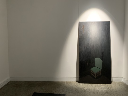
I chose not to add any text to the work. I think the vagueness and silence is important to it.
0 notes
Text
[2025] Year 2, Semester 1, Week 7: Window Commission
For this piece, I wanted a simple and strong message to be displayed on the wall in simple text.
The phrase was inspired by the death of the Palestinian journalist Hossam Shabat, who was killed by an Israeli airstrike on the 24th of March this year. The specific phrase itself I read in an statement given by a friend memorializing him, but I can't find it anywhere.
I used the font "Myriad Pro" because it looks like GB18030 Bitmap but a bit wider. The simple shapes made it easier to prepare the vinyl cut for transfer to the window.

Digital Mockup
I found the vinyl print process to be challenging and due to the high precision and stakes of transferring the vinyl to the glass, but I'm glad I tried it anyway.

0 notes
Text
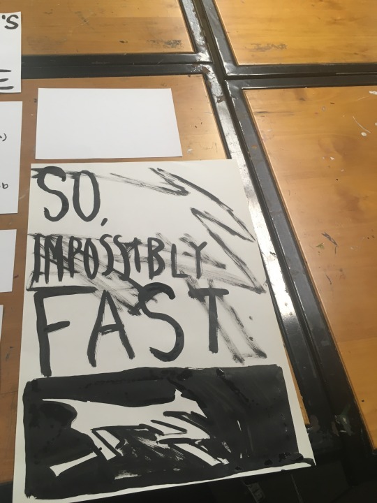
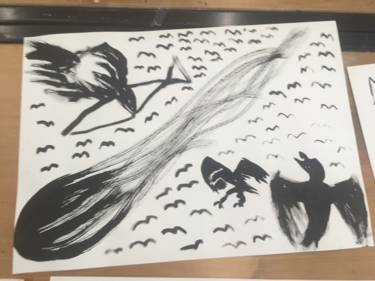
[2025] Year 2, Semester 1: Ink tests (April & May)
These are various works I made out of ink, mostly just experimenting with ideas.
This first batch comes from when I was making the album cover and tracklist for my album Evening's Empire. most of it is from flubbed attempts to write the tracklist or album cover or to use up excess ink, so I was being pretty loose with what I made here.

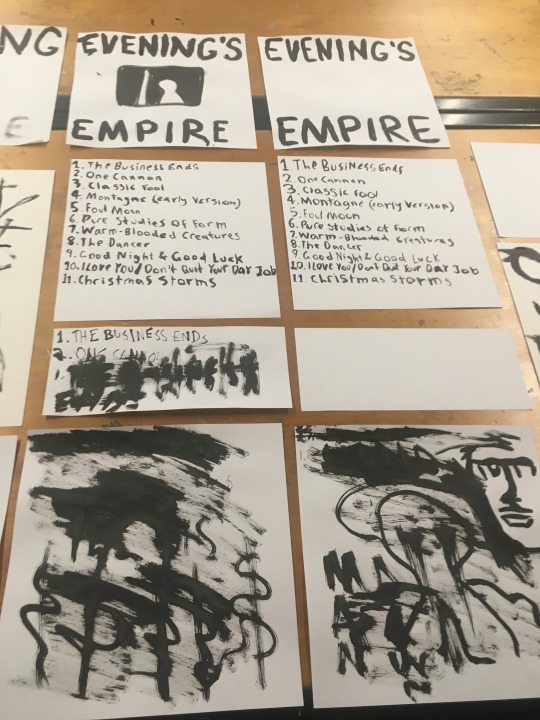
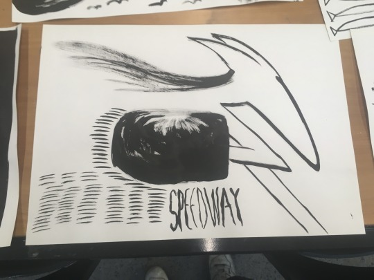
One work I was especially fond of from this group is "Kingdom of Consequence", which is pictured below separately.

It was inspired by the cover for the album "The Devil and God Are Raging Inside Me" by the band Brand New. I was listening to it for the first time while I painted this batch of works. It was pretty good.

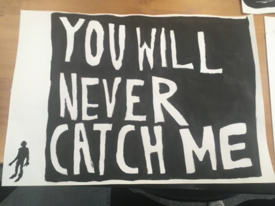
This second batch I made after visiting Post Datum's "Feed" exhibition (I thought it kinda sucked). I am really fond of the top 2 pieces here, especially the figure's shape and the font in "You Will Never Catch Me" (Heavily inspired by the work of Phil Elverum). I also like the shading on the meteor in the top right ink painting, I think it looks really cool.

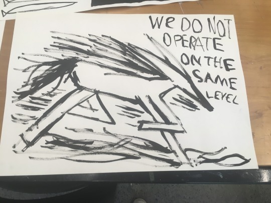
Once again, when stuck for a subject I defaulted to painting horses, but using a new sharper design I came up with to make the creature look faster.

Painting with ink is fun, and I enjoy going in blind to see if I can improvise some cool works in a low pressure environment.
0 notes
Text
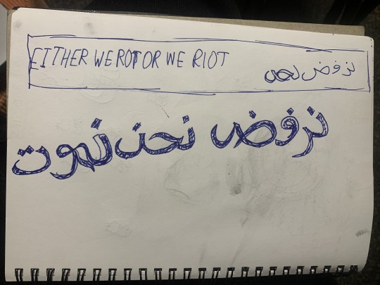
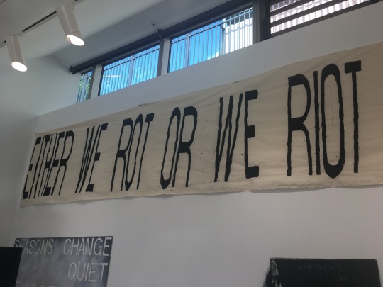
[2025] Year 2, Semester 1, Week 7: "We Refuse to Die"
This piece of art is a text piece consisting of black acrylic paint on 650cm by 90cm of calico fabric. The text in arabic reads "We Refuse to die", which I saw in the news written on a sign from a recent protest in Palestine calling for and end to the genocide enacted on its people by the state of Israel, and also against Hamas. Many western media sites labeled them specifically as "Anti-Hamas" protests, but this article provides more nuance into the situation: https://www.dw.com/en/fact-check-were-protests-in-gaza-anti-hamas/a-72067223

Either way, the phrase "We Refuse to Die" (pictured in arabic above) was one that I found quite powerful, as a hopeful rejection of forces many times more powerful than them.

(Sketch & Digital Mockup) ^
This piece followed the same process as many of my other paintings this semester;
Create a digital mockup of the artwork, matching the pixels to the millimetre dimensions of the canvas.
Use the pixel dimensions to find the locations of each word and letter.
Outline the letters.
Paint the letters.
Its a tried-and-true system for these artworks, although i definitely freewheeled the Arabic text a lot more than the english text, which required more deliberation and revisions due to there being less of a rigid structure (that I know of) like there was for the font.
Speaking of the font, it is once again GB18030 Bitmap, which I am fond of for its verticality, square lines and relatively uniform size for each letter.


If we are unable to speak out against the genocide of the Palestinian people, and take action when necessary, it will slowly become easier and easier for governments to dehumanize larger and larger groups of people, with even less need for lies to constitute it. Everyone in the world needs to realise that the Palestinian struggle for liberty sets a precedent for all humanity, and should be treated with an incredible level with gravity. None of us are free until all of us are.
0 notes
Text
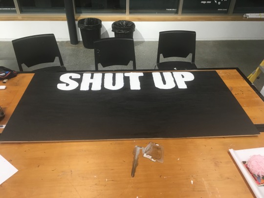
[2025] Year 2, Semester 1, Week 4: "Shut Up" (unfinished)
"Shut up" is an acrylic painting on a large plywood sheet. i was inspired to create it after watching the Post 1945 art lecture on conceptual art.

(Digital Mockup)^
The work acts as a response to Rene Magritte's 1929 painting "The Treachery of Images", which features an oil painting of a pipe with the caption translating to "This is not a pipe". The work serves as a surrealist deconstruction of the at the time pre-existing contract between the viewer and the subject, reminding the audience that a painting, no matter how moving or realistic, will never be more than a constructed image rather than the real thing.

"Shut Up" exists as a tounge-in-cheek, bad faith rejection of this at the time avant garde piece of art, reminiscent of the often aggressive and childish characteristics of online discussion. The use of the Impact font, found often in early memes in the early 2010s, with ironic usage surging in the 2020s.


(2010s authentic vs 2020s ironic Impact font memes)^
I was inspired by conceptual art for this piece, existing within conversation of another famous work. I used the font painting method I have utilised throughout the semester, with the size of the text being relatively easier than other works made with this method.
Ultimately, I never ended up displaying the work because I became interested in pursuing other ideas before I had the chance to finish it by bringing in the copy of "The Treachery of Images" that I had printed out. Truly, this is the real treachery of images.
0 notes
Text
[2025] Year 2, Semester 1, Week 4: "Sayings"
Sayings is an ink on paper artwork consisting of 4 A2 sheets of paper.
With this piece, I wanted to make a simple text work compiling some phrases and sayings that have been bouncing around my head for the last couple of months. I drafted out 12 phrases in my notebook, but only painted 4.
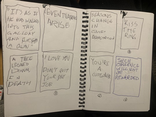
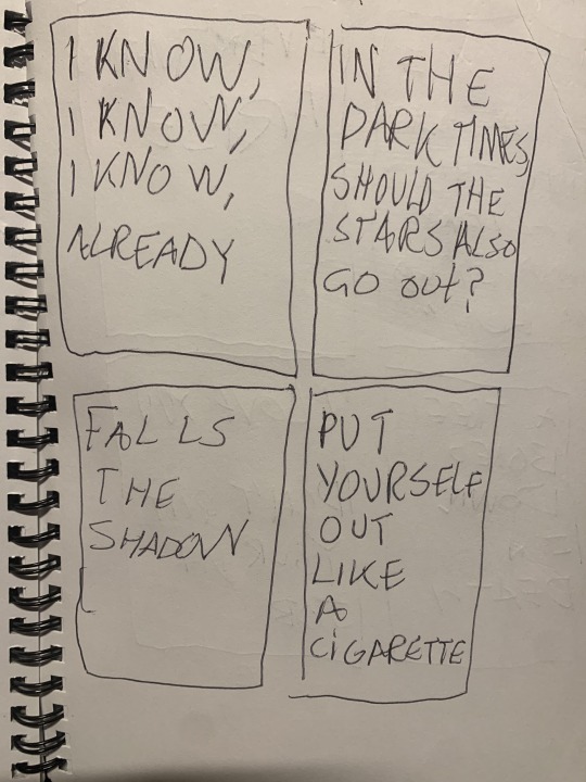
(Sketches)^
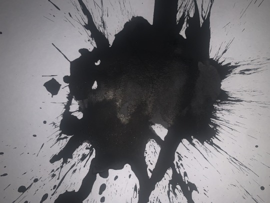
For the "Kiss the ring" panel, I poured ink onto the page, and punched it while wearing my ring, creating a cool, violent splattering effect on the paper.
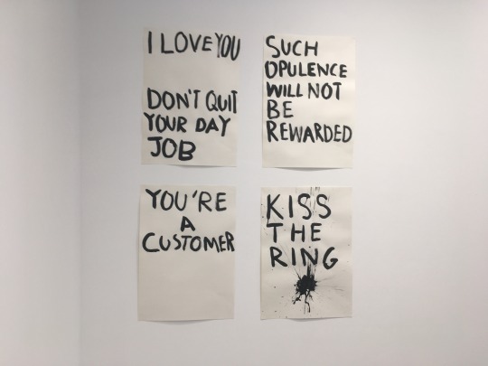
The phrases originate from various places, ranging from quotes in art history, poetry, song lyrics & titles, and original pieces of writing.
In reflection, I should've painted all of the sayings. I really didn't have anything to lose by doing so, but maybe I was pressed for time. This work was created whilst I was also working on Phil, which was quite a time-consuming artwork to make. future revisions may be in order, but frankly, many of these sayings deserve more attention than simply being written down without any additions.
0 notes
Text
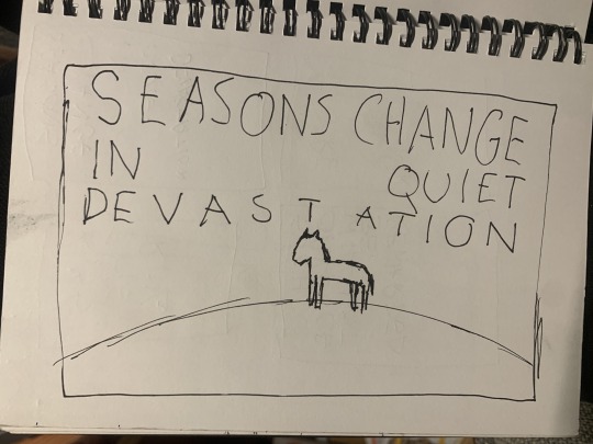
[2025] Year 2, Semester 1, Week 4-5: "Phil"
"Phil" is a painting made on a large-scale plywood board that makes use of both spray paint and regular acrylic paint.

(Early sketch & digital mockup) ^
Whilst most of the artwork contains a deliberately natural and free flowing shape, from the air, to the cliff, and different sections of the sky, the text has a juxtapositional relationship to the rest of the work by being very rigid and repetitive in the constraints of its form, with only very little variance allowed for the overspills and mistakes from the hand painted method. The text is based on the font "GB18030 Bitmap", which I have used in previous works and I translated it across from the digital mockup to the canvas by matching the pixel dimensions to the millimetre dimensions of the wooden board, and using that to write out the text.
The small size of the horse, who is the central figure of the piece, in relation to the rest of the work, helps create a very large sense of scale for the viewer.


The work consists of very desaturated colours, that being black, white and faded shades of blue and purple. More saturated colours show through in the outlines of the text, revealing layers of previously applied paint that have been revealed in the process of peeling off the plasticine used to mask the text from the paint.


The texture of the work is largely informed by application of both types of paint. We can see that in the smaller areas of paint, such as the lower cliff area, the horse, and the letters, the texture of the acrylic paint is mainly flat and unpronounced, which was intended as they were supposed to separate themselves from the rest of the work. For the larger areas of acrylic paint we can see areas where paint hasn’t been completely spread onto the canvas and then been sprayed over, creating a paint bubble visual effect. This can also be seen in the upper region of the painting, where the relative flatness is broken up by the raised areas where the previous artwork was painted over, and also the aforementioned tears displaying underlying layers of paint (some of these being from the previous artwork). The texture of this actual area is given an airy and ethereal quality by the spray paint, which coalesces heavily around the sun, which is given focus by being a large blob of white paint applied directly from the bottle to the canvas.

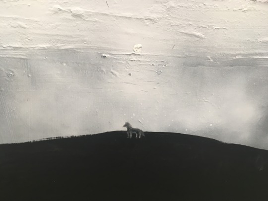
The work is intended to be spiritual, touching on ideas of change, the passage of time, and our relationship with nature and the solitude that it provides us. The text's purpose is to reframe the viewers conception of seasonal change, that instead of a natural shift between different states of being, it is a violent upheaval of itself in an endless cycle. This is in line with my personal experience with how I experience change in my personal life, and also an interesting idea to think about.
The horse is intended to create an anchor point for the viewer in the piece, both spatially and emotionally. Horses are a motif I use often in artwork because they are an animal that I like a lot, and I feel can often be useful when abstracting ideas of human isolation, myth and mysticality through nature.

The text is adapted from the song “Demolition” by artist & musician Phil Elverum/Mount Eerie . I was inspired by imagery of his line “Days Pass in Quiet Demolition”. I wanted to increase the scale of this line to implicate the exterior world in the line, as well as add a specific emotional inflection to the line by changing the word “demolition” to “devastation”.
Also, whilst starting as a necessity of resources, it is important to note how this work was created on top of a previous artwork, further playing into these themes of destruction and reconstruction via change.
The work is intended to be spiritual, touching on ideas of change, the passage of time, and our relationship with nature and the solitude that it provides us.
0 notes