
Don't wanna be here? Send us removal request.
Statistics
We looked inside some of the posts by fullfilledhanako and here's what we found interesting.
Average Info
Notes Per Post
1
Likes Per Post
1
Reblog Per Post
0
Reply Per Post
0
Time Between Posts
7 days
Number of Posts By Type
Text
3
Last Seen Tumblr Blogs


Fun Fact
Tumblr.com rank in the US is 25.
Text
Charles Rodriguez - Virtual Sketchbook 2
Journaling
Asymmetrical balance - The various elements of a work are balanced but not symmetrical
Asymmetry - Lack of symmetry
Balance - An arrangement of parts achieving a state of equilibrium between opposing forces or influences.
Composition - The organization of visual elements in an artwork
Contrast - The juxtaposition of strongly dissimilar elements; dramatic effects can be produced when dark is set against light, large against small, bright colors against dull
Design - The process of organizing visual elements and the product of that process
Directional forces - Pathways that the artist embeds in a work for the viewer's eye to follow.
Emphasis - A method an artist uses to draw attention to an area; may be done with central placement, large size, bright color, or high contrast.
Focal point - The principal area of emphasis in a work of art; the place to which the artist directs the most attention through composition.
Format - The shape or proportions of a picture plane.
Pattern - All-over design created by the repetitive ordering of design elements.
Proportion - The size relationship of parts to a whole and to another
Repetition - The recurrence of visual elements
Rhythm - The regular or ordered repetition of dominant and subordinate elements or units within a design with related variations.
Scale - The size relation of one thing to another
Subordination - Technique by which an artist ranks certain areas of a work as of lesser importance; areas are generally subordinated through placement, color, or size.
Symmetrical balance - The near or exact matching of left and right sides of a three-dimensional form or two-dimensional composition
Symmetry - A design (or composition) with nearly identical form on opposite sides of a dividing line or central axis
Unity - The appearance of similarity, consistency, or oneness
Variety - The opposite of unity; diverse elements in the composition of a work of art
Writing and Looking

Title: Francisco Goya, BULLFIGHT: THE AGILITY AND DARING OF JUANITO APINANI (Page 4.4)
The instructions and ingredients used for this artwork is any sort of pen or pencil, draw across the horizon line to help portray the foreground and the background, distinct the vanishing point, draw in the shadows and shade in from where the light is coming from, and draw good geometric shapes to add detail on the human and the bull.
Connecting Art to Your World
A personal experience of how color has affected me was that not only is it pretty fun to do in art class all the way back in school, but also because it helps add more personality to my artworks. Normally I do black and white since it's easier and it doesn't take as long, but whenever I decide to do color, I always have a fun experience doing so. It helps my drawings pop out more and make it stand out. It's fun to try out different colors as well to help with what works and what doesn't. Color is always a valuable asset for art as a whole.
Art Project

This is a small cartoon I made for this project, it's basically just fanart with some humor in it, which is something I've always loved. My favorite type of art is always fanart since I can draw my favorite characters from movies, video games, tv shows, and many other types of media. It relates to me because I always liked the more funny aspects of fanart and how silly they can be.
Photo/design
Group 4: Interactive Design
1) This is my Steam library collection, it helps to know what games I have, what were my most recent ones, and what games I should try out next.

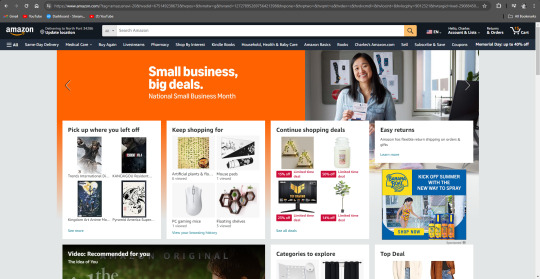
2) My Amazon feed helps me what items I'm looking for and what items I should be interested in checking out.
Url: https://www.amazon.com/?tag=amazusnavi-20&hvadid=675149238673&hvpos=&hvnetw=g&hvrand=12727895269756421398&hvpone=&hvptwo=&hvqmt=e&hvdev=c&hvdvcmdl=&hvlocint=&hvlocphy=9012321&hvtargid=kwd-29088450&ref=nav_custrec_signin&hydadcr=15243_13597374&gad_source=1Links to an external site.
3) My SCF Dashboard helps me indicate what classes I have, what homework is due on the calendar, what my grades are in each class, what emails I've gotten, and it allows me to do many of the work I do for my classes.
Url: https://scf.instructure.com/

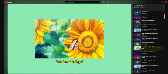
4) The playlist option whenever I want to listen to music on Youtube allows me to continuously listen to music whenever I just want to relax. It can also allow me to shuffle the music so that I can listen to different types of music every time I listen or it can allow me to loop music so that I can just listen to it on repeat.
Url: https://www.youtube.com/watch?v=OcnuAHbI2WI&list=PLOzDu-MXXLliO9fBNZOQTBDddoA3FzZUo&index=13Links to an external site.
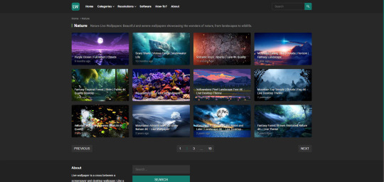
5) This website is able to let me interact with live images and let me download them so that I can have a live wallpaper on my computer.
Url: https://livewallpapers4free.com/category/nature-live-wallpapers/page/2/Links to an external site.
In my opinion, what makes a good interactive design on a website or an app is the overall aesthetic and the accessibility. Take Youtube's for example, it's simple, nice, and being able to access anything on there is a piece of cake. The intent of this website is to help provide entertainment for the user watching. It can also provide information, drama, music, and many other things the user might want to see. It's an app that can help the user just have a moment to relax and enjoy themselves. I would definitely say all of the features on Youtube serve its purpose. Like I said before, its simple, quick, and easy to maneuver. Youtube's design is definitely user friendly and is meant for all types of people to enjoy.
0 notes
Text
Final Exam - Moonview BLVD

This was my so called "big idea" that I had. Throughout the course of this semester, I've gotten to learn a variety of different artstyles and ways of what people like to draw. This drawing that I made represents something more simple that can help define life. For me, I always like to draw stuff more simpler, not because of it just being easy to draw, but because it's easier to understand. I prefer to draw stuff more simple and not really complex that has to make you think. The meaning of this drawing is to help imagine capturing beautiful images around you. Imagine in real life you had this kind of view to look at during the day or night and you'd wish to take a picture of it. That's why both drawing and photography really interest me so much, because of what it can capture and what the meaning of it is. Another meaning that I have with this drawing is to always just start with something simple. Don't try to overdo something you know you can't overcome. Try something more simpler that suits you. Which is why I drew the tree, the road, the bunny, the mountains in the background, I wanted to draw something simple that would also help capture something in real life.
0 notes
Text
Charles Rodriguez - Virtual Sketchbook
Writing and Research
1) My name is Carlito, however I prefer to go by Charles, and a little fact about myself is that I usually love to draw from time to time. My favorite things to draw usually consist of videogame and movie characters, essentially fanart of them on my spare time. However, I am willing to learn how to draw more complex stuff, such as backgrounds, shadings, and many more since I'm still pretty inexperienced.
2) I was assigned #27 - Diane Arbus 1962 Child with Toy Hand Grenade
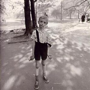
This photo is one of the most celebrated photographs in the history of the medium
The iconic image embodies the awkward tension between childhood tomfoolery and primal violence.
Diane Arbus was mostly known for her eerie photographs of children, intimate portraits of famous figures, and urban scenes.
Arbus received two Guggenheim fellowships to support her work during the 1960s, and taught at the Parsons School of Design.
Arbus changed how the world looks at photographs and how photographs looked at the world
The photo is Gelatin Silver Print and the dimensions of the image is 15 1/2 x 15 1/16
Two techniques Arbus would usually go for in her photos was documentary and photojournalistic photography
Arbus's photos were created to represent real life subjects in their natural environments.
3) My thoughts did very much change about this picture the more I had looked into it. The first time I had looked at this image and saw the title of it, I thought it was kind of funny out of context since it was just a picture of a child with a toy grenade. However, the more I looked into it and the more I had researched about this subject, I was very interested in the artist behind this photograph. The pictures she would take were very interesting to me because it just has that distinct feeling of eeriness inside of it. Nothing is wrong with it, sure, but it's just very interesting to know the meaning behind some of the pictures of what she would take, how she would take them, and why she took them. Knowing that it was to represent real life people and subjects in their natural environments just made it all the more fascinating to learn about what Arbus had done with her career.
Art and Writing
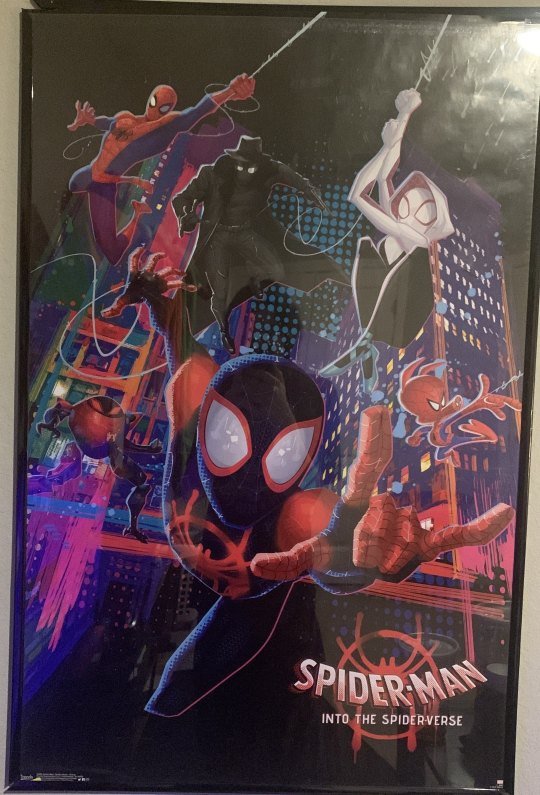
One of the most unique and special things that I have in my room is a poster for Spiderverse. It's still one of my favorite animated movies to watch solely because of how absolutely amazing the animation is. Sony, Marvel, and everyone else behind the team absolutely spent all their time just creating a wonderful masterpiece that will never be forgotten. It's such a beautiful movie from start to finish, I always love to watch it back from time to time because of how rewatchable it is. From the story, to the animation, it's something that I truly love and hope to one day become a great artist.
Writing a Self Portrait
I am 18 years old, I will be turning 19 in July. My preferred gender to be aligned with is male. I am from Wisconsin since that's where I lived most of my life until I moved her in Florida. My ethnicity is mainly American with hispanic. What I usually like to do for fun is mainly play video games, binge watch movies and TV shows, go to the gym, and draw a lot of the time. I don't have any form of job yet, nor am I a part of any organized group. However, one aspect that I truly find unique about myself is that I love to write in cursive and I can do an impression of Donald Duck.
Art Project - Self Portrait
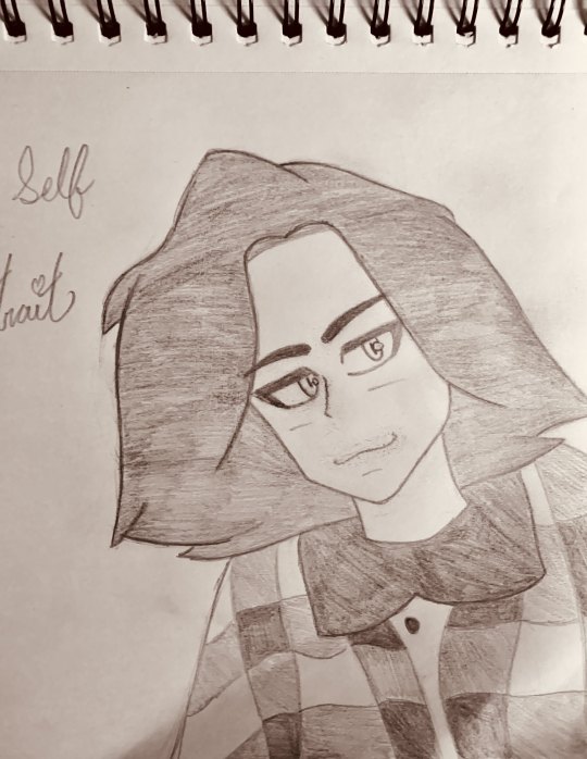
I decided to draw a portrait of myself since I love to have a unique art style that represents how I like to draw my characters. Mainly the eyes, hair, nose, and mouth since I like to keep them simple, but also expressive. I also usually prefer to just color in black and white since it's easier to erase and I'm not the best when it comes to actually coloring, which is something I hope I can improve on. Plus, I always just loved things in black and white.
1 note
·
View note