
Don't wanna be here? Send us removal request.
Statistics
We looked inside some of the posts by fullstackdansmith and here's what we found interesting.
Average Info
Notes Per Post
0
Likes Per Post
0
Reblog Per Post
0
Reply Per Post
0
Time Between Posts
2 hours
Number of Posts By Type
Text
17
Last Seen Tumblr Blogs


Fun Fact
Tumblr was the first site to host the blog for President Barack Obama in 2011.
Text
Thoughts
This then concludes the making of the app and my thoughts on this overall process are that it was very challenging. Due to not using visual studio code, using databases and a whole host of other different areas which I was using for the first time it was tough for me.
One thing I would improve for next time if I did this type of thing again though is that I wished my responsiveness looked neater on other devices and that my app itself was more fleshed out and designed more technically. However, the process was fun for what it was and I’m glad with what I was able to accomplish.
0 notes
Text
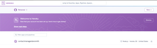
Hosting on Heroku
Once the app itself was all done and created this only meant I had one thing left and this was to host it. Unlike before, where I've used Github pages; this time I have used Heroku.
In order to be able to host my app on Heroku I did this by linking it towards my GitHub repo where all my code was uploaded and updated to throughout the course of creating this app.
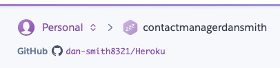
As you can see i used a GitHub repo simply named Heroku due to it’s purpose and connected this to my Heroku and by doing so this meant I could manually deploy a branch where it installs all packages etc needed in order for it to be able to deploy it visually as an app.

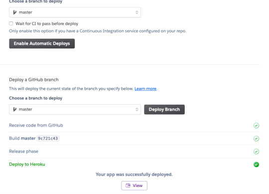
This was then all done and I was able to view it with it’s own URLof https://contactmanagerdansmith.herokuapp.com rather than hosting it locally on localhost:3000.
0 notes
Text
Touching Up
After creating all my pages I then focused on my css styling and making sure I could try get it as responsive as I was able to get it so I could publish it as an app on Heroku.
0 notes
Text
Footer
After finishing the designs for each of my pages I then decided to add a footer to have at the bottom of every page. Just so it makes it look a bit more professional and improve the design. I also added the Copyright logo due to most sites/apps including that within their pages so I thought it'd be only right to include it within my own work.


0 notes
Text
Calendar Page
Originally, I wasn’t going to actually have a calender template due to difficulty finding an example which required heaps of javascript, html and css. However, I came across an example which used just html and css and it only displays one month. But due to the purpose of the app not being published officially I decided to also only do one month but change the designs to suit my colour scheme.
youtube
This is the video I used and I will show the code underneath on how this was done and will show you how I changed my design within css to suit my needs.
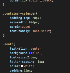
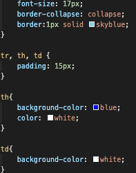

Due to it being repeated over and over in order to fit all the dates in on the calender I shan’t post each individual one but instead as you can see I'm adding individual table data under the days that date falls on separately in order to display a calender format. In order to further improve this, I would add table data for other months and add a button to navigate through these months. Also, by adding an AddEvent using js would be beneficial in future to be able to add data into the calender so it’s functional. As at the moment, only functional thing regarding it is when you hover over a day it turns to a different colour which I chose by using css.
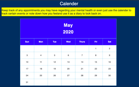
I also added a column with some text to show what the calender would be used for.
0 notes
Text
Contact Page
I then focused on adding in a contact page and this is due to the fact that if anyone had any issues or just wanted to generally talk about something personal that they could email and someone would get back to them. In order for this to work I needed to create another form similar to the sign in and sign up forms.

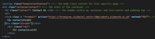
This is how my page looks. I haven’t added a text submission but I’d develop that down the line if I chose to come back to it.

I decided to have add number on there due to it being a mental health app and in case somebody needed to talk through their problems or for someone to feel less lonely even. As, feel that’s suitable for what my app was made up for. I have also used Formspree for the contact form so it’s working and if I was or someone was to fill in the form and press submit then it would submit the email to my Formspree email linked with Formspree.
0 notes
Text
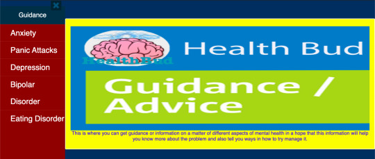
Help Page links
Now, after creating the side nav I had to create a separate page for each help page I needed and design how I wanted these to look. In the end I stuck with a familiar theme within my app and that is by having a core main image with text underneath this and I will show you how one of those looks so you can get the gist of how the other pages will look too. Due to the fact that I've kept the same template for each page but different designs.
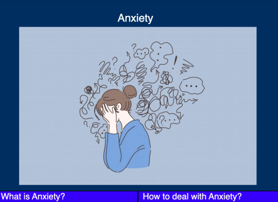
I haven’t fleshed these pages out with too much text as I felt in order to show the gist of what the pages are there for was all that’s needed for this purpose but I'd flesh these out down the line if I was to actually create and publish an app for example.
0 notes
Text
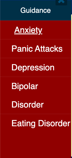
Help Page
After creating my forms, and the home page I then started to add more pages and start developing these. For my help page I wanted a separate nav bar and decided to use a side nav due to I felt this was most appropriate due to having a few different links I had to use in regards to relating to this page. The actual page itself is quite basic however but that’s how I preferred it.
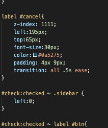
Now in order to create my side nav bar I did create it using the help of a tutorial however.
youtube
This helped me get the general side nav bar that I needed in order for this page to work. I will display the code here as you can see above from the thumbnail I did change the side nav a bit within my css and decided to keep it within the colour scheme I have chosen for the app.


Then this is how my final navbar looked after applying this. It has all my pages on there and they all link to the correct pages.
0 notes
Text
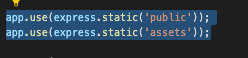
Public Folder
Also, worth noting that to be able to get my css styles working correctly and having my images linked easier I used a public folder so I could easily link my work and include css styles within my app.
0 notes
Text
Home Page
After getting the basics of the sign in and sign up forms working correctly this then led me to starting to focus on a home page which would pop up once someone logged into the app itself. This also led to me creating a nav bar so that they could navigate through the app much better and efficiently.

This is how the navbar looks and I will show how I created this using html and the css to have it working.


I had to create a class for the logo so it fit correctly inside the navbar as you can yourself.
Once this was created and sorted I decided on how I wanted my home page to look. I didn't want it too fancy so I just wanted it to serve its purpose. By doing this, I decided on using a hero image with text over the top.


Then after this little bit of the home page telling them what the app is all about I just added a bit underneath to add some positivity by adding some positive images/quotes.

0 notes
Text
Using Forms
In order to ensure that my sign in and sign up form layouts worked correctly I needed to create forms for each of them to work successfully.

Above is an example of the form I created for the sign in page and enables the form to display correctly how it should and also functionally work.

In order to ensure that the forms posted correctly it also required me to create app.post for each form and this is an example showing how the sign in form gets posted correctly.
0 notes
Text
Switch to Handlebars
Originally, I started to create my app pages as just general .html pages however after being taught handlebars during university sessions I decided it was best to start porting over my files to suit handlebars and add .hbs instead so they fitted within handlebars.
Then, this is how I adjusted it into handlebars format. I decided to also change the page name to signin also.

0 notes
Text
Sign Up
I also needed a sign up form layout like how I did with the sign in form so I decided to use the same layout but change the text however.
I felt it was best to use the same type of layout due to it looking smart and professional.
0 notes
Text
Starting the Designs
After working out a logo for my app and deciding on the name I chose to use for it. I now had to start designing my pages for it and I decided to first start with the log in page. Now, In order to do this I found this neat tutorial which helped me create a neat and professional looking sign in layout interface.
youtube
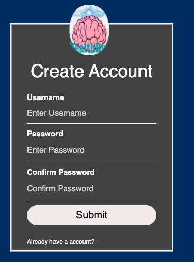
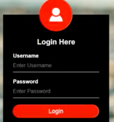
After watching this tutorial and inputting the code needed and changing it to how I wanted it. Due to the initial look of it looking like this...
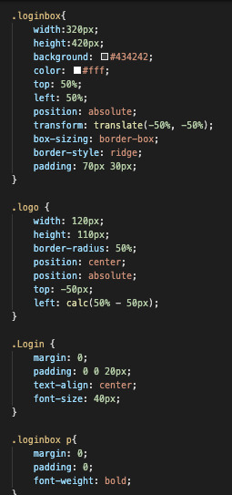

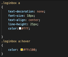
So, after making the changes I wanted to it I then ended up with my own version of how I wanted the login form to look like which ended up to look like this!

I felt it looked better by changing the colours to how I chose and also by rewording some of the text to suit how I wanted it.
0 notes
Text
App Name
After creating the logo, I needed to choose one of the many name ideas that I came up with for my app as shown within my design planning and in the end I decided to go ahead with the name of Health Bud as I felt it was suitable due to the fact I want my app to give out a positive effect on whoever is using it and I felt that Health Bud fit appropriately.
0 notes
Text
Logo
After planning out how I wanted to have my logo I then went about creating it. Due to my app being related to mental health I tried to create a logo which linked to this in a way and so I decided to use a picture of a brain itself and have it look like waves coming off from the brain like it's an active brain itself. I feel due to mental health being linked a lot to relating to us mentally a lot, I felt that using a brain as the core focus of my logo was the right way to go. I created this within Gimp which is a free editing software similar to Adobe Photoshop.

0 notes
Text
Design Planning

As you can see above I planned out a host of different names for my app along with the logo design I wanted to design and also different page ideas that I thought I could include within my app itself.
0 notes