
Don't wanna be here? Send us removal request.
Statistics
We looked inside some of the posts by fundamentlsbiddy and here's what we found interesting.
Average Info
Notes Per Post
0
Likes Per Post
0
Reblog Per Post
0
Reply Per Post
0
Time Between Posts
2 days
Number of Posts By Type
Text
10
Last Seen Tumblr Blogs


Fun Fact
In February 2021, Tumblr had 518.6 million blog accounts.
Text
Week 4 13/3/25
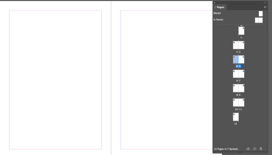
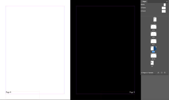
today we are working with Indesign. This is a screenshot of the page menu in the software. I added 12 pages. this includes the cover and back of the book.
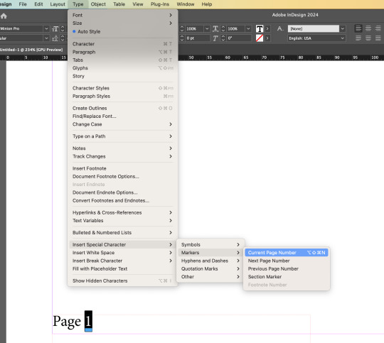
I then went to the parent page which allows me to add anything onto every page. I added page numbers and to make it so it changed for each page and not just say page 1 on every page. I did this by going to the type window, then to insert special character, then to markers and then to current page number. This makes each page have its page number on it.
I wanted to make a page black and so the text popped up with the page number I created a second parent page which has white writing instead on black. I then dragged the B parent page onto the black page so it shows through.
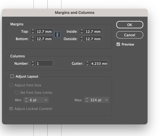
I wanted to add columns on to the parent page to change the size of the margins so I can edit on every page looks and where the writing is placed. I added a 2d column so each page as two columns.

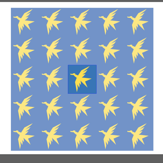
I wanted to create an Endpaper. I started with going onto adobe illustrator and created a bird design coloured it yellow, and placed it in a blue square.
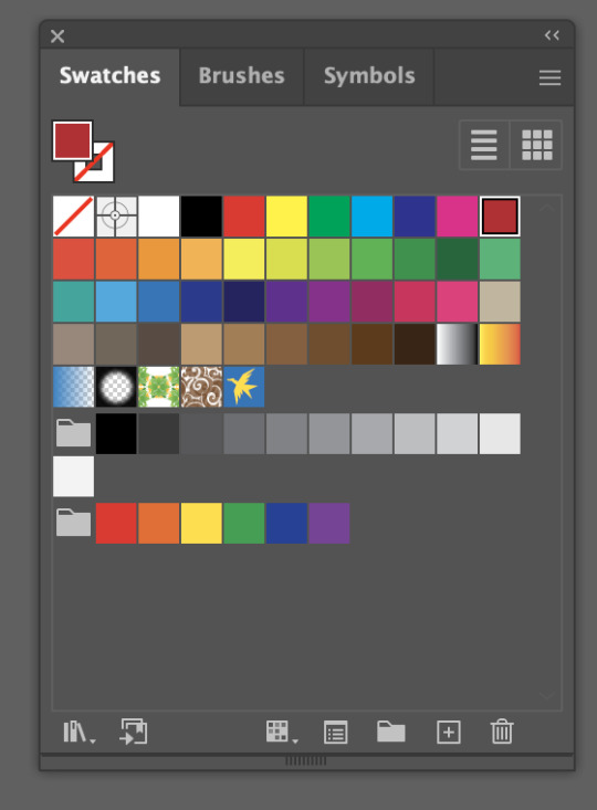
I then dragged and dropped the bird design onto the swatches tab, this turned my design into a pattern.
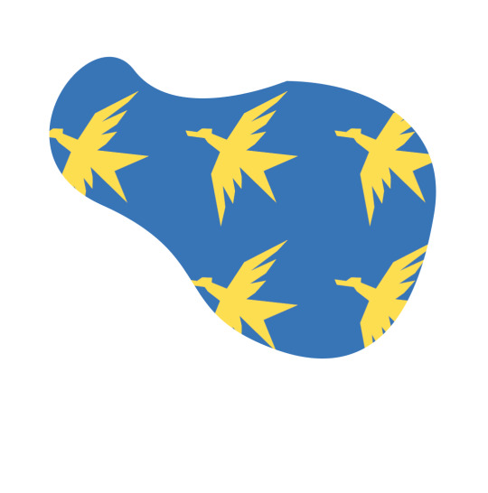
to test the design I created a random shape and coloured it my design. this is how it looked
I can double tap the design in the swatches tab and it popped up with this menu. This allows me to change the design and how it sits as a whole.
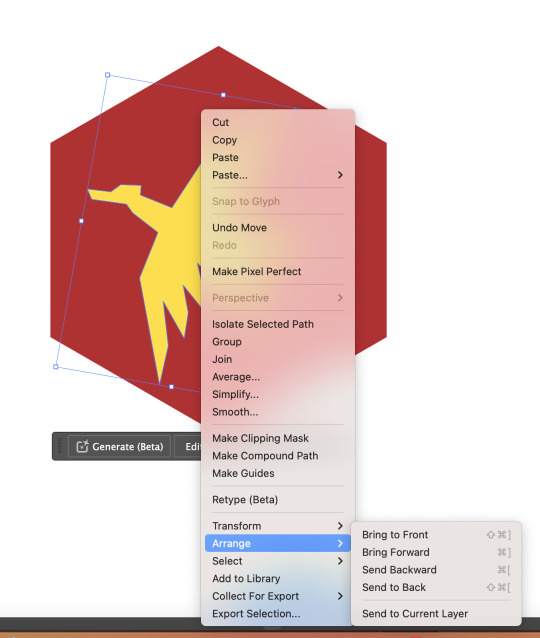
I then did the same thing but with a red hexagon to bring the bird onto the hexagon I would go to the arrange and move to front, this made the bird be on top of the hexagon.
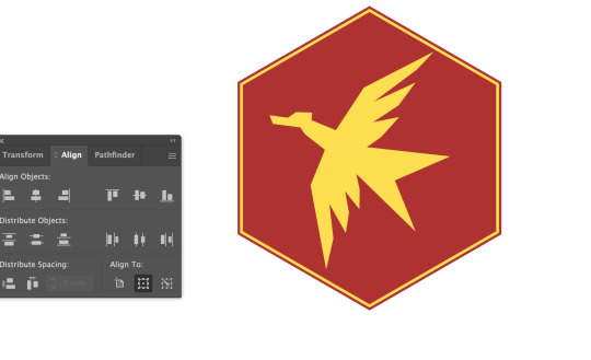
I then added a second yellow hexagon to give it more depth, and to align the hexagon I pulled up this menu which allowed me to align them perfectly.

I then moved it to the swatched tab. and had to edit it so the design was in a hexagon pattern rather than a square. Using the pattern options menu.
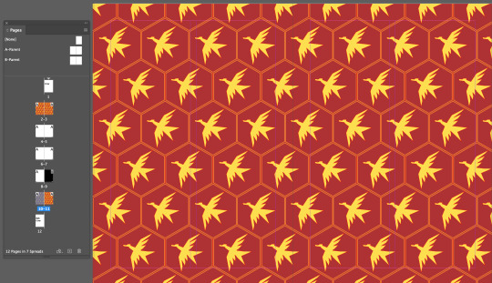
I then created a square in illustrator and put the design into the square I then put this imagine into indesign using copy and paste it. I put these on the 1st and 2rd page as well as the 10th and 11th page.
0 notes
Text
Week 3 6/3/25
today we are working on indesign and we will be working with character styles and paragraph design. this is the base of what we will be working on.
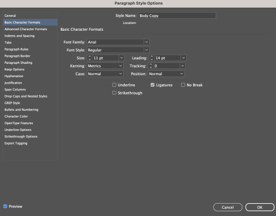
this is the tab I was working on which allows me to change the way the selected test looks. I dislike how they don't give preview of the fonts and you are just expected to know which one you want.
I also changed the space after. Which really helped with being able to see where each paragraph is and ends. I really liked this feature in indesign and was unaware of it before this.
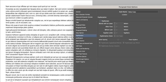
I also removed hyphenation because it looked silly through the hyphenation tab. During this we learned about the proper spacing how the difference between each line is A>B>C>D

This is a diagram that shows the spacing and how each space should be. such as the space labeled A should be larger than the space labeled B which should be larger than C and so on.
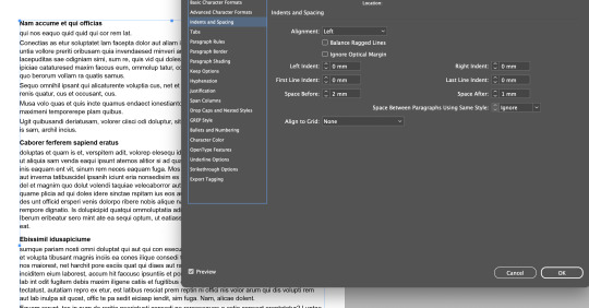
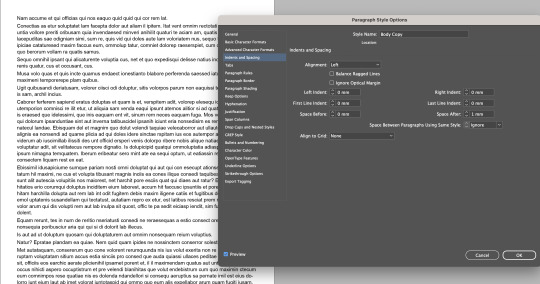
I then wanted to change the spacing in my indesign document. I did this by using a paragraph style in the indents and spacing part which allowed me to change each individual spacing in the paragraph. I did this to make the writing flow better.
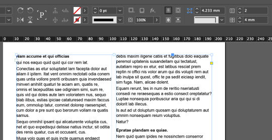
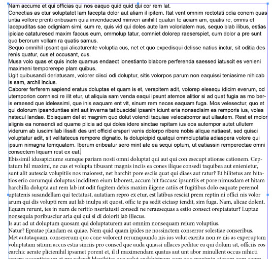
Now I wanted to dived the writing up by adding columns. This was done with the control panels. This will allowed me to separate the writing and create a nicer look.
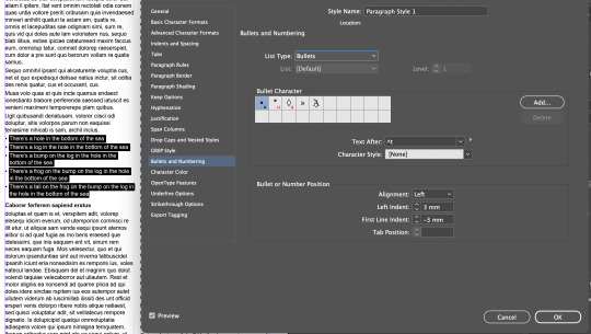
I then wanted to practise putting in other writing and adding bullet points. I used the character style to change the look and spacing of the text, and I added bullet points in the bullet and numbering and changes the first line indent to -3mm so it flowed better and wasn't larger spacing than between paragraphs.
I also made a character style which allowed me to change only one word at a time rather than a whole paragraph. I used this to make some writing Bold Italic.

I also wanted to put an imagine in the writing. I had to go into the imagine settings to make the writing move around the imagine rather than having the imagine sit on top of the writing.
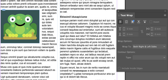
I also made the imagine smaller so the writing goes around the imagine rather than just sit above and bellow the imagine. This incorporates the imagine more in the text.
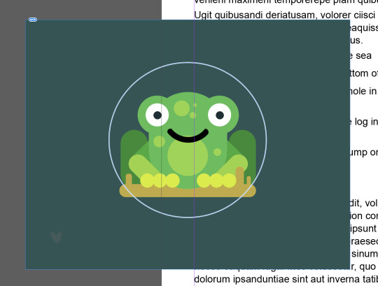
I then wanted to make the imagine in a circle. I did this by creating a frame in the shape of a circle and coping the imagine into the other frame using "Command" + "x".
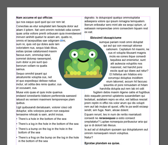
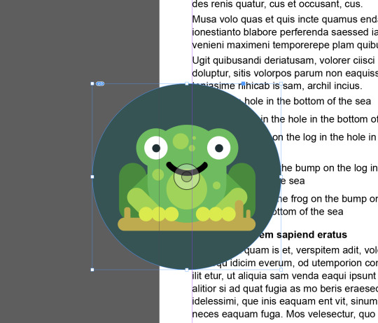
I then moved the imagine into the text and turned it to allow text to warp around it. The same as I did with the other imagine. But this time I created a bigger gap between the text and the frog.
0 notes
Text
Week 2 27/2/25


Today my goal was the remove this guy from his background. I wanted to do a clean cut. to start off with I used the object select tool, which created a base to build off.

After I used the object select tool I went in with the brush tool, and the pen tool I used a masking layer which let me used white and black on my masking layer letting me add and remove from the imagine. I used the pen tool to select around this guys arm, hand, and foot which I then filled in with white on the masking layer and switched the selection and outlined it with black. this gave me a clean cut around his body. I used the brush tool to then draw black on the masking layer getting ride of the background around his hair, and adding parts what were cut out with white. this over all took me around an hour to fully complete.
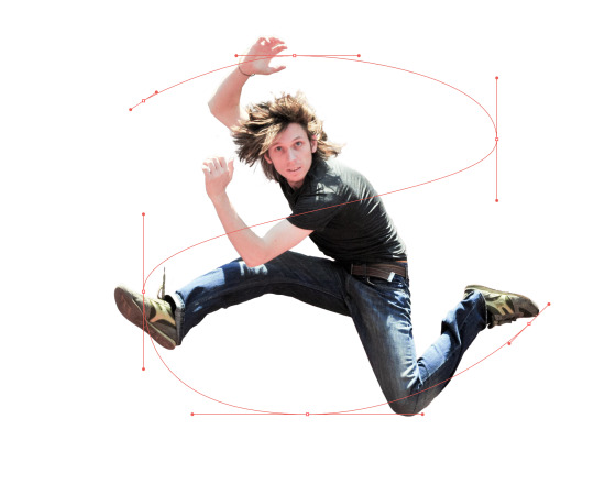
I then transferred the picture to Illustrator so I could then use the pen tool in there and create a snake shape behind him. The design was supposed to be like a snack that goes in and out and around him.

Once I drew out the snake shape, I thickened it and rounded the edges to give the shape a more snake look to it.
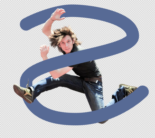
I then linked this illustrator drawing to my photoshop guy. This is so when I changed the shape in illustrator it would automatically change it on photoshop. This was done to make my progress faster and easier.

I changed the snake in illustrator to be holo and have a gradient which instantly changed it on photoshop. This was helpful as it saved me a lot of time.

I then added a different background that is a sunny road. This was done just by dragging and dropping the picture I downloading. I also incorporated the layers I used during this whole process.
0 notes
Text
26/2/25 Week 2

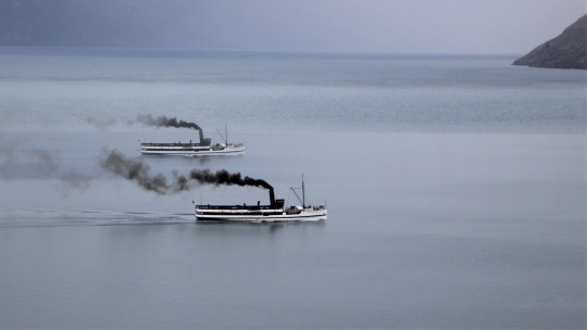
today we are using the photoshop to change images. I duplicated this boat. I did this by selecting the boat and copying the imagine onto another layer, once that was done I used the brush tool with a masking layer to change what was shown and not from the imagine I copied.

I worked on changing a certain peace of the picture. I changed the orange to be a different colour by using the different tools such as the elliptical tool and the polygonal lasso tool, these allowed me to add and remove from my selected area which i then turned into a masking layer allowing me to change the colour of the orange. this one I had lot of trouble thing due to me feeling ill at the time.


In this photo I changed the hue on the middle of the plant. This was done by using the Quick Select Tool and I used the Polygonal Lasso tool to fix up the selected area. Then I turned the selected area into a mask which I then linked a Hue/saturation layer to change the hue of it. this was similar to the past project which made it a lot easier this time as it was just remembering what to do


With this imagine I used the object selection tool to and the masking layer to remove this bird from the imagine, then I used the brush tool, with the eyedropper tool so I can go around the edges and darken/crisp the bird up so it fits with the new background more coherently. then I opened the new background and drag and drop the bird into the new imagine, then transforming the bird which flipped the bird so it faced the right way.
for the last two imagines I was off sick so I had to do them without much to any help. this made the last two more difficult but allowed me to practice the skills another day making it easier to remember them
0 notes
Text
Photoshop Work 24/2/25

the photo on the left is the original photo. I used 3 tools to bring more life into this photo. I used the curve tool and made it easier to see the darker spot while not removing the bright ones. As well as that I also coloured the scene to give it a warmer and happier effect.


the photo of the left is the original. I wanted to make him stand out more so I made the shadows more defined and the highlights brighter, so the photo looked more crips and cohesive.

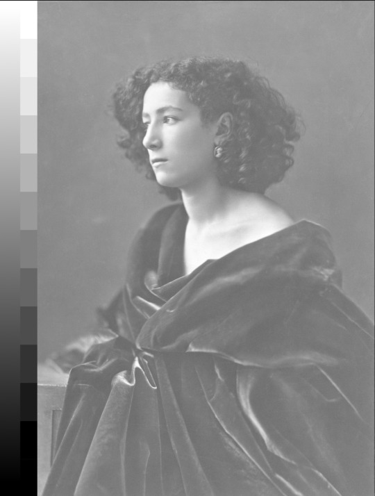
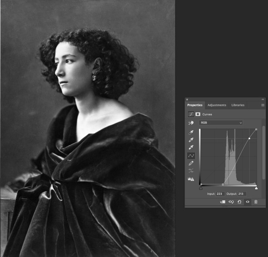
I wanted to make the photo more visible so I brighten the image up with the curve tool. I had trouble finding photos they were black and white but needed help, I also was a wee bit confused on what else I could change about the photo without colours

for this one I darkened the image to give the black more definition, I used the curve tool to achieve this. for this photo I also had trouble finding I this one. When I saw this I decided I needed to darken it as there was not blacks and only grey, but apart from that I wasn't sure what to add
0 notes
Text
Homework 24/2/25

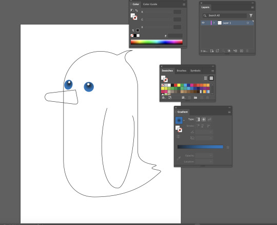
I based my character off a sketch I have done in the past. I wanted to do this sketch because I thought it would be a fun design to do but also allows me to practice with the skills I learned while making the Penguin.

to start off with I made the base using different skills such as the ellipse tool and others. this was a difficult process because the computer kept crashing so each time I had to start a wee but more behind they I was before it crashed. thanks to this I learned easier ways to do these shapes as well reminding myself to save new saves constantly so I didn't lose progess.
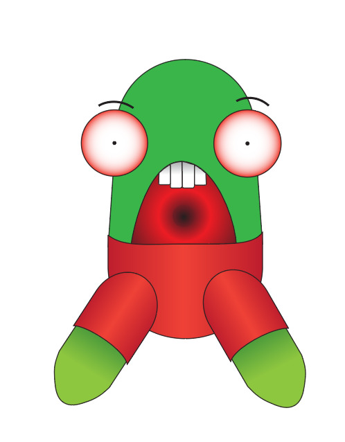
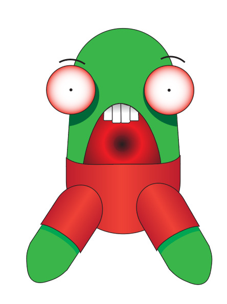
after I had sorted out the body shape I worked on the face and colours. I original used the gradient to colour my character but ended up disliking how it looked and switched to block colours for some parts. I liked the mix of gradients and block colouring because I gave my character more dimension.

My finally design took my around 2-3 hours to complete. I struggled with the mouth and teeth a lot, I regret not making the mouth block colours, but I like the teeth with the gradient. overall this project was fun but very frustrating because I kept losing my progress and getting stuck on odd parts such as the teeth, mouth and shadows under the eyes.
This project us named jerry, I enjoyed bring a favourite sketch of ine to life:).
0 notes
Text
24/2/25 Week 2
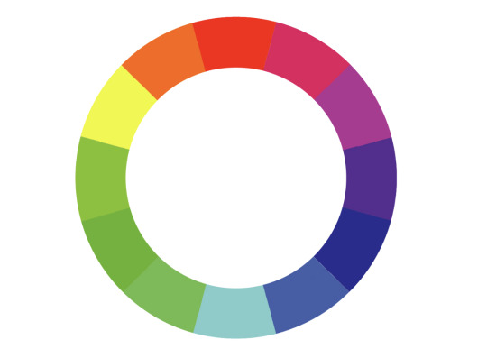
Today we are working on photoshop. we are learning about colour gradients and how to adjust photos to have similar colour gradients. We have been told to use the colour wheel I have used the colour wheel in the past.
We are working on fixing an imagine to allow the shadows to be more noticeable while keeping or brightening the highlights. I used the curves menu which allowed me to change the lighting of the imagine.


For this picture I did the opposite to the previous imagine but used the same technic of the curve tool. The curve tool as an easy tool to understand, and I like how much control you get with using it.
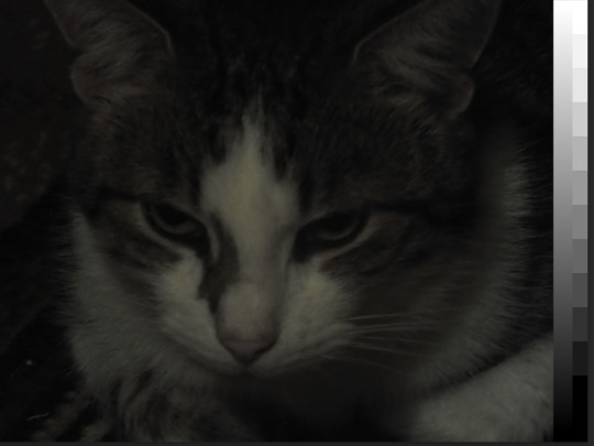

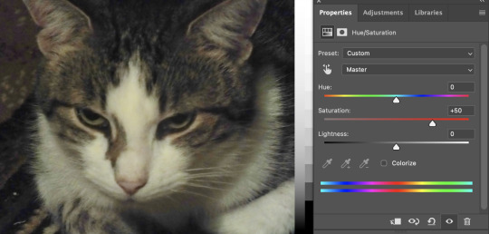
I am just continuing to fix how dark the photo is expect this one has colour as well. I also changed the Hue/Saturation to make the colours more noticeable. The Hue/Saturation tool is a useful tool and I will be using it a lot now that I understand what it does.


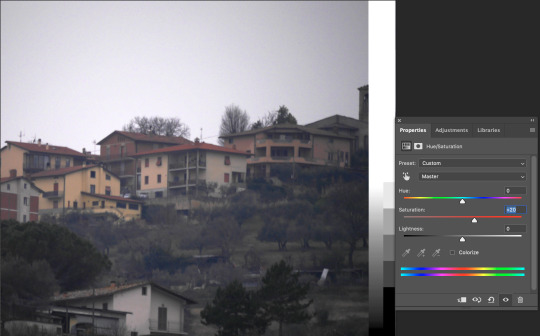
this photo I did the same thing as i did with the cat but I used less saturation when brining the colour forward because the photo wasn't as good quality. this is an example of the photo not needing as much help as other photos, but the small adjustments really helped with the look of the photo over all.


for this on I played around with the shadows and the colour hues. the first photo is how the photo looked before i did anything, the second photo used warm tones on the shadows and cool on the highlights while the 3rd photo was the opposite. and the last one I used only the green and magenta, I used the opacity slider to control how strong the hues came threw. I noticed the different tones make a big difference of how the imagine is received.


For this imagine my goal was to make the photo less blue and feel a bit warmer. I used the curve tool, the Hue and the the colour balance tool to play around with colours and lighting. I ended up with a result I was happy with that still keeps the imagine similar to how it was original just less cold feeling. I also learned how to use a photo filter to help pull out more of the blue.
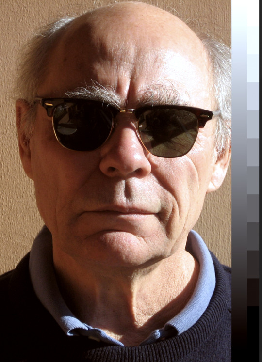
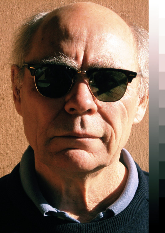
My goal with this photo was to bring away some of the red and bring back some of the other colours. I used the Hue tool, the curves tool, and the photo flitter tool, as well as the colour balance tool. these allowed me to create a less red imagine. being able to balance a photo and make other colours more noticeable is a great skill to learn and I enjoyed being able to fix this photo by myself and challenging myself.
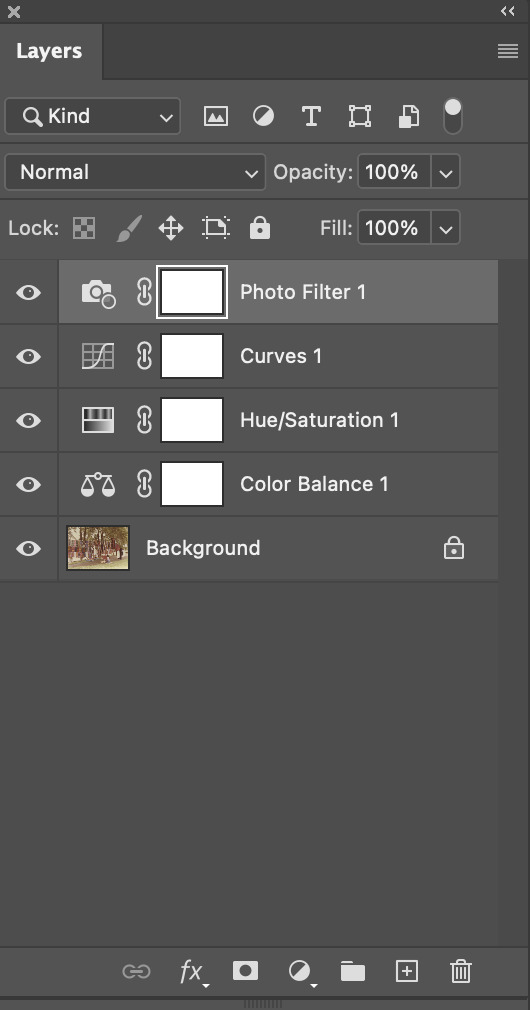

For the previous photo this is the layers I used as well as the curve tool. As you can see I didn't changed the imagines brightness that much but the small difference made the imagine that much nicer to the eyes.
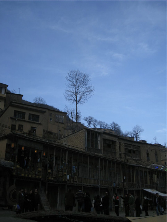
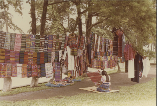
For this photo I had the problem of the sky being a good lighting but the building too dark. I solved this problem by using a masking layer which I turned into a gradient. then I attached the curved lighting layer onto the mask so it only applied to the part of the imagine that had the white side of the gradient. This let me keep the sky the same level of brightness without creating a harsh line where the curved lighting starts.
0 notes
Text
21/2/25 Week1

I worked on more complicated designs with the Pen tool. I worked with hybrid points to create different shapes. this allows me to progress with my abilities and work towards new skills. I enjoyed making the heart and the M
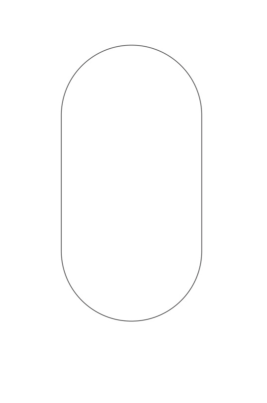
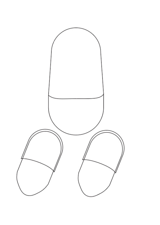
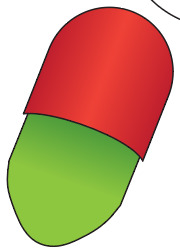
I've started making progress with my penguin. this is the starter shape of the body which I will adjust as I move forward. the pill shape was pretty easy and I like learning new shortcuts in illustrator. I'm gonna name the penguin, jerked
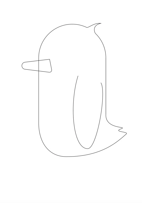
I added a tail. beak and wings on the penguin. this was done with by adding anchoring points to different places on the circle and pulling them out and adjusting them so they looking more like a tail and hair tuft. as well as adding a beak which was just a square I curved the edges of to create a beak.
Jerked the penguin needs some eyes so I gave him some using the Gradient tool. I created a circle and filled it with a gradient. then after that I out a white circle to mimic a light shining in his eye. I made his eyes blue because thats my favourite colour. I enjoyed doing the eyes it was fun learning a new tool.
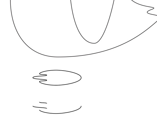
I created a foot shape using the pen tool. Once I did that I created a second foot using the option and moving it, this copied the foot and created another at the same time. After doing this I delete certain parts of the foot only leaving the parts that would be seen from a side perspective.
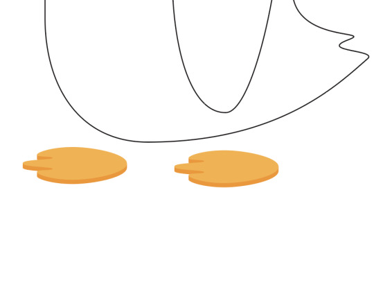
I then joined the edges on the half foot I made to the actually foot using Command J. This automatically created a link between the two together. after doing this I coloured the different sections of the foot lighter or darker oranges depending on where the light should show more.
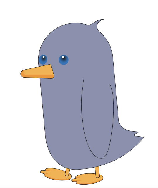
I connected the penguin foot to a leg I made using the same technic as I did on the body. And colour it the same way I did with the feet. Then i coloured the beak and the boy using the same technic but with the beak I added a second square inside his beak to give it more dimension. We ran out of time for this Jerked but I want to continue the progress on him.
0 notes
Text
20/2/24, Week 1

Drawing straight lines in illustrator test 1
I am learning new ways to use illustrator to allow my experiences to be easier and take less time. I spent a long time working on the diamond and was unable to make it look normal

continuation of the straight lines. the goal with this is to become more comfortable with using the Bezier Curves tools
The shape enjoyed drawing the most was the 2 one it was satisfying to finish

I started working with curved lines. I used anchor points to choice how long and pronounced a curved line. I enjoyed playing around with the different curves you can make.

I am still getting used to the anchors and they work but I am becoming more comfortable with each new exercise. these ones are just more complicated versions of my last exercise.
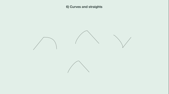
this are hybrid curves these one were very easy for me to pick up, they were also kinda fun to do:)
0 notes
Text
19/2/25, Week 1

IRL drawing lines
I quickly sketched out some straight lines on a piece of paper to give myself a feel for drawing straight lines without any tools but a pencil
this was to remind me how it is to draw on paper before moving to computer. this was nice I enjoy physical drawing.
0 notes