
Last Seen Blogs


Text
Final Exam
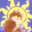
The idea behind this art work was pretty unique for me. I am a drummer, and when I play drums I play on a part of it called the head. That’s mostly on all kinds of drums. I decided I wanted to paint on top of some of my marching band drum heads, since they are pretty cheap and I had some extras. I went to Micheal’s and got paint and then got to work. The big one took me two days and the little one took three because of how much detail went into it. When I first went into what idea I wanted to create I knew I wanted to do nature because I love the nature. The big one has a mixture of blue and pink which I decided would represent a sunrise . I love blue, so I decided the smaller one could use a stream going through the land. I haven’t titled them yet but I might give them to somebody someday. Thank you for an awesome semester!


0 notes
Text
Virtual Sketchbook 4

The artwork I made is my depiction of the genres of music using 12 colors. I decided to use the twelve-tone row series or the 12 notes of westernized music.
Jackson Pollock went off his teachings from Thomas Hart Benton because of his personal issues that affected his daily life. He moved away from Wyoming to outside New York to get over his drinking problems. He moved to get inspiration for his art in a new area. He used typical American techniques to paint, and he painted on the floor. He wanted to express his feelings rather than illustrate it. He would set the canvas on the floor and would dribble, or splat paint all over the canvas in no apparent rhythm. His paintings were original as he would just absolute chaos and lack of structure to create these pieces. These paintings however are quite the opposite, they are huge and balanced with a multitude of different colors that you cannot tell what is important or just the background.
0 notes
Text
Virtual sketchbook #3

This is a close up picture that I took with my sister in front of our astrology sign Aquarius. This is only part of a whole design called the zodiac mosaic.

This is made out of tiles, which according to Ringling, “was often found at palaces or temples because of how painstakingly hard it took to make.” They can also be made out of glass or stone, this one is mostly tile and is located on a sidewalk outside the museum. It was pretty at around 10 feet wide and across. This art is shaped in a compass rose. It was shaped this way to show/point the four main directions and also each direction in between, like southwest. The middle of it is a sun with balanced sun rays in each of the direction points. The directions are even labeled at this points in a small circle. There are circle patterns around the sun. Some of them are just for design and some of them have meaning. The biggest inside pattern is the most important because it contains the astrology which is the highlight of this piece. It contains all 12 signs in astrology, and it represents the path the sun takes in our normal yearly rotations. According to Brittanica, “Each month is correlated to a constellation in the night sky.” This means that this was based off of what stars they saw in the sky when building it. Astrology has been around for thousands of years. When astronomers started noticing that the Star clusters would form noticeable icons, it made it easier to plot since stars move in our sky. When the telescope was made it was even easier to plot these constellations. Eventually specific qualities of people born under specific constellations were made and some people believed this and some people still believe it today. I’m my opinion, this artist was trying to show the basic gist of astrology and how it works in our night sky. They use patterns and rhythms to show how equal it all is and how it relates to directions and the sun and moon. I think Ringling’s Zodiac Mosaic truly shows his ideal astrology piece. His interest in it is shown in how important the piece was laid out on the land. They hold weddings that use this sidewalk and this art points to some major parts of the area. This picture below is to show almost my whole body at Ringling Museum just for further proof since I didn’t lay on the art to take the photo.

0 notes
Text
Virtual Sketchbook 2
1.
Unity and Variety
Unity is the appearance of one condition or theme
Variety is the appearance of diverse themes and is opposite of unity
Unity is found in the daily life of things that do not change, like the color of water we drink, or the same white socks I recycle through each week. Variety is when I wear a different outfit each day, or the different options I can choose to color a drawing.
Balance
Balance is how things are symmetrical and asymmetrically related that creates equal amount of both sides.
Balance can be found in the foods we eat. We try to balance amounts of dairy, carbs, vegetables, proteins, etc. For a healthy diet.
Emphasis and subordination
Emphasis is purposely written to draw attention to a certain point of importance. Subordination is the lesser areas of importance that keep us from being distracted from areas of importance.
A personal example of emphasis is a calendar board I use to keep important things for the month, so I do not forget. Subordination would be the fact that it is a whole month on the board and not a day at time so I feel less stress in my days or important things.
Directional forces
Directional forces are pathways for the eyes to look, whether that be vertical, horizontal, or diagonal.
Like how we look at a I phone, there are paths our eyes look to identify which apps we have and want to choose.
Repetition and rhythm
Repetition is the regular occurrence of visual elements. Rhythm is repetitive ordering of elements.
In life repetition can be a morning routine I do every day, sometimes it varies but the basic element of the routine is repetitive. While rhythm is like music, and it does not change like a snare drum on two and four.
Scale and proportion
Scale is the size relationship of objects to each. Proportion is the relationship of those parts to a whole.
For scale, I always pick the biggest watermelon I can find because they taste better. Proportion would be comparing how many grapes equal a whole watermelon.
2. Figure 4.17 Cildo Meireles Cruzeiro Do Sul (Southern Cross) Unit 4.6
It is a picture of a man holding a tiny wood block on edge of finger. This artist is disorienting scale for visual effects. We all know the approximate length of fingers and seeing this tiny block on it gives us a clever idea of just how small the object is. In this instance, the artist is using emphasis on how poorly the people of southern hemisphere countries are treated. There are also implied directional forces focused on the wood block. In the background is subordination to focus on the scale of the arm. The balance is intact because they would block rest where it cannot fall over.
3. Blue has had the biggest impact on my life personally. Blue is a primary color and has multiple hues that give off different emotional responses. My eyes are light blue that give off kind and soft colors. While dark blue can symbolize the oceans that are endless in depth of blue that eventually turns too dark to tell. Blue is my favorite color.
4. Comic
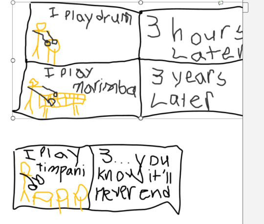
It is more of an inside joke for percussionists but, we always have instruments we could be practicing because there are so many of them. No matter how long I practice, they will always be something else. In my comic is used balance, repetition, and rhythm, emphasis, and directional forces.
5.
Portrait:
Landscape: located above
Still Life:
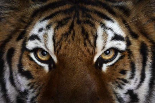
Portrait: This is a up close portrait of a tiger. The photo is zoomed up and really emphasizes the emotion from the tiger. In my opinion the tiger looks threatening. Not as in that they are about to attack, but instead looking at prey and saying it is over no matter how hard you try. Now I believe that the person that did this portrait wanted the exact opposite and instead wanted you to feel disconnected from the environment. ��
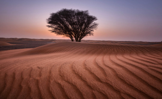
Landscape: This is a beautiful landscape of a desert, but not your ordinary desert. Usually a desert has no trees, but the photo has one right in the middle. To me, this person who took this wanted people to see something different from the usual, and not feel weird or opposed to it.
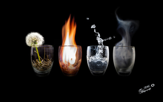
Still Life; This is a still life photo of the elements in glass cups. In order it is earth, fire, water, and wind. The person who took this was trying to make the elements of life fit into small cups. They want people to remember that we had controlled the elements into the palms of our hands, but they are still ever so powerful. These things never change and are infinite, what a amazing picture to remind us of that.
0 notes
Text
Portrait:

Landscape:

Still Life:

Portrait: This is a up close portrait of a tiger. The photo is zoomed up and really emphasizes the emotion from the tiger. In my opinion the tiger looks threatening. Not as in that they are about to attack, but instead looking at prey and saying it's over no matter how hard you try. Now I believe that person that did this portrait wanted the exact opposite and instead want you to feel disconnected from the environment.
Landscape: This is a beautiful landscape of a desert, but not your ordinary desert. Usually the a desert has no trees, but the photo has one right in the middle. To me, this person who took this wanted people to see something different from the usual, and not feel weird or opposed to it.
Still Life; This is a still life photo of the elements in glass cups. In order it is earth, fire, water, and wind. The person who took this was trying to make the elements of life fit into small cups. I believe that they want people to remember that we had controlled the elements into the palms of our hands, but they are still ever so powerful. These things never change and are infinite, what a amazing picture to remind us of that.
0 notes
Text
Virtual Sketchbook
#1
Damien Hirst 1992 The Physical Impossibility of Death in the Mind of Someone Living. Tiger shark, glass, steel, 5% formaldehyde solution; 213 cm × 518 cm (213 in × 213 in).
1. The artist, Damien Hirst, is a leading member of the Young British Artist.
2. The artwork was funded by Charles Saatchi, who offered to pay for whatever Hirst wanted to create.
3. The shark cost 6,000 pounds and the whole project cost around 50,000 pounds.
4. Hirst wanted a shark "big enough to eat you," a fisherman was hired to catch it off Hervey Bay in Queensland, Australia.
5. This artwork is considered an iconic piece of the 1990s in Britian and is a symbol of Britart worldwide.
At first glance the artwork is daunting and scary as you are looking at a shark with their mouth wide open. After reading about this artwork, my opinion on it has changed. I now know that the piece depicts a life and death scenario. The shark is suspended and still, making the mood feel cold, dark, and depressing.
#2
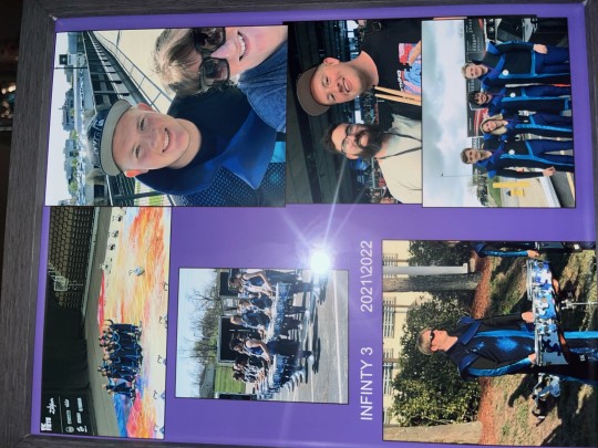
A work of art in my life is a recent one. My mom collected a bunch of photos and merged them onto a purple background. The purple is the color of the organization I was a part of, and the photos are me participating with the organization. This was a big part of my life so far, and my mom wanted to frame to remind me of when I was in it. This gift is close to me and even it only took photos and a purple background, it means a lot more to me.
#3
I am 19 years old and a male. I was born in California, raised in Missouri, and now live in Florida. I am of white ethnicity comprising of German, Irish, Scottish, English, French, and Welsch. I am a musician and am a part of Symphony Orchestra, Jazz band, jazz combo, Jazz Presidential Combo, and Percussion Ensemble. I work at Sarasota High School as the Percussion Director. I think I am one of the luckiest people on the planet.
#4
I am a music major, so music has been a major part of my life and interest me every day. The art that is #2 is also #4 because it represents what I love to do and who I get to do it with.
1 note
·
View note