Don't wanna be here? Send us removal request.
Text
How to choose a font
https://www.smashingmagazine.com/2011/03/how-to-choose-a-typeface/
0 notes
Text
As letterforms were introduced by scribes, they were soon emulated by the founders of type. In 1557, French punch-cutter Robert Granjon cut a typeface based on his own handwriting, hoping to supplant the popularity of italics (first introduced by Aldus in a 1501 Virgil), which he himself had made widespread. His Gothic script (today called Civilité, after the children’s conduct book in which it was used) unfortunately did not catch on, although it accurately reflected the everyday handwriting in Protestant Europe at the time. The problem for Granjon was printers were equipped with blackletter (batârde) for vernacular works, Roman type for works in Latin, and if they wanted variety, (say for poetry), they used italic. Beautiful as Granjon’s vernacular script is, it was not essential. On top of this, the extra sorts (30 ligatures, 24 alternates for terminal letters, etc.) made it difficult for typesetters.
0 notes
Photo
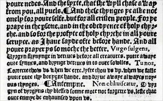
For hundreds of years English was written and read in blackletter. Today we struggle with such works, such as in the piece below printed by Richard Faques at the “Sign of the Maiden’s Head” (St Paul’s Churchyard, London, 1530). The Roman character gradually supplanted blackletter in the 17th century. It was referred to by the English printers as White Letter, due to the lighter massed effect on the page. In the 19th century, during the period known as the Gothic Revival, blackletter was reintroduced as a novelty in English printing. Our modern Roman alphabet is a hybrid reflecting the handwriting from two periods in the development of Roman letters. It combines the Capitalis Quadratus of 1st century Roman inscriptional lettering—which are our “capital” letters—with their devolved state as manifested in the 11th century in the monasteries (that had flourished in France under Emperor Charlemagne). These became our minuscules, or lower-case letters. Charlemagne himself desired to learn to read and write, but said that “a hand accustomed to the sword could only form the simplest shapes.” By this time, war with the Arabs had cut off the supply of reeds, but relief was on the way with the introduction of papermaking (cheaper and more amenable to writing than parchment was), and goose or crow quills were substituted for reeds. These, in turn, gave way to steel pens, introduced in the 18th century (and popularized in the 1830’s), which also had a strong impact on the way we read and wrote. Copperplate scripts, learned from writing manuals, featured steeper angles and added virtuoso flourishing. Handwriting, just like music, was considered a useful art suitable for instructing young ladies.
0 notes
Text
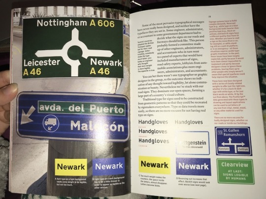
Let’s consider a couple of simple sentences: “The boy walks a dog” and “The boy walks the dog.” The meanings are significantly different simply by the change of one small word. “A dog” is any old dog, while “the dog” is one we know and recognize. Similarly, small changes in typography can fundamentally alter impact and interpretation. For example, type size can be increased, the weight or font can be changed, and positioning within a frame altered; with each alteration, the meaning also changes. An authoritative, urgent, big, bold “STOP” suddenly becomes more lighthearted and less weighty and might even come across as teasing when rendered as “Oh, stop, stop it! I like it!”
0 notes
Photo
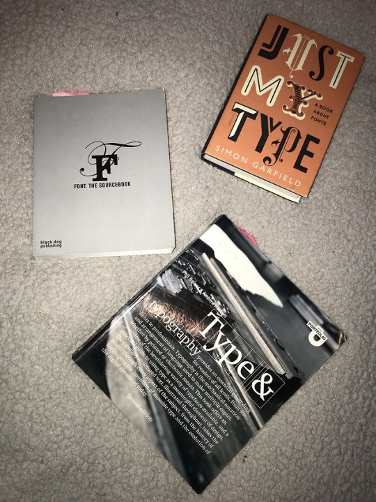
My presentation was a success and I got some great feedback off Laura and Matt. I was also given lots more reading materials to help my research.
0 notes
Text
https://www.smashingmagazine.com/2012/04/when-typography-speaks-louder-than-words/
0 notes

