
Statistics
We looked inside some of the posts by garrettparkerdesignminorstudent and here's what we found interesting.
Average Info
Notes Per Post
1
Likes Per Post
1
Reblog Per Post
0
Reply Per Post
0
Time Between Posts
6 days
Number of Posts By Type
Text
13
Last Seen Tumblr Blogs


Fun Fact
Tumblr has 411 employees.
Text
Week 13 - New Media
The digital aesthetic is a design movement in the 1990′s which embraced “science fiction, video games, and technology” as stated in the book; The smooth, clean, textureless designs embrace a technological future for humanity and was appealing to both consumers and commercial forces alike. Remnants of video games greatly influenced the digital aesthetic with its metallic, flat nature. Cyborgs, space, and technologically advanced machinery which dominated the science fiction genre were carried over to the digital aesthetic as well.
Many of the large tech companies like Google, Apple, and Sony create industrial designs which emulate the digital aesthetic of the 90′s. The smooth, clean, textureless form factors of both cellphones and wearables (headphones, watches, etc) have become the standard for “future technology.” Even car companies have followed a sort of digital aesthetic by having smooth, clean form factors compared to classic muscle cars emphasizing their shape and form.
0 notes
Text
Week 12 - New Media
Many of the fields which use interactive design revolve mostly around the use of internet and smartphones. Apps such as social media platforms provide concise yet customizable interfaces which make using the platform more unique and personable to interact with; Through aesthetics such as overall appearance and layout, a user can tailor an interface to their liking. Digital advertisements also provide interactive design to persuade a viewer into clicking on the ad to find out more information, appearing in unclose-able boxes on the sides and bottoms of most public websites and social media platforms.
A computer itself is also an example of interactive design as its interface is customizable in appearance, accessibility, and usability to provide an equal using experience for any person, regardless of disabilities or lack of prior knowledge with the machine; Backgrounds, icon placements, text size, etc. can be altered and changed in the settings of a computer. Basic rules of programs preinstalled or available for certain computer OS must follow a specific set of design rues in order to provide consistency within the OS ecosystem, but can include unique features and appearances in order to stand out on the market.
0 notes
Text
Week 11 -Graphic Design
the Citizen Designer is an expansive movement based off the expression “everyone is a designer.” As social activists rather than creatives, average citizens use their designs to voice their opinions on major social issues; Expanding the typical client/designer relationship which the book discusses, Citizens Designers work more collectively to make their issues heard. the concept of design is meant to entangle a persons regular lifestyle and commercial work, finding ways to make the world a better place.
The concept of Citizen Designers is relevant because it ignores the corporate standards which much of design follows. Unlike the average few who work as professional designers to create consumer products to solve the average issues, a whole community can voice their own solutions on an issue through their own ideas and designs, not relying solely on a company to solve an issue for them. One issue which is talked briefly in the book is sustainable design, which involves to use of natural elements in consumer design to create a more eco-friendly world. Through DIY and the use of recyclable resources, the average citizen is able to provide a larger impact when solving environmental and ecological issues which regular production has on the earth’s health.
0 notes
Text
Week 10 - Graphic Design
The Bifur typeface designed by A.M. Cassandre in 1929 combines geometric abstraction with Art Deco styling. The letters, which are “reduced to their most fundamental shapes” as described in the book, are then enhanced with shaded areas to fill the missing spaces and add depth to the letterings; The Bifur typeface coincides with Cassandre’s “poster aesthetic” as described in the book and helps to grab the attention of viewers.
Bauhaus typography combined geometric letterforms with san sherif styling to create a type capable of “expressing the spirit of the machine age” as stated in the book, expand past national borders, and coincide with photography. Stencil typeface designed by Josef Albers uses basic geometric shapes with separation down the middle of each type creates a highly stylized and similar to other Art Deco forms of typeface.
The Avant-Garde Gothic typeface, designed by Herb Lubalin became one of the most used typefaces in the 1970′s. As an updated version of san sherif, the typeface used “Evenly weighed capitol letters” as described in the book while keeping a clean and geometric feeling typeface. unlike other typefaces, Lubalin and the International Typeface Corporation typefaces, founded by him and Aaron Burns, were one of the first to license typefaces without being a part of the printing process. this “middleman” process as described in the book, would fundamentally change the business modeling of typeface designers in the digital era.
Bit-map typefaces are by far one of the most stylized digital typefaces. Designed by Zuzana Licko using the Macintosh designed by Apple, the Emporer-8 typeface used ratio-based “pixel stems and counters.” the number in a bit-map typeface symbolized the height of a typeface in pixels; The larger the format a bit-map typeface is used in, the larger the pixel height a typeface has to be (in order to keep clarity).
0 notes
Text
Week 9 - Industrial Design
As a large metropolis Milwaukee is a perfect city to establish business, especially that of industrial design. Brook Stevens, who saw the potential in Milwaukee and chose to stay, lied the framework for Milwaukee’s role in industrial design; His dedication to the craft while refusing to quit (thanks to his father when he was younger) provided Stevens with high design roles and a name for himself. The motto which he follows: “an industrial designer in today’s business world should be a business man, an engineer and a stylist, and in that direct order” changed the way an industrial designer was interpreted forever. No longer was an industrial designer a designer alone, it was a hands-on process which would teach a designer to sell his work, know how to create working and functional designs, while appealing to any audience depending on the target. The successfulness of Stevens’ work in an inspiration for any industrial designer hoping to “make it big” and find work in Milwaukee.
0 notes
Text
Week 8 - Industrial Design
The LED light bulb is a more cost effective, brighter bulb than its hot, tungsten predecessors; Similar in shape to any other standard lightbulb, the LED bulb can work with almost any lamp/ light fixture in your home. The bulb contains multi-coloring which can be controlled via the provided app or through a smart home system such as Amazon Alexa or Google Home.

Sony’s newest headphones provide the latest in noise cancelling and bass boosted sound technology. The “over-the-ear” fit compared to “on-ear” headphones prevents sound leak in public and high-grade noise cancellation maintained by microphones on top of each ear cup. The band of the headphones is adjustable for any size head and contains touch controls on the right ear cup, a power button and programmable button on the side of the left ear cup.

This desk lamps provides bendable pivots toward the bottom, middle, and top of the lamp for full control of the light source. dual springs located on each arm keeps the lamp in the position a user puts it in. The cord, which is run through the metal arms of the lamps, helps to provide a clean look which can work with any desk or table its used on. The lamp comes with two different bases: a heavy, circular base which is normally seen with a desk lap and a clamp-able base which can attach to the side of a desk (the clamp, though, is cheap and doesn’t hold as nice as the heavy base, in my opinion.)

The Keurig, a modern coffee maker, provides fast and easy hot drink making for the user with a busy life. The top plastic area opens to provide a tank to pour water into; A useful measuring device helps the user pour the precise amount of water needed for a specific drink. The front of the Keurig opens to reveal a pocket for K-cups, the quick and easy coffee ground storage system which makes the machine so popular. A user fills the tank with water, adds the K-cup of coffee they wish to drink, and press the “brew” button on the top right side of the machine. Within minutes, the water in the tank is heated and ran through the K-cup, pouring a hot and delicious drink in the nozzle below. A k-cup can be easily removed and thrown away after use, leaving a clean a reusable coffee maker within seconds.

Converse shoes are making a comeback in today’s society. The long, pointed “sports” shoes were first created in 1908. The recognizable star logo is placed within the inner side of the shoe, visible with every step a person takes wearing them. The rubber edging and toe cap is common with any version of the shoe, sometimes accompanied by a white or colored stripe as seen below. Two circular holes are placed within the center side face of the shoe for air circulation within the shoe. These are made with a canvas type textile, but Converse today also sells shoes made of leather and suede in high top and low top styles.

The Zoom H4N pro is an audio recording device mainly used by audio and film enthusiast. The pivoted mics on top provide a 90-120 degree of sound recording straight from the device. If the built-in mics aren't enough, dual XLR input and audio jack inputs are provided on the bottom and back of the device. buttons on the front face of the device provide play, pause, stop, and record control. The three buttons on the front left hand side of the device change the different recording modes on the device. audio recording volume is controlled by buttons on the right hand side while listening volume is controlled with buttons on the left hand side of the device. An SD card slot is located on the right hand side for audio storage. The recorder, slightly larger than an average hand, is portable for any audio recorder on the go looking for high quality, sound recording.

The Xbox One controller is a sleek, comfortable game controller. The colored buttons on the right side of the controller, the joysticks on the bottom right and top left of the controller, the plus pad on the bottom right of the controller, and trigger buttons on the top of the controller provides customizable use for any game developed for the system. The center button, which controls the power of the controller, lights up to indicate the device is on. The matte black look of the controller matches the color of the xbox while the multi-colored buttons provide a fun splash or color to an other wise dark controller.

The Nintendo 3DS is the more recent dual screen gaming device; The foldability of the devices dual screens allows for portability. buttons are located on the right side of the device while the thumb-stick and plus pad are located on the left hand side. a 3D slider is located on the top right side of the device to dial in a users 3D effects preference when playing compatible games. an audio jack port is located at the bottom of the device for headphone connection.

This portable laptop stand is extendable for any size laptop. The light, metal build of the device is slim enough to be invisible to the average user while providing a more comfortable angle for the average laptop user. The knob screws located at the top of each arm, allows a user to dial in the specific angle a user wishes to have.

The Renuzit gel candles provide a fast, compact, and easy way to deodorize a room. The top cap of the candle can be opened and extended depending on how much of the gel a user wishes to expose. Once the gel in the candle runs out, the candle can be easily disposed of and replaced with another. Once the label is removed for the candle, the sleek, white cap blends in with any home decoration while providing a potent scent depending on which fragrance a user buys.

0 notes
Text
Week 7 - Architecture
Two key principles of Universal Design which are relevant in objects and environments that surround me are Equitable Use and Flexibility in Use:
Equitable Use is when a design provides the same means for any user. whether its accessibility, security, or safety, any user should have the same access and appeal, even in diversity; visually, a design should attract any person who comes across it. Technology such as smartphones, which becomes a critical tool in modern society, provides Equitable Use to anyone who uses it. smartphones come in different shapes and sizes depending on the users preference, but at the end of the day, any smartphone provides the essential call, text, and web searching one would expect when buying it. For the user who have physical handicaps which can make smartphones a hassle to use, companies such as apple provide “Accessibility” functions (which can increase text sizes, add voice functions to control the phone, flashing alerts for those who cant hear, etc.) provide a equal use to anyone. Buildings that use ramps instead of stairs provide an equal access to entrances also provide Equitable use as a ramp give both the average and handicap citizen easy access to the door. Also automatic door - opening functions help for those who can open a door themselves, equal access to a building like anyone else would.
Flexibility in Use is a design which provides a wide range of preferences and abilities for a user. Providing choices, accommodations, and adaptability opens a design to a wider range of users. Software such as Adobe’s Creative Suite (Photoshop, Illustrator, Premiere Pro, After Effects) gives users the ability to rearrange and change settings to better meet the need of a user. Basic tools to do basic functions are present when a user first opens a software, while more advanced tool, hidden at first, are accessible for the more advance user and provide different abilities depending on the outcome a user is interested in creating. Car radios which include bluetooth or aux cord capabilities give users different options in listening to music, depending on the preferences of the user; If a user whats to listen to their own music, these accommodations give a user the ability to do so.
0 notes
Text
Week 6 - Architecture
Most skyscrapers are unique in their own way, depending on the use of the building. The residential complex shown below contains a curved center lined with windows and balconies on each side. An ornamental metal fence design with a cylindrical pillar sits at the top with open, rectangular pieces on each side.

The business skyscraper shown below is slick, geometrical, and entirely made of blue tinted glass on the outside.

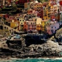
The more modern residential skyscraper shown below contains four different rectangular pieces collaged together with large windows, and parallel balconies on the gray side of the building.

The drawing and image below represents the veterans museum. the larger rectangular part of the building seems to levitate above the main base of the art museum thanks to triangular shaped pillars holding each side along with the smaller, rectangular, glass entrance.


The classical look of the Saint Mary’s Hospital is accented with intricate pillars and carvings above the entrance.


The art museum in Milwaukee is by far one of the most unique architecture achievements in the city. The “sail” of the building is raised and lowered depending on the weather, accents the sleek, futuristic shape of the entrance and bridge which hovers above the main road.


Another example of the classical, intricately carved pillars and entrances are scattered around the city.

This building below contains an art deco style with its geometrical, cubic designs on the sides of the building along with the geometric accents which decorate the top of the building.

0 notes
Text
Week 5 - History of Design
“The most noticeable break with the earlier design resides in the asymmetry of the composition, which deviates from the axial centering of the first three volumes. There is a broad, blank space in the center of the cover, which for De Stijl artists did not represent “absence” of the design, but was an active element that was balanced with the filled-in-parts of the composition” (Eskilson 181).

I’ve noticed a lot of large corporations and government advertisements have gone with asymmetrical, empty weighing advertisements to promote health safety during Covid-19. This example, an advertisement from the Washington Stage Government, contains the phrases “fewer.shorter.smaller.safer” and “limit interactions. control covid-19″ in the top left and bottom left of the ad. The website for more information - “coronavirus.wa.gov” is displayed in the bottom right of the ad. The empty space, mainly on the right side of the ad, actively balances the entire composition (the empty spaces taking up as much space as the large text on the left side). In my opinion, I could see this empty space as a representation of the separation from other many encourage in order to stay safe from Covid-19.
“A photomontage is a composite image made up of a variety of photographic source materials. These might be original artwork, but most often artists liked to use images culled from popular newspapers and magazines” (Eskilson 196).

A movie poster for the movie Sicario represents a modern version of Russia’s photomontage. Stills from the movie, similar to magazine or photograph clippings combined together, are collaged in such a way to fit within Emily Blunt’s profile face. Digitally created, the poster could be mass printed and produced similar to it’s Russian lithographic process.
“This unique exhibition focused on objects that were traditionally excluded from the museum realm, such as industrial products, mass-produced furniture, and even scientific instruments...the catalog further draws a series of parallels between the “pure shapes” of machine-made objects and Plato’s Classical aesthetic, celebrating the objects kinetic rhythms, simplified surfaces, visual complexity, and functional beauty.

This “skeleton analog watch” randomly found on Amazon is a perfect example of the machine aesthetic. the machine crafted gears and springs which hold the watch components and “ticker” together are openly seen to the user. the visual complexity of the many intimately placed gears and the kinetic rhythm of each moving together to create a working time piece; The “functional beauty” speaks for itself as many watches, especially the very intricate ones, contain a high price tag to match their detail and careful craftsmanship.
0 notes
Text
Week 4 - Found Object
On my walk home from work, I stumbled upon an empty, plastic Gatorade bottle placed in the snow next to a nearby CVS.

From first view, I could tell the Gatorade bottle was one of the larger sizes due to the smaller label compered to other sizes; On regular sized Gatorade bottles, the label wraps a good half of the bottle. The signature orange logo along with the bold “G” and orange lightning bold stands out from every other plastic bottle. The lower portion of the bottle is beveled in such a was as to provide a better grip for those who are looking to take a quick drink without worrying it will slip out of their hands. 3D lightning bolts stand out on each face of the beveled bottom, adding to the “electrolyte boosting power” that gatorade is known for. The lemon-lime version of this drink (which is shown empty in the photo) is the signature flavor and color of Gatorade which brightly stands out coinciding with the orange cap. The choice of a grey label compared to a white label like most drinks, helps the white “G” stand out much more and add some medium gray tones to an otherwise bright and overly flashy drink color. The sleekness fits with the sport oriented advertising which Gatorade leans towards, since the drink itself was intended for athletes needing a re-energizing solution without the use of caffine.
0 notes
Text
Week 3 - History of Design

Lithography and Letterpresses which commercialized the reproduction of prints and newspapers, is still used in some form today. Unlike limestone and wood engraving as referenced in the reading (see notes), modern day news printing consists of offset presses onto aluminum sheets which leans an offset onto rubber rollers and lightly pressed onto newsprint to create a clear page.

(Printing Plate image from the article What Are Printing Plates? by Rafael Rivera)
Halftones, which were an earlier version of transferring photography, used varying sized dots which would create depth and contrast in an image. Today, color halftones create a certain pop style with bright flashy colors.
7up Soda cans use halftones to add visual texture. individual dots I can be seen in the corner of the “7″ as well as the highlights of the red dot and the light rays behind it:

Another can, this time a fruity seltzer drink, also contains use of color halftones, used mainly with the fruits at the top of the can.


Sans sherif first released by Willian Caslon in 1816 became a popular advertising font that stands out from the page with its bold and uniform shape. Many different styles and versions of Sans Sherif have been designed over the years, creating a plethora of typecast subsets including Gothic, Grotesque, Calibri, etc. One that stands out to me is ITC Avant Garde Gothic (which I’ve replicated below). While retro in nature and use, the font resembles much of the original boldness and uniform sizing of Caslon’s original typeface.

Another typecast created in recent years is Comic Sans. Although Comic Sans has become a joke/hated font in recent years, it’s styling similar to that of Sans Sherif, was mean’t to be child oriented and used in comic books and children's stories. I tried my best to recreate the font below:

A more spaced out version of Sans Sherif is used for the Mission Impossible: Fallout poster shown below. The bold and uniform typecast contrasts with the lighter gray of Tom Cruise and the harsh white of the empty background.

Modern retail products use similar Sans Sherif typecasts to help stand out from leading competitors. This Equate mouthwash I own contains a modern, white Sherif which stands out from the turquoise color of the mouthwash itself.

An album cover for The Weekend House of Balloons uses a gothic typecast. Gothic, created by the American Type Founders Association. Its mainly black lettering stands bold from the almost white of the empty space and the strong contrast in the image towards the bottom of the album.

0 notes
Text
Week 2 - Design Thinking
Design, in broad terms, are ideas or physical representations of things people either want or need in their lives. Processing an idea into a design can usually start with a problem in need of a creative solution, sometimes even starting with an idea that is in need of a new marketplace. As referenced in the beginning of the article Design Thinking by Tim Brown, Edison began with the lightbulb but envisioned the use in a public setting and developed the necessary industry, thus creating a new marketplace and demand (Brown, 2008).
The design process as a whole is fluid, usually involving revisions and new perspective in order to make a new design a reality. Tim Brown explained this process using three terminologies - Inspiration, Ideation, and implementation (Brown, 2008); As an idea flows through each stage in the process, social changes and problematic issues cause design to circle the first two stages, streamlining the design developing a working solution.
As a film major, much of the technology and software used in the industry was constantly evolved to fix the need of one individual problem. Cinematographers who are tasked with capturing the overall shot in a film would normally develop and manufacture their equipment in order to achieve a certain look that the previous camera design couldn't achieve. Today, many of the basic design created by a number of filmmakers as well as the film community for a “perfect camera” shape the overall look and use of consumer and professional cameras used today. Similar to the process discussed in Design Thinking, designers were inspired by the issues many camera users had, idealized a solution to those issues, and implemented them in the next version of an industries flagship camera.
Software is developed the same way. As a consumer runs into a problem which the program can't solve on its own, Designers develop new interfaces which can achieve the look or effect a person wishes to achieve.
0 notes
Text
Week 1 - About Me
My name is Garrett Parker and I'm a Film major as well as a Design minor. In my free time, I love to watch all kinds of movies while developing my own films. At heart, I'm an artist who loves to create; I take every opportunity I get to come up with something new visually.
When it comes to design, the idea of breaking down aesthetics and understanding a persons interest through works really inspires me. I’d love to better understand designs fundamentals so I may se them in my own works as well. As far as taking this course, it’s a requirement for my minor, but nonetheless I am excited to learn.
As a film major, I use design to develop a certain aesthetic in my works. Whether it’s through custom title cards or mise-en-scene in my films, I’m always thinking about design, even if its unconsciously.
As far as purchasing based on design, I always choose the products which stand out from the rest; I like flashy colors and bold wording which sometimes appeal to a more youthful audience such as myself. I’m not usually one for simplistic designs since it’s become more common especially with larger corporations, except for those which creatively use the aesthetic in a new light.
Can’t wait to see where design takes me!
1 note
·
View note