
Third Year Studies at BA (Hons) Photography, University of Derby
Don't wanna be here? Send us removal request.
Statistics
We looked inside some of the posts by gascoignephotography and here's what we found interesting.
Average Info
Notes Per Post
0
Likes Per Post
0
Reblog Per Post
0
Reply Per Post
0
Time Between Posts
24 minutes
Number of Posts By Type
Text
17
Last Seen Tumblr Blogs


Fun Fact
Women make up for the other 50% of Tumblr’s audience.
Text
AV Script and video link
youtube
Weather with Me is a body of photographic work exploring the changing weather patterns in any location I encounter at 10am and 2.30pm daily from Sunday 14th of May 2023 onwards. This study encourages a consideration of environmental impact and climate change more locally and personally.
Using a hand-built camera and a cyanotype process that utilises natural sunlight to expose the photographs, it creates authentic variations of exposure and image render. This work generates a testimony of time-specific experiences of weather patterns to illustrate the physical and material impact of changeable light conditions, atmosphere and pollution interference accumulated durationally and presented as an authentic visual calendar.
This is a live and ongoing piece of work.
I took inspiration from Ed Carr who is an independent artist, printmaker, and research from North York Moors in the UK. He has also used an experimental style of photography as well as innovating animation techniques. Carr experiments using a wide variety of photography from 35mm stills, to cyanotypes, pinholes, lumen prints and more. His work “A Guide to British Trees” is a stop motion video which incorporates a wide variety of experimental photography. In an interview with Lomography Magazine, he states that his inspiration reverts to how “trees often standing proud at the center of an ecosystem, they are an easy way for humans to connect with the environment around us”. Similarly, in my body of work, he enables nature to speak for itself, giving it the voice that it’s never got to witness before. While Mother Nature has some accountability of the blame for climate change to take, humans have the voice that can make the change, and it’s the change from our negative impact that we need to speak up about and inevitably make a difference in our climate crisis.
Within my current practice, I am capturing the constant change in weather patterns that we, as a country, are experiencing. When researching the theory behind my practice, I looked at past weather patterns for the last 10 years. In my findings, I discovered that over time, our weather was getting higher in temperature during the summer solstice while we were reaching record breaking colder temperatures during the winter solstice. To keep an ethical approach to the topic, I am experimenting with cyanotype paper while photographing through a homemade camera. To create a great depth of detail within my image, I have made a cardboard camera obscura and I’ve been taking it around with me, documenting the weather I experience wherever I go, allowing it to process for a total of 4 hours per image. Through the testing stages of my project, I discovered that the weather impacts the detail I achieve in each image drastically, if it’s sunny outside I can get a much more in-depth image compared to if its cloudy. For me to keep it as authentic as possible, the only time that the cyanotype paper reaches UV sunrays is once it’s inside the box where the sun reaches through the lens cut out of the end of the box. There is no postproduction within this practice as I felt it would affect the results in a way that didn’t support my practice theories and wouldn’t show authentically how much our weather is changing before of our eyes.
When we look back at the history of calendars, we can find that the earliest calendars date back to the Bronze Age with civilisations in the near east region, such as the Babylonians and Persians. These were among the first to record time by using natural cycles including days, lunar cycles (years) and solar cycles (years). The actual documented length of a day is 23 hours, 56 minutes, 4 seconds. A month is 29.53 days and a year is 365.2422 days making it extremely difficult to devise an exact calendar that is easy to follow. It was actually the Egyptians who are credited to be the first to make all their months an even 30 days moving away from early attempts of trying to synchronise with lunar cycles and focusing on aligning with the solar year. It was also the Egyptians who introduced the concept of a leap year every four years.
The Romans developed this model and it was Julius Caesar, who oversaw the formation of the Julian Calendar and is acclaimed for putting in place the foundations of the calendar we use today. Caesar commissioned an astronomer to improve things – the result being that each month now had either 30 or 31 days except February, which contained 28 days and 29 in every fourth year. However, under the Julian Calendar January wasn’t the first month of the year – instead it started in March and ended in February. The days of the week were named by the Romans with the Latin words for the Sun, the Moon, and the five known planets. These names have survived in European languages such as French, Italian and Spanish but in English some of the names for days of the week also reflect our Anglo-Saxon influence. For example, Latin for Thursday is dies Jovis, named after Jupiter, the Roman god of the sky, and in Spanish the day is still called jueves. But in Anglo-Saxon, it is Thursdaeg – after Thor, the god of Thunder, and thus we have Thursday. Many more of the Roman terms for months of the year still survive in English today, such as March after Mars, the Roman god of war; May after Maia, the Roman earth goddess of growing plants; and June after Juno, the Roman queen of the gods. Julius Caesar gave his name to July while his successor Augustus followed suit. In the ancient Roman calendar September to December were listed as the 7th to 10th months of the year – and thus their names: septem is Latin for seven, octo is Latin for eight, novem is Latin for nine and decem the Latin term for ten. But it wasn’t until 1582 that the calendar much of the world uses today was devised. It was called the Gregorian Calendar after Pope Gregory XIII who wanted to get the calendar back in sync with seasonal events like the spring equinox and winter solstice by removing some days and working out leap years more accurately. However, this was a time of religious upheaval and although many of the southern European Catholic countries adopted the new system almost straightaway, some Protestant countries resisted for many years. Germany didn’t change over until 1610 while the UK and the US held out until 1752. Greece and Islamist Turkey didn’t fall in line until the 1920s.
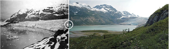
When researching into repeat photography, I discovered Christian Åslund’s photographic work from when he compared the glaciers in Svalbard from archives he discovered at the Norwegian Polar Institute. The archival images date back to the early 1900s, over 100 years since Åslund recaptured the same images in 2003. In 2017, National Geographic interviewed Åslund on his most remarkable assignment he’d done for Greenpeace, an independent global campaigning network founded in 1971 by Irving Stowe and Dorothy Stowe. Åslund stated how they didn’t know exactly where the images from the 1900s were shot from, they had to track down the true locations and follow in the footsteps of the original photographers. The image on the screen demonstrates the drastic difference between the two landscapes, considering that they are the same image taken 103 years apart, these two look like opposite locations. The decline of glaciers in the right-hand side of the image compared to the left side emphasises the impact that greenhouse gases in our atmosphere is having on our colder climates, due to the rising warm temperatures globally.
“Knowledge of climate change wasn’t as common, our attitudes towards climate change were different. Now more or less everyone knows it’s a fact” (Christian Åslund, 2017, National Geographic)
While this quotation from Åslund’s interview may be somewhat correct, in other ways it’s far from the truth. Climate change is a more common factor now of today’s society, however, rich countries such as USA and China have a large historical footprint due to becoming rich over centuries of fossil fuel burning and industrial production. Without any drastic change or action being implemented by major contributors to climate change, the rest of the world would have no feasible way of having a positive influence on the climate crisis.
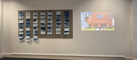
For my installation I have created my very own calendar dating from the 14th May to 10th June. I brought a 8ft by 4t board in order to frame my work completely and allow a more easier way of pinning my work up in a calendar style. Each image is hung up by two pins at the top of the calendar, this then means the work is reenacting a calendar by having the ability to be torn off from the board. The dates are printed on clear vinyl and measured perfectly to it in a uniform style creating the professional look of a calendar. In my printing stage, I found the clear vinyl to show the text better than the white vinyl yet didn’t enhance the boards texture like the white vinyl would’ve. Having it clear means it looks a part of the board as it blends seamlessly in to the rest of the work. I experimented with including data analysis of each image which would include the weather condition from that day, the time I started the photograph process, the temperature it was when I started and the location in which I took the image for. I used flash cards to see if it would look like markings on from a calendar however, I didn’t like the overall outcome as it began to make the work look tacky and almost rushed. While the work is incomplete to show that it’s a live and ongoing project, I didn’t want it to seem like the rest of it was completed half-heartedly. Therefore, I made the curatorial decision to get rid of the flashcards making the overall outcome a stronger finished product.
Lastly, I researched into titles for the project and found Weather with Me to be the most influential for the project. Having the personal aspect of ‘Me’ within the title highlighted the fact that the weather is with me wherever I go, almost explaining the project in simple sentence. It is also a play on words for the song Weather with You by the Australian band, Crowded House which is popular amongst the general public.
0 notes
Text
Mounting my board and the rest of my work
Before I mounted my board I realised I need to sand down the board as it was producing a lot of material shedding from the board due to it being made from recycled materials. Once that was all done I was able to mount my board and with the help of my lecturer and some classmates, I managed to get it up and drilled into the exhibition board.
I made sure to have the board high enough for it to be off the floor but not too high where people couldn’t read the top of the board and see the images clearly. I found putting the centre of the board at 150cm high made it a good measure where it wasn’t going to look out of place or anything.
After I mounted my board, I started putting my video work up and realised it was best to buy a shelf to drill into the exhibition board on the other side which would be able to put my projector up. However, once I brought it I realised it was too shallow for the projector to fit on but thankfully I was able to get some wood to create an extra space shelf on top of my shelf I brought which supported the projector and wires behind. I even managed to get a section cut out the back of the shelves to make sure the wires could fit behind my shelves making it look clean and professional. Once I’d painted the shelves white to blend in to the wall, I also taped the wires to the wall using white duct tape I had which would make the wires blend in to the wall to look smarter.
I then decided to go back to the board to work on putting my vinyl and prints up since my projector was running smoothly. Firstly, I put my vinyl up for the top 7 dates which are the start of my project. I made sure to space these out evenly marking where each one would go. However, some are uneven due to some days being longer than the others such as Wednesday and Thursday as well as some others. This was something I had to take into account as I didn’t want the text to be smaller on these so they fitted in with the rest as I thought that would be more recognisable however, I do think the places I put them in work well with the images and rest of the work.

After I had the vinyls up it was easy to align the other prints underneath each vinyl and I managed to do it in a short space of time. This was how it looked once I’d finished doing all the prints and data tabs, even though I didn’t like it or the way it looked, I felt like a sigh of relief had been lifted by me getting the majority of it up. I knew once the work was up on the wall, I had tiny tweaks to do to it in order to improve. As previously stated, I decided to not include the data tabs anymore due to not likely how they looked and the printers not being bookable for the time period I needed it done by.

Once I had taken all the tabs off the wall and included the other prints that I was still working on, it looked like a strong piece of work especially with the video next to it.
0 notes
Text
Deciding on data tag examples
As previously said, I want to include data to go alongside my images to support why they look like they do. My original plan was to have the data on vinyl to go next to my images, these would be small text boxes which are visible to see and understand. These data boxes would include the weather condition of the image, the time I started the process of that image, the location postcode and temperature when I first took the image. This is data that I feel is useful for understanding the image and my project but it’s also useful information to know for each image and to see the difference between each one.
However, after getting some feedback on my work, I was persuaded to not go ahead with the vinyl data and make my own as they believed it would work better with the calendar idea. I believed they could be right so I changed my plan and experimented with the handmade flash card plan. I followed the same layout as the first original plan of having the data in this order and layout. Once I finished the flash cards and put them up on the board, I realised I didn’t like the way it looked as it looked unprofessional, tacky and like it was rushed.
After debating what a solution for this could be, I decided to go ahead with the vinyl printing, however, due to the time of me being able to print these, the Digital Design Hub where I could print the vinyl was shut and unavailable to print off vinyl in time for my degree show. Therefore, I made the decision to take off the handwritten tabs and leave them clean with no data on them. When all the tabs were down, I actually decided I preferred it when it was completely clean and had no data at all as the work was strong enough to not need it that much. Having said that, I still feel like the data could’ve made it a lot stronger.
My testing of different fonts and pens to achieve different thicknesses for the text


The practice and finished result of what I wanted the cards to look like

Final presentation of my board alongside the tags
0 notes
Text
Setting up for the exhibition
For my exhibition, I decided I wanted to display my work on a board and make a huge calendar. For this I ordered a 8ft by 4ft board however, when it arrived it wasn’t in any packaging therefore it was filthy by the time it got to me. Thankfully it was easy enough to clean with just soap and water and dried very fast.
Before I cleaned the board:

After I cleaned the board:

Once it was all cleaned and dried, I was able to test the vinyl that I plan on using for the dates and data for my board and to support my images. Ideally, I wanted clear vinyl with white writing as I believed it would show up easier. However, the Digital Design Hub didn’t have white ink in stock at the time that I needed the vinyl printed, therefore, I chose black as it would be bold and stand out more. I was debating going for white vinyl and creating a box for the dates and data just to make it visible to the audience. Once I’d put both on the board, I could spot all the bumps and lumps of the board with the white vinyl whereas the clear vinyl hides it a lot better. I looked at it from different angles to see how it would look and I even asked the opinion of other people to see which one they think would work best. In this project I definitely wanted it to look professional like a calendar is, while the white would make it stand out, it would also make it look crowded and too boxy which isn’t what I want for the overall project presentation. After debating which one to go for, I think the clear definitely works best for my project.


While it was getting ready to go up on the wall, I also took the time to play around with the layout of my prints on the board. I tried to put my images next to each other in order however couldn’t fit all 14 of my images on the board without them overlapping. I also wanted to take into account the data to include and date vinyls too where it would have enough space for them. The layout that I decided on was to have the AM on the top row and the PM underneath it, the date would go above the AM while the data goes on the side of each image. Ideally, I want the information to be small, dainty text boxes so they’re not too bulky or mess with the rest of the work.


0 notes
Text
Final Artist Statement
Weather with Me is a body of photographic work exploring the changing weather patterns in any location I encounter at 10am and 2.30pm daily from Sunday 14th of May 2023 onwards. This study encourages a consideration of environmental impact and climate change more locally and personally.
Using a hand-built camera and a cyanotype process that utilise natural sunlight to expose the photographs, it creates authentic variations of exposure and image render. This work generates a testimony of time-specific experiences of weather patterns to illustrate the physical and material impact of changeable light conditions, atmosphere and pollution interference accumulated durationally and presented as an authentic visual calendar.
This is a live and ongoing piece of work.
0 notes
Text
Artist Statement Draft 3
Weather with Me is a body of photographic work exploring the changing weather patterns in any location I encounter at 10am and 2.30pm daily from Sunday 14th of May 2023 onwards. This study encourages a consideration of environmental impact and climate change more locally and personally.
Using a hand-built camera and a cyanotype process that utilises natural sunlight to expose the photographs, it creates authentic variations of exposure and image rendering. This work generates a testimony of time-specific experiences of weather patterns to illustrate the physical and material impact of changeable light conditions, atmosphere and pollution interference accumulated durationally and presented as an authentic visual calendar. - I think this is a strong statement as it explains my work in a great detail but not waffling on where I would lose the attention of the audience
0 notes
Text
Artist Statement Draft 2
"Cyanotype photography is a slow-reacting photographic printing process which is sensitive to UV and blue light spectrum. The sun is our main source of natural UV light and is the main source of UV light for my body of work. Through my selection of images, I hope it is clear to see the different variety of weather patterns experienced throughout the time of my work. For example, the more UV light gained on a sunny day, the more detail within my image." – I like this section a lot as it explains my practice more
0 notes
Text
Artist Statement Draft 1
"Climate change is an ever-growing issue. It is the reason for our world quickly evolving into inevitable demise and it needs to be resolved. Looking closely at the bipolar weather patterns our world is experiencing through climate change, Weather with Me explores, through cyanotype photography, the frequent changes in the Earth’s weather patterns." - I’m not too sure about this part, I think it’s too dramatic and not fitting with my cyanotype
0 notes
Text
Do I need a video every day?
This was something I’d debated with quite a bit within my project. When I was having my project be at home and just at home, there was a solid point in which I could film my time lapses as it was close to a power source. Having a plug socket near by was fundamental to the filming of this as my iPad wouldn’t be able to keep filming without losing charge and stopping the recording once the device died. However, now that my project has slightly altered to me taking the camera around with me, the recording became a problem due to not be able to have the protection for my iPad and the power source for it to be charging.
Having said this, the videos are a strong foundation for the body of work as they support it and back up why it looks that way. What do I do if the images turn out crap with no printing on them? Who would believe me that its because of the photographic process when no one other than photographers know that it's the reason behind it. All of these are constant thoughts I have about if its something I definitely need or not.
After much debate, it is definitely something I need to support my work and create that strong foundation that all projects need to be successful. However, I think it could still be powerful without having videos every day. If I filmed a time-lapse every day then that would be 2 videos per day creating 56 videos in total, to have these all pushed together it would be a very lengthy video. Would someone sit and watch it all the way through? Or is it going to be ignored by the audience? Personally, I feel like it’s going to be more ignored than appreciated but is still something that is needed for my work.
My solution to this debate is to film only a few selected days and clips, I will then merge them all together to create a video which will be no longer than 10 minutes. That way, it will still bring people in to view my work and help give them a more visual idea of my project and the reasoning behind it. I’m also going to film some filler clips. The whole idea behind my project is to document the weather each day, so why not make the video seem like a whole day? I’m going to film a clip overnight which will show the sunrise as my opening clip in the video, then I’ll add in some clips from throughout the day and close it with a different clip from the sunset. This works out a lot better than having a very long video from every single day, plus I believe it works better than my original idea.
0 notes
Text
Project Costs

Here is a list of all the costs that went in to my project. Due to me not being able to afford these costs, I set up a gofundme page to ask for donations towards my project. I set a total of 250 and raised 110 overall covering a good portion of the costs for my project.
This is what I wrote on my gofundme page to inform people of my project and more about the work:
‘Hi, my name is Elisha-Mai Gascoigne and I am a 3rd Year BA (Hons) Photography student at the University of Derby. I am raising money for the installation costs of my final year degree show opening on the 9th of June through to the 14th of June. It will be held at the University of Derby, Markeaton Street, Derby, DE223AW and will have a variety of work from a selection of different Art courses which are held at the University of Derby.
Weather with Me is a piece of work I have created exploring the changing climate we are experiencing in today's day and age. Specifically investigating how the temperatures and weather change day by day, including how bipolar it can seem throughout a singular day. I have always had a fascination with exploring the impacts humans have on Earth and the natural preservation of our environment and I have dedicated this project to delving further into that ideology and researching how we can change.
My body of work is exploring this through the use of cyanotype photography which is a slow-reacting, ecological photographic process which is sensitive to UV and blue light spectrum. The sun is our main source of natural UV light and is the main source of UV light for my body of work. For example, the more UV light gained on a sunny day, the more detail within my image.
Having researched a variety of different ways to present my work in an authentic and ethical manner to my project idea, the final decision has become costly due to the materials needed to exhibit it. I really appreciate anything anyone could offer. Thank you everyone!”
Here is a link to the gofundme page:
0 notes
Text
Box Compromise

I wanted to use a smaller cardboard box and one that would be sturdier and easier to transport, this led me to a wine box. I used to work in a pub so I’ve used plenty of these boxes before and I know for a fact that they’re strong and smaller, and due to them being smaller, I know it would take no heavy weights inside the box to hold it in place. After measuring everything up, I realised the magnifying lens would d fit in completely and the a5 paper would also fit in really well. The length of the box also enables it to fully print an image and fill the entire page which is what I liked most about the silver box. The wine box example is the perfect hybrid between the cardboard box and the silver box making it the perfect box for my project.
I did plan on buying a wine box and using that after purchasing it however, I managed to go to my friend's pub and ask if they had any boxes I could use, they thankfully did and gave me a James Clay and Sons box which they use for the delivery of craft beer that they have. I found this box was pretty much perfect for my project and managed to withhold the weather conditions that we had throughout the time of the project.

This is the set-up I had for some of my photoshoots out during the day, I made sure to have a sign to keep with all of my photoshoots in order to make sure it didn’t get moved, destroyed or picked up to put in the bin which was obviously a worry as it’s a cardboard box. I always made sure to have it in different locations even if it was in the same place, for example, if I was at home and photographing in my garden, I made sure to do a full 360 view almost of the garden so I would photograph the bottom of my garden, have it facing my house, the fence, everything that was in my garden that would get picked up on the camera. Because it is cyanotype photography, there are no details in the sky which would get picked up nor any details close to the camera, so I always had to be careful as to where it was placed in each location.
0 notes

Text
Experimentation with boxes
Throughout this entire project, I’ve been experimenting with different boxes and the outcomes that they’d come out with for my images. My first box was a big cardboard box which was my experiment box, that box was purely to discover if my project could work and something that would work over a period of time. This box did work very well as previously stated however, I knew I needed something different for my project as it was a big box which was inconvenient to transport around as well as everything else I needed for the project (such as tape, scissors, iPad, umbrella for if it rains, hydrogen peroxide, and my makeshift developing tank). With my project now changing to me transporting the box around with me and documenting the weather wherever I went, this was a fundamental detail I needed to have. This box experiment did help me realise what I needed for future boxes.
The next box I experimented with was a more sturdy option, it was a converted camera case which I cut a lens hole in to make a camera obscura.
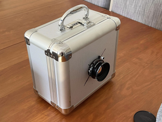
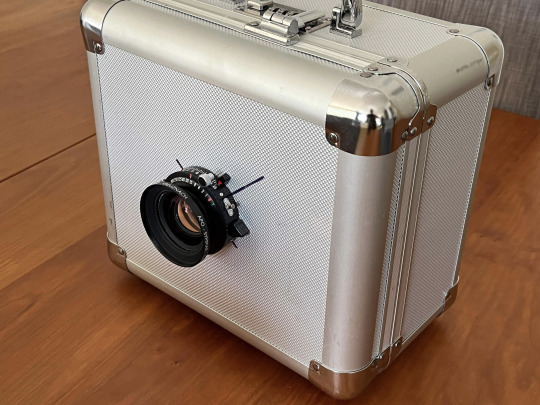
This box was a lot easier to transport around because of its light feel and handle which ticked that box for me straight away. It also had proofing inside which helped for making it light leak-proof saving on the use of tape. The lens was an old medium format one I had which I could use and along with the help of my lecturer and the Media Loan Hub we have at uni, I had access to the correct tools to use to enable it to secure the lens in place. I cut my pieces of paper in half to do only a5 images instead of a4 which meant I could take more images and it would take up less space overall. These smaller pieces of paper also fit in the camera a lot better than the a4 would’ve done and also meant that the whole paper was filled by the image. When you compare this to the cardboard box, there was only a very small section of the landscape which was printed onto the image almost like a vignette effect on my images. At first, I enjoyed this effect on my images but then I grew to not like it once I’d come up with a finalised plan of how to present my work at my degree show. As I was having it in a uniform style, I didn’t like having the images in different places across the paper so I preferred for it to be in this camera where the image completely covered the page.
This was me testing if the lens and the magnifying lens would work well together and if the image would fill the page. Seeing it inside the box helped confirm that this would be the case and once I’d tested it for the 4-hour process time, I could see it in full.
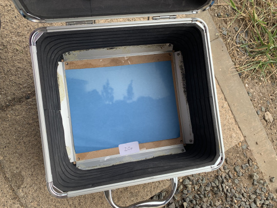
This was the confirmation that the image would fill the paper, this was also the strongest an image had been in this whole experimentation process. The only thing I wasn’t keen on was that it was somewhat out of focus and unsharp however, after much debate I realised this would be the case as it was a long process of photography so landscapes move.
With this camera, I believed that this camera being smaller than the other one, it would take less time in the development process overall so I made sure to do test strips. Here’s the analysis of my test strips :

After using this camera for a while, I did decide that it wasn’t working for me as it wasn’t big enough, it was a struggle to fit the lens in and not distort it in the process which would, in the end, distort the entire image and create a different type of imagery and overall message for my project. It also became very professional having a silver box instead of a cardboard box and almost went against my plan to have it be handmade and recycled so I decided to create a pro/con list to try and decide which camera I’d prefer to have for my project.
0 notes
Text
The Art of Stereoscopic Photography
Many artists understood that the world appears to us in three dimensions because our two eyes see from two slightly different angles. Our mind combines these two views to perceive death. Leonardo da Vinci concluded that even the most realistic painting, being just one view, can only be experienced in two dimensions.
In 1838, Charles Wheatstone (1802-1875), showed that a pair of two-dimensional pictures represented from slightly different viewpoints, brought together in his ‘stereoscope’, could appear three-dimensional. William Fox Talbot announced his technique of print photography a free months later and soon photographs were being taken in pairs for this purpose. Within the following decade, cameras and viewers were invented and stereoscopes and stereographs were soon available worldwide. In 1859, Oliver Wendell Holmes’s essay ‘The Stereoscope and the Stereograph’ celebrated the invention.
“The two eyes see different pictures of the same thing, for the obvious reason that they look from points two or three inches apart. By means of these two different views of an object, the mind, as it were, feels round it and gets an idea of its solidity. We clasp an object with our eyes, as with our arms, or with our hands”
Stereographs sold for a few shillings and people of all classes collected them for education and for pleasure. Small hand-held stereoscopes allowed them to gaze on faraway countries, mechanical inventions, comic incidents, beauty spots, zoological or botanical specimens or celebrity weddings, in the comfort of their homes. Three-dimensional images of famous sculptures were especially successful and Dr Brian May’s and Denis Pellerin’s new book, The Poor Man’s Picture Gallery: Stereoscopy versus Paintings in the Victorian Era (2014) has drawn attention to stereo-photographers’ engagement with famous paintings of the age. Tate Britain’s display of some of the stereographs in Brian May’s collection creates a dialogue between these and celebrated Tate works, six of which are discussed here. It also introduces the photographers who, with rapidity and invention, took up this new medium.

0 notes
Text
Repeat Photography: A visually compelling tool for documenting natural resouurce change
Ronald D. Karpilo at Colorado State University carried out a research study to revisit sites and use repeat photography to create long term records of natural resource change. Geophysicist Harry Reid was one of the early proponents of repeat photography. He made expedition to Glacier Bay in 1890 and 1892 in which during these visits, he quickly recognised the effectiveness of repeat photography for monitoring landscape changes in Alaska. In 1896 he wrote: “all photographs of the end of a glacier are useful, especially those taken from a station easily accessible and easily described; photographs taken from the same station at a future date will show what changes have taken place in the interval”
Over the 125 years that have happened since Reid wrote these words, researchers and photographers have used repeat photography to almost leverage historical photos to document and study the past century of environmental changes in Glacier Bay and many other areas which are managed by the National Park service.
Karpilo and his project partners have collated a combination of historical photos to be able to look at the evolution of each natural landscape and the changes it has had. He approach to this was divided into five phases: 1) historical photo collection, 2) project planning, 3) photography fieldwork, 4) photo pair assembly and 5) photo analysis.
Phase 1: Historical Photo Collection
This is the step which consists of visiting archives and collecting historical imagery which depicts the targeted subjects that Karpilo and his team chose. These are glaciers, vegetation and other resources. The way in which they managed to make relocation possible was to ensure they included identifiable features such as mountain peaks, rock outcrops, static landmarks or lucky in some cases a written date and location underneath or on the other side of the image. Field notes, journals, personal letters and publications from the original photographers also helped assist in finding photo locations and provide context for the images.
Phase 2: Project Planning
This phase is evaluating and prioritising potential photos based on criteria relevant to the project goals. This is where the team would take the images that they’ve collated from phase 1 and looked into if the quality of the original photograph, depiction of natural resources, seasonality of original photograph such as a snow-free summer and photo location access and safety. Once these are then chosen, the locations are identified, mapped and planned for how the repeat photograph can take place. This also includes printing field copies of each image and the physical maps for transportation and logistics.
Phase 3: Photography Fieldwork
This involves visiting high-priority historical photo locations and making modern images. Karpilo says that he asks himself “If I were a photographer, where would I want to go to make a photo?”, a simple technique which overlooks the obvious photo taking locations. This is definitely the technical phase in this whole process as the camera heigh and bearing for each photo is recorded in order to aid the reheat photograph. This is a very slow and time consuming process but helps the rest of the process.
Phase 4: Photo Pair Assembly
To assemble the photo pairs, the historical and modern photos are imported into image editing software as separate layers. The historical photo is overlaid on the repeat photo and made almost transparent and then the historical photo is rotated and resized to best align with the repeat photo. Its key to notice that with the aspect ratio locked, the image is not distorted. The modern photograph is then cropped from the panoramic image which was taken in the previous phase and is cropped to the field of view of the historical photograph.
Phase 5: Photo Analysis
Both photo pairs are then examined and notable changes summarised. Each person who views a photo pair views it through the lens of their own experience and expertise, meaning it is more than often beneficial to consult with specialists from different fields. This small step is very crucial and allows people to notice different dances that otherwise would’ve gone undetected. Depending on the objectives of the project, these are analysed to spit variations in density and distribution, ecosystem composition and connectivity, fluvial morphology, glacier dynamics, geomorphic change, anthropogenic impacts, and other changes. Once analysed, these images are good to go for new journals including both historical and present day images showing the decay of the ecosystem.
This style of photography was the project that mainly inspired me to complete my own project as it’s on the same wavelength and something that needs more awareness on the seriousness of it.

0 notes
Text
"When People Can See Time" - Stephen Wilkes

Stephen Wilkes is an artist and photographer who took on the idea of showcasing, in one still image, the transformation of a place over the course of a day, he called this work “Day to Night”. Wilkes spends a whole entire day suspended in the air in a tent-like structure shooting around 2,000-3,000 photos without moving the camera a single inch. He says “I photograph by hand; this is not a time-lapse… It’s my eye seeing very specific moments”, this style of photography that Wilkes creates is a single visual representation of the video work I’ve produced to support my own images. The way in which Wilkes curates these images is by collecting an incredibly wide variety of images in which he then picks the best moments of the day and night and creates what he likes to call a master plate. Wilkes describes himself as being a “collector of magical moments” as he seamlessly blends into one single photograph where he creates a diagonal vector with sunrise beginning in the bottom-hand right corner. Each image processing time can take about four months until it’s a finalised image with Wilkes paying close attention to every single detail. When interviewed about this image above, Wilkes describes how the sun is rotating with the light changing and all the animals slowly gathering over time around this waterhole. He also states that the animals have a whole process of coming in and going out, how it’s a natural rhythm, thus being something he wouldn’t know without studying his chosen location ahead of time. “It’s such a complicated process and yet there’s so much luck involved”.
Wilkes’ style of photography is something which is so unique, so time-consuming and so mesmerising to see. While my own project isn’t as time-consuming as Wilkes's, it is still a very long, slow process which produces strong and somewhat beautiful images.

“When people can see time, the face of time in a way, it’s this thing we can never put our hands around. But yet, when you look at it, it makes you feel a different way and there’s an emotional thing that happens and that's exciting” - Stephen Wilkes, NPR innovation interview

0 notes