Text


1) the two colors chosen are chosen specifically to be evocative of Christmas. The red on the owl in the shirt and hat are representative of Santa’s outfit, the red and green show up on the branch the owl is perched on to make it a holly branch, the line of green diamonds helps balance out the amount of red in the stripe at the top, and the green in that stripe is used to make wreath shapes
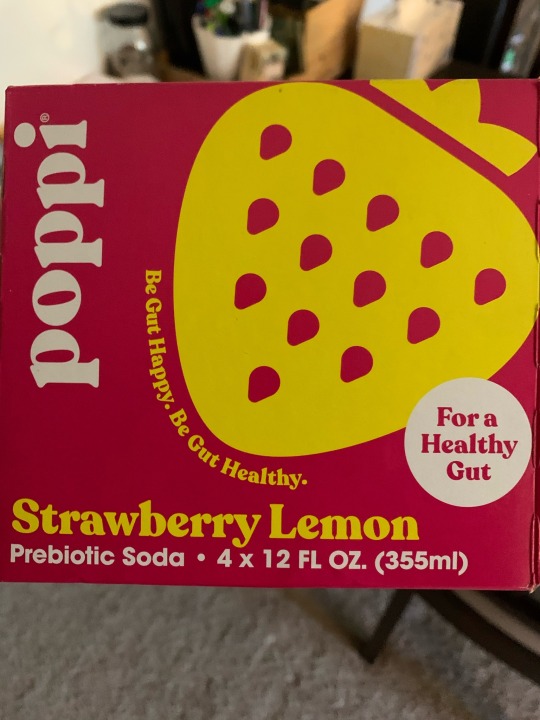
2) the colors chosen are pink and yellow, and they’re used to make connections to the flavor of the drink. The flavor is strawberry lemonade, but because the pink color is the majority of the can the yellow is used to break it up. The yellow makes the shape of a strawberry, with negative space revealing more of the background pink as the seeds. The strawberry ties to the strawberry and the yellow chosen ties it to the lemon part of the flavor
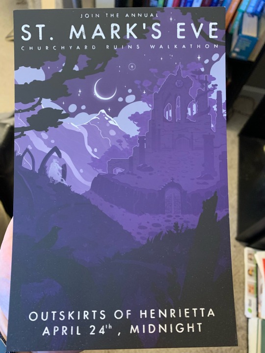
3) three is predominantly cool colors because the designer is going for both a magical feeling and also the purple of the night sky and the way everything gets kind of kind of purple in faint moonlight The object is in the style of an old travel flyer, and the thing it’s advertising is a supernatural rite that takes place after dark
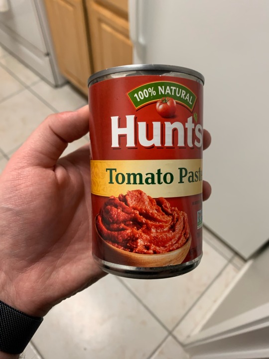
4) this is predominately red because it’s a tomato product, but there’s a subtle use of saturation on the front of that work with the light shining on the image of the paste to help draw the eye there first. It’s hard to tell in the picture but the red darkens as you move further away from the front of the can. It’s easier to see on the yellow band that goes around the can, because the effect is there too.
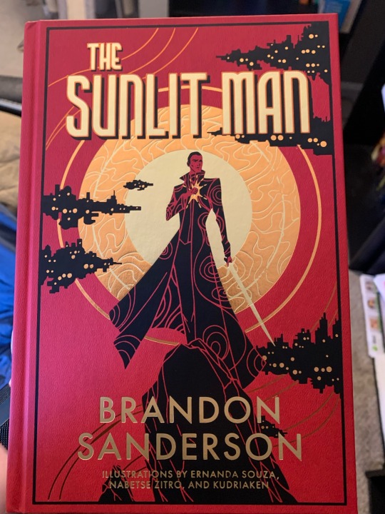
5) the contrast here is used to indicate that the sun can shine and brighten up any place, because the golden foiled lettering stands out across every other color on the cover. The other colors chosen are classically colors associated with sunrise but also with sadness and depression, to make the sun shining have a double meaning of chasing away the literal darkness but also the mental darkness
6) when I got this it was originally all one piece but my cats broke it, that’s why it looks weird by the N. The message “just do one thing” connected all together by one line underneath, the words still separated enough to be distinct but all part of the larger whole. It supports the message by having “just do one thing” be all one piece
7) the figure ground relationship here all work to reveal elements of the story without spoiling anything. The foreground is the person, the protagonist of the story, the midground is floating cities, and in the background of everything (on the cover and in the story) the very large sun is depicted
8) this is the board of a game set in Victorian England times, and the style and naming on the map reflects that. It’s a map of the world, but placed such that England is as central as possible, which is in line with how England saw itself back then. Putting England in the middle also helps highlight the distance that must be traveled as you get to the further spots away, which drives home the expeditionary feeling the game creates using the other pieces
0 notes
Text


1) this background is one solid piece but the vertical lines are there to break the view into “wood” panels, and the design hierarchy is place so that the picture will be noticed first, followed by the word ‘home’ and then the rest of the quote. The leaves up at the top are asymmetric and passive, I believe they’re there to balance out the weight of the ‘home’ at the bottom
2) this piece does a lot of work with scale. In terms of viewing, the eye is drawn to the largest person in the middle first, and then the rest of the individuals, and then the group image down below, and then finally the text below them. This use of scale allows us to see both the group and the individuals that make it up at the same time. I would also describe the upper half as active, with the lines going in different directions and the different poses each figure is in
3) this piece has the most obvious use of texture, with matte foiling on a pebbled surface. The title font and slight tilt give it a more organic feeling that meshes really well as the eye transitions from the title to the plants around it. I would say the plants are passive because even though it’s a collage of different plants, the chosen layout creates one cohesive sense rather than drawing focus to any particular part.
4) a bag of Easter candy, eye is drawn to the heavily weighted 125 in the center of the flower. The petals are repetitive, with each being the same shape and outline and showcasing a different type of candy. The flower is more evocative of spring time than the Easter holiday, so the rabbit is added as a backdrop to tie the candy to the holiday by leaning on the Easter Bunny story rather than the religious roots of the holiday
5) wedding invitation, size, font, and scale are used to draw attention to the names of the bride and groom. There’s a LOT of text on the right hand side and so the flower graphic on the left is used to balance it out by filling up space while not taking away from the importance of the text, and the curve of the line paired with the flower lends a more organic feel to the piece overall
0 notes
Text


1) image of two hands poised to high five bookending the 5.00% apy on the checking account, use of symbols and typography to promote the checking account
2) get out & go over a boat leaving a wake, evocative of feeling free and being on the water. Poster is designed to encourage people to take out a loan to feel that feeling for real
3) two bandaids are arranged a heart, indicative of both health and compassion. With the caption, the stickers message is that getting the vaccine is the healthy and compassionate thing to do
4) poster in the style of old timey travel fliers, but for a fictional location in a book. Imagery and text are intriguing and mysterious, with cool tones. Designed to make the reader want to go there, or at least learn more, both options lead them to read the book
5) box that a package arrived in, company is called dragonsteel. Logo is symbolic of dragons and swords, and also the letter s. Design on the side is evocative of dragon scales
0 notes