
Don't wanna be here? Send us removal request.
Statistics
We looked inside some of the posts by geb-ler and here's what we found interesting.
Average Info
Notes Per Post
0
Likes Per Post
0
Reblog Per Post
0
Reply Per Post
0
Time Between Posts
6 hours
Number of Posts By Type
Text
14
Last Seen Tumblr Blogs


Fun Fact
25% of US internet users with an annual income of $80-100K use Tumblr.
Text
Note to the reader:
Posts appear in reverse chronological order. They are intended to be read in ascending numerical order, from bottom to top.
Post number 4 also appears out of sequence due to some technical error.
0 notes
Text
4. Thomas Florschuetz - Körperbilder (Body Images)

I was looking at some of Gilbert & George’s earlier works and thought it was amazing the amount of powerful images they could create using their multi-image sqaure based grid style.

(Gilbert & George - Cherry Blossom N°5 - 1974)
I think it’s really interesting and it’s fascinating the way the images flow together and the piece becomes something greater than the sum of it’s parts. I wanted to see other work that made use of combining different images to create this sort of visual poetry. I was really struck when I saw Thomas Florschuetz’s Body Images. Although he sticks to one subject and just uses photographs of himself the amount of unique forms that he creates is incredible. They seem like impressions of some alien creature, and capture a feeling of feeling so out of sorts with one’s body.
I also really like that the images are very comedic, staying lighthearted and absurd. I think pictures of deformed bodies and faces trigger some deep part of the brain in a way that body-horror cinema does and can often end up being either gruesome or just plain pitiful.


(TOP: Image from The Incredible Melting Man, 1977 film showing special effects by Rich Baker. BELOW: panorama unwrapping of a head.)
The way the top leftmost image in the set is relatively unaffected and he seems to acknowledge the viewer and maybe even be winking at us helps to ground the image and give it it’s playfulness. It reminds me a lot of the work of David Shrigley, one of my favourite illustrators which has a similarly contorted and playfully ugly aesthetic.

0 notes
Text
13. David Lurie - Images of Table Mountain


The artist’s statement on David Lure’s website reads:
Table Mountain is one of the most recurrent literary, cultural and artistic icons in South African history, signifying changing relations and attitudes towards the Cape (and Africa) over the past five centuries, quite apart from its obvious prominence as a natural and geographical landscape. Whereas it once symbolised all that was strange and enigmatic to the outsider looking in at the Cape of Good Hope, today it ‘speaks’ through the various local inhabitants in different ways with astonishing clarity, variety and diversity.
During his World Environment Day address in 1998, the then State President Nelson Mandela went further and made an analogy between Table Mountain and the nation of South Africa as if their fate was intertwined. South Africa had, he said, embarked on a long, arduous climb, which he likened to an ascent of that mountain, where the determination to succeed was coupled with a collective sense of unity and optimism. Table Mountain as a symbol of unity may be an inspirational ideal; nevertheless, for the moment it remains a symbol of the deep divisions between the haves and have-nots that persists in post-Apartheid Cape Town.
One of the major debates facing the city today and in the foreseeable future is about why the city remains segregated, alienating for black people and fundamentally divided. The question is how to make Cape Town an integrated and thriving metropolis that offers hope and opportunity for all who live here and travel through it? This long overdue debate is a necessary, even if painful, process if we are to figure our way out of the mire of the apartheid city. However, the challenge facing Cape Town is not merely the fact that the working classes and poor live on the periphery of the city. The more immediate, fundamental challenge is the lack of any real social engagement across the class and cultural divides of the city. Middle class Capetonians and business people, who never go into the townships and informal areas of the Cape Flats need to have first-hand experience of those areas in order to develop some sort of common identity with their fellow inhabitants.
The Provincial government in the Western Cape has declared its intention to “take up arms against the three and a half centuries of political and social oppression and racism that has characterized our past”, which it has called “ Shared Growth in a Home For All”: that is, to transforming the divisive social and economic patterns of our past and to create a sustainable vision of a better and a shared life for all in the Western Cape.
Large-scale intervention is required to make human settlements in the urban core of Cape Town a reality for the poor in the immediate and foreseeable future. But before the physical construction of the new city can be undertaken a process of systematic and extensive dialogue, consultation and social engagement will be needed to guide the process in a sustained and confidence building way: informed urban renewal.
Art and culture can make a significant contribution to this understanding. What I have tried to do in this project is to view the mountain from the perspective of different parts of Cape Town and the different communities in order to explore the socio-economic divisions that remain following the end of apartheid, and that persist despite 10 years of democracy. People who have seen the images – even well informed Capetonians – have been surprised if not shocked by these views of the city that they were oblivious of.
It is recognized that we will first need to create a social dialogue that enjoins us to take responsibility for reaching common and agreed goals – all in our unique spheres of influence. As a photographer, I hope to make a contribution to this process.
I thought this would be an interesting project to look at after Lorenzo Vitturi’s Dalston Anatomy because it’s a very different kind of examination of place and I wanted to look at more documentary photography because I’ve mainly focused on constructed images thus far.
On first inspection the pictures appear to be quite interesting free form documentary photos of life around Cape Town but the really interesting thing that this project is the use of the mountain as a visual and conceptual anchor point. Every single image include the mountain looming in the distance which isn’t immediately obvious if you aren’t looking for it.


(edited in photoshop)
This really adds a lot to the series. For one, it serves as a ‘weenie.’ A ‘weenie’ is a design term for a distinct visual reference point for orientation. The term was coined by Walt Disney in reference to dog handlers holding up a hot dog to control where the dog is looking. This is why Disneyland is designed with the castle at the direct centre and the spire as the highest point, and unobstructed in main areas of thoroughfare. The term is also frequently used in game and virtual space design.
As a ‘weenie’ it immediately gives you a sense of location. You roughly know how close or far you are from the mountain and the city at it’s foot. It enhances the understanding you get of the kind of economic stratification of the city as you move further and further out.
The whole series is made much more interesting by the mountain’s function as a metaphor for the difficulties of creating an equitable Cape Town and South Africa. The peak towers higher and higher as you move closer throughout the series.

0 notes
Text
12. Lorenzo Vitturi - selected pairs from Dalston Anatomy


The statement on the project on the artist’s website reads:
Dalston Anatomy is a book project, a multi-layered installation, and a visual celebration of the Ridley Road Market in East London. Vitturi recognised the market as a unique place where ‘different cultures merge together in a celebration of life, diversity and unstoppable energy’ and was inspired to capture this place before it transformed beyond recognition.
Residing in the area for over seven years, Vitturi visited the market daily and witnessed the local community, economy and the very nature of the market changing around him with striking acceleration. From this complicated process of transformation stems Vitturi’s compulsion to collect and picture the objects found at the market.
The objects were left to rot, manipulated with pigment or deconstructed and then rearranged in compositions and photographed against discarded market materials before and after their collapse. The ephemeral nature of these sculptures mirrors the impermanent nature of the market itself, while the reconstruction and placement of these totem-objects in the exhibition space reflects on constant cycles of production, destruction and recreation.
I thought this is an interesting project in relation to Henk Wildschut’s Shelter because it’s also a study of a place and a community that shows it’s subjects indirectly but has a totally different visual approach.
I think the diptychs of obscured portrait and sculpture are really interesting together. I think they create something greater than the sum of it’s parts by pushing to viewer to draw their own conclusions about the nature of the person and place. Looking at any of the obscured portraits alone you might think that you can’t really get a sense of their character. Similarly I think looking at just the sculptures you would mostly just get a feeling on fragility and perhaps a suggestion of location. In pairs however they feed off one another. The inclusion of people, even when you can’t really see their face humanises the sculpture and the sculptures add character to the portraits that otherwise don’t have a lot. It creates a sense of symbiosis between the portraits and the sculptures which represents a similar relationship between the people and the place the pictures represent.
I’m struck that although we’re seeing the same recombination of elements over and over it never begins to feel repetitive. The colours are so lively and the sculptures so diverse it gives the series as a whole so much energy.
0 notes
Text
11. Henk Wildschut - Shelter

VIDEO [link]
The artist’s statement on the website reads:
Close to the port of Calais there is an area encompassing a few hundred square metres that is known as ‘The Jungle’. The people occupying this area have travelled many miles to get there, and their journey is still not at an end. Calais is the departure point for the final and most desirable crossing. There are thousands of people from Iraq, Afghanistan, Pakistan, Somalia, Sudan and Nigeria, all in search of a better life in Britain, the destination of their dreams. While they await the opportunity to make the great crossing, they build temporary shelters: tent-like structures made of waste material from the immediate surroundings of the camp. In the best cases, the cultural characteristics of the country of origin can barely be distinguished in these. The way in which the primary requirements of life are manifested in such shelters forms the leitmotif of this documentary photography project, for which I travelled extensively to Calais, the south of Spain, Dunkirk, Malta, Patras and Rome. For me, the image of the shelter – wherever it is in Europe – became the symbol of the misery these refugees experience.
I think this is a really interesting project to look at in comparison to Sam Ivin’s Lingering Ghost series as it too deals with the conditions of displaced people but approaches the subject in a totally different manner.
While cataloguing the grim conditions people in ‘The Jungle’ have to contend with it also serves as a kind of environmental portrait. The little personal touches, decorations, or bare amenities the people have been able to bring with are very poignant. I think the series is strengthened by showing so little of these people. Not only does it show how little they actually have, by only giving us clues as to who they are or where they may have come from we’re forced to imagine who they might be and what they might have to deal with. The style mirrors the way the actual people involved are treated, often hidden behind a blanket term like ‘the migrant crisis.’
0 notes
Text
10. Sam Ivin - Lingering Ghosts


The artist statement for this series reads:
What does it mean to be an asylum seeker in the UK? This was the starting point of Ivin’s research, which began at a drop in centre in Cardiff, Wales and continued all over England. It seeks to raise questions about how the UK’s migration system treats those who arrive in our country seeking safety.
The result is a book made up of hand scratched portraits, where the eyes have been erased: once arrived in the UK, these people find themselves in a state of limbo, having to await news of their application for asylum for months or even years. They become Lingering Ghosts. These physically scratched portraits attempt to convey the the cruel loss of self, and the frustration that befalls them as they wait to learn their fate.
Ivin’s work offers a contemplative take, away from the glaring lights of the media. His modified portraits simply and powerfully give a view on an issue that is often underreported: the plight of those that waiting for asylum.
Despite being represented without their eyes, these people do have an identity and we recognise them as fathers, mothers, sons and daughters – human beings, after all.
I think the common thread between this series and projects like Front, Mask, and Doppelgänger is the sense of lost or obscured identity. The difference here and I think a poignant one is that here the people are scoured of their identity without their participation. Where the other projects look at the assumption of another identity Lingering Ghosts is more about the removal of identity and agency. The asylum seekers are stripped of their identity and a new one, that of a faceless nobody is imposed upon them.
I think what’s so striking about these images is how violent they can seem. The static feeling of the portraits clashes with the energetic motion of the cuts and scratches and makes it seem like the people are frozen, and being clawed away at by some unseen attacker. This creates a sense of paralysis which enhances the feeling of being stuck in a liminal state, unable to move.
The use of the passport as the cover is really interesting and I think the scale plays into it a lot. This small object that is so mundane to the ordinary citizen changes when presented as the cover of this book. It becomes an object of massive weight and importance. A kind of monolith that hangs over the people inside it.
0 notes
Text
9. Trish Morrissey - Front


The artists’ statement from Morrissey’s website reads:
Front (2005-2007) deals with the notion of borders, boundaries and the edge, using the family group and the beach setting as metaphors. For this work, the artist travelled to beaches in the UK and around Melbourne. She approached families and groups of friends who had made temporary encampments, or marked out territories and asked if she could be part of their family temporarily. Morrissey then took over the role or position of a woman within that group - usually the mother figure. She asked to take her place, and to borrow her clothes. The woman then took over the artist's role and photographed her family using a 4x5 camera (which Morrissey had already carefully set up). While Morrissey, a stranger on the beach, nestled in with her loved ones. These highly performative photographs are shaped by chance encounters with strangers, and by what happens when physical and psychological boundaries are crossed. Ideas around the mythological creature the 'shape shifter' and the cuckoo are evoked. Each piece within the series is titled by the name of the woman who Morrissey replaced within the group.
This is a really quite strange and intriguing project that can be read and interpreted in a lot of different ways. It overlaps with Gillian Wearing’s Mask and Cornelia Hediger’s Doppelgänger series in the way it deals with the idea of being an imposter. That was the way I read the series when I first encountered it and didn’t pick up on the idea of borders. It’s striking to see how seamlessly Morrissey blends into these images at first glance but once you know she’s going to be there it becomes slightly eerie. Maybe it’s just being suggestible but I begin to see or imagine the slight hints in the body language of the other people in the group that she isn’t fully accepted. I read the project as being about that feeling of imposter syndrome, feeling out of place in a group you that you seemingly should fit in with. Un-belonging is a really interesting kind of feeling because it isn’t just being an outsider but something more subtle and something I think everyone experiences somewhere to some extent. I thought it could work to show a disconnect between the roles we feel we’re expected to fill in different environments, for instance when she assumes the role of a child’s mother but the embrace isn’t quite as picturesque or intimate as it should be.
0 notes
Text
8. Gillian Wearing - Mask


This is a really interesting project that touches on many of the same ideas that China Otsuka’s imagine finding me here examines. In the series Wearing wears painstakingly sculpted silicone masks of members of her family, all around their early twenties. The bottom image shows Wearing wearing a mask of herself as a 17 year old. All the masks and final images are near exact replications of actual photographs of her family.
Wearing says:
I was interested in the idea of being genetically connected to someone but being very different. There is something of me, literally, in all those people—we are connected, but we are each very different.
An interesting idea I came across was the idea of the self portrait itself as a kind of mask, because of how easily a false sense of who you are, how you look, or how you feel can be created.
A nice quote from Claude Cahun, an artist whose work was shown alongside the Mask series says this:
Under this mask, another mask, I will never finish removing all these faces.
0 notes
Text
7. China Otsuka

I found this project and besides the superficial similarity of the staircase I was intrigued by the similarities to Cornelia Hediger’s Doppelgänger series but very different approach and overall impact.
For the series entitled imagine finding me Otsuka photoshops herself to appear alongside her childhood self in old family photos.
She says of the project:
The digital process becomes a tool, almost like a time machine, as I’m embarking on the journey to where I once belonged and at the same time becoming a tourist in my own history.
The pictures invite you to imagine the vast gulf of time and experiences that turned one into the other. It’s a little sad to think of so much life lived, now gone, the only trace being the small differences in the way the two dress and look and carry themselves for the camera.


0 notes
Text
6. Cornelia Hediger -Doppelgänger

I wanted to include this image because although it uses a similar visual approach to the work of Klauke, Florschuetz, and Gilbert & George it does some things very differently that add a lot of depth to the image.
The image is very performative, the model is Hediger herself and she plays all the character(s) in the image. I think that’s what makes this really interesting, the blurring of time/space and thus narrative. It’s unclear if we’re seeing glimpses in time of one person - ascending the stairs then sitting down to cry before running off - or three different characters, or two. This whole feeling of confusion is enhanced by the slight movements of the camera. It would have been easiest to produce this by having the camera locked down on a tripod and then the whole image would fit together more neatly. However the changes in angle disjoint the character and the environment in way that adds to the feelings of the character(s).
Hediger says of the project
I was interested in exploring the concept of the Doppelgänger in a broader way. Doppelgänger in German means ‘double walker’, it is a ghostly double of a living person, an omen of death and a harbinger of bad luck. The idea of the Doppelgänger also allows me look the alter ego, the conscious mind vs the unconscious mind, inner conflicts, the duality between good and evil and split personalities
0 notes
Text
5. Jürgen Klauke - Ich + Ich

I wanted to look at more composite images in the style of Thomas Florschuetz and Gilbert & George and came across this piece by German artist Jürgen Klauke. I want to include it because i’m intrigued by the way it deals with self-identity in totally different way to either Florschuetz or Choi.
I think it’s a really interesting piece and says something quite interesting about the fluidity of identity and the way in which our perceptions of people can change so easily based on superficial details. The hands are especially interesting to me. The slight change in the angle of the wrist and the little finger make the left hand seem much more feminine/effeminate and the subtlety of the change shows just how much weight we put on tiny social details.
I’m also struck by how easily time/movement can be coded into photographs. It seems a special power of the medium and and feels so second nature as a viewer. It’s engrained so deeply it allows for lots of really interesting applications in art. It’s so natural I remember the first time I picked up a manga (Japanese comic) and realised it was meant to be read in columns top to bottom and right to left from the back of the book left towards the part it was really jarring to see something that I subconsciously took as so fundamental be done differently.

As a final note I couldn’t help but find the image strangely familiar and matched that feeling with this pieced I looked at in some earlier research on Cindy Sherman. I think to see the progression more gradually makes it more interesting. With more gradations it’s harder to pin down exactly when one character becomes the other and where the lines are drawn in terms of what we think about the character(s). I do think however the closer framed pictures in Klauke’s image are strengthened by having mroe focus on them individually. They become almost like mugshots and to me suggest that we have to judge this person or that what we’re watching is criminal in some way.

0 notes
Text
3. Gilbert & George - DEAD HEAD


Gilbert & George - DEAD HEAD - 1989
Top image taken from the book ‘A Family Collection’ (Villa Paloma Monaco edition)
Looking at Rala Choi’s piece I was instantly reminded of Gilbert & George’s work. Both Choi and Gilbert & George push photography past it’s inherent naturalism and create work that seems to edge closer to other mediums; painting and graphic design/collage respectively. Despite this, Gilbert & George refer to all their works as sculptures.
Additionally both ‘DEAD HEAD’ and ‘Untitled #153′ confront death and the traumatic, albeit in very different ways.
The piece is from a a series entitled ‘The Cosmological Pictures.’ Talking about the series George said that they ‘find it fantastic that every drop of moisture is a cosmology of the world’ (Obrist and Violette 1997, p.203). The series can be thought of as an effort to come to terms with death by considering one’s ‘relationship with the universe as a molecular being’ (Tate Modern).
'The Cosmological Pictures’ also follow on from work produced the previous year for the ‘For AIDS’ exhibition at the Anthony d’Offay Gallery, London which marked the beginning of the hyper-vibrant style. Red, most of all, was a common motif in their garish and sombre works of the late 1980s, reflecting the fear and paranoia about blood during the AIDs epidemic. In the book The Words of Gilbert & George Gilbert says ‘Everyone became terrified of the whole idea of blood. But it’s funny because in some way blood is life.’
To me the picture is a defiant expression of energy and life in response to the idea of death. The face in the centre, dominating the image, suggests to me a death mask.

(https://en.wikipedia.org/wiki/Death_mask)
However, rather than a static, emotionless reminder of a person it’s vibrant and active; confronting the viewer with direct eye contact. The way in which it’s lit is also interesting. The face is lit from underneath, in the way you might do with a torch when telling a scary story. (see: http://tvtropes.org/pmwiki/pmwiki.php/Main/ScaryFlashlightFace)
The effect traditionally is supposed to make the face appear scarier, as it becomes more skull-like but i think the effect is that it just makes the image feel sillier and more playful. By doubling down on these grim clichés of how scary death is Gilbert & George expose these fears to be kind of silly.
The rows of vibrant multicolour tombstones through the back that lead into a bright forest, bursting with life ties the whole image together. To me suggests that a life, even once over, continues to be a thing of passion and joy.
0 notes
Text
2. Cindy Sherman - Untitled #153

Cindy Sherman - Untitled #153 - 1985 - Chromogenic development print
This was the first picture I thought of in relation to Rala Choi’s work. The image draws inspiration from painting in the same way that Choi does and Sherman’s work often deals with identity and the self. The piece is like a gritter, more garish imagining of John Everett Milai’s ‘Ophelia’ :
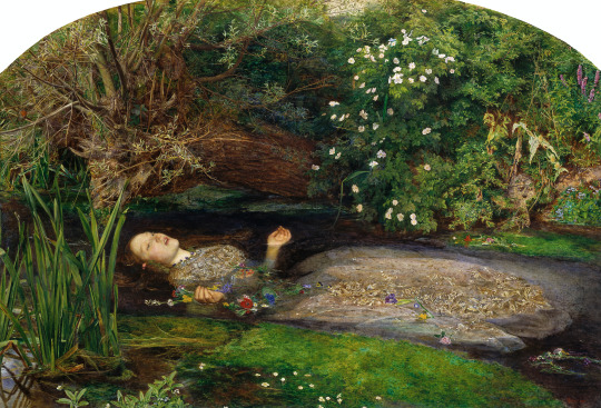
which for whatever reason has been replicated in photographic form an uncountable amount of times.

During an interview about her ‘Fairy Tale’ series (from which Untitled #153 is taken from) she says this:
‘My biggest fear is a horrible, horrible death, and I think this fascination with the grotesque and with horror is a way to prepare yourself physically if, god forbid, you have to experience something like that,’
The corpse in Untitled #153 is at once grotesque and beautiful, stopped dead and still seemingly poised to act. The image itself is theatrically lit but shot rather coolly.
The image is intentionally contradictory and I think this is a real strong suit for photography. Contradiction works so well in photography because for whatever reason we naturally look at photographs as truthful documents of reality. Even staged images have a tendency to be read this way. W.G Sebald says ‘people let themselves be convinved by photographs.’ We know consciously that the figure in the photo is not really dead but the figure certainly looked dead to the camera in the instant the photograph was taken. It’s easy to look at a painting of a corpse and say ‘this could never look this way in real life’ but even a faked image is a real image of something. Photography’s power to force belief (and assumptions) and contradict at the same time gives it a lot of power.
Joanna Lowry writes that this series hones in on ‘...the dark underside of our collective fantasies, a place where the forces of a polymorphous unbridled sexuality and violence are set loose amongst the playthings of the imagination.’
For me this picture forces the viewer to ask “Is this really how death feels?Is this how I would look at a dead woman? Will I look this way or be looked at this way when I am dead?”
0 notes
Text
1. Rala Choi - Embrace

[NOTE: The image is included in a set of similar images on the artists’ website with the only word on the page being ‘Embrace.’ On the artists Instagram the image above is found alone and captioned ‘Embrace. Seri story. Special thanks Seri, sujin, jiwon’ From what I can find online ‘Seri’ can be translated from Korean as ‘series’ but it is also a woman’s name in Japanse and Malay as it’s second use in the caption might suggest. It is unclear if these are unnamed images from a series called ‘Embrace,’ or this image is entitled ‘Embrace’ which doesn’t exist within a series and the accompanying similar images on the website are alternates.]
http://ralachoi.com/index
Rala Choi is a Korean photographer whose work I absolutely love. His works is characterised by a distinctly painterly aesthetic. The high saturation, clipped colours and surreal, dreamy compositions push the images beyond depictions of individuals or scenes and seem more like re-remembered images of moments and feelings.
Writing about another body of work entitled ‘참을수 없는 존재의 가벼움’ (‘The unbearable Lightness of Being’) named after the book by Milan Kundera [link] he says:
‘First, I read the book. The book covers the author's thoughts on what the important things are in life. This made me think for myself what matters to me. The train of thoughts lead me to draw out the fact that we all stand alone in a society where human relations make up a vast spider web. I realized that I confirm my own presence through the reactions and feedbacks from other people rather than myself.’
I think this idea is present throughout a lot of his work. The Asian art magazine Neocha calls his work ‘faceless portraits’ [link] and I think this is pretty apt. Almost all his images are portraits in some sense, the main subject being a person, and almost all of those hide the face. The figures are turned, either unaware of you, or purposely ignoring you. The above image (untitled) is pretty typical of his work but goes a step further giving us a second figure that we can assume the viewpoint of. She’s practically a mirror image (her hair is at least) of the figure in the centre. Are we seeing one person seeing themselves in another. Are they seeing themselves in a kind of mirror as we seem them. Why is one ignoring the other, and why is the other ignoring us.
To me this image is really about the way in which we define ourselves in relation to others. It’s also about the way in which we project ourselves onto the actions of others.
0 notes