
Don't wanna be here? Send us removal request.
Statistics
We looked inside some of the posts by gemmaleeadad2016 and here's what we found interesting.
Average Info
Notes Per Post
29K
Likes Per Post
15K
Reblog Per Post
14K
Reply Per Post
11
Time Between Posts
23 days
Number of Posts By Type
Photo
6
Text
9
Link
1
Video
1
Last Seen Tumblr Blogs


Fun Fact
Tumblr has 16.74 million mobile monthly users in the US.

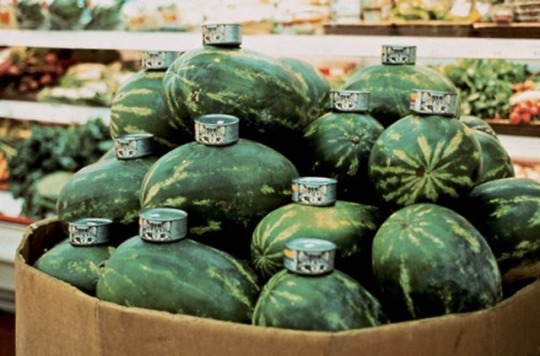
Photo
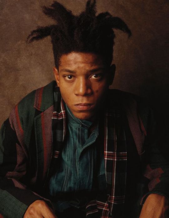
Jean-Michel Basquiat photographed by William Coupon, 1986.
4K notes
·
View notes
Photo

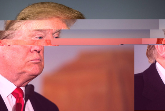
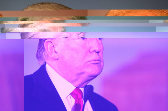
Wk 11 Tute Exercise - Glitch
Editing the text of images to create a glitch
0 notes
Text
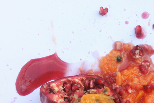
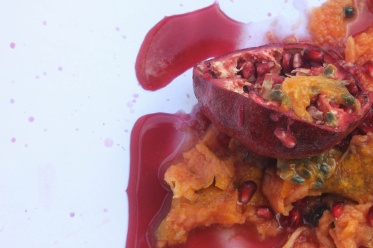
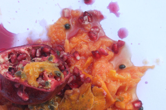
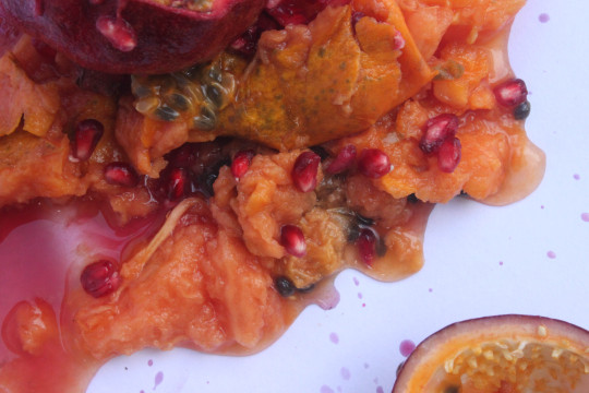
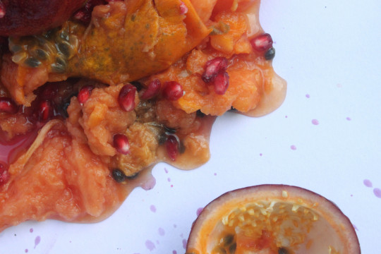
Final Work
In all honesty my work got a little sidetracked, one thing led to another and now I’ve ended up submitting a final work of smashed up fruit. But I promise there is a method to my madness and now I shall attempt to explain it all.
I first started with a continuation of my previous assessment, working with the question on binaries I focused on gender binaries and how they are enforced in marketing through colour. I focused on the implications and labels that colour can communicate and their strategic use in product design. Continuing on from this with inspiration from Gabriel Orozco’s “Watermelons and Cats” (1992), I decided to explore these implications of colour with fruit as my canvas.
This use of fruit as my material of experimentation ended up carrying on through my whole Assessment 2, which was convenient for me since I work in a fruitshop. You could say it was either destiny or just great planning. I experimented with turning the fruit into symbols of gender, symbols of worth and uncategorisable objects, all with the use of colour. This simple change of appearance changed the whole meaning of the images I produced, highlighting how simple our minds are to trick and persuade. These experiments show the simple power of colour in creating and rupturing binaries. Colour helps target a consumer, appealing to a certain gender, class, age. It has been equipped by the marketing industry and design world as a tool, to which holds great power.
I decided to document these experiments through simple imagery because the process of creation was unimportant, I believed the before and after were the main focus. It was all about the transformation of objects through colour, to demonstrate its effectiveness.
Upon reflection on these experiments I started to move on from the idea of colour and think of what else contributes to these assumptions our mind makes when viewing these images of fruit. I started to focus on the physical forms, looking into the sexual implications of the shapes and why our minds think this way. I looked into the history of sexualising fruit and found its evident in the art world dating back to the Renaissance times where fruit was commonly used as a substitute for the human body. This led to further research into provocative artist Sarah Lucas, in particular her work Au Naturel 1994 and her substitution of objects for the human body in cleverly crude puns.
I started to think more into how I could explore and communicate these ideas in experiments. Upon further research I was reminded of this Instagram artist I came across who had recently gained a lot of attention through controversy, stephanie_sarley. Her uncomfortably provocative images of her fingering fruit made me think more into how I could communicate these concepts in an unsettling way, deciding on imagery and sounds that make you squeamish. This resulted in my film experiment, a short film of chopped up clips of fruit violation with an unsettling soundtrack of a mixture of human and inhuman sounds to unsettle you. With this combination of imagery and audio I aimed to make the viewer uncomfortably intrigued.
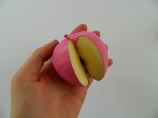
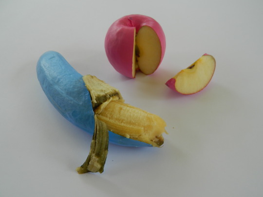
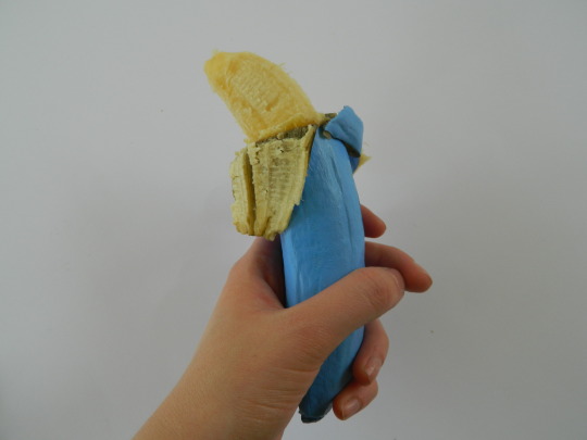
Whilst making the video I was so fascinated by the imagery of the messed up fruit that I kept taking photos on the side that I didn’t really think much about. I thought I might just upload them as documentation but as I reviewed them I was just so fascinated that I decided to submit them as my final body of work. These final five images are not only the aftermath of my final experiment but I believe they are a summary of my experiments as a whole. These images best capture my explorations into binaries and societal constructs, into worth and sexualization. They signify the rupturing of confinement and the freeness of expression. My work became about the experimentation rather than the outcome, which these final images embody.
It is a mess of flesh now undefined by society. Now it is free from constructs it has become an undefinable mess of freedom. If we free ourselves from definition we become free to define ourselves.
Bibliography
Sweet, E. Guys and Dolls No More. 2012. For the New York Times. Retrieved from http://www.nytimes.com/2012/12/23/opinion/sunday/gender-based-toy-marketing-returns.html?_r=0.
Varriano, J. Fruits and Vegetables as Sexual Metaphor in Late Renaissance Rome. 2011. For Gastronomica journal. Retrieved from http://www.gastronomica.org/fruits-vegetables-sexual-metaphor-late-renaissance-rome/.
Gabriel Orozco. Watermelons and Cats. 1992.
Miller, M. 7 Ideas For A Gender-Neutral Bathroom Icon. 2016. For Co. Design. Retrieved from https://www.fastcodesign.com/3063397/7-ideas-for-a-gender-neutral-bathroom-icon.
Stonard, J.P. Sarah Lucas Artist Biography. 2000. For Tate London. Retrieved from http://www.tate.org.uk/art/artists/sarah-lucas-2643.
Sarah Lucas. Au Naturel. 1994. Image retrieved from http://www.whitechapelgallery.org/exhibitions/sarah-lucas/.
Stephanie Sarley. Stephanie_Sarley on Instagram.com. https://www.instagram.com/stephanie_sarley/.
Sisley, D. How finger-fucking fruit became an act of protest. 2016. Retrieved from http://www.dazeddigital.com/artsandculture/article/31497/1/how-finger-fucking-fruit-became-an-act-of-protest.
0 notes
Text
Eugh
For this experiment I decided to venture out into a different medium that I’m still learning. I wanted to explore how my findings could be communicated in a different way, in a way exceedingly more confronting.
As previously written about on my Tumblr, I researched into the works of the brilliantly crude Sarah Lucas. I was inspired by her confrontingly crude work Au Naturel 1994, where objects including fruit and veg are used to substitute the human body in a provocative image.

Au Naturel 1994, Sarah Lucas from http://www.whitechapelgallery.org/exhibitions/sarah-lucas/
Another inspiration was controversial Instagram artist stephanie_sarley, https://www.instagram.com/stephanie_sarley/, who fingers fruit. Her videos of her fingering fruit aim to unsettle the viewer, with fruit resembling the human body. These works have to be seen to be understood, they make you feel things fruit shouldn’t and why?
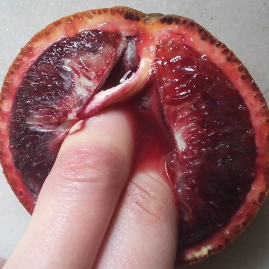
Image by stephanie_sarley from https://www.instagram.com/stephanie_sarley/
I decided to take these concepts and communicate them through film. This resulted in a very short film of chopped up clips of fruit violation with an unsettling soundtrack of a mixture of human and inhuman sounds to unsettle you.
youtube
2 notes
·
View notes
Text
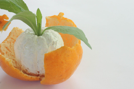
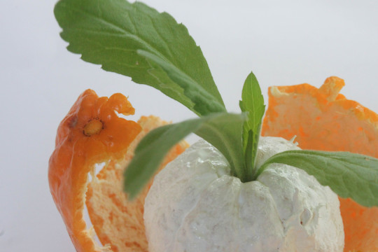
Removing Colour
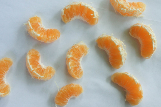
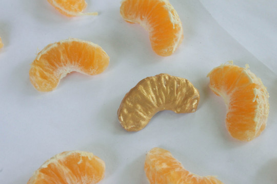
For this experiment I decided to take a step back from my previous experiments and start thinking in the opposite direction. Instead of using colour to it’s full potential I decide to remove it. Relating back to my previous experiments in my first assessment, colour is a universal design tool used throughout society for a variety of reasons, contributing to the creation of categories and seclusion. But what happens when you remove it?
I decided to transform fruit into blank canvases, to see if it freed them from any categorisations they might have. These were the visual results,
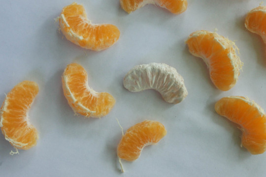
I then started mindlessly experimenting with the visuals using different things I had at hand. I decided to introduce some greenery which creates this strange combination of the seemingly natural and unnatural. Although all elements of this image are natural, the removal of the colour of the mandarin’s flesh secludes it, making it seem out of place.
0 notes
Text
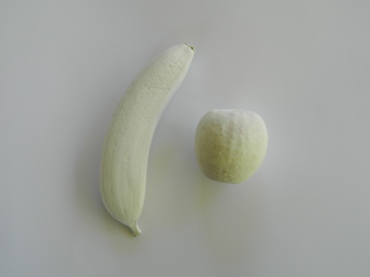
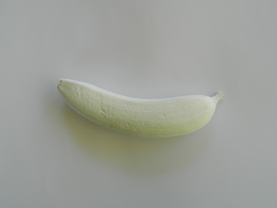
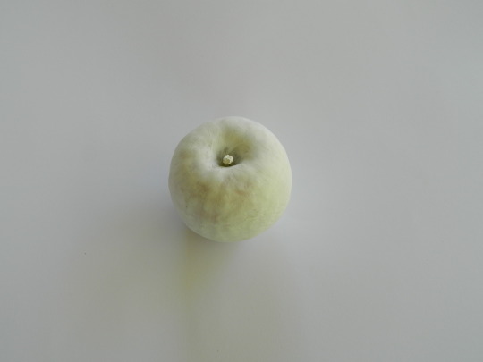
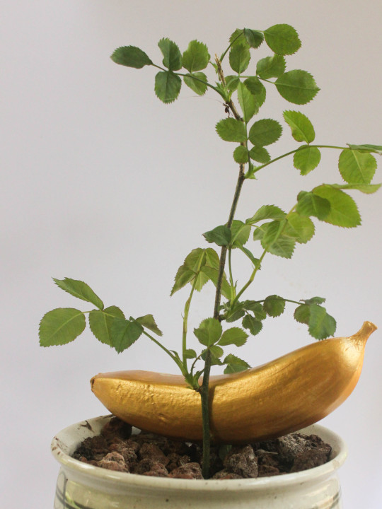
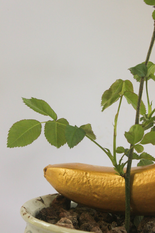
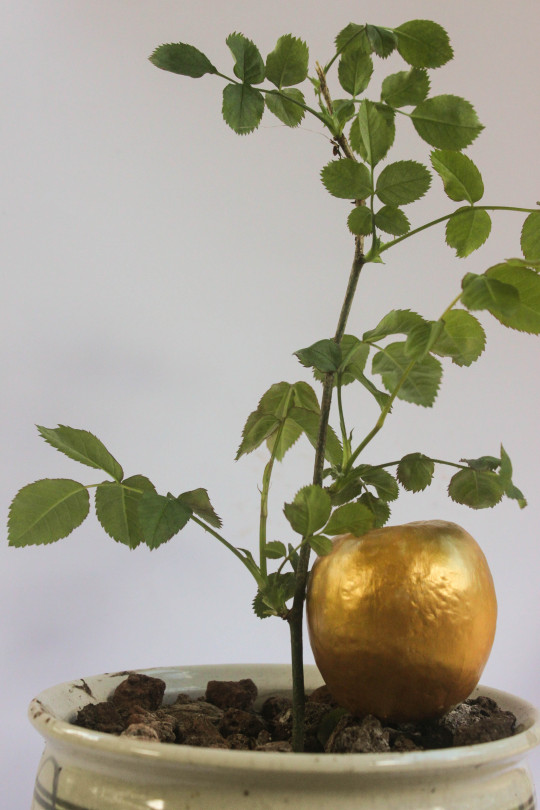
Creating Value
This experiment is a continuation of the class exercise where we created our own objects of value. I made a link with my current investigation for Assessment 2 into colour and how it is used to categorise. Think about worth and value in association to this I thought about colours that signify value and of course my first though was gold.
To many, gold has the implications of worth and material value; it’s gold babe, must be expensive. Gold is a symbol of wealth, it is money, it is what fuels this world.
To demonstrate this study I continued my previous experiments with fruit, using these forms to work upon. I started with the simple banana and apple, worth $1.65 and thought about how I could make them appear as objects of greater material value. Covering them in gold, I gave them a photoshoot and these images were the result.
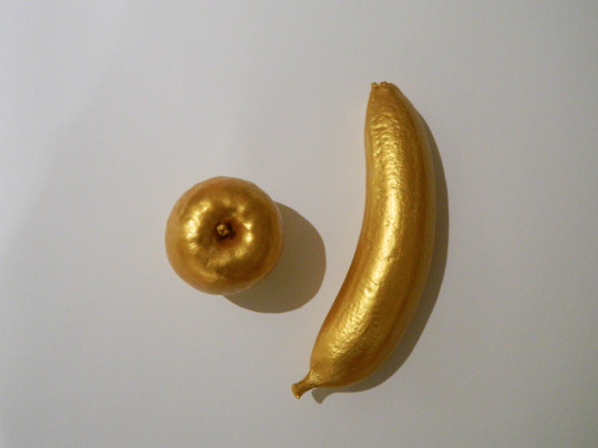
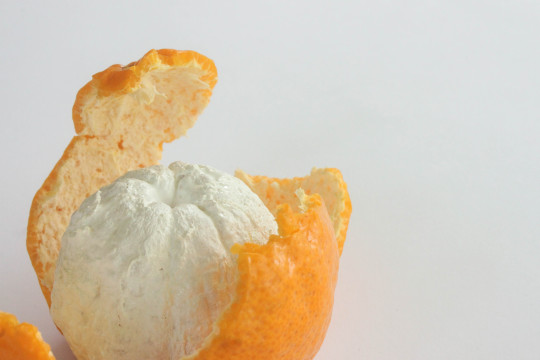
Whilst experimenting I started playing with a mandarin I was eating and though the little segments looked fascinating, I decided to paint one gold and these images resulted.
I then thought more about the binaries question and how I could push this concept further. I decided to create a clash of the natural and unnatural. It also creates this irony that the gold coated fruit looks so out of place as the gold gives it such a superior appearance. Yet in reality it is just a combination of the natural as just plants.
0 notes
Text
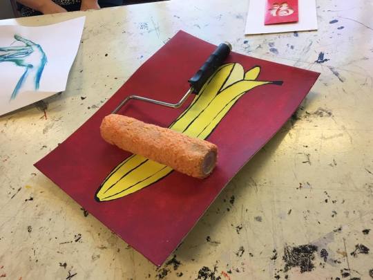
Tute Exercise: Art Auction
In class in week 8 we held an art auction selling off works of art we had created ourselves. With a budget of $5 we were to create a piece to sell. Poor and under prepared, Jess and I headed to the dumpster to see what we could find.
I came across a painting of a banana and a paint roller and decided to combine the two. I pitched them as the only kit any artist will ever need. With this kit one can create anything they desire, all you require is enough willpower to make the paint roller able to fulfill your wishes. The banana painting is evidence of the roller’s abilities, it can do anything.
We then started the auction, each with 5 $1 notes we had created. It started off smooth and fair until a loophole was found. The exercise aimed to question the concept of value and the different meanings within that concept, such as sentimental value and material value.
We questioned the concept of currency and how it originated. How money is just a construct of the mind, money itself is worth nothing, its worth exists in the minds of people as we all choose to believe in its value that runs our entire world.
Our auction was run by a currency that we made and decided to believe in, we gave it worth and the ability to be traded. Then $100 bills were constructed and corporations started forming and loopholes were found.
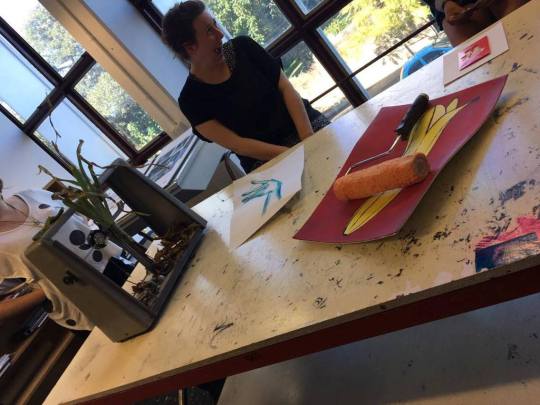
This exercise effectively made me question value and the origin of currency. It gave me an insight into exactly how reliant our world is on this constructed currency and how fragile it really is. What would happen if we all simultaneously agreed that money was worthless?
Also it gave me a glimpse into a rich life with my plentiful $100 bills.
#ballin
3 notes
·
View notes
Text
Assessment 2 Research
I’ve continued to ponder the sexualisation of fruit that I explored in my previous experiment, thinking of how this can be equipped as a mockery of itself. In class Jes reminded me of a creative practitioner who does this perfectly, Sarah Lucas. Her provocative works use objects and furniture “as a substitute for the human body, usually with crude genital punning.” [1]
Au Naturel 1994, Sarah Lucas from http://www.whitechapelgallery.org/exhibitions/sarah-lucas/
Her crude humour perfectly demonstrates the sexual labels and connotations put on everyday items. It evokes the immediate assumptions engrained into our minds, in such an amusing and fascinating way.
This work is a great inspiration for my experiments and final works to come. I will be exploring the ways in which fruit can be used to confront and rupture these sexual connotations.
[1] Quote taken from article by John Paul-Stonard, 10 December 2000, retrieved from http://www.tate.org.uk/art/artists/sarah-lucas-2643
0 notes
Link
Whilst on my facebook newsfeed I came across this post by Co. Design that I thought strongly related to the focus of my previous assessment.
They asked “6 designers to recreate gender-neutral bathroom icons” and the results are very interesting ways of rupturing gender binaries. As my focus was in deed on recreating the restroom symbol as it stands as a complete categorisation and seclusion of gender, this source is perfect.
Well worth a read.
1 note
·
View note
Text
The Power of Colour
Continuing on from my previous work on binaries and my focus on gender binaries, I started to think about how I could continue this study and develop it further. As I thought about what worked well and what could have been improved, I kept coming back to how much I enjoyed the study of colour and the meaning it has in design.
After our lesson week 6 I became inspired by a work Jes introduced us to which was Gabriel Orozco’s “Watermelons and Cats” (1992)
(Image courtesy Tate Museum)
I loved this simple use of colour to create a link between items that are otherwise completely dissimilar and how colour has made this bizarre association seem justified.
This further developed my interest in the use of colour and inspired my next experiment.
Experiment 1
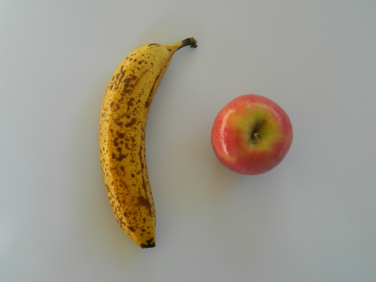
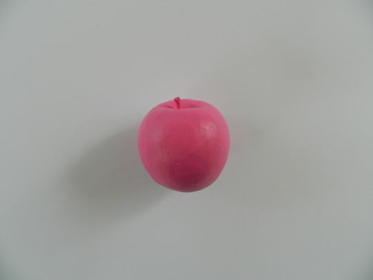
This experiment is a somewhat continuation of my previous experiment for Assessment 1 of painting children’s toys to change their gender target. For this experiment I had a quite literal inspiration from Orozco’s work and the use of fruit. This got me thinking about how even fruit is commonly sexualised and labelled with implications around gender.
I selected what I believed to be the most sexualised fruits that are in season (I wanted a peach but dey expensive u feel), which ended up being a banana and a pink lady apple (even the name itself like cmon).
Even just viewing these objects without context your mind naturally makes these sexualised assumptions due to them having been so deeply engrained into us. Fruit has been sexualised throughout society for decades, one strong example is this common use in Renaissance Art. As stated in an article by John Varriano for Gastronomica journal, “... a handful of painters made pointed references to the sexually suggestive shapes of certain fruits and vegetables. Highlighting the erotic associations of figs, peaches, melons, and squash was particularly common in the era that began with Raphael (1483–1520) and ended with Caravaggio (1571–1610).”
http://www.gastronomica.org/fruits-vegetables-sexual-metaphor-late-renaissance-rome/
To highlight this I decided to demonstrate these labels more obviously, covering them in the colour most commonly associated to their gender labels; pink for the girls and blue for the boys.
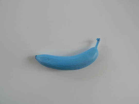
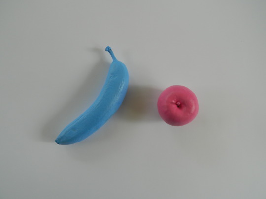
Whilst carrying out this experiment I realised how bizarre it really was. How bizarre it is that the sexualisation of objects and gender labelling is weaved so deeply into society, having been this way since Renaissance times. Our minds have been trained into this way of thinking and labelling as it has become a normality. Even whilst sitting in my garden painting the fruit Mum came up and knew exactly what I was doing even though when you think about it I am literally just. painting. fruit.
I then began playing with the visuals, seeing how I could further experiment with the photography of the objects and this is what I came up with.
This experiment was highly enjoyable and I’m very happy with the visually pleasing yet slightly confusing and disturbing imagery. But I would now like to think about how I can further develop this conceptually and incorporate it into a final work.
1 note
·
View note
Photo

5. Contemporary art and design often looks at the idea of constructed binaries, such as man/woman, soft/hard, straight/gay, organic/synthetic.
Considering the history of these ‘pairs’, how can art and design interrogate these binaries and offer new insights?
Upon selecting this question and starting to think about all the different possibilities and experiments I began to get carried away, wanting to focus on each of these pairs man/woman, soft/hard, straight/gay, organic/synthetic. There are endless binaries evident in today’s society that we are subject to every single day. But as I was thinking, there was one I was most passionate about which was gender binaries. I decided to focus on this pair, carrying it through all of my experiments.
Through my experiments I explored gender binaries, thinking of how design can both build up and break down these categories. In my first experiment I played with the reconstruction of Barbie’s iconic form into a more accurate depiction of the human body. This experiment delved into how the design of Barbie’s form has influenced and shaped the minds of little girls all over the world, including myself. Her unattainable body and lifestyle has caused girls to strive for this unrealistic image whilst enforcing the label of girls as having to be beautiful, striving to reach Barbie’s perfection. This design has encouraged these gender binaries, my experiment suggests a way design can be used to break down this binary and promote body positivity.
My second experiment I focused on products categorised by gender and the absurdity of this advertising scheme. Since birth we are trained into keeping in our category, showered in gifts that are blue for boys, pink for girls. Shopping aisles are separated into girls and boys, as stated by Elizabeth Sweet in Guys and Dolls No More? For the New York Times, “there are pink aisles, where toys revolve around beauty and domesticity, and blue aisles filled with toys related to building, action and aggression.” I explored this theme and how colour can be used in design to both build and break down these gender binaries.
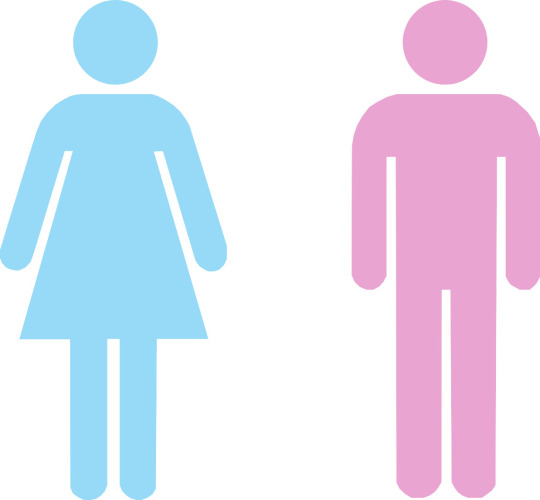
My third experiment was an extension of this investigation, repeating the reversal in digital form. I experimented with the image of a restroom sign that we come across daily, as restrooms stand as the ultimate space entirely categorized and secluded by gender. This experiment provides a solution, catering for the acceptance of all walks of human life.
In my final poster design I wanted to sum up my experiment findings. I wanted the design to be immediately familiar but provoke thought upon closer inspection. I started with the simple restroom symbol silhouettes of ‘male’ and ‘female’ and decided to remove the dress commonly used to differentiate between the two sexes. Taking away the need for a dress suggests that we are all human of the same skeleton, sex does not need to be categorised and gender is just a construct of the mind that has been ingrained into society. I included each colour to suggest that the categories of ‘male’ and ‘female’ do not define us, each human being is different and should be recognized free of labels and assumptions, in this case those that are carried with gender. The grey space signifies that we are all in a grey area, no one is easily definable. The fading of the bodies suggests our bodies should not categorise us, the prominence is in our mind and thoughts and what we do with these forms we have been given.
Sex does not need to be categorised.
Gender is just a construct of the mind that has been ingrained into society.
We are all human.
1 note
·
View note
Text
Reversing Gender Binaries: Digital
In my third experiment I focused on reversing gender binaries through graphic design.
Since birth we are immediately thrown into this world categorised by gender, we are given a birth certificate that states whether we are male or female, our parents are showered with gifts that are either pink for girls or blue for boys and from then on we play with toys that are ‘made for our gender’, clothes that are ‘made for our gender’ and watch shows that are ‘made for our gender’. Arguably gender is just one big advertising scheme, it only exists in our minds, it has no physical form.
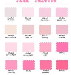
For this experiment I started researching the use of colour as a way of labelling products and advertising as ‘his’ and ‘hers’ and the concept of products categorised by gender. I started searching ‘girls colour’ and ‘boys colour’ in google images and there was a commonality in the results.
Result of ‘girls colour’
Result of ‘boys colour’
I then thought of the most common symbol we come across that signifies the categorisation of gender; the restroom symbol. We have these areas entirely categorised by gender, secluded to solely male or female. You enter these spaces due to how you have been trained to associate yourself.
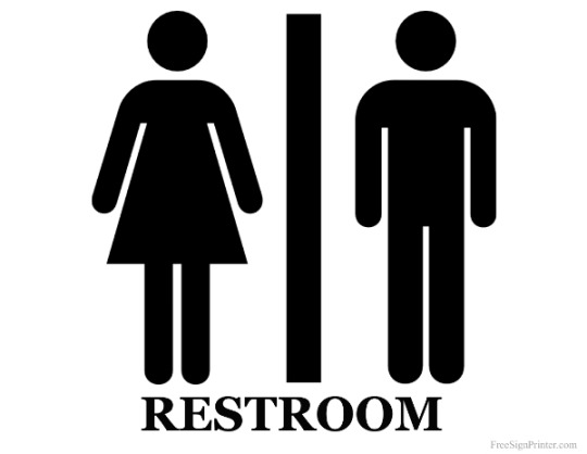
We come across this symbol in most public restrooms and immediately know our place, just by the representation of these silhouettes. I began experimenting with this image in photoshop, combining it with my colour research to create what I would consider a symbol of gender binaries.
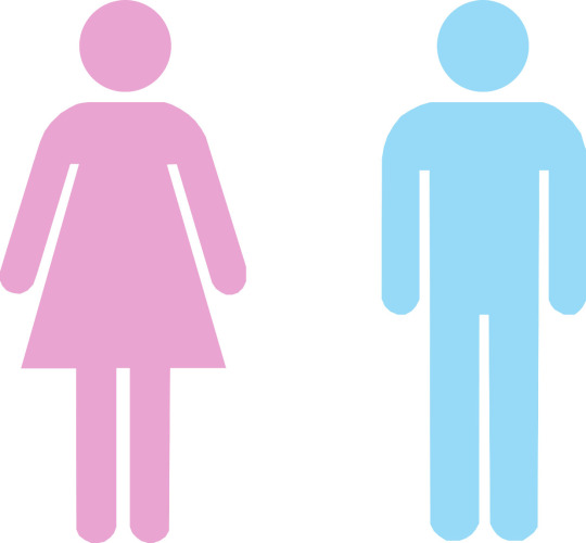
This symbol represents the categories that are forced upon us since birth, that we’ve grown up accepting as who we are. I began experimenting with photoshop to transform this symbol into a rejection of gender binaries and a broadening to cater for all types of human beings.
Reversal of male and female stereotypical colours blue and pink
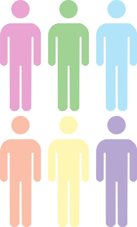
Introduction of new colours and a simplification from the need for a dress to indicate woman hood to the simple human form.
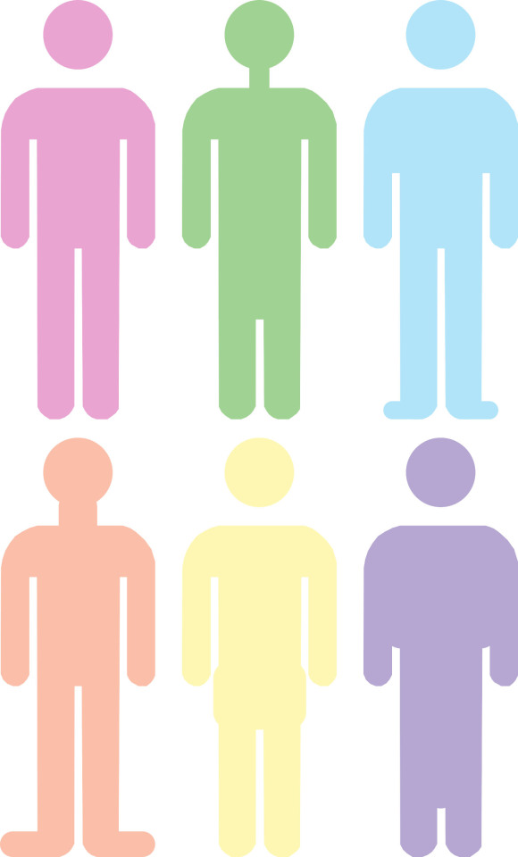
The introduction of different body types and clothing
I think this experiment successfully transforms a symbol of gender binaries into a symbol of acceptance for all walks of human life. The simple use of colour can transform an image, deeming it a powerful tool in art and design. By taking away the need for a dress to differentiate the female from the male suggests that we are all human of the same skeleton, sex does not need to be categorised and gender is just a construct of the mind that has been ingrained into society.
0 notes
Text
Reversing Gender Binaries: Physical
For this experiment I focused on reversing gender binaries in physical form. One marketing tool that has been used for over a century is the design of products categorised by gender.
This experiment was inspired by this article by Elizabeth Sweet of the New York Times, Guys and Dolls No More? from http://www.nytimes.com/2012/12/23/opinion/sunday/gender-based-toy-marketing-returns.html?_r=0. In this article Sweet discusses the true absurdity of categorising products due to gender, comparing it to categorising by “racial and ethnic stereotypes”. Sweet points out that in department stores “there are pink aisles, where toys revolve around beauty and domesticity, and blue aisles filled with toys related to building, action and aggression.”
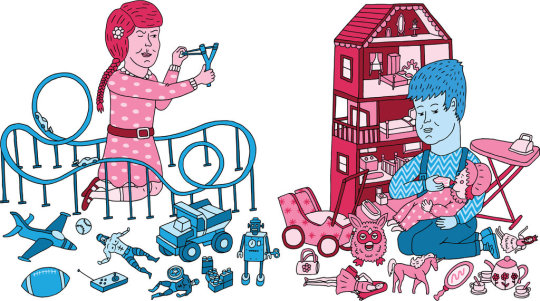
Illustration by Paul Windle taken from http://www.nytimes.com/2012/12/23/opinion/sunday/gender-based-toy-marketing-returns.html?_r=0
From a young age we are trained into staying in this category, buying from the clothes section we ‘belong’ to. Even in visiting my local dollar shop and going to the kids section where they sell these little plastic toys there was a clear division between girls and boys. The Boy’s section had an aggressive theme of little plastic grenades, guns, handcuffs all fake metal and ‘tough’ stereotypical manly colours whilst the girl’ section was all glitter coated wands and tiaras, all pinks and purples. I settles on what I thought were the most stereotypical of these items, a toy gun from the boy’s section and a pink plastic sewing machine from the girl’s.
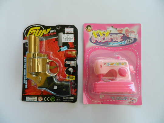
I decided on using paint to reverse these gender categories, demonstrating how powerful the use of colour in design can be. I chose matte black for the stereotypical boy’s colour and a shiny pink for the girls. I painted each object, which was bloody infuriating and fiddly, but I loved the result.
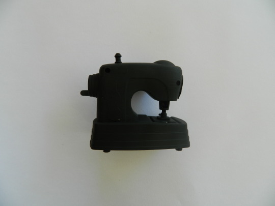
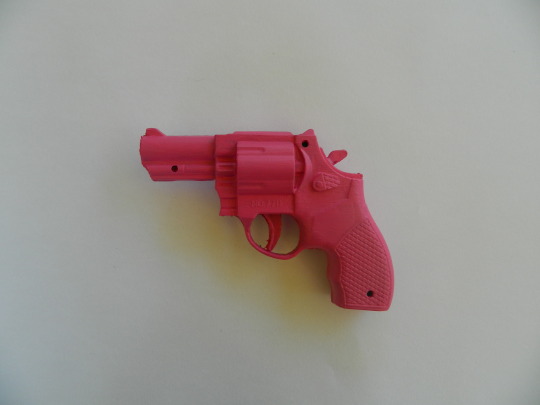
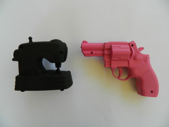
I think it’s a strong, simple demonstration of how our minds have been trained into identifying these categories in products. Looking at these products now we immediately associate them with the gendered colour they have been covered in. The black sewing machine looks like a tough boy’s toy where the pink gun looks like an edgy girl’s toy. This shows how colour can be used in design to both build and break down these gender binaries.
0 notes
Video
youtube
Source for gender binary experiments. Ellen Degeneres commenting on Bic’s new line of ‘pens for women’.
This video ties in with my experiments around the concept of gender binaries used in products and consumerism. Gender binaries are constantly used as a marketing tool to target consumers and sell products. From womens and mens clothing to girls and boys toys, this strategy is used everywhere in the world of marketing and advertising.
0 notes