
Don't wanna be here? Send us removal request.
Statistics
We looked inside some of the posts by georgesmithunit19 and here's what we found interesting.
Average Info
Notes Per Post
5
Likes Per Post
5
Reblog Per Post
0
Reply Per Post
0
Time Between Posts
8 days
Number of Posts By Type
Text
17
Last Seen Tumblr Blogs


Fun Fact
28.6 is the average number of monthly visits per US mobile user.
Text
Alien Communication Task
(Sometime before 11.09.18)
Below is a task which we were assigned a few months ago, but forgot to post here. Our task was to convince aliens that they should not exterminate us I believe.
In groups we came up with our own ideas on how to do this, we decided that by showing them a visual piece, we could communicate to the aliens that we have things that they could benefit from, and that we would not harm them.


1 note
·
View note
Text
10 Minute Lesson Project: Evaluation
15.02.19
Last week (8.02.19), I delivered my presentation to the class about the differences between British English and American English. I’ve already written about my process, which you can read a couple posts down.
Brief Rundown
Initially, this project was very daunting, and it was all throughout to be honest. After hearing that I would need to teach a 10 minute-long lesson to the class, I thought that it would be impossible for me, since I despise public speaking. I spent around an hour and a half during the first week’s class trying to think of something to teach. I couldn’t think of anything, tying a tie, teaching English, even teaching Japanese, in an attempt to possibly help myself learn more, since teaching is a very good way of learning things yourself. I finally decided on teaching the differences between American English and British English, like pants, chips, etc. I had thought of creating an animation, but it would have to be about 4 minutes long, since I needed to fill as much time as I could without having to speak. After said animation, I would hand out worksheets to the class so that they could answer some questions relating to the video.
I realised quickly enough that making a 4 minute animation would be nigh impossible for me given the deadline, so I scrapped the idea and decided to make a video instead, where I would use various stock photographs and footage, and the occasional original assets (the flags and the chalkboard scene). When I got to creating my video, I was feeling kind of hopeless at the start, since I had worked on the first segment for about 2-3 hours and it had only amounted to 20 seconds I believe. Luckily, once I got into the flow of downloading images/footage and importing it into After Effects, it started to go more smoothly. By the time I realised it, I had finished the video, and created about 35 worksheets (huge overestimate, should have checked the actual number of students in the class). I was still incredibly nervous, but I was anxiously awaiting the 8th of February.
The Presentation
The presentation went okay, not fantastically, but not an absolute disaster either. While we were nearing the end of the class, I decided to put my hand up since I wanted to get it out of the way this week as opposed to waiting another week. Anyway, the pacing of the lesson was somewhat decent, and I finished around the 10 minute mark (thanks to Liam and his stopwatch), and I think that it was overall a well-structured lesson. My delivery was poor, and I stumbled over my words a couple of times, but I couldn’t really do much about that. I let the video play for the class, and sat back. It seemed to be relatively well-received by the audience, there wasn’t any boos or laughs that I could hear at least. I said everything that I planned on saying to the class, except the part that it was targeted at children, and so the worksheets may be too easy for them. Once I collected the worksheets back up after the the 10 minutes, I was surprised to find how many names were written on the sheets, despite me saying that it wasn’t necessary (though I did kind of mess that up when I was speaking, so perhaps they didn’t hear it). Most people had scored around 80% or more, which was what I assumed would be the case. Though I think there were only a couple of people who scored the full 22 marks. One of them being my tutor. I think that this proves that there were some mildly difficult questions on there, or that they simply couldn’t remember the information from the video well enough (no disrespect, it was kind of fast-paced).
What Went Well, and What Didn’t
The video creation process went well, and the video itself was well-received by the audience to my understanding. The majority of the worksheets that I handed out were completed, so there was a good bit of interaction between myself and the class. I think that my video demonstrates a good example of visual learning style, as there are no voices in the video, only background music. Perhaps the music helped people to digest the video more easily, whereas, if there were no sounds, the video would be most likely boring to watch. As for the not-so-good parts of the whole thing, firstly, my speaking. As I said earlier, it didn’t go very well in terms of me pitching my video. I knew it wouldn’t though, so I was alright with that to a degree. It was kind of out of my control though, as I’m just not used to speaking in front of others. To improve this, I suppose I need to do it more often. As for the video again, overall, I got kind of burnt out over the subject of differences between American and British English, and after watching others’ presentations, I felt a bit isolated about my theme, since others had seemed to do something that actually teaches something, as opposed to showcasing a bunch of footage and images with some flags overlayed over everything. Next time, I think that I should think of a subject that was actually relevant to the course and the class perhaps, or even something else that I’m knowledgeable about. Back to the video again, I think it could do with a few extra examples of differences, since the video phase was a little too short in my opinion.
Overall, this was not one of my strongest projects, and it left me a lot to be improved upon, but for next time, I know some things that I can do differently.
1 note
·
View note
Text
Final Lesson Video, Audio, Thumbnail and Worksheet Process
07.02.19
Below is the final video about the differences between American English and British English. I think that I did a good job overall, and I guess I’ll see how it goes tomorrow (at the time of writing) when I must present this to the class.
Final Video
youtube
After I had finished the video itself, I needed to import sound into the video, which I mentioned in the last post. I looked around through some of my playlists, and after a bit of trial and error, I used a track from a game called Phoenix Wright: Ace Attorney. I went to SaveClipBro, and copy and pasted the YouTube URL into the top of the website, which let me download the audio file how I wanted, so I downloaded it as a WAV. file. I then imported the file into my After Effects composition. Now it was time to alter the audio levels to match the animation. To start with, I made the start of the audio sound all muffled and quiet, as you can see in the video. I set the audio level to around -21%, and then set another keyframe as the same number just before the black starts to fade out, and then another keyframe set at around -8%, which is actually a lot louder in comparison to the start. I would keep this level up until it reached the end of the segment, and then I set it to -21% again once the first part of the lesson begun. This was so that it wasn’t too prominent when watching the video. I didn’t want people to really focus on the music, but for it to just be in the background. I repeated this throughout the video, when needed. To my pleasure, I found that the audio matched with the video at certain parts, like at around 1:35 in the video—the sound that you hear matches with the tone and how I made it quieten down. Below is the music that I used.
youtube
After importing the audio, I then had to render the video. To do this, I opened up Adobe Media Encoder, which would allow me to render at 1080p quality, for YouTube format. It took about 50 minutes to render, since I’d used a lot of footage and high quality images most likely, but in the end I uploaded it to YouTube but came to the unfortunate conclusion that the audio was too loud and overpowering in my opinion. I deleted the video and re-rendered it with lowered audio levels. This was better, but I’m still not convinced that I’m happy with it.
After I had finished with the audio, rendered the video and was uploading to YouTube the first time, I realised that I hadn’t made a thumbnail for the video, and that it would just pick one of the frames for it it I just left it. So I decided to make a quick one in Photoshop—it’s nothing special, but I think it does its job. I got the two flags that I’d made and resized and blurred them into the background. The background was just a dark grey by the way, I couldn’t think of anything better. Then I just wrote out “Differences Between American and British English” and coloured some words yellow, for no particular reason, but red and blue didn’t look good as words.
Thumbnail
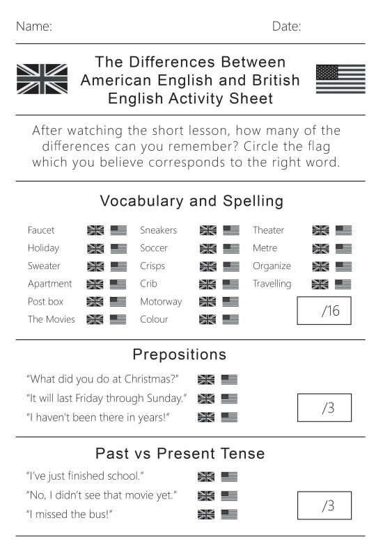
Below is the worksheet that I created for the class to answer after they have finshed watching my short lesson about the differences between American and British English. It is a very basic and easy worksheet that didn’t take me too long. It is aimed at a younger audience as I’ve stated. I added the standard name and date at the top, and separated each segment with thin lines. I took on quite a modern look in retrospect, which I think looks good. There’s minimum text so that younger people don’t have to read too much. I’ll admit that it isn’t the most fun to look at, but that will have to be something that I improve on in the future.
That is about everything that I’ve done in preparation for this lesson. I hope that it goes well.
1 note
·
View note
Text
10 Minute Lesson Project: Video Process
01.02.19
I am here, and I have finally finished my video for this teaching project. It took around 14 hours if I had to estimate (not in one sitting, over two weeks). It’s interesting that it took so long to create a three minute and thirty second video—which reminds me of Wallace and Gromit and how long that took to create just one single frame. I think that the final piece is decent. It’s not like I’m extremely pleased with it, but overall I do like it and I am proud of what I’ve created. I think that it is good for what it is and does its job well; to teach a young class about a chosen subject while also still being fun. At the time of writing, I have not yet imported sound, nor have I created the work sheet that I will be handing out after the video has finished playing, but I will add the sound later, and I will probably detail that later on in this post when I have (if not it will be in a separate post). The work sheet process will most likely be a separate post.
Now I must write about my process of the entire thing. Now, I’m not about to bore everyone and use 50 screenshots detailing every single thing that I did throughout, but I have some of the most important ones, which I will be talking about briefly. So firstly, how it all started. I made black solid layer and immediately got to animating the words to come onto the screen. I’d had the idea to have each word separately fly onto the screen to form a sentence for a while, and now was time to put that idea in to motion. This wasn’t so hard to do, but it definitely took the longest time to make out of everything that is in the video. It was very tedious to be honest, there was a lot of duplicating and fiddling with layers etc. The final animation of these parts honestly doesn’t look great, since some of the words follow each other a bit slowly, but I couldn’t do anything about that as that would interrupt everything that came after it.
Once I’d done this part, and added all the easy ease to make it look more fluid, I decided to use a technique that I had recently learned from Irene, which involves using trim paths to create some confetti-like things that look like they’re flying around the place. Here’s a link to my experience with this technique. I made the colours correspond to the flags of the UK and USA, which conveniently have the same colours (albeit with different shades).

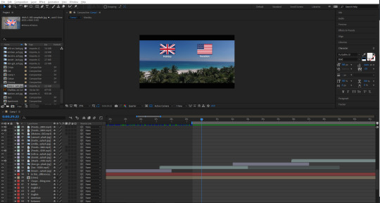
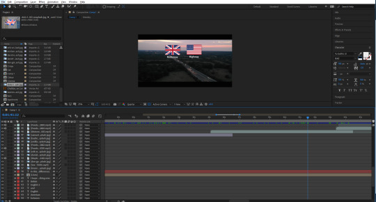
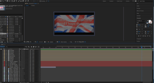
The screenshot below shows a dark screen with a flag in the background. This was the first image to appear after the black screen, which I made fade out using opacity keyframes. I chose to start with USA for no particular reason, and then move onto the Union Jack shortly after. A lot of the early parts of this video are drawn out maybe a little longer than they should be due to me being stressed over the fact that I needed to get the video to four minutes. I was taught by another tutor how to make the flag wave a bit using some technique called turbulent displace, which I couldn’t tell you how to do now, but it definitely adds to the video, instead of having static footage. In fact, I originally had planned to have footage for every single different segment of the video, but I was quickly shot down as soon as I visited various different stock footage websites, and found that there was a lot of bad footage. That or it was incredibly expensive. I quickly abandoned the idea of trying to find footage for flags, though luckily, I was much more fortunate in my search for other footage of the later sections.
I wrote out some messages that would appear on screen while the flags would be in the background, like “I hope that you enjoy, and learn something new.” and the screenshot below. I had them last for a while to draw out the video, but I also knew that drawing something out for so long would not be entertaining for an audience, so I didn’t go overboard, hopefully. Not much else to say about this screenshot.
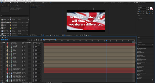
Now I will briefly talk about some of the footage and images that I used for the video. This first part of the video was going to be about the vocabulary, by the way. The first image that I used was one of a faucet, or tap. I got all of my images from Unsplash, and footage was from Pexels. I simply placed the image and then had it move slightly throughout its duration of being there, so that it wouldn’t look too boring. Next, I made the flags that I would be using to differentiate each word. There was a lot of duplicating and then removing things etc. I wrote a word out, and then parented that word to the image of the flag, so that they would move at the same time, but I could simply edit the word to whatever I wanted to without everything messing up. I tried to get each flag and word to move on the screen in a unique way, though I ended up running out of ideas later on, so some of them copy the earlier ones, but I don’t think you would really think that unless I pointed it out. Like right now. I chose to screenshot this scene, as I really like the footage that I chose for it—it may be my favourite footage. Not much else to say, though there were some more creative ones that I did after this one, like with the cinema, I made the words appear on the big screen. The footage for the apartment scene was also nice, it almost looks like I went out and filmed it myself.
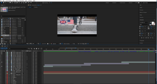
Another scene I liked was this one below, of a girl walking on the street, wearing trainers/sneakers. The way that it is zoomed in looks really good, as well as the flags that fall onto the screen, and then fall off at the end. I think that the contrast between the real life footage with the little icons I made in Illustrator is probably best showcased here, in my opinion. After this was a football/soccer scene, where I ran into a little mishap—there was this short black screen that appeared for half a second, which I was able to avoid by duplicating the footage and moving part of it just before the glitch, which covered it up nicely. That’s pretty much it for this screenshot.
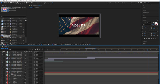
The next part of the video was going to be about spelling, which may be my favourite aesthetically pleasing segment that I made throughout the video. I really like the specific image of the flag, along with the white text over the top of it. I tried to keep it lighthearted, and added a little “(yay!)” under the big word “Spelling”. Some people may catch it. I’ve noticed that throughout the video, the font seems to switch up a lot. I always used the same font, yet it still looked different.
The first part of this category would start with the motorway/highway, which again, very aesthetically pleasing to me. I think that it is pretty perfect footage for this particular part. After this was one about colour/color, which also had the same error that the football/soccer scene had. I was able to cover it using the same technique. After this, theater/theatre, meter/metre, which I think I chose a pretty nice image for from Unsplash, and then organize/organise, which again had some really cool footage to accompany it, and it also looks like I could have filmed it.
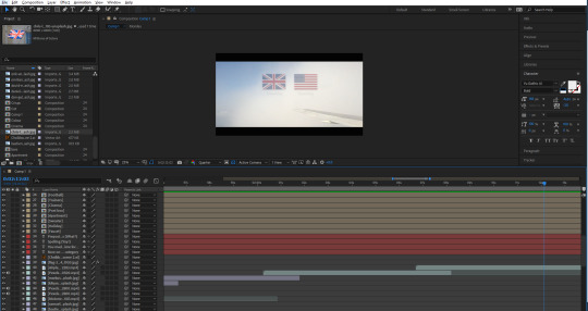
Next is undeniably my favourite scene from the whole video. It was of a plane that was just barely in the shot, while there were clouds blowing across the screen. I used this to my advantage and decided to try something new with the animated flags and words. This time, I lowered the opacity of both flags once the cloud went over it. Also, the way they appear on the screen also looks really good (albeit unintentional) as they look as if they’re blowing onto the screen following a cloud that seems to have blown them along with it. The whiter the screen got, the more I lowered the opacity of the flags—even going down to 15% when a big cloud essentially covered the screen. I think that this ended up looking really good, and honestly like it could be a separate thing of its own. I’m hoping my audience will be able to catch the words, with them being covered by the clouds as well. It doesn’t help that the words in this case are incredibly similar; traveled/travelled.
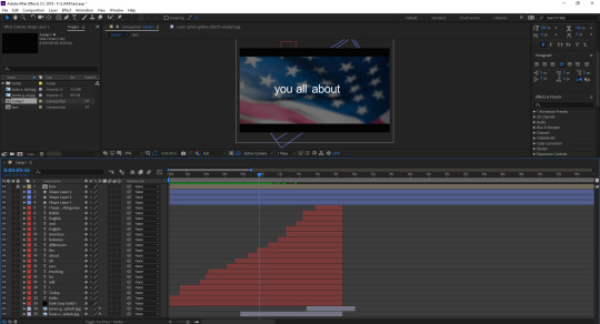
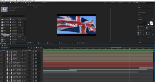
After this was the segment that introduced prepositions into the video. I didn’t exactly know what those were, so I thought I would add a little “(what?)” under the word, just a little lighthearted addition, as I assumed that not everybody would know the word either. Also, before this, I typed: “You made it! Now it’s time for...”. In retrospect, this may seem like I’m being patronizing, but at the end of the day, this was created with the intention of appealing to younger people.
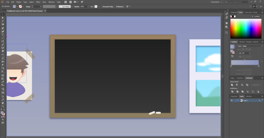
Next, I thought about how I wanted these prepositions to be for awhile, until coming up with the idea of having a chalkboard as a way of teaching. I had no idea what stock footage of image that I would use, so I thought to just make my own thing this time. I took to Illustrator and started working on a little scene that would have a chalkboard in. The chalkboard itself was easy to create. I just made a square and gave it a slight dark grey to darker grey gradient. Just to give it some slight detail. I also did this with the wall in the back, just going from light purple to a more blue purple. I made a border for the chalkboard, and added some chalk sticks using the rounded rectangle tool. I resized them and placed them on the corner of the board. Then next thing I made was the window on the right. This was easy to make, all I did was create a little scene of some hills, and some clouds, then blur them using the gaussian blur to make the whole scene look like it was in the distance. I then made a border around this, and them thick line through the middle to make it look like a window frame.
The last thing that I did for this scene was create a little picture for the wall. I made a white rectangle and then gave it a drop shadow. I made a small rectangle and then made some triangles to cut into the rectangle. I then coloured it the same as the border of the chalkboard, and shrunk it. I then duplicated it and placed it over the paper on the wall—to look like tape. I then made a character out of some shapes and the pen tool. I guess you could call it an Easter egg, since it kind of resembles me.
After this graphic, I made the second to last segment—Past vs Present Tense. I got another American flag and placed it into the background. This lead into the final part of the lesson which was just using the graphic that I made of the chalkboard again, and then it came to the final slide, which thanks the audience, and then fades to black, which I did by getting a solid shape layer which I coloured black, and adding a keyframe at the start set to 0%, which moved to 100% at the end.
1 note
·
View note
Text
10 Minute Lesson Project: Initial Ideas and Brainstorming
24.01.19
Our new project this time around is to use the skills we have learned and the research we have done on memory, learning and teaching methods, to create a resource using art and design to educate a chosen subject and demographic. We must essentially design and teach a 10 minute-long lesson about whatever we want. In this post, I will just be detailing my initial ideas and how I plan to do things.
Initial thoughts
Initially, I must say that the thought of this filled me with dread, and I thought that I would never be able to accomplish such a thing. Though, at the very least, we are allowed to do it whatever way we wish. For example, I thought it over for a good hour and a half, and eventually came up with a decent idea with help from my tutor, which was to teach people the differences between British English and American English. My initial ideas were not really good, and I was just frantically searching around to try and find something to teach. My original ideas were to teach the periodic table(???), teach Japanese, which I thought would help me learn more if I were to teach it, but quickly dropped this idea as it would be just too embarrassing. Teach people to tie a tie, which would be incredibly boring and I would struggle greatly to reach the 10 minute mark. My final idea was to simply teach English, like the correct their, they’re, there, you’re, your etc. Again, I don’t think I could make a 10 minute lesson about something like that, since I don’t know how I would get my point across without it being a boring and talkative PowerPoint presentation.
The plan
Once settling on my (most likely) final idea, I had the idea to create a 3-5 minute animation essentially explaining the differences between certain words like pants, chips, faucet etc. using some nice graphics in Adobe Illustrator, quickly realising that it would most likely take far too long to create graphics for every single word + animate it with text, since I planned to use a lot of words in this (Still won’t completely rule out this idea though). Aside from the animation, I also thought that I would create some worksheets to hand out once the animation was finished, to see how much they remembered. That or they will be able to answer them immediately, since the topic is laughably easy for anyone who has been in the UK or US for at least 8 years, and already know the differences. The worksheet, by the way, will most likely be around 3-5 minutes long, much like the animation. The length of these things will all be decided once I’ve decided that the animation is long enough. To fill in the other 1-2 minutes or so, I plan on starting the lesson by briefly explaining what will be happening, and then at the end of the lesson, after the period where they must answer the questions is over, I will then display the answers on the board to let people mark their own work. I may or may not ask if anyone got full marks, though they most likely will.
A change of heart
Anyway, instead of creating all those graphics in Illustrator, I thought instead, I would create an actual short movie-type thing in After Effects using either stock footage, my own footage, stock photographs, or my own. I will try and make it as cinematic as I can, using black bars at the tops and bottom of the screen, and have images/footage panning across the screen slowly. Then I would have it maybe blur in the background and then have text move onto the screen using some of the techniques and skills that I’ve learnt. You can bet that I will be trying my best to draw certain aspects out as long as I can too. I want to avoid talking as much as I can to be honest, and although the approach that I’m taking doesn’t really showcase my illustrative or digital art skills, it may do me good to try something new for once, and show that I can do other things.
Content
I will be doing different categories of the differences. Below are the ideas that I’ve gathered for now, with help from this website:
Vocabulary - Pants-underwear-trousers etc., potato chips-chips-crisps-fries etc. (I’m not sure how I will be doing these first two ideas yet), faucet-tap, sneakers-trainer, cot-crib, fizzy drink-soda, sweater-jumper, mailbox-postbox, plaster-band-aid, drugstore-chemist, football-soccer, apartment-flat, holiday-vacation, the movies-the cinema, cookie-biscuit.
Spelling - motorway-highway, color-colour, behaviour-behavior, theater-theatre, meter-metre, organize-organise, traveled-travelled. (I find it amusing that Tumblr is redlining the opposite spellings here, saying one is incorrect).
Prepositions - I plan on rephrasing these examples below, but you get the idea of what I will be doing.
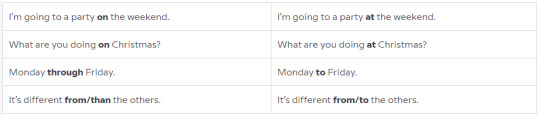
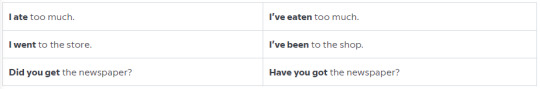
Past Simple vs Present Perfect - I may or may not use this category, but if I were, I would definitely rephrase them again, and they would most likely be at the end of the video, as well as the previous category, since they are a little complex, though if you can follow the pattern, you may just know all of them at once.
Regular or Irregular Verbs? - Another one that I may or may not use—these words may be way too easy, since there is an obvious pattern with them. But regardless: leapt, dreamt, burnt, learnt-leaped, dreamed, burned, learned.
1 note
·
View note
Text
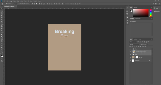
Book Cover
11.01.19
Today we had to make a book cover for a television show/movie etc. For mine, I chose Breaking Bad. We were going to be using the techniques that we’d learned over the four weeks before the holidays.
To start with, we needed to make the document A4 sized, and portrait. Then we had to type our titles out. Each word needed to be on a separate layer, so we could edit both of them on their own. Next, a solid fill layer (layer > new fill layer) which I coloured yellow—this was in reference to the hazmat suit which is commonly seen in the series. We could mess around with the words until we got something we thought looked good.
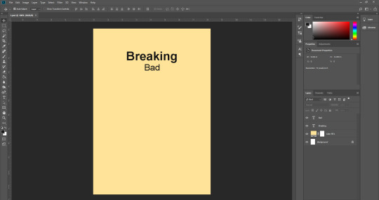
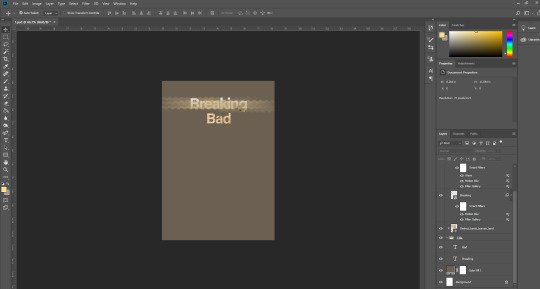
Next, we needed to find an image that related to the series. I searched “barren landscape” and selected large when searching. This was referencing the barren land that the main characters travel to often. It was either this or “desert”, but when I did search that, I got images of big sand hills etc, which was not what I wanted. Now, we could open the image that we’d found by going to file > place linked and finding the image in our files. Once we’d done this, we could place the image behind the words, which were now both in a folder titled “Title”, which we then duplicated with ctrl + J, and titled “Title 2″. With the image behind the text, we could hold alt when hovering between the layers, and it would clip behind the word. I moved the image around until I got something that I liked—which was difficult, since it never matched up well. I had to change the colour of the background because the yellow just didn’t look good with the image. I changed it to a kind of low saturation brown, which is a nice colour.
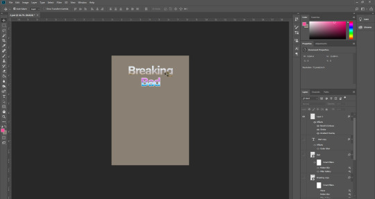
After this, I needed to click on filter > filter gallery, and this would let us choose from many different textures and filters etc. On the duplicated “Breaking”—which we did earlier on—we clicked on sketch > halftone pattern, and change “dot” to “line”. Before we could click “OK”, we had to go back and change the colours on our palettes, which were black and white at the time. I changed mine to the background colour, and the yellow from the first background. Now we could click “OK”, which would give a line effect on the word, which we could extend off if the word if we wanted to. Then we went to filter > distort > wave, and set the top number on the “Wavelength”, to 32 minimum and 33 maximum. Then for “Amplitude”, we set it to 1 and 2.
Next, we edited the word “Bad”. We went to the FX button at the bottom right under the layers panel, and clicked “outer glow” and set the colour to an electric blue. We duplicated the word earlier, and for the duplication, we changed the electric blue to an electric pink, and changed the range so that both colours were visible on the same word. Finally, we had to make the bottom word, in my case “Bad”, have a kind of 80s neon text effect. To do this, I just double clicked on the layer, or you could click the FX button, and then go to gradient overlay, which would let you choose a colour for one side, and then choose one for the other, so I picked a neon pink and a neon electric blue. Lastly, we added a white stroke around the word to finish it off.
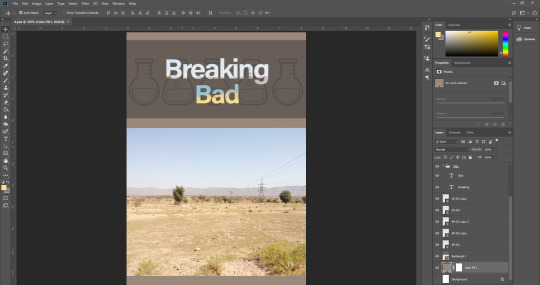
I wasn’t really pleased with how the above designs look, namely the neon 80s text effect, the top word looked pretty good actually, I like the simple bold typeface mixed with the photograph behind it. For the word ‘Bad’ I decided to just use the brush technique like I did for the pink and blue in the above design, and make it blue on the top and yellow on the bottom. Blue for the blue sky, and yellow for the hazmat suits which are really prominent in the show. I then searched for some sciency things on Google, and set the search tool to transparent. I found some test tubes, and laid them out on a nice banner behind the words. Then I simply took the image from the back of the word, and placed it on the bottom half of the cover, since this is supposed to be a book cover after all. It’s just a quick thing I put together, though it could be developed much farther.
0 notes
Text
Surreal Scene Task
14.12.18
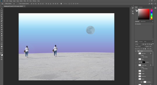
Today we were given the task of creating a surreal background inspired by Salvador Dali’s “The Persistence of Memory”.
We were given an assortment of images to use for this task, but we had to use certain ones first. Firstly, we had to hide every layer except the market square floor. Then we needed to do ctrl + t to transform it to make it cover the entire bottom half of the composition. We then could add a gradient map, an adjustment layer (the half-eaten Oreo icon in the bottom right). I chose a blue to purple one. Next we had to add the moon, that you can see in the top right corner of the composition. I changed the moon’s colour slightly, but not much. One more thing to mention—in the screenshot below, you may notice the second girl on the right. I kind of forgot to edit it in a non-destructible way, so I couldn’t remove this. Think of it as a little hint to what I will be doing later on.
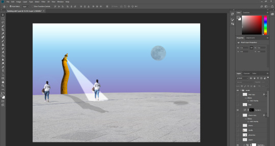
Next we had to edit the lighthouse. First of all, we had to make is appear again, so that we could edit it. We had to go to edit > puppet warp, which allowed us to add pins to the object. We had to add five pins to the lighthouse, one at the top, all the way through to the bottom. Then we were able to move the object around, as you can see in the below screenshot. Then we had to make a selection using the elliptical marquee tool, and place the selection under the girl. We needed to make sure it was flat, so that it corresponded with the angle of the floor. We then could add the selection (top left) and draw from the top of the lighthouse all the way to the edges of the circle selection on the floor. We did all this making sure that we were holding down shift, so that we wouldn’t lose our selection, and we could also add a new one.
Then, we could set another adjustment layer > curves, and then alter the brightness of it, and then filter > gaussian blur, to make the light look softer. Another thing to do was add a shadow being cast by the lighthouse. This wasn’t too difficult to do, and just took a bit of trial and error. What I did was duplicate the lighthouse, warp it a bit, flip it so that it looked more realistic, and then make it a solid colour, by double clicking the layer in the layer panels and selecting solid colour overlay. Then I just lowered the opacity until it looked about right, and also corresponded with the shadow that the lady was casting originally (I didn’t add that).
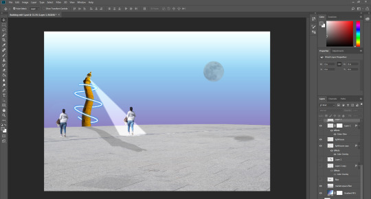
Next, we needed to select the pen tool and draw curved lines over the top of the lighthouse. Then we could right click on the lighthouse layer > stroke path, select a black brush (on a new layer, and add a layer mask). Ctrl on the lighthouse > then remove every other overlapping line, so that it looked like it looped around the lighthouse. We then finally added a blue glow around the lines to make it look like lightning. That was everything for the tutorial.
I’m sorry I didn’t do a very good job at explaining this segment, my notes were a bit scrambled and even I couldn’t really make out what was supposed to be next.
After I’d finished the tutorial, we were allowed to edit whatever we wanted in, using the existing images, or finding our own. I chose to firstly duplicate the woman on the right and move her to the left of the composition. For this, I used the clone stamp tool—I think I pulled it off fairly well. Next I took the killer whale (I think it was?) and shrunk it, blurred it using the gaussian blur tool, and placed it next to the moon. This was to make it look like it was jumping from somewhere over the moon. I also took the deer and just gave it a shadow, which I did using the same technique I used for the lighthouse’s shadow. I just duplicated the original thing, (the deer) warped and changed the opacity to make it look as real as possible. I also did this for the moon and the killer whale(?). Finally, I made the Goose appear, and I thought I would try and edit it a little farther than the other things. I tried to duplicate its head and neck, and then stitch it onto the side and rotate it to make it look like it has two heads. Some kind of frankengoose. I also gave it a shadow using the techniques I mentioned.
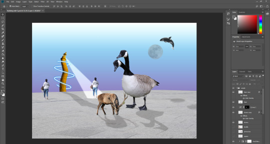
This was an interesting task, and I think that the result is quite frankly, all over the place, but fun nonetheless. I think that the inspiration from Salvador Dali’s “The Persistence of Memory” is only visible in the wavy lighthouse, and maybe a little with the barren landscape.
0 notes
Text
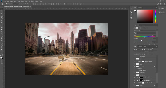
Post-Apocalypse Edit
7.12.18
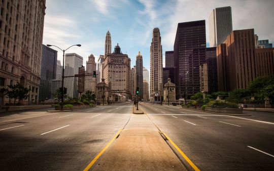
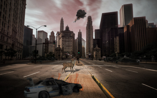
Today we had to take a scene and some images and edit it so that it looked like it was taken after an apocalypse. With my edit, I didn’t plan on going crazy with effects, and I wanted it to look semi-realistic. Below is the original photograph.
To start with, I took the deer from the set of images, and placed it onto the road. I resized it so that it looked like it was actually on the road. I used the things that existed in the photo, like the traffic light in the center. I thought that the deer would be around half the height of the lights. I made the deer a bit darker by adding an adjustment to only the layer which had the deer on. I did this to make it fit with the theme of the photo. Next I decided to make the shadow for the deer. This was probably the most fun part of the edit, and I think I ended up pulling it off really well. I simply duplicated the deer, and squished it and moved it around to fit with the lighting. I looked around at the other things which were casting shadows to determine where the light source was coming from. It looked like it was coming from the south-west of the image, so that’s why I made the shadow cast to the right(ish).
Now for the sky. It was a luscious blue, but I changed it to a washed-out red shade. This was a real pain, and I don’t think it looks really good, but it will have to do. I essentially just drew around all of the buildings using the polygonal lasso tool. Of course, it would never be perfect, but I tried my best. I added a slight red glow around the selection, to hide the inconsistencies. To make the sky red, I just added a hue/saturation adjustment layer and changed the sliders around a bit.
Next I decided to add the police car that had crashed and was now burning, because I looked for a transparent image of fire on Google images. I moved the car around the photo until I was semi-happy with it. It just didn’t fit in anywhere, given the angle of the car. Although, in hindsight, I could have it crashed into one of those plants on the right, by the side of the road. The car was obviously too bright at the start, so I made it darker. It was also underneath a huge shadow, so it had to be darker anyway. I rotated it a bit and then placed the car on the curb thing in the middle of the road. I got the fire png and placed it behind the car (or in front?) and then edited it slightly, using layer modes etc. I tried to add a light source coming from the fire, but it just didn’t look good so I dropped it.
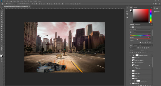
Next, I took the image of some grass, and I made them darker and less saturated. I placed them at the side of the curb in the middle of the road. I thought that it would be a big commitment to add grass everywhere, so I kept it at that and moved on. Then I got the crack image. It was an image with a white background, so to eliminate this, I simply had to change the layer mode to multiply. I resized them and duplicated them and placed them on the road. I think that they look fairly real. The next thing I did was add a plane to the scene. In retrospect, I suppose it kind of contradicts the whole post-apocalyptic vibe, and makes it seem more of a straight up apocalypse. You could say the same about the car being on fire, actually.
But nevertheless, I continued. I got a transparent plane from my old friend Google again, and then rotated and shrunk it a bit so it looked like it was in the background. I also got an image of a cloud of black smoke, to have trailing behind the plane, so it looked like it was crashing down into the scene. I also duplicated the fire and placed it behind the plane—very subtle but it works. Another thing I did earlier was change the colours of the plants on the sides of the road to a darker shade, to try and make them look as though they were dead. I just drew around them using the polygonal lasso tool, and did my best to get it as neat as I could. Luckily they’re in the background, so you can’t see them very well.
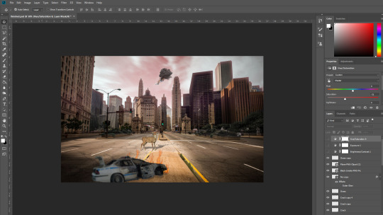
Final Result
Below is the final result. There’s not a lot of things going on in the image, but I think the subtle parts look really good, like the deer’s shadow, which I’m quite proud of. Upon looking at everyone else’s in the class, I came to the realisation that mine is kind of lacking, and boring. I’m also fairly slow when it comes to editing, since I tend to spend a lot of time on the subtleties, so that the overall thing will look good. Though I will usually get something done to a good standard if I do have a lot of time to work with. Overall I think that it’s a decent edit, but could use some new additions, as well as some revisions, like how I could move the police car into the background a bit, crashing into the dead plants.
0 notes
Text
Disintegration Task
7.12.18
Our first task today was to create a disintegrating effect on an image. The image we would be using was of Carlton Banks from The Fresh Prince of Bel-Air. Below is the image we used

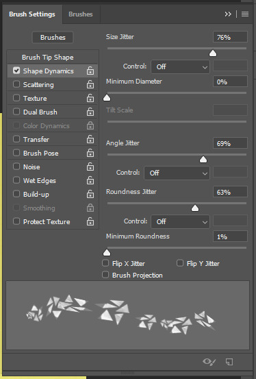
So we started by selecting the polygonal lasso tool, which was the third tool down on the tool bar, and was a hidden tool, so you had to hold down to access it. Essentially it lets you make shape selections as opposed to selections made using the pen, or free hand, using the regular lasso tool. We had to create 5 separate shapes which could be done by holding down shift when making another selection. Then we went to edit > define brush preset which, made a new layer and then went to window > brush settings. This opened up a window that let us change settings of a new brush that we just made using the polygonal lasso tool. There were lots of options to chose from, and the ones we chose was the spacing, which made the gap between each stroke wider, perfect for what we were doing, and the angle jitter and roundness jitter, which were both underneath shape dynamics. This gave us a cool unique brush that randomly alternated size and angle. You can see how the final brush looked at the bottom of this image.
So now when we’d made a new brush, we had to then make the brush using the clone stamp tool, which would let us clone the face. So making the brush yellow (the background yellow), we had to make the left side of his face look disintegrated, so we just randomly painted all over it, so there was no visible line where the face ended. After this, we had to make a new layer and make the head appear (the first and original layer), so that we cold then steal the particles from the head and then clone them so that they could appear to the left of the head, where we’d previously edited them out. I added a bit of noise to the layers with particles on them by double clicking the layers, to add a bit more of a disintegration effect, which I think paid off—it’s a but subtle but I think it looks works well.
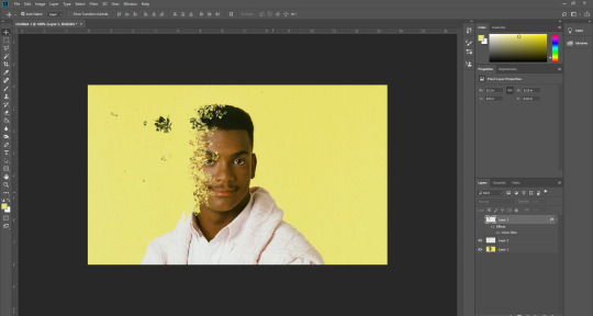
Afterwards, we had to insert an image of a cracked texture, once we had, we then needed to make it rounded, to fit over the face, essentially. This would serve as an added effect to the disintegration effect. To make the cracked texture, which was a square image originally, we had to go to edit > transform > warp, which I didn’t know something as useful as that existed, so I learned something new there. Well, I also learned how to make a new brush, so that was good to know too.
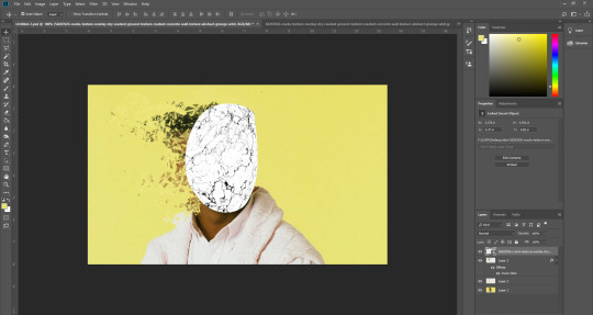
Now that we’d made the cracked texture round using the warp option, we could now alter some things to make it look like a cracked effect. We changed the layer mode to multiply, so that the white would be removed, and then we duplicated the layer and changed it to divide, this made it so that there was a black crack effect, as well as a yellow one, corresponding to the background. I made both of my crack texture layers divide, when I was experimenting, but I actually think it looks better than having the black crack, so I kept it like that. If we weren’t happy with how many cracks there were, then we could make layer masks (Japanese flag icon located at the bottom right corner of the screen, under the layer panel) on each texture layer, and get a black brush so that we could remove some of the cracks. I didn’t get rid of too many since I was happy with how it looked.
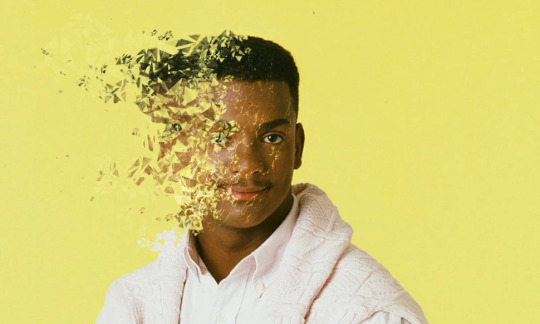
Final Result
Overall, I am really pleased with how my edit turned out—the glowing cracks really add to the disintegration effect, because it makes it look like there’s about to be even more particles disintegrating from the face—like they’re about to explode off of the face. The particles themselves look really good too I think, and I tried to make it look like they got smaller as they faded away and got farther away from the face. I’m also pleased the subtle disintegration effect on his clothing. Also, I was pleased to find out that a couple of people chose my work as their favourite from the class when we got up and looked at each others’.
0 notes
Text
Restoration Task
30.11.18
Our next task was to use an old photograph and edit it so that it didn’t have all the crumples and creases anymore. There were four photos to choose from, and I, like most of the people in the class it seemed after going around and looking at everyone else’s, chose the one below. I knew this was going to be a difficult task, but I started working on it as soon as possible. I put together a before and after—though it looks more like an after and before, the way I put it—so you can see the original photo and my edit.
I started with the area above her left eyebrow, and then then below the eyebrow and then the eye. This was one of the most difficult parts of the whole edit, but I think I pulled it off relatively well, although the eye looks a bit off. For this task I used both the clone stamp tool, as well as the spot healing tool, mainly the clone stamp though. There’s not really a whole lot to talk about for this task, but notable things that I did was edit the hair, which looks decent, I think I almost got the texture right, though it was challenging (as was the whole task) as there were a lot of different tones, much like with the skin, too. At least I managed to keep the shine on the hair. I also removed the background, or most of it, which doesn’t look too bad, but with it I think I kind of ruined the entire image with the right side of her face, (our left) it just looks really flat because they were right next to each other, and they sort of merged together.
Result
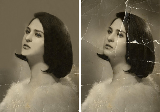
Overall I’m somewhat satisfied with the result, though after seeing everyone else’s versions at the end, I was kind of disappointed with mine. It ended up looking like a painting at parts, like her cheeks and chin, I think I just didn’t blend them well enough. I am pleased with the hair though, like I said, since the texture isn’t half bad. Though it doesn’t look as silky as the photograph.
0 notes
Text
Chickenpox Removal Task
30.11.18
Now we had to remove this baby’s chickenpox. To do this we had to use the spot healing brush tool, which was the seventh tool down on the toolbar.
This was a fairly quick and easy task to do, since the spot healing brush tool takes its surroundings in when you use it. And since we were operating on quite a big image, and the baby’s skin was basically the same colour throughout his body, so the spot healing brush tool would be perfect for this task. The most tricky part to do was the hair.

I ended up removing all of the spots that were visible using the spot healing brush, and I didn’t need anything else, since the clone stamp would be too finicky and when you wanted to go over something, it would always get a different skin tone, because it slightly changes across his body, and there’s also shadows that are present to take into consideration. The hair was the most challenging part of the task, since it was difficult to get the spots that were underneath or next to strands of hair. The spot healing brush still did a good job though, and it was definitely better than using the clone stamp since the hair was random, so cloning another part of the hair would be obvious, as oppose to seeing what the spot healing brush does, which is fill in based on what’s around it.
Another tricky part was under the head, to the left of his chin—you may notice that it’s a bit different to its surroundings, but that was the best I could do in the allotted time, and it doesn’t look too bad. The reason why it was tricky was because the tones just varied quite a lot, there was a lot of darkness from the shadow being cast from his head, and then his chest was lighter, where the shadow wasn’t being cast on. I also took it upon myself to try and remove the bags under his eyes, which wasn’t too necessary, but I just thought that they may be like that because of the chickenpox. I actually used the cloning tool for this one, instead of the spot healing brush because I needed to keep the tone the same throughout.

I think that I was successful in removing the spots from the baby, and also, I think that the name of the tool, ‘spot healing brush’ fits perfectly.
0 notes
Text
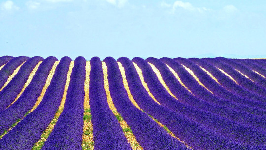
Clone Stamp Task
30.11.18
Today our task was to use the clone stamp in Adobe Photoshop to remove and add some things to an image.
The image we were going to be operating on was a field of purple flowers with a single tree in the middle, as seen below. First of all, we had to open up the image in Photoshop, then we had to select the clone stamp tool which was the ninth tool down on the toolbar. We also had to make sure that we clicked on “sample all layers” which was near the top of the screen. This meant that you could edit the image from a new layer even if the layer was empty. We did this because we were going to be editing in a non-destructive way.
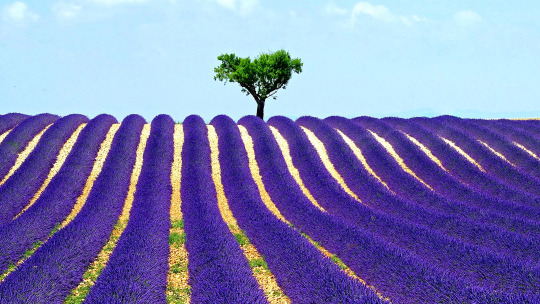
So once we were on a new layer, we had to firstly hold down alt and hover over the parts that we wished to clone. We were told we had to clone two trees at the sides of the main tree that existed. To do this we had to select the bottom of the tree, just above the flowers and use a small clone stamp brush size so that we could clone it accurately. Zooming in really close helped a lot. I wanted to have small tree and a regular sized tree that looked like it was right next to it—this is where the new layers thing came in handy. I was able to clone the tree to the right easily, and I just erased the flowers if I’d accidentally cloned some of them. With the tree to the left of the main one, I decided I’d wanted it to look relatively far back in the distance, so I did ctrl + t for transform and shrunk it a bit. I also lowered the opacity to make it look like it was in the horizon. We then placed all of these trees in a folder so that we could start the next edit.
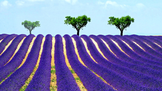
Next we had to remove the existing tree. This was actually slightly more of a challenge than cloning the trees. We now had to clone the sky and paint over the tree to remove it. This was easy but it kept on bringing back a tree from the already cloned trees. So to get around this we just had to keep re-selecting an area of the sky that was empty so we could eventually remove the whole tree. After we’d removed the tree, we then had to bring the flowers back that were in front of the tree, because we couldn’t perfectly remove the tree there. To do this we just cloned the flowers to the left of the tree using a really small brush size. This worked out pretty well. That was it for this particular photograph, so it was time to move onto the next one.
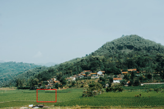
Now we had this new photograph to work with—a nice shot of the landscape in quite a rural spot. That is, until you see the pylon lines that are very protruding in the overall photo. Our task was to remove these so that the photo looked better. I thought that it would be a relatively straightforward task.

So to remove these, we had to use the clone stamp tool once again. So our focus was the top right of the photograph, which was where the pylon lines were located. The top of the lines were easy to remove, and then they got slightly more tricky to remove as they went down. We needed to make sure that we got the sky tone right when we were painting. because it did change slightly, which is something I noticed as I tried to remove them when they got closer to the trees. The trees ended up getting a bit blurred around the edges unfortunately, which was something I couldn’t really change because I foolishly forgot to make a new layer and worked straight on the original one. This was my bad, but I think that the final thing turned out fairly well still. The pylon lines went into the trees a bit so I had to try and remove them while keeping the trees in good condition. I think that I pulled that off fairly well—I basically just cloned random spots in the trees and painted over the lines, which turned out not so good, so instead, I simply opened up the same photo and copied and pasted the trees onto the area that I’d messed up and blurred the sides slightly so it fit better.
Finally, we also had to remove the fence in the field.
0 notes
Text
Building Edit
23.11.18
Today we were doing some Photoshop techniques and experimentation. The posts below talk about what we did—for our last task we had to create a short edit of a building using different Photoshop techniques.
There were a selection of images of buildings to chose from on Interact, and I chose the one below. No particular reason why, I just thought it would be fun to edit since it kind of incorporates the rule of thirds, with the walls on the left and right, and between them is a gap.

Firstly, we had to open it in Photoshop. We needed to add some grids to the composition, so to we went to view > new grid layout, which opened up a new window. It contains different settings and presets which allows us to create the perfect grid. We had to delete the number which was in the ‘Gutter’ box, so that there would be no gaps between the lines that divided the boxes. We set the number of columns to around 6, so there wasn’t too many and not too little. We also made sure that there were no rows, just columns that went down.

After this, we had to hold down the marquee tool so that we could select the rectangular marquee, and then drag it down the first column, so that we would get a solid, even selection, because it would snap to the grid. Then, we would hold down shift so that we could select every other column, without losing the initial selection—a very useful tool. Next we copied and pasted these selections and did ctrl + t for transform, and rotated them 180 degrees upside down. Then we could hide the guides that we’d set up by doing ctrl + h. We had now created something that looked quite abstract and complex.
After we’d done all of this, we clicked on the “half-eaten Oreo” icon in the bottom right under the layer panel, which was the adjustment layer, and click on hue/saturation, so we could colour the image. We had to make sure we clicked “colourize” underneath the sliders. Then we could move the hue slider and pick what colour we wanted and then we could move the saturation slider to make it more saturated or less saturated. I made mine a saturated blue-purple colour. Then after we’d done that, we did the same thing with a different colour—yellow in my case, and held alt on the keyboard, and select between the new adjust layer and the layer below it (the copy and pasted selection layer), so that it was clipped to that layer, and the adjustment would only apply to that layer.
After this, I did some slight alterations in terms of colour, and changed the yellow to a pink. Then we could mess around with the selection a bit, so we did ctrl + t again to bring up transform and then did shift + alt and resized the selection and moved it into the center of the screen, luckily it snapped into the middle so it was completely even.
Then I decided to rotate the selection vertically, so that the selections were going down as oppose to across. I then double clicked the selection layer and added a drop shadow to it. I made the drop shadow have settings so that it was solid with no soft edges, and moved it slightly down. I then gave it an outline, which I made white, and very thin—I think it was set to one or perhaps it was even less. Either way, I am pleased with the result, I think the colours go really well together and the vertical selection looks quite modern and futuristic.
Final Edit
After we’d created the first one, we could make our own edit now. So I went and grabbed a different image from Interact and started to edit it using similar techniques we used for the first tutorial, like using a grid to make sure selections are accurate. I duplicated the image and made it slightly smaller, and rotated it, then duplicated it again and rotated it back to normal, so the previous selection looked like a frame or something. I cut out four rectangles from a duplication of the original image and gave them solid drop shadows, so it looks like they were getting lifted off the screen. I also made them red by applying a clipped hue/saturation adjustment layer. I only kept the layer that the rectangles were on top of black and white.
Final Edit

0 notes
Text
Face Swap
23.11.18
After using the liquify tool, we now had to try our hands at swapping faces in Photoshop. If we wanted to do that, we firstly needed to consider what similarities needed to be shared between both images. They needed to be facing the same way, they needed to have similar lighting, similar file size, similar skin tone, (which can be edited if they’re not too different) and they had to make sure that nothing was obscuring the face, like hair hanging down for example.
I chose Rupert Grint, or Ron Weasley, and Daniel Radcliffe, or Harry Potter. We were told they should link in some way, so I thought these were perfect. I actually contemplated choosing Emma Watson (Hermione Granger) over Ron, but ultimately decided on Ron since I thought I would they would look more similar.
Firstly, we had to chose the pen tool, which is the fountain pen icon on the left hand side in Photoshop. We had to select a good portion of the face, and make sure to go all around so that the selection would link back up with where you started. When the selection was made, we needed to click make selection, which was at the top. Then, we had to make the feather of the selection 30px, because this means that they edges will be very soft and so it will make copying onto the head much easier when we need to start making the skin tones match more. You can also lower the opacity of the face temporarily so that you can align the facial features up more precisely. Then we added a layer mask, which looks like the flag of Japan, and is located on the bottom right, under the layer panel. Now we had to pick the brush tool, make it black so we could make parts of the original head come through (to get the skin tones more accurate) and also make the flow 15%, so that it takes only a little off each time. Finally, we could add an adjustment layer if it was necessary, so we could get the skin tone as good as possible (hue/saturation will usually work well).

Here is a GIF version of the before and after: https://imgur.com/a/oIzqbld
I think I made a pretty good face swap in my opinion—although it doesn’t look like it would be a real person’s face. The skin tone is alright, Ron’s (top left) skin tone is a bit more pink than Harry’s, and you can kind of see that in the final version at parts, like his eyelids for example. Another thing that could possibly need improving is the moustache—it’s ginger of course, which doesn’t correlate with Harry’s hair, which is brown. Although, just above his forehead does look a little ginger, so maybe you could pass it off as just slightly different facial hair, but then again, below that is his beard, which doesn’t look ginger at all. So maybe I could put a layer mask over just the moustache and make it more brown by altering the hue and saturation a bit. Another thing—the face looks a bit too high up in retrospect, so maybe I could bring it down a little if I were to do it over.
0 notes
Text
Using Liquify
23.11.18
Today we used the liquify tool in Adobe Photoshop to create caricatures of celebrities.
We had to find a large image of a celebrity on Google images. I searched for Johnny Depp since he was the first person to pop up in my mind for some reason. Then we went to filter > liquify which was at the top of the screen. It took us to a different window where we could alter the image greatly if we wanted.
There is the forward warp tool, located at the very top left, the pucker tool, which was the fifth tool down, and the bloat tool, the one below it. Pucker makes the area smaller if you hold it down. Bloat tool does what it suggests (as did the pucker tool), it does the exact opposite—makes the area bigger. The forward warp tool lets you use a brush (you can alter size, density, pressure) to move things around.
I used the forward warp tool a bit to alter the size of the head, as well as other things like the nose and eyes. For Johnny Depp, I warped the eyes, and the mouth. I also moved the jaw down, making his head look very long. I made his lips puckered (no pun intended) together a bit more using the pucker tool as well as the bloat tool.

Afterwards, I chose a different celebrity—Aaron Paul. I made one of him, but when I was finished, I accidentally saved over the Photoshop version, so I lost it unfortunately, it was better than the new one, too. Anyway, for this one, I just warped the key features of his head, since I didn’t want to fall behind, and I had to compromise. I think the chin and ears look kind of silly—I should’ve not touched the ears, and warped the head down a bit more.

Overall, I think I was successful in making a caricature-type photo edit. Next time, maybe I will adhere to the method of how most caricatures are made, which is by exaggerating the facial features etc. If the head was somewhat long, then I would make the head super long, so that you would be able to tell who the person was. Again, if the eyes were big, I would make them bigger to create the same effect.
0 notes
Text
Where is my Mind?
16.11.18
Today we were given a task involving Photoshop. We had to take an image of this head and edit it so that he looks like he was sliced up. We were given a tutorial on how to do this.
First of all, we had to make a path using the curvature tool, and make an oval from one side of his head to the other. When the path was created with the curvature tool (using select at the top), we made sure that the feather was set to 0. Feathering essentially decides the softness or hardness of the edge of the selection. After this, we needed to make a new fill layer. To do this, we had to go to layer > new fill layer > solid colour. I chose red as the colour as I was wanted it to resemble what it would actually look like inside.
Then we had to reselect using the pen tool to encompass all of the head. After that, we copy and pasted it into a new layer, then moved the layers around a bit, so that the top of the head was above the red oval layer. Using ctrl + t, we then masked out the hair from the original image using the black paint brush, if we wanted to fill make it come back, then you would use white. We then rotated the top of the head a bit to make it look like it was being lifted off, like a kettle. Lastly, we needed to give it some move realism, so we went on the mask layer of the red oval, and started to give it some shadow using the burn tool.
Result
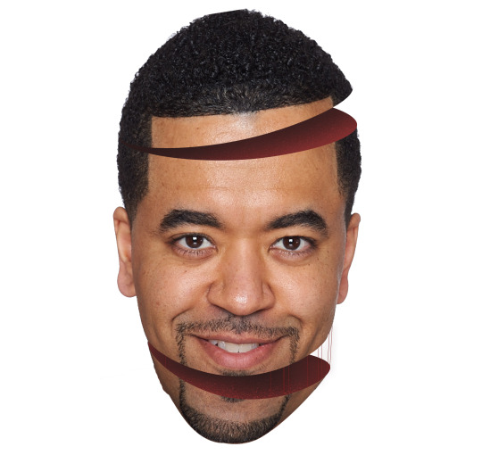
Above is the final result of the tutorial. After following the tutorial for the top of the head, we were told to replicate that somewhere else on the head using the notes we had written down. While I did write notes, I still ended up not being able to follow them, I don’t think I wrote enough/made them detailed enough. It was just a bit tricky to remember, with all the masks etc. After receiving help with it, I ended up with this graphic. I made it so that the chin was hanging off of the head, and also added these strands that are supposed to look as though they’re holding the chin from falling. Along with this, I also gave the insides some texture. I looked for one resembling blood texture, and the closest I could get was these water ripples, which I altered a bit. It kind of looks like it’s bubbling, but I still think it looks better than just leaving it as a solid red colour.
0 notes
Text
Post Pitch 2 review: Reflect
16.11.18
After our first pitch, we were given feedback etc. which I’ve talked about in the last post, so afterwards, we needed to improve and make some new graphics (e.g. the logo, poster) and then present them to the group a second time.
We made a PowerPoint presentation with a few slides showing the previous design of the board game, and then the latter slides had our new and improved graphics with notes on the sides when we presented. We each presented our respective graphics this time, unlike the last time when it was two of us just talking about one thing. I was extremely reluctant to doing this presentation, since I struggle with speaking in front of people, but once it was all over, I did feel somewhat proud of myself.
My script
I wrote a short script of what I would be saying for my part, which talks about my logo. I didn’t even need to use it in the end, I just took it up with me and I basically memorized my lines, with the added help of the notes on the board. Here’s my script anyway:
Here are the logos I created. I tried to make them look simple so that children could understand them. I chose the primary colours and green because they’re eye-catching and most children are likely to have seen these colours the most in their lives. I made the arrow in front of the logo look like a leaf to fit with the jungle theme, and the squares at the end of the logo are supposed to represent the board tiles.
I managed to say most of that, and I only flubbed one of the lines, so I’ll count that as a win.
What feedback did you get from the group?
After presenting, we were given some feedback, I don’t think I was able to salvage it all, but what I remember was a question that asked something along the lines of “Why would parents spend money on this product? They could just watch a video about teaching colours or something like that.”
Well essentially, it is a versus game (if you’d like it to be) so of course, you can’t really pull something off while watching a video, since it’s a board game, and the reason for it being a board game is so that the child can have a more hands-on experience with colours—a video won’t really let them interact with anything. Plus it’s also a more entertaining than watching a video. But I do get the point that they were trying to make.
I wrote all of the feedback once I sat down after presenting, and still I only recalled one other comment, which was “Logo already looks like a logo—looks professional.”
I do really appreciate this comment, since I did try my best to make it look like a logo that you would see on a similar product if you went to a toy shop or something like that. I think if there were any other comments, they were likely praise, since if there was more criticism, I think I would have remembered it once I sat down to write it down.
What went well?
I think that overall, everything after the first presentation went actually really well. With the first presentation, all we had going for us was one outdated graphic, and two people speaking about it, not to downplay any of that by the way. From the creation of the graphics to the final presentation, it was just better than the first time. The addition of a logo, a poster and a new board game design just combined to make a solid second part of this mini project. I think that all three of us clearly got our points across when talking about our respective new graphics. Also, this time around. I think that each of us contributed evenly, we all said our parts, and it was just better choreographed and planned this time. I am also proud of the logotype that I came up with—the one with the arrow at the start and the squares at the end to represent the game tiles, the one that the person was referring to. Also, throughout the presentation, I did try my best to keep looking back at the audience.
What could be improved?
While I have been saying that it went well overall, there are still aspects that could be done better still in the future. Firstly, the graphics themselves. They were all good, but of course, they could still be improved, if only very slightly (namely the board game graphic). Personally, the logo I made (the one with the leaf, the one that only has the initials) could need some work—it still looks a bit flat to me, like kind of cheap even, but I still like it, I just think that I could perhaps make it look maybe a bit more 3D—like I could add some highlights somewhere among the logo, and change up the colours a bit in some way. Now I said that the presentation went very well this time around, but there were still slight hiccups (not literally). Although I’m definitely not going to blame any of us for slipping up a little, and I haven’t done a presentation in a long time (and I would love to keep it that way), so I think that it was very likely that I would slip up at least once. This is more of a ‘what else could improve this product as a whole if we had more time?’ kind of question, but I think that a social media ad, a mobile app, with an icon, an animation and or a box/package that the game comes in could all improve and solidify the product and ideas behind it.
Final Poster

I would like to also dedicate a bit of this post to talking about final colourboard poster, courtesy of Toby. I think he did a great job of it to be honest—and actually, my top logo looks a lot better somehow, it looks like how I envisioned it could look if I were to give it some small improvements, minus the highlights that I mentioned in the what could be improved segment. Below is the board game, which I really don’t have any criticism for, except maybe make the gaps between the pathways, if you get what I mean—but it’s very minor, it doesn’t really matter in the grand scheme of things.
As for the graphics on the poster, I think they portray the jungle theme well, and I do like the bottom of the poster since it goes well with the board game graphic. I’m not a huge fan of the top half of the poster if I’m being honest, I think that the background of the sunset kind of clashes with everything else a bit—perhaps if it were just a bit more desaturated, it would fit in better. The hanging leaves at the top also look a little off, I think it’s the high contrast between the dark leaves and the lighter shaded leaves.
Overall though, I do like the poster and I think it conveys all of our graphics well, though some other things could be added, maybe some information about the game, and the age rating icon somewhere on there.
0 notes