
This is my blog post to document and dissect my day to day progression, displaying my work throughout the course.
Don't wanna be here? Send us removal request.
Statistics
We looked inside some of the posts by georgiagower-blog and here's what we found interesting.
Average Info
Notes Per Post
0
Likes Per Post
0
Reblog Per Post
0
Reply Per Post
0
Time Between Posts
3 days
Number of Posts By Type
Text
12
Photo
4
Video
1
Last Seen Tumblr Blogs


Fun Fact
Tumblr is used by 21% of adults online aged 18-29 years.
Text
Final Evaluation
When given the brief of ‘Under the Influence’ I began by establishing the context of the brief. With this being that there is no set theme, I was allowed free reign over what I wanted to produce and set my own project in relevance to my specialism and interests. My initial reaction to the freedom and flexibility of this project scared me as I was worried I would get lost with no direct guidance throughout the eleven weeks, therefore I began by recording clear target areas that I wanted to accomplish in the aim to keep me focused and able to produce as many practical outcomes as possible. By producing a comfort zone diagram I have a visual aid in understanding what I am already capable of producing and which areas I can challenge myself in to ensure I am improving my skill set. This will allow me to create outcomes that include techniques and mediums that I feel confident in using, combined with a mix of skills that I can improve on and build my productive outcomes. I decided to specialise in collage and photographic media as I can explore the power of creating an audience reaction whilst continuing to express my interests in fashion media and style. The running theme throughout my project is questioning sexuality and female objectification, discovering opinions on what is socially acceptable within society, media and gender. My aim is to be able to create an audience reaction, positive or negative, by translating a worldwide opinion on nudity and acceptance into a single image.
To initiate my investigation I began by choosing four topic areas that I am interested in to ensure that whichever path I decide to take my project in, I will not get bored or find myself struggling to further my developments. I chose to explore the opportunities of magazine layout, fashion photography, album covers and layered collage. These areas all revolve around my overall specialism of collage and fashion media, therefore by finding artists related to each area, allows me to compare and contrast the possible outcomes I could produce and gain a broader understanding of my personal style preferences. To gain a variety of inspirations and sources, I combined primary and secondary research in order for me to approach my project with as many influences as possible. At the beginning of the project my research was mainly sourced through websites, books and magazines as I found these were the best origins for information on artists and their artwork. However, as I progressed into the following weeks, it became useful to go and gather my own primary evidence like my human figure observation and drawings. This allowed me to push my drawing techniques as well as achieving an alternative source in comparison to an already captured image. The most impactful research that I gained was from the street art tour in Brick Lane. Having a first hand experience surrounded with hundreds of artists work was a unique experience in which I found valuable as this was where I found my inspiration for my final piece, investigating INSA’s work with augmented reality and the concept behind scanning over a still 2D image and it coming to life and becomes 4D. By looking at artists Patrick Waugh and Bruce Weber, I am visually inspired by the collective book layout of manipulated photography and the techniques of blending photography with collage to create a contrast of texture and mediums. Comparing this style to David Carson’s layout design, his structured and linear aesthetics create a more rigid and traditional approach to displaying photography and illustrations. I prefer the loose and hand rendered look to work, in which i can achieve by exploring image manipulation allowing me to combine my photography with traditional techniques to achieve a distorted style. By looking at these artists it allowed me to finalise my project concept and the style in which I am going to explore through research and practical testing.
To begin my practical experiments I responded to workshops set in the introduction weeks of the project. I used these as warm up productions that allowed me to begin to explore the possibilities in which techniques and methods I could use when experimenting in my own project. To ensure I had a varied body of work, I set myself the target of completing four different mediums and techniques. This allowed me to keep on track of my production and also gave me different finished looks amongst my work. My main technique of working was collage, a smooth blend of digital and analogue processes to make a visual comparison between a hand rendered look and a graphic finished aesthetic. I also explored the effects of photography and how my imagery can be altered with digital techniques to produce a new style. I produced lots of patterns from my own photographs and drawings to use these as background fillers instead of block colour, with the aim to add texture digitally to resemble the layers you gain from traditional techniques. To explore my theme of social modesty and female form, I put together a photoshoot in which I gathered imagery in order to further develop by manipulating, layering and distorting the photographs. These alone created a reaction amongst male peers expressing their opinion of nudity being something that isn't acceptable however the images did not show anything that would be censored for public viewing, just simply celebrating the natural lines and shapes the figure produces. I also used printing techniques, drawing with inks, adapting scales of work by posterising and pasting onto walls and traditional photography techniques such as cyanotypes. I wanted to push my practical development out of my comfort zone, therefore following my inspiration form the street art tour I also developed my work into short animations in response to INSA’s augmented reality artwork. The strengths of my creative decisions in the processes I used were that I created a wide variety of work exploring all techniques, textures, tone and scale whilst maintaining a fluent style throughout, allowing my production files to flow in a natural order and shows development from each experimental piece.
My critical perspective changed throughout my project as I originally was responding from artists works and techniques, however I then found myself questioning my work and asking myself why I was producing work in this way and what message I was trying to project. I transitioned from working from inspirations and created my own message to respond to, questioning female objectification and the social acceptance of public nudity. When producing my initial experiments I had to ask myself why I was producing work in such a way and why I felt the need to express my opinions through my art. It was a natural instinct to want to celebrate the female form and use it amongst my work, however I noticed that I still had to cover up assets of the female form to abide to a social acceptance of modesty. This then made me question why universally we feel so strongly about covering up the female body and why it is more acceptable for men to expose themselves and not be objectified or frowned upon in the same way as women. Therefore my aim was to express these views through imagery and create an audience response through these experiments.
The decisions I made with materials aided my productivity in practical outcomes as the cut and paste techniques I used in traditional collage, left me with off cuts and excess materials in which I used to produce another outcome. Each design I created led directly into the next mixing materials, techniques and textures to vary the aesthetics of my artwork. My experiments with newly learnt techniques such as the animated pieces and the ink works allowed a deeper understanding of the opportunities my work could have been taken if I hadn't have chosen collage as my main technique.
I chose my final piece to be an A1 image of the female form with the male form layered underneath. In this image I wanted to express the views upon having nudity displayed in a public place, however I have covered all areas of the body that would be deemed ‘indecent’. I have still tried to inform the audience of the importance of female objectification and portraying the message to celebrate out bodies in a positive and free environment rather than shaming and controlling a from of expression. Having pushed myself out of my comfort zone i was able to produce a final piece that is different from my normal type of posterising and xerography productions. My peer and tutor reflections and feedback have aided my production throughout the project as my work continuously received an automatic response of profanity and strong social views. This re assured me that the work I was producing was creating a reaction which was my initial aim of my project. This has aided my understanding of the power an image can have and how a message can be translated through imagery. I feel I have been able to expand on this concept and improved my knowledge on conceptual art that has a greater meaning behind it.
Overall I am happy with the progress I have made over the project. I feel my understanding of the the importance of creating an outcome for a purpose has been improved and developed by using my own concept ideas to carry me through the project. My project concept has allowed me to complete outcomes in a range of techniques whilst being able to maintain in my specialism. I think I have answered the questions I had set out to investigate and have gained a new perspective on my own views and opinions.. If i was to go back and complete my project again i would complete more photoshoots in order to gain a wider range of photographs to work from, however I found it beneficial to produce multiple outcomes from the same source as my comparisons between techniques and methods were more visible. I feel I have stayed true to my specialism and style of working throughout the eleven weeks and have found deciding upon my own concept beneficial in understanding the pathway in which I would like to further into a career path.
0 notes
Text
Final shoot
Whilst having my final piece display planned out, I needed to shoot my final photographs in order to choose one to display and create my animation for the augmented reality content. Having chosen to express sexuality and female objectification I wanted to use the power of a male and female body contrast. By doing this I am able to show both genders side by side and create a reaction that would either celebrate the human form or highlight the public opinion of female modesty and shaming of nudity. During the shoot I tried to capture angles of both genders side by side to accentuate the similarities and differences in shape and body line. This showed the female and male form in the same light to achieve a response that was equal and fair on both genders. The fully exposed forms would not be appropriate for an environment of education therefore I tried to portray my message whilst still conforming to avoid censored content.
I found by layering my images I was able to create a doubled body effect placing the male figure under the female to keep to my style of abstract and manipulation. I also inverted these photographs to create a greater contrast between the images and allowed a tonal layering that added depth.
When creating my animation for the augmented reality content for my display, I wanted to create the effect of madness and confusion to add emotion to the still image. Trying to portray conflicting opinions on social views and the constraints women have when celebration of the female form. Therefore I created alternative images from my photoshoot that were dramatic and would act as an effective contrast when being played in a sequence. I achieved this by placing extreme colours next to each other and created sharp shapes amongst the animation to show movement. I chose triangle shapes to make a shattered effect, again to express my conflicting opinions of social standards.
The peer response I received regarding my final piece was positive in the aspect of being able to express my personal overlook on public opinion. Also being successful in creating an active repose to the emotion the augmented reality added to the piece. Having spoken about my project and context of my assignment, I feel I have achieved my goal of creating an opinion and conversation regarding personal opinions towards sexual objectification and the un written rules of modesty.


0 notes
Text
Texture collage and prints
Below are a collection of development pieces exploring more analogue and digital techniques. I have experimented with the use of xerography to manipulate my photography to create an abstract style. I also used the printer to print my photography onto a textured background, carrying the use of a worded print to contrast the black and white imagery. Also gathering vibrant sheets of paper I was able to print onto block colour with the words layered over the top, this then meant I had a contrast of colour and texture. The words horizontally crossing over the page creates an almost patterned design to the images. This allows me to compare my own made patterns to an uncontrolled text pattern. I feel the text pattern has a more authentic look to it and sits well as a background texture, allowing the imagery to stand forward off of the page. I also created a layered collage in which i had my imagery printed and layered onto an A2 sheet, painted over, peeled off and re stuck down. I continued this process in repetition to create a complete sheet of layered imagery and textures. This allowed me to see the visual effects textures have and how depth can be created by a repeat process.


0 notes
Text
Augmented Reality
A technology that superimposes a computer-generated image on a user's view of the real world, therefore providing an overall view. Augmented reality is the integration of digital information with the user's environment in real time. Unlike virtual reality, which creates a totally artificial environment, augmented reality uses the existing environment and overlays new information on top of it.
The term "augmented reality" was coined at Boeing in 1990 by researcher Tom Caudell. He and a colleague, David Mizell, were asked to come up with an alternative to the expensive diagrams and marking devices then used to guide workers on the factory floor. They proposed replacing the large plywood boards, which contained individually designed wiring instructions for each plane, with a head-mounted apparatus that would display a plane's specific schematics through high-tech eyeware and project them onto multipurpose, reusable boards. Instead of reconfiguring each plywood board manually in each step of the manufacturing process, the customized wiring instructions would essentially be worn by the worker and altered quickly and efficiently through a computer system.
When using augmented reality in my own work i am using it as an enhanced version of reality created by the use of technology to overlay digital information on my photograph images of something being viewed through a device. My final piece will be viewed live in person as an A1still photograph, meaning that for it to work, it must allow the user to see the world as it is right now, and use that information to manipulate the space, pull information out of the environment, or alter the user’s perception of reality.


0 notes
Text
Cyanotypes
Having an interest in photography and it being a running theme throughout my project, I wanted to use a traditional process to discover the visual differences and advantages analogue processes have in my project in comparison to digital techniques.
I found that the length of time exposed to the light created different effects amongst the cyanotypes. If the image was exposed for too long I lost the detail of the face however if the image was not exposed for long enough it would leave the paper with a faded outcome and therefore lose the detail. I also had to create the right coating of solution onto the paper for the ink to be absorbed, trailing both heavy coatings and light coatings to discover the best consistency. It took me four attempts to be able to gage the right consistency of solution to light exposure to gain the clearest image.
After exposing my photographs and washing off the solution I placed two of my images into a coffee coating and ,eft it to absorb onto the surface. This was to change the colour of the image, to dull and make a clearer final outcome.


0 notes


Text
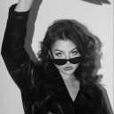
Female Objectification

Women are too often reduced to the sum of their body parts and it is all too obvious and difficult to ignore, we tend to focus on sexual objectification. The difference between the way women and men are portrayed in national newspapers and other media, social standards and global opinions on female nudity.
0 notes
Text
Printer Collage and Posterising


From my original photographs I wanted to produce a range of designs that combined both digital and analogue collages, allowing me to explore the visual effects of mixed media and techniques. I also tested the use of scale alongside my collage pieces in order to discuss the power and impact size has when reacting to art work.
From my pattern designs I used digital layering to combine my photographs with the added texture of my designs underneath. This allowed me to incorporate blocked abstract shapes amongst my digital edited images, creating a digital collage with the effects of traditional technique.
in comparison to my smaller scaled pieces, I gathered three different materials in the aim to create a contrast between the textures. With the same aim of showing an abstract and distorted style, blocked shapes were created to reveal the worded layer underneath the image. I wanted to explore the use of worded textures as well as plain colours to add a depth to the flat image, adding interest and conflicting messages as the written pages have no relation to the photographs.
Whilst focusing on conforming to social views on female form and nudity I wanted to explore the impact of having no identity to the photographs. Rather than simply removing the faces I found it more effective to collage over them to keep the style and technique of the work. This also allowed me to add a comical side to my art and also introduce a bit of colour. I found that if the figures had no identity it was almost like they had less of a human quality to them as the photographs can not be pin pointed to a specific person.
In progression I am going to carry further the use of creating no identity to my work and continue blending faith digital and traditional processes. However I am going to turn away from my large scale work as I am comfortable with this process. This is also down to the fact that my smaller pieces contain more meaning and translate my messages in a more impactful way. I want to push myself further in new skills and techniques that I haven't used to the my full potential yet.
0 notes
Text
Mid-Project review
During the past two years of learning new skills and processes, I have visibly adapted a style in which I naturally work in. Using collaging techniques, digital editing and posterising, I express my sense of style in abstract and unique work allowing me to explore aesthetics of my pieces and create multiple designs using the same subject starter.
When given the brief for the final project i wanted to express my passion for collage and manipulative photography, therefore I was able to produce a range of work that incorporates both analogue and digital processes as well as discovering how to smoothly gel the transitions between the two.
Although I have created my own personal style of working, I still want to push myself in the final weeks of the project and create a final piece that is adapted further than my previous pieces. Rather than displaying work that is cut and pasted together that has a hand rendered look, I would like to put up something that has more of a finished and smooth look to it, something that will push my skills and force me to leave my comfort zone.
My practical outcomes are supporting my project proposal and personal brief for this project, however my next actions are to support these outcomes with my research and artist responses, therefore being able to compare and contrast relevant recourses that will aid my practical developments. Therefore allowing me to continue my progress with new knowledge and fuel my developments in response to my research.
I also need to question the reasons for the choices and pathways that I have taken during the project. By questioning my descisions I am able to retain a conscious narrative to my outcomes. Also allowing me to meet the criteria for a high standard of work.
I have found myself questioning my work and asking myself why I was producing work in this way and what message I was trying to project. I transitioned from working from inspirations and created my own message to respond to, questioning female objectification and the social acceptance of public nudity. When producing my initial experiments I had to ask myself why I was producing work in such a way and why I felt the need to express my opinions through my art. It was a natural instinct to want to celebrate the female form and use it amongst my work, however I noticed that I still had to cover up assets of the female form to abide to a social acceptance of modesty. This then made me question why universally we feel so strongly about covering up the female body and why it is more acceptable for men to expose themselves and not be objectified or frowned upon in the same way as women. Therefore my aim was to express these views through imagery and create an audience response through these experiments.
0 notes
Text
Patterns
Having developed my abstract aesthetic tiles into colour corresponding digital pieces, I wanted to explore the possible effects that pattern could have when used as a layered texture. When i produced my female composition photographs I placed colour to add texture and depth to the imagery therefore by creating my own patterns i have he opportunity to scale the imagery to fill the coloured sections with patterns and drawings that relate to my photographs.
I began by creating a basic pattern using an analogue process, beginning with basic shapes to allow a sense of understanding to the process of making an image translate and follow as a pattern throughout the page. By completing this by hand, I could switch and rotate the four sections and visualise the stages necessary. This allowed me to be more creative when creating digitally as i was aware of what was possible and what would look the most effective.

I then began digitally by scanning in my body composition drawings that I had inked and painted on top of, I wanted to include these as I could visualise the aesthetics of them as a repetitive pattern. I experimented with scale, colour overlays and layering of different images to create a depth of texture. I also chose colours that i thought complimented the pattern design as well as the imagery in which it would be placed into.


I then experimented with using the original photographs as the pattern, using large scale images to be able to see the photos within the pattern clearly and also scaled down to create more of a balanced pattern that displayed more of the colour balances rather than the actual images inside the design. I used filter effects, colour overlays and distortion tools like liquify to create an abstract and obscure pattern to compliment the photography but still not distract from the imagery.


0 notes
Photo


Street Art Tour
Having gone on the Shoreditch Street Art Tour, I was given the opportunity to explore the vast diversity of art in the area and the scales in which art is being produced.
The piece of art that stood out for me was INSA’s stunning piece "The Cycle Of Futility" is a fascinating development in INSA's combined reality/virtual reality art. The large scale pairing was produced onto the side of a building which stood out due to the vibrance and scale of the art. This alone created a visual appreciation, however the tour guide then showed us how this piece could be brought to life. INSA created an app in which if held in front of the art, would show the piece as a moving image. When painting the art onto the wall he took a picture after it was completed and then went bak and painted over it, took another picture and so on. It was then created into a stop motion animation from the still images captured in the process of putting up the artwork which can the be seen through this app, therefore successfully transforming a still image into a virtual reality.
The idea of creating work that can then be seen in a completely different light really excites me. i wish to explore augmented reality and the possibilities and path options it could give me to progress my work, combining two different mediums to display my work, 2D and 4D.
0 notes
Photo


Collage
Wanting to experiment with collage and layering, i gathered newspapers and magazines in order to collect a range of textures between the pieces of imagery. I selected imagery that would make the audience feel an emotion, in this case the response i received was a sense of uncomfortableness. This was down the the scale of my collage, having the mouth in the place of the head in such a large scale allowed an abstract style. I also used the photocopier to alter the colour and scale of the body section. I layered these on top of each other and peeled away at the top layers to reveal the colours underneath. This adds an extra layer of texture to try and create as much depth as possible.
0 notes
Photo


Development
Having enjoyed the Abstract Aesthetics workshop i went back and looked at my body composition photographs and wanted to incorporate the two together as they both use the visual effects of negative space.
I wanted to create a coloured selection of tiles as i wanted to move away from the monochromatic palette. I wanted to ensure the styles of the tile related to the photographs however i struggles to create a likens of shapes between the two.
To progress i want to create a colour palette that will have a meaning to the image and be specific in my selections. Linking colour and public emotion to create a response that will compliment the imagery
0 notes
Photo


Abstract Aesthetic
Based on minimal design ideas of Kazmir Maldevich and Sol Lewitt, I developed experimental pieces that explore the basics of aesthetic composition. This gave me the opportunity to refine and test my visual language, battling between precision and accuracy and embracing accident and chance.
Using monochromatic black and white squares I was able to create simple and minimalistic designs that correspond to Maldevich’s style and methods of working. By splicing the opposing colour to the sheet i was working on top of, I created strips of paper in which i could either purposefully place onto the paper or use an accidental method. I created four tiles at a time and chose to produce two considered tiles and two tiles that were by chance. I felt that the less amount of paper i had on the square, the more effective it looked with the composition of negative space. However when i held the strips above the tile and dropped them onto it, the pattern and layering of the accidental method worked really well, therefore showing a complete comparison between considered and accidental styles of working.
The comparisons made between peers showed variances altho being set the same tasks and using the same minimalist materials. We discovered that most students preferred to have control over where their strips were placed, resulting in many of the tiles looking like they contained letters, therefore the considered placing left a subconscious design of iconography by creating existing and recognisable shapes and symbols. The accidental method was less popular however i preferred this style as it created layers and textures, allowing me to be more free with my work and therefore produce more as i wasn't so pressured for a specific outcome.
I am going to use a more free and loose method of working to progress my production of work. This will allow me to create a bigger body of work and also test a new style of working.
0 notes
Text
Saul Bass case study
Developing the depth of comparison and contrasting opinion needed to show a detailed and explored depth of research. By using the work and inspiration of Saul Bass, I am able to investigate the visual language and meanings behind his work and apply these traits into my practical experimentations. As Bass' ideas are based on simple and stripped back graphic designs, it allows a universal understanding as there is no need for context behind the work. There is a clear message or emotion translated through his work without the background understanding, meaning his work is timeless and will always be understood.
The first step to gaining an understanding of Bass' style of work was to compare and contrast three pieces in which he worked on between 1959 and 1978. The first was a promotional poster for the film 'Anatomy of a murder'. This is a very intense piece of art as the contrasting colours red and black immediately translate into an emotion of violence and danger due to the large sea of red. The use of negative space is used effectively as the black space is a lot smaller therefore your eyes are drawn to it first. Bass uses cut out lettering within the black area therefore you are reading the title of the film first. The style in which this poster is produced is quite raw and has a hand rendered look leaving a cut out aesthetic. This is making the piece original and unique as each shape is of a different size, whilst contrasting the intensity of the colour to the almost childlike shapes and parts of the figure. Having such a simplistic and muted style allows your imagination to fill the negative space and start to begin thinking about the narrative to the film.
The second piece I looked out was the 'Girls Scouts' logo. This has a completely different vibe to it as the green colour used is a peaceful and relaxing visual. The organic fluidity of this design is very distinctive and pure with an innocent look to it in the smooth lines and shapes used. The logo cleverly uses negative space to create three faces within the image, all of which are the same figure but they all look different due to the colour and shape of the rest of the logo, this resembles unity and acceptance which is what the 'Girls Scouts' is all about. Therefore Bass was able to portray a message within the work that resembles the ethos of the comity itself.
The last image is a poster again but this time for the film 'Bunny lake is missing'. The first thing that jumps out to me about this piece is that is a lot more monochromatic compared to the other two artworks. The colouring is a lot duller and the large area of black feels like a pit of darkness especially with the word 'missing' sitting above it. The hand rendered look is back in this design as a girl has been cut out of the black negative space however she is still attached to the edge of the square sending off a message of some sort of hope and opens up the possibilities in which the story could take. The negative space in this poster is used as a 'looking room' which means the area around the figure is used to look into for opportunity and hope, which contrasts with the darkness of the colour black, therefore sending mixed messages to the audience.


I also watched the title sequences to the 3 Saul Bass films. The first was ‘Anatomy of a murder’, this title had a bold statement as each segregated limb was synchronised with the beat in the music making a dramatic and purposeful effect. The stop motion technique aided the hand rendered look to the shapes and construction used. Following the sound tempo and and accents it creates a metaphor for the storyline of the film, each agent and beat describing a heightened part of the narrative. The second sequence was ‘Psycho’ which had a more extreme and eery feel to it. The pitch of the music tightened the dramatics and added a startling and impactful suspense. The last sequence watched was ‘Seconds’, this title sequence has a disturbing and un settling feel. It incorporated human interaction but distorted and manipulated facial features into an unnerving visual. It was almost hypnotic to watch and the lack of identity left an uncomfortable emotion.
To compare and conclude Saul Bass' work I had a look at other artists that have similar style to Bass and people who have been compared to him. Noma Bar, Cody Hudson and Olly Moss all express qualities of his work all in different ways. Noma Bar uses negative space like Bass to create imagery within imagery, cleverly creating silhouettes and smooth outlines to create a simple but effective design. Cody Hudson uses the hand rendered look of shapes and composition to create simplistic but aesthetically pleasing design. Olly Moss expresses a relationship between type and image and the way in which he composes his work shows vision and space for questioning the message. He also uses segregated shapes to portray a unique and minimal look. Having seen other artists work that has clear resemblances to Bass' I have written three rules in which will help me to respond in the style of Saul Bass, these are; reflect upon narrative with the use of imagery, shape and colour, use negative space with unique placement and contrasting colours and finally, use segregated shapes for a minimal, organic and a hand rendered aesthetic.
My response
I Wanted to respond to Bass' work in a way that I would enjoy and still be able to put my own style on, therefore I decided to create my ideas digitally. I chose an album cover that I thought I could manipulate into a resemblance of Bass' artwork so I began by layering imagery on top of each other and blanking out the areas in which overlapped, managing to use negative space to create shape and silhouettes. After I was had done this I decided to explore more with the use of layering so I wrote out one of the songs lyrics that was on the album and layered it over the top of my silhouetted design. I like the effect this created however I wanted to still keep the integrity of the image, therefore I spliced up both the image and the lyrics and placed them alternatively in strips to create a contrasting pattern. I also furthered this by using xerography to stretch and alter the image to create an even more manipulates design. Reflecting upon my outcomes I began off strong with the use of negative space in response to Saul Bass, however I felt too limited in what I could produce in order to keep it simple and minimal. Therefore I began adapting my ideas too far and ended up creating something I found visually exciting rather than resembling his work. I will be using my analysis of Bass' work to help improve my own style and explore working in more styles that will challenge and better my work.

0 notes
Text
Out here, in the field
The aim of this workshop was to produce non-narrative sequences that generate bigger ideas. The content of the panels will be developed from drawings of the immediate space around me, encouraging me to record my immediate responses. By creating a three windowed view finder i was able to capture smaller detail within a large area of perspective, ensuring a lifelike sketch of my surroundings rather than trying to record a large space and loosing the accuracy and likeness.
I decided to capture my day at the zoo, expressing the world around me in an unexpected way as I was surrounded by many global animals that could place me anywhere in the world. After the day of sketches and recordings using my view finder I was able to appreciate the accuracy i was able to capture by focusing on sections at a time.
For my comic I wanted to keep it simplistic and clean, therefore I only combined three drawn panels as i enjoy the layout and look it has as it is easy on the eye. I chose my three Giraffe sketches due to the effectiveness of the pattern on the skin that translates onto the three panels, allowing me to experiment with shade and shape. Keeping the deign black and white made sure the detail of the animal can be well seen without distraction of colour and the grey scale helps to use the imagination of other possible things i could have drawn. Having added the words “head in the clouds” was a composition decision to bring the three drawings together and be seen as a collective. It also confirms the animal i drew as a giraffes neck is long and ‘in the clouds’.
Having drawn my sketches i edited them digitally in order to get a clean and crisp line, also making it easier to edit and erase sections i wasn't happy with. i was also able to add correct tone by editing digitally as i could ensure each colour matched and was adapted to the exact percentage. Below i have my peers work along side mine to show the comparison of an analogue comic and a digital comic. Toms piece is more sketchy and rough, keeping a pure integrity to the work, exploring scratchy and harsh marks makes a complete contrast to the smooth and sharp lines of mine. I think both comics are very effective whilst being completely different in style. Toms shows a more rural landscape with a broader landscape whilst mine shows a specific view point and perspective. Next time i would like to sketch in a rougher style, keeping my lines loose and scruffy to capture the integrity behind the drawings.

0 notes
Video
vimeo
Spring Board Presentation expressing initial ideas
After the brief was introduced I have researched and collected many influences in which have inspired me in my initial research. By producing a Spring Board I have been able to have all my ideas in one place to explain where i think my project could go and explain where my interests have originated.
When the brief was introduced to us I was unsure in where to start my ideas so i began by recording my influence and inspirations from the world around me and everyday life. By doing this i could select an area of interest in which i would be able to produce the most amount of work towards. The possible areas i came up with are fashion photography, design layout and collage. These three areas are thing i feel most inspired by and motivated to create exciting work.
When exploring my areas of interests i discovered the artist Patrick Waugh who created the BOYO zine, which is a collection of fashion photography, photo collage and typography in the layout of a magazine. This style and type of product immediately inspired by and opened my mind to the possibilities of producing work in this style, exploring analogue and digital processes to gage effective ways of working.
I am excited by design and visual characteristics of layering, colour and composition. Also using previous interests of collage and manipulation to produce unique and original work that can be pieced together as a collective to resemble the fashion magazine layout but instead using images that i have distorted and made exciting. Having an interest in layout also means i would like to explore the use of typography and turning words into pieces of art, translating a message in a creative and original way.
0 notes