georgiahorton98
36 posts
Blog dedicated to my research
Don't wanna be here? Send us removal request.
Statistics
We looked inside some of the posts by georgiahorton98 and here's what we found interesting.
Average Info
Notes Per Post
4
Likes Per Post
4
Reblog Per Post
0
Reply Per Post
0
Time Between Posts
20 days
Number of Posts By Type
Text
15
Photo
2
Last Seen Tumblr Blogs


Fun Fact
Tumblr has been providing a Korean-language service since 2013.
Text
Monday 4th January
Today I will starting my next project on the theme of war. I will be doing my research on 3 different artists that have covered the same topic in a range of ways and styles, from modern to classical painters.
Francisco de Goya
Francisco Goya was a Spanish painter and printmaker. He was born into a lower-class family in 1746 in Fuendetodos, Aragon. He studied art from the age of 14 under baroque painter José Luzán y Martinez and then later moved to Madrid to paint under neoclassical artist Anton Raphael Mengs, this would shape the next part of his life greatly, becoming a court painter for the royal Spanish Crown in 1786.

Charles IV of Spain and His Family (1800–01)
In 1793, through texts and letters, it was found that Goya suffered from a unknown medical illness which eventually left him deaf. After this point in his life, his works became more dark and negative.
In 1807, Napoleon ordered the French army into Spain known as the peninsular war, with Madrid being where Goya lived at the time. While not spoken outright in text, through his series of paintings and etchings it can be implied that Goya was against the war that took place, showing the brutal happenings and practices of the French army.

The Third of May 1808 (1814)

Y no hay remedio (And it cannot be helped) (1818-1824)
The last period of his life, where his famous series the Black Paintings (1819-1823) were produced, show the accumulation of all the darkness within Goya’s life. Alienated by the war in Spain, Goya isolated himself. Later, he would move to Bordeaux in France where he completely the last of his etchings La Tauromaquia. After a stroke that left him paralyzed, Goya died 16th April 1828 at the age of 82.
I really love the figure work of Goya, he is one of my favourite artists. Inspired by his work, I would love to use the etchings he did as an inspiration. His pieces were not based of what he has seen but what he had heard, this is something I could take into account when doing my piece. The way he incorporated body language more than anything is my favourite and tells more than the expressions on faces. I could emulate his style by either doing a lino print or and plastic plate etching.
Henry Moore
Henry Moore was a British abstract-sculpture artist. He also produced many drawings among other graphic works.
He was born in Yorkshire, England in the year of 1898. Born into a poor family of 8 children, his father was determined not to let Moore become a miner like him and encouraged him to pursue education. After being accepted into a grammar school, his headmaster had payed attention to the passion and talent Moore had for medieval-sculpture. Set on making art his career, Moore attempted to get a scholarship despite the disagreement of his family, who did not want him to become a sculptor.
In 1916, on Moore’s 18th birthday he volunteered for Army Service during the First World War. He was the youngest of the regiment and was injured later in 1917 during a gas attack during the Battle of Cambrai. After recovering from the attack, he spent the rest of the war as a physical trainer, romanticising the war at this point in his life. He later went on to change his thoughts on this, seeing war as “anti-life”.

Reclining Woman (1930)
After the war and over the next few decades, Moore would dedicate his life to developing his style and teaching sculpting.
When WW2 started, the school Moore was teaching at in London was evacuated. During The Blitz, Moore did intense graphite artwork of people in the London Underground subway while sheltering. Later, these arts were bought and used as war pieces, making Moore a wartime artist.
Moore’s home was hit by shrapnel in 1940, prompting him to move out of London and into Hertfordshire, where Moore would live and work for the rest of his life, creating sculptures and art works. Moore died in 1986 in his home.

Woman Seated in the Underground (1941)

Tube Shelter Perspective (1941)
I like Moore’s sketchy work. It seems scary to me in a way that strikes me as morbid and dark, with the figures having no faces or emotions but still able to communicate sadness and darkness. I would like to try incorporating Moore’s charcoal-y type of artworks into my own for the project, however I am not a fan of the statues.
Paul Nash
Nash was a surrealist painter and war artist. Born in London 1889, Nash's original passion was in landscape painting because he was bad at figure drawing. He was inspired by landscapes with ancient history, such as rubble forts and castles.
At the start of world war 1, Nash applied to become a private, training as a guard of the Tower of London, because of this Nash still had time to paint and draw. After being married, in 1917 he then began training as an office, acquiring the position of second lieutenant at Ypres Salient, a relatively calm place that wasn’t majorly attacked during WW1. Later in the year, Nash fell into a trench and broke a rib and was brought back into London. A few days later, a majority of his squad were killed in an assault. Nash considered himself lucky to have injured himself before this incident. While healing in London, Nash took the time to sketch and paint, working from sketches he had done while on the front line. Nash was commissioned to become a war artist just shortly after.

Spring in the Trenches, 1917 (1918)
In 1917, Nash returned to Ypres Salient as an official war artist during the Third Battle of Ypres. In this time, a tonal change in his work would come, becoming disillusioned by war with the bomb-stricken landscapes. This anger at the destruction of war on the landscape became a creative drive for Nash, creating dozens of pieces of art and even risking his life by trying to get as close to the front lines as possible.
Returning to England, in 1918 Nash spent 6 weeks on the western front creating what he called the “fifty drawings of muddy places”. When he returned to the safety of mainland England, he developed these pieces. While in Belgium he only worked in pen and inks, but while in England he learnt to produce lithographs, further developing his style of work. He also began working in oils.

Sunrise, Inverness Copse (1917)

The Ypres Salient at Night (1918)
In 1918 Nash was commissioned by the British War Memorials Committee to paint a piece for the Hall of Remembrance project. He chose Ypres Sailent as his main subject. When the war ended in 1920 Nash continued to work as an artist, but slightly struggled with money and work.
Through the 1930′s Nash did a range of works, including that for galleries, books, illustration and theatre work.
During World War 2, Nash was appointed to the War Artist’s Advisory Committee as a full time war artist paid for his work. Nash’s work was unpopular for his focus on landscapes rather than figures and brutal war. Nash produced a series of watercolour pieces while working as a war artist during this time.

The Messerschmidt in Windsor Great Park (1940)
After completing these pieces Nash found himself sick with asthma. He had difficulty painting during this time and decided to do collages instead. Between bouts of illness, he would attempt to paint and create work. Nash died in his sleep of heart failure in 1946.
I like Nash’s focus on landscapes, I find it very endearing. I’m not a big fan of the style of his paintings a feel a little too bland to me, however I find the watercolours striking, and something I may consider doing as a test to my pieces.
3 notes
·
View notes
Text
Tuesday 5th January

Today we were tasked with making effective propaganda pieces similar to those during WW1 and 2. To do this I researched the style of said pieces then took my own concepts and made them into posters. I noticed that the posters are usual minimal with bold text that is usually guilt-tripping or empowering, so I decided to show this within my work by using bold and imposing text. I am enthusiastic about empowering people who are poor and under privileged, so this is what I came up with.
In the first image I tackled the problem of what I believe is billionaires, as I feel that all billionaires do is hoard wealth while people suffer. I used the imagery of pigs which are a sign of greed, this is to make whoever my viewer is think about the exuberant amount of money billionaires own.
The second image is of COVID workers. I made this piece to guilt trip people who do not wear masks or take care of others during the pandemic. I used an image of two nurses clearly under distress to empathise this.
In the last image, I wanted to make an image that emboldens the common person rather than riches. With people’s organisations such as BLM becoming prominent I feel like this is more important than ever that we outline the problems we face.
1 note
·
View note
Text
Monday 11th January
Infographic Analysis

https://informationisbeautiful.net/visualizations/trillions-what-is-a-trillion-dollars/
First and foremost, the most striking thing about this infographic is the use of colour. The scale of the yellow to red hue is used often when either evoking a sense of danger or a sense of increasing growth in colour theory, which the artist here has used. We can see that with the increasing scale of the rectangles in the image the hue becomes more intense and warmer. This subconsciously backs up the increase of value in the viewers mind, similar to how a heat scale shows warmer areas.
Another element of this piece is the use of shape and size to show scale. The smaller number of trillions in wealth is tucked into the top left corner while the larger amount of wealth takes up a large amount of the lower quarter right side, this helps us know visually just how big the 1% own and emphasises on the use of scale in the image.
The text and font are both bold and contrasting against the colours used, with a consistent use of formatting with the number of trillions on top and an explanation of where that money is owned or used. This not only makes it easy for us to read but also easier for us to digest the information in the graphic.
Other elements of this piece include a repetitive use of rectangular shapes repeated, in conjunction to the size mentioned earlier, a rectangle is a strict shape that is very good for holding information, with even the overall image being rectangular and large. On the website screen we have to scroll through this information with the last portion of the info graph taking up the entire screen, which really backs up the use of scale and size. This piece is not very “fun” with its use of shape but rather focuses on the information being easy to take in.
0 notes
Text
Tuesday 12th January
Memorials Research
Soviet Citizens WW2

Brian Delaney, 9th May 1999
https://www.iwm.org.uk/memorials/item/memorial/18001
This memorial is one dedicated to the 27 million Soviet citizens and service workers who died during WW2 for the allied victory with Britain and America. The memorial was funded by the Soviet Memorial Trust fund as a competition in 1997. In 1999, the piece Soviet Citizens, designed by Brian Delaney and sculpted by Sergei Shcherbakov was erected in Southwark, Greater London. The statue describes a large, bronze base with a human figure, with a bell held in the middle. On the face of the base lies the head of the statue.
The memorial is aimed at the family of those who lost their lives in the Soviet Union during WW2, although this sculpture is London, so another target audience is perhaps the allied country of Britain who fought alongside the Soviets which can include those of all ages and gender. I could possibly see this causing controversy. This is because despite the contributions to victory in WW2, the USSR is often undermined with anti-communist and anti-Russian sentiment, sometimes even being completely forgotten about or commemorated. Complete demolition of some Soviet memorials has also occurred, such as in Poland.
HMS Iolaire-Centenary Art Installation

Torcuil Crichton and Malcolm Maclean, 29th December 2018
https://www.iwm.org.uk/memorials/item/memorial/81218
This memorial is dedicated to the 201 sailors who lost their lives in the sinking of HMS Iolaire during WW1. The memorial is a totally self-funded art piece done by the designers Torcuil Crichton and Malcom Maclean. The piece was erected on the 29th December 2018 in Stornoway Harbour, Isle of Lewis, Scotland. The piece is made up of 280 wooden planks, one for all 280 men upon the ship at the time of sinking. At night-time, the piece is illuminated with deep blue lights for those who died and red for those who survived.
The target audience of the memorial is the family of those who died during the sinking and also the survivors of the shipwreck. I don’t see this piece causing any controversies, this is because I feel a memorial of this type is just socially acceptable, although I could see complaints of maybe the fact that none of the names of the soldiers were put on a plaque nearby.
Memorial Proposal
I would like to propose a memorial to the sinking of the Herald Enterprise in Dover, Kent. I chose this disaster because it is personal to me, as my grandfather died in this tragedy. This memorial will go in Dover, Kent and is aimed towards the family of those who died as well as those who survived and witnessed the incident. There are still many alive who remember and were affected by this incident, so I need remember to be tactful while designing this memorial.
Some ideas I have are perhaps a model/recreation of the memorial of the boat with names of all 192 who died. This might cause some controversy with the recreation of the boat which may evoke some bad memories in people.
Another idea I have is a simple plaque that overlooks the place of the shipwreck, perhaps in a high area like the dover cliffs. I was thinking of this plaque being made out of the scrap materials on the ship. This could also be controversial physically using the object where people died.
Another important part of the memorial process of the shipwreck on the anniversary is the use of a wreath thrown into the water. I would like to incorporate some wreath design into the piece to commemorate that.

Here is the illustration of the first design I proposed. I tried to incorporate the model ship on a base which describes what the memorial is showing. The boat is made of metal and brass and has 192 names carved into it with laser. Around the base of the boat is the wreaths, submerged in water similar to a fountain. I wanted to put the names on the boat to replace the name of the boat designer, who subsequently committed manslaughter, to reclaim the boat. I would like the plaque to be places on the dover promenade, facing towards the area where the boat sank, perhaps even lining up with the sea line to illusion the boat still sailing.
I don’t think this will cause any major controversy, as the incident also affected me and my family directly. A problem I could take into account is the graffiti problem in dover, a fence around it may help deter this.
0 notes
Text
Monday 18th January
Project Exploration

To start my pre-exploration of coming up with a project proposal, I made a brain storm or mind map of all the different elements and types of war. I explored all types of war I could think of with the main types of war being political, international, civil, social and governmental. This helped me decide what I felt most passionate when it comes to deciding on just a single idea. In the end, I wanted to go ahead with coup d’états in socialist countries as I feel that is something I feel passionate about due to the genocidal nature of them.
Project Proposal
Review
During my course I feel that I have learnt a bunch of new techniques that mostly revolve around things I have yet to try. In this project, I would like to explore more on things I have already tried but have not found much fun in. A lot of my previous projects have used mediums such as pencil, digital, video and 3D to create my final piece which I have found easy to do as I enjoyed them all, however in this project I would like to go back to different mediums of traditional artwork which I tend to struggle with. I have planned on using the mediums of printmaking such as etching, lino print, ink and even exploring some use of charcoal.
Project Concept
I will be exploring my project proposal for my project on war. The premise of my project will be focusing on physical international wars, however I would like to touch on a subject that most do not which is wars in third world socialist countries, focusing on the crimes committed by the countries we usually consider the good ones. This is because of my political leaning which is leftist, I feel very strongly for the fact that we usually forget about the damage that war has on left leaning, third world countries to the point that things such as murder and assassination has almost been completely forgotten about and ignored. I feel that tackling this problem will bring light to something I feel that should, while teaching people about events that they may not know about such as the Vietnam War.
I will first explore my artists of choice. I have chosen to explore the works of Francisco Goya, Paul Nash and Henry Moore. I chose a range of artists to chose from as I would like my material tests to be quite varied.
I will then look around at photos and stories from the wars such as those that happened in places like Vietnam, Venezuela and Cuba. It’s very important for me to get as much info about the wars as I can, such as watching and researching documentaries while doing my work.
After finding all the correct references and doing my research on the events of the war I will move into planning the composition of my pieces with 3 sketch phases. The first sketch phase will be the initial idea of the piece, then the composition, then the digital render of the piece which will combine both of those ideas and create an ultimate final idea
I will then move into my material testing phase, using a range of materials such as lino prints, etching, charcoal and ink inspired by the artists I researched I play around with these to create a series of prints in different ways. Once I find a medium that I enjoy I will then move into creating my final pieces.
Once I am happy with my medium I will create several pieces in that medium based on the sketches I created.
Evaluation
Throughout this project I will evaluate my progress. I will make sure to reflect on my pieces as well as my plan to ensure everything goes smoothly. The plan I made above will help my keep everything on track, and when I am evaluating my final pieces it will also allow me to know what went wrong and what went right by reflecting back on my project proposal, it will also help me when it comes to my next project knowing how I can do better next time.
0 notes
Text
Monday 25th January
Audience
When it comes to the audience of the exhibition, I must take good care in making sure my pieces are audience friendly and appropriate. The main viewers of our pieces will be the people of Dover, mostly collage aged kids and parents of those who will be looking to send their children to the collage or parents of the people who have submitted pieces to the exhibition. For ease of understanding sake, this exhibition will be for people around the ages of 16-50+. Things such as gore, bloodshed and excessive portrayal of brutality are completely inappropriate for this project and also protects people who are sensitive to the topic, as it can be triggering. People who would want to come see this project are people who are interested in applying to the course, as well as people who are interested in seeing the work we produce in the Art department of the college.
Planning the Exhibition
I started off with research on how other people display their work, since I want to work with different types of printmaking I looked at how people lay out their displays for that type of work. I made a collage of different examples of printmaking displays. They all use different ways of displaying the piece however, what they all having in common is that they all use more than 3 pieces and are all neatly collaged. For protection of the piece they all use different styles, with some put into a classical frame, others put into more modern acrylic casing and some with no display frame at all. These are all options for me to display my piece however my favourite is the middle acrylic styled casing and the left to right style of the bottom right gallery which is what I would like to do.

The steps I would need to make this happen is first of course to make the pieces, which I hope to do with both dry point printing and lino printing. For finding the size of the piece, they would be done on A4 paper but cut down, leaving 5 or so cm between the print and the paper, but naturally cut with a guillotine. The next step I would I have to make or buy the acrylic casing. Acrylic is fairly cheap and easy to put together as well as cut, I would have to work out the correct size for this by measuring my pieces. To hold the acrylic case to the wall, I would have to use some kind of support such as nails to hold it in place, I would want this to look neat and straight, so using a spirit level is necessary.
This is a visual plan of how I want my piece the be laid out. Like mentioned earlier, I’m doing a series of pieces, so I want my prints to be in a chronological, minimal order.

Under my displayed work, I would need a tag or explanation. I wouldn’t want the tag to say too much, in fact I would just want the piece to have my name and the name of the series of prints. As for marketing digital prints for sale and for advertisement would produce interest as well as get my work out.
This was written without COVID restrictions in mind while still confused on circumstances. To adapt this to our current circumstances, I would like to do a similar design to the 3 beside each other. In class we went over the layout of the exhibition which will now be presented online. We were asked to chose a range of layouts and I voted for the one which I felt could’ve evoked what I wanted above, although the one I did not vote for won, I will do my best to adapt my piece to the layout chosen when it comes to uploading exhibition work.
0 notes
Text
Tuesday 26th January
This week we worked on creating some posters for our exhibition. To start I looked at some examples of gallery posters, mostly focusing on the name as that was our first task.
We decided the title for our exhibition would be “The Challenge of War” as a group, by splitting into several groups then discussing it together and voting. We then looked into what type of image we’d use on our poster. I then took into account we were doing war, and thought it would be fun to make a design that mocked the propaganda posters of the world wars.

For my first design, by taking the “we need you” famous propaganda poster, I wanted something like “we need you for our exhibition!”. For my second design, I wanted to use something that symbolises war, so I came up with the greek god of war Ares as the main focus of the piece.

My piece did not win, however, we as a group decided on someone else's. Next week we will be doing more work on the poster.
0 notes
Text
Monday 1st February
Task 1
For the first task, we were asked to develop the poster we decided on last week during our Tuesday lesson. We were asked to think about many things including the text, text size, font face, positioning of the image and composition of the poster. Here are some of the posters I looked at:

After some research on posters for galleries, this is the composition I quickly came up with. I mostly took into account here the text placement, I wanted my composition of the poster to wrap around the image we had planned to use. I like this composition because its easy to follow. I also wanted to change the poster title from white to red, to separate it from the text below it.

Task 2
For task two, we had to decide on imagery for the poster. To start this off I looked at some examples of exhibitions that had multiple artists participating. They tackled this in a numerous amount of ways, including only having typography, making a collage of images and art, and creating graphics for the poster.

Another thing I looked at was graphics commonly used in these posters, that also relate to war. I found that illustrations, typography silhouettes and plain graphic icons were all applicable to posters.

When it comes to war colour pallets, I found that a lot of different colours can mean a lot of different things, for example the strong greens can represent the uniforms of soldiers, the blue can mean peace and the red usually means power, blood or combat.

Task 3
During the rest of the lesson, we were tasked with splitting up into two groups and making a poster. With the research I did beforehand, I used that to create a poster. I went with a strong silhouette type graphics poster, by taking images and playing around with them i found i could change them into silhouettes. I also thought about my text, and I thought putting the title boldly under the gun would be good, as well as fitting the other text under it. I thought a QR code might be helpful along with the link to our gallery.

0 notes
Text
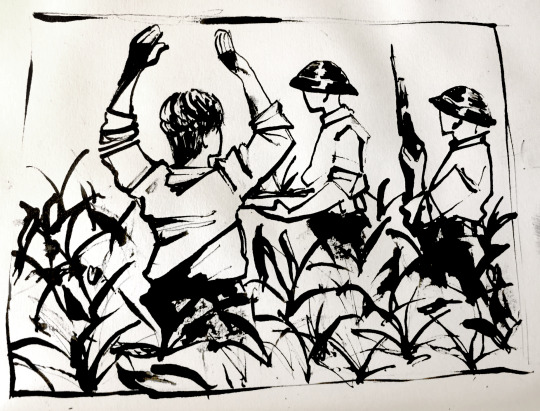
Tuesday 2nd February
Today I started my sketches for my final pieces. I worked with photo references to create stories, however all these stories are real ones and all the people in the art are real people, similar to etchings which Francisco Goya created on war.
I am working according to my project proposal, so for starters I made an initial sketch to get my ideas for the project. I got these ideas from photos as well as reading about the Phoenix Operation. The Phoenix Operation was a CIA led operation involving the USA, Australia and Southern Vietnam in an attempt to take over the country with fascist reasoning. In this operation, many NFL soldiers as well as innocent civilians were tortured, brutalised and killed even just for suspecting for being a soldier. Napalm bombs were dropped on villages full of innocents as well as a deadly gas called agent orange dropped on over 4 million Vietnamese people, causing birth defects seen in citizens even to this day. The US denies this effect on people, despite effects also being seen in their own soldiers.
The sketches I created below focus mainly on the less horrific, but still haunting and tragic parts of the war. I did not want to show any brutality considering the audience of the pieces are collage aged kids. I still wanted to show some of the oppressive, humiliating fascism of the operation which I feel is age appropriate.

These are the first initial sketches I made using pen.

I then took these sketches into digital and worked on better composition and planning. I feel like I maybe could’ve done more planning such as more preparation and work on the composition of the pieces, however I am happy with the composition in these, as well as the gestures and body language which is what I was trying to focus on when making them. I also could’ve looked at a range of more subjects such as landscape and ruin subjects similar to those of nash. I also could’ve considered a more 3D form of art. I am happy with all these pieces and will be the baseline for when I go into my other work, I may even use some of these as a final piece, however at the very least my final pieces will revolve around these sketches.
0 notes
Text
Monday 15th February
Today I started playing around with some of the ideas I created. To do this I planned on doing both etchings and lino prints, as well as test out any other materials I had, I also had access to ink and digital media.
I first took my lino prints and outlined them onto a piece of paper, by placing them down onto the paper I took a pencil and traced around the pieces to create a base.

I started my first test piece by doing an etching. I did this by drawing my piece onto the base I made so I knew how to fit the photo on to the board I have. I then traced the art I made in preparation to my pieces onto the page quickly. By placing the board over the top of the base, I used my sharp etching tool to create lines in the board. I have to make sure they’re deep so the ink sets into the lines I create.

This is the finished result of this process. When doing this process I failed to account for the fact the image is backwards. I also failed to account for the printing process of transferring the ink. I made several attempts at printing but was unsuccessful.

Because of both theses failures in my process, I decided to keep my art piece in the form of a plate, except with the ink inside it to outline the lines I created. I believe I would be happy to use this as a final piece but continue to experiment, I like this technique.

The next technique I tried was lino print. To create the lino print I outlined the base again and trace my piece onto the lino using ink. The next thing I would do use a carving knife for line to cute pieces out the lino to create a silhouette. This did not work out for me. I did not like using the lino. When carving the pieces I ended up cutting myself several times. Because of this I gave up on pursuing my lino test.

The next technique I tried was India ink. Using a piece of wood and my India ink, I can create mark-making techniques with various line thickness and strength. This piece reminded me of japanese styled prints. I decided this will be the material that I will use for my final piece. I wish I had more colours than just the black to use and experiment with.

0 notes
Text
Final Pieces and Evaluation
Title and Description
Horton, Georgia. Hostage 1969. (2021) “A Vietnamese citizen being held hostage and interrogated close to a village. A part of the phoenix operation lead by the USA, which tortured a murdered over 81,000 Vietnamese National Liberation Front members.”
Title and Description
Horton, Georgia. Phoenix Program. (2021) “A group of National Liberation Front members being rounded up for execution. The CIA executed the Phoenix Program to interrogate, torture and kill members of the National Liberation Front who were fighting to protect their country from a military based coup d'état performed by the US, Australian and South Vietnamese.”
Title and Description
Horton, Georgia. Execution. (2021) “A National Liberation Front member being held prisoner in his own village, awaiting his execution by US Soldiers. This was commonplace during the Vietnam war, where suspected National Liberation Front members would be taken from their homes and executed.”
FINAL EVALUATION
For my final piece, I decided to go on and continued with my India ink piece from before. I liked doing this because I found the line variation and mark making fun as well as making the piece striking to look at. I made these pieces to represent the pain of civilians in socialist countries, who were oppressed and killed by Americans. Everyone in the photo is a real person involved in a real event that happened, I intended to not make a propaganda piece promoting socialism but more a piece that shows the horrors of war, the people that we usually consider the heroes aren’t always that. I also did not want to show any gore, as it would be inappropriate, just body language. I feel that my work is effective and gets the point across.
I feel like I could’ve done more artist research. I feel like the variance I had in research hindered me in the fact that because of the lack of materials I had access to. This is because of COVID restrictions. More research may have helped me in finding original ways to use the most basic of materials, as well as cheap alternatives or even just the use of common household items to create a piece. I also feel like I didn’t use all aspects of my research, despite researching Henry Moore and Paul Nash, I didn’t use many aspects of their work to my advantage such as exploring creating a piece with oil paints or a statue like they did. I could’ve also considered making a piece with digital art that I have access to, as I have explored a number of digital processes such as 3D artwork and digital art.
I feel like I could’ve also explored more initial ideas for my pieces, such as exploring a range of subjects such a landscapes and other things. I went with the first range of ideas I had rather than discovering more options I could have.
I think I could’ve done more work with colour. I did not even attempt a piece in colour, similar to one of the artists I researched. I wasn’t able to do this due to COVID restrictions within the project which stopped me from ordering and getting the materials I needed. I could’ve also worked with more materials, however due to coronavirus and vulnerability in my health, I decided it would be best to use whatever I have access to. I feel like I could’ve spent less time doing preparation work and more time doing final art work. I wish I spent more time on planning out my pieces. I would’ve also liked to have done more final pieces. This is because I don't think with the 3 pieces that I made that I truly encapsulated the horrors of the Vietnam war.
I am also disappointed with several plans I had throughout the project that did not go the way I want or changed last minute. For starters, I planed to have no explanation of my art pieces, however I later changed this as seen above, to have explanations of my pieces. This is because originally I was planning to do my pieces as an etching, however, due to my negligence on researching, I did not have the right tools to properly transfer my trapped ink onto the paper. This means I had to change my final piece materials, and I found my final pieces didn’t come out as clear or as knowledgeable as my original sketches which were made in mind for the etching boards I had. This is why in the end I decided to instead explain the pieces rather than let them be self-explanatory or let the viewer reflect themselves on the pieces.
Despite all the problems I faced in the last 2 or so posts, I still feel I managed to get a Goya feel to them, I specifically wanted to do an etching to mock and copy his style of work however that did not turn out how I wanted. Regardless, the hard and striking lines in the work I made as well as the gestures still managed to copy at least some element of his work while creating some originality in my piece.
Through my process I have learnt a ton of new things, such as new techniques and ways of working. I don’t usually do several tests before doing my final pieces so this project taught me how to do that. I also learnt new art techniques such as lino print, etching and India ink. I used different tools and different materials to play around with this. I also learnt to focus more on using body language to show emotion since most of my figures were blindfolded or faces were hidden. I exaggerated the poses of my subjects to achieve this emotion in my work.
I am happy with several outcomes of the project. I was able to find out that I really enjoy working with India ink and I was also able to discover a passion for design things such as poster and general design planning such as the war memorial task which I found very fun. I also found out things what I don’t like, for example, I did not like the dangerous process of the lino printing. Because of injuring myself several times with that process I quit pursing lino.
The feedback I got from my teachers was strictly positive. I feel this held me back a little because more critique I feel would’ve allowed me to work on different things and done more with my project. There were times during the project where I would feel confused as to why we were doing said task, however, in the end I feel it makes more sense to me.
The pieces will be presented online due to the coronavirus on the Dover Technical College website. I considered doing a voice over for my piece, however instead I made descriptors for my pieces in place of this as I have been recovering from COVID and have a sore voice.
0 notes
Photo


For the ‘Changes’ prompt we were asked to find two photos of the same place, one taken between 1900-1970 and another taken in the present time and place.
The place I chose for this prompt was the Buckland Paper-mill just outside of River, Dover. The building has had rich history and gone through numerous changes over the course of its lifetime, the beginning of which is unknown.
The photo on the right was taken c. 1910. This was during a time where the tram rail was still in use and active. The photo on the right was taken in 2020, a full 110 years later, where the tram rails have been replaced with roads that lead in the town centre of Dover, and the Paper Mill itself being turned into expensive apartments.
I think this change is both good and bad, while I feel that the history of the Paper Mill should be preserved, but I also think that turning the space into apartments is exclusively good, however, I don’t agree with the expensiveness of these apartments in a fairly poor area which leads to gentrification and doesn’t help with problems the area faces such as homelessness.
The building also got renovated into a gym and will later have a CO-OP, which will help residents in the area with accessibility, but this also poses the possibility of damaging the smaller businesses in the area.
0 notes
Text
Orlin Culture Shop
Orlin Culture Shop based in Erie, Colorado is a company owned by Brian Edwin Miller, a graphic design artist who works in creating illustrations for big brand names such as Adobe and Mental Floss Magazine.

"The Curiosity Shoppe" by Brian Edwin Miller
Miller was born and raised in Colorado. Miller was raised artistically, with his father as a musician and photographer and his mother a crafter, teaching him to be passionate at a young age. Realising his passion was in illustration, it was something he decided to pursue full time, dedicating his projects to creating beautiful landscapes that are full of life.
He then moved onto working in the gaming industry where he was able to first experience working in art full time. Starting off as a concept artist, he eventually made the transistion to an art director. This company was later shut down and dismantled, and Miller started his own business- Orlin Culture Shop.
With a wife and two kids, today he uses this heritage as a means to continue his family tradition of being creatively involved.

“The Mysterious Museum” by Brian Edwin Miller
On his website miller shows his process of how he creates art. Using a digital tablet, he creates the composition of the art by placing down lines and tone. From there he uses a texture brush and defines the form and lighting in black and white. This helps define where the eyes will be moving around the image. It’s after this where he adds the colour, by replacing the black and while values with coloured ones. During this process he explores a range of different colour palettes that affect the mood of the piece until he is satisfied.

Then, on his separated layers, he adds effects that tie the image together as an illustration. This is shown below in this gif:

This is a process I could consider using in my print if I choose to do that, while I’d prefer to do my piece traditionally and not digitally I can still take into consideration the use of layers to create an image and think critically about the complete composition of my print and what I want to be focused on in the image. Miller tackles the idea of place in a beautiful way that tells interesting and dark stories in beautiful detail.
The Orlin Culture Shop is not considered under any specific art movement, however is arguable it has been influenced by the print design movements of the 20th century.
The Deco art movement covers a range of different visual art styles that developed around the 1910′s and 20′s. In graphic design, the movement originated from illustrations in fashion magazines. The print-like look of the movement is similar to that of Ukiyo-e, famous examples of Deco art include the anti-nazi regime posters that were developed during the time.
Pop art is a movement that was recognised in the 1950′s and 1960′s in England and America. Pop art was influenced not by the political or abstract world like most movements before were, but by what was in popularity in that moment such as comics, tv and media. The style was described as corporate and many did not respect it.
0 notes
Text
Katsushika Hokusai
Katsushika Hokusai was a Japanese artist that used woodblocks to make prints, most famously his series of works “Thirty-six Views of Mount Fuji”. The piece was a response to the boom in travel in Japan. It was this print that helped him rise to fame both nationally and internationally.

“The Great Wave Off Kanagawa” by Katsushika Hokusai (1829-1832)
His exact birthdate is unknown but if often stated as the 31st of October 1760. He was born to an artisan family in the Katsushika district of Edo, Japan. It is believed that his father was a mirror maker who produced for the shogun. He began painting at around the age of 6, likely from learning from his father by watching him design and paint mirrors.
At the age of 12 his father sent him to a work in a bookstore, where books were made from wood blocks and cuts. At the age of 14 he worked as an apprentice wood carver until the age of 18, where he joined the studio of Katsukawa shunshō. It was here we was taught Ukiyo-e, a style developed using carved woodblocks during that era of time.
Upon Shunsho’s death Hokusai started to develop other styles, taking inspiration from French and Dutch engravings. He also changed the subject of his works, focusing on landscapes and places in Japan rather than figures that the style of Ukiyo-e usually focuses on.

Egret figure studies from “Quick Lessons in Simplified Drawing by Hokusai”
Later on in his life Hokusai did a range of other things including educational manga, large illustrative pieces and books.
The method of printing Hokusai used, woodcutting, or similar such as lino print, is something I might use to create a print as my final piece. This process uses a shapable material such as wood or linoleum and a sharp tool to create incisions with create a relief. From there ink or paint is rolled onto the wood or linoleum. When transferred onto paper this creates an image where only the areas where there isn't an impress is transferred onto the paper.
Hokusai’s work used beautiful vibrant colours and wonderfully shaped lines that created a beautiful effect on the paper. I believe his art has a lot of wonderful movement within it that makes the eye follow the image around into it. This is something I could take into consideration when creating my print, variating the line shapes to create movement and depth in my landscapes.
Hokusai was apart of the Ukiyo-e and Japanese art movement, both of which originated in Japan during the Tokugawa era (16th century to 18th century) . Ukiyo-e refers to a particular style of art that was made with woodcut in Japan.
0 notes
Text
Jake and Dinos Chapman
Jake and Dinos Chapman, born in 1966 and 1962 respectively, are British sculpture artists. Their subject matter is seen as controversial and shocking, creating scenarios that are similar and inspired by the horrific and disturbing works of Hieronymus Bosch and Francisco Goya.

From “Hell” by Jake and Dinos Chapman (2000)
Dinos was born in London and Jake was born and raised in Cheltenham with his brother, later moving to Hastings where they studied at William Parker School. Dinos later went on to study at the Ravensbourne College of Art while Jake studied at the North East London Polytechnic. Eventually they studied together at the Royal College of Art together.
They began collaborating in 1991 by making plastic and firberglass mannequins of people. One of their notable earlier works were 83 scenes inspired by “The Disasters of War” by Francisco Goya, showing the brutality and torture of the Peninsular war.
In 2000 they made a piece called “Hell”, which depicted thousands of small miniature figures of Nazis, arranged in 9 glassed cases that had been arranged into a swastika. Later in 2003 they bought a few of Goya’s “The Disasters of War” etchings and altered them by adding odd faces such as clowns and mice.

From “Insult to injury” by Jake and Dinos Chapman (2003)
To this day they still explore these controversial topics, exploring the darker side of place with hellscapes and terrifying imagery, shocking the public with their realism of the dark history of human nature.
In their series of pieces “End of Fun” and “Hell’, they used over 60,000 2-inch toy soldiers to create scary and morbid depictions interpreting hell that took two years to make. The amount of dedicated detail and time effort put into the scenery are something that I won't be able to achieve, however, something I could consider taking inspiration from them with their attention to fine details in pieces. I enjoy their works as they aren’t afraid of shocking people with the details and darkness of their works.
They were considered a part of the Young British Artists movement. A group of British artists who exhibited in 1988, most of which graduating from Goldsmiths. They were known for their use of “shock tactics” and depicting the real, an art style that was heavily criticised.
0 notes
Text
Woodcut
Woodcutting is a printing technique that uses a block of wood as a relief. A relief is a slab of material that have been carved to create a recess in the surface, and when painted on top allows any area that is not painted onto to become an image. Because of this, all of the areas that are not affected by ink become a line drawing.
In woodcut, the artist usually use a gouge to carve out the areas that will not touch the surface area the print is transferred onto. The surface of the wood is covered with a roller which allows the ink to only sit where the surface allows it too.

White-line printing with Japanese plywood.
Woodcut is believed to originate from china from 220 BC, and first started off as a textile printing method before later moving to paper. Later on in the 13th century the method found its way to Europe and became a dependable method for the old masters when paper was introduced to Europe. Being a dependable method of printing, woodcuts were the main medium for creating books and illustrations during this period of time, a stayed in popularity until the 19th century for the easiness to carve the wood and cheap availability of the material.

Example of a woodcut relief and the print it creates.
0 notes
Photo


For my 2D part of the project I have decided to focus solely on photography, since print is not available to me I have decided to focus that part of the project to researching various prints and their methods.
The place I will be focusing on is the theme of sea and lighthouses, a location also touched on by the previously researched Ian Breakwell. I chose this as the location of my piece as I am particularly fascinated with the idea of lighthouses and the ocean being a piece of symbolism for loneliness. Lighthouses before the 1800′s were usually manned by 2 people, with a few accidents such as the Small’s Lighthouse incident where after the death of his partner and being stranded on a small island with the corpse, went insane. The law was drastically changed after this to include at least 3 people manning a lighthouse.
By the 1960′s lighthouses were fully automated with the invention of electric lights. The lighthouse pictured above, the South Foreland Lighthouse in St. Margaret's Bay was the first to do so. The lighthouse is isolated, with a mile walk between the closest parking area and the lighthouse itself.
To achieve this idea of confinement in my pictures, I made the lighthouse the main focus of my set of images. Breakwell managed to achieve this idea well in his time-based piece with a similar setting. While the weather wasn’t to my preference and I wanted darker skies, I still feel I have achieved this. The photos are lightly edited, I feel that maybe I could’ve edited them into black and white to further emphasise the feeling of loneliness. I could’ve also made it more framed like Breakwell's video. Because I want to keep a consistent theme in my art I could consider doing this in my time-based Challenge.
0 notes