
Statistics
We looked inside some of the posts by giannthusblogging-blog and here's what we found interesting.
Average Info
Notes Per Post
3
Likes Per Post
3
Reblog Per Post
0
Reply Per Post
0
Time Between Posts
21 days
Number of Posts By Type
Text
3
Photo
1
Last Seen Tumblr Blogs


Fun Fact
Tumblr Inc. is using 66 technologies for its website.
Text
BLOG 104: KALARO KITA, HINDI KALABAN (Advocacy)
Last meeting, Sir Ced introduced to us the art of Typography. At first, I thought it is just about choosing a right font, alignment, and style when it comes in using text. But with our Typography lesson, it thought me a lot about Typefaces, Text or Typography. It has also life, a story to tell, an art as well. Through text you could express your thoughts and feelings and can also create an art through it, like poetries, poems, songs, novels but with this topic it has her own style of interpreting things, subjects or advocacies.
Text for me is one of the important things when it comes to editing, where details or words that are use is visible in our layouts. But I learned that Text also has an anatomy, just like our body. It also stated at the presentation of Sir Ced that Typography is a basic form of graphic design. We tend to choose fonts that we think is cool to look at but it is not like that, simpler font makes it more elegant and readable than choosing a font that is not appropriate to your design and not so readable to your audiences or viewers. That is why Sir Ced, recommend us to use serif and san serif fonts or the usual fonts that we know like Arial, Calibri, Central Gothic and etc that is fitted and looks good at your layout deisgn. But that's not it, Text can also be graphical, through text you can create an image representing a subject or topic you choose.
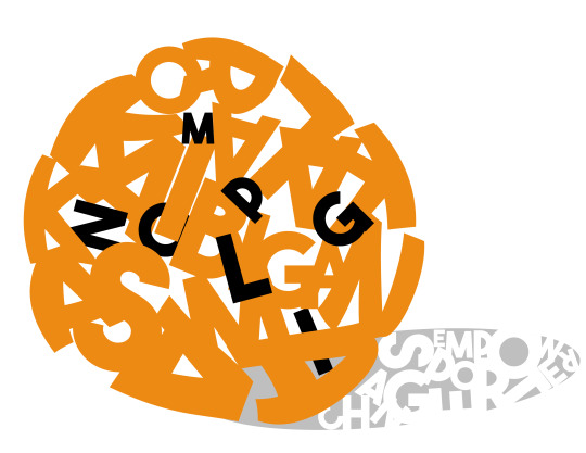
That is why, Sir Ced made us do an activity that connects to Typogprahy. He gave us two opstions one, create a Typefaces Anatomy or two, create an advocacy image using Text. It was challenging though and you'll come to think of it what kind of an advocacy you want to share. I had already in mind and it was about Sogie Bill but I asked myself, if I create this and people will ask me why is this my advocacy, i guess I won't really give the straight answer because I don't really know a lot about Sogie Bill. I just heard it on news or radio and issues about the society that links to that topic that is why I created something that is close to my heart. That is sports. I had created a big circle that symbolizes a ball with the words, KALARO, KAIBIGAN, KASAMA and colored it with orange then it has also the acronym of the MPG and the name of the person who created the event Coach Noli. It has also shadow, that represents the essence of the event with the words, CHANGE, SPORTS and EMPOWER. I had diffuculty in doing a perfect circle shape for my advocacy and when I looked at it, I just hope that my audiences would get what is my Typography Advocacy is all about.
As a Student-Athlete, I had experience of not having fair treatment when it comes to sports. Oppurtunities of playing are less in the Philippines, most especially when it comes to basketball, football, futsal, softball or any kind of sports. This are one of the concerns of the Student-Athletes since then but with the love and passion for sports, women still strive to work hard for their goal, to voice out and to be heard through sports.
Mindanao Peace Games is an event where empowered women of Mindanao in different regions, unite and play. It was created by Coach Noli Ayo from the Ateneo de Davao University, he come up with this event to showcase the talents and skills of women in Mindanao. It also gives oppurtunities to the youth to be expose and to experience more about sports. But this event is not about competing but it is about being stewards of change in action and in the environment. Coach Noli believes that through sports we could help communities, through sports we can help Mindanao. That is why the theme of the MPG is Kalaro. Kaibigan. Kasama. and has a tagline #KalaroKitaHindiKalaban, to change the perspective of sports as a competitive sport but sports being the a way of uniting diverse cultures and regions from Mindanao to be as one. As the apprentice of the Mindanao Leadership Summit of Mindanao Peace Games, I advocate and voice out for sports as a medium of communication and connecting with other people, communities and even the Philippines. Mabuhay ang iSports, mabuhay ang Pilipinas, mabuhay ang Mindanao!
0 notes
Text
Blog 103: Ang buhay ay parang gulong, makulay (Color Wheel).
In today’s blog, we will talk about RGB and CMYK Wheel. The activity was to recreate the Color Wheel in RGB and CMYK using Photoshop. Sir Ced gave us instruction on how we will do it. Before that, what is the difference of RGB and CMYK?
RGB Color Wheel stands for Red, Green and Blue. Any color can be made by mixing with this three colors. It is “Additive” color system, it is started from black then color is added.

A sample photo of RGB & CMYK. (Taken at the Digital Imaging PPT.)
CMYK Color Wheel stands for Cyan, Magenta, Yellow and Black. It is a “Subtrative” color system, it is started from white then color is subtracted.
I didn’t really had a hard time in doing RGB color wheel in photoshop, you will just use the hues (degree) starting at 0° (Red) then add it 30 to have Orange to be followed until you reach 330° to have Rose. This will be filled in the 3rd layer of the slice. The slices has 23 and has 5 layers, now let us do the outer layers the 4th and 5th layer. We will just use the brightness and saturation, set it in 100 to reveal the color, by using a color picker, click the color then as you clicked it you can already do the 4th layer of the Color Wheel, just minus the 100 (Brightness) to 60 and just leave the saturation at 100, to give you a dark shade of the color to be filled at the 4th layer then to be followed, same instruction minus the 100 to 30 and it will give you a darken shade of color to be filled at the 5th layer. Now, let us focus at the lower part of the layers, the second and first layer. First, click the color then minus the 100 to 60 (Saturation) that will give you a light shade of color to be filled at the 2nd layer, to be followed with the same instruction 100 to 30 then filled it at the 1st layer. This would be my final output for RGB Color Wheel.

As you can see, the colors are more focus on brightness and saturation. While in CMYK, it is more on hues and tints. This is my final output for CMYK Color Wheel.

To be honest, I did had a hard time doing this because it focuses on primary then secondary and tertiary colors that should be followed so that you won’t be confused of the process in doing it. Now, instead of changing HSB (Hues, Saturation and Brightness), we will change the CMYK values in the color picker dialog box. Let’s start the middle layers first which are pure hues. Start at the primary colors the Cyan, Magenta and Yellow.
Yellow: Y=100% C & M=0%
Magenta: M:100% C & Y=0%
Cyan: C=100% M & Y=0%
The secondary will lie between the two primary colors. While the tertiary colors which are made by mixing two primary colors with 1:2 ratio meaning 100% : 50% ratio.
Orange: Y=100%, M=50%, C,K=0% (between Red and Yellow)
Chartreuse: Y=100%, C=50%, M,K=0% (between Yellow and Green)
Turquoise: C=100%, Y=50%, M,K=0% (between Green and Blue)
Azure: C=100%, M=50%, Y,K=0% (between Cyan and Blue)
Violet: M=100%, C=50%, Y,K=10% (between Blue and Magenta)
Rose: M=100%, Y=50%, C,K=0% (between Magenta and Red)
Next, let us filled the outer layers the 4th and 5th layer. Click the color using the color picker then go to the CMYK Values, not touching the other values rather click the K then type the value to 30% for the 4th layer to give dark color then 60% for the 5th layer to give a darker color. Then focus on the inner layers, the 1st and 2nd layer. Click the color using the color picker, to have a light tint color just change the 100% of the color to 60% and the 50% to 30% this color value will be filled at the 2nd layer while the 1st layer change the 60% to 30% and 30% to 10% to have the color value in a lighter color. This instruction are to be followed.
This color wheel thought me to be patient because it will really test your patience but as you try to comply it and doing it precisely, it’s worth it. I get to be more interested about digital imaging and how to appreciate RGB and CMYK and also its use when we do lay-outing or graphic designs. I just can’t wait what DIGIPUB could teach me, as a creator this gives me tips and also lessons in dealing or doing a creative output. It is just like thinking out of the box and appreciating colors and their values.
0 notes
Text
BLOG 102: LET’S PUT THE PSYCHOLOGY OF COLORS IN TO ACTION!
My topic will be focusing on Movie Posters, why? Because I love movies and one thing that I look forward to is the trailer itself and also the official poster of the movie. It gives me that thrill and the vibes of the movie. Sir Ced, introduced to us the Psychology of Colors that means every color that is present to a certain design has meaning. Now let’s check the 10 movie posters that I personally chose.
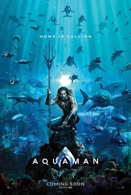
Aqua man
Aqua man’s poster is connected to the word aqua which means water or the ocean itself. It has dominant blue and light blue colors, it has the mammals living in the ocean, the coral reefs, the place where Aqua man lives, the Atlantis and Aqua man itself with his trident. The poster represents calmness and coolness, it will really give that feel of the ocean and description of Aqua man.
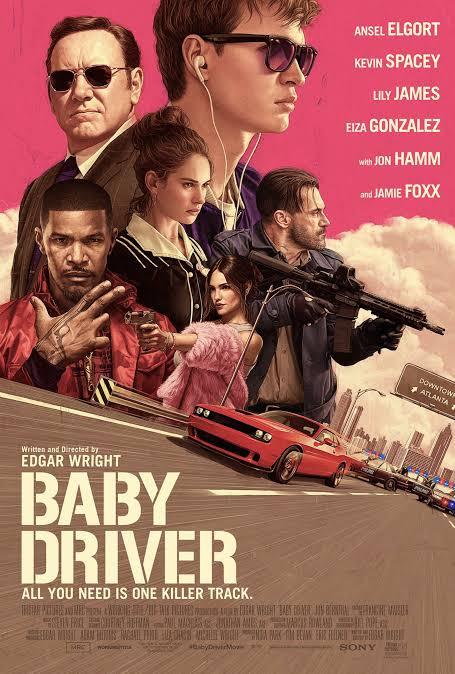
Baby Driver
Baby Driver’s poster is a digital design, it gives a vintage style of the poster, we usually see this in a video game more likely, GTA: Vice City. Pink is a sign of being youthful, fun and exciting and when you watch this movie, it will give those three words and you’ll never regret it. But pink also in the psychology of colors represent an encouragement of action and confidence. You will be impressed on how the movie was shown and the story of Baby, the name of the character.
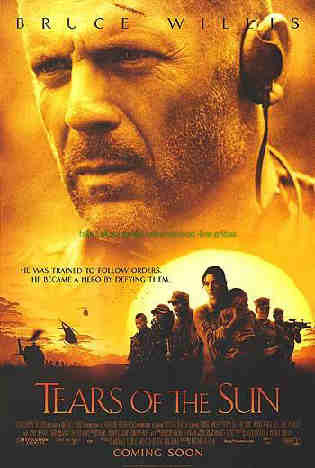
Tears of the Sun
The poster has a dominant shades of golden yellow that carries the promises of a positive future, it also embodies optimism, enlightenment and happiness. In France culture they signify it as jealousy while in Greece culture it signify as sadness, this could relate to the movie, to its color design and its title. Yellow also stimulates nervous system and mental process. It also encourages to communicate and activates memory.
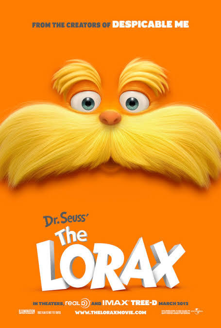
Lorax
Orange is the dominant color in this poster. The color represents a strong positive or negative association to orange, generally elicits to a ‘love it’ or ‘hate it’ response rather the other colors. It embodies fun and flamboyant. This colors stimulates activity and appetite and it also encourages socialization. A fact about this color is that, it signifies as a United States Army Signal Corps in the United States Army.
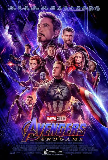
Avengers: Endgame
Avengers, a movie that blows peoples mind with the plot, story line, the characters itself that really gets the involvement of people in the movie. Avengers: Endgame poster represents the last wave in fighting for their love ones and for the world. The poster has a dominant color of purple that embodies the balance of red’s stimulation and blue’s calm. It also represents a mystic and royal qualities.
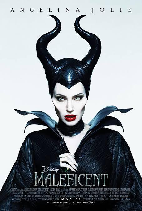
Maleficent
Maleficent poster focuses on black and white with a bit shade of red. Black is associated to sophistication and power that could relate to the character of Maleficent, it has also a dominant color of white, enables fresh beginnings, the new beginnings of Maleficent and sharing her side of the story. A bit shade of red, increases enthusiasm and encourages action and confidence.
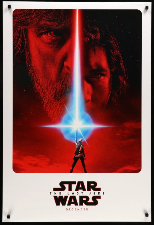
Star Wars: The Last Jedi
The dominant color in this poster is red. Red draws an attention and it is easily to recognize it. It recognizes as a stimulant, it is also increases enthusiasm and encourages action and confidence. It also provides a sense of protection from fears and anxiety. In Feng Sui, when your front door is painted to red, it invites prosperity to the residents and another fun fact Bees can’t see the color red, they can just see all other bright colors.
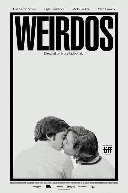
Weirdos
They say that Gray is boring, dull and it’s not part of the colors but this color has a meaning. Gray embodies of intellect, knowledge and wisdom. It has that classy look and often as sleek or refined and it also represents being neutral. It is dignified, conservative, and carries authority. This color creates expectations, it may be simple but unique in many ways. A fact about the color gray is that the human eye can distinguish about 500 shades of gray.
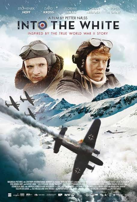
Into the White
White represents purity, cleanliness and neutrality. That is why in weddings, brides usually use white gowns for their wedding and in Ancient history when you get to afford white cloth or dress, it means you are rich in that time. But white does not focuses on dresses but it also aids mental clarity, encourages us to clear clutter and enables fresh beginnings. Just like in painting, after painted something you pick another blank canvas and it could be a new beginning, experience, thoughts and learning. Fact about white is that when you dream and there is a appearance of white, it represents happiness at home.
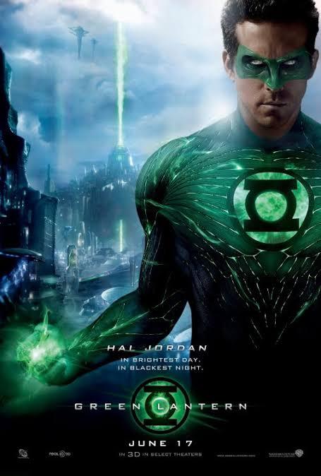
Green Lantern
Green is the dominant color on this poster. It signifies as nature and fresh. It can be a ideal backdrop in interior design, because green occupies more space in the spectrum. It is also use to military that uses night vision because it is more visible in the eyes. The effects of this color is that it is soothes, it relaxes you mentally and also physically and it offers a sense of renewal, self-control and harmony.
My realization to this lesson is that every color has meaning but it also depends to the artist on how he or she express it. I believe through these colors it expresses what we feel and what we want to say. I love the fact through combining and mixing these colors can create a story, a portrait, an art that will somehow can change one person to another. Color Psychology helps us to generate our mood and what we really feel to a certain thing that captivates our attention. It is a big help for us communicators and also aspirants of being a photographer, painter, filmmaker or in any way you express or tell stories, to know what really fits in a scene or art. It enables us to be creative and to be expressive in our own craft.
0 notes
Photo


Blog 101: Color Theory – Color Wheel, Schemes and Tones
Color Theory creates a logical structure for color. According to a site called Interaction Design Foundation, Color Theory is a term used to describe the collection of rules and guidelines regarding the use color in art and design, as developed since their early days. It informs the design of color schemes, aiming at aesthetic appeal and the effective communication of a design message on both the visual level and the psychological level. For example, color crayons we can organize it by color and place them together that shows the colors in relation to each other. There are three basic categories of color theory that are logical and useful:
· The Color Wheel,
· Color Harmony,
· And the context of how colors are used
Modern color theory is based on Isaac Newton’s color wheel where it has the primary (Red, Yellow, Blue), secondary (Green, Orange, Violet), and tertiary colors that can combine and produce another color:
The Color Wheel is a color circle based on red, yellow and blue. It is tradition in the field of art. Isaac Newtown is the one who developed the first circular diagram of colors in 1666. Color wheel shows color coordination that gives life to an art or design and can make you think of emotions, feelings and the story behind it.
Color Harmony, where do you usually heard this? Paintings, photos, films. Why is it important? What do color harmony does? Well, it is an application of harmony that jives or unit with combination of the different colors. Color harmony delivers visual interest and a sense of order and it has dynamic equilibrium.
So, our first activity with Sir Ced Zabala is photography that connects to our lesson the Color Harmony and schemes. Individually should have 8 different Color Harmony; that includes Monochromatic, Analogous, Complementary, Warm & Cool Colors and three other Color Schemes that includes; Split Complementary, Double Complementary and Triad or Tetradic Complementary. After, taking photos and trying to find that harmonious combination of colors, I selected 8 photos to represent each color harmony and schemes. It was also instructed that we should give it a tile and also identify the different color harmony and schemes that are present in the phots. My photos were taken in my university at Ateneo de Zamboanga University, and the famous Butterfly Garden at the Pasonanca, Zamboanga City.
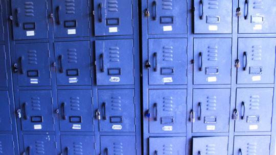
“Blue Lakers”
Monochromatic
I took this photo at the famous tunnel of ADZU at Xavier’s Hall Building, all lockers were painted in blue and I got the chance to took the photo while the sun is still present at that time and it represents Monochromatic features where it shows different shades of Blue. The colors that are present in the photo was Indigo, Blue and Light Blue. It is titled Blue Lakers, because it is obviously showing blue colors and Lakers is translated into Filipino meaning Lockers. I just love the fact of having nice photo and also a humor like for the title.
“Green Hay”
Analogous
This photo was taken at the field of ADZU, I was searching for a fitting photo for Analogous and it was hard because in Analogous it should be connected or located next to each other at the Color Wheel. It is in a shade of Green but when you check the color wheel, these colors are next to each other. I chose this photo because it gives me that kind of green and nature vibe but it is entitled Green Hay, because obviously it is green and hay because I just thought it was a food of an animal like cows or horses.
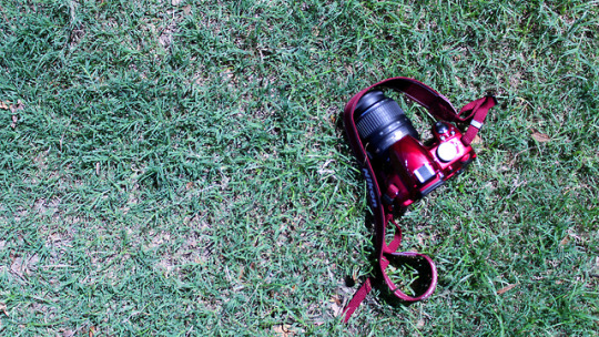
“Pulang Nikon”
Complementary
This photo was taken at the same location, backfield. I took this photo because my classmate has this beautiful glossy red camera and it really attract me plus it could be complemented with the grass at the backfield. Complementary focuses on one or more pairs of colors. Red and green are complementary to each other. It is called Pulang Nikon because the dominant color of the photo is the red camera and it is really the first think you’ll see. Nikon was the brand of the camera and don’t worry I did asked a permission to the owner when I took a photo of it.
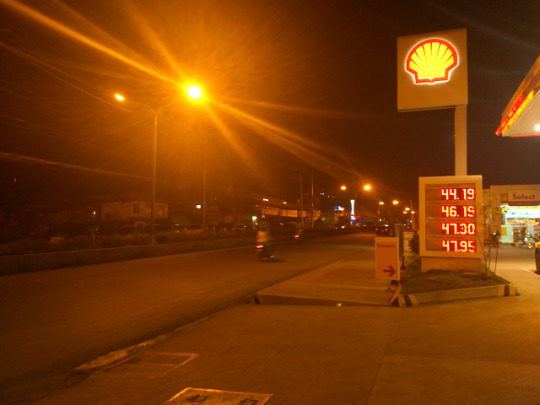
“Street Shell”
Warm Colors
This would be the first photo that I took after our class in DIGIPUB when Sir Ced, told us to take 8 photos for the Color Harmony. We were at the gas station that time, waiting for the other car finished to gas up and saw this view, titled it Street Shell. It shows the streets light at 7:30pm and the gas station name, Shell. Warm colors focus on yellows, oranges, browns, yellowish greens, warms reds and other colors that shows warmth. The colors that is present to this photo are Red, Gold, Yellow and Brown.
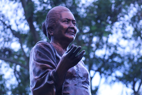
“Maria Clara Lobregrat”
Cool Colors
Butterfly Garden was one of the famous place here in Zamboanga City, because of it’s scenery, the butterfly garden itself, the museums and also the Maria Clara Lobregat statue. Took this at the Pasonanca, Zamboanga City and had the chance to get this kind of color scheme, a blue like or cool colors give an impression calm and create an impression. The colors that are present in the photo are Indigo, Lavander, Blue, Light Blue. It also help the mood of the scenery because it was getting dark at that time already.
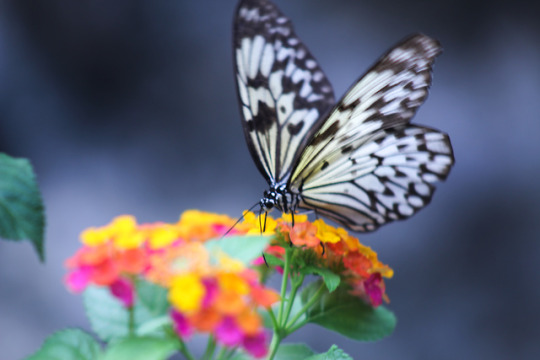
“Flower Fly”
Split Complementary
This was taken at the Butterfly Garden, Pasonanca Zamboanga City. I was with my classmates that time, we just had a street photography that time and also like doing our project activity for our DIGIPUB. Looking at the butterflies flying and moving around the area will really make an impression of beauty. I just love how this photo was taken. This represents split complementary were one hue plus two others complement, you could use the letter Y as your guide in looking for that split complementary colors. The colors that are present in this photo are Yellow Orange, Yellow Green, Purple. Tittled it as Flower Fly that is visually presented in the photo.
“Hi-school”
Double Complementary
Double Complementary is a two complementary color sets, you can use the letter X as your guide in finding the complementary colors for this color scheme. This photo is entitled as “Hi-school” that sounds like high school, it represents that the school year has just begin and new things will happen and to experience. The colors that are present in this photo are Red Orange, Yellow, Blue and Purple. Took this photo at the ADZU Cafeteria. I just had this idea combining the present colors that I have in relating to double complementary.
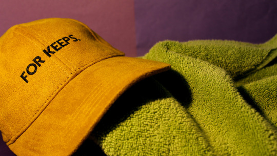
“For keeps.”
Triad Complementary
This would be one of my favorite because I just made it at home, did some strategies in making this set up just to achieve the Triad or Tetradic Complementary. Triad Complementary is three hues equally position on a color wheel. I just had my cap, my towel and colored papers to represent as my background with the help also of the lamp in my room. It is entitled as “For keeps.” Because I based it on the word that is present on the cap. This could also imply that I am a cap person. I love collecting caps because it helps me to be me and to be unique for myself. The colors that are present are Gold, Dark Purple, Light Green and Dark Yellow.
This activity gave me the chance to show my photography skills and also to learn more about color harmony and schemes and its importance in doing a design or an art. This also made me learn and appreciate of being creative in your own terms, what I refer or I like more. I also learn to adapt the learnings also learn from my mistakes, what should be the colors presented and what should be improved. Now, every time I go out I would really look at things differently because colors are just not colors the way we learn from grade school to high school but colors brings an art to life.
3 notes
·
View notes