
Statistics
We looked inside some of the posts by ginellevirayy and here's what we found interesting.
Average Info
Notes Per Post
5
Likes Per Post
4
Reblog Per Post
1
Reply Per Post
0
Time Between Posts
3 days
Number of Posts By Type
Text
15
Photo
2
Last Seen Tumblr Blogs


Fun Fact
Tumblr has been banned in Indonesia for providing people with access to pornographic content.
Text
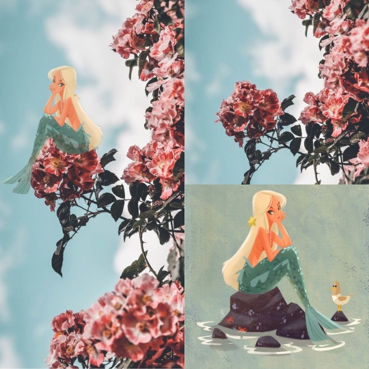
D7 : REMIX ART
The freedom & fear, the empowerment & risks, of Internet Culture.
While creating this remix, I incorporated one picture and put it on another photo. There was a lot of freedom and empowerment choosing these photos. I thought to myself what are two things I can put together, but I like at the same time. I chose flowers and mermaids. Obviously, mermaids are usually portrayed in water and not tiny sitting on flower petals. This is the freedom and empowerment of this assignment. Choosing what we like and empowered by doing things extraordinarily. The fear and risks of the Internet culture is that sometimes people tend to take stuff and put it in a negative way. There are so many facts and opinions and people all over the world like to state their personal thoughts. Some use the Internet in a bad way spreading negative thoughts and views.
Your thoughts about Copyright: is it working as is? Should it be strengthened, weakened, or modified?
My thoughts about Copyright is that it does not really work and should be strengthened. Other people may take credit and not giving it to the initial person who created it. I know Copyright works for many things, but it is not as strong as protecting original works. There is a process such as properly marking and registering your work to ensure your work is safe.
What license you’ve chosen for your work and why.
I chose to use the license of Public Domain for one picture, which was the flower photo. I chose this because a lot of creative works online are not protected and can be used so others can create their own works too. For the mermaid photo Edwardian Taylor created it, but publicly displayed it on Tumblr with a bunch of his other artworks. Edwardian Taylor is a “Freelance Visual Development & Character Designer for Dreamworks TV, Universal Studios/NBC, Nick Jr., Sesame Studios, Reelfx, & Out of Order Studios. Children's Illustrator represented by The Bright Group International/ Bright Group USA.” I admired his work so I decided to incorporate his illustration of a mermaid and give him credit.
Your experience of making your Remix piece. How did you do it? Did it come out as you expected? Were there surprises? Challenges? Insights?
I took two photos I found and put it together with the app called Photoshop Mix. I really liked how it turned out because to mermaids and flowers are a good mix. I fell in love with the photos right away and decided to mix it up.There were no challenges at all. I actually thought it was quite easy. I used the flower picture to be the background so I did not change anything. For the mermaid I decided to flip it so she was facing outward sitting on the flower. I cropped it so it was only her instead of the rocks and water that were included in the visual art. Then I just blended her more into the picture. This activity was fun, creative, and really enjoyed it.
https://edwardiantaylor.tumblr.com/post/160243567957/not-going-to-be-able-to-do-a-new-mermaid-everyday
0 notes
Text
EC: FEEDBACK
What did you think of the format of the class?
The format of the class was very organized and easy to understand. Each week doing an activity, interviewing an artist, and listening to presentations was a nice way to learn about art. It was a very simple and fun format I really enjoyed.
What did you think of making & presenting your Art Gallery?
Making and presenting the Art Gallery was a wonderful experience. It was helpful, useful, and relevant. I learned about different comic book artists like their strategies, ideas, concepts, and execution of fine work. I never thought I would have to learn about comic book artists, but I am glad I did. I also loved making the website because I enjoy organizing and putting things together. This was the third website I had to make and it was pretty fun.
What did you think of visiting the SOA Art Galleries?
Visiting the SOA Art Galleries was my favorite part of this class. I was very educated by different artists in the university. It enabled me to understand the meaning of the artist’s artwork. I liked hearing different techniques and stories that were well executed in their masterpieces. Every week I would look around in awe because so many students are talented. I believe this was a very useful, helpful, and relevant assignment. It was a great eye opening experience.
What did you think of the weekly Art Activities?
The weekly Art activities were fun to do. I liked how everything was about our choice, which gives us a chance to think and express our thoughts. I have never heard of Zines until this art class. I learned something new for each activity. I never realized how hard plaster casting was. I forgot how fun finger painting was because I have not done it since I was a child. I had the chance to talk about problems in the world. Also, I thought the spray painting activity was gonna be easy, but I was wrong. I never gave up though because all the activities were fun and useful. I had the chance to execute things my way without rules and guidelines. Doing these activities enabled us to have freedom, which I loved.
What did you think of the “7 Ideas about Art”?
The “7 Ideas about Art” was basically everything that we were taught in this class. I walked into this class wondering if it was just drawing and writing, but I was mistaken. We took pictures, played with paint, thought about architecture, talk about Speech, and remixed songs. They were totally different ideas, but was all very relevant to the teachings. Not only did Glenn teach, but the Ideas of Art taught us too. There are so many mediums of art that I learned, which was fun and I know will be useful in the future.
How did you feel about using Tumblr for your blog?
I have never used Tumblr before so this was very different. For CSULB, I am used to posting on Beachboard so I really admired the unique way of posting assignments. I was able to look at other student’s artwork as well and I love how everybody’s Tumblr post was one-of-a-kind. Using this website made us design the backgrounds and fonts which I thought was really fun. Making our own profile was new and we were able to express our true selves in a blog.
How did feel about using Wix for your virtual art gallery?
Fortunately, I have used Wix before so it was not complicated at all. Once you get the hang of it, it will be easy and simple. Wix was the perfect way to create our virtual art gallery because it gave us so many options and tools that were very convenient.
What did you think of using the class website, glenn.zucman.com/i2va, plus your own websites, instead of BeachBoard?
As I mentioned before, the class website and using our own websites were so different than using Beachboard. Every time I was on tumblr I did not think of school. I thought of it as posting another blog on my website. I really liked this idea because there were links that brought us to other websites. I got the chance to look at student’s masterpieces, which was pretty cool. Beachboard is the usual boring thing teachers use, but Tumblr is so much better. I got to make a theme and be organized that would look flattering to the eyes of others.
What did you think about having a class with no tests? I don’t just mean “was it cool to not have to take any,” but students use tests to guide their study and participation in a class. Students tend to learn what’s on the test, and to not learn anything that isn’t. Did not having exams make it harder to focus or find importance and relevance in the class?
Not having exam was better because it would have distracted us from the fun of the class itself. The class was very unique not having an exam. Although we had fun activities we still learned a lot of concepts. I would not think of it as a class where it’s a “break” and “easy”, but it was a class where we got to be ourselves and learn at the same time. I feel like exams are necessary for classes so important information are embedded in our heads, but not for this class. I have learned a lot of things that will be in my head without studying. I believe it is all about the experiences we go through in life that will be stuck with us forever.
Any other thoughts?
n/a : Such a great class!
0 notes
Text
D7: Short Story #7 - Tatiana Mata
Artist: Tatiana Mata
Exhibition: POSTURES
Media: Photography
Gallery: LBSU School of Art
Email: n/a
Instagram: tatianaamata
SHORT STORY
Once there was a little boy named Hero. He was lost. Lost in his thoughts. Lost in life, wondering what he wanted to do in the future. He had two older siblings Theo and Leo. Both were intelligent little boys and number one in their class. One day, Hero ran out of the house, crying. He did not fit in with his brothers and felt left out. His parents always said they did not have favorites, but it was apparent he was the least favorite. He felt so pressured at such a young age. He ran and ran, hoping his thoughts would leave his brain. He stopped at the park and started to sit on the swings. Other children were around just running, jumping, being caught at the end of the slide by their parents. Hero felt even worse, looking at them. He was disgusted by how happy the kids were with their parents. Jealousy. That’s what he felt, all the time. Hero looked up, always thinking about how it was to be far away. He wondered how it felt like to be up there. “So peaceful,” he thought to himself. A few moments later, his grandma walks up to him.
“Hero, don’t just go running off like that! You almost gave me a heart attack” she exclaimed.
He questions, “Why do mom and dad hate me? Why does Theo want to be a surgeon? Why does Leo want to build tall buildings? What am I going to do?”
“Whatever your heart desires. There are so many options. The sky's the limit, Hero.”
A plane flies by distracting Hero from thinking. He looks up, “The sky’s the limit,'' he repeats.
Growing up, he studies to fly. To be exact, a pilot. There were no more tears, no more running off. He always wondered how it felt up there. Peace. Happiness. Now that he was in control, king of the plane, there was no more looking up, only looking down at the world below him.

“Hindsight is 20/20” by Tatiana Mata
0 notes
Text
Essay : ART & (my) LIFE
At the beginning of the semester, I was a little skeptical about taking an art class. I started to ask myself questions doubting myself if this is what I really need and if it is necessary. Despite my thoughts, I actually liked the experiences I have had throughout the semester in this class. I truly learned the different aspects of art and how they can connect and interact with the world.
I would like to start off with the activities we did for this class. We went from doing finger painting, zines, and plaster casting to a student’s choice, speech actions, and photography. At first, I did not see anything special, but once I did every activity I felt different. All of these, together, have taught me that art is not just about color or how perfect it has to be. I learned that it could be messy, emotional, and anything that brings out a multitude of thoughts. Sitting and participating in class taught me that art is basically whatever you want it to be and just to express your mind on any topic. Each activity gave me a chance to use my ideas and analyze them, enabling myself to make my own art piece.
We also interviewed several talented artists on campus. This was actually my favorite part because this truly transformed my understanding of art. I got to take a look at different kinds of art like paintings, digital art, sculptures, installations, quilts, and many more. Some artists took their time and thought into their masterpieces. Some relied on to go with the flow and put out whatever their mind has expressed. An artist can be mediocre or exceptionally talented, but everyone goes through a path that led them to inspiration and into a void of peace. Walking through the galleries opened my mind to how each person is unique and extraordinary, not to mention the curiosity of what goes on in each individual’s head. A one on one interview gave me a chance to connect with the artists and understand their concepts of color, form, and intentions.
Why do I need art if I am going to be a nurse? This question circulated my mind all the time, and now I know the answer. Art is a very powerful thing and helps us recognize our emotions. It can make us happy, sad, or even bring out a memory from the past. No matter what kind of art it is, it enables us to be aware and open-minded, giving us a chance of interpreting the role it plays in everyday lives. As a nurse, it is an art to care for patients. It is a career that connects the nurse to their patients, forming unity and understanding. Art and nursing can be a little disconnected, but we both look at things from different perspectives. We use our heart and mind and with a variety of specialties for nursing we have specific strengths, passions, and expertise.
Overall, my experience with art was beautiful. It is a lovely thing, and it is something we see every day. It enabled me to explore my mind further of what art can be, and it is limitless. Every time I look around me, there is art such as the people, architecture, music, and dances. If we set technology down, we begin to look closer into our world and how it can affect and enhance our lives.
0 notes
Text
EC: MUSEUM VISIT
The pictures taken below were from the Grand Central Market in Los Angeles. Instead of taking a picture of 2 different neon signs I decided to take pictures of 2 different standpoints of the food market.
Formal:
The first picture (on the left) consists of higher exposure and simply styled neon lights. The signs displayed are monochromatic, clean, and smooth. However, we see that the colors are bright, consisted of small details. We see a variety of shapes, such as circles, ovals, rectangles, and squares. The signs are large, enabling the customers to see clearly what the food place is called. With this in mind, the structure of the signs is hung with thick wires from the ceiling so that it may be recognized distinctly. Moving on to the second picture (on the right), that is bolder using a variety of colors such as red, green, blue, orange, and yellow. The shapes of the signs pop out more using arrows, and one sign actually is shaped like a mermaid because the food they make is seafood. The designs are more clever, setting up a bolder and eye-catching construction.
Conceptual:
The first picture (left) depicts a more crowded place, yet the signs are on a more straightforward design. I captured the chairs, counters, stanchions, and even friends and family interacting together. I noticed that there were more people in the top picture because the signs read delicious food such as sticky rice, ice cream, and pizza. Those are a variation of foods that Americans tend to consume further. The right picture is less crowded and has more of an open pathway than the top image. For this one, the signs say chile & spices and candy & snacks which do not attract a lot of people as the more fulfilling foods. With this being said, as we look further to the back of the picture, we see the signs ‘Belcampo’ and ‘La Tostaderia’, which starts to get crowded again because of the specific foods they cook. Despite the differences, we see that both pictures include the beautiful neon lights and the subject of food uniting people creating happiness.

0 notes
Text
D6: Artist Conversation #6 - Vanessa Perez
Artist: Vanessa Perez
Exhibition: n/a (Illustration/Animation Group )
Media: Digital Art
Gallery: Max L. Gatov Gallery West
Email: [email protected]
Instagram: nessycreates
About the Artist
Vanessa Perez is a student in the Illustration Bachelor of Fine Arts program. She is an artist based on Anaheim and will soon be a CSULB graduate. Vanessa is an aspiring children’s book illustrator and writer. She also enjoys pre production drawing like character design and background painting. She hopes to publish several books in the future to help children learn and feel important.
Formal Analysis
When talking to Vanessa, she mentioned that for digital pieces, she usually sketches and paints from start to finish digitally. She will sometimes make thumbnails and sketch ideas on paper. In addition to this, she said the iPad makes it really easy to do it all digitally. For this exhibit, she also painted traditionally using gouache paint, which is almost like watercolor, but more opaque. While I was talking to Vanessa, the topic of color also came up. Color is really important to her because it helps her to tell a story. She usually uses a lot of vibrant and saturated colors in her work. Sometimes she’ll have an idea for an illustration in her head, and the first thing she does is think about color. She mentions that she looks for a lot of reference and inspiration before starting to paint, and finding a color palette that she feels works well helps make the painting process even more comfortable.
Content Analysis
Vanessa learned that figuring out who she wants her audience to be is important when deciding the content of her work. She wants to create art for kids and hopes to create make children’s books in the future. She is heavily inspired by Mary Blair who was an artist for Disney. She really knows what she wants to do and she found her passion. She creates for others to find happiness and gives such a positive vibe with her artwork.
Synthesis
All things considered, Vanessa’s artwork was amazing to look at with the fun charismatic characters and magnificent colors. Her artwork resonates to me because she found a purpose with what she does. In each art piece you can see the hard work, thought, and effort she puts in. What she does is for a great cause which is to help children feel important. In the future, when I become a nurse, what I would be doing is help other people in the community feel better. The thought of caring for other people in the world is amazing and that is why her motives with her artwork speaks out to me.

0 notes
Text
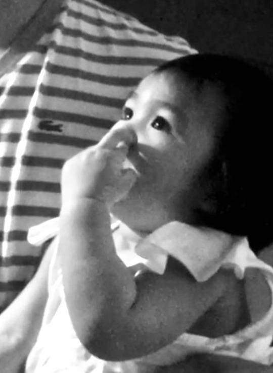
D6: Storytelling (Photography)
#1 --> Why did you choose this story?
I chose the story of a day in family life because I believe it is more personal. There are a lot of families out there in the world, and each one is so different in their way. I wanted to express the actions, emotions, and daily happenings of a specific family. I chose this story because I wanted to capture the random, touching, and fun moments that they can look back at. Family means so much to me, and I will do anything for mine. We all share principles, values, and, most importantly, we grow together. They become our first teachers because we can learn from them and become one of our stress relievers, lessening anxiety we may have.
#2 --> How do you think you did?
I believe I did a good job trying to capture elements throughout the day. I tried to include contact of family members, specifically doing their handshake, their dog resting comfortably on his soft bed and a baby doing an innocent thing. I liked putting the pictures in black and white because I think it stands out more when trying to tell a story.
#3 --> Which image do you think is the individually "best" image in your story?
The image I think is the individually “best” image in my story would be the picture of all the members of the family together in unity. It depicts a big family some smiling, crying, or not even ready for the picture. This image is perfectly not perfect.
#4 --> Does your photo story contain an image that you think is not, by itself, a "great" image, but that is nonetheless important because it helps to tell your story?
I believe each picture is a great image and significant. When capturing simple moments in life I think it is beautiful and can find any little thing to make it seem like a perfect picture.
#5 --> What would you do different next time?
Next time I would like to capture more moments of unity instead of individual family members. I would like to show more laughing, crying, happiness, or sadness just so the audience can feel the emotions when looking at a specific photograph.
#6 --> Are there other Photo Stories you might like to tell?
I would like to have a Photo Story about poverty, homelessness, or low income citizens in America. I feel like this is a major crisis in the United States and I would like for people to be more aware and make a change in the world. Capturing moments of real life problems in America is something so important and big that when seeing photographs maybe more people will take action in trying to help our society and community.

The Family Handshake.
The Youngest Member Doing Her Thing.
1 Bed For 3 People.

67 Never Looked So Good.
Chocolate Cake in Her Hair.

Indestructible Family Picture.
0 notes


Text
D5: Architecture & Urban Planning – The Wedge
I chose to redesign the USU Wedge because it is a well known spot and I am guilty of using this wedge. I see people pass through this all the time and it is difficult because people made it a two way path. First of all, I sketched my idea on paper and scanned it using my phone. I decided to remove the grey marble design in the middle and created a bench that is the same material as the white pillars. I chose to make a bench so students can sit down or lay down while waiting for their ride, the bus, or just simply waiting for class. It is another area where people can hang out. A positive thing about this is that when your sitting on the bench you do not have to worry about people passing by you or when the bench is empty you can clearly just go over it. This can take away the wedge because you are not trying to squeeze into a tight spot where you wait for people to pass through and wait for your turn. Also, on the side of the bench I added a decorative mural so it is not plain looking. Students will talk about this new access route a year from now because it can be a new spot to hang around with friends and because of a cool mural.

0 notes
Text
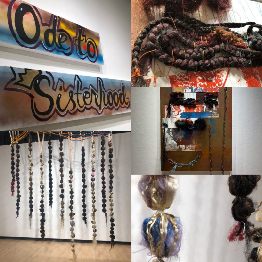
Artist Conversation #5- “Grad Week” | interviewed artist in the past |
Artist: Jillian Thompson
Exhibition: Ode To Sisterhood
Media: Print, Installation
Gallery: LBSU School of Art
Email: [email protected]
Instagram: jillian_thompson
Jillian Thompson is a graduate student at California State University Long Beach. She has a Master of Fine Arts degree in Jewelry and Metalsmithing. She is working on her current exhibition, Ode To Sisterhood, focusing on African American culture and black women.
Jillian Thompson’s artwork exhibition reflects on her braided hair childhood and the issues of gender in the Hip Hop community. She incorporated vivid primary colors, such as dull green, vibrant red, blue, gold, yellow, orange, and brown. The materials she used were acrylic paint, spray paint, drywall, and bags of hair. The bags were a reference to what it looks like when you walk into a beauty salon. Her art is very abstract, even though there was a theme. Looking into some pieces of artwork, you need a big imagination. Thompson likes to express her creativity by creating a unique visual experience. Her display was big enough to see from a distance, but you have to go up to it to see the details.
Thompson emphasized the idea of history. Her theme of braids is a reference from her childhood when she first learned the purpose of them. Braids are meant to protect, strengthen, and encourage hair growth. She would see posters hanging on beauty salons while African American women put hours of labor into their hair. While talking to her, she mentioned that they had become trends, but they have been out for a long time. She stated that the black culture is now mainstream, and other cultures are now taking the forefront of it. It is not supposed to be like that because they think it is new, but it is not. Her exhibit also included her beautiful metalwork, chains representing the hip hop culture. She created large gold chains for women characterizing the ethnicity of black women. Her grandmother’s neighborhood inspired Thompson’s colorful display on the wall in Detroit, Michigan, during the summer.
The composition of her art is inspiring. It is easy to say that her ideas do not only come from her mind but her heart as well. Even though it was just a small room full of artwork, the aura and vibe felt so welcoming. She wanted us to learn and have more knowledge about where she came from. Like Thompson, my grandma inspired me as well. She pushes me to succeed in my long term goal of being a nurse. Even though she had Alzheimer’s, and I had to remind her who I was every day, she always puts a smile on her face, and her aura was amazing. I had to take care of her by washing her body and helping her walk to the bathroom. This artwork resonates with me because culture is so significant, and I am motivated to tell a story. Still, instead of hair and chains, I will do it by the determination to pursue a career in nursing.
0 notes
Text
Speech Actions
My artwork expresses my speech on First World Problems more specifically poverty and hunger. I am showing a collage of food to give an example that in first world countries we have so much food to the point of where we play with it to make it look “nice” and “fancy” then to put up to display and showcase it. Rather than if it was a country that is in famine that would be happy to be able to get some rice and beans. Eating some normal sweets to us would be a luxury for those who are struggling to get food.
I chose photography and collage as my medium because it gives a perception of how the generation now takes pictures of their food before they eat it and post it on social media. Their captions may be ‘Food is Life’ or ‘Eating Good’ just to show off what they are eating before it quickly disappears into their stomachs. I believe I was pretty successful of trying to express first world problems. I tried to incorporate a variety of food to indicate that people who are hungry are not able to eat the food we have. That we take advantage of the things many people can not afford or possess. For most of us we experience hunger as a temporary sensation. We should really start giving to those who do not have enough and make an impact. If I did this project again I would try and capture the real faces in situations they live in. The expressions that show more than words can describe.

0 notes
Text
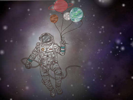
D4- Student Choice
For this assignment, it was our turn to pick the media and the content. I created this piece for my little cousin’s birthday invitation. He loves space and everything in it. When I was younger I have always wanted to be an event planner. I would have scrapbooks of fabric, decorations, and so on. With the piece of art that I have made, I have shown that I like to plan events for many different types of occasions. The ones that I want to do the most would have to be those that are for kids because they are typically less formal. I can just let my creativity flow, usually by adding original characters and making creative settings where the character or characters would be.The media I chose was digital art because it was the best format for the invitation. I like sketching on my iPad because it is most efficient for me, and if we mess up, there is nothing better than an undo button. With the development of innovative pens and apps, there are ways our art can look like an oil or watercolor canvas. I believe I was successful because I made my little cousin happy and tried to imitate space the best way I can imagine. My experience was excellent because I love creating, and I got to experiment with different colors and textures. What I got out of this project is that no matter what kind of art or medium you choose to do, it is always limitless. It is our choice and freedom that enables us to create a masterpiece.
0 notes
Photo

D4- Artist Conversation #4 - Chloe Krsteski
Picture of the art piece
4 notes
·
View notes
Text
D4- Artist Conversation #4 - Chloe Krsteski
Artist: Chloe Krsteski
Exhibition: Fine Line
Media: Graphic Design
Gallery: LBSU School of Art
Email: [email protected]
Instagram: chloekrsteski
About the Artist
Chloe Krsteski is an undergraduate student in the Bachelor of Fine Arts. It is her 5th year attending California State University Long Beach and she is working to get a degree in graphic design.
Formal Analysis
Fine Line is a graphic design group exhibition. Ten artists created this art gallery, and I got the chance to have a conversation with Chloe Krsteski. She created the piece Wired!. Everything they do is digital, but for this purpose, it was experimental graphic design, so they made pieces that broke digital norms. Chloe mentioned that initially, this piece started as an illustration (drawing to digital art illustration). Then it was created into a real-life version. For her particular art piece, she made a base out of a metal rod and hung it in order for her to build it hanging. Then she worked all the wires around the rod and formed the skull face. The challenging parts for Chloe were the eyes of the skull because those were free hanging. They did not have a metal rod to support them, so she had to connect them in away from the sides to where they would hang. The zip ties were used more so to ensure nothing would fall.
Content Analysis
The art piece was special to Chloe because she has never made anything like these before. This really broke her out of her comfort zone. It was intended to be a PSA for people who are consumed by technology and need to “unplug” themselves from it. She was trying to pick a cause that people overlook when choosing a PSA, so she decided electronic addiction was overlooked often. It felt that making a scary visual out of everyday chords people use would be a unique approach to raising awareness.
Synthesis
I love how Chloe Krsteski came out of her comfort zone and making her graphic design illustration into a reality. Her artwork resonates with me because she is expressing a cause in the world, electronic addiction. I am one victim, but of course, I am not addicted. It was more of a wake-up call to put my phone down and create memories with our eyes. We should enjoy the world and nature without a screen. I appreciate her work because I know it spoke to many people.
1 note
·
View note
Photo

My pictures would not upload together with the essay so here is a separate post from Artist Conversation #3 with Destiny Randall.
0 notes
Text
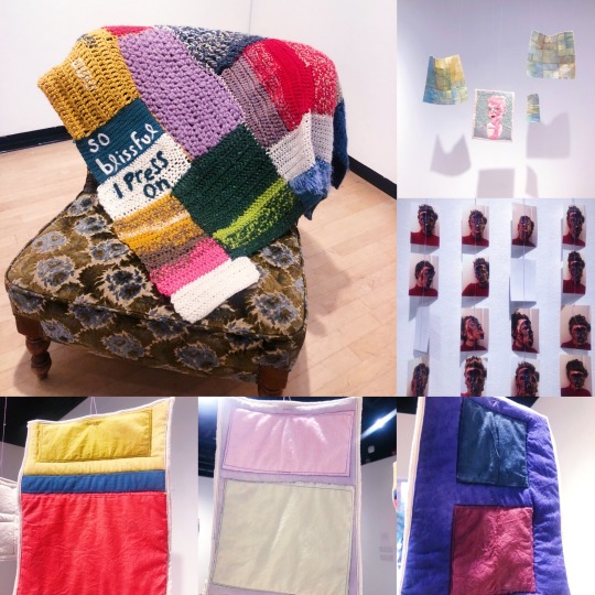
Artist Conversation #3 - Destiny Randall
Artist: Destiny Randall
Exhibition: hanging by a thread
Media: Studio Art, Fiber & Textiles
Gallery: LBSU School of Art
Email: [email protected]
Instagram: makingmydestiny
About the Artist
Destiny Randall is a student in the School of Art’s Fiber Program. She is an undergraduate student who transferred her junior year of college from California State University Fullerton. During her years at CSUF, she was initially pursuing animation but realized that is not what she wanted to do at all. Destiny heard about the fiber program at CSULB and transferred. When I was talking with her, she mentioned that she would like to change her focus now. She is going more towards the route of video and photography. Instead of just having others stare at hanging art on a wall, it would be her interacting or others interacting with the work. This idea allows her to talk more about the concepts.
Formal Analysis
Hanging by a Thread is an exhibit created by three different artists, and I had the chance to interview Destiny Randall. Her pieces were made out of hand-dyed muslin, cotton, wool, photographs, beads, dried flowers, and various fabrics. I asked her about the inspiration for the colors chosen. She started by talking about the six small quilts. She had made them for her color theory class and had to abide by the constraints of the project. Destiny was thinking about her concepts of the psychology of color and not what society may think of color. She explained the first small quilt that was red and pink and how it was monochromatic, which she finds to be boring. This represented her being bored in the city called Split, Croatia. She is not a beach town kind of person, and there was nothing to do in the city, so she just wanted to leave. She explained another quilt that was green and purple. She loved the color scheme, and it represented her favorite city she went to, which was Vienna. Destiny was not abiding by the typical conventions of color psychology, but what she felt from each color and going off that. For the quilt top, she dyed six different types of purple fabric and eight various bands playing how long she left them in there to see the ranges of color. She disliked the majority of the purple because it turned out to be pinker. She ended up bleaching with thyroxine, which is a product that doesn’t completely strip off the color like bleach often does. Instead, it would leave residual of the dye. Destiny bleached most of it but kept some purple she liked. That explains the yellows and oranges because those were residual dyes that remained. She said that this was the first semester she had come to learn fiber, so she never experimented that way before. She also used a method called applique, which is a quilting technique used to take fabric and stitching it on top of another piece of fabric.
Content Analysis
The art gallery focused on the topic of self-care and mental health. While signifying the significance of self-care, the three artists made art to cope with anxiety, depression, and other overwhelming feelings. Destiny mentioned that there doesn’t have to have a big concept behind the art. For example, the big quilt top was made just because she wanted to, and it made her feel happy. Sometimes artists get so caught up on the concept of things. She said, ‘oh, this has to mean something’ and ‘oh this has to be so politically relevant.’ She continued saying that it doesn’t always have to be that way. Artists can have work that is just for themselves, which helps them feel better. I asked Destiny if there were any stories or memories behind some of her pieces. The six small quilts expressed her trip to Europe a couple of years ago. She had gone to six different cities, and each represented her emotions at the time. For the self-portrait quilt, Destiny said she was crying and took a photo of herself to memorialize that moment. She wanted to “bring beauty from the ashes of that moment” and it expressed that. Destiny also talked about her friend, Sage Larae Monroe’s, blanket and that she tends to have anxiety. Destiny picks at her scabs, and Sage picks at her fingers. To keep herself from doing that, Sage learned how to crochet, and she would do it every day for a month, every time she had the desire to “self destruct” her body. Sage would crochet using different colors, so at the end of the month, she stitched them all together in an asymmetrical pattern, thus creating the blanket. The words on the blanket comes from the concept through anxiety and that she is joyful and trying to maintain this sense of sanity.
Synthesis
Destiny Randall was amazing to talk to and was so sincere when talking about her work. Of course, with their exhibit being about self-care and mental health, they speak out to many people and also personally. Their pieces have a lot to say, whether there is or isn’t a concept. You can tell they have gone through a lot, and art was a way of coping with the difficulties in their lives. Their art becomes meditative and quieting to the mind. Destiny’s artwork resonates with me because I have some overwhelming feelings and insecurities that may cause me to feel down. Since I am not a very artistic person, I like to garden instead. Gardening gives me peace, and I learned it could help reduce depression, anger, or stress.
0 notes
Text
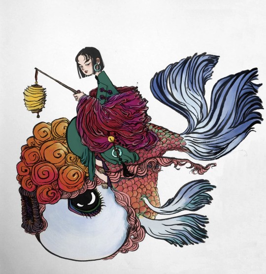
Artist Conversation #2 - Hanjialin Bao
Artist: Hanjialin Bao
Exhibition: Gui
Media: Graphic Design
Gallery: LBSU School of Art
Email: [email protected]
Instagram: amber_baoo
About the Artist
Hanjialin Bao is a student in the School of Art’s Graphic Design Program. She is an undergraduate working on her BFA in Graphic Designing, but she loves creating storyboards, illustrations, and animations. She was born in China, but moved to the United States to further pursue her dream and continues to show her passion by expressing traditional Chinese culture in her art.
Formal Analysis
When I was communicating with Bao, for project Gui, she primarily drew her art on paper using brush pens. The brush pens are ideal for Chinese and Japanese calligraphy applicable to a wide range of styles and techniques. After drawing, she then scans it, which I did not expect and found interesting. Since her art is scanned, it is on paper and framed. It is not big nor small, but in fact, it was the first thing that caught my attention. Color is very significant to her works. She mentioned that “it always takes me much longer time compared to just black and white.” Bao tries to use plenty of color without losing the details of the linework, which is always the difficult part. Depending on the meaning of the works, she will use the color that serves the mood, whether it has a specific meaning or background. But other than that, she goes with her feelings. Her exhibition expressed a lot of red, which made the art pop out and used colors opposite from their color wheel. Her art is very detailed, and the colors are well blended.
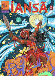
Content Analysis
Bao is creating a story based on traditional Chinese myths and the characters she designs. The illustrations are part of the artworks that support the story. Her idea for this project is composing a book of half an illustration album and half comic book with a storyline. She would like to show a more profound and broader understanding of Chinese myths and legends. Therefore, in this exhibition, she is creating her mythical world. She would like to be an artist who introduces Chinese culture and contribute to the diversity of the world of graphic design. Bao states, “Ideally, my project would make traditional Chinese mythology more accessible and entertaining for people of various cultures.” Besides publishing it as a book, she would like to publish it on computers and cell phone apps. Bao says she has been in touch with online comic companies that can help her out.
Synthesis
Hanjialin Bao’s gives out a positive aura with her art. I can tell there is a lot of time and heart that goes into them. It is just not the drawing and coloring, but the researching of myths and getting a story that makes sense with a timeline. Her art includes many other things people do not realize. I feel like this is life. That you do so many things, but some people do not realize how much effort you put into it. For example, we all have goals in life. I would like to become a Registered Nurse. People not around me would not know the hardship and amount of time, effort, struggles to succeed in this goal. Only you will know how much sweat and tears you put into something.

0 notes