
Don't wanna be here? Send us removal request.
Statistics
We looked inside some of the posts by ginevrapasquale and here's what we found interesting.
Average Info
Notes Per Post
0
Likes Per Post
0
Reblog Per Post
0
Reply Per Post
0
Time Between Posts
2 days
Number of Posts By Type
Text
17
Last Seen Tumblr Blogs


Fun Fact
The average Tumblr user visits about 67 pages every month.
Text


This is my animation that I have created for my brand House of Flor. To create this I have used some images and patterns I have made throughout this project, some of these pictures were taken in the studio and others taken in my location photoshoot for my campaign imagery which also involve the product I have made for it which is the mug. To make this animation it took me two days. I have used Photoshop for the entire video. Firstly I set up a page on Photoshop where I could of started doing my animation once I got my page up I started to put my pictures in, to do this I’ve created four layers and in each layer I put a different picture that I wanted to use once I was happy with all my layers I saved it all just as a Photoshop file. Then in each layer I had to create movement to do this I just moved my layers around and saved it every single time I would move something to make a new frame each time, once I did that for each layer I ended up having 109 frames for this animation. Then I got rid off the layers and put all the frames in from the first frame to the last one. Once all the frames were in order I just pressed “window” then clicked on “timeline” once you click on timeline it automatically gets all your frames you’ve put on Photoshop in a line and underneath each frame you can change the speed from 0.1 seconds to 10.0 seconds, most of mines are 0.2 seconds and 0.5 seconds so that it wouldn’t all be the same speed. I feel like this turned out really well, overall I’m pleased with the outcome as I think the all the images and colours match really well together and it also flows really well. It also works really well as the tones I have used for it match my brand as well.
0 notes
Text
JOHN LEWIS


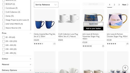

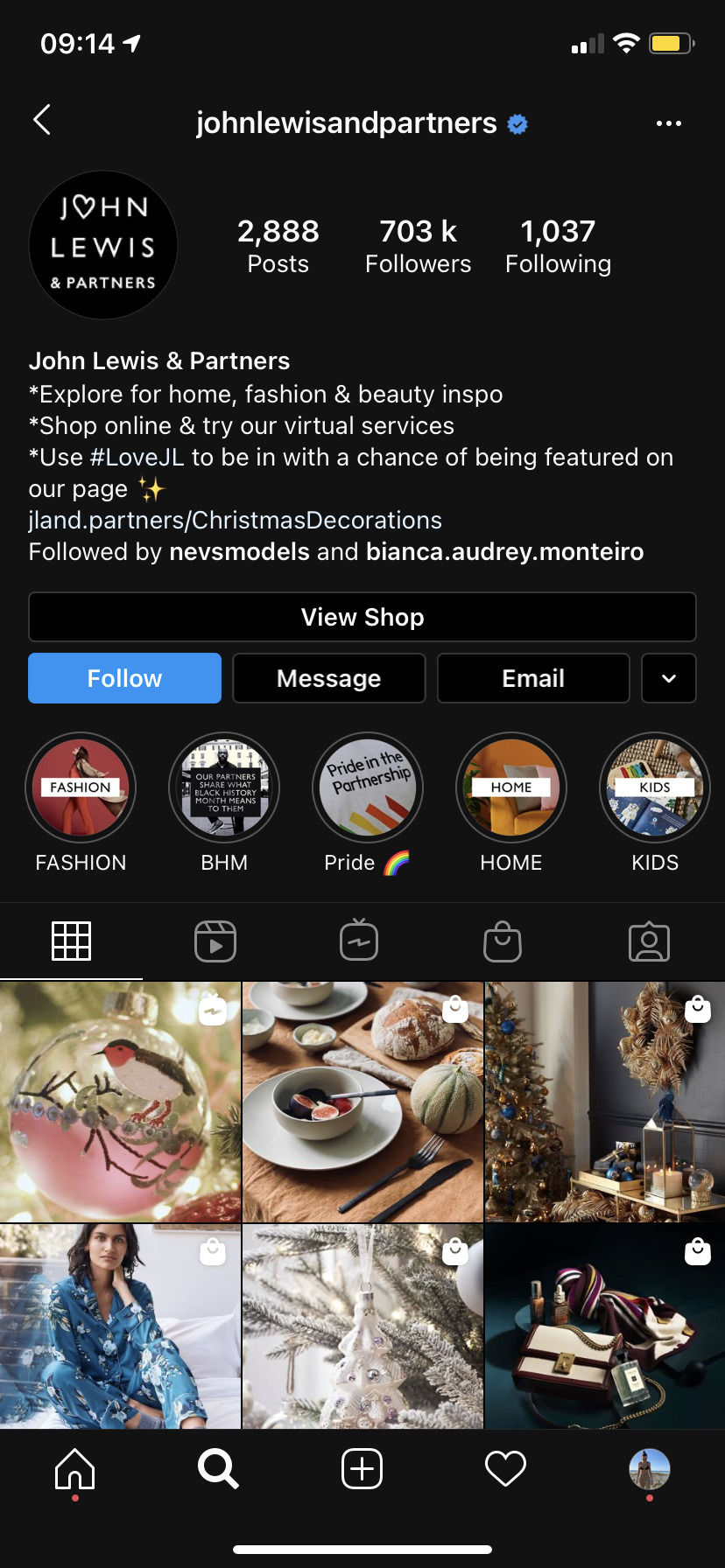


Another brand I've also looked at is John Lewis. John Lewis opened a drapery shop at 132 Oxford Street, London in 1864. Born in Shepton Mallet in Somerset in 1836, he had been apprenticed at 14 to a linen draper in Wells. He came to London in 1856 and worked as a salesman for Peter Robinson, an Oxford Street draper, rising to be his silk buyer. He set out the principles for how the Company should operate and produced a written Constitution to help Partners understand their rights and responsibilities as co-owners.Spedan Lewis wanted to create a way of doing business that was both commercial, allowing it to move quickly and stay ahead in a highly-competitive industry, and democratic, giving every Partner a voice in the business they co-own. This combination, so ahead of its time, continues to make us what we are today. John Lewis is the 5th most popular department and home store and the 5th most famous. John Lewis is described by their customers as: good quality, good customer service and trustworthy. I did the same research I did for my other brands like H&M HOME, I looked up at their website and the way is present and also looked at their Instagram page, the way their website and Instagram page is set up is very similar like their website shoots of their products are very simple and minimalist like the ones of H&M as they just use a white background for it, they also do different set up for holidays of the year example their Instagram at the moment as loads of Christmas shoots like shown on the pages above. John Lewis also links the prices of the products on the image like H&M does on their Instagram page to make it easier for the customer to buy it straight away instead of looking for the same product on the website.
0 notes
Text
H&M HOME


I have decided to also look at H&M HOME for “brands research” this is because it links to the specialism I have chosen for this project. H&M HOME was launched online as a home textile concept in 2009. The assortment has been extended throughout the years and rolled out, in many markets mainly via shop-in-shops and online. Today, H&M HOME is a global interior brand within H&M Group. In 2018, H&M HOME opened its first standalone concept stores. It’s the best place to go to when you want to find inexpensive soft furnishings. It's basically the easiest way to overhaul your home without getting out the Farrow & Ball. While there are some trend-led items. I thought it was really important to look at their website, Instagram etc... to see how they present and promote their items and how they also attract their customers through using Instagram and their own website. The first few pictures above show how their website is present, I would personally say it’s very minimalist and simple, like shown above most of their picpictures are taken behind a white wall, also looked and the text they have used for their website which also remains simple, I have also noticed how simple and clear their website is set up this is because sometimes it’s very hard on other brands website to find the price or what the product is made off. Also look at their logo which is very similar to mine as they have kept it plain like I did for my brand, just a simple font which makes it accessible for everyone to read. As well as their website I’ve looked at their Instagram page too. Their Instagram show a wide range of Instagram highlights like shown above, different holidays of the year example as we are getting closer to Christmas, they’ve been posting loads of Christmas home set up on their page to show what they are selling for it, also link the price of the product in the picture which I think makes it so much easier for everyone as you can just click on it and it automatically opens the product where you can buy it straight away, it’s definitely an amazing great selling tool as the customer doesn’t need to go on their website and look for the same product they’ve seen on Instagram. I can see that they have taken effort and time into making their website and Instagram page well detailed and they also show how a product could be styled at home, which gives the customer a better view on the product at home.
0 notes
Text
FINAL EDITED PHOTOSHOOTS


This photoshoot was taken a in massive field near Bury. These are the final pictures have chosen and edited by using Lightroom. I absolutely love the aesthetic of this place and how the tones of the sky just worked so well with the outfit my model was wearing and how it also linked to the botanical theme, on this day the weather was sunny and clear, which really changed the aesthetic of my pictures. I did have few problems with the camera sometimes as it was quite sunny so the pictures would come out quite bright, I changed my camera settings to Manual mode Auto ISO with shutter speed at 1/250 sec and the aperture at its widest setting, such as f/4 and the Iso at 100 which is the lowest this is because it was very sunny. I just love how everything worked out so well. My model was wearing bright green shorts with a white blazer and a jumper on top of the blazer to also give more of a campaign look, as brands usually style loads of different items together for their campaigns to make it stand out and look very unique and original, this is the look I was going for my campaign pictures. I am so pleased with the outcome of these pictures as I think it links really well to the brand I am doing and I will definitely be using these pictures for my portfolio as well.
0 notes
Text
INSTAGRAM STORIES EXAMPLES


These images above are few examples of Instagram stories I have found on Pinterest. Compare to the Instagram stories I have screenshots these are a bit more different this is because of the other page I have actually taken screenshots of each page to also show how the story flows where as on here I have only got pictures of the first story, but reason why I have chosen these images it’s because I like the colour palette they have used of each one and also like the lay out as it has really inspired me. For my Instagram story I am definitely going to consider the colour palette that I have used throughout my entire project as I want everything to flow, and also will consider the same fonts I have been using for my brand. All of these images look very clean and simple which is definitely what I am going for with my own brand. I love colours and fonts they have used for each story as everything matches well.
0 notes
Text
INSTAGRAM STORIES


These pages above show screenshots of instagram stories I have taken while looking on instagram. I have taken these screenshots to see how different brands promote their items/products via Instagram and how they use it so that I could of had different ideas on how to create my own Instagram story. Some of these screenshots above mainly reflect on botanical which is the theme of this project and others link more to homeware. These Instagram stories are videos taken with a phone just by using the Instagram camera you find on the app. Example the third page above was this Amiri Instagram story that came up on my feed. The reason why I did take screenshots of it It’s because it linked to botanical because the background was plants, as shown above you can see that the person who was taking this story was moving as the first image there was way more plants then there are in the last screenshot I have taken, I also put all these images in order so that it would be easier to see how the story flows, I really like this story as they have kept it very simple and each story that was taken had something different written on, they have also used a simple font to make it easier for everyone to read and used white for it, this is because it creates contrast with the background they have used, example if they've used black for it, it would of made it much harder for everyone to read it as the background is already quite dark. The last page above is a Copenhagen brand I follow on Instagram, I took screenshots of this one because it links to homeware and also linked to what I am doing for it which is mugs, they mostly use their Instagram story to show what’s new in the shop and what's on sale, as you can see on the page above they have used a simple text for it, they have used gifs for it like shown on the last screenshot I have taken and also highlighted some of the text they have used so that catches peoples attention more and makes it easier for people to remember. The story we will be creating it will look more like a GIF as we will be using Photoshop to create it but looking at how different brand use text and pictures for their brands has definitely helped me and gave me ideas on what I could do for my own one.
0 notes
Text
STUDIO PHOTOSHOOT


For this lesson I have just taken some simple images of my mug in a studio, I firstly took some pictures of the mug and I just set up my studio with a bright blue background and used bright pink paper to put on the table I was using and also put it inside the mug as I think it looked cute, I really like how the bright blue and pink really contact with each other also like it because the colours I have used match the tones of my mug. These two contacts sheets are just all the images I have taken for this lesson but I am gonna look into each one and choose the best ones so that I can edit and develop them, by creating some patterns, adding shapes etc... To edit my favourite images I am gonna use Lightroom. After taking some pictures just the mug I wanted to take some pictures where the model holds it as well, like the images I have chosen for my mood board I have made for this photoshoot. I really like the way the images came out where my model was holding it and she kept on changing the angle or holding it in a different way. To take these images have used artificial light, I also took these images from different angles as some of them are taken from below, some are closer and some are further out.
0 notes
Text
MOOD BOARD

I have done this mood-board to have some ideas on what I could shoot in tomorrow lessons as I need to shoot some pictures of my mug in a studio. I have found these images on Pinterest. For this photography lesson I just want to take simple images of my mug as I've already taken my campaign images. All these images are very similar to each other, example like backgrounds, the majority of these pictures have a white background or a white sheet, I really like the picture with the black mug above this is because it really stands out, as the white background contrasts with the black mug. I will take pictures with different coloured background like I could match the background to my own mug instead of just doing white, I could also get one of my friend to hold it like the images above. One image that really inspired me is the first one on the right, I just love the way the model is posing with the mug I thunk it looks really charming and love the sheet they have used for the background as it creates a soft and gentle effect. I think it will work really well just to have some simple images that I can use for this project as I could always edit them by making a pattern as I have already taken all the images I'm gonna use for my Instagram story.
0 notes
Text
URBAN OUTFITTERS


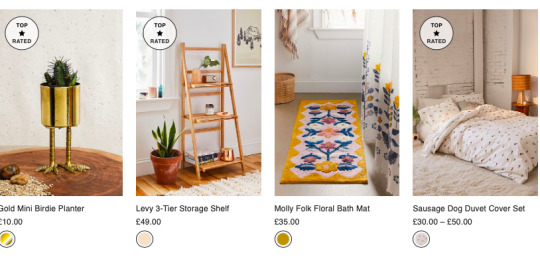

Urban Outfitters, Inc. is a multinational lifestyle retail corporation headquartered in Philadelphia, Pennsylvania. It operates in the United States, Sweden, United Kingdom, Spain, Denmark, France, Germany, Ireland, Belgium, Canada, Italy, the Netherlands, Israel, Poland, and the United Arab Emirates. Urban Outfitters targets young adults aged 18 to 28 through a unique merchandise mix, compelling store environment, websites and mobile applications. We have established a reputation with these young adults, who are culturally sophisticated, self-expressive and concerned with acceptance by their peer group. Urban Outfitters' top 18 competitors are J. Crew, AEO, Gap, DENY Designs, Inditex, Vinyl Moon, Reformation, Abercrombie & Fitch, H&M, URBN, ZARA, Forever 21, Aeropostale, Uniqlo, TJX, Ross Stores, Buckle and Macy's. The reason why I have chosen this brand is because is a well known brand, above here I have taken screenshots of their website page to see how it’s presented, and how it is done, prices of the products. I have also looked at their packaging and their shopping bags to even have an idea and to see what's different with my own brand and how I have made different packaging to theirs, I personally think their packaging are very different to mine as i have fully designed a pattern for my own one as they have kept theirs very simple, they have used cardboard boxes and kept the same colour where with mine I did an orange box and a pink one. I am not too sure on how I feel about the shoots they have taken for their website as I think it can come across quite messy, I would personally doing it more minimalistic as there's too much going on which makes it harder for the customer to understand what they are selling, they usually do the home set up to show the product or they just use a white background. Urban Outfitters can also be quite expensive sometimes this is because the company is in decline and they need to charge more just to survive at this point...Urban Outfitters has had a rough couple of years. Once the go-to spot for the young and hip, the chain has faced declining sales in recent years. However, there is absolutely no denying that Urban Outfitters is also the most overrated shop on the high street. Aside from the overpriced clothes and the bizarre store layout, the controversial pieces this shop sells are often outrageous and massively overlooked.
0 notes
Text
BRANDING GUIDELINES


In today’s lesson we had to develop branding for our product by developing logo concepts. we developed a branding guidelines pack that considers colour, type and image. To create that we used Illustrator and set up two art-boards where we could of started to design our own branding guidelines. First page above shows my logos, fonts and colour palette I have used to create my own brand where as the second page I have put my boxes mock ups. To come up with these ideas and design I have used illustrator and I have also got inspired through looking on Pinterest so that I could come up with different ideas for my own brand, as shown on the page above I have decided to keep my logo very simple this is because I want my customers to focus on the brands name instead of anything around it, that's why the main logo is very simple and easy to be read by everyone. Also with my colour palette I have tried to use colours that go really nice together, so that my brand will have a nice looking instead of putting random colours that don't match well. It’s very important to show every single step and how you've created your brand as it also helps myself to have a visual idea and how I've organised everything. and I can also go back on my guideline to see what fonts and colours I have used to create my own brand.
0 notes
Text
EXAMPLES OF BRANDING GUIDELINES


Brand guidelines, also called a brand style guide, are essentially an instruction manual and rule book on how to communicate your brand. They lay out all the visual details, as well as important notes about the company’s voice, tone, and messaging. They come in the form of a physical or digital booklet filled with examples of what to do and what not to do.Brand guidelines comprehensively cover a company’s brand identity, including its:
Logos: full logos, secondary logos, and icons
Colour palette: primary and secondary colors
Typography: font styles, sizes, and spacing
Other imagery: photos, illustrations, and artwork
Voice and tone: how the brand uses language and emotion
When companies take the time to create brand guidelines, it helps to ensure that their brand image. Stays consistent no matter where it shows up. This will pay off big time in the long run, as your company will generate the familiarity and reliability that open the doors to brand loyalty. Example Urban Outfitters, a lifestyle retailer, is all about edgy designs and quirky product shots in its visually creative style guide. The retailer’s brand guidelines include its photography methodology and a good deal of information about its logo and brand face. As Urban Outfitters believes in evolving with consumers’ changing preferences, the retailer doesn’t shy away from rebranding itself every six months or so. Everything from the logo to the store environment is refreshed to appeal to modern consumers, making Urban Outfitters one of the best brand guidelines examples to follow if you’re interested in staying hip and relevant. Truly helpful brand guidelines don’t just tell you what you should do. They also paint a picture about what you shouldn’t do.This helps to drive home your usage requirements in a visual, easy-to-understand way. The guidelines also make it clear that you’ll be harshly judged if you tilt the logo or add embellishments like drop shadows and gradients. The more details, the better. If you’ve addressed this in your brand strategy, explain specific scenarios and uses for different colours, fonts, and imagery. The purpose of brand guidelines is to make sure your brand is always conveyed in the same way and the document itself is no exception. You can accomplish this by adding small touches that are in line with the guidelines you’re explaining.For example, instead of numbering pages with plain black numbers, use your logo icon and colour accents to make it your own. Use your brand colors and fonts in section headings, as well as in your explanations and descriptions.
0 notes
Text
COSTUMER PROFILE

Customer profiling provides much needed structure to a marketing plan. It helps you (and us) understand what the ideal customer is looking for, what matters to them most and how best to speak to them. After all we want to reach the target audience with our brand, not the marketing director or media planning team. This objectivity will help with every step of the project, from the creative right through to buying media spots and assessing outcomes. Customer profiles aren’t the same as demographic information. While demographics usually provide the key dimensions that advertisers seek (age, location, gender etc), profiling groups these dimensions, along with other elements (psychographic/behavioral for instance) in creating the ideal customer profile. For example, being able to reach women aged 25 – 35 years old might have a certain value to a brand, but being able to reach women aged 25 – 35 with children at home will have far more value to manufacturers of toys. Customer profiles, and the values ascribed to the traits provided (audience valuation), give us a firm base with which to plan and buy media. Beyond this, they provide objectives and deliverables to the marketing project as a whole, increasing the likelihood of reaching your target audience as efficiently as possible. To create my customer profile I have used Illustrator, I firstly went onto generated photos and chose a picture that I could of use for my own profile, once I chose the picture I liked I opened Illustrator. Then once I put the picture I chose on Illustrator I turned the opacity of the picture down around 60% so when I would go around It with the pen tool I would be able to see what I was doing, once I was happy with the outline I did with the pen tool, I filled the image with the colours I wanted to use to ended up creating a new person. Last thing I did was adding the details of this new person including every single detail like shown in the image above. I kept my customer profile quite simple from the fonts I have used for it to the colours, this is because It makes it more professional, if I used loads of colours for it and changed the background from white to a bright colour I think the attention wouldn't be on the customers profile but on the colours I have used for it.
0 notes
Text
LOCATION PHOTOSHOOT


This week we had to do a location photoshoot, to start taking some images for our campaign. I thought it would of worked so well to take some pictures in a field as it also links to the theme botanical. These two contact sheets are just my favourite pictures I have chosen out of all the ones I have taken, these images have already been edited. To edit my pictures I have used Lightroom as it edits them better than Photoshop, I just change the brightness of them or the exposure. The mug I have used for these images is my final product I have designed for this project. As we had to take campaign images I wanted to do something quite different than the usual home set up for it, most brands I have looked at usually do a table set up with the mugs they are promoting. I also tried to match my models outfit to the mug and the colours of the field, as shown above my model is wearing some bright green shorts which could link to nature/botanical then decided to put a simple white blazer with a lilac jumper/cardigan on top of it which matched my mug design, as it has lilac tones. I am very pleased with the outcomes as I will definitely be using these images for my instagram stories. I just think the colours and tones of these images just work really well all together, it was also something different as so far all the images I have taken are in a studio, and used different kind of props for it. To take these images I have used natural light for all of them, I am very surprised as the weather was better compare to all the other photoshoot we had to do as most of the time it was raining, which has really helped me to get the best pictures out of it. I also took my pictures from different angles as show above, my favourite pictures are definitely the ones where are taken from below as the sky just worked so well with it, also really love the way my model was posing with my mug and the different set ups we did for it, example I put some flowers in the mug to also work more towards botanical, I really liked how the flowers actually matched the colours of my mug. Then after I took enough pictures of my model, I thought to take some groups pictures as the lighting was so good for it and I could always use them for my instagram story or do some graphic edits with them. The last page above are some backup pictures my friends have taken to show where and the way I was taking pictures of my model, and the different poses we have used.
0 notes
Text
HOW BRANDS PRESENT THEIR ‘BRAND’


Brand imagery is the result of all the visuals that represent your brand’s identity. The images that make up your brand imagery can appear in a variety of forms, from billboards to Instagram, websites to print ads. These images are more than simple visuals, they convey an emotion in the viewer (known as “brand feelings.”). This often occurs on an intangible level, building trust and confidence over time and repeated exposure. You can view brand imagery as an opportunity to visually communicate with your potential customer. Whether you’re modern or traditional, simple or complex, clean or edgy, show them who you are, why they should trust you and how, if they choose your product, you it will make their lives simpler or better. While brand imagery represents your brand’s identity through aesthetic appearance (meaning the images you use to visualize your brand), your brand image refers to how your brand is perceived on the outside and the reputation it has in the world. You can use imagery to help shape your image, but your image is impacted by many other things, such as your values, actions and how you communicate. For instance, while Mercedes and Dodge are both trying to sell the same product, they are attempting to sell to two different audiences. In Mercedes ads, the cars are most often silver and shown in urban environments, with clean serifed fonts. The color and setting evokes luxury, confidence, and technology. Dodge chooses to use red cars and often sets their cars on racetracks, with bold, heavy sans-serif fonts, to sell the idea that their cars are fast, powerful, and strong. It’s crucial to think carefully about colour, composition, typography, content and style work together to create different moods. The basics of colour theory and typography to understand what message your brand images are sending. For example, dark colours and heavy fonts project seriousness; pale neutral palates can give a modern or even futuristic vibe. Knowing your audience allows you to pick the design elements to focus on. Audiences are not one size fits all: your audience might react well to your logo on a clean background with a few supporting graphics, while another might only respond to on-trend animated GIFs that will make them smile.
0 notes
Text
MOOD BOARDS


This week we are off site. We have to take pictures on location, to also start taking images that we will need for our own campaign. I have decided to do some mood boards of different kind of fields, poses, and also how they have styled their models. As the theme of this project is botanical, I thought it would be perfect to take pictures of my model in a natural environment, and I just thought a field will be perfect for this. I am also considering how I could style my model for my images, this is why I have chosen all these photos I got from Pinterest so that each one could inspire me from the tones of the image to the way they are posing, just little things that I could recreate in my own ones. One image that really inspired me is the one where there’s a table and loads of Jacquemus bags on it, I just really like the idea of how they have fill a table with loads of the exact same bag, and also really like the angle from where the picture was taken, by taking the picture above shows all the bags on the table if they took the picture from the same high as the table and model you would not be able to see what's on it, I would definitely like to recreate something similar, with my own product which is a mug, I think it would look really cute if I put a cute table and a chair in the middle of a field and take pictures from different angles and also I will be experimenting more with natural lighting as all the pictures I have taken so far are all in a studio which means I've only been using artificial lighting. I personally think that would work really well for my campaign as I also think it’s quite original instead of setting up a table inside and take pictures of it, it would also link more to botanical as well, I would bring loads of props with me so that I can do different set ups for it, but the table idea is definitely something I'm gonna keep in mind as I really liked it, also really liked how the colours really contrast, as they have used bright colours for it, I am also gonna bring flowers with me as I will like to take pictures with a bunch of flowers as well.
0 notes
Text
CREATIVE MATERIALS USED WITHIN MARKETING PRODUCTS


Another thing we had to do as part of the homework was to research creative materials used within marketing products. So I started to look on Pinterest, instead of looking at things products and brands that didn’t really relate to my specialism I started to look at homeware and what kind of materials they use for it. At first it was quite challenging as there wasn’t so many pictures, like most of them were quite plain or didn’t have anything compare to skincare products where there are more creative images for it and use more creative materials as well. The first page above shows images that I have found through looking on Pinterest. I have noticed that all these images I have chosen are all very simple. Where as the second page shows two brands that I have chosen to look at which is Zara home and H&M home, this is because I wanted to see what materials they use for their shooting when they have to promote the product, I have noticed that Zara used more of an home vibe to show their promote compare to H&M home as they only use a white background for it. This is why I also think maybe Zara products might actually sell more than H&M as I think customers would want to see how the product would look at home example like the mugs I have chosen, the pictures are taken on a table where they have set it up, as you want to attract your customers and show them your item in the best way possible, Zara is more out there as even their shoots on their website it’s always on location or in a set up studio which definitely gives a customer an idea of what they are going to buy, I Personally think Zara is always good with the set ups as you have to be carefully with it because if it’s too much the customers won’t actually pay attention to the product they are promoting but everything around it. Looking at these images has definitely inspired me on how I could develop my own images and what kind of materials I could use for my next shooting once I will be taking pictures of my actual mug that I have made.
0 notes
Text
MARKETING FASHION PRODUCTS

This part of the homework was to research marketing fashion products and how brands promote their items/products.Put most simply, marketing is where fashion and business intersect. Marketing is one of the most important aspects of fashion – without it, the end products wouldn't sell! The bottom line of any business is to make money and marketing is an essential channel to reach that end goal. Creativs explained that without marketing many businesses wouldn't exist because marketing is ultimately what drives sales. A marketing strategy to compete in the ever-changing fashion industry can be quite a challenge. Fashion marketing is the branch of the marketing industry that deals with the advertising of clothing and accessories to the target market. This includes ads in newspapers and magazines as well as commercials on television. The most important aspects of fashion marketing are identifying the target market at whom the clothing will aimed, determining where to sell the products to maximise sales and deciding at what price to sell the products, to attract customers and generate profits. The other aspects include deciding how the products should be displayed; this is where the creativity and resourcefulness of the marketer comes into play.Fashion marketers need to be well-read in both marketing and business. It also helps if they have a natural flair for fashion and pop culture. They need to be able to plan, design and coordinate ads that will reach the masses, and entice them to buy or take the desired action.
Nike starts with story and emotion to conquer hearts and minds (and global sports apparel markets) Nike’s marketing campaign can be an example to all marketers everywhere. That’s because the marketing concept behind this mega-brand is responsible for global brand awareness that is likely to last for centuries to come. There have been competitors and imitators, sure, but with 48% of the American athletic footwear market (and 96% of the basketball footwear markets) nobody even comes close to Nike. Nike’s marketing strategy starts with emotional storytelling and goes a lot further than advertising spend or celebrity endorsement. From ‘Just do it’ to Colin Kaepernick, Nike keeps raising the bar with evocative, memorable campaigns that tug at your heartstrings and stay in your head. Nike builds it all brilliantly into word of mouth marketing: the ads, the stories, and the emotions are so good you can’t help but talk about them. And every time somebody makes their own video about Nike, or makes their meme, Nike wins. Nike always wins. It’s key to use emotional storytelling in your marketing plan for long-lasting brand awareness. Instead of competing against fast fashion or haute couture, MATTER espouses a different set of values. With that focus in mind, MATTER integrates modern fashion design with traditional textile production made by artisans. The focus on making connections, both within the community and between customers and producers makes every piece a conversation starter and a piece of personal identity. It’s key to center your fashion business on the community it supports and you will build brand loyalty for years to come.
0 notes