
Statistics
We looked inside some of the posts by gmackarts102-02 and here's what we found interesting.
Average Info
Notes Per Post
8
Likes Per Post
8
Reblog Per Post
0
Reply Per Post
0
Time Between Posts
13 days
Number of Posts By Type
Text
7
Last Seen Tumblr Blogs


Fun Fact
BuzzFeed published a report claiming that Tumblr was utilized as a distribution channel for Russian agents to influence American voting habits during the 2016 presidential election in Feb 2018.
Text
Course Reflection (ARTS 102)
Throughout my experience in ARTS 102, it has made me more confident as an artist. This course has done a fantastic job in shaping me into a designer. It has done an amazing job teaching me the basics of the industry standard programs which are the Adobe collective of Photoshop, Illustrator, and InDesign. It has taught me a lot about the forefront of typography and its extreme importance in the field. Our textbook, Becoming a Graphic and Digital Designer by Steven Heller, we read throughout the course was amazing. This was one of my favorite textbooks that I have had throughout all of college. It wasn’t just a plain old textbook, there were first-hand accounts from successful designers and their perspectives on topics throughout. Breaking down their inspirations, teamwork advice, technical, social commentary, digital media, and how extensive a career in design can be. This book was just a great motivator throughout the course.
Throughout the course, I think helped a lot were our blog posts on Tumblr. We can do all the work we want in class, but the Tumblr post helped us reflect on the readings throughout the week and our work in class. As my professor Khalili said at the start of the semester, being able to communicate in words to a boss or client about your work or your process in the industry is so important. Even if you aren’t becoming a designer being able to explain your work-process in any job is important. I was glad that I was able to refine this skill throughout the course.
A wonderful thing we partook in the class is peer to peer criticism which I think is so important to do especially in the field of design. For this reason, personal judgement can get clouded especially we are working on something for so long. Professor critique is good but it’s good to have people on the same level as yourself critiquing.
I loved it when we would mix peer to peer critique and professor critique because I think our best work came out after. We had to be able to separate ourselves from our work to take constructive criticism to create better work. A notable take from these events was the constructive criticism sandwich, which is criticism, compliment, then criticism again. It was a smart way to help others that don’t critique much to get in a proper rhythm to do so.
I took this course because I wanted to get a B.F.A in graphic design originally, personally things got in the way to not allow that to happen. However, I am so happy that I still took this course as it has helped me learn so much about the field and I got to learn programs that I always wanted to learn. This course has made me more confident in my decision to make designs and to be a more creative thinker. So much of this class is process like sketching, writing, and thinking. The more you do throughout your process, such as tweaks and modifications, the better the result will be. I think this course is great to take even if you don’t want to be a designer. It makes you a better creative thinker, helps you broaden your perspective on design, learn new techniques, and is an overall enjoyment of a class to take. I had a very pleasant non-stressful experience with this class, and I am so glad I was able to take it.
1 note
·
View note
Text
Weeks 11 and 12 in ARTS 102
Chapter 16 speaks about the importance and essence of “E-Commerce” or online shopping. This goes through the experience and the discussions of the designers and their perspective on working in the online atmosphere. All of the designers do not undermine their work when working on digital content for e-shopping, they take it just as seriously as if it was a physical. This was a nice chapter to read about because I wanted to know about the landscape of e-businesses and how they fit in with graphic design. As the medium for shopping has only skyrocketed in the past couple of years. Chapter 17 of the book presents the new and ever-evolving career of User experience (UX) design. Bruce Charonnat speaks about the difference in designing and engineering UX but the importance of both. He also goes into how most successful UX design has a great community build. This chapter was just a good way at seeing new perspectives of people that work in the field. Chapter 18 talks about programmers and how important they are. Though every programmer knows how to design, the same doesn’t go for designers. The people that are needed graphic designers focus on computers for programming are needed everywhere. It breaks down computer talk from algorithms, AI design, programming. The experiences from the designers only reinforce that design has so many avenues that are seen. Chapter 19 goes into making choices on where to get further educated on the skills of graphic design and where to go. It is straightforward, and does its best to advise the reader into finding their way into the career. There are many perspectives that I read that help when lost in figuring out what you want to do. This chapter is great for inspiring designers, and I wish I could go into a BFA but due to financial trouble that is not possible but I wish to continue learning more. These past two weeks in ARTS 102 we did a quick project on syntax and semantics. It was a pretty straightforward project with the main focus on understanding the syntax and semantics of objects while comparing them. It was mostly figuring out the object you wanted to do. Then finding images and comparing them with the context of the situations against each other. The technical focus that we did was understanding typographic hierarchy to help us better create designs. There is nothing that I regret in this project, it was just an enjoyable experience especially since I wanted to learn more about InDesign. This current week we are starting our final project of creating our process book. We are laying down the foundations and finding inspiration for our books. The process book is just our progression of understanding the subject and projects from the beginning of the course to now. I am very excited. I have many ideas, and currently have inspiration from many graphic design process books. I have a general idea of what kinda book I want but I am worried about the technical aspect of placement of objects, gridding, and so forth. Just starting to work in InDesign and I am worried that my idea for a minimalist sketchbook style might backfire and will be too boring but hopeful not since I have only just begun.


1 note
·
View note
Text
Week 9 and 10 of ARTS 102
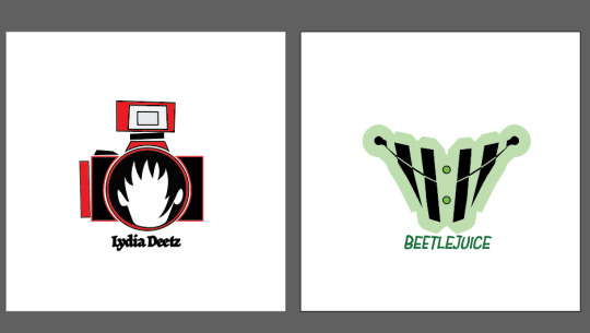
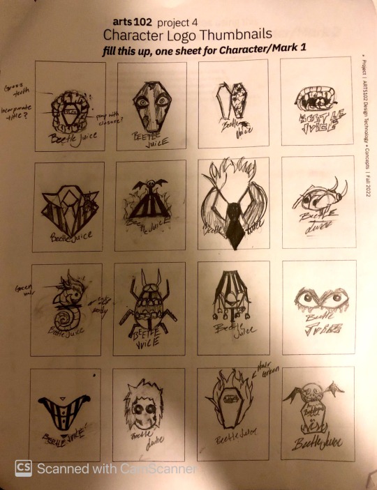
In these past week's reading, Chapter 15 in Becoming a Graphic and Digital Designer went over the process of designing apps for mobile devices. It details the importance of user interface designers and the complex workflow of thoughts that must be considered when creating interfaces for mobile devices. As it is not the same as computers and a lot more is held on the stakes of mobile app design for users. Especially nowadays when many mobile apps hold most of today's communication. It is wonderful to hear all the accounts of the designers because they all sound so enthusiastic about creating User interfaces. It was interesting hearing about game design and its influence on the user from Frederique Krupa. Mainly, because of how it influences him in his design efforts as games can be so motivational. So far, this was my favorite chapter because of how it tackles design for user interface in so many ways. It even had a small commentary at the end about women’s involvement in becoming more prominent in their creative careers. It made me more interested in the career of being a user interface designer and how broad of projects you can work on as one. Last week's class was working in adobe illustrator to make the logos which was not too bad, and it was enjoyable for me. Made a combination of a sketches to make Lydia's Mark which I'm quite happy with. I got to learn more about how to use it and it was quite easy to navigate through it. I had to do a few tweaks, here and there within the sketches and translate them back into adobe illustrator but not too many changes were made. In this week's class we are completing our marks for our 4th project. We worked on concept statements, color palettes, and fixing things to help scale the marks in any size. I feel happy with my design but there are a few gripes I had throughout the working process. I chose a better typeface that helped the mark stand out more. I tried to play with gestalt's theory a lot within my logos but in turn I feel like my logos came out a bit too simple. However, I wanted it to be simple because I thought it fit more with the project parameters. I like the colors I chose, though I was worried because I thought the marks looked better in black and white, so I chose monogamous colors or just one color for each mark to kind of act as a highlight. With the help of my professor I was able to create like a background or outline for my Beetlejuice mark. This helped with adding a color to the mark and brought out the stripes a bit more. The process of compiling everything into Adobe InDesign was nice and it made me satisfied with the work I did. I think the only thing I would change within my work would probably be to study gestalt principles a bit more so I can make more illustrative marks to be more eye-catching.


1 note
·
View note
Text
Weeks 7 and 8 of ARTS 102
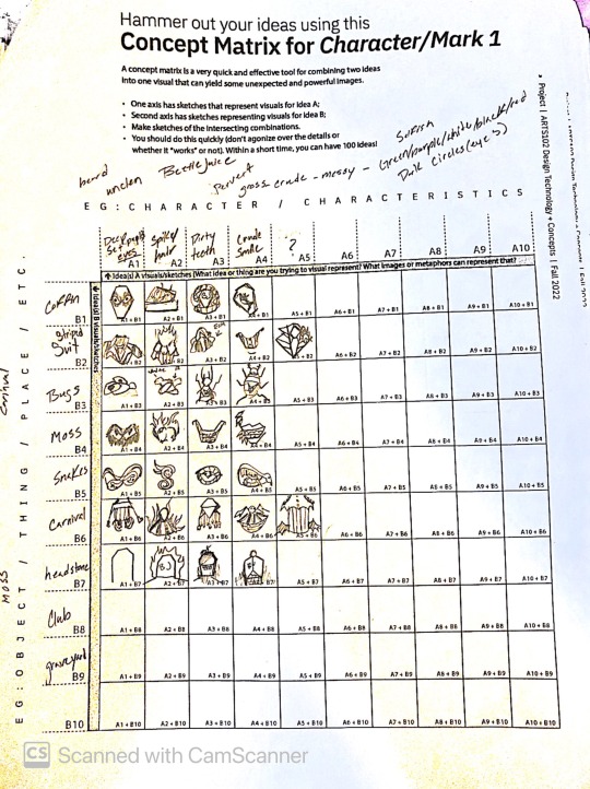
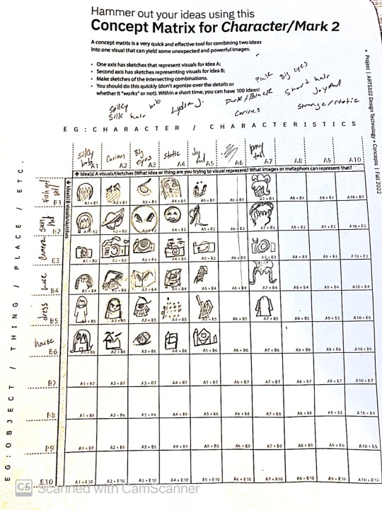
In this weeks’ reading we went through a few chapters that centered on innovators of the art of design, deviating from the norm, and intermingling with other fields. Chapter 11 concentrated on understanding the different avenues of creation when collaborating with other fields and how that affects the profession. My favorite account throughout the chapter was Richard Saul Wurman. Though he comes off a bit self-serving, it is his mindset I like which helps him sell. The idea of learning and moving on to keep busy and active. It is quite poetic in a sense to me, like the "just keep swimming” quote in Finding Nemo. I would love to embark on a lifestyle like Wurman. Chapter 12 focuses on people that break outside the box and do stuff that cannot be replicated in some people's eyes. Their work is so different, like a fingerprint, and no one can replicate it. It is cool to hear and see the works of these designers along with their thoughts. Though the idea is very confusing to me. When reading the perspectives, it reminded me of how abstract artists speak. Chapter 13 plays off chapter 12 with innovators and focuses on the future of how to design. This chapter serves a great reminder that most innovative graphic design is not meant to just be pretty. Though to enthrall the viewer and capture their gaze to make them think about a message that might be portrayed. Ideas can also come in an influx of ways from people you know, mentors, clients, or just yourself. Chapter 14 talks about the intermingling of design with other fields which overall helps fortify the structure of many companies, galleries, and much more. Things would lack continuity and not be memorable if there was not a designer needed to help in the field. The interactions of designers broadens as the field can be a wide range of jobs. Through all avenues communication is present through the interactive multifaceted mediums of design to help people navigate through things. Throughout this week, we have begun project 4 with class to create a logo for two characters from an iconic movie. Though it is not so simple, you have to show the principles of gestalt to truly make your logo work. I chose Beetlejuice because I just grew up loving scary things and I knew it would be an interesting process to design a logo for Beetlejuice and Lydia Deetz. I re-watched the movie twice to get all the info I would need and try to incorporate as much as I could into my mood board and concept matrix. My focus for the logos was character attitudes, emotions, and colors. I loved working on Beetlejuice's design. I had a bunch of ideas working in the concept matrix and the thumbnail sketches were a breeze. I settled on one design for Beetlejuice and I am happy about it. Lydia was a whole other story though; I love her character and she has some iconic moments, but I struggled translating that into a logo. I have not really made my mind up on the design that I want to do but I am not discouraged to say the least. The next biggest thing besides working on Lydia's logo is working on finding proper typefaces to work with the designs. As I sketched out typefaces that I would want but I have no clue if I will find something like my sketched typefaces, but I can hope.

1 note
·
View note
Text
Week 5 and 6 of ARTS 102
This week's reading went over book design, editorials, social innovation, and illustration. Chapter six detailed how intricate the book design industry is and before reading this I didn't know there were different subsections and jobs designers could get. It is cool how they mention the flow of work and how it contributes through all design but not every designer can design in every subsection. Which I find to be really cool and opened my perspective to how broad graphic design jobs can be. Chapter seven dives into the design of Editorials, Magazines, and newspapers. Breaking down their composition of design and how they flow and the demand for jobs in the categories. Len P. Small caught me off guard because I really had to think about the need for newspapers in today's world. As Small said the world is so enamored with technology, so physical newspapers are like a break for the eyes. Which I really agree with as almost everything nowadays is on the screen. It is kind of nice to look away from the screen and have something like a newspaper or magazine in front of you. Chapter eight dove into social innovation and how contributions from graphic designers are able to have influence for public good. It's interesting to see how far and how much it takes to basically be on a path for a career powered by social innovation. Chapter nine talks about branding and its significance within graphic design. I think branding definitely holds a lot of weight in companies and businesses. Without it no one would really know what businesses and companies market themselves as. Almost everyone looks at a type of branding every day whether it’s a box of candy, a billboard, or a sign of an advertisement. I think a lot of people undermined branding although there’s so much effort that goes into it. Chapter ten breaks down illustration and its importance in the industry. I think this chapter is interesting as it breaks down how illustration was originally overlooked or not appreciated on its own within graphic design culture. Although illustration has so much to it, as there are so many techniques and strategies for designing along with illustrating. For these past couple of weeks class work has been us mainly working on our third project. Which is creating a poster to get people to vote. Which has been a frustrating but a fun experience. I had a lot of ideas for the poster at first so i made a lot of thumbnail sketched. I experimented a lot with photography, drawing, using a lot of photoshop, and figuring out how to use InDesign. Throughout my process I ended up almost creating two posters with two different quotes but the first poster that I made using photography and InDesign I dropped. It ended up coming off more aggressive than I would’ve liked. So, I worked with a more hopeful quote and more hopeful poster idea. I concluded that I really wanted to create a poster by illustrating it because I couldn’t really get my vision through Photoshop. I decided to use Procreate and draw out my vision. I use my work of Photoshop to be more of my reference while illustrating. The first one didn’t work but the feedback in class helped me. I got on the right track with the background, so it didn’t strain the viewers' eyes. The final thing I did was do some color tuning in photoshop and warping the text of my quote so it would blend into the illustration. Now that I finally finished the project, I’m very happy with how it turned out. I really think the only thing I would change about the poster now would probably be minimalizing it. As it feels like the poster unintentionally is a little too busy to the eye which I want to avoid in the future of my projects.


1 note
·
View note
Text
Week 3 and 4 of ARTS 102
This week's reading in chapter 3, it focused on working with other people within the graphic design field which I find to be quite interesting. I am a very isolated person so the idea is quite intimidating but I am open to the idea of working with other people. I just don’t want to deal with discourse but reading the experience of other graphic designers in the field was quite interesting because most seemed to not have a bad time when working with others. Designers only seemed to have some conflicts when working with clients but that's why some would set limits on what clients they would work with. In the following chapter, it dealt with a lot of things like the style and history of topography. The experience that designers had with learning, using it, and creating typefaces. Which was very intriguing to learn about because I somewhat struggle with typography. I do like experimenting with the styles of text because it enhances the final product, whatever medium it may be.
Chapter 5 goes over logo creation which is very interesting to me and I’m very glad that I got to read other designer’s experience with it. Mark Fox didn’t even learn design in college, but combined his knowledge of fine arts from which he learned in college with what he got to experiment with to enhance his portfolio. He defines logo design as that it is a symbol that suggests but doesn’t depict whatever the logo is representing. In personal projects I have had a difficult time creating logos. However, I hope if I do have some classes or projects dealing with logos it will help amplify my skill.
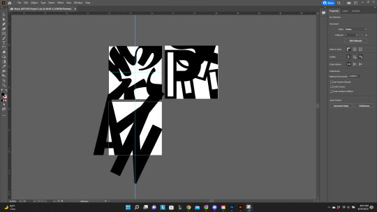
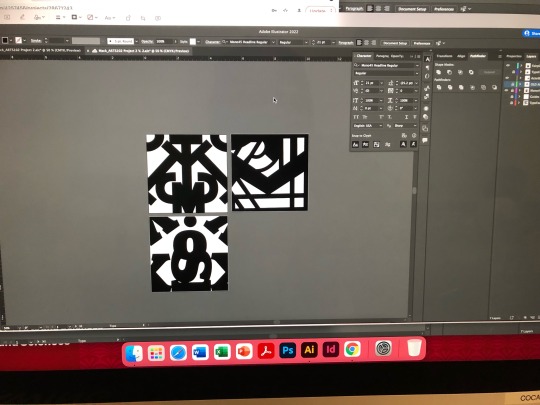
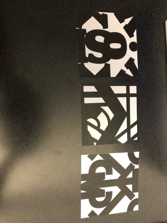
These past couple weeks I’ve been working on a project which was abstracting typefaces to make abstract pieces for a larger piece that the class put together. It was very interesting working around letters and abstracting forms. I had a few ideas that I’ve definitely changed over time. Though it was really fun experimenting with all the different typefaces and working with Adobe Illustrator. I think my pieces alone look cool; however, I think they look amazing with all my classmates' pieces. Every person in class whether someone abstracted a lot, one made their typeface very large, or did it very small it all looked great together. There’s nothing that submerges anyone's work within the collage to me. All of the art boards are very unique and catch the eye of whoever’s viewing it. I think along with everyone else's artboards, they all blend in very well along with each other.
1 note
·
View note
Text
Week 1 and 2 of ARTS 102
Reading for class recently defined graphic design saying what it is and the inspirations of famous designers with their motivations attached to their work and prowess. It was interesting reading the inspirations or reasons designers fell into graphic design, because I compare it to myself as I have always liked creating but I have tended to have trouble being creative but with making graphics, it fills my visual library and makes me a more creative artist. Chapter 2 went more into Studio life, and it was great to read about the designer's experience and hear the do's and do nots within the Studio. Along with inspirations for other graphic designers it spoke on where designers can work, and it is nice and affirming to hear the choices one can have. Especially with freelancing or starting your own business. It was also comforting to hear about the confusion and guidance some designers like Lynda Decker had to get to where they are in their careers. Along with that I got to attend a Graphic Design + Illustration event recently which was a great opportunity to learn about my professors in the program and meet new students in the same field as me. Along with that I got to learn about new events that had great graphic designers that would be headlining. Recently I have just finished a design for Project 1 of my class which was made to encompass a 6-word memoir attached to an AI- generated image related to the memoir. Main purpose of the project which was to learn photoshop which i had a lot of fun learning. The AI-generation was awkward to use, and I had to tweak or combine images on my own. Along with that the images were quite blurry. It was extremely refreshing looking at different images with a feeling close to what I wanted. The AI made me more open to new outcomes and it made my process more creative. In terms of using the AI program there is nothing I would do differently. The images paired with the memoir emphasize the emotion that I wanted the viewers to feel. Changing the forms of the text and how they are laid out made a significant difference to creating a strong visual impression for the project. I think the only thing I would do differently is on the "River of thoughts..." memoir, I would change the placement of the letters for a stronger effect and lay them across the river.

2 notes
·
View notes