
Don't wanna be here? Send us removal request.
Statistics
We looked inside some of the posts by grad502-rubybird and here's what we found interesting.
Average Info
Notes Per Post
0
Likes Per Post
0
Reblog Per Post
0
Reply Per Post
0
Time Between Posts
1 day
Number of Posts By Type
Text
17
Last Seen Tumblr Blogs


Fun Fact
Celebrities use Tumblr as well.
Text
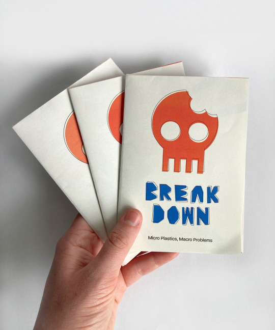
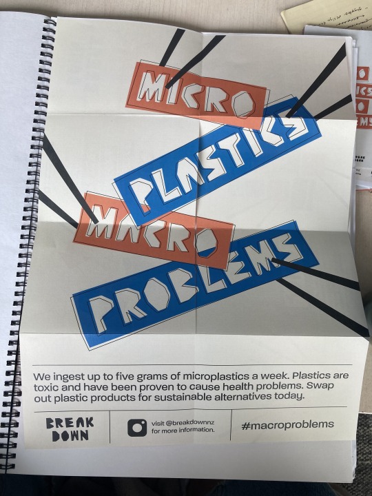
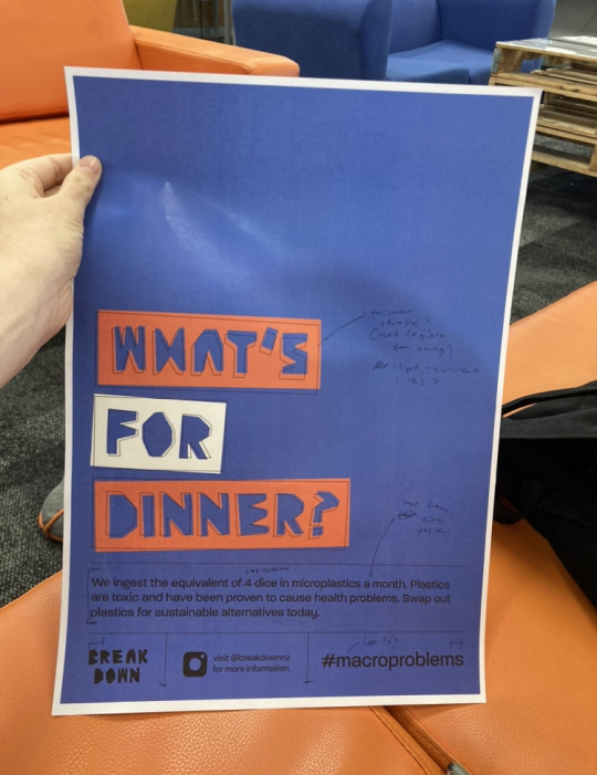
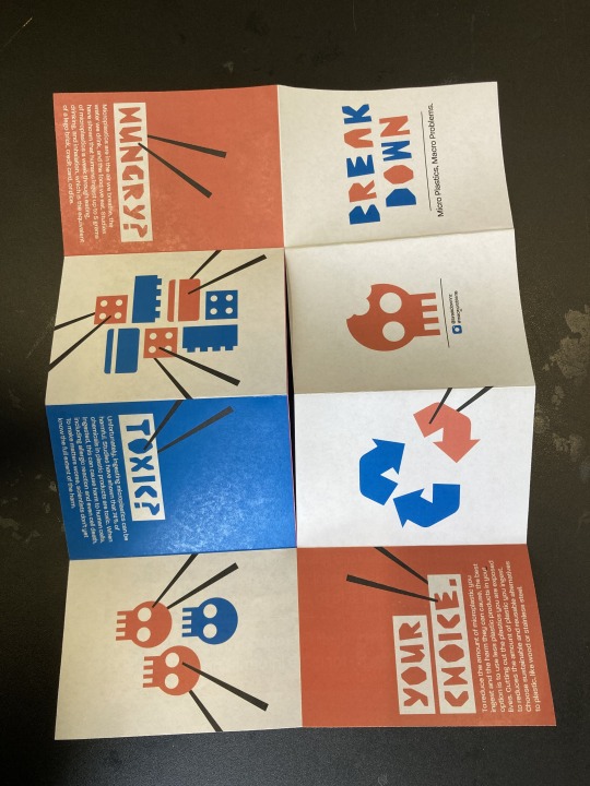
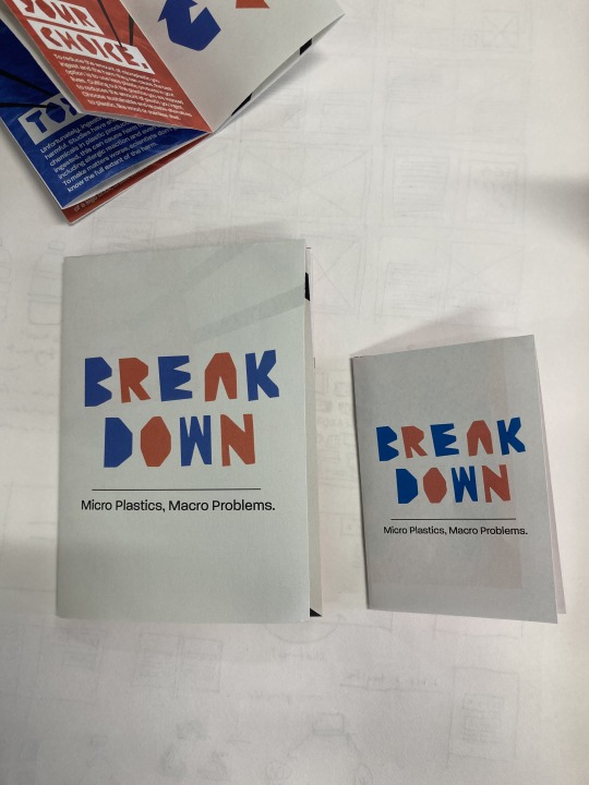
Week Thirteen - 8 Fold Final
After making adjustments from the feedback I received, I finalised my 8 Fold template document to prepare for the creation of my final 8 fold for hand in. I printed onto 120gsm A3 paper that had quite a warm tone to the white. I then trimmed the white edges off the final print out, before making the cut and folding it up. I am really happy with how it looks as a physical product, and with how my messaging comes through on it. The colours also printed really nicely. I think it is a good summarising piece of collateral for the campaign, which essentially sums up the key ideas I wanted to share.
InDesign Printing File

Final Printed 8 Fold

0 notes
Text
Week Twelve - Mockups
After finalising the designs for my collateral, my next step was to create mockups of the different formats to show how they will be viewed by the audience. Where possible, I wanted to use my own photographed images as this will reflect the actual outcomes more accurately. For the poster series mockups, I photographed actual poster series around AUT, where poster series would be placed in real life. For the instagram posts, I photographed a hand holding a phone with the post on it. Creating bespoke mockups means that they will be better suited to the project and unique.
Instagram Posts - Raw Images
Instagram Posts - Edited
In photoshop, I cropped the images and resized them to make the phone a similar size in each image. As well as this, I used levels and exposure to brighten the photo and make the colours reflect the on-screen colours. Using the brush tool, I brightened sections of the background and darkened some smudges and reflections on the phone screen. As I don’t have much experience creating mockups or editing photos like this, I am quite happy with the results. I think using a real hand to hold the phone makes it more personal and shows how it will be used, which is good.
Poster Triptychs
Own Photos
I took photos of two different poster series around AUT. I like how they both have the same pink frames, which links the two series together despite their different locations. I wanted each poster series to have a different location and surrounding to reflect real life more accurately.
Final Mockups
I cropped each photo and used levels to make the contrast and exposure look better. Then I added each poster and resized it to fit the frame. At the end, I added a small amount of noise to each poster to make it looks more realistic.
Compostable Plates - Images used
The paper plates collateral was much harder to create my own mockups for. As well as this, there were limited mockups available online and none that showed three plates which I wanted.
Instead I made a composite image from found images online and constructed it in photoshop.
Wooden table
Photo by Nathan Dumlao on Unsplash
Photo by Simon Berger on Unsplash
Paper Plate
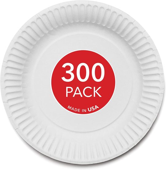
https://www.u-buy.co.nz/product/49QLQN0-stock-your-home-9-inch-paper-plates-uncoated-everyday-disposable-plates-9-paper-plate-bulk-white-300
On photoshop, I got rid of the red sticker on the plate image, and used the brush tool to add the off white colour from the campaign palette. Then I removed the background and saved it as a PNG so I could place it on the table surface. I lightened and cropped the table top image so it wasn’t too large or dark. Then I placed the plate PNG on in an arrangement of three. Using the brush tool I added some shadow below the plates to create depth and realism. Then I placed in PNGs of the plate designs from Indesign.
Again, with my limited photoshop ability and experience making mockups this was a bit challenging but I’m happy with the outcome.
0 notes
Text
Week Twelve - Finalised Collateral + Campaign Artwork
After getting some last feedback and making some adjustments, I wanted to officially finalise the designs for the campaign collateral. This meant refining dimensions and grid systems for each format. I placed my designs from Illustrator onto specially made Indesign documents, where I used the parent pages to add in custom grid and margin systems for each format.
For the compostable plates collateral, I also finalised the dimensions of the physical object. I did some research into paper plates currently on the market and sketched out the sizes onto some A3. Seeing the physical size allowed me to adjust until I found a size I was happy with. In the end I decided on doing a plate size smaller than a usual dinner plate with dimensions of 200x200mm, with a 40mm raised edge. This gives me a 120x120mm area to place my design.
Plate Dimension Planning
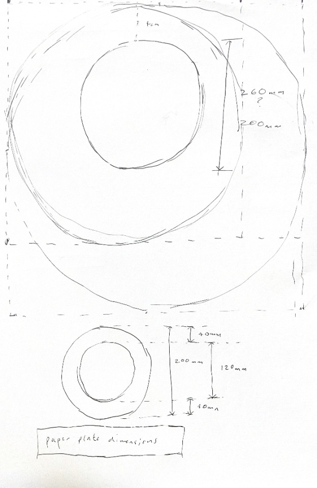

Plate showing design and rulers

Finalised Designs


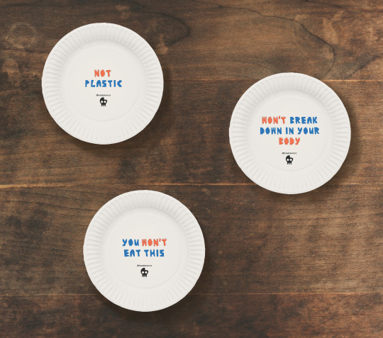
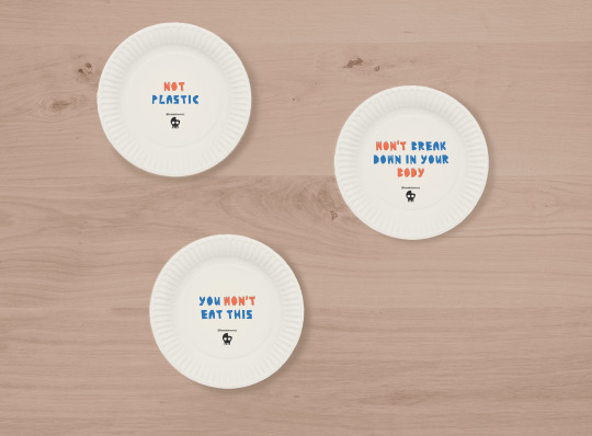
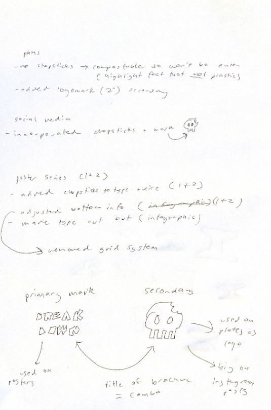
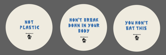
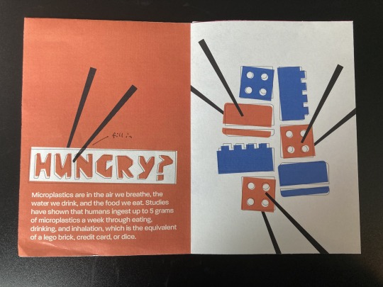
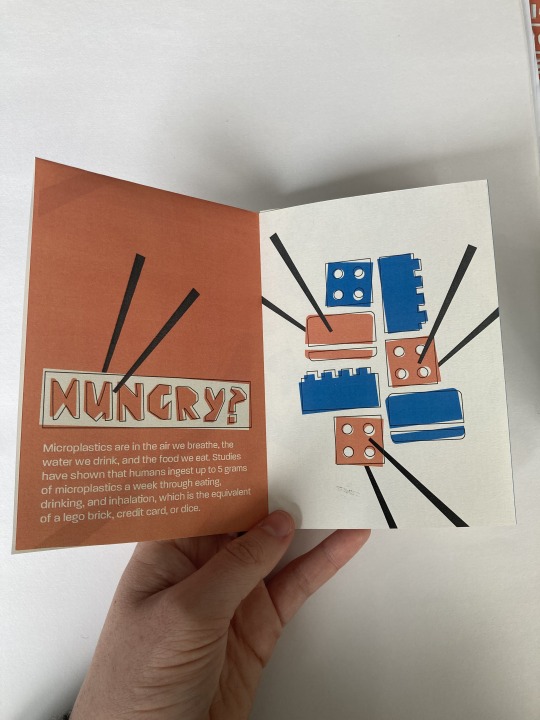
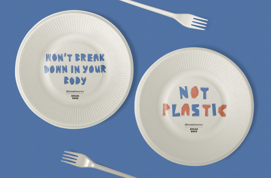
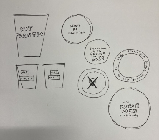
The final design of the compostable plate collateral is very typographic. The copywriting of the typography highlights the fact that the plates are not made of plastic, therefore not producing microplastics or being ingested. The key words ‘won’t’ and ‘not’ are written in the bright orange colour with an offset stroke to highlight the copywriting intention. Below the type, I have included the secondary mark of the bitten skull to reference other collateral from the campaign. I have also included the instagram account name so that the collateral can increase digital awareness of the issue as well. The designs are only in the central circle of the plate as this area will be flat so the design won’t be affected by the raised edge.
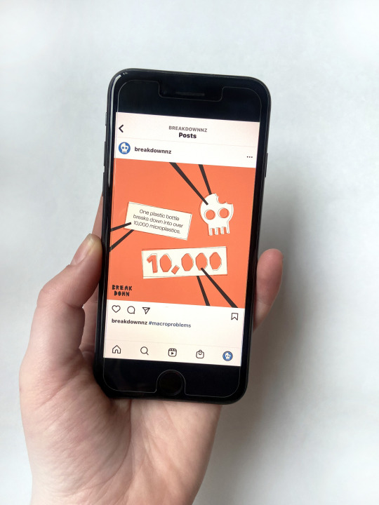
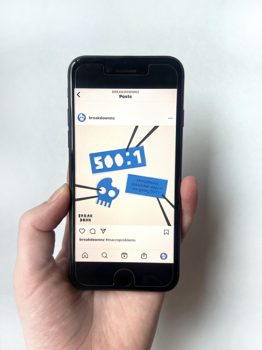
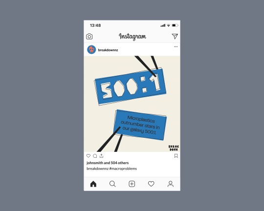
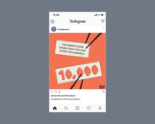
Instagram Posts
Showing Margins of document setup - used to align the logo in the corner of the Image

Final Designs


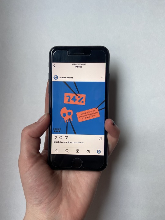
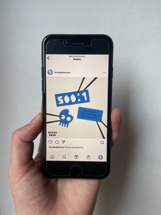
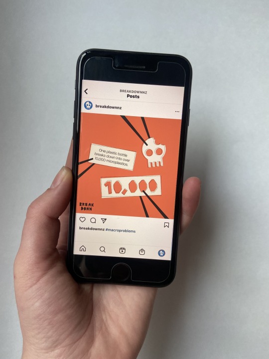
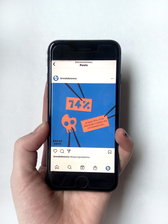
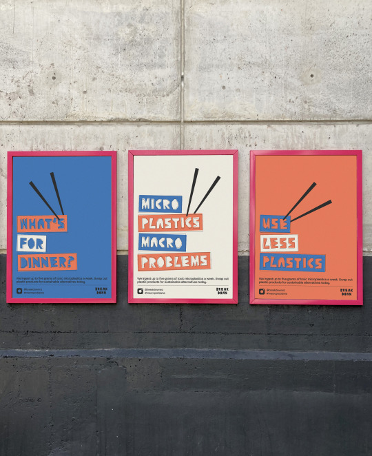
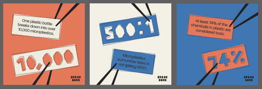
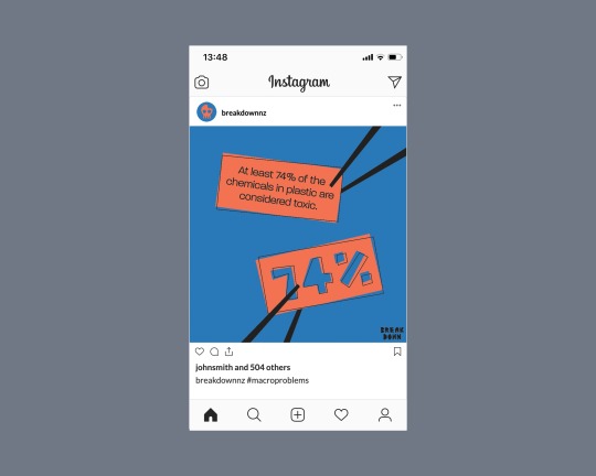
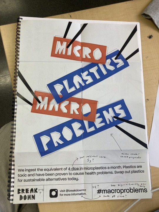
The final instagram post collateral is a series of three posts that can be used individually or as a carousel. On this format I focused on key statistics that show the magnitude of the issue. The main number from each statistic is featured in the display typeface, with the whole fact housed in a similar sized shape as body text. I also included the bitten skull logomark because it reinforces the idea of harm and ingestion. Each element on the post is supported by the interactive element of the chopsticks. In the bottom left corner of each post, I have put the campaign breakdown logo to link this collateral to the others. Each post has a different coloured background and foreground elements, which adds some variation to the series. The offset stroke idea used in the design system is of course included in this collateral as well, reinforcing the irregularity of the layout and microplastics themselves.
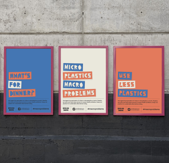
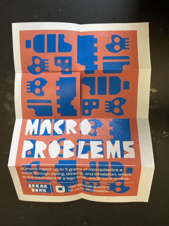
Poster Series One - Infographic style
Image showing margins and grid system of the series.

The grid and margins in the poster series is very important to ensure that the each poster in the series links to each other and is cohesive. It is also important to keep the bottom sections consistent across both series.


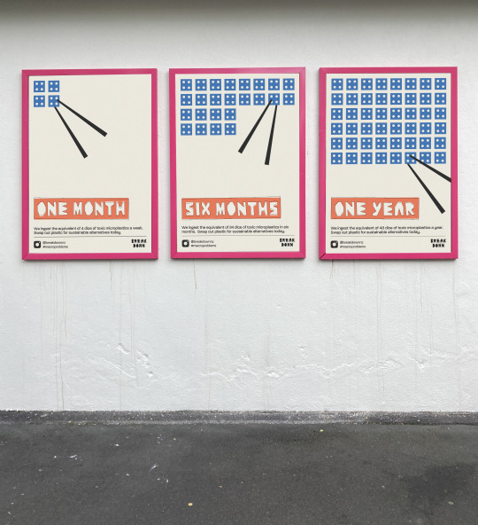
This poster triptych links back to the infographic idea explored early on in the project. Each poster visually shows the different amounts of plastic a human can ingest in three different timeframes, represented through a dice. Each poster includes a pair of chopsticks picking up a dice, which visually shows the ingestion idea, reinforcing the body text of the poster. The display type showing the timeframes is cut out of a slid rectangle to prevent the letters getting lost in the many individual elements in the dice section of the poster. This also has the offset stroke on it to link to the rest of the campaign.
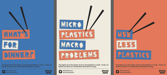
Poster Series Two
Margin and Grid system

Final Poster Series


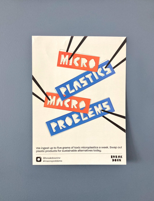
This final poster series follows a similar strategy to the 8 fold brochure. Through the display typography and body copy, the ideas of ingestion, toxicity, and the call to action are communicated. Like the instagram posts, each poster has a different background colour to make the series more varied. The chopsticks icons has been used again on these posters to link it better to the other campaign collateral. The triptych is very typographic, with the headings in Breakdown Display cut out solid shapes, emulating plastic pieces.
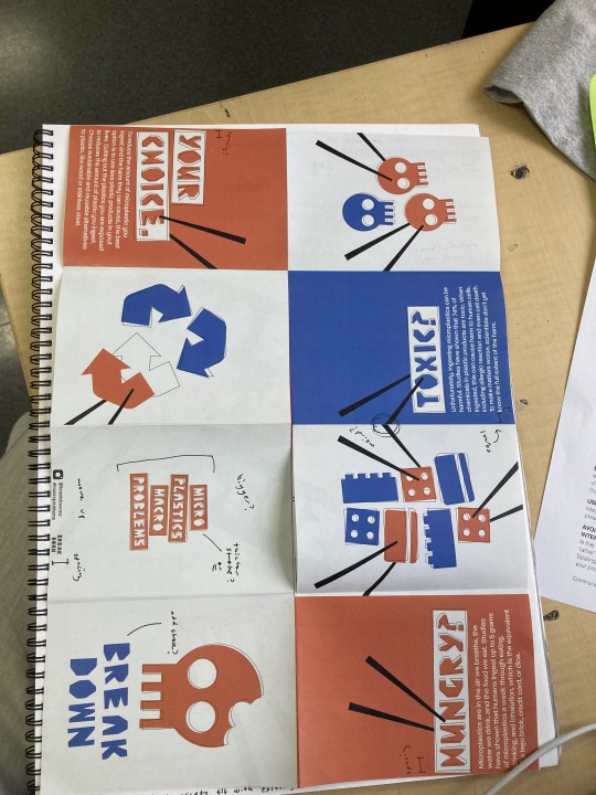
8 Fold Brochure
Grid System - Cover

Grid System - Spreads

Grid System - Poster

Final 8 Fold Brochure


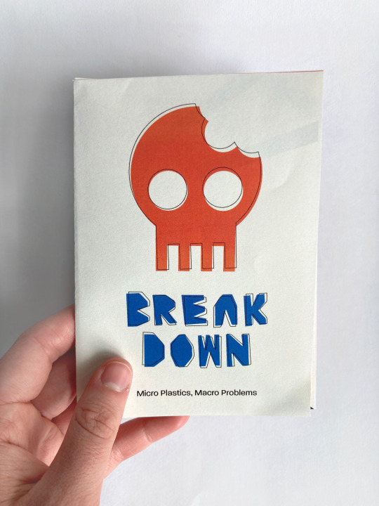
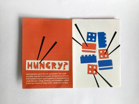
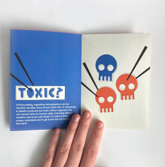
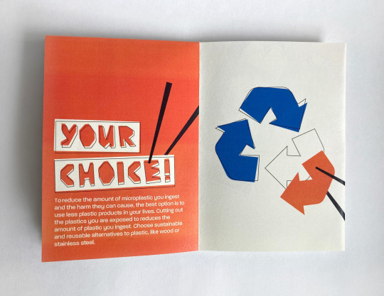
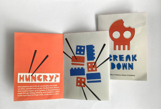
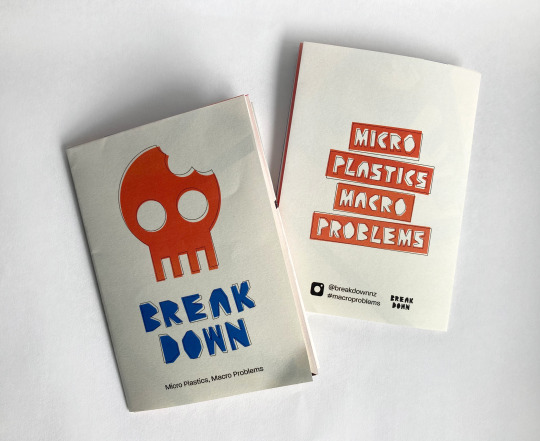
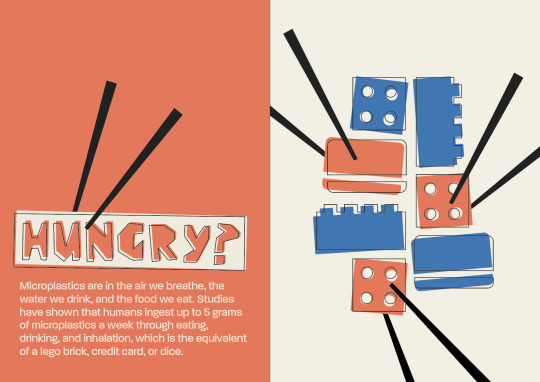
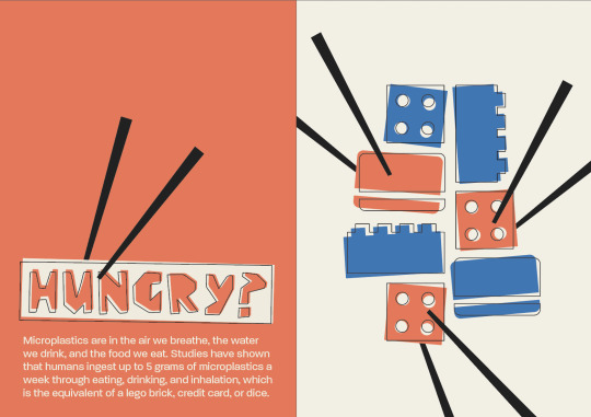
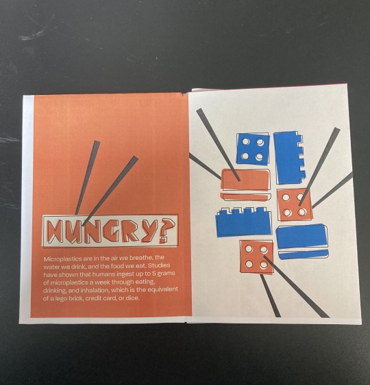
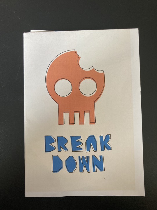
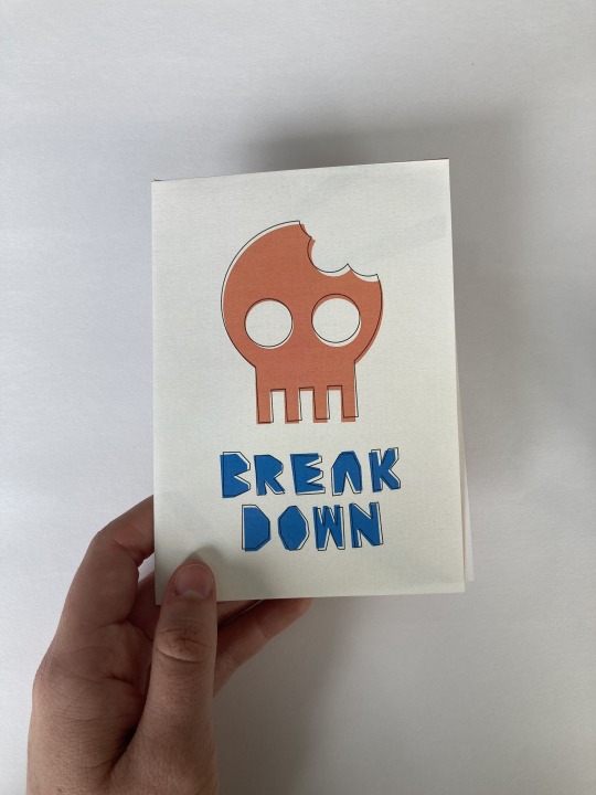
The final 8 fold brochure/poster format has a very cohesive design style, as each spread is designed the same, with varying background colour and illustrations. Each spread has a different focus; ingestions, toxicity + harm, and the call to action of choosing and using less plastic products. I have highlighted the bitten skull image on the front cover as it essentially sums up the issue the campaign focuses on. To add context, I have included the tagline ‘micro plastics macro problems’ below the campaign title, to ensure some initial understanding and engagement. The poster heroes the tagline in a large scale, with chopsticks used to again highlight the ingestion context. The chopsticks and stroke are the only elements on the spreads done in the black colour, so they don’t get lost in the designs.
0 notes
Text
Week Twelve - Final Feedback
For the last class of the year, I went in and got some feedback from Raul. It was good to get the opinion of someone who hadn’t seen the project before, and I got some very helpful advice. Below I have included some changes I made.
Notes of feedback
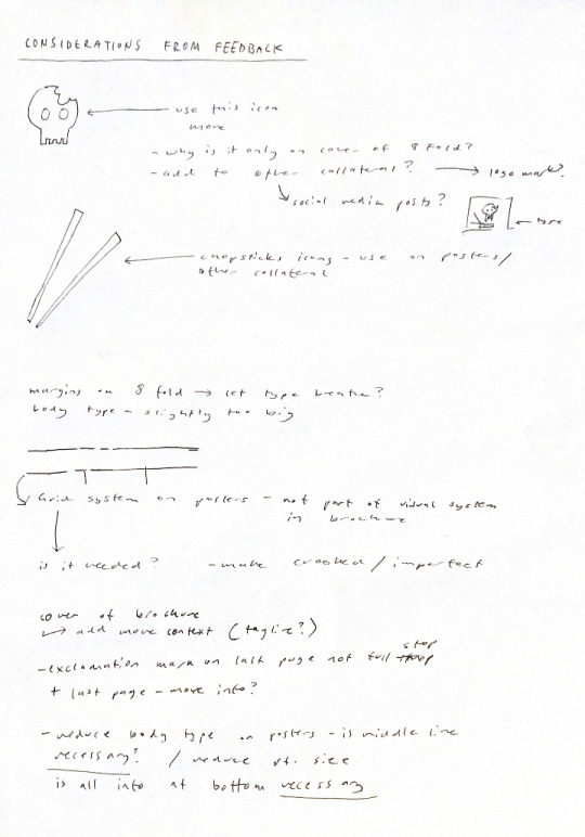
Summary of changes
8 Fold - Poster
On this poster I made the point size of the type smaller so it was less overpowering. I also condensed down the copywriting to two lines, to make the messaging tone more simple and direct. Because the typographic imagery on this poster is the tagline, which clearly summarises the issue, the copywriting didn’t need to have as much hierarchical value. I also made the row of information below the body text have more breathing room by condensing the hashtag into into the instagram account name section. This section is much cleaner in terms of the hierarchy now, which makes the important information more accessible. I then tried to refine this bottom information section further by taking out the very structured and even grid system. Because I hadn’t used this idea in the brochure, it wasn’t something that I wanted to include in the design system which meant that I needed to try a different strategy.

When I removed the lines, the layout of elements looked very unconsidered and random. This didn’t work for the desired design, so I tried some other options.

Here I tried to make the layout work better by sectioning off the information with a coloured box . It still didn’t look very clean, and I didn’t like the black type on orange as much.

Here I simplified the bottom information and added a single dividing line. This worked better than the rigid grid system that I was using earlier and also made the layout easier to read because there is a visual division between body type and secondary information. I then tried this information panel style on my other poster series to see if it worked on these.
Poster series tests

This is the infographic style poster series that I tested the new information panel style out on. I also made the typography negative space in a solid rectangle to fit with the other poster designs, which I liked more as it is bolder and stands out from the dice imagery. When each letter was separate, the individual elements got lost in the page because of the number of dice which is quite busy. I think that the bottom section looks much better like this as well.
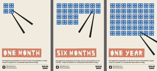
Here I added chopsticks to the above refined poster series. This situates the viewer in an eating visual environment, and adds some more context to the dice visuals. In my feedback, Raul mentioned that the chopsticks are an important interactive device in my work and that they should be incorporated into more of my collateral.
I also added chopsticks to this poster series as well to make it link better with the 8 fold collateral and the overall design system. This series also looks better with the refined information panel, and as such I will use this new layout in my final collateral and campaign artwork.
Compostable Plates collateral refinement
Following my feedback I also refined these collateral designs as well. I didn’t want to use the chopsticks in these designs as I didn’t want the eating idea to be implied. I want to highlight the fact that the plates are compostable and won’t produce microplastics. I did add the logomark from the cover of the brochure and the instagram name to link these to the rest of the collateral and increase public awareness more.
Single colour type

Key words highlighted in orange - orange has more weight than blue, brighter and conveys a sense of urgency
Instagram posts
Another part of my feedback was to include the skull with the bite icon more. This icon is a very simple summary of the campaign messaging; that we are ingesting toxic plastics. I decided to add a skull icon with offset stroke to the existing post designs, and decrease the text size. I found that the posts with only the 2 elements of rectangular type looked a bit odd. I think that three elements creates a more visually appealing effect. On top of this, I increased the size of the logo mark in the corner to make it look more purposeful.
Original design

Reworked version
8 Fold - Brochure
Following my feedback I also reduced the point size of the body text from 12 to 11. I think this looks better as there is more breathing room and it allows the illustration and display type to stand out more.
12pt body copy
11pt body copy
As well as this minor adjustment, I also tried out adding the tagline (micro plastics, macro problems) to the cover page as it needed some more context. From the skull visual and title, it is a bit challenging to understand immediately what the campaign is about without reading the internal copywriting. I think I might experiment a bit more with this because I’m not super happy with how this looks. The tagline placement seems a bit random; I might try adding a line to create some separation and to link to the line used in the posters.

0 notes
Text
Week Twelve - Collateral Refinement
To prepare my collateral for finalisation and mockups, I wanted to test out and refine another more successful idea for the poster series. The current poster triptych I am working with gives a successful overview of the issue and call to action, so I thought about bringing in an infographic style poster series and refine it to fit with the final collateral.

Finalised poster series

Original idea for infographic style poster series

Refined bottom panel - made to match with bottom panel of existing poster series.
I wanted to experiment with adding the offset stroke that I have used in my other collateral to make the final campaign artwork more cohesive. In the above image it is added to the title text.

Here I have added it to the dice, however I think it looks too busy and disorderly like this. I think I prefer it with the stroke on the type only.


I also developed another couple of images for the instagram post collateral.

I quite like the simplicity and direct messaging of these posts.
mocked up versions


0 notes
Text
Week Eleven - Asset Development
I want to start finalising the collateral assets for my campaign in the next week so that I can work on my project document and mockups. I worked in Illustrator to make some small edits and adjustments, as well as test prints where I wrote out notes of things that needed adjustments. I found that looking at the collateral in a physical format at the required scale was very useful for making changes to my designs.
8 Fold Brochure
Following up from prototyping in week ten, I created more print outs where I made the adjustments from areas I picked up on last week. One thing I wasn’t sure about was the stroke thickness. On the prototypes from last week I found it was too thin and didn’t look as purposeful as I wanted. I did a print out with thicker stroke, but found it was too thick. In then adjusted the document to print a copy on some thicker paper stock to look at how the colours would print. On the reverse of the brochure (A3 poster) I made the stroke thicker because the format is larger and made to look at from a greater distance.
Thicker stroke prototype
Thicker stroke cover
Thinner stroke spread.
Finalised prototype - on 120 GSM off white paper stock
Brochure Side - I am really happy with the stroke weight on this copy (0.6pt). Especially in the 94% black, it isn’t too overpowering and still allows the coloured areas to have some weight. The depth of field it adds works well. This print out doesn’t look the best in terms of colour because the printer was low on toner, however I am happy with the paper stock. I like the matte texture of it and the weight is perfect as it still easily folded. From this prototype I have also finalised the copywriting and fixed the typos from the previous prototype.
Poster Side - Again, I have finalised the copywriting and fixed it from the last prototype as it had an incorrect statistic and convoluted wording. The stroke weight on this is also improved.
Compostable Paper Plates
I wanted to test the designs I had made on a plate, but obviously couldn’t physically print on a paper plate very easily. I made a mockup to test the size and circular format. I had also added the logomark and instagram account name to the formats and wanted to see how this would look. I think it is important to include this information on this tactile collateral format to increase audience reach and awareness.
Illustrator vectors

First Mockup - the designs were too big for the style of the plate so I reduced the size
Resized designs - I quite like how they came out but I think a different plate style would be better so that the design could be larger.
Mockup link - <a href='https://zippypixels.com/product/mockups/miscellaneous/plate-mockup-free/'>Free Disposable Plate Mockup By ZippyPixels</a>
Social Media Posts
I also refined the type in the social media posts because I felt it was too bold. I was using Paralucent in a medium weight however I made it light. The medium weight made the hierarchy convoluted which I didn’t like. I think the light weight is more suitable.


Preliminary instagram post mockups - it was useful seeing the designs mocked up how they would appear in the app as I was able to judge the readability of the text by comparing it to other type in the app. I think I wiIl adjust the sizing of the logo in the corner as it is a bit close to the edge, and a bit small.
0 notes
Text
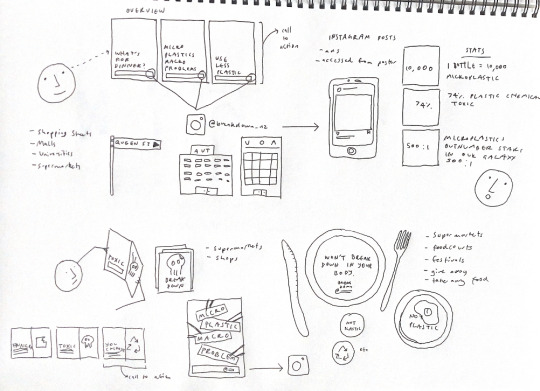
Week Eleven - Audience Awareness Journey
This task was completed in task, with the aim of mapping out how the audience would become aware of the campaign through our chosen collateral forms. As well as planning out the order, I also brainstormed some key locations for physical collateral formats and their usage. I put in the key messaging of each collateral as well.
Poster Series
- Shopping streets + Malls - where the call to action (using + purchasing less plastic products) can be carried out by the audience
- Universities - target the demographic of Gen Z
- Key content - harm from microplastics and call to action, connect to instagram account.
Instagram Posts
- Accessed through advertisements in the app or from the account address shown on the poster series and 8 fold zine
- Key content - statistics that help audience understand magnitude and scale of the issue
8 Fold
- Available in supermarkets and shops - focus on sustainability and locations where consumers can carry out the call to action
- Key content - give an overview of whole campaign - ingestion, toxicity, and call to action
0 notes
Text
Week Eleven - Typeface Tweaks
From looking at my prototyped 8 fold, I noticed that the letter H in the typeface isn’t very clear. It doesn’t immediately look like an H. I did some sketches to come up with and original idea and then played around with the vector shape in Illustrator.
Sketches
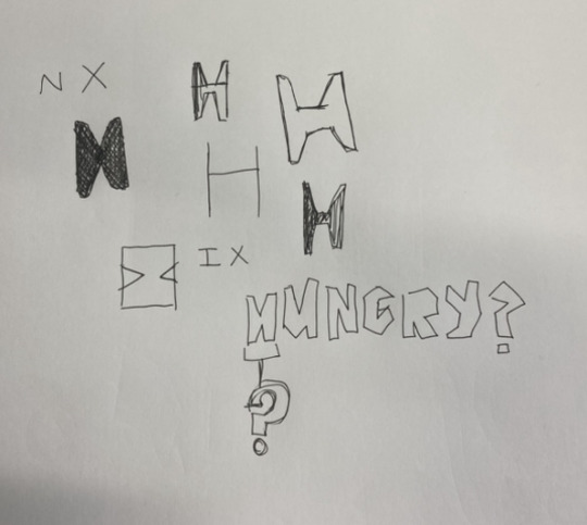
Original (left) to edited version (right)

Tested in a word (new version top) - immediately much clearer and obviously an H (not reliant on context)

Original spread with the letter H

Edited spread - new H letter

I am much happier with this new letter form as it is much more legible and is clearly an H
I also checked to see if there was a similarity between the C and G, however when I did a side by side comparison they are definitely different enough to make the text clear.

0 notes
Text
Week Eleven - Poster Series
original poster series -

final poster series -
This is the final version of my poster series. I added the offset stroke and made the text more irregular by tilting the angles. I also made the type all black (94%) because it looks more cohesive with each poster having the same colour type. I have also used black type more in other collateral like the back poster of my zine.

I then printed the first of the series out on A3 to see how it looked, and made some notes of what to change.
Edited poster series

I refined the text and layout of the body text and resized some of the bottom row of images. I also made the stroked marginally bigger as it wasn’t very obvious in my printout.
Mockup
I decided to see what the series would look like mocked up so I took a photo of this poster series opposite the AUT art and design building on St Paul Street. In photoshop I added the posters to see how it would look.

I don’t think the pink frames work very well, so I might try to recolour them or find a different place to photograph a mockup.
0 notes
Text
Week Eleven - Collateral Refinements
8 Fold Trial - with offset stroke
On this printed trial I made a few notes of refinements to make. One change I need to make on all of my work is making the black colour a lower percentage so it isn’t a full black, which can be overpowering. After some trials, I will be using 94% black in my work instead of the 100, which definitely looks better.
Brochure Notes
- Fix the spacing of the body text on the ‘your choice’ and ‘hungry’ pages
- Change the letter H in my typeface - more legible
- Try out enlarging the tagline on the back cover
- Make the stroke on the back cover thicker (0.5 not 0.3 - consistent)
- Fix the spacing of the instagram account and wordmark on the back cover (move upwards)
Poster Notes
- Increase point size of stroke - thicker than on the reverse side as format viewed at a larger scale
- Change the copy slightly - no relevance to the 4 dice in the visuals, maybe change to 5 grams?
- Fix the spacing in the bottom row of information - equal
- Fix the hierarchy in the bottom row of information - hashtag very big, greater hierarchy than the body copy and very different to other type in this row
Reworked information section of poster - refined copy and resized, reduced size of hashtag and centred elements.

Offset Stroke Trials
Before I make the decision to continue with the offset stroke in my final collateral, I tested it out on some of my existing designs.
I like the depth it adds to the designs as it is very flat in style. I also like the irregularity it adds, which links back to and emulates the irregularity of microplastics. These screenshots show the side by side comparisons I made on some of my more successful designs to help guide my decision.
I also found that printing the brochure with the offset stroke was very useful because I could see how it would look as a physical comparison.


After looking through these experiments, I think I will continue with the offset stroke. I think it is needed to create some interest and add some depth to the layouts.
0 notes
Text
Week Ten - Asset Development
Over the weekend I did some work focused on my three extra collateral aside from the multi-format zine. I experimented with adding the offset stroke to some existing designs I had, as well as creating some new ideas. I’m quite liking the offset stroke idea because it links back to the irregularity of microplastics, and the imperfect nature of this. It also ties my typeface in quite nicely because the irregularity and unevenness of the typeface is what I like about it.
Here I have added the stroke to the text on one of the poster series I have made. I quite like how it looks, and adds a bit of extra detail. One thing about these posters I’m not sure about is the bottom border that had extra information on it. Some areas seem much larger than others, which creates a messy hierarchy. I will probably change this on these posters and also the poster I will use on the back of the brochure.


These are some concepts I am working on for the social media posts format. I want to hero statistics in these as I think they are very effective ways of communicating the issue for a smaller format. I have tried these with and without the offset stroke as well.


I also played around a bit with the paper plate experiential format. The message I want to come through in these is that the products are not plastic, and are not harmful. I created a quick png of a paper plate because I think the circular shape is very important and will dictate the layout of my designs. It also helped to see the designs mocked up, even though the quality isn’t great.
Plate Image - https://www.tesco.com/groceries/en-GB/products/259396076?currentModal=ImageZoomModal&selectedUrl=https%3A%2F%2Fdigitalcontent.api.tesco.com%2Fv2%2Fmedia%2Fghs%2F7a8f97f8-83e5-457f-bb4e-40904e9a83f1%2Fd5f19b11-0850-4021-a2d2-25d2c151270a_1796166256.jpeg%3Fh%3D540%26w%3D540


I tried to do a more symbolic one without words that communicated the same idea. I found that the cross through looked too even and almost made it look like eyebrows on the skull. I then had the idea to make the cross out of the chopsticks icon I have been using, which I think is a bit more successful.


0 notes
Text
Week Ten - 8 Fold Brochure Development
Following up from the printed prototypes I created, I got some helpful feedback from Paul. I wrote down some key points and made some edits of the spreads. The image below is the original spreads that I printed, edited to add a larger margin below the body text, which aids legibility.

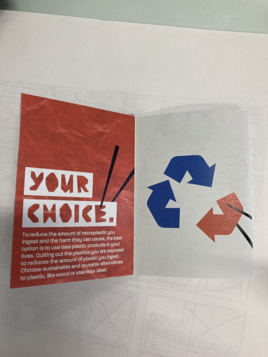
One key piece of feedback I received focused on the last spread, focused on the call to action and the audience’s choice. Because this should have more of a positive tone than the other two spreads, as it is focused on fixing the issue, I wanted it to look like the chopsticks were completing the reduce reuse recycle symbol, rather than breaking it. I found that simply shifting it down didn’t make it as clear as it needs to be.
In these top two, I tried to make it clearer by adding a stroke around the recycling symbol to show where the orange arrow is going. I liked this, but it was very clean which didn’t match the typeface I’m using. I then tested out offsetting the fill shape to make a more uneven look, which is the image below.


I also tried using a drop shadow style effect to fit with the flat colours I’m using. I think this works quite well and is clear, but the colour seems odd because it’s not used anywhere else.

I expanded on the stroke idea and tested it on all the spreads to see how this worked. Just using it on the last spread I thought would look out of place. I also added it to the text on the poster as the front and back of the brochure need to be cohesive. I quite like the illustrative style the outlining creates, and might try incorporate it in some other concepts I’ve had for other collateral.


This offset stroke idea reminded me of illustrations by Bernice Myers, a midcentury children’s illustrator. She uses outlines and solid colours in quite an interesting way, with some parts of her illustrations only outline and some only fill. Not sure how relevant this is to my own project, but it came to mind when creating these trials which I found interesting.


Cover development - I also got feedback that the skull with the bite icon was wasted on the back cover, so I tried a few options with it on the front. I still wanted the tag line to be on the cover so I tried it out on the back.

I also tried out a version using the stroke idea from before.

0 notes
Text
Week Ten - Collateral Finalising and Planning
Originally, I was just going to use social media posts and a poster triptych alongside the 8 fold brochure, however I want to add a physical, interactive, and usable format that applies better to the contextual neighbourhood of my project. I decided on creating compostable cardboard plates and cups, because they cut out the need for single use plastic bowls and cups which contribute to microplastic pollution and ingestion. The messaging I want to employ on these are that the products are not plastic, are not toxic, and won’t be ingested.


I like how these cups are very simple, incorporating a simple illustration and branding word. I want to use this simplicity to highlight the fact that the cups and plates will not be made of plastic, so I might even keep it text based.
Collateral Plan
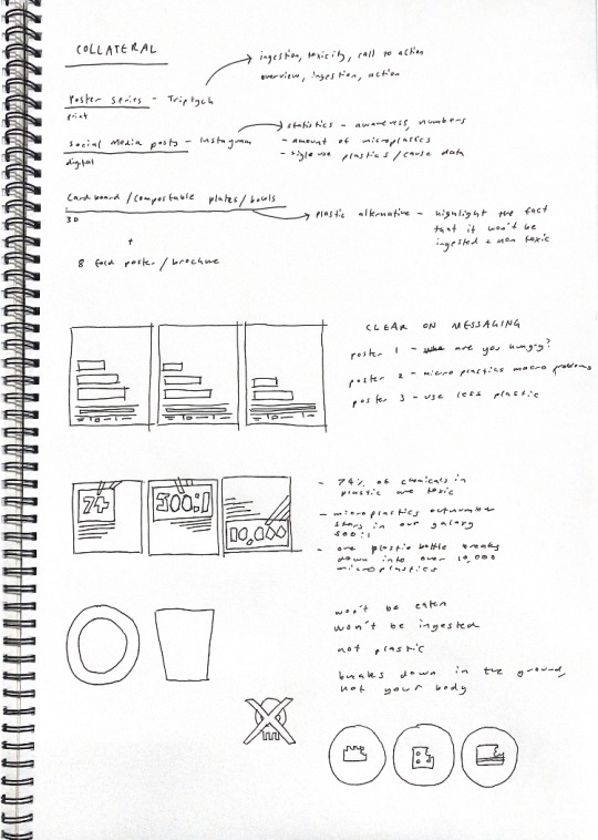
My final plan is a poster triptych, instagram posts, and compostable cups and plates/just cups.
Quick Sketched plans
Quick mockup of an idea

0 notes
Text
Week Ten - 8 Fold Brochure Prototyping
From the sketches I created in week nine, I digitised some assets for the brochure format. I wasn’t super happy with the digital spreads I created as they are very unresolved but I’m glad I’ve made a start. Eventually, I created some spreads based off a poster series I had made. I decided to print this to see how it works physically.
Starting Point - digital brochure spreads


Spreads based off poster series - digital

Alternate with texture applied - I struggled with the document size in this.

First Printed trial - brochure (not full size)
Size comparison - left = actual size (printed on A3), right = small (printed on A4).
It was quite useful seeing it in real size, as I was able to ascertain whether the point size (12pt) worked or not. I think it’s the right point size to choose, because the type is all clearly legible. The white text on the orange and blue backgrounds works because there is enough contrast between the type and background colours.
page from the printed brochure using the plastic texture in the solid colour area. I quite like this look, however I will need to experiment with it in the other formats as well before I make a final decision.
0 notes
Text
Week Ten - Development
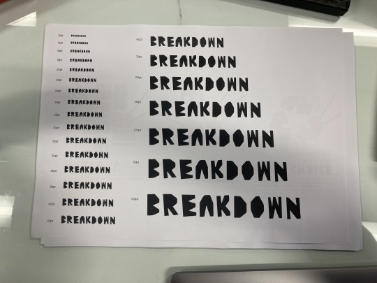
Since creating the breakdown font officially, I wanted to test out the different point sizes of my typeface and what worked better. It is very clearly a display typeface so the smaller point sizes definitely don’t work as well. I think the kerning on the typeface came out quite well which I’m happy about.
I also printed out some of the more successful posters and series I have created to date to see what they look like at a larger scale. I got some feedback from Paul which was also very helpful.
I showed this series to Paul and he suggested making some adjustments to the final poster to make it more of a positive tone; putting back rather than taking away. He also suggested a question mark after the toxic heading rather than a full stop which I think works better.


Edited poster series based off Paul’s feedback.
Some more feedback that I want to play with is incorporating photographs or textures into my work. I think textures would be an interesting addition as currently I am using a lot of solid colour in my work. A grainy or structured grid texture could add some depth and link back to the overarching topic of microplastics.
I looked at some different texture options online.
https://unsplash.com/photos/hQ3WZnY3yZ0

The grainy texture is quite nice and links back to the grainy microscopic elements of microplastics.
https://unsplash.com/photos/qv05FvdE26k

https://www.rawpixel.com/image/2363282/free-illustration-image-grid-paper-textures-vintage
This is quite subtle paper texture, but I like the imperfections and materiality of it.

https://blog.spoongraphics.co.uk/freebies/6-free-high-resolution-plastic-wrap-textures
The grid structure on this is interesting but it positions the viewer in a school context, which takes meaning away from the campaign.

This plastic texture is quite interesting and positions the viewer in a plastic environment. Applied to the icons, it could reinforce the idea of eating plastics quite well.
https://unsplash.com/photos/MS9Tnh3if1o

I tried out this texture on the icons of a poster to see how it looked. While I like the texture, it looks quite fabric like which might not match the rest of the campaign.

Poster with the texture applied to the icons. It is very subtle, I might make it bolder. Not sure if this situates the poster in the idea of eating plastic very clearly.

In this poster I applied the plastic texture. Although this isn’t the plastic type that these items are made of, it still positions the idea of plastic more clearly than the other texture I think. I might experiment with this texture a bit more.
0 notes
Text
Week Nine - 8 Fold 9 Panel Zine
I wanted to get a bit more prepared for this format as I feel like I have been putting a lot of focus into other formats. To do this I did some research on Behance of spread layout design, and made some sketches of ideas for my brochure.
Research

This spread is very illustrative. The colour palette works well with the illustration style as well, as it very playful and bright. I like how the spread layout is a full spread illustration, with text incorporated into the illustration, through the notebook and speech bubbles. The birds eye viewpoint on the illustration is quite different, and adds some depth which is a nice contrast to the flat illustrative style. There isn’t lots of text on the spread, which allows the illustration to really stand out.

The pages in this spread are a lot more separate than the last full DPS. I like the use of paragraph rules in both pages. The text formatting on the right page is quite interesting as well, with a range of column widths and shapes. It is almost laid out like a newspaper, with different sections of text incorporated into the spread with images and heading text.

This is an interesting layout because the centre fold is largely ignored in the layout. I also like the contrast between the ordered layout with even borders and the text that bleeds off the page. The body text is formatted in a way that I haven’t seen before, with the left text column very square and justified and the right left aligned. This adds some contrast in the body text that would otherwise be very traditional. The image/pattern that goes across the centre fold is quite interesting and adds variation in the grid.

This spread is interesting as it is sectioned off unevenly. The image on the left page extends over the centre fold, making the space on the right page smaller. The text on the right page is also further separated by the coloured boxes which contain the heading text and the body text. I like how all the text is left justified which creates a nice section of space on the left for the type to breathe.

This spread is very number centric, featuring a lot of statistics and data, in both graphical and numerical forms. I like how all statistics are shown in the same box/window style, with solid red heading boxes. There is no clear grid system, however all elements are aligned to the same edge margins, with the exception of the globe images. The colour palette in this is very strong which suits the bold and direct tone alongside the sans serif all caps typeface.

This spread is very simple, but the type layout is quite interesting. The page is split into thirds vertically, with a stacked type heading taking up two thirds and single column body text in paragraphs taking up the remaining third. Both the text and the photograph are aligned to the same margin system. The heading type is a traditional serif typeface in all caps, which is very clear and readable.
Layout Sketches
Before I go into illustrator, I created some sketches of ideas for layouts. I always find that working with sketching first allows me to work through and record ideas quickly, and start to think about what works well and what doesn’t. First, inspired by my research and ideas I have been thinking about, I sketched out some very quick layout plans without any specific info or imagery, focused fully on placement. Then I created two pages of sketches relevant to my topic.
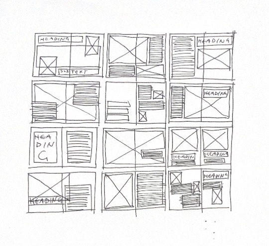
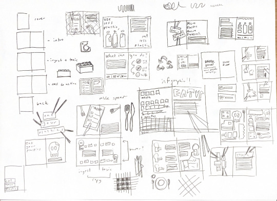
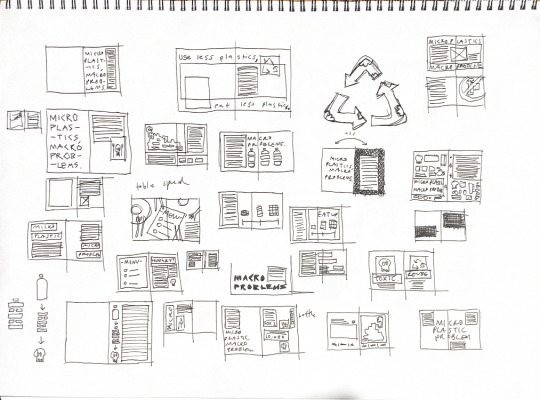
Next, I will take some of my more successful sketches and work on digitising in Indesign and Illustrator.
0 notes
Text
Week Nine - Digitising Typeface
Paul sent through some instructional links for creating a typeface so that I could type with the breakdown typeface I developed for this project. Using the Glyph application, I imported each letter vector and resized it. In the app I was able to test and edit the sizes and width of the glyphs, and I could add numbers and punctuation marks. Following this tutorial shared by Paul (https://blog.prototypr.io/make-your-own-handwritten-font-168ea5aeb4b4) I found the process easier than expected. I was then able to export the typeface into my font book for use in the Adobe suite.


Screenshots showing the glyphs I added in the application


Screenshots showing the testing and resizing
Top - original hyphen
Bottom - resized hyphen to fit the rest of the typeface

Breakdown Typeface - in the font book.
0 notes