
Don't wanna be here? Send us removal request.
Statistics
We looked inside some of the posts by grad504-catherinepascual and here's what we found interesting.
Average Info
Notes Per Post
0
Likes Per Post
0
Reblog Per Post
0
Reply Per Post
0
Time Between Posts
4 hours
Number of Posts By Type
Text
4
Video
13
Last Seen Tumblr Blogs


Fun Fact
In Q3 of 2020, 31% of US users access the Tumblr app daily.
Text
Rationale - Social Media Typographic
My ‘Type in motion’ project explores the concept of time with EB Garamond’s history versus its present characteristics and modern possibilities. The overarching concept is time, more specifically past vs present and future. The first two animations are called ‘History’, which explore the origins of EB Garamond and different evolutionary events. Chronologically, the second set of animations are titled ‘Present and Potential’. These works delve into the typeface’s current and informational traits. My research has uncovered the rich and fascinating history of EB Garamond. The typeface has endured through several centuries and is still celebrated today. Therefore, ‘time’ was a fitting concept, and with this, numbers, years and clocks were relevant visual elements.
Regarding colour choice, it remained restrained and simple to focus the viewer on the different concepts of time. The beige parchment colour visually referred to the past, while white represented modern-day paper. Black was kept consistent across all animations as a connecting element; there was also no reason to change the colour of the ‘ink’. In the History series, the paper was initially wrinkled, but in the context of different design ages, smooth parchment paper was, historically, more correct.
The transitions between frames either used turning, fading, circles (expanding to fill the screen) or ink spilling movements. These transition types complemented the roundness of this serif typeface and the underlying themes. Firstly, turning mimicked how numbers on a digital clock turn when a minute passes. Circles refer to clocks and time. Ink splatters link to past and present writing practices, and finally, the fade transitions mirror the softness of EB Garamond’s rounded serif points.
The amount of large visual elements versus small static text in all animations depended on the nature of Facebook and Instagram as media facilitators. Research has shown that Instagram is geared towards feeding our visual perception, while Facebook is informational. Furthermore, the dwell time was tailored according to the demographic research of each platform.
In the future, I think historical photos and an expanded colour palette would be exciting additions/points of experimentation to consider. Perhaps I could have utilised more glyphs and more outgoing layouts in the 'Present and Potential' animations. And while I did analyse my type specimen and took informational inspiration from it, I think it held more visual potential that could have been translated to the Instagram animations. But overall, I am extremely satisfied with the produced work and the depth of research they are rooted in.
0 notes
Text
Reflection and Thank You
This isn’t part of the brief requirements (and it wasn’t required in the rationale), but I just wanted to say that this entire animation journey has been one wild rollercoaster. I went from being super excited about this project to being extremely, oh so incredibly, frustrated trying to learn Photoshop animation then back to the same level of passion and excitement (once I was more familiar with the program). Despite the circumstances of lockdown, I learnt so much from the teaching team and I’m grateful for the knowledge and resources they provided. Photoshop animation is something I can use in the little things now - whether it’s just a small birthday animation for friends and family. And the skills and processes are something I know will be valuable in the real design industry. So thank you James and Karol for leading this paper - your efforts are much appreciated.
0 notes
Video
tumblr
Instagram 2: Present and Potential
I sound like a broken record at this point haha, but again, the reasoning explained in the last post translates here (just a few additions and differences). The ‘EB Garamond’ title is a bigger point size to fit the Instagram dimensions better. The word ‘now’ obviously means ‘present’ and the letters are highlighted to meet in the middle ‘O’. The middle O depicts the same middle position of the present in between the past and the future. Then the different glyphs are showcased, with the same static text at the bottom. I did choose for the font size to be smaller so there was more negative space, since everything prior and that is upcoming fills up most of the screen - a visual breather if you will. The circle becomes a clock and a fun clock animation is showcased - this was inspired from the very first Instagram iterations. Once again, the infinity symbol is drawn from the middle, with ‘endless potential’ at the bottom - if you can see, there’s no full stop used in this animation series - because the present is fleeting and the future is undefined. Just a little Easter Egg for y’all :)). There’s a lot less information in this translated animation and the reasoning behind that decision is based in the research I conducted for Instagram content. Instagram content is a lot more visual and image-based - therefore small and static text would be less ‘effective’ on this platform.
Anyways, that’s all the explanations for the final animations - I’m going to write a reflection recounting this design journey then the final design rationale!
0 notes
Video
tumblr
Facebook 2: Present and Potential
This next series jumps forward in time to celebrate the present and get excited for the future. From parchment paper, we move to white paper of today - hence the black and white colour choice. EB Garamond is often used when books are published, so ink is still a relevant and importance element today. Hence, the reveal of EB Garamond is through ink spilling through the paper. Next, the creator of typeface is mentioned -through my research of Facebook and Instagram content, Facebook usually showcases a lot more information. Therefore, this animation holds a lot of small informative text - such as the release of EB Garamond, and how many languages it supports. All this information was inspired from my type specimen when I was looking for further inspiration. Again, the circular and ink transitions are utilised to establish a clear design system across all animations. Next, the letter ‘O’ was chosen to showcase the different glyphs and languages - simply because - it’s the base shape for a clock and we’re realllly exploring time here woohoo. 3 o’s are chosen to fit nicely within the Facebook dimensions and also it represents past, present and future - though, that’s a liitle bit of artistic interpretation and not design communication. These 3 o’s become 3 clocks (pretty self-explanatory) and these then merge to form the infinity symbol, which is an ode to how enduring Garamond has been (literally through 5 centuries) and thus, how enduring it will be in the future.
0 notes
Video
tumblr
Instagram Animation 1: History
A lot of what was written before can be applicable to this - but there are a few differences I want to explain. The way in which EB is revealed is different (ink splatter) and the manner in which the 5 weights are depicted also differ. There is no real reason other than a little variation in the execution (but not necessarily the final message) would make things more visually interesting - and I’m always up for the extra challenge! Here, the circular transitions are used to seamlessly introduce the clock format - except with this, the clock numbers are replaced by each revival year of Garamond before EB Garamond. The turning effect is used to reveal this information (same reasoning as before). And everything afterwards is backed up by the same reasoning as well haha. I do want to say that the full stop is used in the ‘History’ series to subtly visualise the past as being something that is final. If you look back, the ‘7 revivals’ and final descriptive words all have a full stop - and this is linked to the concept of the past, which will also translate to the next series of animations.
0 notes
Video
tumblr
Facebook Animation 1: History
The beginning of this animation visualises the creation of the typeface’s name. ‘EB’ in ‘EB Garamond’ stood for the 1592 Egenolff-Berner specimen sheet, which showcased Claude Garamond’s origical roman types. The ink splatter is a reference to the writing practices back in the age when Garamond was first created (in the 16th century). Scribes would use ink and parchment paper - hence the black and beige (paper background) colour choice. The animation also recognises present characteristics that are important to EB Garamond - such as the weights, and the fluctuating movement visually informs that piece of information. The movement from ‘5 weights’ to ‘7 revivals’ mimics the way in which numbers would turn over on a clock. Then the 7 revivals is rooted in the research I conducted and it further explains the evolution and history of EB Garamond. The circular transitions are prevalent across the animations because it is the basic shape of a clock and also, since EB Garamond is a rounded serif typeface, it makes sense that transitions are not so sharp and square (if that makes sense). Lastly, the descriptive words are the three adjectives which I brainstormed from the beginning of the semester - they were chosen because I thought they best described this historical aspect of EB Garamond.
0 notes
Video
tumblr
Final Instagram 1.0
(after all refinements, I’ll reupload all of them and write further commentary hehe).
0 notes
Text
To-do list
-- Refine last three animations.
- Write all your design intentions for each animation!
- Rationale writing today!
0 notes
Video
tumblr
Transition from 2011 to 3 ‘O’s is too fast
0 notes
Video
tumblr
Transition between 2011 and ‘O’s --> ink transition.
0 notes
Video
tumblr
Dwell time of 2011 needs to be longer.
Changed the rectangle transition to circular one - fits with the other animations much better.
0 notes
Video
tumblr
Added different glyph versions of the ‘O’s and that will transition into 3 clocks.
0 notes
Video
tumblr
Dwell time of 2011 needs to be longer.
Rectangle transition - change.
Clocks in all 3 ‘O’s?
Refer to time/numbers breaking then go to infinity symbol.
0 notes
Video
tumblr
What I have so far from all the experiments so far for the Facebook one! I did choose to change from beige and black (in the first 2) to white and black. The changing colours represent paper changes - from cream/beige parchment in the past to white paper of the present day.
I added Georg Duffner in this one according to my research of Facebook content - to be more informative.
0 notes
Text
Social Media Strategy: Instagram + Facebook information
From my marketing studies and experience, Instagram provides more visual/image-based content while Facebook slightly leans more towards informative/video content. This has always been driving my animations but I think it’d be good to find some research to back up this reasoning:
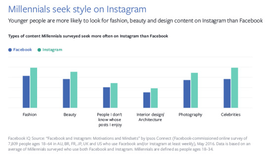
Across all four countries, people strongly see both Instagram Stories and Instagram Feed as visually beautiful places to revel in creativity.
https://wlkr.digital/how-should-facebook-instagram-content-differ/

https://www.linkedin.com/pulse/facebook-vs-instagram-how-why-content-approach-must-different-franks/
Facebook and Instagram are two totally different feeds. They may be owned by the same companies, but they have different uses and user expectations. Brands need to have an organized strategy and optimized approach for both channels.
Many digital marketers will probably argue that for visual branding success, Instagram is the leader in the pack.
What the Facebook IQ team found was that Instagram is a place people go expecting inspiration and an insider’s perspective while on its big sister channel, people are seeking opinions and real-time content.
For example, during a big cultural event, Instagram is where users want to see a celebrity’s inside look and cool images (visual). With Facebook content regarding the same event, the audience will be looking for up-to-the minute updates or a critic’s review and maybe even strong opinion (informative).
0 notes
Video
tumblr
I wanted to add the infinity symbol at the end to refer to the future - I was going to add the words ‘endless potential’ to be more direct (as seen in the storyboard) but I think the symbol speaks for itself.
Perhaps some static text is needed?
- Flashing white at the beginning - gotta fix that gee.
- Add 35 languages + endless potential.
0 notes
Video
tumblr
Added the clock animation.
0 notes