
Don't wanna be here? Send us removal request.
Statistics
We looked inside some of the posts by grad601studiophoebechow and here's what we found interesting.
Average Info
Notes Per Post
0
Likes Per Post
0
Reblog Per Post
0
Reply Per Post
0
Time Between Posts
46 minutes
Number of Posts By Type
Text
16
Video
1
Last Seen Tumblr Blogs


Fun Fact
Post activity is at the highest at 4:00 pm EDT; notes peak at 10:00 pm EDT.
Text
Changes I would make if I had more Time
If I had more time, I would’ve definitely liked to experiment more with colours, as I wasn’t too sure if I had completely nailed the colour palette in this publication.
If I had more time I also wished that I would’ve been able to create more imagery for our publications to put in my thematic intro and outro.
I also would’ve loved to experiment more with my front cover and back cover, as although I am pretty happy with it, I would’ve loved to develop it a little bit more.
Apart from that, I’m pretty pleased with how everything else went in my publication! Definitely wasn’t smooth sailing the whole time but the outcome was still good :)
0 notes
Text
Reflection on my Publication
Reflecting back on my publication, I am quite pleased with how everything turned out. However, I do wish that I had more time to complete it as a few things in my publication were a bit rough.
I’m also really happy with the people that I got in my group because although all of our design conventions were very different, it really challenged me to think outside the box, and I can confidently say that it made me design in a way that I normally wouldn’t.
I’m quite happy with the colours and overall layout, and was surprised that my printing process went by quite smoothly. I only ended up having to reprint a couple of times, only because of minor problems, but I’m really happy with how the overall physical publication turned out. I don’t wish that I did anything differently, as I’m quite happy with it.
0 notes


Text
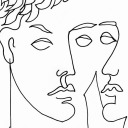
FINAL FRONT COVER

The red tones as the front cover represent deep connection. We all interviewed people that we hold close to us like our parents or our best friend. This red represents that. Red also most importantly represents love and care. I thought this colour would be perfect not only because it is a colour that a lot of our publications share in common, but is also bold and vibrant, and draws the viewers attention immediately. Red can also mean pain and suffering, which is also a strong representation of all of these people that we’ve interviewed and how they have undergone/faced obstacles in their life that have negatively impacted them. As previously said, life isn’t always smooth sailing.
I chose the main imagery as resembling a swirly road, flipping inside and out to show the rigid and lifestyle that all of these people that we interviewed faced. Some had to move away from their families, and some had to leave their jobs, which has meant that they haven’t been able to live the most perfect and easy life. Life is all about making mistakes, and learning from them. That is how we learn, so having this windy red road helps to symbolise the life lessons that these people had to undergo, and the struggles they had to face along the way because of that.
0 notes
Text
Reflecting on Nigel’s Publication
Looking back at Nigel’s publication, I did make quite a few minor changes. His designs were much simpler in comparison to Dana, Jess and myself’s. He used mainly photography and a couple of outline illustrations. I struggled with building on that as the imagery was quite plain, and there no filters or photomontage-ing going on. I did although really like the travel stamps that he had used, so I built on that quite a bit, as well as the outline illustrations, that connected well with myself, Dana and Jess’ publications.
0 notes
Text
Reflecting on Jess’ Publication
Looking back at Jess’ publication, her one was completely opposite to Dana. She had so much text and I struggled a lot working with it. I couldn’t make the text bigger (to match the size of the other fonts in my publication) as it would go off the page, so I ended up having to keep it at size 10pt. She gave me a lot of imagery to work with which I am very grateful for, and I’m also really happy that I was able to be in a group with her. Her colours were completely different to mine which was the only thing that bothered me for this brief, so it was quite hard to create cohesiveness with all of our different colour palettes.
0 notes
Text
Reflecting on Dana’s Publication
Looking back at Dana’s publication, I ended up only making a few minor changes. I already really liked her publication, but I shifted around a few elements in order to create cohesiveness.
Looking back, I’m glad that I had dana in my group, as there was quite a lot of opportunity and room to work with as she had used both imagery and illustration. The only thing that I struggled with with her publication was negative space, as she had quite a lot of it, as her interview questions and answers were really short, therefore, not a lot of body text.
0 notes
Text
Minor Changes I Made for the Final Print
- Made all question colours red
- Turned down opacity of some of Nigel’s imagery
- Shifted around positioning of road on back cover
- Made type all the same size
0 notes
Video
tumblr
TEST PRINT
This was my first test print of my publication. I obviously didn’t cut trim it down, as it was a test print. I just wanted to make sure that the pages were in the right place, and the colour that it printed was accurate and not too light or dark. I’m really happy with how it turned out on the first attempt. I just need to make sure that for my final print, I extend the background past the actual length of the page, and hit the bleed, otherwise I might potentially have some white space on the edges of my page after cutting it.
0 notes