grad602-courtneywrann
Communication Design Studio IV
55 posts
Don't wanna be here? Send us removal request.
Last Seen Blogs
kurahieiritrjio
kurahieiritr JIO
rampocolypse59
Rampocolypse_5.9
blahblahbayern
meme fatale

vol-bol
VOLBOL!

universe-prime
beep bop boo boo bop
Text
Reflection
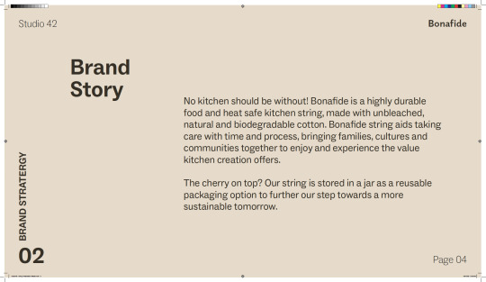
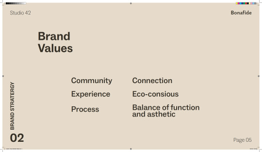
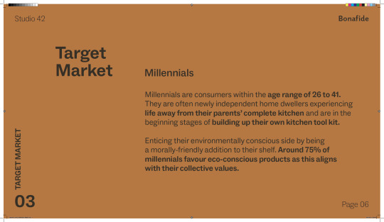
This string packing assignment was a great deal of enjoyment for me. The first portion of this assessment with the group went well. I believe that everyone contributed equally and that everyone was on the same page about the vision of the brand we wanted to establish, a brand that is deemed friendly to the millennial target market. I would have liked greater control over the design process, but I appreciate that not everyone could have worked on it due to other obligations.
Following the actual presentation, the comments about the packing were quite positive and helpful. It was encouraging in the sense that we were on the right road and that both the lecturers and classmates thought we had set the brand story and values properly in order to fit with the target demographic.
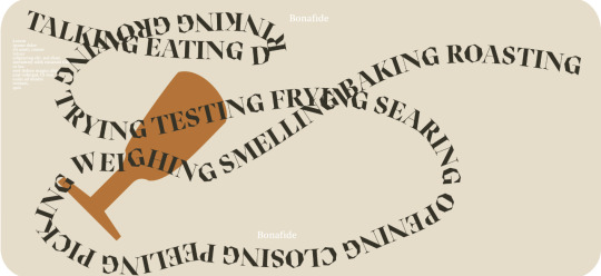
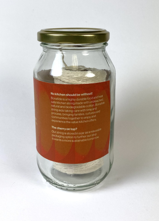
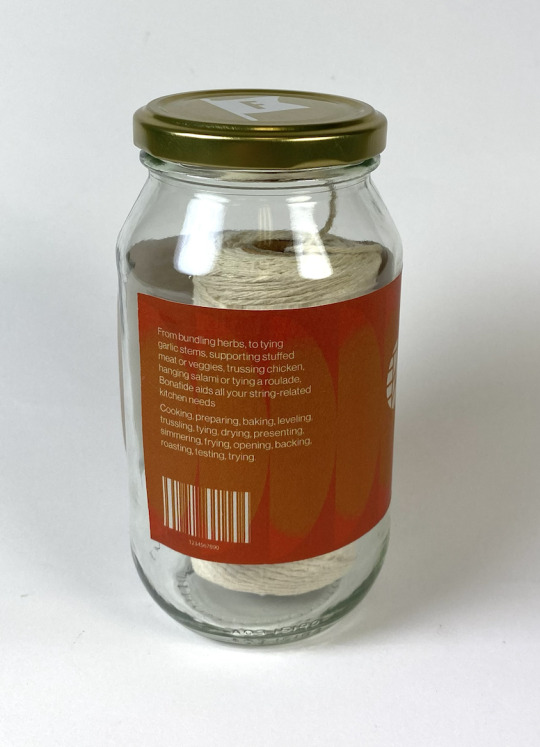
The feedback was extremely helpful, and I agreed with everything; the logo needed to be revisited because it was not clear what it was visually, we needed to focus on one label/packaging option because it became unclear if we were offering just one or more versions of the string, we needed to reconsider the packaging because people often peel the packaging off mason jars to reuse it and that is not the purpose we want it for, and finally we needed to focus on the layout, especially with text as there is noticeable cliff hangers that is not pleasant to the reader.
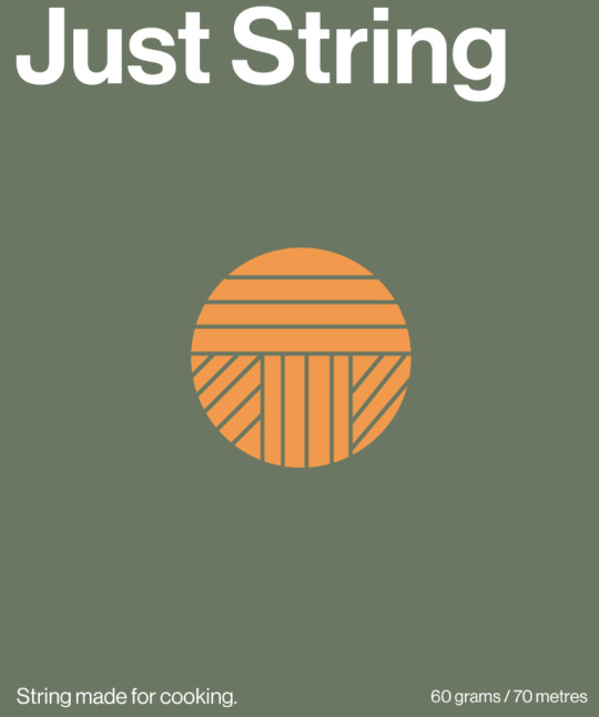
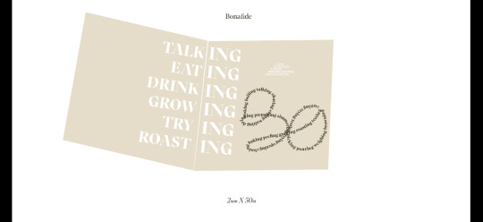
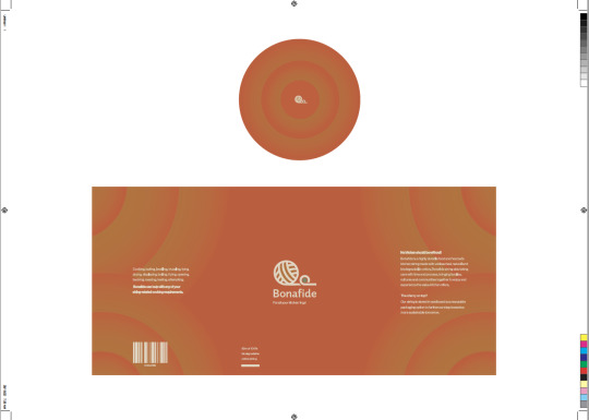
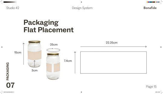
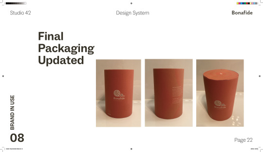
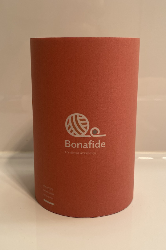
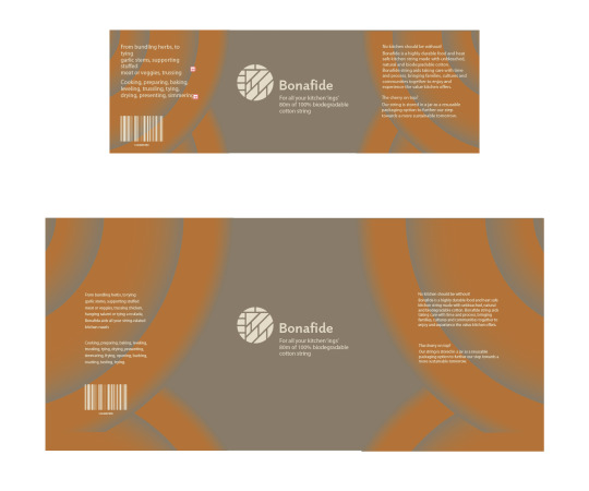
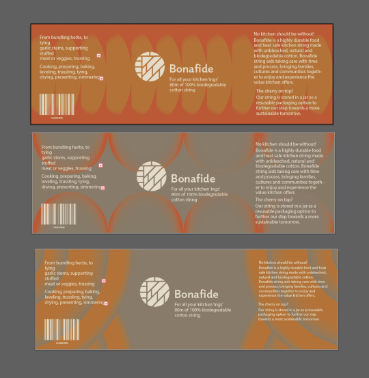
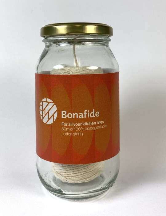
Original Packaging:
Based on the feedback, I made improvements straight away, first researching other package designs to see what other designers often use for cardboard cylinder packaging. Choosing cardboard cylinder packaging because it has a similar form to the mason jar but is less expensive to provide and purchase for the consumer as well as more eco-friendly.
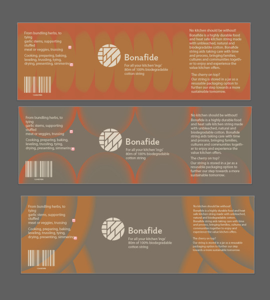
I wanted the package to retain significant elements of the old design. I utilised the colour scheme from the first label shown above, as well as the artwork from the third label, to accomplish this. As I feel the third label would work nicely with the more prominent string ball logo, that I had created
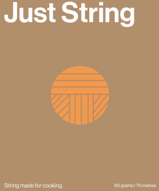
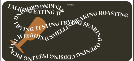
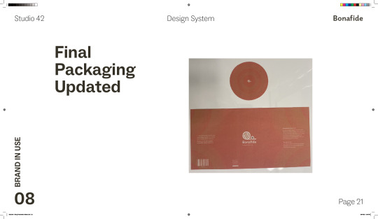
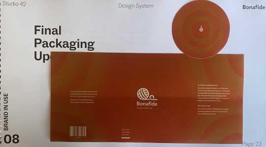
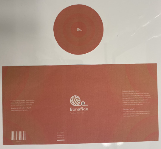
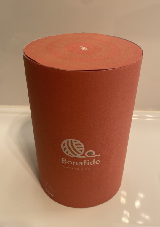
Final Packaging:
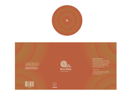
I believe I successfully integrated these two labels to make the final packaging pictured above. It maintains the colour palette and undoubtedly connects with the warmth of the kitchen that the target consumers experience. I continued to include this scheme into the advertisements so that it would be immediately identifiable throughout the various media platforms including Facebook and Instagram.
0 notes
Text
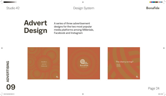
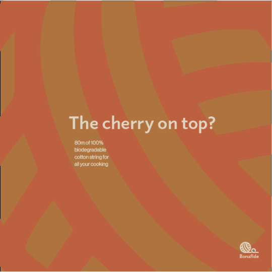
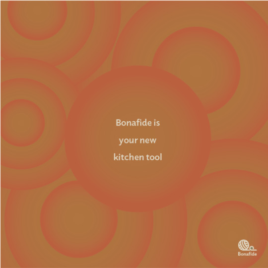
Week 13 - Advert Design
The advert design needs to specifically reach the target audience of Millennials. From my research, 87% of Millennials use Facebook at least once a week while 71% used Instagram at least once a week (Digital Media Ninja, 2021). This is a huge indicator to me of these being the most likely media channel platforms to cater for my Advert Design. Facebook and Instagram however can both use the same dimensions for feed adverts (1080 x 1080 pixels), so I am considering creating a couple of Adverts so they can be different across platforms to help enhance engagement.
Reference:
Digital Media Ninja. (2021). Which Social Media Platform Do Millennials Use? https://digitalmedianinja.com/what-social-media-do-millennials-use/#:~:text=product%20or%20service.-,Instagram,lack%20of%20content%20and%20text.
Advert Design Process:
Concepts:
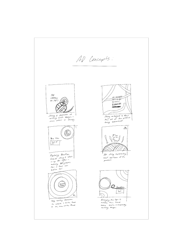
Explorations:
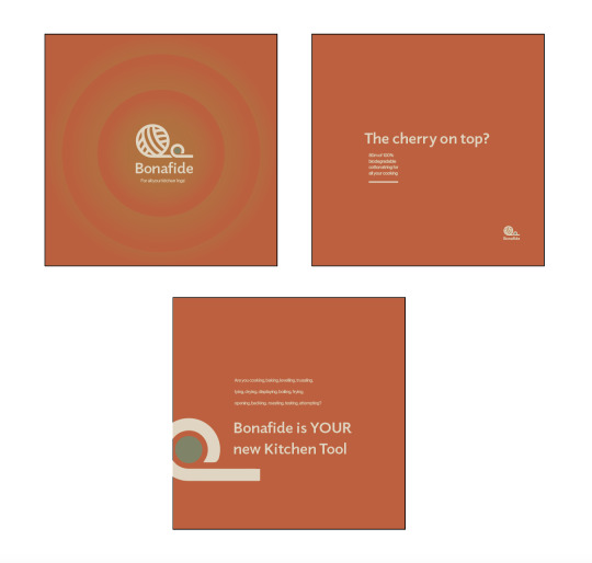
Refinement and final Adverts:
I wanted the final advertising to have the same colour scheme across all media channels so that the brand could be clearly identified. The campaign's colours are warm, echoing the original brand idea of aiming to transfer warmth from the kitchen customer feel to the packaging. Then I made certain that Bonafide was prominently shown in each advertisement.
0 notes
Text
Week 12 - Print
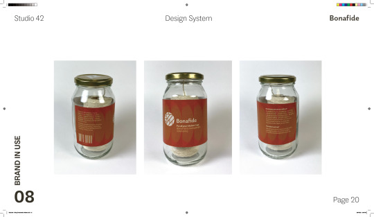
Printing the new Label:
Adding the Label to the Packaging:
Final Packaging printed on sticker paper:

0 notes
Text
Week 12 - Design Process of updated Packaging
Investigation of Type Size:
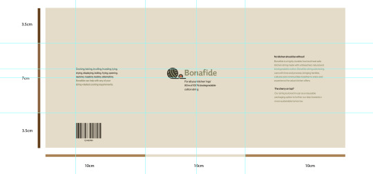
As previously mentioned in previous posts I found the type size too large, to further look into this I took a couple of photos of everyday items I use around my house, to compare the type size to the original packaging design.
Original Packaging Design:
Photos of Everyday Items:
From this investigation, the text is needing to be slightly small on the packaging as it is evident the everyday items packaging type is not as big as the original.
Applying new Type Size on new Packaging Size:
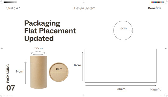
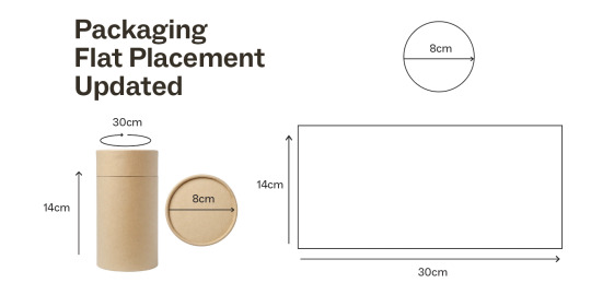
New Packaging Dimensions:
Applying new Type Size:
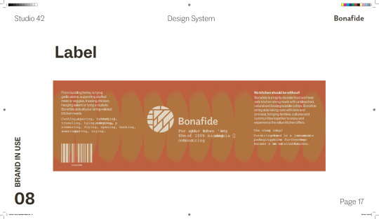
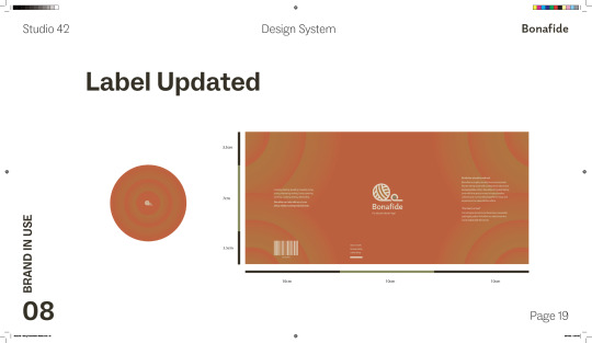
I first made the existing label size the new size for the packaging.
Then decreased the size of the type accordingly - to get rid of cliff hangers.
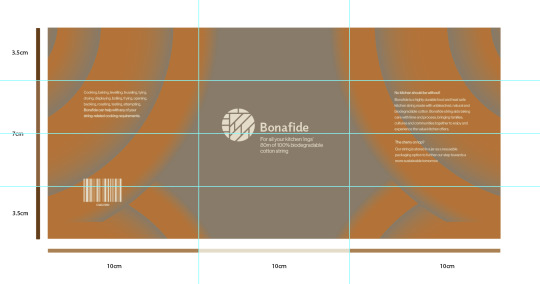
Reconsidering Layout:
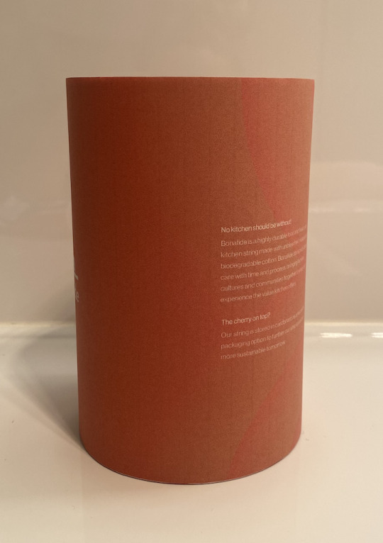
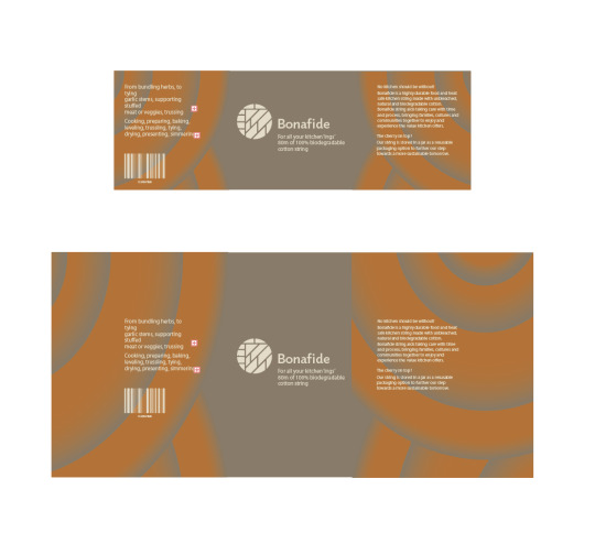
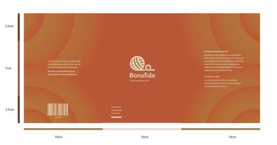
I changed the size of the body text on the left hand since I thought it was starting to repeat itself. As a result, I condensed it while emphasising to the audience that Bonafide can assist with any cooking needs.
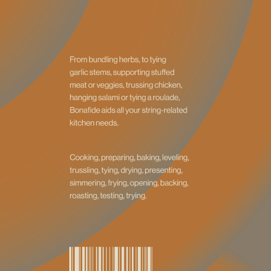
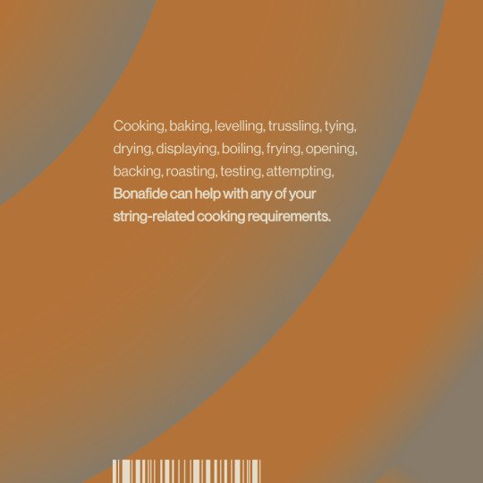
I then proceeded to change the height between each line as both sides of the body text (referring to the original photo) are at different leadings. Then slightly making the key points and questions thicker, so they can stand out when printed.
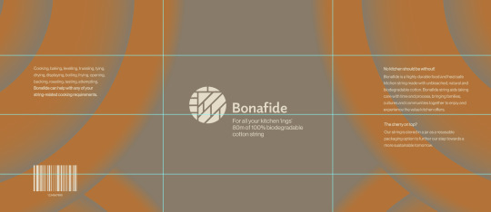
To help with placement for the packaging design I created my own grid system, the grid made up of three columns.
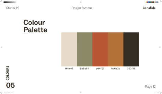
Colour Palette Changes:
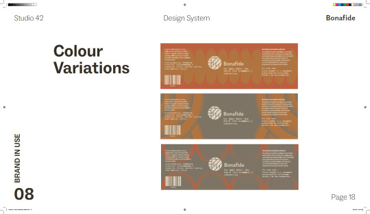
I wanted to try a mainly red colour palette but I felt like it was losing its original feel from the first packaging.
I then decided to experiment with other colours from the chosen colour palette but looked quite dull.
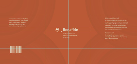
I decided to go with the colour palette of red and orangey brown. I am now experimenting with the shadows and placement of objects.
At the moment final packaging of the body:
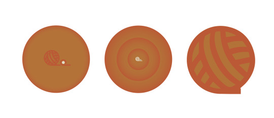
Top of Packaging Design Process:
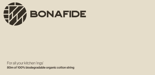
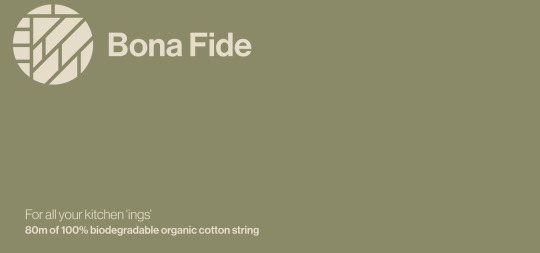
I wanted to combine symbols from the main body package into the lid's top, so I considered just having the logo in the centre, combining the same images, and looking at an extended pattern of the logo. From these three options, I chose the second alternative, as seen below, since I believe it fits well with the existing new package.
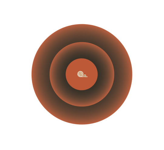
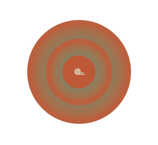
Top of Packaging Colour Variations:
Final Top of Packaging:
0 notes
Text
Week 11 - Revisiting the Existing Packaging
Existing Packaging:
The feedback we got for the packaging was that it wasn’t clear if there is three different string flavours or what? The lecturers stated that we needed to pick one and expand on that - further strengthening that one. Such as making sure there are no cliffhangers in the text - this could be prevented by the text size etc. I 100% agree with this feedback as I feel the type is a little too big, especially on the first and second concepts shown in the image below. In addition, there are definite cliffhangers on the left-hand side, that are not appealing while reading.
I really like the colours of the first concept as I feel like it's a lot brighter and I find myself gravitating to it more. However, the background design on the third concept resonates well with the string concept plus could tie in well with the new logo. These are some things I am wanting to personally explore and play around with. In addition with the change of packaging the existing label size will be a bit bigger plus will be looking into designing the lid of the packaging.
Packaging Inspiration:
I wanted to look over my package design research since it could be useful now that I've switched from a mason jar to a cardboard cylinder.
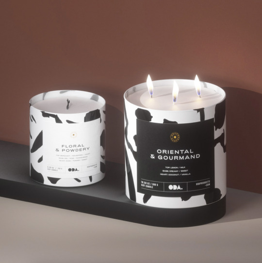
https://www.behance.net/gallery/147837939/Oda-Candles?tracking_source=search_projects%7Clid+packaging+design
Even though this is a candle design is still has the cylinder shape. Through the making of the logo, I like what I call the ‘sticker effect’ as it highlights the key areas you are wanting to show. This is shown on the packaging of the candle with a square above the background design.
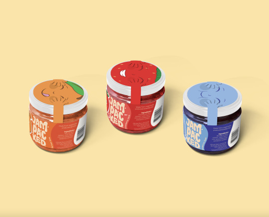
https://www.behance.net/gallery/133224013/Jam-Packed?tracking_source=search_projects%7Cjar+packaging+design
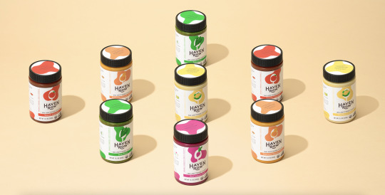
https://www.behance.net/gallery/63769157/Haven-Row?tracking_source=search_projects%7Cjar+packaging+design
These two designs are very similar, and what made me like them is the design on top of the packaging. I like how the first one plays on with the illustration, whereas the second highlights the logo, I feel like this is something worth considering in creating the packaging of the lid. Such as could the lid be a whole background design and then have the ‘sticker effect’ of the logo on top?
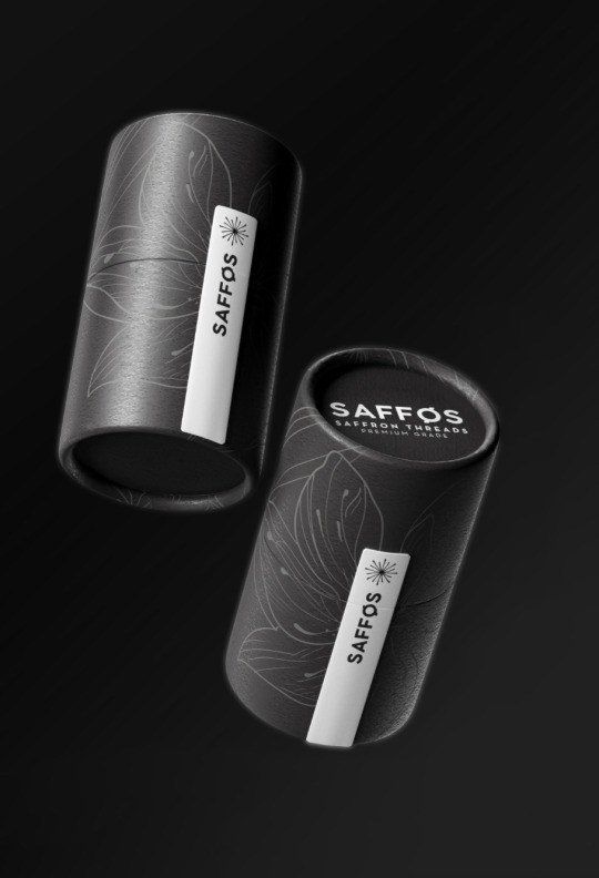
https://www.behance.net/gallery/123532249/SAFFOS?tracking_source=search_projects%7Cjar+packaging+design
I really liked the base design of this packaging, I was considering if this could be used just on one half of the packaging, such as the lid, to create a bit of contrast.
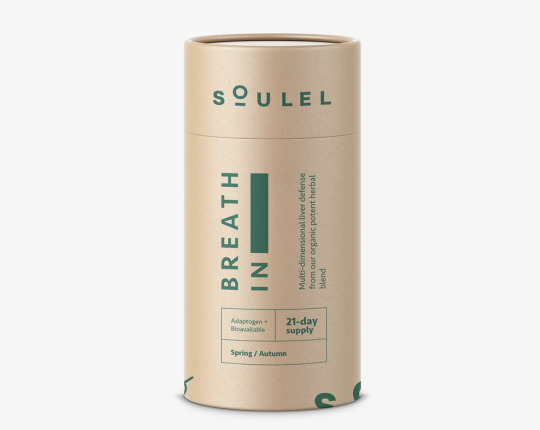
https://www.behance.net/gallery/140156207/Packaging-for-natural-supplement-company?tracking_source=search_projects%7Ccylinder+design
Different to my other research this one decided to have the logo around the edge, I did like this idea as it has a similar colour palette to the existing one.
0 notes
Text
Week 11 - Creating the New Logo
Concepts:
I based my concepts around the string, the use of string in the kitchen as well as a kitchen symbols.
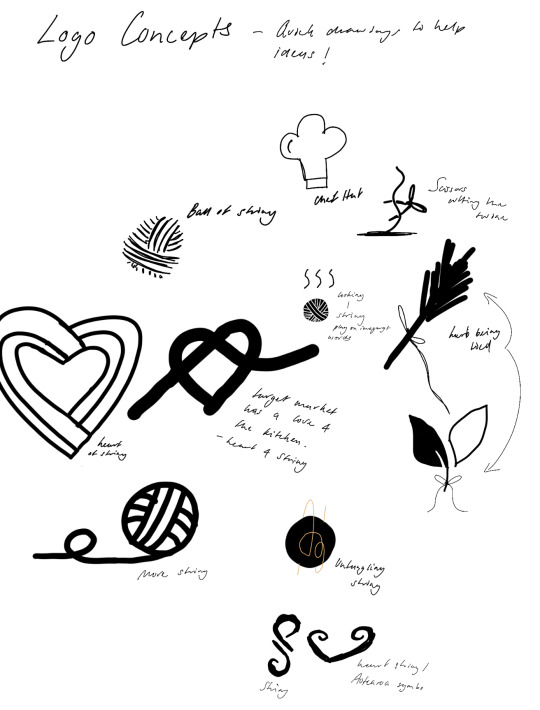
Exploration:
I choose to make the selected drawn concepts in Illustrator. From these four explorations I am gravitating to the two on the right-hand side, as I believe it is more evident what the brand is, that is string. It will let the consumers know straight away. In addition, still keeps the circular shape of the existing logo too.
Refinement:
The chosen two (top and bottom of the right-hand side of explorations), I really like how they both have a different feel to them. The first image below shows a more not so rough looking string, yet does this meet with the clean brand image? not quite.
The second exploration is however cleaner, I believe that it resembles the already created theme of the modernism/clean approach for the packaging. Through both of these explorations, I used techniques of outlining the image or using another colour behind the logo to create a focus point, as I believe it creates more depth to the already flat illustration.
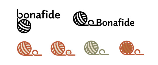
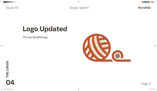
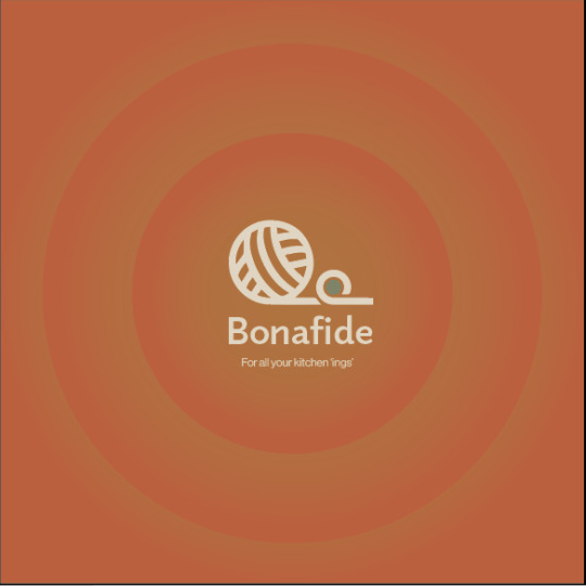
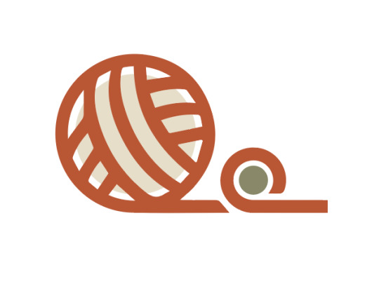
Final Logo:
0 notes
Text
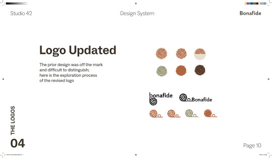
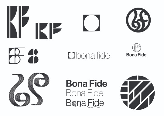
Week 10 - Rethinking the Logo
Reflection:
From the feedback received none of the lecturers understood what the logo actually was. Therefore it needed to be changed.
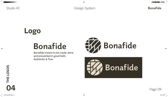
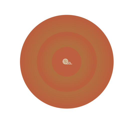
Existing Logo:

I want the logo to continue being a stand-alone symbol however, the logo needed to resonate with the values of the brand as well as show its purpose - could look similar to the target market illustrations I created:

Logo Research:
https://www.behance.net/gallery/152772741/LOGOS-COLLECTION-2022?tracking_source=search_projects%7Clogos
I really liked this logo as it’s line art I found very similar to the target market illustrations. As it was flat I like how they added the white to add a bit more depth as well as highlighted the focus point.
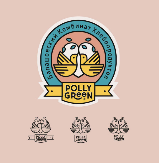
https://www.behance.net/gallery/152843213/Balashovsky-Bakery-Plant?tracking_source=project_owner_other_projects
I love this logo much like what was mentioned before I like how it has a flat illustration. The outline of the white created a sort of sticker effect in my eyes really allowing it to pop out from the base colour.
https://www.behance.net/gallery/103153337/LOGOS-COLLECTION-2020?tracking_source=project_owner_other_projects
Unlike the other logo research, this illustration of the wine glass is completely flat, but I really like it, I think its cause the ‘wine’ is coming out of the glass making it not a traditional stand-alone glass. Could be an idea for untangled twine.
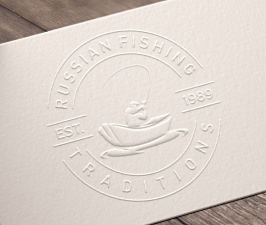
https://www.behance.net/gallery/80260659/Volzanka-russian-fishing-traditions?tracking_source=project_owner_other_projects
I appreciate how the fishing company used this logo and how it is engraved on the packaging. Adds another idea on how the logo can be placed on my packaging.
0 notes
Text
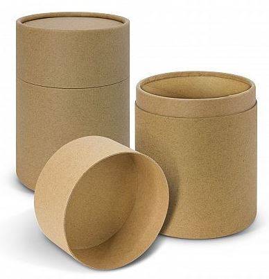
Week 10 - Finding Alternative Packaging
The feedback on the glass jar in particular stuck out to me. It was said that when reusing a glass jar, you usually strip the wrapper off, but it was not the use we had in mind for the jar. In addition to the cost of the jar, it is more cost-effective to provide some form of cardboard packing, especially if the glass is inadvertently shattered on the floor. Will the customer buy a new jar or not bother for the next time?


I looked at circular packaging on Behance, and a lot of the packaging that drew my eye were thick cardboard cylinders. This appealed to me since it is not as fragile as a box and it maintains one of the major characteristics of why we chose the jar of it not being readily damaged in the draw.
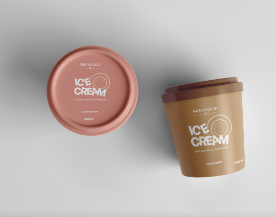
https://www.behance.net/gallery/145924137/Free-Ice-Cream-Round-Tub-Mockup?tracking_source=search_projects%7Cround+packaging
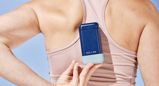
https://www.behance.net/gallery/117931987/Ace-of-Air?tracking_source=search_projects%7Ccircular+packaging
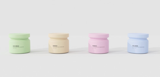
https://www.behance.net/gallery/143777235/Sofia-Cosmetics-Brand?tracking_source=search_projects%7Ccosmetic+packaging
From my research, I looked into cardboard cylinders however a lot of the ones online were very skinny in shape, and it looked like it could be easily knocked over - definitely not ideal. Therefore I wanted something wider. This would be the ideal shape of a cylinder:
As it can easily fit any round/circular size of a string.
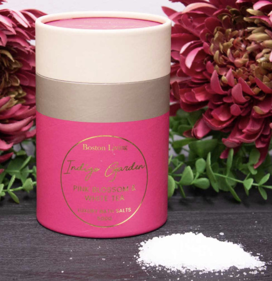
I work in a retail homeware department store, I walked around looking for packaging that resembled the images above. I found this packaging of bath salts was ideally what I was after packaging-wise. Therefore I decided to purchase this and base my design measurements on this. As I would like the whole cylinder to be the same colour and would cover the existing packaging.
0 notes
Text
Week 9 - Take back from Feedback
My key notes from the feedback:
Need to re-image the logo - as it was not clear
Pick the strongest packaging - then expand on that, as there is too much going on and is not clear
The presentation of the slides was good, need to make sure there is not cliff hangers and it did not leave a good feel for the audience
Lecturers like the theme of the warmth of the colours - resonating with a warmly welcoming to welcome the target market of people in the kitchen
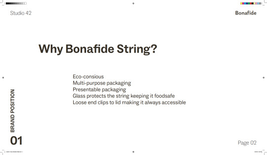
Cost of glass and use of glass jar needs to be rethought. The theme is also eco-friendly yet the cost of the jar may be expensive, and there are cheaper eco-friendly ways such as a cardboard cylinder that is a better option
0 notes
Text
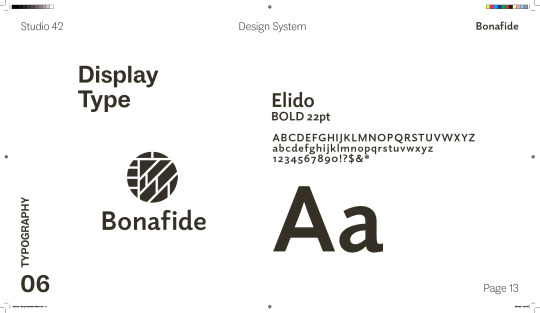
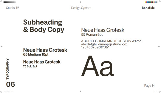
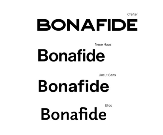
Week 9 - Final Typography Choices
From the previous research here are the four type faces we are considering. As they are simplistic and modern and would appeal to our target market.
0 notes
Text
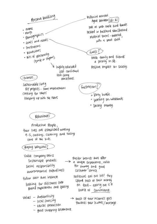
Week 9 - Personas
Persona Brainstorm:
Chosen Personas:
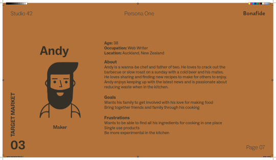
Andy
Age: 39
Occupation: Web Writer
Location: Auckland, New Zealand
About
Andy is a wanna-be chef and father of two. He loves to crack out the barbecue or slow roast on a Sunday with a cold beer with his mates. He loves sharing and finding new recipes to make for others to enjoy. Andy enjoys keeping up with the latest news and is passionate about reducing waste when in the kitchen.
Goals
Wants his family to get involved with his love for making food
Bring together friends and family through his cooking
Frustrations
Wants to be able to find all his ingredients for cooking in one place
Single use products
Be more experimental in the kitchen
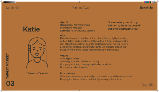
Katie
Age:32
Occupation: Advertising and Promotions Manager
Location: Auckland, New Zealand
About
Katie is a busy and creative mother of one. She is highly educated, self confident and ambitious. Katie works a 9-5 job and spends the rest of her time cooking, cleaning and looking after her kid. Katie is a go-getter and loves getting stuck into DIY projects around the house, often making things herself instead of buying new.
Values
Cooking for others
Spending time with friends and family
Company ethics and buying sustainable products
Convenience in her busy life
Frustrations
Wants to make more sustainably conscious choices at the supermarket
Keeping her house tidy and aesthetically pleasing but practical
“I want every item in my kitchen to be aesthetic and still practical/functional”
Personas Illustrations:


0 notes
Text
Week 9 - Writing Our Point of Difference in the Market
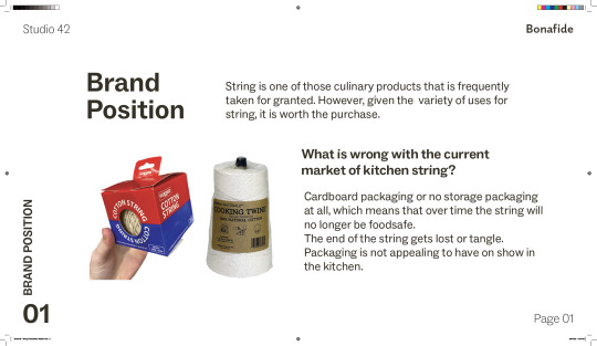
String in the market is a typical cooking item. Twine is one of those culinary products that, like plastic wrap and parchment or wax paper, is frequently taken for granted. However, given the variety of uses for string, it is worth the purchase.
According to in-store research, string is usually discovered in a cardboard box and then kept in a drawer after being purchased. The end of a twine bundle might be difficult to locate in a box, making a basic tool harder to grasp. Furthermore, as string is stored in the draw over time, the cardboard packaging loses its form and seems worn. As a result, customers will put it in their drawer, where it will add to the clutter or grow dirty rapidly, rendering it unfit for food consumption. To remedy this, displaying the string on a tabletop jar will be a decorative yet functional addition.
String in a jar is a trendy centrepiece for a typical kitchen item; no more searching for the end of the twine as it is readily spotted on the top of the jar, as it is threaded through the hole at the top. No need to be concerned about where it is because it may be placed wherever it is most convenient without the inconvenience of it toppling over or rolling around in a drawer.
0 notes
Text
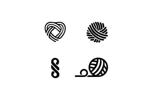
Week 8.2 - Logo Concepts
Logo Concepts:
From these logo concepts we all gathered that we liked the bottom right, as it resemble the product (the string of course).
0 notes
Text
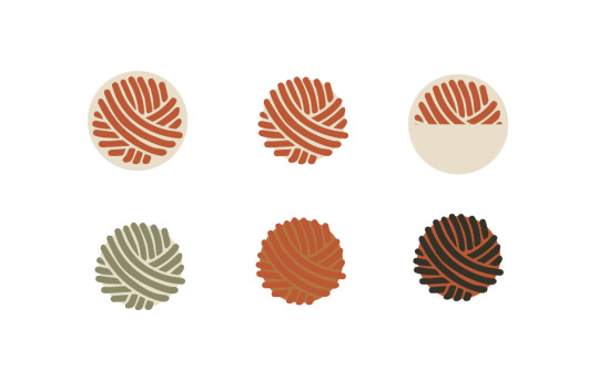
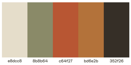
Week 8.2 - Colour Palette
Further colour palette exploration:
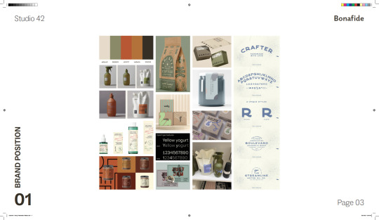
From the mood boards we all gathered we like the organic looking colours as we our target are more ‘organic’ too.
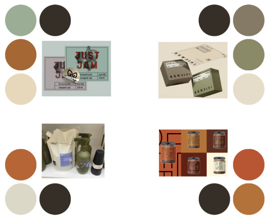
Chosen Colour Palette:
0 notes