
Last Seen Blogs

demogorgon-1983-blog
dark shadow

porcelain-tum
18+

dewdneym
Unknown World

mochimelodyj0311
mniam kawaii
cederenesciorpg
Cedere Nescio


Text
Advertisement Location
I researched several places for this advertisement, and after researching I found the product would be suitable when advertised in supermarkets or plant markets. As with the 'String for homemaker' product most of the users will be elderly people who love to plant and cook, so advertising on social media platforms will not be possible for our product.


0 notes


Text
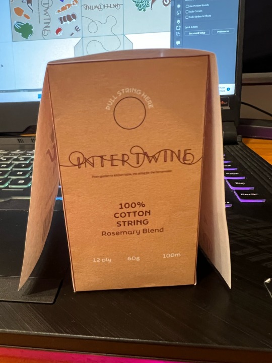
Remake Logo


From Formative we have made a few logos and the above is one of them, I find it very suitable for the product that I want to aim for. Below I have corrected some details to make it clearer.
0 notes

Text
Planning for remake
Create a fresh design system; include more visuals and illustrations; use that for the box.
Update the display - Use layouts and grids to ensure that everything is even.
Add one more colour to the pallet, thinking colour about food or vergetable.
Redesign the persona's page and create a graphic for the people that might better explain them than words.
Improve the presentation's appearance.
0 notes
Text
Audio Feedback
BECKY
The name is nice but the visual language isn’t very intertwining
The logo doesn’t fit with the brand values
Take it back to the real basic visual grammar
Talk more about the visual language so that it gives more context to the user
Fewer words on the slides as it makes it hard to read
Translate what you’re saying into visuals
Maybe show the uses of the string and why your string is better.
PAUL
Nice introduction about the team
You skipped past the logo too fast on the presentation - what you are highlighting
Present to the audience, engage w the audience, don't loose contact w the audience
Set up the presentation w prompts so that u can talk to the audience
Personal - would be nice to see an image or a graphic, think about the info rollout
James “bbq king” put that info right at the top so that introduces the character right away, captures who this person is
The line length is too long, fix it - what is the most important info? Put it at the top
What is the purpose of showing the logo on the grid - what was the communication, it highlighted that the T is out of line - what are you trying to show
Watch the gutters when doing grid layout - attention to detail
Presentation layout is really nice
Good names intertwine but visual language doesn't connect - what are the characteristics of intertwining
The logo doesn't feel supportive (brand value) or intertwine
Take it back to real basic visual grammar - how can we say intertwine w form
The character of the presentation - the brand sounds friendly and homey but the vibe that we are getting is a serious brand
But then we see the illustration on the pack that we didn't really talk about - improve that - is that just decoration we need to know what it is there for -
If you want to go for the eco-packaging vibes it would be nice just to keep the package clear
0 notes