grad603-caitlin
Materials + media
GRAD603 - Caitlin Love - 2023
45 posts
Don't wanna be here? Send us removal request.
Last Seen Blogs
valwithsprinkles
valwithsprinkles

carry-wall-responsibility-publ
Untitled

docetequeend
QueenD

williamjavier73
williamjavier

Text
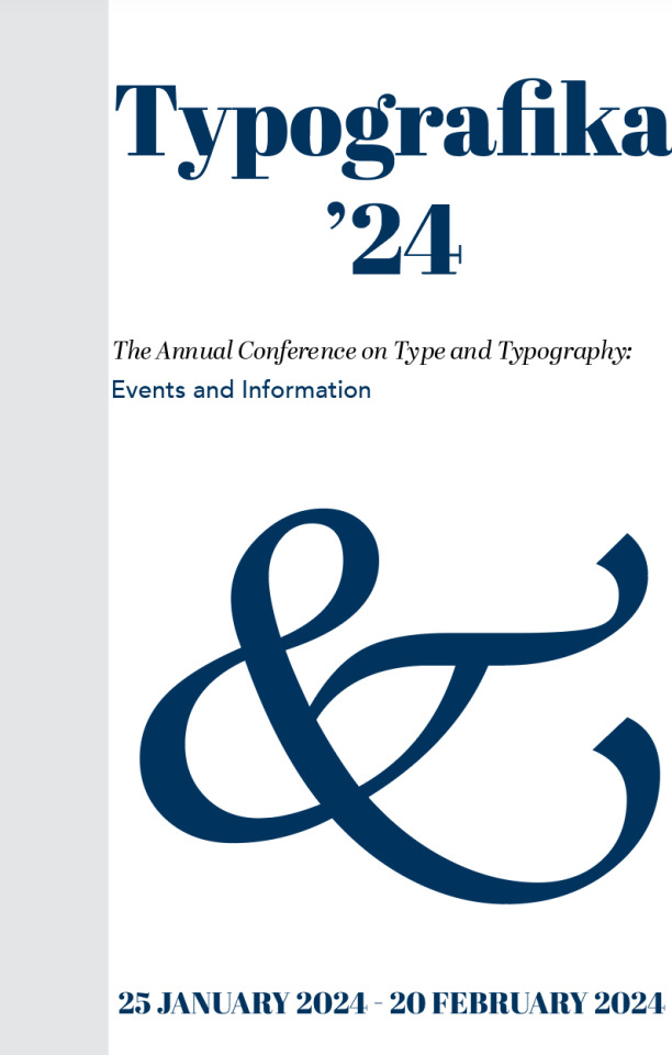
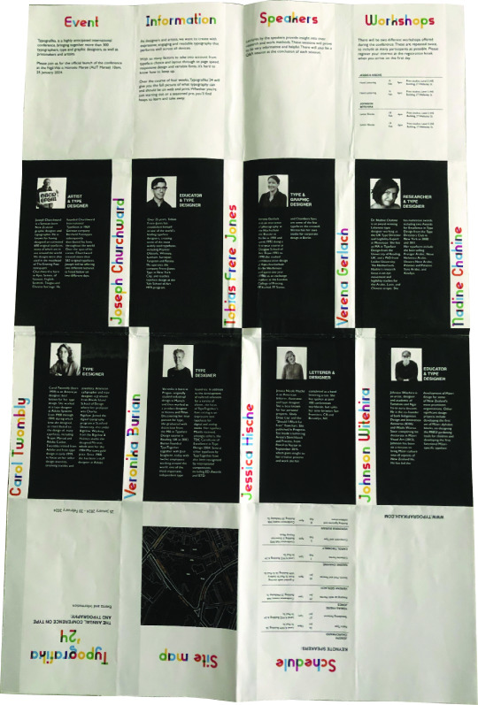
Week 6: Final pamphlet + reflection
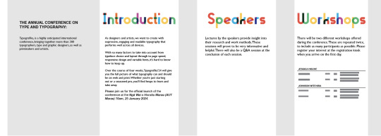
Throughout the creation of my pamphlet, I have learnt a series of fundamental design skills such as hierarchy, spatial proximity, white space, visual conformity and rhythm. The organisation of content has proved to be an integral lesson in applying design fundamentals to ensure a cohesive relationship between text and imagery has been established. I have recognised that some areas within the provided text varied in length, making it challenging to organise text evenly from one panel to the next. I have approached this challenge through extensive iterations where I have altered the composition and placement of assets to ensure a harmonious flow between each panel. Overall, this assignment has proved to be an exciting challenge that required me to think outside the box to prose plausible solutions to the design problems I have encountered, teaching me key fundamentals I can apply to future projects.
0 notes

Text
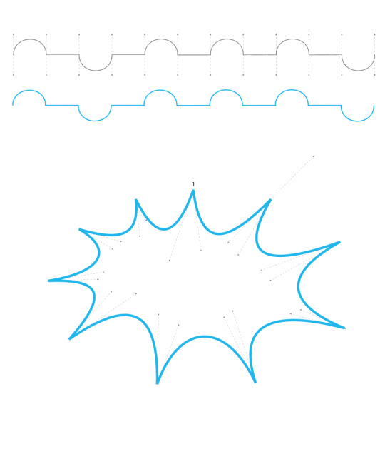
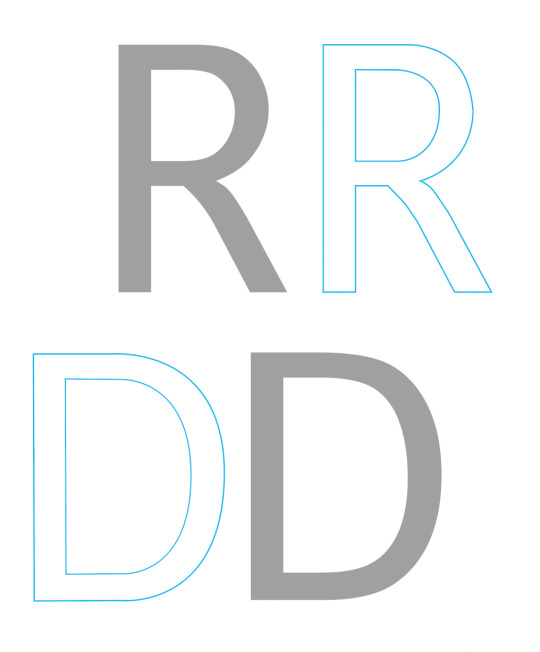
Week 6: Poster iterations
Artwork iterations:
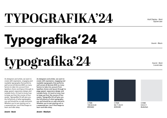
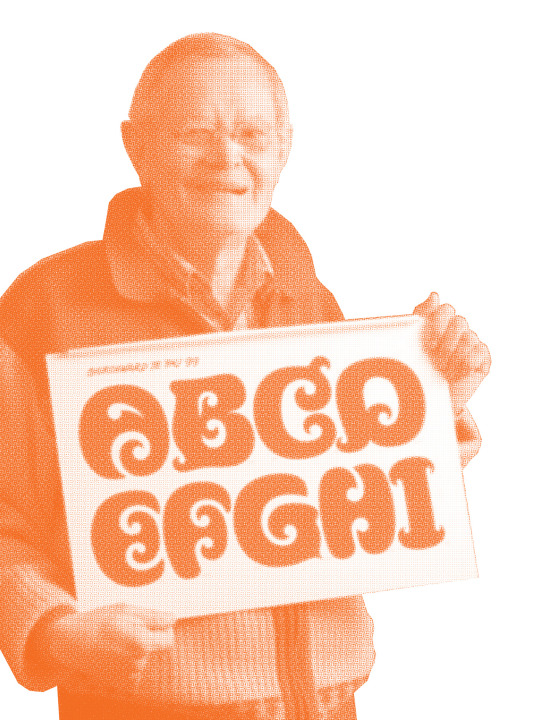
I have experimented with colour to establish whether a bright pop of orange could be beneficial in increasing contrast and visual interest within my design. I have used a serif typeface (Abril Fatface - Display) for this iteration to form new configurations and possible outcomes. I found it particularly challenging to work with a serif typeface as it contained unique characteristics such as short, thin extenders, bulging terminals and a combination of straight and curved lines.


Poster iteration:
I have finalised my approach by including my reworked design onto my poster to see the relationships between text and image. I have noticed that the inclusion of orange within my work makes my poster too busy and would need further refinement before final submission.
0 notes
Text
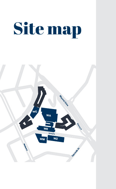
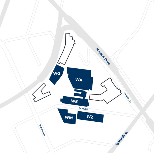
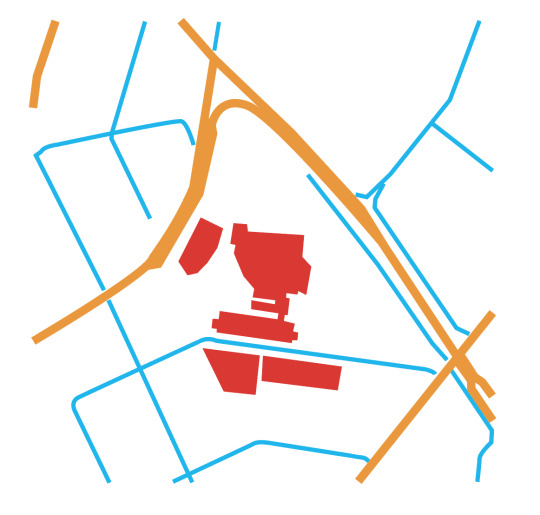
Week 6: Map iterations
Initial mock-ups:
I have acknowledged my initial map was overcrowded and lacked white space, making it difficult for the viewer to identify key locations and information within my map. I then quickly drew up sections within the map that would be included within the final design to establish key sections I would need to include and subtract unnecessary content that hinders the overall readability and flow I aim to achieve. I have experimented with thick and thin line-use to separate sections based on importance.

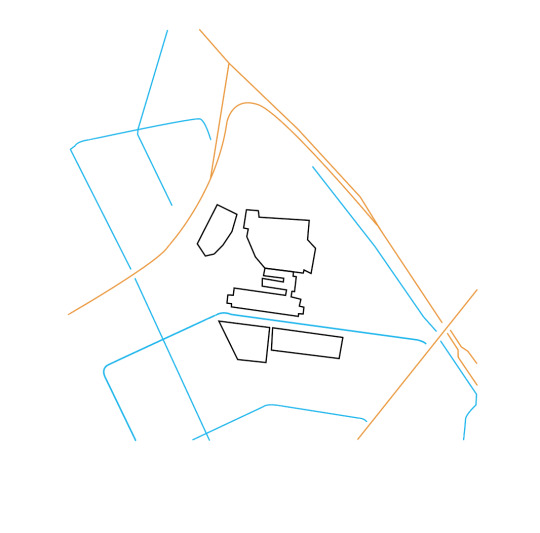
Finalised design:
I have finalised my approach by incorporating my designated colour palette, using an off-white and deep blue to distinguish key information from secondary details. I have also created contrast through variation in line use, ranging from thick to thin and outlined vs colour-filled.
0 notes
Text
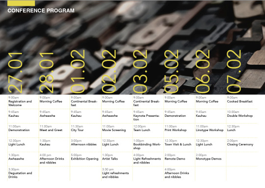
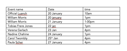
Week 6: Table refinements
Annotation of previous work:
I have recognised several inconstancies within my table and I have outlined areas needing improvement and further refinement. The issues detailed consist of an unorganised alignment of text, with some columns centre aligned to the bottom whilst other text is aligned at the bottom, creating an imbalance in placement.
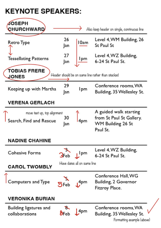
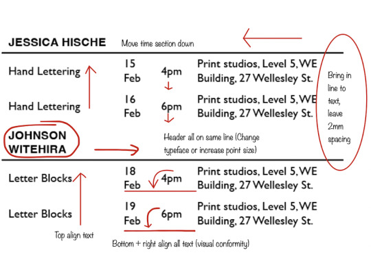
Table & Column settings:
Top-aligned, right-indented text within each column to ensure text is placed within the same line.
Iteration + reconfiguration:
I have reformatted the text within each column to establish visual balance and conformity within my table. I have achieved this by indenting all text to the right in combination with the top alignment of text within each column. I have also changed the typeface of my headers and opted for lower-case to add contrast to help organise sections of text such as the body copy, captions and headers.
0 notes
Text
Week 6: Class exercise
Table formatting + Paragraph styles:
Final result:
0 notes
Text
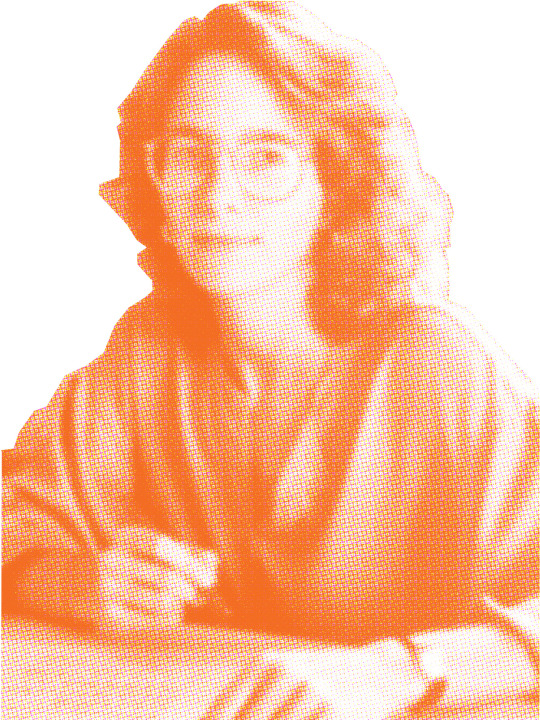
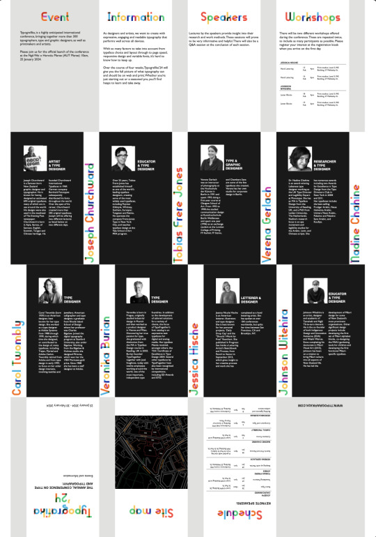
Week 5: Feedback
Poster side:
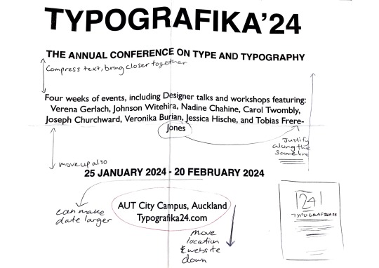
Lacking font consistency, consider using Gill Sans throughout the entire poster
Don't combine sans-serif typefaces (too similar / clashes)
Enlarge date
Poor negative spacing between text, little contrast within paragraph spacing
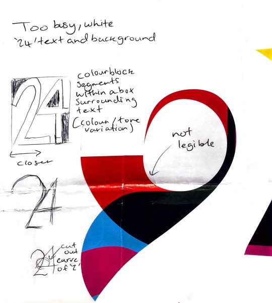
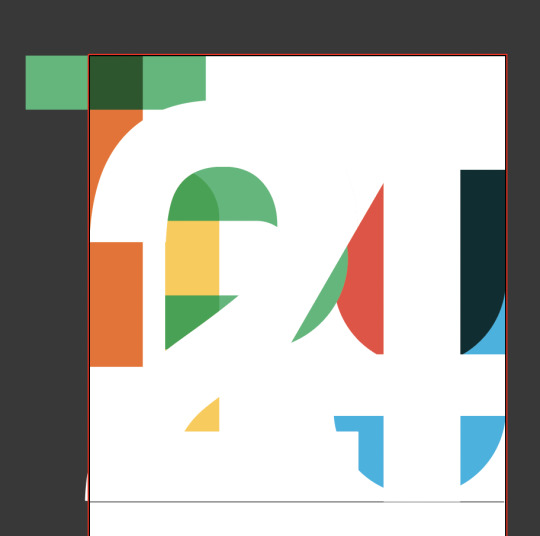
Think of changes to the '24' design (colour subtraction)
Information side:
Typeface of headers is too busy, wrong contextual placement
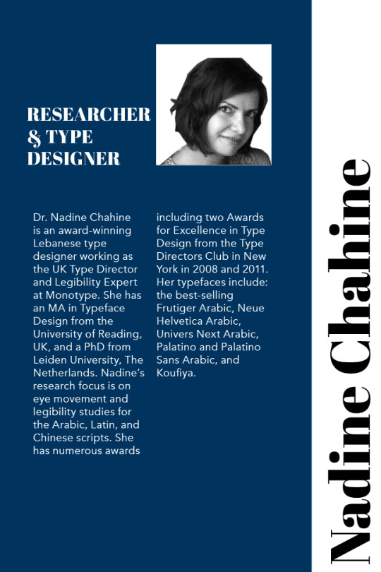
Consider a relevant typeface that complements the brief (possible a female designer)
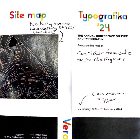
Distill colour palette (Think of font book)
Map is too busy, remove unnecessary buildings
Refrain from centre alignment of text, change to top alignment (tables)
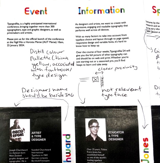
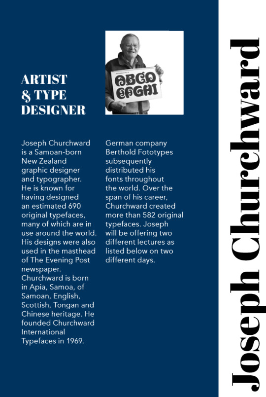
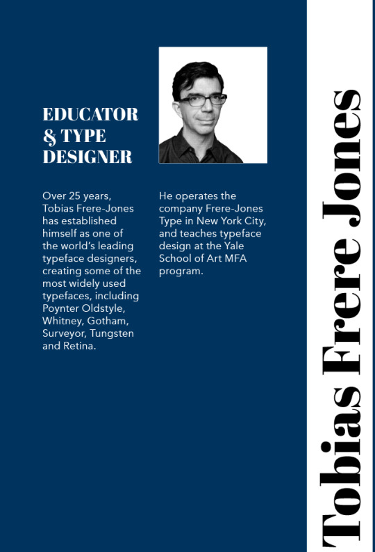
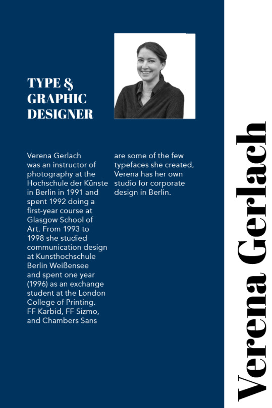
Reconfigure proximity of speaker paragraphs
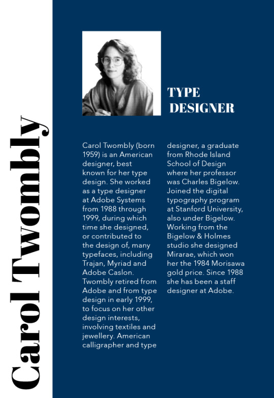
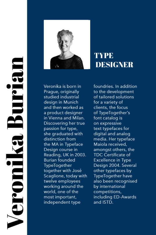
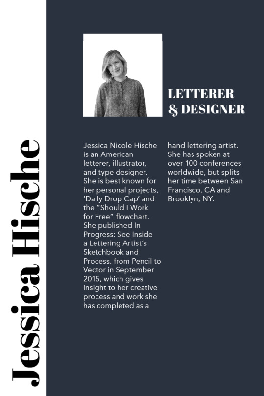
Align speaker header with image to ensure both elements correspond to each other
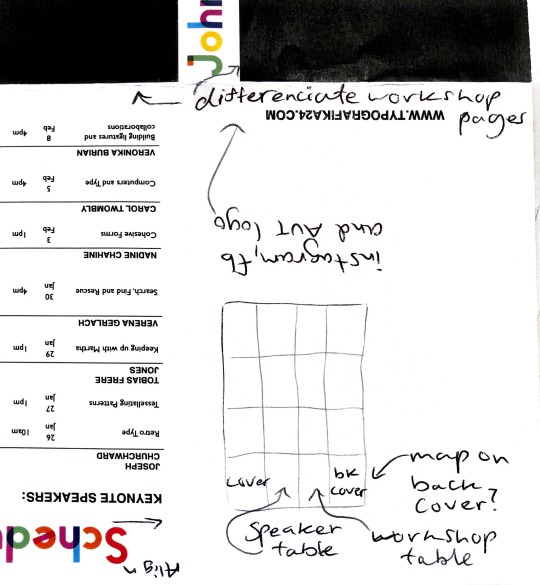
Consider differentiation between workshop and keynote speaker pages (colour use, placement, contrast)
0 notes
Text
Week 5: Photo editing + colouring
Initial editing:

Images placed within pamphlet:
Refinement of images:
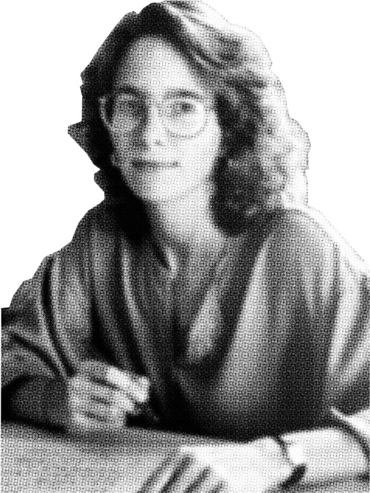
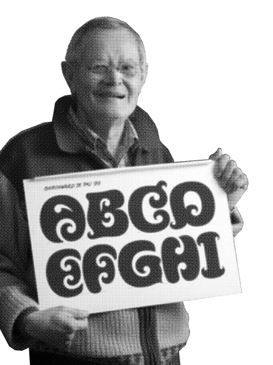

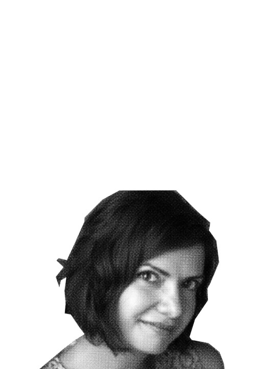

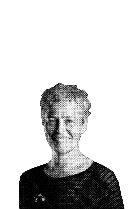
Images placed within pamphlet:
0 notes
Text
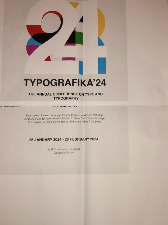
Week 5: Brochure iterations + print test
For my poster, I wanted the symmetry to be balanced and centred within the page to promote stability and a static sense of momentum to complement my abstract configuration of type. Despite the complexity of my type centre-piece, I wanted to ensure the text remained legible to convey a meaning, as I've acknowledged that at the core, typography must communicate to the viewer as it resides in language and must serve a purpose. Through a visual exploration of type, I have achieved my intended aim of expanding the visual vocabulary and expressive potential typography can convey, adhering to the brief and relating back to the type convention my brochure is intended to promote.
I have re-adjusted the layout of my 16-page panel by revisiting preliminary ideas explored in flat plans to help determine the organisation of content, allowing me to re-examine the rhythm of each panel to ensure it flows seamlessly. Expanded use of white space has been used within each panel to establish a greater relationship through variation and repetition to achieve rhythm and form a cohesive system.
An issue I recognised upon printing was the inaccurate division of each panel, leading to difficulties with the folding aspect of my pamphlet. I will resolve this issue by refining my grids further to ensure it promotes a cohesive distribution of spacing through the use of grids, margins and columns to divide content into equal sections.
0 notes
Text
Week 5: Printing issues
I encountered an issue while printing, as my work was not printing to scale despite having the correct document settings and proportions. I double-checked the page and document set-up and realised it was malfunctioning and printing in A4 for an unknown reason. I then resolved this issue by creating an entirely new document and placing my work within the A3 pages, resulting in my work efficiently printing to the correct sizing.
0 notes
Text
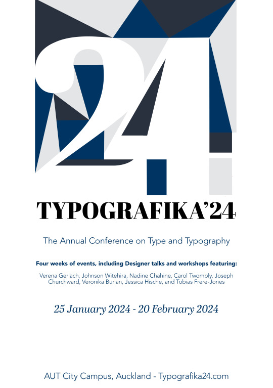
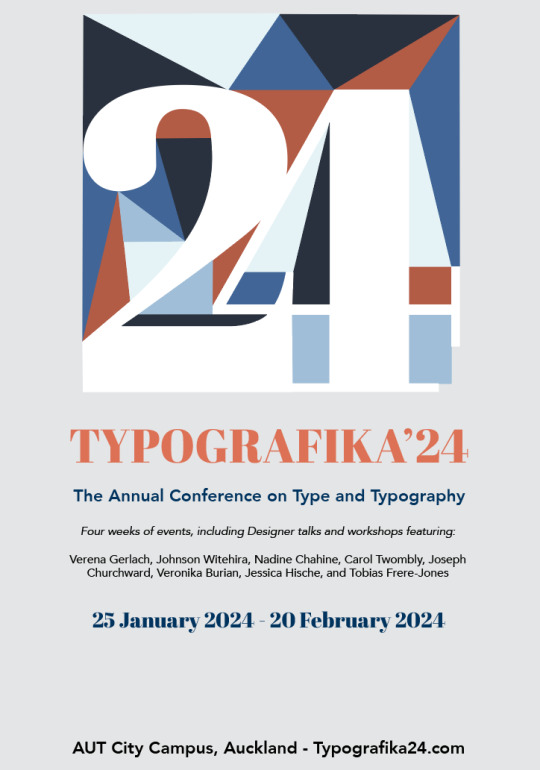
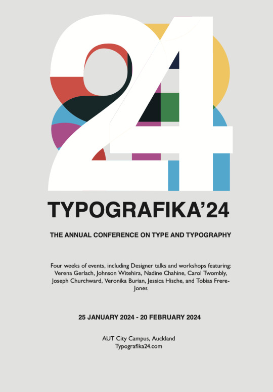
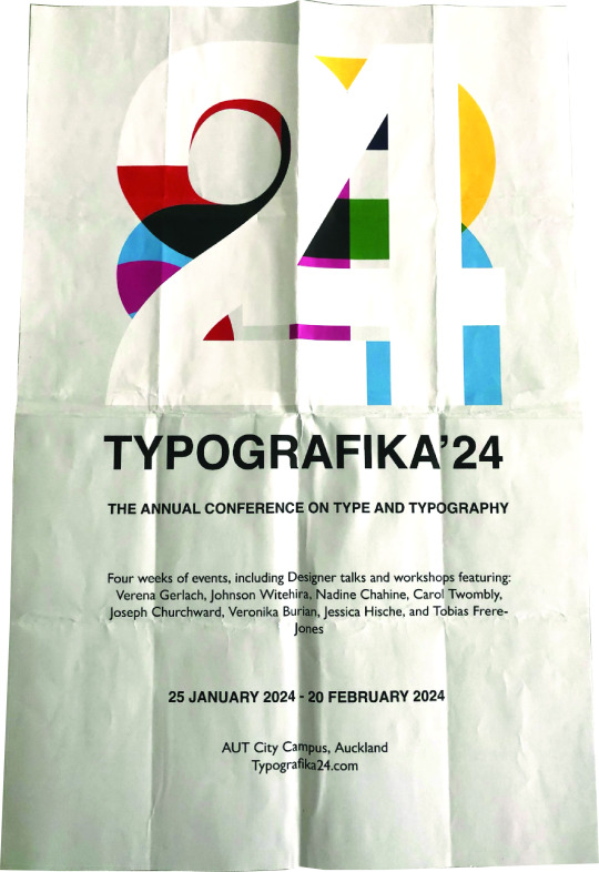
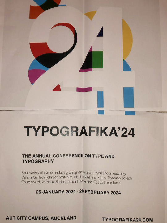
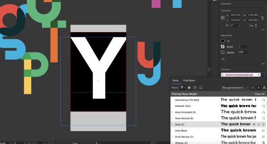
Week 5: Type experimentation (Poster design)
I wanted to create a compelling poster that explored the lasting qualities of my typeface, Gibson's bold colour. In constructing my work, my decisions were influenced by paying close attention to the spacing, visual organisation, style and size of elements concerning one another.
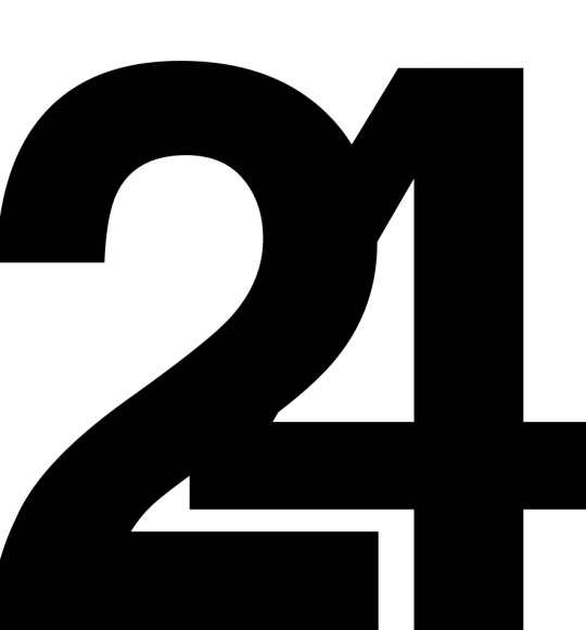
Initially, I was planning to use a letter but realised it was out of context and decided on the number, 24 to symbolise 2024. Through the use of simple, geometric forms I have altered the dynamics of the composition through the placement of each object. I have emphasised the relationship between positive and negative space through a variation in value, colour and space between objects.
I then began assembling content, considering the composition, balance (the deliberate distribution of elements), consistency and harmony (similarities between visual elements, contrast (differences between visual elements), proximity (placement of elements about each other), repetition and adequate use of white space (deliberate open areas within a composition.)

The use of thick, curved lines invokes a sense of tranquillity and harmony, with some lines vanishing and reappearing to imply motion and momentum to guide the viewer's eye across the page. Lastly, I have resolved my final design by subtracting and adjusting elements to form a cohesive whole that expresses rhythm and consistency.
0 notes
Text
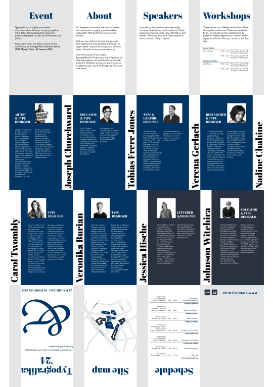
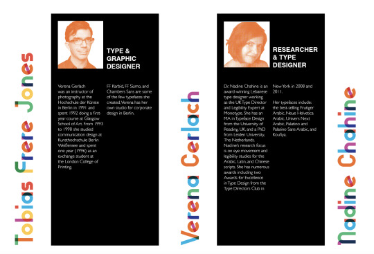
Week 4: 16-Fold publication
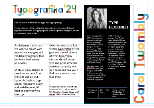
I have configured my layout with content ranging from geometric forms arranged at a diagonal axis in combination with vertical and horizontal headers to add visual interest. Throughout this experimentation, I have alternated in my use of colour and decided on a basic, monochrome colour palette to ensure the bright configuration of colour within my display typeface did not cause conflict with other elements. I have resolved this issue by sticking to simple B&W and replacing the solid block of the colour of the shapes in the top and bottom columns with an off-white.
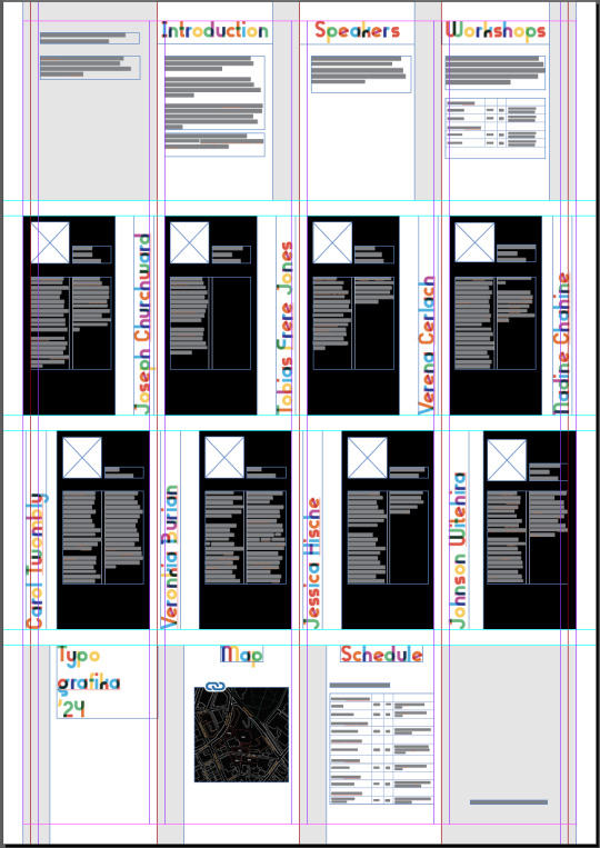
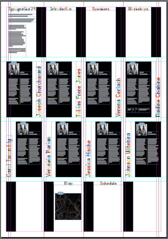
My next steps included the completion of all text and other assets and possible reconfiguration of placement and scale to establish a clear hierarchy within my work. To appeal to my target audience, consisting mainly of young adults interested in a potential career in typography or design I have carefully considered a balance between a fun, playful appearance with a formal approach to suit the tone of the conference.
I have spaced out content by incorporating solid shapes in an off-white to organise content and promote visual consistency.
0 notes


Text
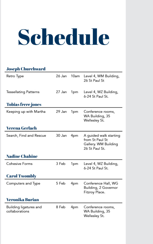
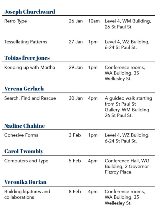
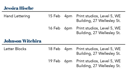
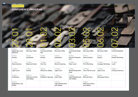
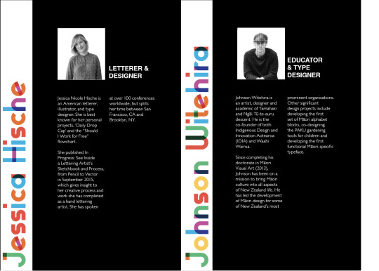
Week 4: Implementing tables and columns
Initial word document table:
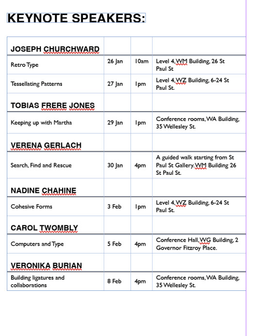
At first glance, I observed a series of errors within the table presented in the word document such as inconsistencies in spelling, abbreviations and capitalisation. Another key issue I have recognised includes poor distribution of spacing between columns, making it ineligible and difficult for the reader to comprehend.
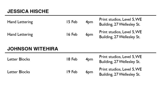
Refined table:
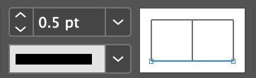
To break up content evenly, I have set the line weight at 0.5 underneath the designer's name to highlight key information and ensure the text is formatted in an organised manner.
I have also alternated between the centre and bottom alignment of text within my table to contract information to justify the text as a whole.

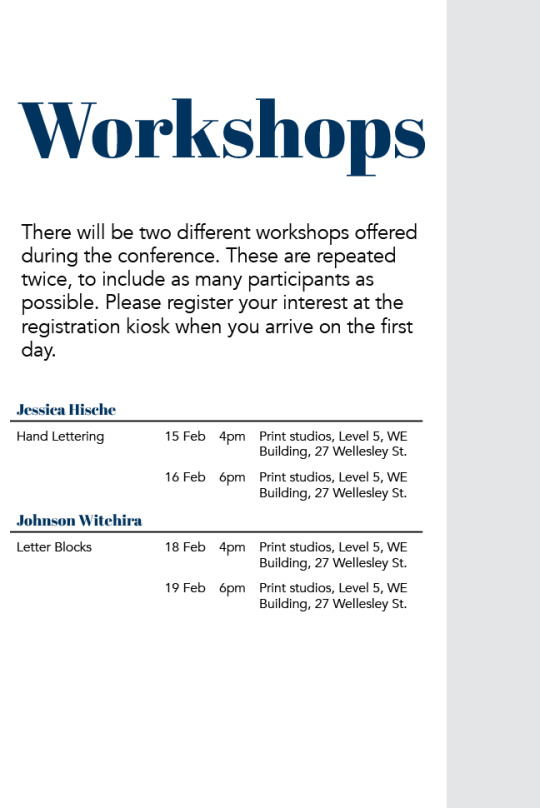
As the speaker times, dates and locations involved a heavy amount of content, I have dedicated a separate page to configure content using 13 body rows and 4 set columns, with a 1mm cell insert to centre content within the table without hindering the readability of the text.
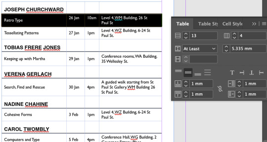
To conclude my approaches, I then refined my initial work and ensured it expressed visual balance and consistency within my work.
0 notes
Text
Week 4: Layout and composition
My first steps consisted of organising content and arranging the order in which it would be presented within my 16-fold layout. Once the basic composition had been established, I explored my initial idea further and arranged content in juxtaposition to each other to aid my venture in achieving visual harmony and an adequate use of white space.
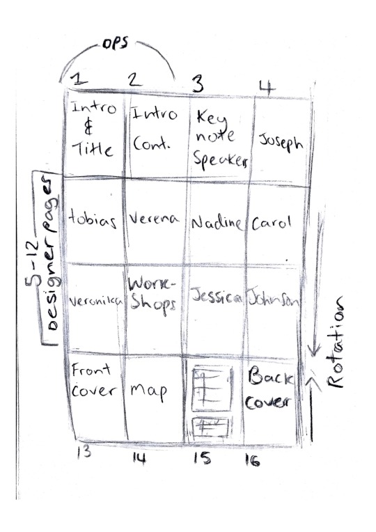
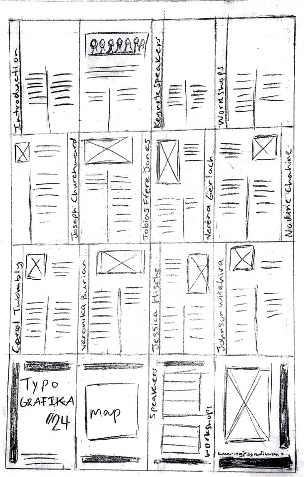
For my designer pages, I recognised the importance of a predetermined grid to formulate a consistent structure for each page. By using a grid as an initial starting point, I was then able to move freely and go beyond the boundaries and implement the use of shapes to break outside the columns to create an exciting visual arrangement.
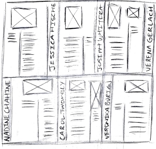
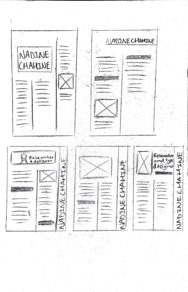
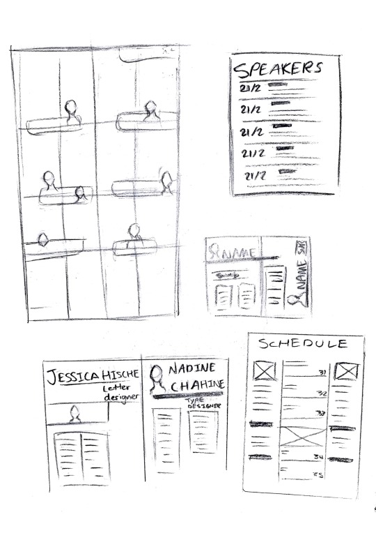
Initial page mock-up:
0 notes
Text
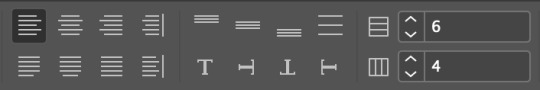
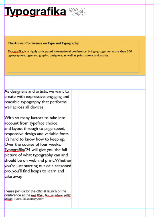
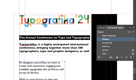
Week 4: Margins, columns & paragraph styles
Before I have begun compiling text into its allocated sections, I implemented tools such as grids, columns, margins and paragraph styles to ensure formality and consistency within my work. Since I had small chunks of text to work with, I decided upon a simple single and two-column grid in order to evenly distribute content and promote visual interest.
Through the use of paragraph styles, I have also used a range of different weights to express different ways an individual type style can be presented whilst considering the text was cohesive and flowed throughout each spread.
0 notes