
Don't wanna be here? Send us removal request.
Statistics
We looked inside some of the posts by grad603-poppi and here's what we found interesting.
Average Info
Notes Per Post
2
Likes Per Post
2
Reblog Per Post
0
Reply Per Post
0
Time Between Posts
7 days
Number of Posts By Type
Text
14
Last Seen Tumblr Blogs


Fun Fact
The “We are the 99%” Tumblr blog became the slogan for the Occupy Wall Street movement.
Text
B6
RATIONALE
Overall, I am proud of how quickly I learnt this application. I had never even heard of After Effects before, and now I would say I can successfully make most kinds of animations using the application.
What Went Well:
- I really enjoyed exploring 80′s style editorial design, as this is an area I have not researched or designed in before. I like the way they bend the rules of traditional newspaper styles.
- I think the approach I took was a unique and out-of-the-box way to communicate the content behind the audio
- I did find using presets was effective in enhancing my animation, but I definitely needed to manipulate the range, opacity, on/off, and other parts of the preset to make it work for me.
What could be improved:
- I think if I had more time I would have loved to become more familiar with what after effects is capable of doing, although I do like the way I have done it, I definitely feel like the process could be cleaner and more efficient if I knew a bit more about the application and had more spare time to play around.
MY WHY

Using sans-serif for a newspaper title felt unnatural, but I have done this because in my research into newspaper in the 80′s it was very common to only use sans-serif typefaces. I really wanted to make this animation feel like something that would have been created in 1981.

In this following scene I did take a slightly more modern route. I did this because I really wanted to break up the newspaper scenes otherwise they way feel too repetitive and boring. I love the drama and suspense this scene has. The flickering light letters and the black negative space makes this composition feel eerie.

This following scene appears slightly different to the previous newspaper scene. At this point in the audio the person speaking changes. While still keep the same design principles I wanted to give the impression that this was a different “newspaper” to correlate with the changing of narrators. To me this makes the animation feel like a collection of events in history.

Up until this point all text was linear and horizontal. Contrast is a very important design tool that helps to engage audiences. By contrasting the layout I feel like it refreshes and resets the animation.

Again this is an eerie part of the audio, which I wanted to enhance by adding quivering letters and dripping blood. I also did this because I want to remind the viewers that although the audio doesn't say it specifically, there was a lot of violence involved in this historic event.

Again, another newspaper with the same design style but slightly different layout to continue the feeling of collections.

I felt like I had used a lot of negative space when it came to text, so I used this layout to break that up. I also hear a very slight stutter on the word “who’s” so I added multiple of the word, highlighting the importance of the word values in red. I did this because the entire disruption of this tour was caused by clashing of values.

I kept this text small as it mostly consists of filler words. Again changing up the layout of the text to contrast to compositions before.

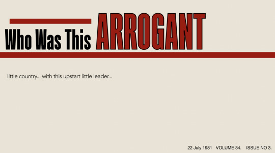
I think this is a beautiful example of text as image. I feel this is a powerful scene. It is dramatic, having people feel like they are almost locked inside this word “prevail”.

I kept my credits very simple because I didn't want it to overpower anything in my animation.
AUDIO
For dramatic affect I added some bass, heartbeats and light flicking sounds. I got these from free sound.org. I also added some of the original sounds of the protests against The Springbok tour at the end of my audio for the credits.
0 notes
Text
B5
Final Hand - Things to keep in mind:
Stick with the tone of the audio
Must include a title in the beginning, and correct credits, year, name of student, audio extras reference, credit typeface. Make credits elegant and considered.
must be mpeg-4 file, between 40-75 seconds in length
1920px by 1080px - 25fps
Published using Adobe Media Encoder
Render don’t export
Url must have:
Research on speech and the speaker
concept developments
ideas
progress screenshots
Rationale behind design choices
storyboards
experimentation and tests
reflection on design decisions
STORYBOARD/PLAN

First attempt - (unclear)
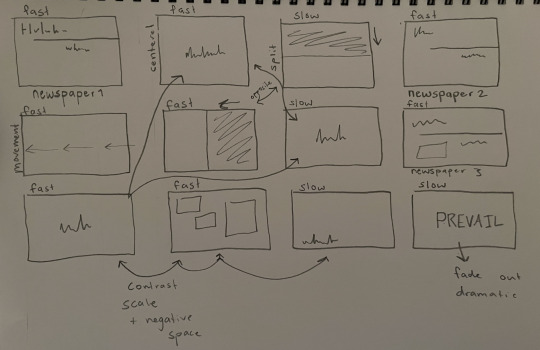
Although this may not make sense to anyone else, this storyboard is all I need to get started.
Their are moments in my audio that feel more intense, and some moments that are drawn out and eerie. As shown on the top left hand corner of each scene I have listened to the audio and created a pace to match it.
I have also made sure that their is both contrast and patterns in my layouts and compositions of each scene.
I have made a pattern of busy + fast, paired with scenes that are slow and simple, to retain enactment and add suspense.
DEVELOPMENT:
This was my beginning scene. But when the titles grid was laid over it, it was clear the text was far to close the the edge. Also the subheading text was too small and made it look awkward with the amount of negative space.
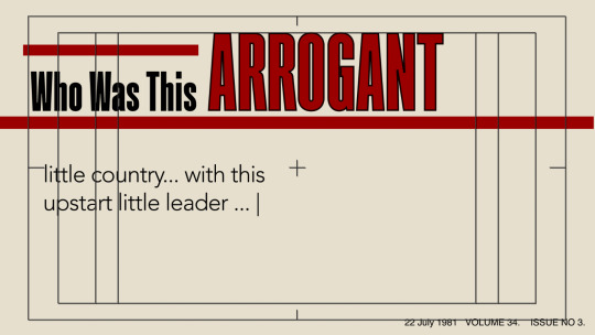

This is the developed opening scene with all important text within grid.
Originally this was to be my second scene. (below)

And although I do like the idea of the black solid representing a stage, think was a very dramatic and drawn out section of the audio, so I want to empazise and take advantage of that more.
This is the sequence I came up with instead (below)


I added and edited a flickering light preset to this scene, adjusting the flicker motion and range, to empathise the drama.
0 notes
Text
B4
Lecture notes
Disneys 12 Principles of Animation:
- Squash and Stretch
- Anticipation
- Staging
- Straight action and pose to pose
- Follow through and overlapping action
- Slow in and slow out
- Arc (travelling in an arc)
- Timing
- Exaggeration
- Solid drawing
- Appeal
Workshop
In the workshop we learnt how to navigate after effects.
We learnt about:
- Key frames

- Shortcuts

- Compositions
- Wavelengths in audio

- Frames in seconds
- Grids and guides

- Saving and rendering

- Layers
- Source text
- Squash and Stretch

- Layer controls

SDL
After this class I went home and practised some of what I had learnt. This is my first time ever using after affects so I needed to spend a lot of time learning.
I tried constructing a composition in photoshop and using the “import and composition (retain layer sizes) I inserted into after affects to test my skills on animating each layer.

I created a newspaper composition.
Feedback from teachers suggested a few things about this composition
1. The text and shapes were to close to the edge of the page
2. Their was too much negative space
This was my solution

- I feel that this uses space better
- resembles more of a newspaper
- uses text and layout style of 1980′s newspapers (sans serif type, dark grey paper, high contrast images

DESIGN STYLE^ WHY?
Typefaces:
I have selected kilographg because bold, condensed sans-serif typeface were very common in newspapers in 1981, so this contacts my kinetic type to the time period of the audio to enhance the feel of being taken back.
I choose Avenir for body text because it is simple, readable and pairs well with Kilograph
Colours:
After researching, newspapers in both New Zealand and the rest of the world consisted of the colours, dark red, black and white, with often a grey-toned textured paper.
Additionally, red black and white are closely associated with New Zealand, most specifically with the Maori culture. Because this event was such a significant let down to the Maori population, I feel that using these colours makes a statement and reminds viewers the importance of this event by relating it to the people it affected the most.
Thirdly, I want to make red an important colour because it signifies the true violence and horror that came from the Springbok tour. The audio supplied to me has a very eerie feel, and I want to enhance this visually.
Textures:
I have also added a few reference textures to use when constructing the newspaper scenes in my animation.
0 notes
Text
B3
Springbok Tour took place in 1981
Type and Design in 1981:

Design in the 1980′s was very bold and geometric. It included a lot of shapes and bold colours.
____________________________
MTV Marketing in the 80′s:

______________________________
New Zealand Newspapers and Magazines in the 80′s:


All above aritcles/newspapers are real from the the National Library of New Zealand in the early 1980′s.
Looking at these newspapers from the 80′s, it appears that serif typefaces were rarely used. Type seems to be very geometric and squared. Everything is quite blocky and bold. There are channels of text the is not parallel or structured. There is a lot of angled text.
My Take:
Because the Springbok tour was a huge national event that was broadcasted on all news channels at the time, I want to take a lot of type and design inspiration from newspapers and channels. I am going to take the angle of displaying my audio as if it is a section on a NZ news channel.
1 note
·
View note
Text
B2 - Kinetic type, After affects
Rhetoric tone
Movement + Motion
Type choices are important. Type appropriate to the sound of the voices.
Colour choices
Building on previous knowledge
Geometric
Type and its Uses:
Serif:
- formal
- respectable
- traditional
- practical
Sans Serif:
- neutral
- modern
Slab serif:
- bold
- heavy
- impactful
Mono-spaced:
- orderly
- technical
- referring to code
Script
- casual
- elegant
- personal
Display
- quirky
- unique
- friendly
- expressive
- amusing
ADOBE AFTER AFFECTS:
- Extension of Photoshop
- Industry standard software
- Very stable
- Very strong with text affects
- Supports a lot of different file types
- Easy to create type/imagery in photoshop to then transfer into after affects
Setting up after affects
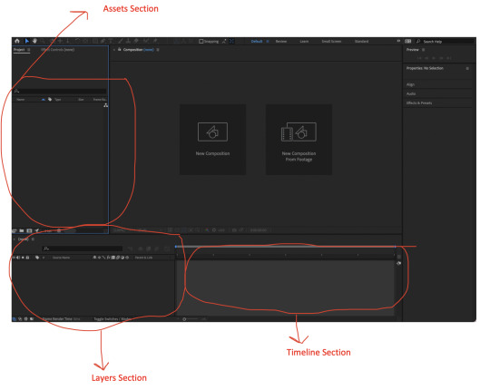
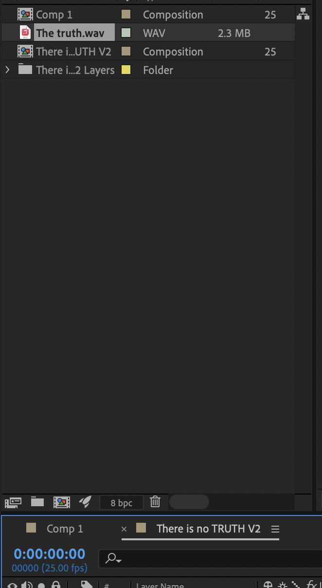
Assets Section:
This the the project panel, where I will store and organise my different assets and compositions
Layers Section:
This is the area that I will be working with the different layers of my files/assets
Timeline Section:
This is the area that I can work with my layers over time to create animations and make changes to the content.
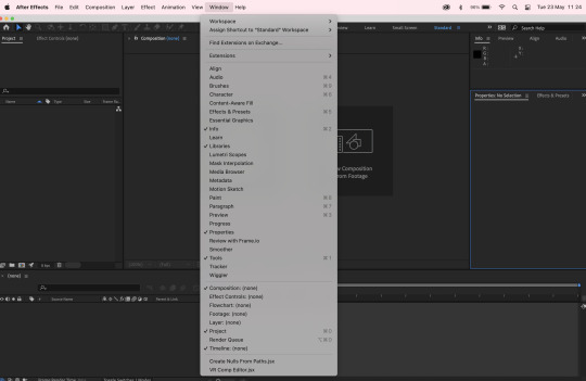
There are different workspaces depending on your reason for using after affects. For example if you are just working the animation alone, then you can select that option and your workspace will not have type tools but have lots of paint and animation tools. We are recommended to use the standard workspace, but if there is a tool we are missing we can find it in the window drop down box shown above.
Composition Settings in the After Affects File for this Project:
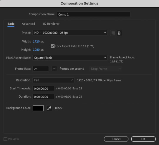
Once I had set up the correct file composition I saved it named and saved it to ensure I don’t lose this file.
Importing and Asset:
1. Double click on the project panel
2. Your files saved to your computer will come up
3. Import the needed file as “footage” this will ensure it comes in as one layer, if a file with multiple layers is needed, this should be imported as a “composition - retain layer sizes”, meaning each layer made in the file will be separated in after affects.
3. Select open, the assets will show up in the project panel with a preview
4. To bring the layer into use, click and drag it into the workspace
Fixing Pixelation on a Vector Layer:
If when an image is scaled up it becomes pixelated, there is a switch that can be used to stop this and sharpen up the edges.
Ideas:
Flick through like old film.
0 notes
Text
B1 - Brief, Transcript, Research

Key points taken from brief
- Use adobe affects
- Create something that works with, and enhances, the tone of a supplied audio
- Mp4 file must be between 40 - 75 seconds in length
- Full HD (1920 x1080 pixels) Frame rate - 25 frames per second. Published using Adobe Media Encoder - in the mpeg-4 format
I have re-jigged the rubric in a way that makes sense to me so that I can be reminded of how a designer needs to function to come to an effective outcome.
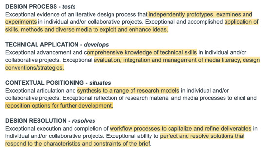
test - experiment/prototype develop - analyse/evaluate situate - relate/synthesise/reflect resolve - decisions/refine/perfect
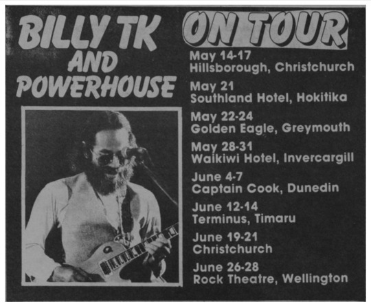
MY AUDIO: SPRINGBOKS TOUR
Transcript received through MS Word:
“Who was this arrogant little country with this upstart little leader who thought that they could do this? On the world stage
Government has the authority under New Zealand law and the responsibility under the S Agreement to stomped this tour. I think that 1981 was the last great battle in the war. To determine whose values were actually going to prevail.”
Grammatically correct version: (After listening to the audio over and over to get the correct words and grammar that MS Word transcript missed.)
“Who was this arrogant little country with this upstart little leader who thought that they could do this on the world stage?
Government has the authority under New Zealand law and the responsibility under the Gleneagles Agreement to stop this tour. I think that 1981 was the last great battle in the war to determine whose values were actually going to prevail.”
RESEARCH
LEADING UP TO THE TOUR:

__________________________________________________
GLENEAGLES AGREEMENT:

SIGNED IN 1977 ^^
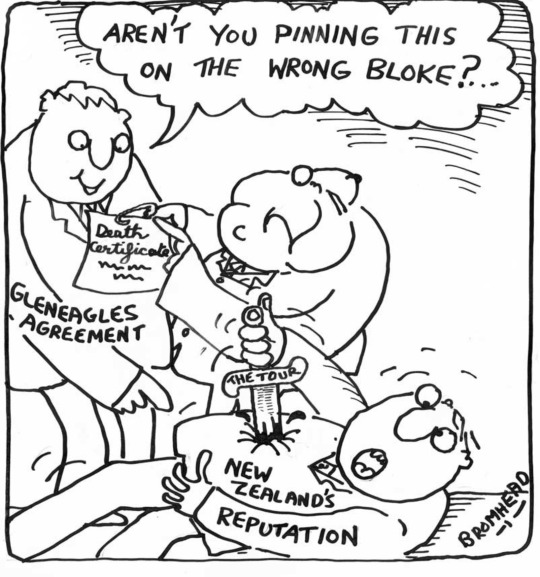
Peter Bromhead, 'Aren't you pinning this on the wrong bloke', 22 July 1981. This cartoon shows Robert Muldoon giving a death certificate to a man representing the Gleneagles Agreement while on the floor a man, representing New Zealand's reputation, is dying by suicide with a sword labelled 'the tour'.
__________________________________________________
HART (Halt all racist tours)
HART was organised in New Zealand in 1969 to protest rugby tours to and from South Africa. Their first protest, in 1970, was intended to prevent the All Blacks, New Zealand's flagship rugby squad, from playing in South Africa, unless the Apartheid regime would accept a mixed-race team.
Founded by University of Auckland students with the specific aim of opposing sporting contact with South Africa. With a Springbok tour to New Zealand scheduled for 1973, the issue was to become increasingly politicised.

^^ HART badge worn by anti-tour groups ^^

^^^Friday 1 May 1981 was the second National Day of Action organised by HART (Halt All Racist Tours) to stop the Springboks from touring New Zealand (the first National Day of Action had been on 5 December 1980). Mass marches of tens of thousands of people protesting about the proposed tour took place all over the country. ^^^^
(sourced from Christchurch Library)
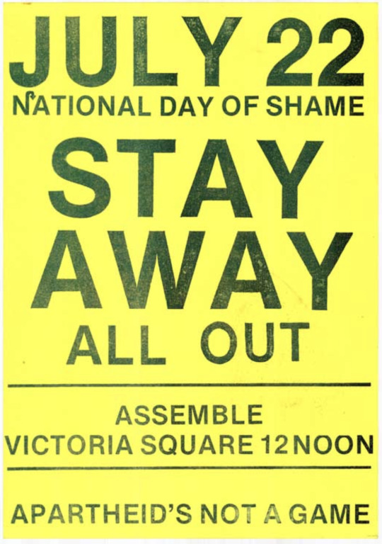
^^Poster created and displayed to protest the tour in 1981. Wednesday, 22 July 1981, named the “National Day of Shame”, was the day of the first match of the Springbok tour. ^^
(sourced from Christchurch Library)
__________________________________________________
TOUR DIARY:
Info on: https://nzhistory.govt.nz/culture/1981-springbok-tour


__________________________________________________
ART AND DESIGN LEADING UP TO AND DURING THE SPRINGBOK TOUR:
ANTI-TOUR POSTERS 1980-1981 (sourced from Christchurch library)


This poster was created by Christchurch artist Michael Reed for a street protest against the tour. (BELOW)

__________________________________________________
TE PAPA Museum (Stephanie Gibson) interviewed artist Chris McBride who was involved in design anti-tour posters at the time of the tour.
https://blog.tepapa.govt.nz/2018/11/01/artists-against-the-springbok-rugby-tour/?cn-reloaded=1
Stephanie:
“What are some of the key ingredients of protest design? When I look at these posters, the elements that strike me the most are the strong directive words (‘Mobilise’,‘Oppose’,‘Patu’), the upraised clenched fist, and images of crowds.”
Chris:
“You need clear, direct, and readable messages, vibrant colours, powerful symbols, and imagery – to catch people’s eyes and persuade them to act. The Wellington Media Collective was at the forefront of designing anti-tour material. Simple phrasing was reproduced across a range of different designs, and sometimes chanted during protest marches.”
Chris McBride’s Posters (created in 1981):


__________________________________________________
PHOTOGRAPHY AT THE TIME OF THE SPRINGBOK TOUR


0 notes
Text
Week 6
The Final Brochure-Side Layout:
Here is the final for the first three rows of my brochure side. I do believe I achieved the idea of the flow between rows, while still have them slightly segregated in relation to their content. I like the text layout, and I feel the drop shadows on the images bring the images out of the page and causes these rows to look less like a collage/mood-board. I think the use of the outlines type on both the bottom two rows at the top row brings unity and flow, along with the connecting lines.
I also added a sepia toning to my designers images. I did this because its undertones will now be the same as the brown accents in the design and create a more established design system.
The full brochure side ^
Wrap-Up
As a whole, I think I have successfully created a design style that represents both the location (though industrial text as image, using the colours associated with the city) and the nature of the events.
I think my skills in InDesign have improved a lot. Most specifically with paragraph styles and grids.
These are things I was not confident with at all before this assessment. I now understand the importance of it and how it contributes to an organised and well created file.
I think my experience with typography has improved, especially concerning type as image. This is something I have not used a lot, but I know think it is a very powerful tool. I have also learned a lot about font pairing through adobe. They recommend what typefaces go well together, and after looking through a lot of that I now know that when it comes to typefaces, it is a great tool to use ones that contrast from each other to highlight the uniqueness of the fonts.
Overall I feel that my skills as a designer has improved as a whole.
0 notes
Text
Week 5
Interaction - ORDER OF OPENING


MY PLAN

I don't want my brochure to look broken up and patchy when it is opened up. I think it would be easy to just design panels 3,4,5 and 6 to look good on their own, but I need to consider how this will look when the brochure is open completely.
Panels 3,4,5 and 6 open as one long horizontal panel. This gives me the opportunity to use this space in a way that flows rather than just individual panels. I feel that this will be more appealing to the viewer.
The next step of opening the gateway fold brochure is show in image 2.
I want to find a way to have panels 3,4,5 and 6 to have their own group, but to also make this flow into the next 2 rows of panels when opened up in the next step.
I think I could use lines to create the flow and unity between the two.
Text and Paragraph Styles:

These are the paragraph styles I created when designing the brochure side of my publication. ^
I had to decide between aligning to a side, or justifying all lines. Although I like the clean look of the justifying, it left odd gaps and squished type that wasn’t easy for my audience to read. So I went with aligning to one side.


This is what my paragraph style looks like when text is added. ^
More Text Compostions:


______________________________________________________________________

This is my final layout for panels 3,4,5 and 6 with the tables included. ^
0 notes
Text
Week 4
I have received some feedback in class on my work to date. The main things I was told was that I need to figure out my design style and stick with it. I find ti hard to stick to one system, as I have so many ideas and possible ways to take my work. But as mention before I need to focus on the purpose.


Analysis:

I feel like this just isn’t giving off the right vibe for the location, although Aucklands colours are blue, the use of blues in this work so far feels either slightly scientific, or too related to the ocean and water. There needs to be more hints of the city in here.


I used the 3D workspace in Photoshop to construct a 3 dimensional metallic structure out o fly mix-matched letters.
I love the 3D metallic structure-like type as the statement for the poster. I think the use of multiple different fonts within one word actually works well. Although it goes against “design rules” sometimes in the creative place it is our jobs to bend those rules, and I think this is a great message to tie into typografika’24.
The poster just needs the colours broken up, I wanted to experiment with just blues but I think it needs some variation. ^

This is my final poster. I have incorporated the browns to gives it more contrast and variation. I think using a sepia toning over my typografika’24 image has made it feel a lot more industrial and represent the structures in the city centre a lot more effectively.
I moved the when and where information to a more readable place. The purpose of this poster is to give the base-level information about the event. Therefore when my audience is viewing this poster I must ensure the key information is obvious and readable.
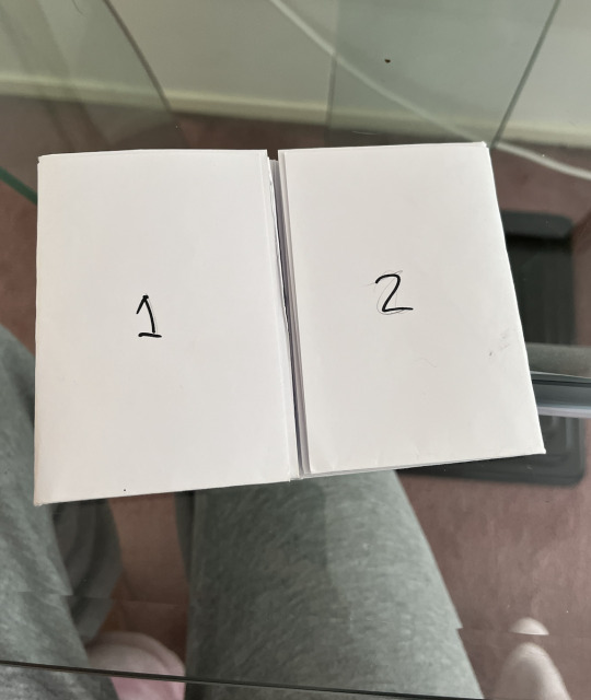
Front and Back Cover of the Brochure

Vision^
Back Cover

Front Cover


Map:

Table Experimentation


I tried to make my table in InDesign but because I am not very skilled in it I count figure out how to create the table in the way I wanted it.
I ended up just making the base of it in photoshop as that is what worked for me.
I wanted my table o be functional but also not just a standard table. I used 2 shades of blue to make the columns more defined and separated and easier for my audience to read.
Although the orginal table I made in InDesign (2nd images) is very clear, it just didn't feel right amongst my design system.
0 notes
Text
Week 3
Layout and Composition
Proximity: Nearness in space
Proximity in design functionality refers to using grouping and space to define different aspects on a page. Less proximity (grouping) leads the audience to relate different text/imagery together. Grids and guidelines are an effective way to achieve this.
Space: Distance
Negative space is an important design tool as it can help control the audiences eye by drawing attention to specific aspects on the page. For example surrounding important text white negative space creates a strong contrast and therefore draws more attention.
Contrast: Difference
Example:
-different text sizes
- different colours
- empty/busy space
- different type faces
Contrast works by using the differences of things to highlight other aspects within those things.
Hierarchy: Importance
- eye movement
- prioritising text
- draw attention to most important information
Repetition: Repeating elements
- create unity
- can create texture
- unlocks hierarchy, rhythm and unity
Purpose and Design Style:
Before beginning the designs of the poster, I wanted to be certain of what my purpose was, and exactly what I was trying to portray in my work.

Here I have listed the things that I relate to typography as a whole. ^


As someone who struggles to begin the process of designing because I don't know where to start, I made a brainstorm narrowing down the main concept I want to communicate:
USING CREATIVE VARIETY TO FORM INTO ONE
This is my main concept. This concept embodies the idea of bringing people, creativity and talented minds together in one place, with one purpose; to learn more about typography.
Visually, this concept could be shown through:
- connecting lines (representing different paths taken that connect people and thoughts)
- layering (using combined knowledge to create a new form)
- morphing (using different imagery/visuals to morph into something bigger)

Experimenting with design fundamentals in the effort to find a design style:


What's Working:
- I like the concept of using individual letterforms to create one letterform, I think this concept ties in well with my idea of combining different backgrounds of knowledge into one place (typografika’24).
- I also think the use of a serif and a sans serif font pair well together
- The varying shades of blue work well together, and relate well as it is the colour that is associated with Auckland which is where typografkia is located.
- I like the spacing, the use of negative space gives the audience the space to view without feeling over whelmed.
What Isn’t Working:
- Imagery that doesn't directly relate to the conference purpose
- Feels very flat and 2 dimensional
- The green doesn't relate to the purpose
- Message is unclear
- Not enough contrast, imagery and text is morphing as one on the page, because there isn enough difference between the different aspects.
Next Stage of Experimentations:


What's Working:
- I like the idea of using orange tones to break up the blue, black and white
- I like the name of the conference becoming almost like an image.
- Better contrast
- Better use of space, doesn't feel as empty
What Isn’t Working:
- Still doesn't have the depth and meaning I want
- Message is still unclear, dates not included
Next Stage of Experimentations:
I want to dive into controversial idea of using multiple different typefaces in one word. Although this isn’t “correct” I think that it makes a statement, of thinking outside of the box, and again correlates to the idea of combing different aspects to create one form.

I like this concept but not in a linear form.


I am liking how this is coming together.
But I have not yet found my design style, so I am going to put a pause on the poster development, and focus on the design style before I move forward.
0 notes
Text
Week 2
This week we looked into the printing process. This was very interesting for me as I did not know how printing works when it is broken down.
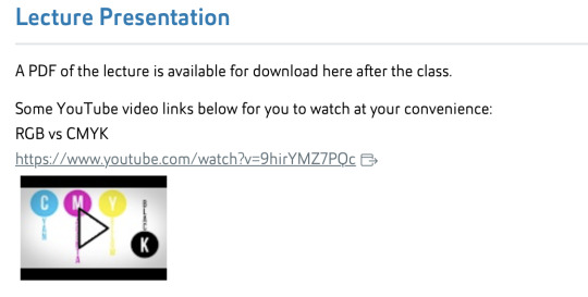
The most important information I took from this lecture was the different uses for CYMK and RGB colour.
In its most basic form RBG is designed for screen/digital viewing. CYMK is used for print.

This image shows how the two different colour groups produce different outcomes. When the RGB colours overlap they add to the colour and lighten. In CYMK when the colours overlap the colours subtract from each other and get darker. This is new to me, and I feel it is very important to know in the future when I am getting more into print.
Something I found extremely interesting is how printing works. I never knew that printing only requires 4 colours
Cyan
Magenta
Yellow
Black
I never knew that when you lay these on top of each other they can create the colours of any image that is being printed. Example below:

https://www.photographymad.com/pages/view/using-coloured-filters-in-black-and-white-photography
I did some research into colour filters and greyscale.
A common issue that occurs is that some colours can be read as very similar when converted to greyscale. For example a dark blue and a dark red could appear almost identical in black and white. This causes images to appear flat and unclear.
Using colour filters when converting to black and white can transform the way and image looks in greyscale.


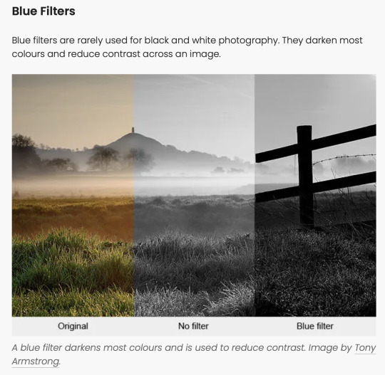
I think that black and white can be a very powerful tool, and knowing how to use grey scale and colour filters to create the most effective visuals will be key for me in this project.
The Colour Wheel
In this project it is recommend to keep our colour palette to a maximum of three. Personally I really like the effects of using colours on opposite sides of the colour wheel and par them together.

They have a strong contrast against each other and used correctly, can create beautiful designs. This is a concept I will be experimenting with later on in the project.
Remembering that this is also relevant to who my audience is. This is important for me to keep in mind when selecting my colour scheme. As different audiences respond in different ways to colour.
Speaking of audience this leads me on to thinking about my design choices. I am learning to come to terms with the “why?” of my projects and the choices I am actively making. I tend to create designs that I think work. I base everything off my own opinion. However, as a design you are working majority for other people and encompassing what they are wanting in the designs.
This means I need to learn to make design choices based on what will be most effective for my specific audience. In this project my audience is : People who hold interest in learning about typography.
Thinking About Colour:
Because brochures main function is to inform, the colours must be readable, which to me means having a smaller could scheme. Black and white are good base shades to use when informing, I think just adding one or two colours to black and white is the most effective way to have a interesting yet understandable brochure.
Common brochure colour schemes:


My Colour Scheme Idea:
Black
White
Varying shades of Blue
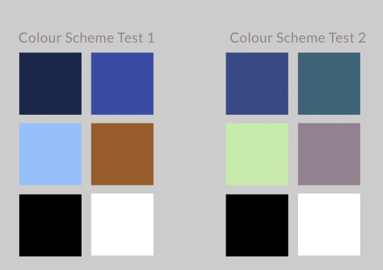
These are two colour schemes I want to test in my beginning fazes of this project to see how they function with a brochure/poster layout.
1 note
·
View note
Text
Week 1

For my personal organisation I created a folder system to effectively group and keep track of my progression week by week.
Project Details:


The key concepts I took from this brief:
- Consider interaction with publications
- Build on previous knowledge
- Acquire intermediate skills to utilise industry-standard software to design and produce a printed publication.
We were provided with a document outlining the information about typografika. This document contained many grammatical errors, which I assume was done purposefully for us to proof read and edit as part of showing out intermediate level design skills.
Documenting Process:
As a designer, I have my own way of organising, grouping and documenting my process in a way that is most effective for me. I personally use folders on my desktop and write my thoughts and feelings on notes. I find Tumblr in-effective for me to document processes, so I will use my own documenting processes, then update Tumblr at a later time.
I will be using this Tumblr blog to document process, experimentation, outcomes, learning etc. Each week I will populate and update the blog with new information relating to this project.
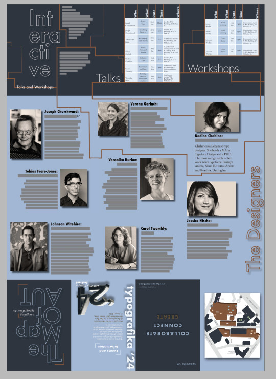
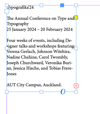
What is Typografika’24?
Typografika’24 is a typography conference and event. It brings together many talented creative mind to inform. There are workshops and talks where designers will share their knowledge.
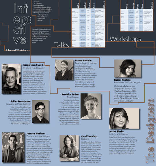
The Speakers at TYPOGRAFIKA’24
There is not much space for too much information about the designers on the publication, so I have selected the designers I am most interested in, and done thorough research for my own knowledge and understanding.
Verena Gerlach
(source: https://www.oneclub.org/awards/adcawards/-judge/3273/verena-gerlach )
Verena Gerlach is a graphic/type designer. She specialises in typography and has been extremely successful in this industry.
She is most recognised for her fonts she created for global font companies such as:

http://www.identifont.com/show?18W ^^
She has created a vast range of fonts with varying styles and purposes. She has both formal and playful fonts, as a type designer she is versatile in her work.
Verena officially began her work in the design world in 1998 when she founded her studio for graphic design, type-design and typography in Berlin. She began lecturing in type design and typography in 2003 and now gives workshops and lectures globally.
To develop a better understanding of how Gerlach functions as a type designer I watched this lecture that she gave called “How to find the real (type) face of a city.” Video : https://artmuseum.pl/en/doc/video-wwb-tv-typespotting

In this presentation she speaks about her project of over 10 years which was to create a typeface that takes inspiration from, and represents Berlin. Below are some notes I took from the presentation about her project and her design processes.

Below are two images that Verena found that display the original “block” typefaces that were used in Berlin around the time of the Cold War along with the original images she took of real type she found in East Berlin.


And now below is how she used the theory of “ staying true but allowing change” in a recreation of the original fonts used in a new current way:

You can see the use of the pictures she took of the original typeface, but embedded into a “new era” of design for Berlin.
As someone who often struggles with the design process, this presentation gave me new ideas of ways to inspire my work. For example, if im feeling stuck, in can be as simple as going outside and taking pictures of areas/buildings/landscapes etc to help me broaden my thinking when designing. It can be easy to get into your own head when in a creative space, and stepping outside of your own head and allowing new ideas to come to you can be eye opening and inspiring.
Johnson Witehira
In design research in my first year I did a project on Witehira using his design principles and style to influence my own work, so this is a speaker that I am very familiar with. This is the research I had on him for this project:
- HIS LIFE
Born in Taumarunui, Witehira grew up in Gisborne and now lives in Fielding with his wife and two children. Reflecting on his childhood, he says it was bereft of Māori design: “When I was growing up as a kid the only thing in my home that was Māori was the people, and I think that's such a strange thing.” Now when he walks through his own home he looks at objects – like a chair or cutlery – and wonders what they would look like reimagined; what it would be like – and have been like – to grow up surrounded by practical Māori design. From a young age Johnson Witehira took notice to the lack of Maori influence in New Zealand. He recognised that Maori culture and tradition deserved more attention and recognition. “Before our Pākeha ancestors arrived we designed everything in our world. We designed our clothes, our tools, our vehicles, everything, and now for the most part what we’re often doing as Māori is decorating other things people have made to make them Māori.”
In Highschool Witehira decided in being a designer and went on to study graphic design. After this he studied a Doctorate in Māori visual arts at Massey University where he explored how to include Māori visual culture in a contemporary way. ”I went from Western design knowledge to learning about Māori design and practice. It’s been a long process – about 12 years.” “When people think Māori art or design they think patterns stuck on something and that's often what we do - put patterns on a thing and say that's a Māori design. People make Māori tools, but they do them as art objects - we should be using them. “I've got the same view of people making kete to go on walls in homes - you don't see Pākeha making bags and putting them on their walls.”
- WHAKARARE

One of Johnson Witehira’s biggest achievements as a designer would be his creation of the first offical Maori typeface “WHAKARARE“Māori designers have a responsibility to bring Māori visual culture back into the world they live in. For Witehira, typography is identified as an area of particular interest because it concerns both design and the written language. The wero (challenge) was to create the first by Māori for Māori typeface, a typeface that reaffirms Māori ideas about the world and stakes a claim to the printed page. The name of the typeface, Whakarare, is borrowed from a pattern in Māori carving which inspired part of the design. Meaning to confuse or distort, whakarare creates a distorted effect in carving by traversing the pākati notch and other elements. An example of the pattern in context and an illustration of the element can be seen in figure 2. Witehira was motivated to create a Māori typeface for three reasons. Firstly, as a Māori designer he wanted to use a typeface that connected to his culture and identity. As acclaimed typographer Jeffery Keedy (1994) points out, we need more voices in typeface design, voices that relate to who we are and our own experiences in life.
- DESIGN STYLE
Witehira’s work has a strong aesthetic that comes from combining traditional Maori form and pattern with ideas from graphic design and contemporary Western arts practice. Through his numerous projects he looks to develop indigenous and Maori design in the areas of typography, graphic, product, packaging and fashion design. He has also been involved in the development of Māori design education through teaching and the development of new Maori-centred design programmes.
Red is a staple colour in Johnson Wisterias work which is associated with energy, willpower, anger, leadership, courage, longing. Which are all things that relate to the purpose behind Johnson Witehira’s work. He is pushing Maori influence in the design world and is reverting the westernised design in current times back to indigenous influence.

This is his work displayed in Times Square.
Commissioned by the QT Hotel Wellington to create a wallpaper.

Nadine Chahine

Kouyifa Typeface:

I Love Typography:


More Fonts By Nadine Chahine:


Sources:
https://arabictype.com/about/
https://www.linotype.com/1185618/koufiya-family.html
https://www.myfonts.com/collections/nadine-chahine
Structure:
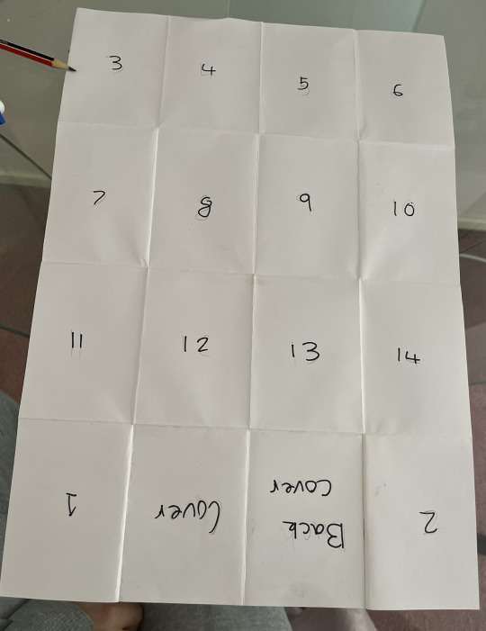
In class we discussed and attempted different types of folds for a 4x4 brochure with a poster on the other side. I experimented with an accordion/concertina style fold and a gateway fold.
*insert videos here
After experimentation I decided a portrait poster with a gateway fold would be a more interactive way of displaying typography as it requires more attention to unfold as well as being more unique in terms of regular brochures. However, I wanted to be sure that my brochure would be interacted with in the way that I was designing it to be. So I got someone who isnt involved with design and asked them to open the brochure the way they thought it was meant to be done. This was successful and gave me confidence in the interactive side of things.
*videos of Armani opening
INDESIGN SETUP
In class we were shown a tutorial on the format and set-up of our InDesign file for the brochure. There needs to be one page set-up as a poster and another page divided in 4X4 sections to construct the brochure side. We used grids in InDesign to create a functional template.


Learning Outcomes: TEXT
- I learnt how to continue text from one text box directly to another
InDesign will let you know of there is text that is running outside of the text frame. We know this because of the red box icon attached to the text frame.

By clicking this icon you can create another text box (whatever size and shape wanted) and the text will continue where you left off.


The by selecting “show text threads” you can see what order they are in and in what order there are meant to be read.

I really think this technique will benefit me in the brochure making process as it means you can ensure all text is included in the brochure, and using the “show text threads” option will allow me to keep my text organised and ensure it is read correctly by my audience.
Learning Outcomes: A-PARENT PAGES
On the pages panel there is an “A-Parent” option. This means the page I am working on is the template for the other pages in the space. This allows fluidity throughout while also saving time. It means you dont have to create grid guidelines on each page, instead just on one and InDesign will paste it across all pages.

0 notes