
Don't wanna be here? Send us removal request.
Statistics
We looked inside some of the posts by grad604brookethomson and here's what we found interesting.
Average Info
Notes Per Post
0
Likes Per Post
0
Reblog Per Post
0
Reply Per Post
0
Time Between Posts
1 day
Number of Posts By Type
Text
17
Last Seen Tumblr Blogs


Fun Fact
When “GIF” was named word of the year in 2012, Oxford Dictionaries U.S.A. credited Tumblr for pushing the word.
Text
Final Poster

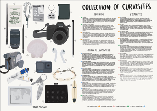
Some adjustments I have made to this poster include the numbering system, using a different font so that the numbers match the funky style of the title. I have also changed the font of my name which was at the bottom left, to become the same style as the funky title, but only as the outline as it is less important than the main title. The subcategories also had a distracting font which was competing with the main title so I changed it to a simpler font Poppins. Finally, I have expanded on the key to show where some items fit into two categories using two dots.
0 notes
Text
Feedback session

Emil’s feedback
Change the smaller titles from the water colour the Poppins font which I have at the bottom with the key.
Can use more than one of the key on some objects
Can make my name bigger and in the same funky style as the new title.
0 notes
Text
New Title


I thought that my initial title was a bit messy so I created a new title using Procreate following Blake Gordon's design style, becoming more relevant. To make this, I made a small collection of how Blake Gordon has used type across a few of his designs then had it in front of me when drawing it. I will also apply the same technique to the numbering system next to the objects, using a similar font style.
0 notes
Text
New Updated poster
Following the feedback Emil gave me, I have changed the titles at the top of my sections. I have also changed my category names and created a key at the bottom. The key with coloured circles is much easier to understand. I've also changed the title at the top by changing the handwritten font and boldness, to stand out more easily.
0 notes
Text
Feedback on my Critical Report


One of the main points that both my peers and lecturer said was to create more paragraphs in my essay as there is too much writing at once. To split the text up I need to look where I have changed to a new idea within the paragraph. I may also decide to out smaller subheadings saying the creative, creation and creative communities to make it more clear to the reader what the paragraph/s are about.
0 notes
Text
Emil feedback - poster
Change colours around
Move video camera to edge
Remove blue colour and green
Move the title to top
Change the titles of the categories to a normal font
Use colour codes… make oceanic inspiration, and adventure (and maybe film) a title at the top and replace the current titles to become little key at the bottom with colours. keep in sections
Make numbers in order in text
Refine descriptions
Handwrite canon word on camera
Remove creativity category
Can make the images bigger and move further over to the text side
0 notes
Text
Feedback given to peer


I have given feedback to my peer who has just got the main points down in her report.
0 notes
Text
Connections in the industry
I have two connections through my dad to the design industry.
Ross Murray is the owner of RedSpark Creative, design agency in Auckland. He is one of my dads friends and I have a close connection wth Ross and his wife Angela, who have recently offered me an internship at their design agency.
Craig Whitehead is the owner of Insiders design agency also in Auckland. This company covers a range of advertising methods but graphic design is one of their specialties. Craig is also very good friends of my fathers and is very well known in the industry.
0 notes
Text
Design Agencies/Studios
Milk Design NZ - Milk Branding Studio
Fuman: Branding, packaging and graphic design agency
Husk: Graphic Design Studio
White Rabbit Design Agency
A few of these agencies and studios have certain values which they stand for and a lot of those are ones that I align with. Environmentalism is a common value that some companies stand by where they can, such as using eco-friendly packaging. Most of my design practice involves my connection to the environment so, having a link between my values and other studios is very helpful.
0 notes
Text
Design Agency vs In-house design (quick notes)
Design agencies: exposed to different topics and medias, along other designers. Exposed to the process of working with clients. Get to have brief and strategy sessions learning to communicate and present them. Sell my own ideas to the clients. Creative director who has a lot of experience, would be a mentor and can help me grow. Complete a project then move to the next client. 2-3 months on each topic. More broad.
In-house: takes more responsibility of the success of a brand. Work on a project for a long term and really understand the brand on a deeper level to ensure the greatest success for the customer. Learning about a specific topic, working in a team. You get an insite and learn everything about the company and their funding ect. You come out an expert on a specific niche. Years on end on one project. Able to freelance on that specific neiche afterwards. Won't get design mentorship. Can take that knowledge from the part I most enjoy and can perfect it.
youtube
0 notes
Text
Diving deeper into my poster
Water colour style titles for categories - History of water colour:
The medium of watercolour has been particularly associated with England for several hundred years. However, further back in the history of European painting, it originated by using pigments, consisting of earth or vegetable fibres ground to powder and bound with gum or egg, which were in use in the Middle Ages. They were used on manuscripts, fabric, stone, wood and canvas.
Nowadays watercolour paint has become a digital texture that can be easily transferred onto any type of canvas. On digital illustration platforms such as Procreate, the watercolour style has been replicated and programmed to seem realistic with darker more defined colour showing up when the stylus pen is pushed harder, and a thinner more opaque line with lighter pressure.
When did digital illustration begin:
The earliest forms of digital art can be traced back to the 1960s, when artists began experimenting with computers as a medium for creating visual art. One of the first artists to work with digital technology was John Whitney, who used a computer to create abstract animations in the 1960s. Digital illustration has revolutionised over time and has become easy to use at everyone's fingertips, allowing anyone to become a designer or illustrator.
0 notes
Text
Themes my peers saw in my poster
organisation
creativity
adventure
film
beach/ocean
muted colour
0 notes
Text
Week 10.1
Where am I?
I have made a poster which is very close to being done, possibly a few more adjustments. I have a few ideas about my essay but haven't started it yet.
Where do I need to improve and how can I do that?
I need to begin writing my essay and thinking about possible themes and ideas I will include in it. I need to do more research about the methods I use to design, and find out the history of them, showing how I can use my research skills.
What further research do I need to do?
I need to research the way I have made my poster: the way I have used watercolour paint and digital illustration. As well as key themes and ideas relating to my favourite designers such as surf culture, environmentalism etc., and how that relates to my design practice.
Do I need to reassess the 20 elements I have chosen?
I have recently changed a few of my objects as some are very very similar to each other and it was unnecessary to have them all on the poster, so I have added more important objects which fit more into the personal possessions category as well as the design inspiration, after realising that all the objects don't have to just be tools.
Self assessment:
Investigating B-, research skills B+, analysis and reflecting A-, synthesis intergrating B-.
0 notes
Text

Newly updated poster, using a lot of the feedback given to me last lesson. I have now swapped the sides that the objects are on, added a title and my name, and created a key at the bottom for the overlapping categories with more important topics. I have also removed some of the less important objects like the colouring pencils, as well as the tripod and portrait lens (which are too similar and were unnecessary). Another change I made was making the numbers on the side of the description bolder so it is easier to see and read. I like the layout of this poster better now, along with the new objects. I believe there is still room for improvement where I could add more of a design flare to make it more interesting.
0 notes


Text
More Feedback from Emil
I need to switch my objects to opposite sides on the poster as the objects look more interesting.
Can I group my objects further using coding with colours or shapes with the categories that overlap. I can also add other categories such as key themes and ideas such as the environment, values, and culture as different symbols.
Remove some of the similar objects. Spread the objects that are coloured around the page so they lead the eye to different places.
Remove the titles above the categories and made them more neutral as they are distracting
the top of the poster isn't working as well as the bottom. Can remove the tripod and video book, don't need all three lenses.
need to include my name
my poster needs more of a design flare, more creative layout.
0 notes
Text
Current thoughts about my A2 poster
I need to update my objects by removing some of the repeated items. I will remove my tripod, and Wacom tablet from my inventory, and replace them with my earbuds - as I listen to music often when designing. A whisk to represent how I love baking.
Possible extra objects: colour, surf board, a poster I like
I need to include deeper themes and ideas into my work, such as surf culture, the environment and adventure. Do I need to change my categories to adjust to these themes?
0 notes