
grad604chloeharrington
GRAD604 Design Research Chloe Harrington
38 posts
Don't wanna be here? Send us removal request.
Last Seen Blogs

love-vafs
Not white, not black, gray.

k-nep
N E P U

annasmith1993-blog
Anna Smith

auntiejojo801-blog
Premonitions

doanthaics
Đoàn Thái
Text
Course Review
This course has helped me learn more about myself as a creative and how I can apply deeper connections and contextual thinking into my future work
I feel as tho the first 6 weeks of this course had a really confusing direction and the communication between classes that were getting told different things was very confusing. I think that is why I struggled to engage with a lot of the research-based tasks as they were not clear at all.
Was also super frustrating having technical difficulties majority of classes that significantly impacted my learning.
0 notes
Text
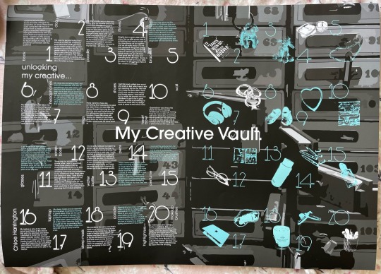
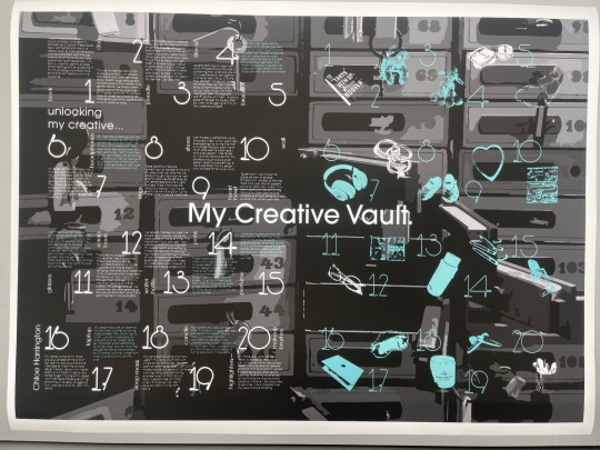
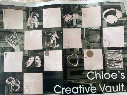
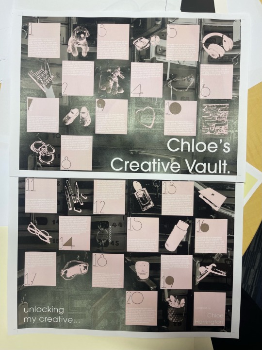
Final A2 Poster
I'm really happy with how much I developed this poster from its original concepts. I think I have executed a great layout format while still having an overarching theme of myself being the Vault opening up to show my creative inspirations and elements that I can them reflect into my future as a creative.

0 notes
Text
Final Critical Review
Crafting Design Identity: Exploring Personal Insights and My Creative Journey
I’m outlining and analysing the influences and insights that have directed my design choices and have given me guidance into the designer I currently am. This document involves exploring my journey of self-discovery which has been heavily influenced by my surroundings throughout my childhood, and how they have made me see the creative world through my lenses.
I want to understand what drives my design journey by taking a closer look at the three key aspects of my creative process: the factors that have shaped me personally, such as social challenges, specific creatives that are passionate about projects that are based on concepts that I'm inspired by, as well as communities that can strengthen my practice and allow me to grow. It's important to recognise that these various influences hold universal significance. My unique creativity offers a distinct viewpoint that may inspire others or have underlying connections.
Before this paper, I was uncertain about my path as a designer and whether I had chosen the right degree. This journey of self-discovery has shed light on my identity as a creative. I've realised that my designs consistently revolve around themes of social change and helping others, reflecting my early life experiences dealing with challenges and hardships. I found comfort and a means of coping with these challenges through creative expression. Painting and sketching, which I initially used as coping mechanisms, have now transformed into a genuine passion of mine.
At this stage of self-discovery as a creative, I have a passion for illustrative design, often incorporating elements of photography or vectorising images, and then deconstructing them. Typography was something that I thought would never be my strong point until recently. The GRAD602 studio paper I'm currently doing has made me find a new love for typography and working with publication design. I'm determined to explore this aspect further to potentially find a deeper passion within it.
My design inspiration stems from my desire to escape and redirect my focus from the underlying issues I faced during my upbringing. The experiences I endured led me to discover and embrace hobbies like horse riding and painting, which now inspire my current projects with a deeper sense of purpose and a personal connection to my audience.
In my design journey, I aspire to empathies with and connect with children and young adults, conveying that it's right to feel isolated at times. By finding one's creative outlet and passion, it's possible to come to terms with challenging situations. The past can't be changed, but it can be reimagined and applied to shape a more meaningful future.
Building on my journey and creative influences, I've delved into the current landscape of design and its impactful practitioners. By doing this I’ve seen a larger range of skilled designers that have unlocked creative inspiration and views I didn't know I had. In my exploration, I've uncovered noteworthy creatives who have significantly contributed to the field. These individuals have not only produced outstanding work but have also left a lasting impact on communities and influenced my thinking and practice.
Leta Sobierajski - Vogue Fashion Night Out Tokyo
Leta Sobierajski's creativity and freestyle draw me into her design lifestyle. She has worked for huge brands like Gucci and BMW and her approach to design represents her as an individual and is now a creative director working with her husband Wade at their studio: Wade and Leta. Working with her and her team would be a happy environment while being super interesting and informative. I found it super fascinating when looking into Leta's background and how she often struggled to find rhythm in her style until she produced a core principle. The other principle is “purposeful eclecticism,” a simple method of reinventing a brief, seeking a twist, and flipping the perspective to discover an otherwise unobtainable solution. It’s all about interpretation (Miltimore, 2021). Leta always strives to create something that doesn't follow a typical standard which is super inspiring.
1
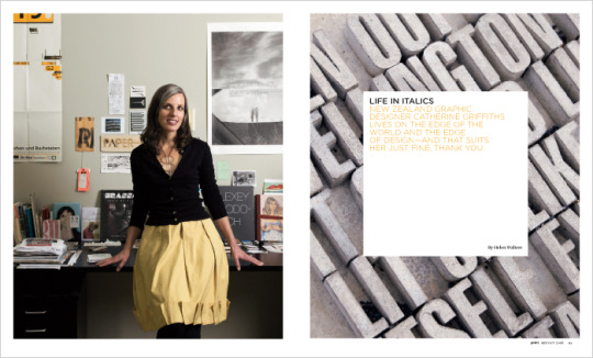
Catherine Griffiths- Labour of Love
This poster created by Catherine Griffiths is a style that catches my attention. The way she has crafted the typography to have a broad appearance yet have a soft and calming approach is a great complement to the meaning behind it. Catherine was out to create a wordplay poster but struggled to make it flow. Jacinda was campaigning for a Labour of Love. But, for some reason, I couldn’t make the words work (Studio Catherine Griffiths | 03 Other in(Ter)Ventions, n.d.). She then continued to explain that it took her 5 months to create the right play on the world for the poster to work as one cohesive unit. The inspiration ended up coming from the announcement of Jacinda Ardern's daughter's name. This poster's simplicity is a style that caught my eye and it's comforting to hear that not all phrases look right but you just have to step back sometimes and look at it from a different viewpoint to get that more profound meaning to make one whole unit. Catherine's typography has always stood out to me, and her style made me view typography differently as I originally really struggled with it and now, I’m starting to enjoy it.
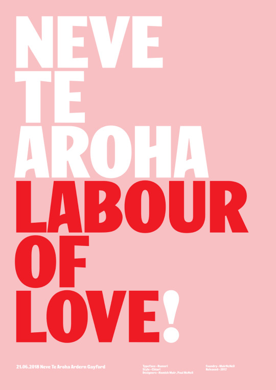
2
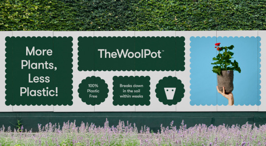
Seachange Studio - The Wool Pot
This was a project that initially I didn't look much into until I stared at the designs more. The longer you look at it the more aspects unfold and make you ask yourself more questions. This project stuck out to me as it's got that modern and minimal aspect to it while having such a huge social impact. I love how it has this playful and friendly approach while it's got the underlying theme of the global warming issue. The use of creating the sheep around the product of a pot that is being promoted is creative yet minimal. This is the type of style I want to push myself further to try as it says so much in such little design. This is important because it can have a large target audience. I’ve noticed most of Seachange’s projects reflect this minimal visual aspect with a larger underlying issue or theme they are trying to portray.
3
Emma Kaniuk- Semi Permanent
Co-founder of Akin Studio, Emma’s design approach is “great ideas, crafted well” (» About, n.d.). The minimal style she uses across many of her projects as well as her colour pairing choices are skills that inspire me to start deeper thinking when I’m in the process of making those choices. This showed me the importance of breaking down the design process and the making process. This project in particular was interesting to me as I generally wouldn't see these colours working well but she has done a great job at blending them all with the right amount of contrast. You can see how her design system has been put into place and the more playful style that's showing through. This was designed for designers; she wanted it created with more noise and less visually minimalistic style, as that is what designers are used to. I found this thought process interesting and backed up amazing with her statement of great ideas crafted well. This phrase is something that I want to keep reminding myself of in the initial stages of projects as it can be applied to anything to push myself further.
Throughout this research journey, I've learnt a lot about the industry itself and how all these talented designers were once in a similar position to me. I've learnt that many talented artists and designers have their phases where they are trying to figure themselves out as a designer or just sometimes are struggling with concepts and starting points. These creatives I've researched have given me so much insight into how they started with some projects feeling lost and unsure then broke the theme down to end up with these amazing meaningful designs. This has also taken a lot of unnecessary stress I’ve been putting on myself thinking that I'll never get a job or be good enough to work in the industry. I've realised I'm just starting out and still trialing what my natural strengths are and what I can put some more work into improving. As for my future, I originally thought I wanted to purely go into branding design but now I've taken more of an interest in typography and am still interested in web design. Web design has always been a practice I've been intruding into, and I picked up a web-building paper this semester and I found it fascinating. Doing the design part as well as making the prototypes feels super rewarding as you get to see the entire process from building it to a finished user-friendly site. It would be great to incorporate both type and web design together into a campaign to integrate both practices. I would like to work towards getting into a role in a design agency as it will be more fast-paced and will allow me to get a lot of exposure to many industries, clients and projects without having to move around different companies, according to Lorenzo Bellucci (Bellucci, 2022). I also currently do a bit of freelance work however it ended up in construction branding design so I would like to keep spreading my name out there to see if I can grow a solid and reliable client base in different workforces.
When starting my poster, I wanted to collect elements that I use in my design process and elements that have a lot of significance to me. I wanted to experiment with my new interest in typography in this poster so I decided to test out creating my typeface for a numbering system. A lot of my design process in the past has been used as an outlet as I didn't want to express verbally how I felt. This inspired me to go with the theme of my vault as it represents things, I keep close to my heart and items that hold importance to me. I decided to scan the elements as flat 2D vector images to bring light into the setting.
The element of my book not only started my love for reading but also challenged me to realise that I want to create work that connects with my audience emotionally and deeply enough to make them feel like they can relate and then form discussions about it. The book sparked interest in my practice of creating for social change and the greater good by influencing my approach to combining concepts. Before I would tend to use a lot of great ideas and struggle to combine them as now, I gather all my ideas and see which ones have that deeper connection to form a clearer story for the audience.
I also had a similar realisation when thinking deeper into my heart bowl assets. This journey made me think more about designing for the greater good and helping others. The man who made the bowl didn't have much and was the most happy and lovely person I had talked to in a while. He showed me how effortless it is to be a great person; this is something I'd like to put more into my design work to share with the future world.
Throughout this process, I’ve learned a lot more about myself than I initially thought I would get from this paper. I've come to realise that although I'm still on my journey of finding my true strengths and passions, I’ve realised that I want to design for social change and to connect with the community on a personal level. I found it so interesting seeing how the creatives I looked into interpreted their briefs to reflect an interesting topic. I also never thought deeply enough about the root of all my design inspiration and how those elements had a significant impact on it so it was fascinating to connect them, build a greater bond with memories, and apply them to the project.
One challenge I faced was understanding the initial brief of this paper, which led to me struggling to research in the early weeks. Going into GRAD704 next year I now have a clearer understanding of myself as a designer and what my practice may become as well as the areas of design that I thought I enjoyed. This research into the communities has given me great insight and guidance in unpacking a brief to fit and visualise it in your aspect so that when I look for an internship what agencies I would like to work for and the style of designs that would align with my best. If I were to look back at myself 12 weeks ago when I was asked who I am as a designer, I genuinely had no clue how to answer. Now I can confidently say I'm a curious designer who's passionate about benefiting society.
0 notes
Text
Printing Issues
Printing is always something i dread as nearly everytime something goes wrong. And of couse today was one of those days.
I went to the warehouse stationary to get my A2 poster printed. They did a great job on a 160GSM paper weight which I was really happy with. However, I got home and noticed I was missing my highlighter element by the number 19. This was really frustrating however it also made me realise there were some grammar errors so I was able to change these to allow for a better overall poster.
I went back to get it reprinted and the second print even though it was the same time, was of horrible quality.
It then took me another hour at warehouse stationery to sort out the issue with the printer to be able to finally print a document that was up to submission standards. This was really frustrating as i was short on time and ended up costing me more than it should have. However, now I'm happy with the final and feel good about submitting it.
0 notes
Text
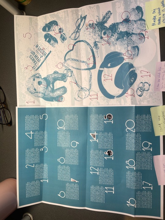
Poster changes
I was really happy with this design until i printed it. The image in the back had a strange pink and yellow tint to it. This inspired me to the vectorise it to match my elements.
I also didn't like how the pink squares looked a bit random and their grid system just wasnt working to their advantage.
I think I'm going to revert back to my original colour pallette of the deep teal colour and try to refine the squares or even eliminate them.
As for the body copy it is blending in too much with the pink. I think even with the blue background it may still get a bit lost so I might have a trial with using a heavier weight in that font to see if it will become more readable.
0 notes
Text
Poster feedback
Today I got feedback on the current stage of my poster. I was the happiest in the stage I'm currently at but it was super helpful to get guidance from both of my lecturers on their opinions and how I can push the design further. I want to minimise my elements as the collage style is quite different from the structured side of my body copy.
0 notes
Text
Critical Review Progress
Section 2
Throughout the context of this document, I am outlining and analysing the influences and insights that have directed my design choices and have also given me guidance into the designer I am at this current point of my design journey. It involves exploring and examining my journey of self-discovery which has been heavily influenced by my surroundings throughout my childhood, and how they have made me see the creative world through my lenses.
I want to understand what drives my design journey by taking a closer look at the three key aspects of my creative process being, the factors that have shaped me personally such as social challenges, specific creatives that are passionate about projects that are based on concepts that I'm inspired by, as well as communities that can strengthen my practice and have opportunity to grow. It's important to recognise that these various influences hold universal significance. My unique creativity offers a distinct viewpoint that may inspire others or have underlying connections.
160 words
Throughout the context of this document, I am outlining and analysing the influences and insights that have directed my design choices and have also given me guidance into the designer I am at this current point of my design journey. It involves exploring and examining my journey of self-discovery which has been heavily influenced by social change and helping others.
Section 3
In my creative journey, I draw inspiration from two primary influences: gymnastics and watercolour painting. These influences shape my core values and ideas, including the importance of authenticity, discipline, and the x use of colour and form in design. I naturally gravitate toward blending digital and traditional media, mirroring the grace of gymnastics and the subtlety of watercolour.
For research and idea generation, I rely on visual research, interviews, and collaboration. These methods help me uncover unique perspectives and themes that resonate with my experiences and interests.
As for the role and importance of design, I view it as a powerful tool for self-expression and advocacy. I'm particularly passionate about design's potential to address social and cultural issues, such as gender equality and sustainability. Design, to me, serves as a means to bridge gaps, foster awareness, and contribute to positive change in our ever-evolving world.
145 Word Count 400 MAX
To be quite honest before this paper i had no clue what i wanted my practice to be or if i was really in teh right degree as i had found myself questioning alot about what i really enjoy in life. This paper has made me realise more about myself and who i am as a designer. I reaslied that alot of my designs always came back too social change and helping others which makes sense as in my childhood i had to deal with alot of challenges and hard situations that i wouldnt want anoyione else to go though, so if something i can design can just help that single individual my job is done. Coming to think of i in alot of these situations of having a absent parent, moving cities often and fainly members getting diagnosed with terminal illness,i always found myself naviating alot of this childhood trauma though creative expressions.
This technique of using creativinty as a coping mechanism is often used by artists when creating new songs so like them i did this by doing paintings and drawings when i was little. I always loved it and thought school noticed it became more of a passion and tallent rather than a comping mechanism.
Currently at this stage of discovering myself as a designer i really enjoy doing moer illustaive based design with s slight mix of photography in there. However as much as i struggle with typography its something that id like to dive further into and see if i can find more of a passion in that area.
My other outlet i always found myself around was animals .I grew up with a stong love for horses and dogs and as i did have both from a young age it became more of a escape to be around the with no disctactions and having a clear head.
A lot of my inspiration for my design i guess kinda comes from trying to escape and distract myself from a lot of these underlying issues i grew up with. A lot of the pain i had to deal with made me find passion and love for these hobbies like horse riding and painting which now i can channel into my current projects to have that level of deeper meaning to connect more personally to my audience. I really want to empathise and connect with my audience of children and young adults to show that its okay to feel isolated sometimes but by finding your outlet and passion can help you come to terms with a lot of situations you may be put in. You cant change the past but you can change how you view it and apply it into your future.
0 notes
Text
Poster developments
In this project, I really wanted to push my developments and test using a large range of materials and styles to come up with a design system that can be used easily


0 notes
Text
20 Elements Body Copy
Book
I read the sequel to these books and really changed my perspective on books. These books really connected with me on a deeper level as many of the events that the characters went through were quite similar to my own and events that have happened in my family. I want to use this process of connecting with an audience in my future designs to make more emotional connections with the audience.
Dog
This was my second teddy that I loved as a child. My childhood best friend and I both got these as our dream dogs were golden retrievers due to their friendly and gentle nature. I’ve always taken good care of this toy and she's still in great condition. This reflects back to myself as a creative as I take good care of my creative tool kit so it's lasted so long.
Poodle
This little poodle was my first-ever teddy and my favourite one in my childhood. This little dog came everywhere with me. To this day I have no clue why I gave it such a strange name and never really thought it was weird until I got older and really thought about it. Lamb-chop. It’s stuck through all my moves of different homes and cities I’ve lived in and still, somehow it’s sitting on my bed in my flat now… 20 years later.
Fitness
Weights from a gym class I really enjoy. This Les Mills pump class is something that I and a couple of my close friends all do together and we all really enjoy it. To me, they represent self-growth and bonding closer as I don’t always enjoy or want to go but when my friends make me go with them I feel great after the class and spending time with them. Its also a good mind reset for me as I often go when I’m struggling to think of new creative concepts.
Bracelet
My oldest sister gave me this bracelet for Christmas one year. Both of my sisters have this same bracelet that has been engraved with my name and my older sister’s name Brooke on the side. This is my most significant and meaningful piece of jewellery as I received it right before she was diagnosed with her terminal illness.
Headphones
My Beats headphones allow me to block out my surroundings and focus on whatever I put my mind to. They are my go to when I’m getting into my creative zone as they make me feel like the worlds stopped. They are also a huge help when I’m procrastinating as I will use them to go on a walk and reset my mind.
Rings
My rings are something that I not only an accessories, but also as something I play with when I get anxious and stressed out. They help me to feel secure and now I feel weird when I don’t have them on as I can’t fiddle with something if I get nervous. They all were given as gifts and most of them aren’t able to be replaced so they have that sense of uniqueness to me.
Shoes
These ceramic shoes are something that represents me and my sister when we were little. We always thought hers was the right and my one was the left shoe, as I’m left-handed and she is right-handed. These little shoes are always on display in our house ever since we have grown up no matter what house we have lived in.
Heart Bowl
I got this bowl crafted from wood and shells in Bali, which was a real eye-opening trip for me. The man who made the bowl didn’t have much and was the most happy and lovely person I had talked to in a while. He showed me how effortless it is just to be a great person, and this is something I’d like to put more into my design work to share to the future world.
Wall
Queenstown was always the place we went to escape Christchurch. I ended up moving there for a year after my parents split and I absolutely loved it. This wall in particular was something me and my sister spent a lot of holidays and hours sitting by. It was a place that just felt super safe.
Glasses
I got these blue light glasses back in lockdown as I was pretty much glued to my device all day every day for way too long. They are also my go-to accessorise when I don’t feel amazing about myself as I feel like I can hide behind them in some sense. These glasses help me get into my creative zone as they add another layer to my having to focus as part of the process.
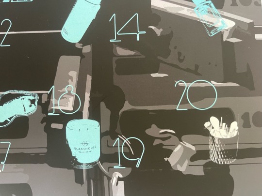
Scrapbook
These are my scrapbooks I made while I was in preschool. These have always help so much importance to me as they captured and hold so many amazing memories and milestones in my childhood when times were not always so easy. I love flicking through them and seeing all my little drawings and art pieces i crafted. The collage style art was something I did often growing up and would like to start using it as a planning tool in future projects.
Waterbottle
I’ve recently noticed my habit I’ve picked up on always having my water bottle on me at all times. This was something a year ago i really wanted to improve on to benefit my overall health and wellbeing. It helps me feel like I’m staying in routine and is something I’m proud of now. I invested into a more expensive drink bottle as it keep my water really cold however its turned out to be average quality.
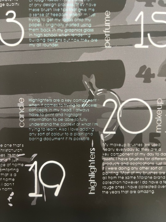
Pens
These marker pens are my go to when I’m trying to create concepts or rough ideas in my initial start of any design process. They have these brush like tips that give me a sense of freedom when I’m just trying to get my ideas onto my paper. I originally started using them back in my graphics glass in high school when rendering building designs but now they are my all rounder.
Perfume
I received this perfume from my mum as my 18th birthday present and its one of my favourite perfume scents I’ve owned. Its one of the scents that a few of my great friends use that i met in uni halls last year and was something that we both immediately noticed as we meet.
Laptop
My laptop is one of my more proud purchases at the end of last year my previous one broke. I decided to invest into a more design friendly version with higher specs which meant i had to work harder to get it. Its one of my assets I own that helps me do everything and without it id really struggle as now I also do a lot of my job in my laptop.
Sleep mask
My sleep masks are an essential for me when it comes to having a good sleep. They are my go to when i just want to escape any problems and fall asleep faster as i find them super comforting. All of the ones I own my mum has brought for me as stocking fillers for Christmas and they range from nice silk ones to funny animal ones.
Candle
This candle is the same one that’s used in my home in Christchurch where all my family lives. Its the scent of lemon-grass and it just makes me have a piece of home in my flat. Its quite a comforting and fresh scent to me that is a really nice reminder of home when I’m missing it, as i don’t have any family in the north island.
Highlighters
Highlighters are a key component when it comes to trying to process concepts in my head. I always have to print and highlight information to be able to fully understand the context of what I’m trying to learn. Also I love adding any sort of colour to a plain and boring document if its possible.
Makeup brushes
My makeup brushes are used nearly everyday so they are a key component of my day to day assets. I have brushes for different products and applications, just like if i were doing any other sort of painting. Most of my brushes are all from the same Morphe brand collection however i do have a few rouge ones i have collected over the years that are amazing.
0 notes
Text


Here I started testing out the original typeface I created bur found it started to look quite messy when I added in my elements. I am going to use the more structured typeface I created to allow it to look more cohesive.
0 notes
Text
Layout testing + Grids


Today I really wanted to finalise a good layout for my bodycopy that could also be reflected in a similar style for my elements side of the poster. I decided to use the first layout option as it was a good way of breaking the page up clearly while still making good use of negative space.

I came up with this grid as it evenly spaced out all my body copy in proportion to my assets. It also distanced the rows enough to make it more reader-friendly as when I previously had tested the rows closer together they looked too tight and clustered.
0 notes
Text
Researching into Working in Industry
I wanted to look into what type of industry would best suit me and I would perform best. I've come to the decision that working in an agency would best benefit my growth as a creative.
Im the type of person who thrives under pressure and although this is something I need to work on it often has its down side of having poor time management and procrastinating to the max. I often will leave things kinda last minute and then cram out all my ideas until I'm happy with the over all outcome.
When researching agency-style workplaces I noticed that a lot of posters mention how fast-paced and hectic it will be to start off with. A few times you will feel like you running all over the place to try to meet deadlines and understand the business as a whole. But it would calm down and become the new normal after a while. This would probably work as a strength for me as I would rather be thrown in the deep end and have multiple opportunities to work on a large range or projects at similar times.
Originally I wanted to go into a house designer role but now I feel like I'd almost be limiting myself if I were to go straight into one. I will take any kinda of design job I can get when I start searching for one however I'm going to push myself to try to get into an agency as I will hopefully be able to network more and push myself harder.
0 notes
Text
Creating my own Typefaces
I really wanted to push myself on this project to get more into typography as its not my strength. I'm really happy that I did as it helped make this poster more personal and a better reflection of myself and my own work


I decided to use this typeface as it looked cleaner and was easier to read alongside my chosen typefaces
I tested adding images into the typeface which i really liked the incorporation of however i did end up removing them as they got washed out against the background
0 notes
Text
Week 11 - Vectorising my assets
I vectorised my image by using Adobe Capture. I was recently re-introduced to this app and it really is amazing. I tested out the different tones I could make for each graphic and then once I was happy with them I exported them into Illustrator when I played around with the colours. Although this was a tedious process it helped me think further into the creative meanings behind the images by being able to try to reflect what they meant to me depending on how deep or dark the tones could go.


I also decided to vectorise the vault image as after printing it just as a photo it looked really out of place and had this strange pink tint to it. This also links into the style of my elements creating a theme throughout the entire poster.
0 notes
Text
Week 10 - Chosen creatives
Leta Soberiajski
Leta, a freelance designer and art director based in New York City, creates viscerally stunning tableaus by fusing traditional graphic design elements with photography, art, and styling. Her multi-media practice explores visual journeys. Wade and Leta, who make up the other half of the creative team, have dubbed their style "Music To Your Eyes," where speculative design converges with vibrant mediums to create a recognisable personality in all of their work. She credits Gins, whose work "their work has made us consider the physical effect of the work that we make and has even encouraged us to create our own work philosophies such as "design as performance," to give a greater understanding of the physical activity we strive for in the work we create, whether through a brand, a sculpture, or an ad." as one of the visionaries she draws inspiration from.
She attended Purchase College to study graphic design, and she has been working on her own since 2013. Adobe, Bloomberg Businessweek, D.S. & Durga, Google, Gucci, IBM, The New York Times, Refinery 29, Renault, Süddeutsche Zeitung Magazin, Target, Tate Modern, and UNIQLO are just a few of the many companies she has as clients. She teaches at the School of Visual Arts as an adjunct professor as well. For its annual New Visual Artists Review, which chose 20 international designers under the age of 30, Print Magazine has recognised her.
Catherine Griffiths
Catherine Griffiths is a designer, typographer, artist, writer, feminist, and activist from Aotearoa New Zealand. Her practise, which combines graphic design, self-publishing, writing about design, and commissioned art installations in public and private spaces, depends heavily on improvisation. Notable projects include her ongoing Vowel series, TypeSHED11, Wellington (2009), the curation and co-organization of TypeSHED11, Wellington (2002, 2004), and the Wellington Writers Walk, a series of large-scale concrete text sculptures.
Catherine has been involved with Parlour: women, equity, architecture since its inception and is active in the global design community. She launched the platform Designers Speak (Up), created the Directory of Women Designers, organised a poster project and exhibition titled hkoi, Present Tense: Whine Toi Aotearoa, and protested against gender inequality in design in 2018.
Seachange Studio
Tim Donaldson and Amanda Gaskin, the company's co-founders and creative directors, are in charge of Seachange.
Before relocating to New Zealand to launch Seachange, Amanda and Tim spent more than a decade perfecting their skill at prestigious creative companies in London. They brought a vast amount of expertise with them. Their exposure to many cultures has given them a unique global viewpoint that sets them apart from their contemporaries.
They frequently serve on international judging panels, most recently for D&AD, New York Young Guns, and locally for the New Zealand Best Design Awards, and their work has been praised in esteemed design journals.
A talented collection of creatives with a love (bordering on obsession) for what they do make up the Seachange team.
They expertise is in creating brands from scratch, but we also relish the challenge of revitalising legacy businesses from a new angle.
Although the studio is situated in Auckland, New Zealand's Tmaki Makaurau, it serves clients all around the world.
Emma Kaniuk
Designer and art director Emma Kaniuk is based in Tmaki Makaurau, Auckland. She is one half of Studio Akin, one of the few creative businesses owned by women. She recently founded her own not-for-profit organisation called Tradespeople because "I wanted to be part of the changing the standard." Akin is a branding agency with offices in Tmaki Makaurau, Auckland, and Naarm, Melbourne. It collaborates with forward-thinking individuals to create brand worlds at the nexus of creativity, culture, and technology.
Emma has worked on projects in the arts, aviation, education, finance, fashion, FMCG, hospitality, infrastructure, and social good initiatives in her previous positions at Special Group and Designworks. Her work has won accolades both nationally and internationally, including the purple pin of distinction for graphic design from the Designers Institute of New Zealand Best Design Awards. It has also been highlighted in publications like Creative Review, Communication Arts, Monocle, and numerous websites.
It's safe to say that Emma's practise now heavily emphasises collaboration. Her presentation will be a sort of love letter to all the alphabets and logotypes she and Akin have created individually as well as with other people as she looks back on a number of her projects.
0 notes
Text
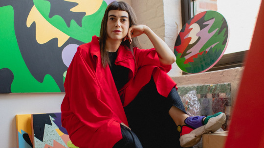
Image testing
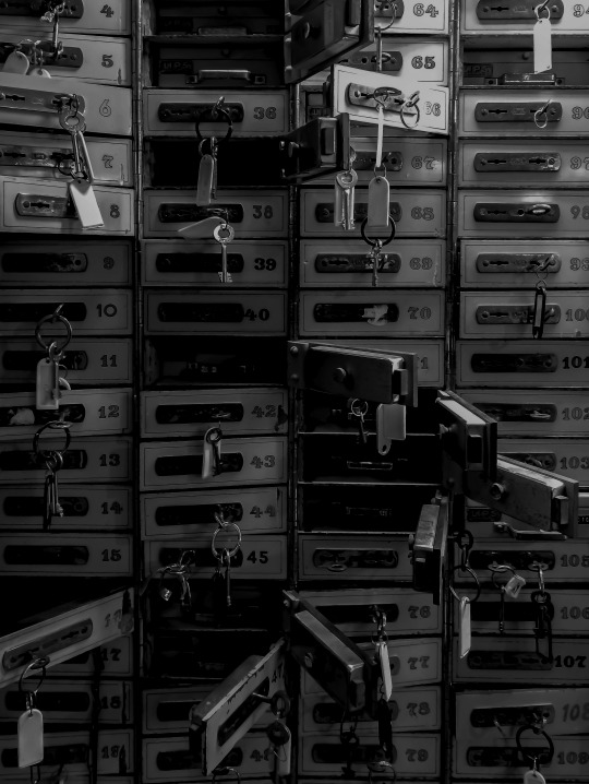
I sourced this image of Unsplash as I wanted my poster to have a theme of my elements getting unlocked in my vault. A better understanding of discovering myself.
0 notes


