
Last Seen Blogs

90snostalgiaaddiction
Stanley Yelnats
solufain
Not Your Kind of Tumblr

catladysim
Cat lady sim

sleeplessinx
SAILOR SATURN

smooky10-blog
Therealsmooky
Text
Critical Reflection
The two briefs this semester open me to a more complete and professional process of designing a publication, from setting up a neat grid system in Indesign to binding at the end. There are a lot of vital moments in this semester that I found challenging and inspiring: making design decisions on a more professional level and communicating with other people including but not limited to mentors, group members and critical friends, binders and printers. I have never saddle stitch a whole book before the potluck brief so I find it very enjoyable to bind everyone's efforts together.
Towards the end of the pataka brief, I got hit by Omicron unfortunately. I was trapped at home for nearly two weeks so I lost some opportunities to get more feedback from the tutors and critical friends when I was designing my publication. I would rate myself "need improvement" on the pataka brief that I didn't generate 100% of the work amount that I could possibly put out. Also, what I learn from this brief is that I will need to plan more ahead, especially when it's close to the deadline the availability of the print shops and all facilities has become super tight. Even though I have checked everything with the printers before printing the publication, there still might be some errors and bad copies. I would ask to print more copies next time just in case there's an error, and I would leave more time for revisions.
0 notes
Text
Aspects that could be improved


I did check the order of the pages on the printer's program when I was at their shop, but I found that the imprint and the dedication were printed on the wrong page (the other side) and unfortunately the time wouldn't allow me to do another print. I will next time try to reach the printer earlier and leave enough time for reviews.


The inside bleed was not trimmed off in a copy of the publication, so the texts were too close to the edge.
0 notes
Text
Final Publication


Paper used:
Matte 120gsm
Gloss 130gsm
I have designed a section of spreads on a dark blue background, so I choose to print this section on a gloss paper that separates it from the rest of the pages.
0 notes
Text
Soft Cover


PVC Banner Material
I chose a soft PVC fabric which is usually used for outdoor banners. The touch of it is similar to leather paper, but it's inexpensive and very durable.


0 notes


Text
Cover design

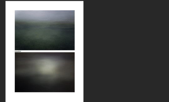
The title of my publication is "Try not to be Buried by Anxiety", so I'm planning to print the dust jacket on transparent paper (or half-transparent) and cover up the book title, which will imply the idea of "buried by anxiety". I added a feather filter and outer glow to the type so it evokes a sense of unsure and disoriented, while it is also resonating with the moody images inside the book as well.
0 notes


Text
Critique

Above are some small errors that I need to be careful with (spelling, leading, alignment etc.). I will need to go back and proofread my publication.

To make the layout consistent, it will be better to always have the titles in the top right corners, while the images are stretched all the way to the top/bottom of the pages.

The page number is too large on the page.
Change the typeface of the title. (This typeface was my second choice for titles but it finally got back to Freight Pro.)
Stretch the image.

Delete the page number on a new master page and move the title up just like the other title pages.
Change the image. The image on this page doesn't fit in so well since the other images are moody and abstract.

Suggestions on the composition.

Think about the binding and change composition. The texts in the middle will be bound into the spine so it will be better to separate them onto two pages.
0 notes

Text
Fonts & Paragraph styles

Above are the fonts that I have used in my publication, I have only used 3 typefaces because I want it to be minimalistic. I have selected a calligraphy typeface for quotes that exaggerates the contrast between the body texts and the quotes, therefore there will always be a hierarchy of the noteworthy lyrics and lines in the poems.

Even though the number of fonts is limited, the paragraph styles in my Indesign document ended up being surprisingly numerous. The paragraph styles are mostly different swatches, tints and alignments for texts.
0 notes
Text
Grids


Above is the baseline grid and the A-master grid that I've decided to use mainly in my publication. The spacing of the baseline grid is 12pt, which would be reasonable for the leading of body paragraphs. The top and bottom margins are aligned to the baseline grid. The outer margin is 10mm while the inner margin is 10mm larger because I would like to use perfect binding for this publication. The verticle gutters are 3mm, and the horizontal guides are aligned to the baseline grid.
0 notes

Text
Moodboard

I found some publication design examples that have also used a verticle format or a transparent cover page.
0 notes
Text
Planning


Reviewing publication components in relation to content using provided book design component checklist. Using the checklist process, create a list of formal concepts that you could integrate into the design of your publication.
Appearance, front & back cover:
Size: 250mmx130mm
Transparent dust jacket
Binding: saddle stitch/perfect bind
Paper: matte, not over 300gsm
Title: hierarchy of the word “Anxiety”
Background image
Back cover: quote, publisher (myself) and logo
The contents of my publication are lyrics and poems so the length of each line will be very short, and that's why I have decided to use a verticle format of 250mmx130mm so the texts can be composed nicely onto the pages.
Editorial content:
Title page
Table of content
Headings
Introduction
Body texts: poems, lyrics, quotes
Images: photographs, typographic posters
Page numbers
References
Page design:
Grid: 4x4
Baseline grid: 12pt
Body text: a range of variations depending on the text
Paragraph styles & Character styles
Master pages with page numbers, and make sure the grid system is consistent
Typographical compositions
0 notes


Text
Manuscript
Publication Title:
Try not to be Buried by Anxiety
Introduction:
Anxiety—true anxiety—is one such condition. It’s a double-edged sword: at times the self-criticism inherent with anxiety can encourage rigorous thinking. Anxiety simultaneously motivates us to become better and tells us that we’re not good enough. But that sort of detailed self-reflection can easily tip over into a state of perfectionism in which actually doing something can prove impossible. Like its frequent bedfellow depression, anxiety can strangle both a creative impulse and a person on a fundamental level.
Sometimes words are the only way to write what you feel, not what you mean. This book contains poems and lyrics that portray the author or the artist’s view on anxiety and anything that is provoked alongside anxiousness in their minds.
Contents:
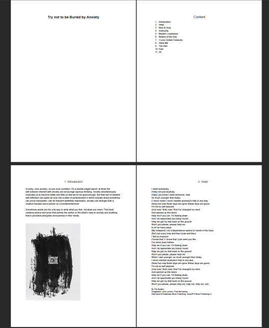
Help! By The Beatles
Songwriters: John Lennon / Paul McCartney
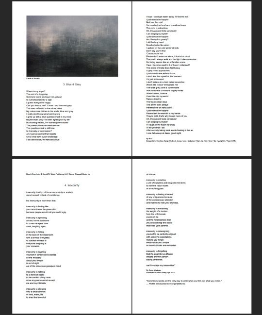
Blue & Grey By BTS
Songwriters: Hee Soo Kang / Ho Seok Jeong / Levi / Metaphor / Nam Jun Kim / Nive / Tae Hyung Kim / Yoon Gi Min
Insecurity By Sonja Milekovic
Published on Hello Poetry, Apr 2015.
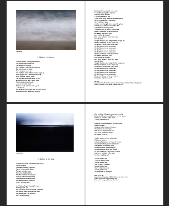
Modern Loneliness By Lauv
Songwriters: Ari Leff / Jonathan Simpson / Michael Matosic / Michael Pollack / Mike Elizondo
Bottom of the Sea By Yi Zhi Liu Lian
Songwriters: Yi Zhi Liu Lian / PSROSIE / Shou Yan / Xiao Hei Voc English translation by Isaiah Siegfried Chen
I Love Certain Gestures By Valerio Magrelli
Published by Poetry, October/November 1989.
Allow Me By Chungmi Kim
Published by Red Hen Press, 2004.
The Nails By C.K. Williams
Published by Farrar Straus and Giroux, 1999.
Fear By MINO / Taeyang
Songwriters: Ji Ho Woo / Min Ho Song / Ji Yong Park
28 By Agust D / NiiHWA
Songwriters: Hee Soo Kang / Yi Jeong Jang / Yoon Gi Min
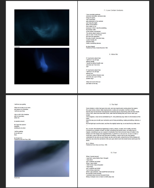
The contents are songs that I have listened to and some of the poems are the ones that I have studied before in high school. These are all related to my topic and they talk about the author/artist's own struggle and feelings of being anxious.
1 note
·
View note