grad701designforchangejordantane
GRAD701 Design for Change Jordan Tane
120 posts
Don't wanna be here? Send us removal request.
Last Seen Blogs

dokidobe
yellow.dr.monv

walonsy
♡ I'm a Dreamer ♡

funnysamy
I don't know.
chainymail
Clank Clank

malaumersing77
BATANGBENGKOK
Text
Reflection
When I look back on the past few months, I cannot believe how far we have come as a group. A common interest brought us together and kept us together to the end. We knew our project needed to be Māori and Pasifika focused and we never lost sight of that.
We stayed strong as a group when others were trying to direct us in a slightly different direction as we believed in what we were doing. This did not mean however that we stuck to our guns. Having people challenge us actually improved our work and our eventtual outcomes as we had to strive to make people understand what our project was all about.
We were not afraid to regroup and change tact slightly and a good example here was when we had originally envisaged that we would get young Māori and Pasifika to learn their native languages which would ultimately help them identify more with their cultures. We soon realised that this was too broad so we repositioned ourselves and started to focus on showing young Māori and Pasifika people that it is up to them to say how much they identify with their cultures and it does not matter if they do not speak their native language or know about their culture.
There were a few key moments that shaped our campaign and the first was making the decision to use portaits of the people we were walking to as visuals and then even more so, imstead of reading a blurb on how each peoson identifyed, I asked them to draw how they felt they identified.
The next key moment was the the development of our logo and typography. It was short, it was simple and it got the message accross bit most importantly, gave context to our visuals.
I know we made people were were interviewing reconsider their identities and that showed me we were on the right track and that we can change people’s attitudes.
I would not change a thing about this experience as even though we had some tough and frustrating moment, they shaped our campaign and only made it better.
0 notes
Text
Brand book


The whole point of a brand book is to showcase the brand system of your campaign and I really enjoyed putting this together. We used our brandsystem and the language we had used in our campaign to produce this brand book.
The aim of the brand book to me was to tell our story frok the start to finish. I could not be happier with the final product as it tells the story from the beginning and what our aim was to the final outcomes.
The key features to me were the logo, typography and the visuals. The handwritten font along with the title font made the logo and the brand. It was consistent throughout the campaign as well as the brand book. The visuals were the impact that connects the viewer to the campaign. It all worked together I felt and strengthened the brand system.
As the ‘challenges’ page explains, we did have problems with having people understand what the aim of our campaign was and other key features. This only made our campaign stronger however as we had to go out of our way to make sure people did get it and did understand what was so important to us.
0 notes
Text
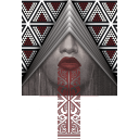
Lenticular Prints


Lenticular printing is where two images are displayed on one canvas. The image will change and appear to move depending on the angle in which it is viewed. With the portraits and drawings, we needed to give it context without taking away from the image. That is why having the ability to have two images was essential. As a result of this sense of movement, the audience will spend more time interacting. This will ultimately have a longer impact on the viewer and will more likely lead to better memory retention.
I knew from the onset of this project that I wanted to complete the posters as my outcome as these are often what grabs people’s attention initially but them remains ingrained in the viewers brain. They need to be powerful but at the same time simple.
I found as I progressed with this project however that I felt I needed something more impactful and I knew lenticular printing was the way I needed to go. The fact that you can see images from two different directions will grab peoples attention as they will notice it as they walk towards it and then see that from the other angle as they walk past that there is another image. This invariably makes them go back and look again. It can be humorous to see someone going back and forth to see the progression from one image to the other. The result is that they will not forget it and it will remain etched into their brain for longer.
The effect of having many of these boards together is even more powerful and I would have loved to have had as many as I could. The issue was timing and cost to be honest. Each board between the the crafting wood and the printing of the posters itself was expensive. Not only that, the time it took to make each of these boards was very labour intensive and difficult as the dimensions had to be precise.
In saying all of this however, I could not be happier with the result as I know it will help portray our message. The other major development with the lenticular printing was the actual 2 images. Originally my concept was to have the plain image of my subjects and then the other image showing the visualisations that each of my models had. This did not portray the message however and I realised that it did not give the viewer context. This is when I changed to the concept of having one of our title lines such as What makes me Maori?
This gave me the context I needed and gave the viewer the notion that this is well and truly to do with how my subjects identify with their cultures and what their struggles are.
0 notes
Text
Product shots


Final product photoshoot of Kyani’s and Sisi’s outcomes as we needed these for our brand book. You will notice that I used black background for all these images as this is in line with our colour palette. The other reason is that having a black background means the viewer will not be distracted.
0 notes
Text
Setting up Brand Document


When I print testing our brand book I realised that I needed to change the font size and grid system since we are printing at A3. On screen it had looked different, but when it was printed, the font size was too large and overpowered the page.
0 notes
Text
Presentation Script


I originally wrote the script for our presentation as I wanted us to be prepared and have time to practice so we all knew what to say and what our parts were. When we did get together however to practice, my first draft was far too long so I had to revise.
I have always felt it is best to be prepared for presentations as I do not like it when people read from a script. It seems so fake and insincere. We have a powerful message and campaign and if we presented it like we were not 100 fully invested, then it would have been obvious.
0 notes


Text
Photographing mockups


As I was the one with studio equipment I had the job of photographing and lay-outing everyones outcomes. It was so exciting to see it all come together and to see how all of our outcomes individually were great but together they were powerful and unforgetable.
0 notes
Text
Lenticular making

After making my first lenticular poster, I was asked if I could make a few more (12 was suggested!). I did not like to say but I do not think anyone realised just how long the first one took me to make (not to mention how much each one would cost as it is around $100 just for 1).
It was certainly a labour of love as many burns were received throughout the process as well (thanks to my trusty glue gun). As can be seen from above, each panel had to be measured precisely.
It may not have been easy, but the results speak for themselves (I just hope I don’t have to do many more any time soon!)
0 notes
Text
Final Prints


When I completed my prototype board I had cut each panel and then attached it to my panels but I was never quite happy with the final results. I then had the idea to print 2 panels together which could then be folded in the middle. This was it could fit over the top of each triangular panel. The result of doing it this way was that it had a much more professional look.
0 notes
Text

My first test mockup of what my lentilcuar print outcomes would look like in a display format
0 notes
Text
Lenticular printing


The printing of the panels for my prototype board which I had changed. The idea was to fold in the middle and this would lay over each triangular panel which gave a much more professional look.
0 notes
Text
Group Report
Jordan Tane, Sisi Panikoula, Gloria Falaniko and Kyani Utia
Part 1
Tasks and activities
Around 300 words.
As a group of four, we agreed, at the start of our process, that we wanted our project to be Māori and Pasifika focused. Coming from different backgrounds, we were able to each bring our own cultural advisory and knowledge to the team. This has been constant throughout our project and has remained a key motivator for our work. A key contributor to the development of our project was the regular workload reports/mini deadlines that were led by Jordan. This allowed for us to have a significant amount of work done by a certain time, whether it be big or small tasks. When it came to cultural advisory, Jordan and Kyani were in charge of emailing and getting in touch with certain people. This is included setting up meetings and following up on emails. As a team, we all contributed to giving each other feedback on our individual work and design outcomes. This meant keeping each other accountable for the amount of work each of us are putting in as well as any mistakes or when someone may be going off-track. Gloria and Sisi were key participants for note taking and writing down of our conversations and discussions.
When it came to design, Jordan led our photoshoot, that is essentially our key component to our project. This meant art directing our models and their positioning, the tone of the design, and look and feel. A detrimental part of this was the equipment, space (taken at Jordan’s house) and time that contributed to a successful photoshoot. We each spent majority of our time working on our project outside of class time. This meant we were all constantly ideating and developing our project.
Each of us, at different stages, were initiators for the pivoting of our project. The approach to our project was constantly changing and it called for the shifting of our thinking or even a completely new idea – where each of us had the chance of taking the lead with this.
Part 2
Group protocols and processes
Around 300 words.
Our main platform that we used, remotely and in-person, was Microsoft Teams. In order to ensure we each were all on track, we began with a mini deadline system, to which usually gave us two days to complete them (through the chat feature). This entailed outlining a list of tasks/homework we each had to complete by a certain day. Through Teams, we set tasks such as research that needed to be done, design exploration, definitions we had to write up, finalizing parts of our project (tone of voice, keywords, target market), and mood boarding. At times, we would also assign specific tasks to different people, and this was sometimes determined by each of our strengths. With this method, we were able bring our work together and slowly refine. Jordan and Kyani mostly assigned these tasks however, we agreed on them as a group. This was a constant structure that we continued to follow throughout our process. An advantage that we had as a group was that we already knew each other and were able to check-in very regularly if not every day. This also allowed us to give honest constructive feedback and were able to work with each other’s strengths and weaknesses. We set regular online meetings which were usually twice week (excluding class-time), however, we were always in-contact through the Teams chat messaging.
When it came to being able to work in-person and regularly come to campus, it was not only easier to work but even more so help each other stay motivated. Sisi and Gloria were strong motivators and challengers of our work, constantly offering encouragement and support. However, our key motivation for this project was our passion for the topic, where we were able to see ourselves in our project. In addition to this, on a cultural sphere, a significant part pf our process was receiving outside support, help and advisory.
Possible Photos
· Chat messaging (tasks set on teams)
· Our meetings (online or offline)
Part 3
Learning and challenges
Around 200+ words.
Learnings
What we learnt was how we each work together and being able to lean on each other’s expertise. We each brought something different to the table and could challenge, improve, and make suggestions on each other’s work, while gaining new skills in the process. A huge part of our project was networking and initiating conversations with the people around us. We learnt that having real conversations with friends, family and classmates was just as effective as journal article readings and educational videos. An integral part of our project was getting in touch with a range of people outside of class for cultural advisory. We reached out to a range of people from AUT such as Albert Refiti, Jenni Tupu, AUT Maori, Pacific at AUT, Natalie Robertson, and John Vea. We even had the awesome opportunity of discussing our project with Johnson McKay and Storm Smith from Ira Design at their design studio. The entirety of the process, from emailing, following up and scheduling time to meet with our advisories, was a huge learning curve. Throughout this we were able to build confidence in articulating and showcasing our project with each time becoming clearer and more concise, especially with the complexity of our topic.
Another significant aspect was growing in our own culture. A key takeaway from this project was learning to take pride in our culture by bringing it into a space (communications design) that has very little to no Pasifika representation. We found that the key a successful campaign was making people uncomfortable.
Challenges
With a Māori and Pasifika focused project, our initial challenge was not having cultural advisory in the class. It was difficult articulating the project in a way where others were able to understand it. However, this lack of understanding was a pivotal part of the development of our project. Another key challenge was finding examples of design work that were similar to ours, as there was very little to no Pasifika graphic design work. It was challenge researching design projects and campaigns that we could follow and test its success and effectiveness.
Although reaching out to a range of people outside of class was a huge part of our process, it was also a challenge. Not all replied to us or were available. This meant, not progressing with the project due to lack of information or advisory on our topic. Time management such as organising time that we could meet that worked for everyone was also a key challenge when it came to reaching out to people. In addition to this, the focus group questions that we had formulated were quite difficult for our subjects to answer. Some questions were too deep and complex to answer effectively. On the other hand, what came out of this was the switching to ‘portrait drawing’ activity, to which was significantly more effective.
Another challenge was positioning our project. With a Māori and Pasifika topic that looks at cultural identity and the seriousness that comes with it, it was difficult to get our project to say what we wanted it to say. From a language and typography driven project to an encouraging cultural journey campaign to where it is now, we were adamant on the project showcasing our true intention. A central part to this was deciding on design outcomes that incorporated all of our research and work that was effective, taking into consideration us as third design students and not educators or professionals.
As a group, we would not change anything about our process and obstacles. Our project would not be when it is now if it weren’t for these cultural challenges and having our ideas challenged. We have learnt to not only see importance in our issue and seriousness of our issue but also not have to defend it.
0 notes
Text
Final Title/first look into the campaign

I wanted to have a title page of some kind that introduced not only the name of our campaign but also a sneak peak of the content.
It shows our brand system in fact on this one page. The colour palette that did not deviate at all throughout. The logo, typography and the visuals we produced. It even gives the viewer a sense of what it is all about. I did not want the outcomes to show on this titile page as I feel you need the viewer to want to look through to see for themselves. The title page is meant to grab the viewers attention and I feel this does.
0 notes
Video
undefined
tumblr
This animation acts an extra set of thought-provoking questions and showcase the confronting and bold statements, which aims to challenge what you believe the term plastic means.
0 notes
Text
Lenticular Final Mockups


As I was aiming to create 4 lenticular prints. It was essential that I chose the right candidates to be depicted on these posters.
Colour and visual impact was important to me when I selected them as well as the individual models own visualisations that they had drawn themselves on my ipad over their images.
0 notes
Text
Final Portraits


When looking at each portrait all together is when you can really see the impact that this set of work has.
Photography has been used to help the viewer connect with the campaign. The viewer looks in the eyes of these people and connect instantly. This is the power of photography and why it was important to have it as an integral part of our campaign.
They each felt they really captured how they felt visually rather than how they had tried to describe how they felt when we asked them the interview questions.
It is obvious from each of these images that each felt they did not have the right to identify with their culture.
I was so grateful for each and every one of my models who gave up their time to not only pose for me, but for the time they spent talking with me. They let me into their inner most thoughts and struggles with them identifying with their cultures. The kaupapa that we built was amazing and I feel this is portrayed in their final images.
0 notes