
Gris O'Driscoll | 2D Animation | Animation tests, experiments and my writings go here
Don't wanna be here? Send us removal request.
Statistics
We looked inside some of the posts by gris-0 and here's what we found interesting.
Average Info
Notes Per Post
1
Likes Per Post
1
Reblog Per Post
0
Reply Per Post
0
Time Between Posts
1 month
Number of Posts By Type
Text
14
Last Seen Tumblr Blogs


Fun Fact
Tumblr’s website traffic is steadily declining.
Text
MED2306- Cinematography CW2
Task 1: Fly Through
https://vimeo.com/543422524
vimeo
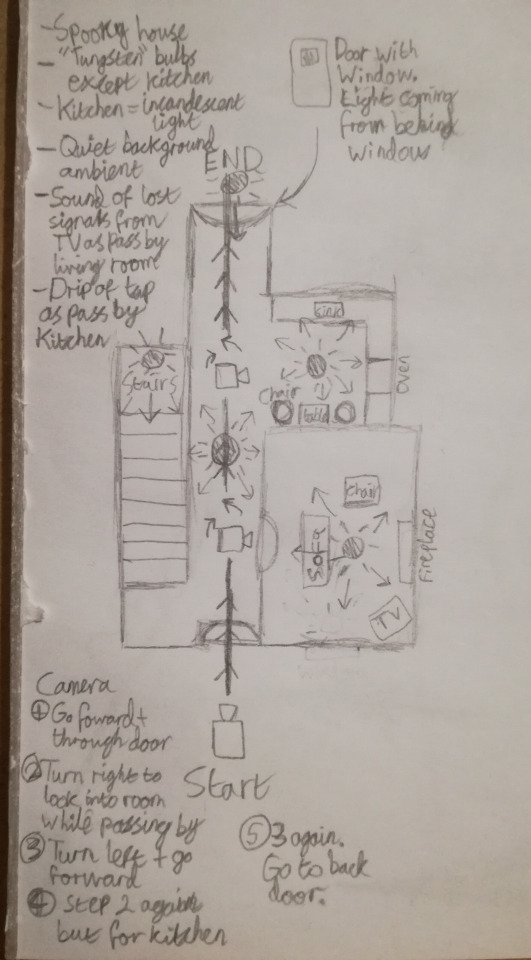
The concept for the setting that the camera would fly through is an unsettling house. The camera begins outside the front door before travelling through a hallway, looking into the living room and the kitchen as it goes and ending by the back door. Lights are located midway through the hallway, in the living room, at the top of the stairs and in the kitchen. The lighting used, due to the setting, are positioned around ceiling level with the light scattering downwards across the area. In doing this it was hoped that the lighting would somewhat emulate the effect of ceiling lights illuminating the set. For a similar reason, all the lights except the kitchen light also have a slight yellow tint to appear similar to old style lightbulbs and add to the general "old abandoned house" feel that was trying to be achieved. The exception is the kitchen, which instead uses a sterile white light that was also meant to feel unsettling.
Parts of the original layout plan are missing in the final animation, though these are mostly just props that were left out due to the tedious nature of searching for suitable, feely accessable 3D assets. The one detail that was left out that would have impacted lighting somewhat was that a backdoor with a window that had light shing through was supposed to be present. This was dropped in the end due to the same reason of finding a 3d asset that suits my needs was deemed as counter productive. However, in a convenient turn of events, the lack of light at the end of the hallway actually adds to the atmosphere and makes the setting slightly more unnerving.
In terms of sound design, though lacking in the final fly through, the notable sounds that were decided would have been TV static and some water drop sounds. The TV static and interference would play as the camera looks into the living room only to fade to silence as the camera turns away, and similarly the water drop sounds would be heard after a point in the hallway, getting louder as the camera approaches the kitchen and quieter as the backdoor is approached. Both sounds would have a slight reverb to them to further add to the feeling of emptiness within the house.
Overall I would say that my aim of achieving a certain atmosphere was successful, though the execution could be better in terms of lighting and camera movement. Camera movement as it turns is extremely janky and timing fails while passing the living room of the house, though it was less so when passing by the kitchen. The main reason this happened was partly out of struggling to find a good frame to have the camera turn to look into the room while still also giving the camera time to look down the hallway again before getting to the kitchen. Ways this could have been amended include slowing the camera movement down the hallway as it passes by the room, extending the hallway out or even having the living room as an open space by changing the set layout. As for lighting, most issues were technical related as often render previews are significantly brighter than final previews, so multiple times certain settings for the light sources had to be changed in order to accommodate. In the end the lighting may have been a bit too bright compared to what was intended, though it came close.

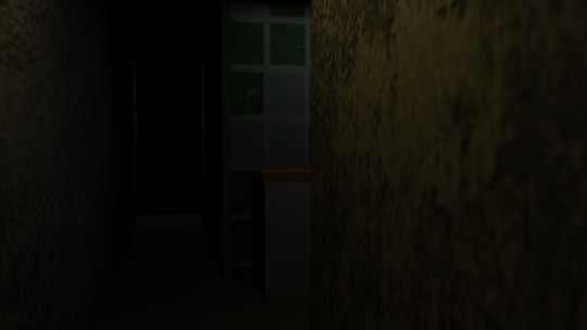
Pictured: The same frame, preview vs final render, before changing the rendering and lighting settings
Task 2: Packshot


Packshots are images of items that are taken in a way that both highlights the object in the picture including all its details and is intended to look appealing to the viewer. They are used in advertising to communicate the product.
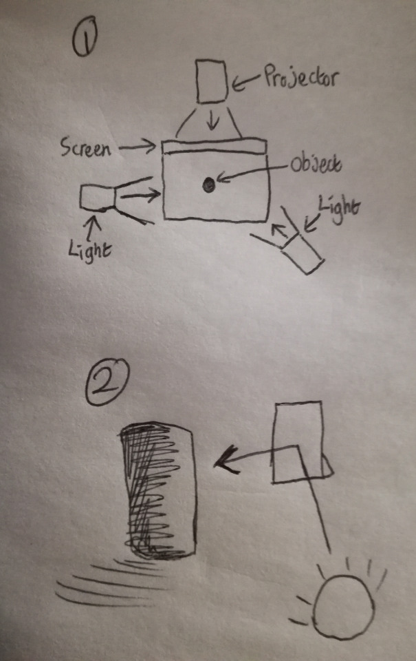
When taking my own packshots I used an energy drink can and a vinyl tiger figurine respectively. The lighting set up was roughly as follows:
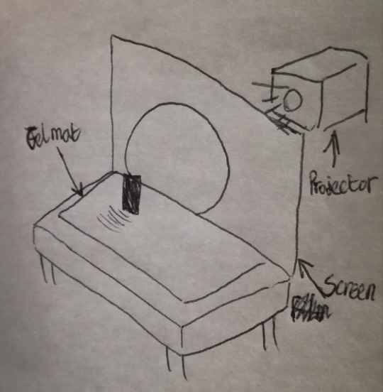
The set up includes a projector that's shining onto a screen which dissipates the light, spreading the area it's casting over, and acting as a backdrop that draws attention to the object in front of it. A gel mat was placed under the object, both to allow the light to shine better on the object and for added visual appeal.
Additional lights were also added when taking my packshots. Two in particular were used to light the front of my chosen objects and the set up for them, at least for the packshot of the tiger model, are pictured in image 1 below. The purpose of the lights are to ensure that the object is lit in an appealing way that brings attention to the important parts of the prop. Due to this, the lighting set up is very similar for the energy drink packshot though the way the lights are placed might differ slightly for the sake of making the object more visible. Though unneeded for my packshots, occassionaly a propped up plain white surface is used to angle the a light source towards the object that the light may not otherwise be able to reach. This is pictured in image 2 and typically is used when taking pictures of transparent objects.
My packshots were mostly successful, though the tiger model image is slightly blurry. Before taking the picture I could have had the camera focus on something else that's the same distance away to ensure the camera is focused correctly. Moreover, in the energy drink packshot some light from the right bleeds onto the backdrop and the gel mat, drawing attention away from the prop and ruining the packshot. This could have been easily fixed by moving the light source further away. Though minor in this instance, in a real life setting the energy drink packshot wouldn't have been accepted for advertising for the mere reason that the can is slightly dented. When creating packshots, everything has to be accounted for to sell the product pictured, including taking into account the state of the product.
Task 3: Glamour and 3 point light shots

Pictured: Glamour shot

Pictured: 3 Point lighting
Glamour shots and 3 point light shots are usually used to take pictures of people as the individual set-ups flatter the subject of the picture. The way this is done usually entails the use of lighting that keeps the individual well-lit but refrains from lighting that's too harsh.
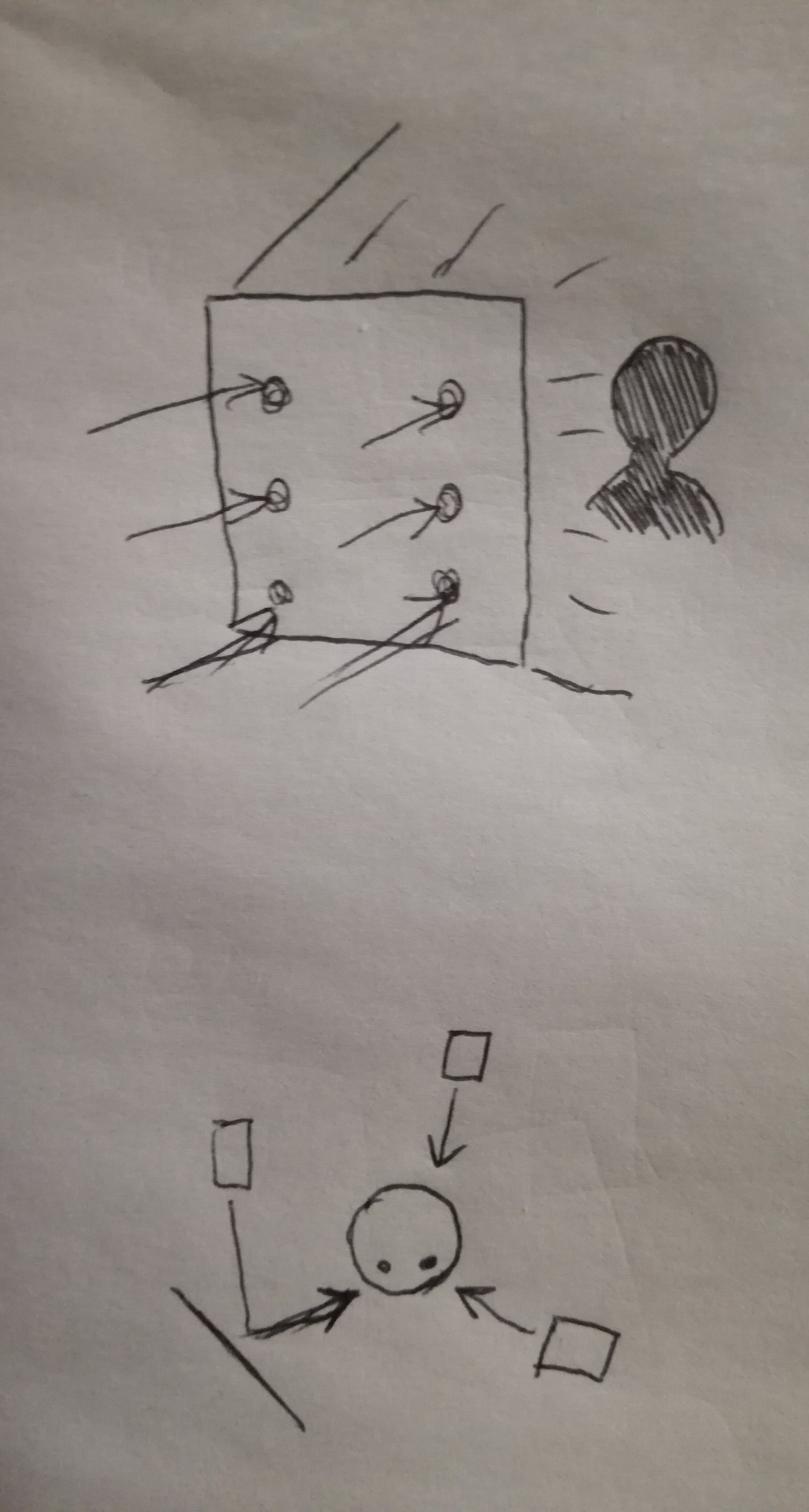
In glamour shots multiple, evenly spread lightsources are used and placed behind a screen that dissipates the light, and the subject sits in front of the screen when the picture is taken. The lighting being evenly placed ensures that as much of the subject's details can be seen as possible while the screen allows the light to scatter and prevents it from being too harsh. The topmost drawing pictured illustrates this.
In 3 point light shots lights are placed two on the front and one on the back with the subject's picture being taken wile standing between them. The light behind the subject is the backlight intended to seperate them from the background and make them stand out more. One of the lights to the front, is the key light that's used as the main source to light the subject. The final lightsource is the fill light that's usually softer and is used to brighten dark shadows that'd otherwise appear from the key light. In the drawing above, the light that's illustrated hitting the surface is the fill light while the light directly shining onto the subject is the key light.
0 notes
Text
MED2306- CW2
1st study- Boring Room Challenge
Video link: https://youtube.com/watch?v=Dd6jOmC2dSE&feature=share
In this study, multiple types of shots had to be used to make a single room or setting appear more interesting. The overall direction that was taken was using a variety of shots to give a sense of narrative structure, all in a single setting.
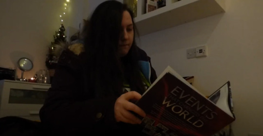
(Pictured: Myself reading a book, medium shot)
The opening shot. The slight low angled view allows the viewer to see that a book is being read while also drawing attention to the person in the shot, who is the main person of focus throughout the video.

(Pictured: Medium-long shot)
A shot taken where the book is placed down on the bed before the person gets up and walks to the front door. The person, who again is one of the main focuses in the video, is placed around the centre of the shot in order to draw the viewer’s attention. The shot also allows a clearer view of the setting- which appears to be an apartment. The lighting is mostly dim to set the atmosphere.
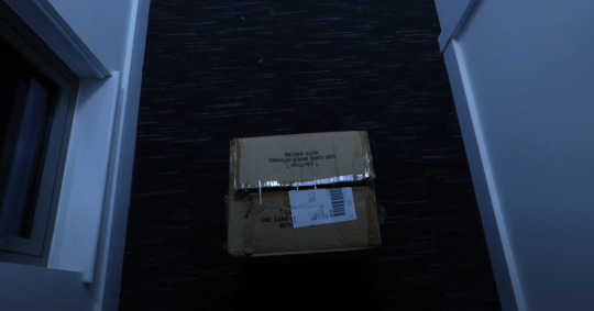
(Pictured: Box at a high angle)
Opening the door, the shot changes to the box. The high angle and positioning of the camera is supposed to simulate a first-person view from the person featured in the video. As up until this point a single character has been the main point of focus, the viewer naturally assumes that the shot is a first-person view.
(Pictured: Extreme long shot)
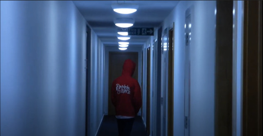
Down the hallway from the box a myserious figure walks away, who is implied to have something to do with the box. In the shot, the camera begins as an extreme long shot but zooms in to become a long shot and focus on the figure. The lighting here is particularly washed out and cold, contrasting with the warm lighting of the apartment. The figure is also stationed in the middle of the shot to draw the viewer’s eye.
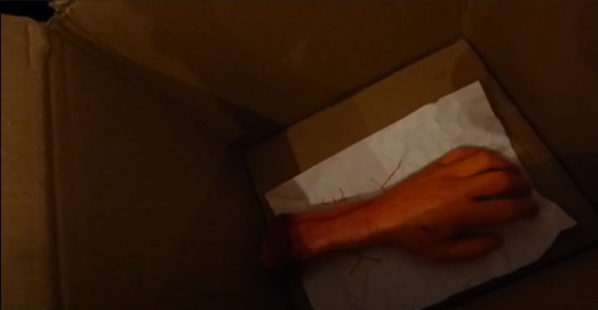
(Pictured: High angle shot of a hand)
A high angled shot taken after opening the box, revealing the contents. The shot differs from previous ones mentioned as the composition draws less attention to the centre of the shot and instead veers off to the right. The overhead shot allows a clear view of the hand, while the composition retains a level of interest in the audience as it’s less mundane compared to a centred composition.
2nd study- A day in 60 seconds
Video link: https://vimeo.com/498957212
The second study differs in some way from the first in that the purpose is to show the progression of time in a day. The main intention was to follow an average day, taking different shots to highlight time and location changing, while also editing the shots together in a way that gives something of a cohesive narrative. As there was some limitation in recording myself directly for the project, a prop was used as a stand-in. This both came with positives and negatives when creating my video.
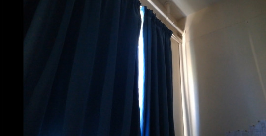
(Pictured: Curtains)
The opening shot was of some curtains with sunlight shining through. The shot signals to the viewer a few details about the setting. Firstly, it’s taken in-doors, possibly in someone’s house. Secondly, and more importantly, it’s daytime. The shot highlights the fact it’s daytime by the use of contrast between the light shining through the curtains and the dark of the room.

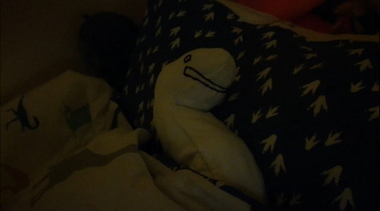
(Pictured: Prop in bed)
Next shot is a short pan over to the prop in bed before the prop is seen moving about a bit, which is implied to be from the sunlight which was established as being there in the previous shot. Again, the prop was a stand-in for myself and my initial idea was to have me be recorded in bed, eyes closed, before squinting from the light and rolling over. As a prop became used instead though, a slight wriggling motion was used instead to indicate a response.
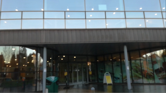
(Pictured: The Hub, establishing shot)
An establishing shot of the Hub, where the camera is facing at the sky before panning down towards the doors. Directly after, the next shot has a coffee being taken out a set of automatic doors, which were implied to be the doors of this buliding as indicated by this shot.
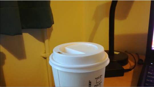
(Pictured: Coffee on desk)
The coffee being placed on the desk, a quick and subtle detail added to the video. The coffee itself is a form of prop and gets referenced slightly later in the video and is actually quite important in representing the change of time. It also should be noted that I found this shot somewhat troublesome to do correctly as both the speed the coffee was placed down had to be in line with the pacing I wanted to have. Also my hand couldn’t be in the shot as it would break immersion as the character the video follows the day of isn’t a human and doesn’t have hands.

(Pictured: Prop looking at screen)
A shot of the prop looking at the screen. Just establishing more of the daily activities being captured at this moment in time, though another later shot will also focus on the screen that now has something different on it. This is to again established the change in time.

(Pictured: Close up shot of the head of the prop)
A close up of the head of the prop that has a slow zoom in, which was a fun addition to include. Given a direction on what would appear in the video was already somewhat decided upon before filming, this would have originally been a shot of my face with a somewhat vacant expression instead. In my opinion the lack of expressive capabilities with the prop makes the shot more amusing as the expression and thoughts of the character get left to both the slow zoom and the viewers.
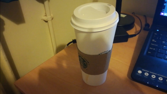
(Pictured: Coffee cup after a fade-in transition)
Another shot of the coffee cup that appeared earlier, which fades from one clip of the cup to the pictured one where it’s moved and the lid is slightly skewed. The transition is supposed to signify that the coffee cup has been used over the course of an undisclosed amount of time, which itself signifies a time shift.
(Pictured: Prop in bed)
The final shot of the film where the prop is in bed, very similarly to how it began at the start of the video, before the light switches off and the screen goes black. The previous shot directly before this also included a shot of the curtains being pulled closed, similarly to how the curtains were pulled open at the start of the video. The two shots exist to show the final moments of the day when everything goes dark and the day is over. The similarity of the opening and ending shots also give the video a somewhat cyclical structure to the narrative.
3rd study- Character cinematography
Before taking the shots of the character model came setting up the lighting. The lighting set up was a basic three point lighting layout, which is most commonly used for photography. In this particular lighting set up there’s a subtle but diffused back light that’s intended to highlight the outline of the subject, a key light intended to highlight parts of the subject and emulate a particular light direction, and finally a fill light that’s intended to maintain visibility in certain features and soften shadows. Back lights are located behind the subject, keylights are often placed in front and facing somewhat down on the subject and fill lights get placed across from the key light to act as a secondary light source. For the sake of differentiating the different light sources in this study, I used a blue light for the key light, a red light for the fill light and a green light for the back light.

(Pictured: Close Up shot of head)
In this shot the camera was placed somewhat below the character, angled upwards. This angle was picked as it would be able to capture the whole head clearly compared to picking an overhead angle. In doing this the lighting used is better visible.
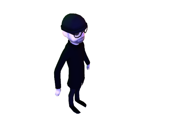
(Pictured: Full body shot)
In this shot an overhead angle was used, unlike with the head shot. As the reason behind picking this angle was to capture the full body in a dynamic way as opposed to having the head and face as the sole focus I felt it was a suitable choice. However, in selecting this angle the use of lighting becomes less obvious though this in part is due to the character being mostly black and not reflecting as much light.
In the process of using this lighting set up the largest issue I found was by far to do with the backlight. Maybe due to my setting choices for the light or the type of light used, the inclusion of the backlight didn’t visibly change how the model was highlighted.
4th study- Reconstruct a painting
The 4th and final study focuses on attempting to emulate the lighting and composition of any painting that seemed suitable.
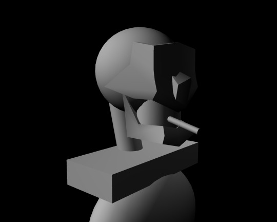
(Pictured: A makeshift 3d model based on the key shapes of the skeleton used in the reference image)
To better do the study I created a simple, low poly model that is supposed to resemble the basic shapes of the skeleton in the original painting I based my study on. Deciding to carry out the task this way came with strengths and weaknesses. The positive in doing this was that I became able to better set up the composition to be more accurate to the original painting, which in itself is a bit of a necessity when the skeleton is the only subject that appears in the painting. However, the issue comes with how low poly models don’t interact with light as well as high poly models due to how the light can’t diffuse as well on a blocky surface. On top of that, when producing my final render I failed to realise how the render would differ from the render preview in Maya, leading to the lighting to appear dimmer overall and for the secondary light source, which was used to highlight the parts of the skeleton furthest way from the viewer, can barely be seen in the final render.
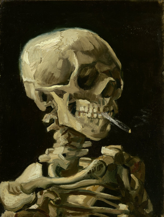
(VAN GOGH, 1886. Head of a Skeleton with a Burning Cigarette [Oil Painting on canvas]. At: Amsterdam: Van Gogh Museum)
Pictured is the original reference painting used to carry out the task. In my CGI recreation I used two light sources. One is above the viewer to the left and would be the lightsource in the painting giving the skill the visible highlights, and one on the other side of the skeleton of a lower luminosity, enough to cast some light to define the skeleton on the black background but not enough to lose the shadows on the front of the skull. As stated previously however, due to a rendering oversight, the lighting overall came out dimmer than expected.
0 notes
Text
MED2304- Animation Studio Skills
1st technical excersise (storyboard a pre-existing scene)
For the first technical excersise, a storyboard was reverse engineered from the opening scene from the movie “Redline” (https://www.youtube.com/watch?v=rRLPdgcGPRg) and from there was analysed shot by shot.
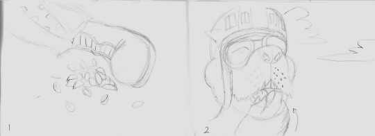
1- Close-up shot of pile of nut shells
2- Close-up shot of a dog-like character, eating nuts
In the opening shot of the scene, a pile of nut shells next to a mysterious foot is the main focus. The shot itself is mostly uneventful with the actions within it, merely having a few extra nut shells fall from above at random points, though in doing this it does place more focus on the audio instead. During the shot, the three main sounds that can be heard are cracking (presumably from the nut shells) the grunts from someone off-screen and the sound of an announcer. The announcer, it should be mentioned, has a voice presentation similar to a sports announcer, as if they’re there for entertainment purposes.
After a cut, then comes the second shot. The head of a dog man is taking up most of the frame and he appears to be the one eating the nuts. He’s wearing goggles and a helmet, implying he might be a racer, though with the casual way he eats the nuts and vacantly looks into the distance he doesn’t appear like he’s about to compete any time soon. On top of taking up most of the shot, a simple sky was picked as the choice for the background which further draws attention to his presence in the shot as well as his appearance. Being a dog man he clearly isn’t human, so the setting must be a fantasy or a sci-fi.

3- Long distance shot of the previous dog person and 3 more on top of a platform
4- Establishing shot of a long racetrack
The third shot shows a long distance shot of a platform with more dog people in similar clothing to the first, three looking off into the distance while one climbs atop the platform before handing cans to the the character closest. Again, the background is a mostly plain sky so focus is placed more on the foreground of the shot and the audio. The characters interactions within the shot are reminiscent of waiting in a spot for an event to start, complete with sending a friend to fetch extra supplies while you continue to wait and ensure no one takes your position. Likewise, the announcer that can be heard mentions an “interplanetary war” at this point, which confirms that the setting is a sci-fi. The announcer also mentions an event called “Redline” that’s still very popular with people from everywhere.
Next shot is an establishing shot revealing a long racetrack framed with tall structures and crowds of people along the sides of the track. The crowds of people present serve to solidify the announcer’s claim that Redline is still popular, while the racetrack serves as an indicator to the nature of what Redline is. The way the structures and signs frame the racetrack draws the viewer’s eye to the centre of the shot and help give an understanding on how long the track is. The shot itself is a low shot angled upwards, further making the scale of the structures and everything else in the scene appear larger than they might actually be and giving an impression to the scale of the event.

5- Long shot of two characters talking in front of a crowd of people
6- Long shot of two more characters talking, this time working on repairs
Panel 5 is a long distance shot where two more dog people, now appearing to be a common sight in this setting, are talking in the foreground while sitting on what appear to be motorbikes. The character to the left is closer to the viewer and takes up more of the shot, so focus is naturally drawn to him in the shot. The second closest character is the other character across from him who he is talking to and also takes up a lot of the shot, though is more isolated to the right hand side. The audio places less focus on the announcer at this point, now focusing on the conversation between the two characters where they appear to be waging bets for the race. With this context the composition of the shot may be reflective somewhat on how confident they feel with their bets, with the one closest to the viewer being the most confident and so taking up the most space. In the background, other noises and sound effects can be heard from what one can assume to be the other people in the vicinity.
Panel 6 has a different two characters talking about the work they’re doing at that current moment. In the overhead shot one can see clearly that they’re building or repairing something mechanical. Given the context from previous shots thus far it’s implied that this is one of the racing vehicles. It should be noted that Redline has an artstyle that uses deep colours but renders highlights with solid white while using black for shadows, and that it uses a lot of black even when one would usually expect a midtone colour. Backgrounds are also rendered in the same style with the same use of colours, leading to characters to somewhat blend in with the surroundings. However, in the instance of this shot this aspect works to an advantage as people become more aware of the elements aside from the characters talking, which is the vehicle they’re working on. Positioning of the characters also help with this focus as the mid point is mainly taken up by part of the vehicle which is coloured magenta compared to the other differing colours in the shot. The character that’s directly next to this part of the vehicle is the only other element in the shot with the same magenta colour with his shoulder pad which is also directly level with the other magenta elements and, if you were to draw it out, would form a horizontal line for where the eye is drawn to in the shot.
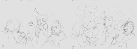
7+8- A group of 3 older characters smoking from tubes before exhaling teal coloured smoke
Two panels for the same shot. Here 3 characters appear to be smoking from some kind of apperatus. The Character’s heads and the apperatus are all above the halfway point of the shot and lined up horizontally. The apperatus itself is gold coloured, is the only gold coloured element in the scene and is slightly off center, being placed more to the left of the shot. Instead, the character in the middle is instead in the centre of the shot. After exhaling the smoke as per panel 8, the smoke is again placed above the half-way point of the shot and is a vibrant teal/green colour in contrast to everything else where much is shaded over with black.

9- Two characters interacting in the midground
10- Three characters in the midground watching a ball getting thrown past them
panels 9 and 10 have similar composition decisions. Characters appear in the midground while bikes are placed in the foreground. Panel 9 has the bike body take up nearly the entire shot beneath the midpoint while the bike handles extend past that. This composition set up allows the viewer to both be able to acknowledge the bike and the character interactions that happen above the half-way point of the shot in similar degrees. In contrast, panel 10 places all the elements beneath a slanted line across the shot with the bike somewhat blending in with the elements behind it. However, parts of the bike in panel 10 are reflecting light with a white shine compared to other things in the scene and still draw attention to it and the bike also takes up space across the entire right hand side of the shot. The background in panel 10 is the sky again as the shot is taken looking at an upwards angle, which creates a contrast between it and the mid and foreground elements in the shot. A ball briefly makes its way across in the top left corner of the shot, and with only the blue sky background behind it it stands out while on-screen.
11- A low angled shot of two characters playing with a ball
12- A child drags their dad from one side of the shot to the other
In panel 11, again, the fore and mid grounds are both below the midsection of the shot. The highest point of the shot only reaches around the middle of the shot and is also the foreground element. The shot is an extreme long shot and everything else is distant by comparison. Once again, the sky takes up most of the shot. A ball that’s being thrown here is seen moving against the sky which, like panel 10, creates a contrast.
Next panel has a shot where a boy is pulling his dad moving from one side of the shot to the other. The perspective is in such a way that two bikes are in the very foreground and obscuring most of the shot, framing the boy and his father moving through. Interestingly enough, the framing of the boy and his father isn’t perfectly centre and instead is slightly to the right.
13- A still shot
14- A long shot of part of the race course
The shot for panel 13 is a still shot of part of a destroyed bike on top of a support beam. The bike on the beam is the main focus of the shot being saturated in the centre and is somewhat framed by a few wires stretching across the bottom of the shot. The bike is an orange colour in contrast to the deep blue of the sky behind it and the grey of the support beams. The shots inclusion might exist to further establish the setting in that there has been many other races in that location before and the destroyed, rusted bike is a testament to that.
Panel 14 shows a long shot, could possibly serve as another establishing shot, of the racetrack. In the distance hills, mountains and the winding road can be seen, and again the road is very centred in the shot. A flying vehicle of some kind approaches, following the path of the track, as the announcer who is talking in the background gets drowned out by the sound of sirens.
15- The hovering vehicle arrives
16- A close-up of the vehicle, revealing a human head manning it
In panel 15, the vehicle finally arrives and stops itself directly in front of the viewer, in the centre of the shot. As it stops, the shot zooms slightly to focus closer on the vehicle.
After a shot change, a view that’s implied to be a close-up of that same vehicle is seen. The Closest element to the viewer within the foreground is an orange dome that contrasts with the grey blue of the rest of the ship. Within this dome appears to be the head of a man wearing a helmet and a headset who turns his head and begins talking, quickly becoming apparent that this man is someone important to the race’s operation. The next element in the shot that draws the eye is the camera on the ship which uses a lot of black in its design but with a highly contrasting white highlight from the lens reflecting light. The final thing the eye is drawn to in the shot is the background that also uses and orange colour, but a more dull variation.

17- The ship flies past a silo
18- The ship turns around to the direction of the silo
For panel 17 the hovering vehicle flies past a silo in the foreground with 4 dog people atop it, which is presumably the same 4 dog people from the first 3 shots that were discussed. As the ship slowly flies to the right of the screen, revealing more of how it looks, the silo moves to the left and slightly upwards. The silo itself stops at around the midpoint of the shot while the 4 characters on top are above that midway point. Most of the background is the sky, however a few signs and other structures do appear in the bottom right corner of the shot. The three orange domes on the ship allow it to stand out from the rest of the shot as they are the only orange coloured elements present.
The final panel has the ship turn around towards the silo, but as it does a light shines into the shot, capturing the viewer’s full attention. At this stage of the shot the silo has moved much further to the left of the screen, and though the light shine isn’t directly in the centre of the shot, it is only slightly off to the left.
2nd technical excersise (create a 2d scene into a 3d scene)
For the second technical excersise the task of creating a 3d scene from 2d elements was done using Adobe After Effects. While the task allowed me to potentially create a 3d looking scene out of a pre-existing photo by cutting out foreground, midground and background segments using a single image, I instead decided to make my own scene from scratch by gathering a set of images I found online.
The images are as follows:


Camera settings came next. The camera was set to allow keyframing which also then had the setting enabled for easy ease, which directly allows After Effect to automatically ease in and ease out for camera funtions between keyframes. Depth of field was turned on for the camera to allow object further away to appear blurry. Focus distance was then adjusted in order to dictate how close images have to be before they blur. Aperture was changed to alter how distant images appeared and the blur settings edited so things didn’t blur too much in line with the other settings. After the right settings were decided upon the camera position was keyframed at one part of the stage and keyframed at a different part, closer to the background and more to the right, while After effects generated the in between frames of camera movement from point A to point B. Due to how a room was selected to be the setting of the video I felt it was better to make everything more enclosed like you would expect. In doing this however by not increasing the aperture or blur to too high of a number for example, a lot of potential depth that could have been shown was lost.
Throughout the process of doing this exersise, this video tutorial was followed: https://www.youtube.com/watch?v=NmynUfkgOpo
3rd technical excersise (stop motion character design)
This stop motion character was originally planned to be made using lightweight material for the clothes, some kind of fuzzy, hairlike material for the hair and the legs to be painted on, which would make the creation process of the character more streamlined as less time and resources would be needed to work on the legs.
By the end the character came out very similar to the original plans. Differences did occur such as with the colours ending up being deeper and a few features missing in the final model, such as the belt buckle. Though the shirt was planned to be filled out using toy stuffing in the original design, a sponge body was instead used in the final model. This is due to being able to more accurates make the body appear more accurate to how a larger body type looks in terms of body definition, and also because a shirt can be easily sewn around a body that is already there rather than guessing how large the shirt should be without making the body seem too fat or too thin.


4th technical excersise (throwing an object)
The fourth excersise was to animate a character throwing an object in a 3d space, which personally I chose to do in Maya using a character rig I already had on hand.
When animating the first course of action is to research for what you’re about to animate. In this case, I decided that it would be best to animate the character throwing a ball and study how people in baseball pitch as a response to this. Part of my reason for picking this throw style is due to the wealth of documentation of footage and tutorials on how people posture step-by-step when pitching. The resources used for my research are as follows:
https://www.youtube.com/watch?v=iuvoRWnSv7E
https://www.youtube.com/watch?v=jZKvJY6gDfg
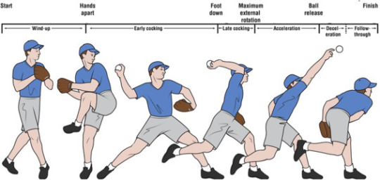
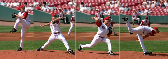
Unfortunately the research quickly came with the discovery that baseball pitchers have slightly different and varied pitching styles. While this did grant the possibility of a few different ways of animating the throw, it meant that I still ultimately had to decide on a single throw style and go from there. Ultimately the throw style I went with is a blend of the one featured in the Howcast pitching tutorial video and the one featured in the step-by-step throw process image of the man in the blue shirt.
When animating the throw the process can be broken down into steps. In this instance the steps include a wind up where the character places their center of gravity on one leg, the one that corresponds to the same side with the hand holding the ball, and pulls back. Next step is the character stretches their leg out that they aren’t balancing on and move their center of gravity to the foot, all while twisting their chest in the direction towards where they’re going to throw while being led non-throwing arm first. As the chest twists the hand throwing the ball moves towards th throwing direction while slightly bent, and upon the arm moving level past the head the forearm extends and the ball is released.
5th + 6th technical excersise (building and rendering a chair)
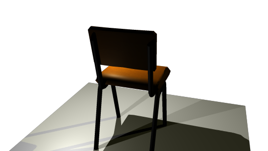
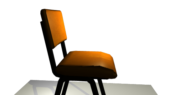
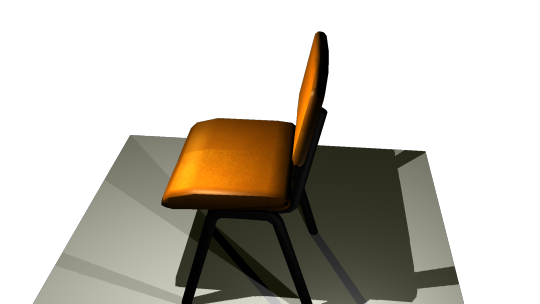
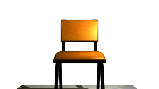
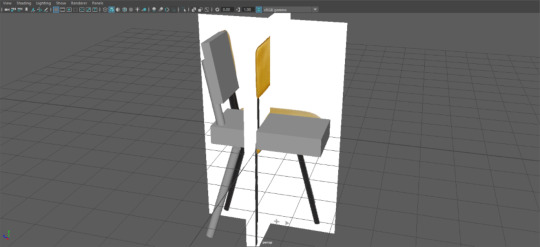
To begin making a model chair, first a reference needs to be found. As the chair being made is one that will be based directly on a chair that already exists, a set of references taken from different angles of the chair will be needed, especially for the front and side views of the chair.


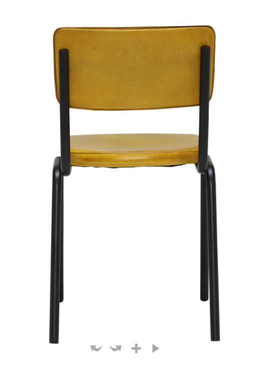


After finding the references, the next step is to import the front and side images into Maya. This is done through the use of image planes placed directly into the different camera angle ports.

Even this early on in creating a chair were issues met. In particular, side view didn’t already exist for the chair though a front view did. However, the original source for the images did allow a 360 degree view of the chair in an interactive viewer, so the side image was acquired through screenshotting the side view of the chair. While there were no other options in this case to get the necessary angles of the chair, it did also lead to a lot of time being wasted attempting to crop and scale the image correctly to align and be the same size and dimensions as the chair image that already existed.
Next step was roughly planning the basic shapes of the chair. Only half the chair needed to be worked on as it would be mirrored to ensure symmetry. Likewise, only one leg was also worked on to also be mirrored.

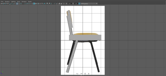
After planning the basic shapes, next was adding more vertices and manipulating the shape to be more like the reference images. It was around this point that the chair not being a direct side and front view became an apparent problem when deciding the width and length of the cushion segments, so a rough estimation of the actual size and shape was made based off some of the other reference images.
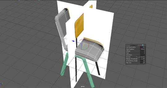
After creating the general shape of the chair came mirroring parts of it.

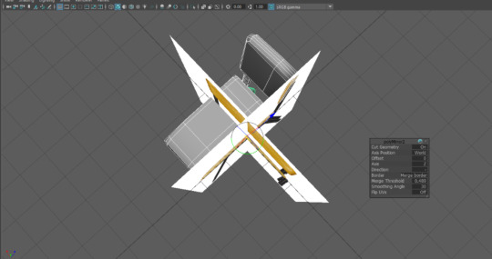

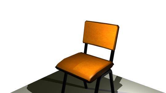
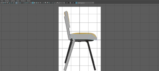
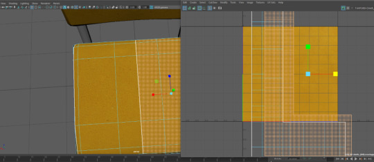
Now the chair model itself had been completed, texturing was next. Fortunately, a sample of the chair material was one of the reference images already available to me. This texture was applied to the cushion parts of the chair, then the UVs for the parts of the chair that use it were scaled up in the UV editor to make the texture smaller.
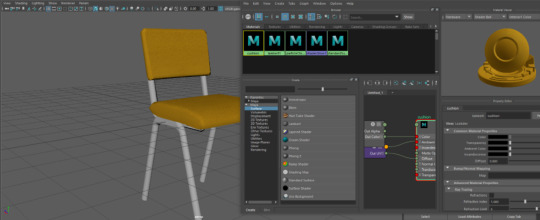
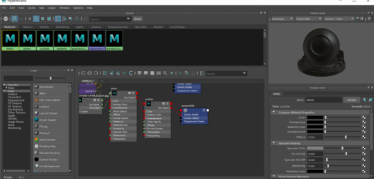
After was editing the shaders on the texture. Initially there was somewhat of a roadblock in using the shaders as I lacked experience using nodes in Maya, making both the node view somewhat hard to navigate and figuring out how to link nodes together in the correct way somewhat confusing. After figuring out however, all that was left to do was adjusting the way light interacts with the texture while using my reference images to decide the most accurate settings. Adding a shader was also applied to the metallic parts of the chair afterwards. Both parts of the chair use the Blinn shader as that shader has the quality of being able to reflect a lot of light, which makes it both suitable for metal objects or shiny material like chair leather.

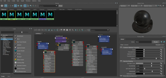
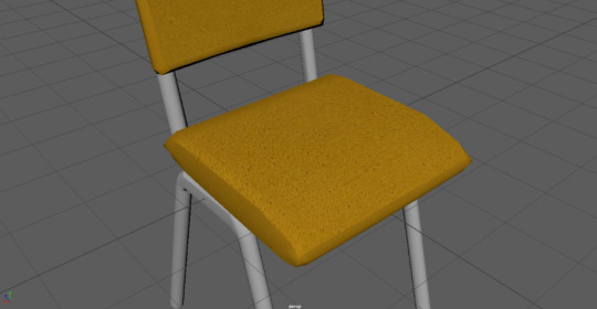
Finally, after the shaders were applied and the process moved onto organising lighting and camera set-up for rendering purposes, it quickly became obvious that the preview image provided in the hypershade viewer might not be the most accurate for how the material will look when in the renderer. To accommodate, the shaders were adjusted while using the render view as a reference instead.

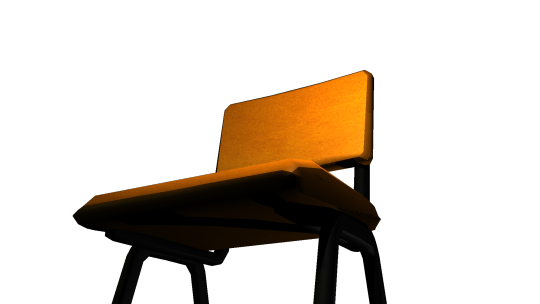
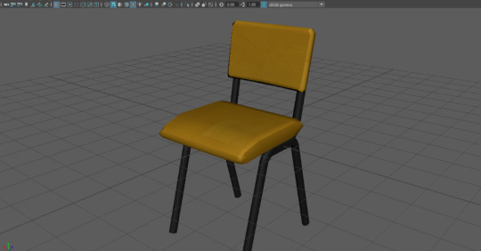
Overall, a decent attempt at a chair model. After saving the rendered images it appears that the chair itself appears significantly more orange than the direct render view in Maya, which might possibly be due to how one of the light sources I used I set to have it project a warm toned, light yellow, light, though given how different the final render looks from the previews there probably another reason. Regardless, my final thoughts are that the shaders are one of the highlights in the finished model though the model itself is extremely low poly and next time I should smoothen my model or increase the poly count.
0 notes
Text
Med 1443 Design for Animation- Pre-production of an Animation
Storyboard: Scene 1- https://vimeo.com/418403045 Scene 2- https://vimeo.com/418403894
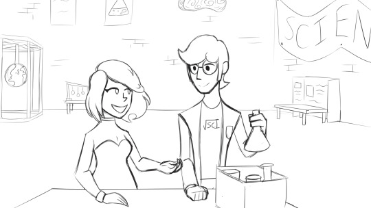
Indisputably pre-production is an extremely key yet a lesser talked about stage of the animation process. The pre-production encompasses several stages overall, though is in simple terms everything that comes before the actual production of the animation itself that will be needed to successfully communicate the visions for the final product to those who will work on it. In the very beginning of the pre-production stages an animation is nothing more that a simple idea. In the real world, one may have an idea and wish to bring it to reality, however, are unable to do it alone. In these situations the idea may be pitched to a client who will be able to provide the resources to take the idea further. In these situations it’s best to bring as many visual resources as possible to the pitch as to better to communicate your idea and know what ultimate goal you have for the project, ensuring it’s possible to achieve your vision. This aspect includes how one plans to incorporate design decisions into the animation which will keep the animation possible to achieve while also still appealing to the client. To emulate this scenario a theme was given, “trapped”, and we were expected to pitch our individual ideas to the class on how we interpret the theme and would create an animation based on it. It remanded answers to a range of questions: What is the plot? Who is the main character? The setting? How does the story resolve? Ect.

For my own pitch, there were in fact two characters: Sebastian and Christie. Sebastian is a geeky aspiring scientist who gets easily flustered and is quite smart, though he also has a bit of an attention-seeking streak to a fault. Christie can be easily summed up as the trendy popular girl, being social and fun to be around with a sense of humour but perhaps a little hot-headed. Christie is also interested in science but to much of a lesser degree compared to Sebastian.
Within the animation itself, Sebastian, Studying the sciences, finds himself performing chemistry at a science fair and impressing the masses with it. From there he sees Christie over in the distance and is taken aback, and after Christie takes notice of him he decides to try and impress her only to mix the wrong chemicals by mistake. This results in him being covered in liquid and making a mess. While cleaning up, totally defeated, a love letter is handed to him, and looking up the letter belonged to none other than Christie who wasn’t put off by Sebastian’s failure at all. This plot is meant to interpret the theme in a more metaphorical sense in that Sebastian fails his goal of impressing the girl he has a crush on and so is stuck socially, at least until the resolution.
When performing the pitch, at the time, the character boards were incomplete but the storyboard was finished. However, due to error the storyboard used in the pitch wasn’t exported and was just the raw file, which lead to the inability to show the storyboard during the pitch and that had to be resolved though verbally explaining what was pictured on the storyboard. For feedback concerns were raised over how much planning would be needed for my project as I use multiple characters and also with different shots taken I’d have to draw all the backgrounds alongside them. Moreover, It was mentioned that with how I initially wanted to portray background characters as being simply a universal set of silhouetted figures that there might be the the issue of the animation looking cheap. The feedback given was taken into account, and the way I personally dealt with these issues will be mentioned later.
As we could only make 30-35 seconds for the completed animation design decisions had to be made to reflect that. Any complicated and details for the plot couldn’t be done as there is the heavy risk of going over the allocated time or being unable to complete the animation by the deadline, especially given the project could only be done as an individual and not as a group. A wide range of settings would also be unideal as those settings had to be planned and the backgrounds drawn. Complicated character designs are generally a poor choice for projects with only a single person behind them that have to hit a deadline. Characters should be able to properly convey an idea to the viewer as well as fit in among the setting. Character backstories and backgrounds can’t be too complicated in this instance as there would only be 30 seconds to tell the audience the character background along with the main plot. There were, indeed, many decisions that had to be made.
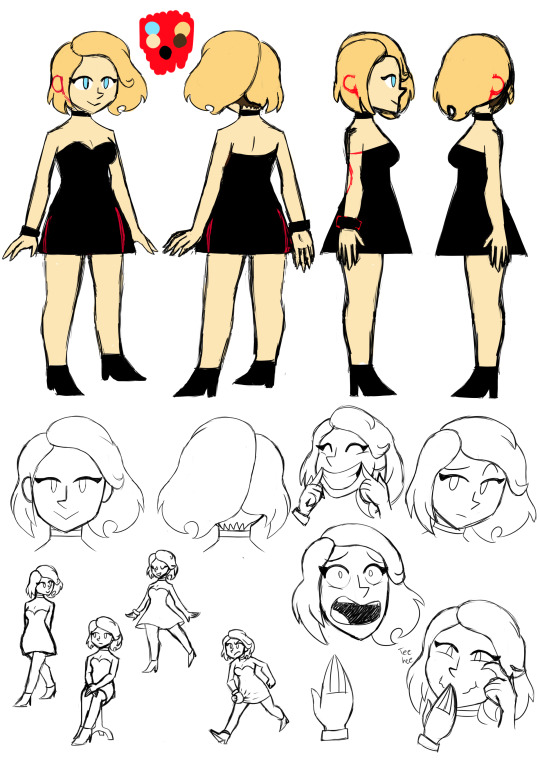
In answer to the plot and characters, I knew I would be unable to make something extremely complicated so story-wise decided upon a simple concept that had been used time and time again. The concept is the typical cliche of a nerd, possibly a social outcast, falling for a pretty girl who is popular and out of his league. This concept is a popular theme in rom-coms but also appears in many other genres, such as the superhero genre in the form of Spiderman in the Marvel Cinematic Universe, Action-comedy in Scott Pilgrim vs. The World, and even books and movies aimed towards children such as Dairy of a WImpy Kid. Though one should often try to avoid cliches when they can, especially in regards to the main plot, in this instance I felt as though it would be a good element of the story as it’s very simple, recognisable and wouldn’t be especially hard to incorporate into a 30 second animation. As for character designs both Sebastian and Christie were more designed to be recognisable in their stereotypes as opposed to aiming towards anything especially remarkable. Sebastian is a geek type character and, like a lot of geek stereotypes, wears glasses and is designed to appear a bit lanky and tall as far as his body type is concerned. He also wears a lab coat, fitting of his interest in science, and wears a shirt with a design that looks like a mix between the inscription “sci” (which is supposed to be shortened from “science”) and a square root symbol incorporated in. He notably still looks unprofessional though even with the lab coat, which leads back to the idea he’s an aspiring scientist and not a real one. Christie on the other hand was designed to appear more pretty and fashion-conscious than Sebastian, and wears a low-cut dress, high heels, and a few accessories in the forms of a bracelet and a choker collar. She’s also notably blonde hair-blue eyed, which is another stereotypical quality, this time of attractive girls.
The artstyle I was aiming for for the animation is one that incorporates mostly simple shapes and lines. The character’s bodies are supposed to be easy to construct and very angular in places. From this decision it became much easier to keep characters consistent and animate them. The concept of designing characters that can be drawn using simple shapes is nothing unusual as the ability for a group of animators to replicate the design in their own drawings is always taken into consideration, as well as how well the design can be quickly drawn and its capacity for flexibility and mobility. Notable designs that use simple shapes include many designs that incorporate the “rubber hose” artstyle, which is characterised by simple body shapes and long, seemingly boneless limbs, and in more modern times cartoons such as Ren and Stimpy, Spongebob and Steven Universe also use a lot of basic shapes in their character designs.
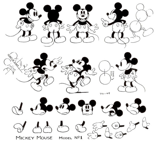
Original Mickey Mouse design (an example of a rubber hose artstyle design)
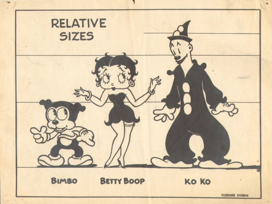
Character designs from Betty Boop (another example of rubber hose artstyle designs)
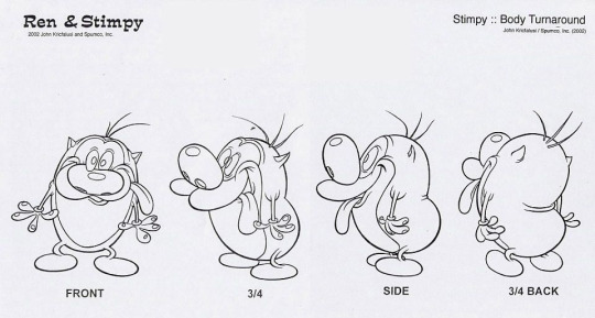
Stimpy’s design from Ren and Stimpy
Character designs from Spongebob
Other small design decisions were also made when I was creating the character designs, such as eyes being drawn as a single line to represent the top eyelid and a circle, Sebastian’s glasses sometimes obscuring one or both eyes, eyebrows only being presesnt when needed to express emotion and characters’ hands only having individual fingers drawn when there is distance between it and other fingers, otherwise simply being represented as a single shape with lines across to represent the fingers. These design decisions mean less time is spent animating as less detail in the drawings is demanded and also helps maintain more consistency.
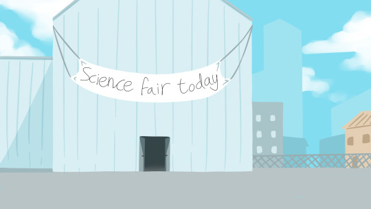
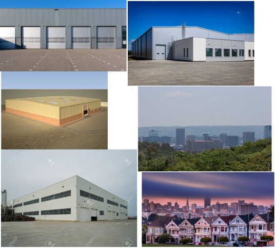
The settings made for the animation are another area to talk about. There are two settings present in the animation, the first one being the outside, external shot of the building hosting the science fair, a shot only present in the very beginning of the animation, and the inside of the building where the science fair is being hosted itself. From first creating the storyboard I already decided how I want the settings to look. The external shot would show that the science fair would be taking place in a large industrial looking building, possibly a warehouse of some kind, while the interior would have an array of science themed attractions and decorations. This inspiration was directly inspired by my own experience attending the Big Bang Science Fair a few years ago which itself was hosted in a large warehouse-like building. A detail added to the background of the external shot are distant buildings and skyscrapers which was a touch added to add to the industrial atmosphere that warehouses tend to have.
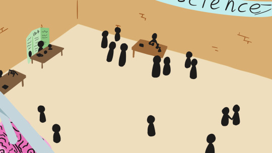
As for the internal shot, the perspective is taken from a high perspective overlooking the area, in which you can see figures in the room and various science attractions. A crowd of people are gathered around a particular table, and as the camera zooms into that area and the shot cuts to Sebastian mixing chemicals together, it implies that he is the person at the table:
In order to design these settings some research was necessary, and so I created two mood boards in order to better understand what was wanting to be incorporated into the settings.
Both of the resulting artworks for the setting were drawn in an external program rather than straight into Harmony. The reason for deciding this is because the setting is the main focus of these shots and so it is important that more control can be possibly given to make the settings look appealing, which would be better achieved in an art program as opposed to in Harmony itself which is instead designed with mainly animating in mind. Instead of Harmony the art was created within Paint Tool SAI, which was the only available option for drawing within at the time of writing. Comparatively to the industry standard Photoshop, SAI is a very flexible art program, very user friendly and achieved the purpose I wanted to use it for, however possesses some limitations such as the inability to type text and insert it into an image and having only basic image editing options available.
The completed art was kept simple partly due to stylistic choice and partly due to being aware of potential time constraints. By keeping the setting art simple it meant that the backgrounds could also be simple without looking out of place. Moreover, a notable feature of the internal shot is that there is a lot of empty space in the room even with the people present, which allows the backgrounds to remain simple even as shot angles change within the animation as very few background elements have to be drawn. The art uses mostly pastel colours, which are easy on the eyes, help portray the tone of the animation as being lighthearted and not particularly serious, and are also different enough from the colours used on the characters to have them stand out but not so much so that the characters look out of place.
The animation process itself had several issues appear that needed to be addressed during production. From the beginning on of the main issues that appeared was in regard to the way I created my storyboard. Though the storyboard itself was easy to follow and there is very little difference between that and the final animation, I separated the animation into two scenes in the hopes that animating could be more easily done bit-by-bit. In itself this isn’t a poor idea, however Storyboard Pro separates scenes into individual Harmony files when exporting. Partway through the production process I became no longer able to access any editing software that could be used to edit the two scenes together, which meant that I had to leave the two scenes separated. The other issue that arose was that I didn’t know at the time how long exactly my storyboard was in relation to the animation, especially after editing the length each storyboard cell plays for. When finally exporting the storyboard I found that the animation would only come to 27 seconds if I followed it scene for scene so some adjustments were made to extend certain shots, maintaining the accuracy to the original plan while also hitting the correct time for the animation. Generally between the storyboard stages and the animation stages of production is an intermediate stage in which animatics are created. Animatics, as stated by Boopanimation.com, are defined as “an animated storyboard [...] with the correct timing and pace of the film”. In regards to this, an animatic is a more detailed storyboard and in particular is often used as the main foundation that animations are created from. All the main features of what the animation includes and its flow is already there as it should be able to successfully communicate the intricacies of the way the finished animation should animate like. Also the animatic should often include sound effects and any spoken dialogue. In the case of my own project this step was missed in part due to a lack of knowledge on how to create an animatic and how to use particular programs to assist me. This lead to a flexibility in the way I can adjust my animation and what it features even after exporting the storyboard, however, it did have a heavy toll on the way the animation flows in my opinion as everything feels like it’s going too fast.
During the actual production itself I structured the way I made the animation by focusing on a particular scene, and then doing one shot at a time. The way the animation was created was through the use of mostly pose-to-pose animation, so creating two keyframes and then planning, and later refining, the motion of the in-betweens. When animating the characters I focused on animating the character’s bodies first before adding details such as the hair in which it’s necessary to animate in a slightly different way as principles such as follow-through and overlapping action are more easily applied to them. Exceptions to using pose-to-pose exist within the animation however in minor details, such as the liquid in the “do not mix” flask after Sebastian Picks it up, liquids as they pour out of flasks, the burst of blue smoke that appears in scene 1 and the love hearts that appear around Sebastian as he’s waving to Christie. All the given examples use straight ahead animation because animating this way tends to offer a more natural, organic flow to the animation that’s suitable for elements such as smoke and liquids but at the potential cost of consistency and time. In comparison, pose-to-pose was mostly used because once an end point is decided for where a character will move to comparatively less time is spent attempting to ensure it flows well and adding details such the rebounding action an object with follow through might have. The overall method I tended to stick to for animating was to draw the key frames, move the image in the key frame slightly frame by frame, and only notably manually drawing in betweens when a reasonable level of motion happens or parts of the body are angled in a way that I was no longer able to use the same base drawing between frames. On one hand this was a great choice to further cut production time and keep consistency, but on the other hand the animation feels mildly stiff and flat. Along the same lines tweening was also used at times when only a single drawing was needed for a scene, again cutting production time but at the expense that the animation looks flat.
Colouring, backgrounds and the finalisation of particular details were some of the last aspects added to the animaton. The backgrounds weren’t particularly hard to make as, like what was previously stated, the setting had key background elements given a lot of space between them so very little had to be drawn in a lot of the shots beyond the walls and floor. One of the more troubling shots that had to be drawn was in regards to when Sebastian looks up to see Christie in the distance for the first time. In the shot established a few seconds before, the setting is represented as having a lot of people present. In this first shot the individuals were represented as vague blobs with circle heads, which I decided upon in the end to save time and felt could be excused due to it being a distant shot. However, in the later scene, the shot is looking out at part of the room on ground level and any people seen that close have to be able to be recognisably people otherwise the animation quality might suffer. In answer to that two background characters are present, one talking to Christie and one closer to Sebastian, clapping at him and keeping some level of consistency between that particular scene and the one right before. Aside from that there are no other people present however, not even any silhouettes, which lead to the scene overall feeling very empty especially given the setting. As for colouring that aspect was surprisingly hard and tedious. With how I created most of the animation, manually moving the same image across multiple frames and only redrawing when necessary, consistency between frames became even more important as the slightest change could potentially be extremely noticable. If I had coloured the keyframe beforehand and then used that same coloured image across frames, adjusting as necessary, the issue might not have been so troublesome. Regardless of this flaw I still dealt with it, either manually using the fill tool across different frames or copy-pasting some of the same elements from previous frames to future frames and transforming them as necessary.
Overall I would say I made a decent attempt at the planning and production of an animation. I succeeded in hitting the deadline, planned the character designs and made reference sheets, added some artwork for the settings, and thought about how I would overcome the issues of time constraints and only being a single individual working on this project. Regardless of that though, many mistakes were made in planning and production that might have done more harm than it was worth. From going through the process of planning and producing the issues found include the following:
The character designs are good for portraying their cliches but could be much simpler
When creating the animation I used the standard 24fps, which meant more frames had to be accounted for that were probably unnecessary
The animation feels flat due to the animation process
Because of the nature of having multiple shots, several backgrounds had to be drawn
The principles of animation weren’t used that extensively due to the animation process, leaving the animation feeling somewhat dull
All of the issues mentioned could have been easily solved if I had thought out the pre-production better. Though I succeeded in making the final animation, unnecessary complexity meant that other areas, notably the animation itself, had to suffer. To mitigate this I would firstly have to reflect on story elements and ask myself whether two characters are really necessary if I were to tweak the story in some way. On top of that, would it be possible to have a single shot used, and use a single background that had more time and focus put into it? The artstyle could be changed, as it mostly keeps characters maintaining somewhat lifelike proportions and body shapes. Do they have to be human at all? If the characters were drawn in an even simpler way then manually drawing more inbetweens might be more plausible which would solve the issues of there not being many animation principles present and the animation feeling flat. In conclusion, when trying to go through the pre-production process again, I’ll need to ask more questions and find better ways of keeping hitting deadlines possible without making quality suffer so much.
0 notes
Text
MED 1443- CW1 (Character design and rigging)
Squirrel run cycle and design
Among some of the most important aspects of not only animation but much visual media in general is character design. Character designs are often used for communicating to the audience in themselves, from being able to tell the audience about a character’s personality to making a statement about the environment and setting. Though much of the time animators are given someone else’s designs to use it is still important to know the best approach to designing a character.
When designing a squirrel to use to animate a run cycle, the most important aspects were ensuring it could communicate to the audience that it’s a squirrel and can be animated like a squirrel. In order to do this images of squirrels had to be studied. The face shape especially was important to get right as the head is one of the main parts to the design the audience will focus on, and if that body part doesn’t resemble a squirrel then it could gravely impact the rest of the design. The other main feature of the design that grants the audience the believably that the character is a squirrel is the tail, which is iconic to squirrels as an animal in both real life and through the design of squirrel characters.
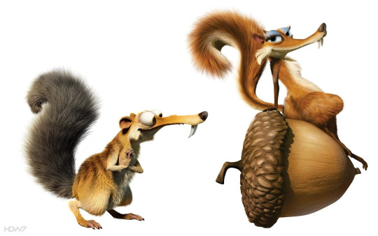
(BLUE SKY STUDIOS, 2009. Scrat and Scratte, two squirrel-like characters [online image]. Available from: http://hdw7.com/wallpapers-286/scrats-in-love.html [Accessed 21st February 2020])
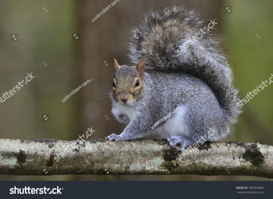
(COLIN ROBERT VARNDELL. Photograph of a grey squirrel [online image]. Available from: https://www.shutterstock.com/image-photo/grey-squirrel-sciurus-carolinensis-345394868 [Accessed 21st February 2020])
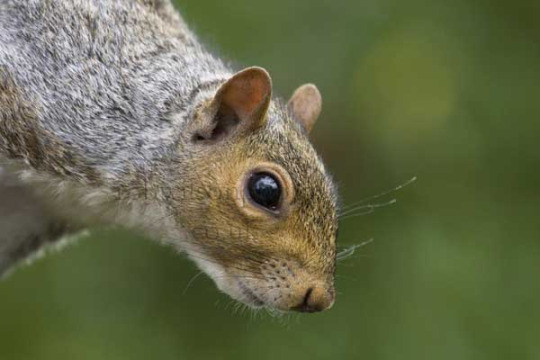
(JILL WILLSON, 2007. Close-up of a grey squirrel [online image]. Available from: http://www.robwilsonphotos.co.uk/grey-squirrel-head-image-p-693.html [Accessed 21st February 2020])
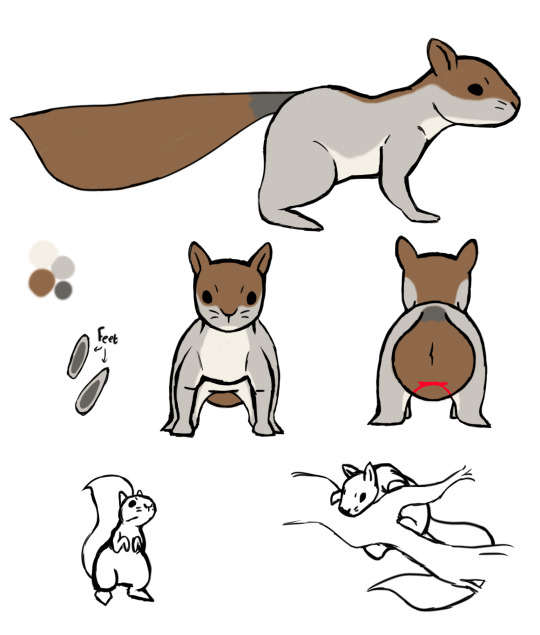
(The character reference sheet of the squirrel design created for the run animation)
Designing characters for an animation entails creating a character sheet to use as reference which is as detailed as possible and presents the design in a variety of angles. Typically this same sheet will also have added detail such as the colour palette and aspects that are featured in the design but cannot be immediately seen from the character rotation. The particular features of the reference sheet I created include the side, front and back views of the character which are fully coloured, the colour palette, and two drawings of the character in different poses. The design and coat colour of the squirrel is heavily based off of a grey squirrel in particular and the design was kept relatively simple to keep the animation of it simple and straight-forward.
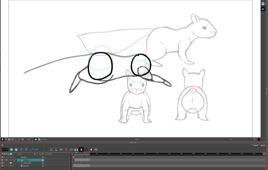
For the animating process it wasn’t particularly different from animating any other walk or run cycle initially. Two circles were first drawn and animated moving separately to each other in circular motions, and then the outline of the body was created from the two circles, the general shapes of the legs were added and a line planning the tail movement was added. Throughout this process the way a squirrel runs was studied and broken down into the key components of the contact, passing, high point, low point and recoil. Part of the reference sheet was exported to Harmony for ease of access. After planning the foundations of the run cycle the inbetweens were added, the legs, head and tail adjusted for a more fluid movement and eventually frames were re-used with adjustments added to create the squirrel’s preparation to jump and the jump itself. The details of the “ground” (actually a tree branch) and leaves in the animation were added last.
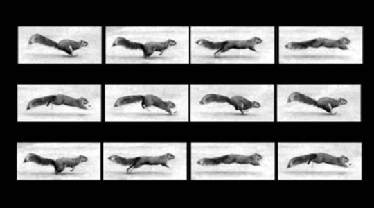
(EDWEARD MUYBRIDGE. An illustrated study on how a squirrel runs [image online]. Available from: https://hannahloughridge.wordpress.com/2014/03/31/a-squirrels-run/ [Accessed 21st February 2020])
youtube
(PHILIPPEHUNGARY, 2015. Squirrel run (slow mo) [video]. Available from: https://www.youtube.com/watch?v=TiPKCEHHSBA [Accessed 21st February 2020])
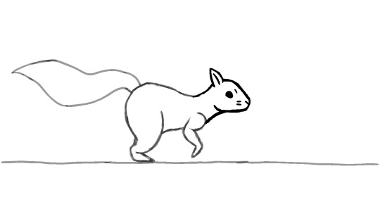
(A frame screenshot, post animation clean-up)
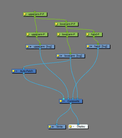
Harmony rigging
Rigging is the process in which either a model or a drawing are given a method to more easily control them. In the case of 2D the process entails attaching separated drawing elements together through pegs and creating a hierarchy. The process of animating using a rig differs significantly with hand drawing the animation as, compared with hand drawing an animation, animating using rigs is mostly animated using tweening and swapping parts with pre-drawn assets. Rigs in 2D pose the benefit of making animation a much faster process and allowing an entire team of animators to use the same assets and give consistency. The general result of such a method of animation can lead to a particular kind of animation style as everything or almost everything is tweened, which might be a good or a bad thing depending on the approach.
As stated previously, rigs are created using individual drawings connected using pegs. When learning how to rig, a simple arm was created to be used. Firstly the arm was created from using the line tool to create two parallel lines, then a circle was added to the midpoint to represent the elbow and mid-arm, then another to one end of the lines to represent the wrist. It was ensured that the circles were large enough to overlap slightly with the lines so the cutter tool could be used. The arm was then duplicated in another layer, and on one layer anything past the mid-arm had the cutter tool be used to delete them, and on the other layer anything before the mid-arm was deleted instead. Afterwards on a new layer a hand was created that overlaps with the representing circle of the wrist. The circles were individually selected, the midpoints found and marked with a small brush size after zooming in on the points to make a note of where to place the pegs. Afterwards the parts of the circles that are within the lines of the arm on the same layer were deleted. The dots in the centre of the circles were used as a point of reference in where to place the pegs.
A menu exists in Harmony called the node library where blocks that represent the layer and other components in the animation are displayed and can be edited, which is used to create a hierarchy for the purposes of rigging. Every time a peg is placed a new representing block (coloured in green) is added to this menu which is named after the layer the peg is placed on with the suffix “-P”. After organising the components in the node library in a clear way, lining them up in the same way the drawing elements are lined up relative to the stage, all the pegs were added and then placed above their associated layers. Relative to the real life body parts the upperarm-P is the “shoulder”, lowerarm-P is the “elbow” and the hand-P is the “wrist”. The lowerarm-P-P is above the lowerarm-P and the hand-P in the hierarchy, so that peg controls both the lower arm and the hand when it moves. The upperarm-P-P is connected to the upperarm-P and the lowerarm-P-P so it controls everything when it moves. The auto-patch is used as an aesthetic element to hid the outline of the arm pieces that overlap across layers and making the arm appear seamless and unsegmented, though when personally attempting to use the auto-patch personally it appeared to not work.
When animating it used mostly keyframes and tweening. The beginning keyframe begins with the arm off stage, and then a few keyframes were added for when the arm rises up and bends, one bending a bit less and lower down, then one not bent but below where the the arm finishes in the animation and finally one of the arm fully stretched out and angled completely horizontally. The keyframes then were moved across the timeline as necessary in order to give the appearance of ease-in and ease-out.
Maya rigging
Rigging in terms of 3D differs quite significantly from rigging in 2D, both in process and in importance. Though rigging 2D isn’t necessary in order to animate, most 3D models that are animated use a rig of some kind. Skeletons are often used in these rigs, which act as a form of structure that allows you to use a 3D model. The skeleton is created independently of the 3D model however, and the skeleton is merely attached to the model mesh itself at a later point.
The process of rigging within a 3D program usually entails creating the skeleton and then adding a method of being able to use the joints without having to select the joints themselves. Within Maya the option exists to create joints, as well as the option to give an X, Y and Z angled view of the stage. To begin making the skeleton I started from the top of a leg and made my way down and did so from angle X, which is a side view of the stage. This was done because it’s the easiest angle to define the leg shape with while also keeping all the joints aligned with each other if viewed from the front view, angle Z.
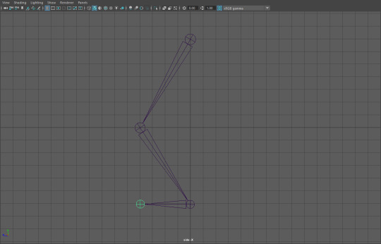
(Creating the leg from a side view)
After creating the leg in this angle, the camera angle was changed to angle Z and then the leg was duplicated and the duplicate was moved beside the original leg with a gap present. The grid was used as a point of reference to ensure the legs were aligned with each other as much as possible. Afterwards, the view of the stage was changed to view X again for the purpose of creating a spine, and afterwards the spine was centred between the two legs but placed slightly above them. The top of the legs were then joined to the spine via making the bottom-most spine joint the parent of the children upper leg joints. By parenting a joint the joint then will make a “child” to that parent move with the parent when it moves, but if the “child” is moved itself the parent won’t follow. Two arms were also created while in the view of angle X and duplicated as the legs were, then connected to the top of the spine by parenting.
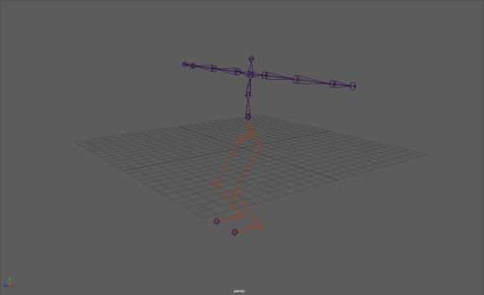
(The skeleton, partway through assigning IK handles)
IK handles were added after the initial skeleton was completed. Notably IK handles are important to the rigging process as they act as means of limiting to what extent joints can move in relation to other joints. Mainly, without any IK handles assigned a joint would be able to be moved anywhere on the stage which would cause issues when adding a mesh to the rig as then the mesh could be transformed or moved in unintended ways. With an IK handle assigned, attempting to move a joint up and down would just rotate the joint around the other joint the handle is assigned to and no transformations in the rig would occur. Any joints assigned with an IK handle become a red colour in Maya as opposed to blue.
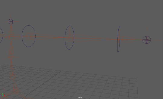
(Final stages of the rig; adding NURBS circles)
The final step to rigging a skeleton is to add a method of controlling the joints besides selecting the joints themselves. Besides making model movement much easier, this step is also taken as selecting the joints themselves could also lead to issues such as accidentally changing the skeleton rig in some way. In order to perform this step in the rigging process NURBS circles are used. The joints of the skeleton are first checked to see if they’re pointing at an angle, and if so those same angles must be applied to the associated NURBS circle. This step must be applied to every NURBS circle. The NURBS circle can then be placed to the designated joint by selecting the circle and holding Q, which snaps the circle to the centre of the joint. Afterward the circle can be properly assigned to control a joint, though that stage will be explored at a later point by myself along with perhaps creating a mesh.
Expressions and head turn
When creating or designing a character the face is important to take into account as much of the time it’s the main method of allowing the audience to know what a character is thinking and feeling besides through body language. With this in mind a range of expressions a character can display should be drawn for reference purposes. As an example of this process I quickly designed a head design for a character, whose default expression appears a bit serious but is quite expressive with the range of emotion they can display. The actual head proportions remain mostly consistent with what you would expect from real life head proportions, and when creating the base construction of the head using circles and lines, lines were added across the “face” to plot where certain facial elements would go. These same lines were also extended out using different coloured lines on a seperate layer to cross the front view of the face and ensure the proportions and facial construction remained relatively consistent across different angles. To remain consistent with the proportions of the front of the head, the front of the head was copied and everything within the outlines of the head erased and redrawn to create the back view of the head.
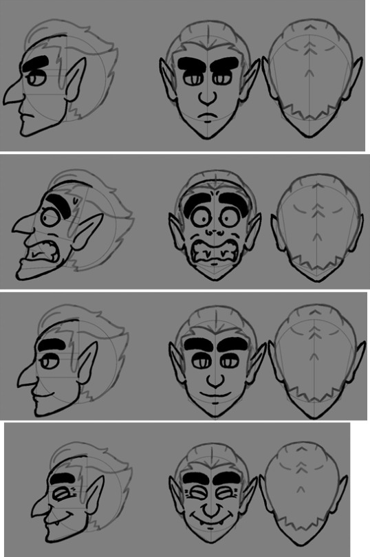

(Expressions top to bottom: neutral, panic/shock, relaxed/contentment, joy, rage/contempt)
The design is partly based off of a vampire with no particular one in mind, and was given a large hooded nose, pointy ears, slicked back hair, thick eyebrows, often half-lidded eyes with long lashes, and a slim face. The eyes are a notable part of the face as are the eyebrows as they’re the facial elements most often used to display emotion. The style of the eyes means they’re both easy to draw as they’re simple ovals and expressive as they’re a bit larger than one would expect from real life eyes. The brows are also large that make it much easier to aid in representing certain emotions. Some minor exaggeration is added to the facial expressions to better represent emotion, such as some squash and stretch to the jaw when smiling or making the mouth unrealistically large when baring their teeth. By doing this it allows more freedom with the extent to which a character can express their emotions as well as more clarity to the audience in displaying how they feel.
When creating a short head turn animation the biggest issue faced was attempting to ensure the facial construction remained mostly consistent with the head references as failing to get the head construction correct can be a main deciding factor between whether they look like the same character or not. Because of how the head is turning and moving almost every frame, the construction had to constantly be checked and adjusted as needed. To save time doing this however, around four main key drawings were created and duplicated across multiple frames and edited slightly, moving the eyes, nose and mouth mainly and transforming segments to give the illusion of the head turning.
1 note
·
View note
Text
MED1444- CW2 Walking Animations
The illusion of movement is essential in animation as form of media; without the movement, the ‘animation’ would just be no different from, say, a singular drawing or a still image of a highly rendered 3d model. Though stills and non-moving models like as mentioned can be considered art forms, animation gains part of its status as an art form through the use of movement. If art is a form of expression of emotions or portraying ideas then most of what makes animation an art form is through the use of movement, for that is one of the main ways that animation provides a sense of expression and emotion. An entire character can have their whole personality revealed to the world through their basic movements, it can show their intents or their emotions or a vast array of other cornerstones to what makes a character. Of all the ways a character can move with their actions, the simplest and most used form of movement by a character is the basic act of locomotion. Even this simple act of moving can give a sense of personality and identity.
Basic walk cycles are greatly important in regards to movement. Though a character may appear without legs or may appear without arms or may differ in any way to a standard human-like body shape, the standard way a human walks is still one of the most commonly drawn upon resources animators use as a point of reference for bipedal characters. From the way a human moves there are several key points of focus that are essential to grasp before adjustments can be made to tailor the movement to a particular character better. The main points of a human walk in simple terms are contact > low > passing > high > contact. ‘Contact’ are the points of the walk where both feet have touched the ground, though the foot that was previously raised above ground is only contacting using the heel. ‘Low’ is the lowest point the whole body is in relation to the space around it, where the foot that newly made contact with the ground is now entirely making contact with the ground, the leg that foot belongs to is bending a bit, and the other foot is starting to raise off the ground. ‘Passing’ is the mid-point for walking where the now raised, bent leg is about equal level with the other leg. ‘High’ is the highest point the entire body is in relation to space, where the lifted leg is at its highest and the foot contacting the ground has the heel raised slightly in preparation for the next ‘contact’. During the leg movements, it is also important to make note of how the arms move, where the way the arms move is inverse to the motion to the legs, so for example if the left leg is the one currently moving forward it would be the left arm that is moving backwards. Despite this the arm movement and pacing isn’t too drastically different from the leg movement and pacing, where the contact movements are in fact the highest points of the arm movements but the passing movement is still around the mid-point where the arms are about level with each other like the legs are.
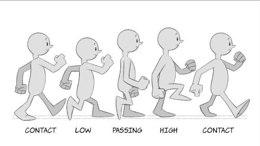
(Pictured above: a visual reference personally used during the production of the 2D walk cycle [Image source])
Though these key points of human movements are essential, once established they can be adjusted as necessary to change the way a character looks as they move. For example, if additional frames for movement are added post-contact but then quickly build up speed until next contact, it may give the character the appearance of being graceful or very careful with their movements. Alternatively, if more frames are added alongside that of the character getting lower to the ground during their ‘low’ point before they build up speed, it may instead cause the viewer to believe that the character is quite heavy and needs time to build speed with their movements.
2D (Harmony) Animation:
The first of the walk cycles created and completed was 2D hand drawn. This was created first as I felt it was a good introduction into how to create a proper walk cycle and to get a feel for the way the human body moves. Creating it was relatively straight forward. To begin with, before the walk cycle was even in a rough draft stage, a character had to be created to animate. The specifications for the character had to be that they had two arms, two legs, feet and a head. As the main focus of the project was the walk cycle itself, the character didn’t have to have too much thought into it, so I created a simple character for the animation that lacked any distinct features to note. Due to this design decision as well as the very non-realistic proportions or drawing style, a massive amount of time was saved when it came to animating it. This design was drawn in Photoshop and then imported to Harmony to use as a reference. The design drawing includes red segments for some areas to highlight the rough size of the joints, where the joints are and how the character should overall be drawn when sketching them.

Firstly for the animation I had to plan the basic features of a walk, so the points of contact, low, passing and high. These were used somewhat as keyframes; they helped with the initial plans and figuring out how to pace the walk correctly but were adjusted or redrawn as necessary as needed in order to ensure the animation retained a flow. Besides that the animation was done frame-by-frame, again with adjustments and frames added here and there to ensure that there was a flow. Moreover, the actual drawing process of the character was done piece-by-piece as opposed to drawing the entire character all at once, so the body, head and legs were drawn first, then the arms and hands, and then finally the feet. By separating the body parts it made editing the body to make the walk feel more natural a much easier process. A minor change took place at this point whereby I didn’t draw a neck as I did in the design plans, making the head float slightly above the body. This change was decided upon to both make the design mildly more interesting and to make the animating process slightly faster.
After the basic animation was complete additional changes were made to it. Notably, extra frames were added to the entire animation overall improve the pacing. This is especially true after the feet make contact with the ground as at that point in the animation the momentum in the leg is lost and has to be built up again so the additional frames creates the illusion of the leg moving slower. Moreover the additional frames were used to add some exaggeration, with squash and stretch and a more pronounced follow-through in parts of the character. As the character design was very unrealistic to begin with, it made squash and stretch all the easier to accomplish and more importantly fit the whole look of the animation a lot better. The final thing added to the animation was shading to the character. In the final uploaded walk cycle compilation there was also another version of the walk added where the character lacked feet, which was added mostly due to how the walk still works even without any distinguishable feet and shows how a walking animation can work well for a character even if they lack that body part.
Generally the 2D walk cycle was quite successful as the finished product had a mostly smooth pacing and, like many animations, any minor errors in the character being drawn that might have been produced aren’t immediately noticeable. The direction intended to go for the walk was one of being mostly basic, almost as basic as the character design itself. Interestingly enough however this may not have been entirely the end result achieved from the walk. The walk could be observed as carrying some sense of purpose in the character and the way that character has a bouncy quality to the walk that makes it appear to be feeling a positive emotion almost. The pacing of the walk also is what gives the character these qualities, and the fully upright gait. Interestingly enough it should still be noted that the character is still quite generic in appearance as is the walk despite all this, so the question could be asked if this is just a neutral walk and is just perceived as having some form of purpose through bias created through the actual animation style, and if so how much bias was created in this manner and how much of the perceived emotion is due to the actual gait the character has. It would be an interesting point to experiment with in future.
3D (Maya) Animation:
The main change between animating a walk cycle in 2D and one in 3D is the introduction of a 3D space as opposed to merely a 2D one. This poses some challenges and as well as some benefits: on one hand one must now display more attention to detail and animate more of the character due to the 3D format now presented, but it can be argued that it is much easier to use real life movement as a direct reference and one must not have to worry about how well one can draw or translate a 3D reference point to a 2D plane. Through the use of 3D one can merely import or create a 3D model and then only have to worry about the movement and posing aspect and not how accurate it looks to the design, because the design was only needed as reference for the model creation itself. Furthermore, like with many animation programs including Harmony, Maya has the option of calculating and auto-filling inbetween frames with movement based on keyframes. This is a process called inbetweening, or ‘tweening’, and through its use it can drastically cut the production time of an animation. While this was not used for the 2D walk cycle, it was heavily used for the 3D one, almost being used exclusively in fact.
The model used in Maya was one imported as opposed to one I personally created from scratch, so the sole focus was on the movement. Because it was not my design however it posed a limitation on what one could expect the personality to be as well as the movement style. In this instance the model was of a zombie so one could expect a sluggish, hunched over stance while moving, or at least that was what myself imagined and tried to capture. While one may think the fact the model was imported to be a massive drawback to what I could animate with it, how it was animated, ect. it might be considered a good form of practice especially if one imagines that much of the time animators are given designs to work with rather than design them themselves. When it came to animating the model, as stated previously, it was mostly animated using tweening. An extremely important thing to note is that subtlety is key when using tweening and ensuring you calculate where and how much something is tweened. This is mostly due to the fact that because the in betweens are auto-generated you are at the mercy of how the program calculates the in betweens and it usually comes down to numbers and inputs in many cases. It’s important to get the numbers right and what frames you choose to use as keyrames otherwise movement can look stiff, robotic or unrealistic. In the case of Maya the animation itself was simple and easy enough. The keyframes used were mainly the moment a foot begins to leave the ground, the moment a foot touches the ground and the passing movement where the body (in relation to the ground) is at its highest. From there, the main issues faced were mostly figuring out how many frames were needed in-between keyframes to make the movement not feel too rushed, and maintaining an awareness that creating keyframes is based on particular joints selected rather than the positioning of the entire model meaning that several keyframes had to be created at around the same time in the animation for different joints. Besides that, after the animation was mostly complete, minor adjustments were made such as adding extra keyframes around the same points as previous keyframes where i manually moved parts of the body to ensure the pacing was correct enough to give a sense of the body slowing in and out of movements. The extra keyframes had to be created otherwise any changes would be overwritten by tweening. As with the 2D animation, the animation process was mostly segmented by body part again, where the legs and feet were first to be animated and then the rest of the body.
The finished result of the 3D animation came out quite well. Though the robotic look of the tweening was initially a concern in the early process of the animation, after adding the extra keyframes with my own adjustments it made the walk much more natural looking. As with working in a 3D space as opposed to 2D, all aspects of how the body moves from all different camera angles had to be given, which meant that I also had to pay more attention to detail when it came to looking at real life human movements for reference. The reference used wasn’t any source from the internet and instead was just looking at how the other people with me at the time walk and keeping in mind the key points of a walk cycle. One change for example was that I needed to place slight more focus on where weight was distributed on the body as the character walks, as such from a front point of view the body shifts slightly in the direction of whatever leg is remaining on the ground, so less weight is placed on the leg in the air. Although this detail typically may not be needed in a 2D animation it must be added to a 3D as a camera can be placed anywhere around a character model and highlight any details such as that that were missed out. Back to the point, despite tweening the movement appeared relatively organic, and as for the tweening itself it did greatly help with both the speed of producing the animation and being able to make the animation look smooth. However the movement of the arms I felt ended up being slightly stiff, which is due to wanting the arms to remain pointing as much to the floor to possible to add to the “slow and hunched over” look of the character but failing to look at reference to that, nor give any real sense of gravity or weight to the arms or anything of the sort. In this regard it was a bit of a novice mistake but at the same time one, I feel, would take a few hours of investment at least to finally be able to visualise and translate the movement to animation form correctly, but one which might very well stick with me. It might be worth looking at more reference material for how gravity works with dangling and suspended objects and how they move when moving in future.
Final thing to note with the 3D animation is that, after rendering, it was discovered that due to some settings applied to the character model I was not aware of the rendered model, does in fact, lack a torso. While this is unfortunate the legs, arms and head were still maintained which were the key points of movement in the model itself, so the walk cycle wasn’t too gravely affected. This goes back to the point again of importing a model and someone else’s design to animate with as opposed to making one, that by importing one you are also at the mercy of how one rigs a character model or what settings are placed upon it. Despite this using other’s character models is still an important part of being an animator so even with minor errors such as these using a character model that isn’t my own is still a valid option even if I have the option not to.
Stopmotion Animation:
Stop motion is quite similar to 3D in regards to having to animate on a 3D plane and (again) having to animate aspects of the body which might not even ever be seen in a direct way by the camera or brought to focus. However with stopmotion it could be argued that this aspect is even more crucial as at times not placing focus on the way an entire model is animated can either cause errors to arise that are extremely time consuming to fix or even cause the model your working with to be awkward to animate with. These aspects are all just par with the course with creating anything with stopmotion though, or anything with practical effects. In a way stopmotion can almost be considered a paradox with animating- animating itself has almost always had a focus on how it could be used to suspend disbelief (the only notable period that comes to mind where this was an exception was when it was first conceived and used for study purposes) and yet stopmotion itself has the quality of being limited to what can be done in real life terms. Models created for stopmotion, sets and props all have to abide by gravity for example or the laws of physics. Limitation isn’t necessarily a bad thing however: it breeds creativity. Any, or almost any, limitations imposed by stopmotion can be overcome or has been in the past, and nowadays any limitations that can’t be directly overcome practically can be overcome through external means such as video editing software. In some way someone might consider that stopmotion has in fact very few limitations at all, the only limitations are your knowledge on how to create practical effects, your knowledge with animation itself, creativity and patience.
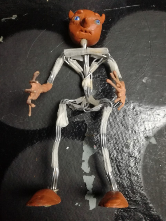
(Pictured: An image of the model used for the walk cycle)
In the case of the walk cycle animation I produced, a model that I created from a previous stop motion project was used. The model already filled the criteria needed for a character to animate walking, being bipedal and having two arms and a head, so it was quite convenient. Moreover, the model was constructed using flexible but sturdy wires and can stand on its own in a variety of positions unassisted making it all the better to animate with. Other traits the model included that made it more efficient to animate with included a fully rotating head, mobile eyes that can be adjusted as necessary and latex hands and forearms which add stability and strength to the hands, fingers and wrists. Though the character is a blank slate and has no personality immediately intended to be associated with them, the approach for the emotion and personality I wanted to give the movement was one of nervousness and fear. In this regard the default pose the model begins with has the arms up, getting closer to the chest as the animation progresses and knees bent a bit to give the impression of being physically small. As the animation progressed I also added the detail of having the head look around a bit, as if alert.
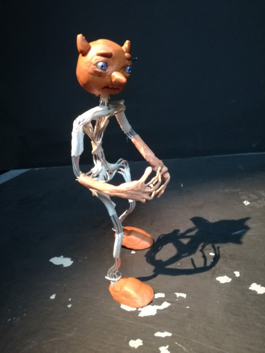
(Pictured: Model posing for first frame of the animation) Regardless of however well the model may be made it was however still a model, a physical one. Going back to what was mentioned earlier about limitations in stop motion, gravity exists and the threat of the model toppling over mid-frame when attempting to pose it or take a picture was an unfortunate reality. To counteract this double-sided tape is added to the soles of the feet to try and ensure the model stays in place. This is only a temporary fix though as through use the tape becomes less sticky and must be replaced. As the entire model has to be picked up only to be repositioned again after reapplying the tape, the fact that tape has to constantly be reapplied is much less than ideal. It is more ideal than having the model fall over in comparison though as if that happens then there’s the likelihood of parts of the model moving on upon impact. Aside from this the amount of times the model toppled was thankfully not a large amount. As what was previously stated one must focus on many aspects of the way a character moves when it comes to working in a 3D environment, but due to this in regards to stopmotion if you position your character correctly (assuming you’re not attempting an awkward position) then gravity itself can be used as a form of guide in that the model should be able to mostly still stand on its own unassisted due to weight being evenly distributed on the character model. This was extremely helpful for me to acknowledge when repositioning the model from frame to frame and minimised the times that accidents like having the model fall occurred.
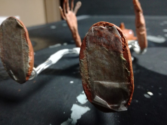
(Pictured: Soles of model with tape applied)
The general animation process was just like how it was with all previous walk cycles, getting a grasp on what a walk looks like on a biped. The addition of making the character look afraid wasn’t troubling to achieve either as if you can envision what someone might look like when afraid then translating that to reality is often only limited by your knowledge on how to animate and pose a model. The only notable faults that occurred both during and after production were that during the animation process, after the camera’s battery was replaced after running out, the exposure increased massively though this was only a minor hiccup that was easily fixed, and that after finally reviewing the walk cycle at the end it was found that character movement was notably but unintentionally jittery in places. The jitter was more than likely caused by mispositioning the model so parts of the model go back over a movement they just moved from, so almost like taking a step forward (metaphorically speaking) and then a step back then forward again. Repeated instances of this caused jittering though it was more notable in parts of the body than others. To fix this issue would be time consuming to say the least as it would require repositioning the model as much as possible to be like in a previous frame, then making the changes necessary and most probably animating the rest of the frames from there even if the other frames were already animated, and that’s assuming that the entire clip was not just scrapped and redone. Aside from the jittering the rest of the animation appears successful, with decent pacing, a clear emotion displayed and the walk appearing mostly natural.
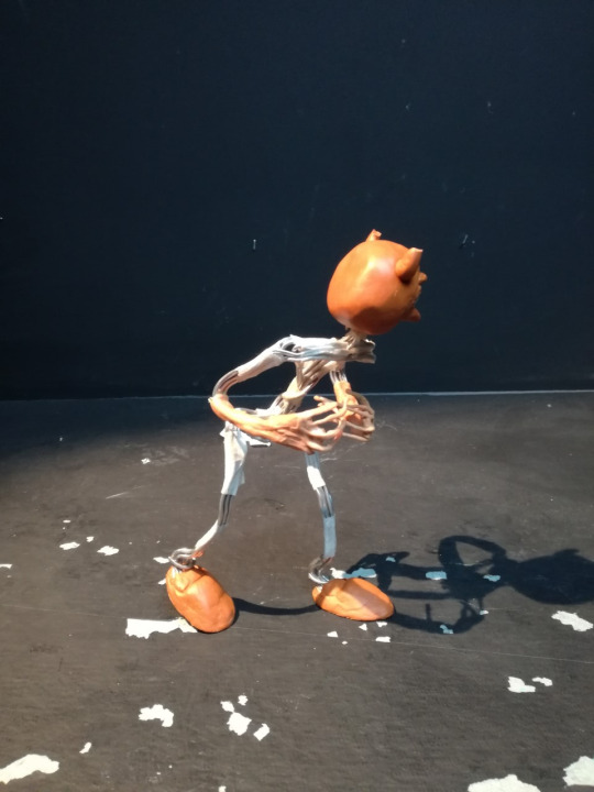
(Pictured: The model, posed in a frame nearing the end of the cycle)
(Pictured: The set-up of the scene)
0 notes
Text
MED1435- CW1 Part 2, Human Movement
To build experience for stop motion further we created and rigged our own models and used them to express human movement.

The finished model (pictured above) was constructed using wire, Milliput, latex and microporous tape. To begin creating it, wire had to be cut into 5 segments at around 30cm each, roll the wire across a flat surface to make the wires as straight as possible, and then bend the wires in varying ways that cross over each other. From making the wires cross over it gives more support to the overall model. The wire frame is held together using microporous tape which is characteristically more flexible and adhesive than some other types of tape such as masking tape which makes it ideal for holding a fully poseable skeleton together. The tape is placed in locations where bending the model wouldn’t be ideal, and as such locations where wire is exposed can be compared to joints on the human body.
After constructing the base wire frame, thinner but more flexible wire was added to the back of the “hands” to create fingers and latex was added from the hands to the forearms as a way of representing skin. Latex is a material that is notably elastic so movement is still allowed in the skeleton whenever it’s applied. About 3 layers of latex was added to the arms and baby power was added after it was given time to dry to ensure the latex didn’t stick to any fluff or other inconveniences. Milliput was used to create the head and feet as no movement is necessary for the face and the feet themselves and milliput becomes quite solid and durable once it has set. The Milliput was smoothed down and details were added before it was set however.
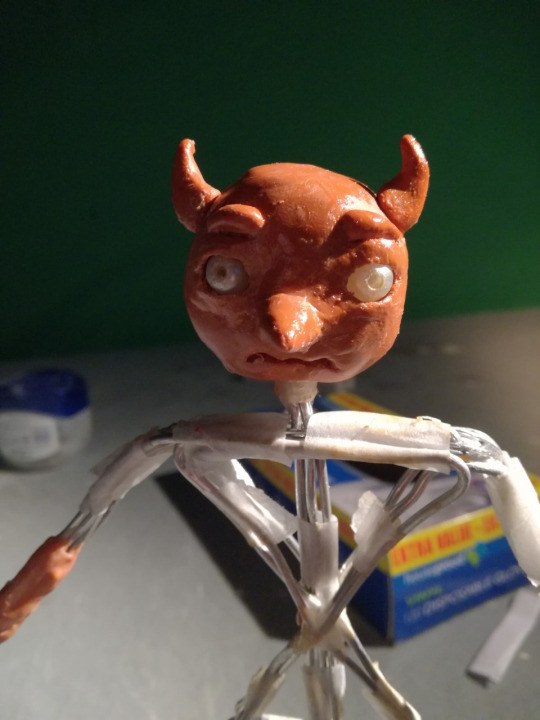
Though a larger pair of eyes were initially used when creating the head, the eyes were eventually replaced with beads to add extra space on the head and increase the amount the eyes can move. Blue paint was eventually added to the eyes to represent the iris and movement to the eyes during animating was performed by moving the eyes using a pin inserted through the hole in the bead. Vaseline was added to the eyes to make movement easier.

During the production itself, methods of creating the animation were mostly straight forward. To keep the model in place on the ground even when posed in an odd position, double-sided tape was added to the soles of the feet to add grip. This same method was also used to keep the prop grounded to the bottom of the set after it is pushed and as a way to have the character pick up the prop in the first place.

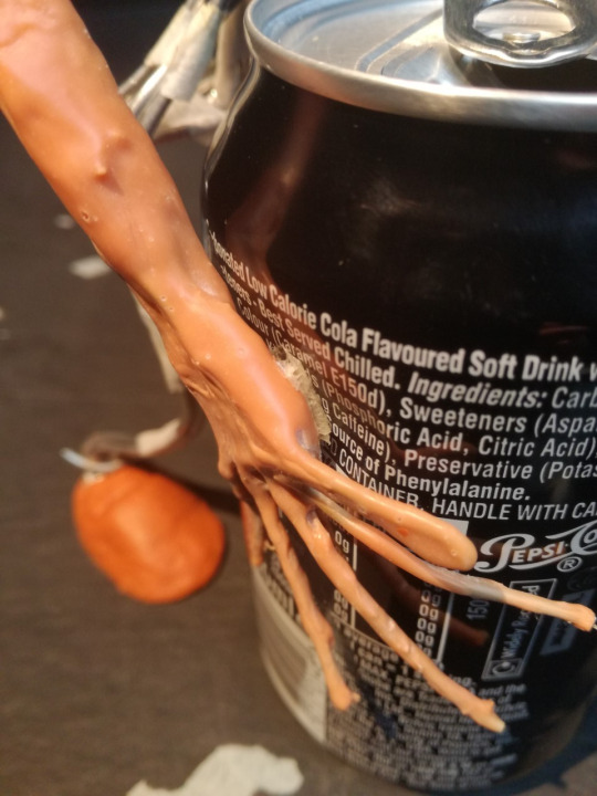
One of the more problematic segments of the animation that required time to overcome was getting the character to jump. From the point where the model begins to bend their ankles and lift their feet further and further from the floor it became increasingly challenging to keep the model balancing still enough to take a photo for the frame. After that came the issue of figuring out how to keep the model suspended in the air to create the illusion of a jump, as not having a few frames dedicated to the action of being suspended in the air would just make the model appear to disappear and reappear in the position where it was supposed to land. Eventually it was decided that the model had to be suspended, but not through holding it up using my hands as the methods of creating an effect or action has to be discrete to the viewer. From this a wire from my headphones was used as a basic way of achieving the effect, and it was weaved through the chest area of the model and remained mostly unseen by the viewer through many of the frames as much of it was hidden off-screen.
In my opinion the creation of and animating the model went well. Using the model I was successful with being able to represent certain actions and have the character interact with the environment around it. Overall the animation was relatively well-paced and easy to follow and has points where principles of animations were used, such as anticipation when a jump is about to be performed. Moreover there are moments where movement appears to flow relatively well. However there were also moment where the animation appeared jittery and seemed stifled. An example to be given would be during the initial walk, where limbs weren’t given enough freedom to move so the character appeared stiff in its movement. Much of the jittering of the animation was caused by not adding enough frames during movement and from the re-placement of the model when it accidentally topples during production and accidental camera movement and movement of the prop item. During production this hit a head when the camera and props were moved for the recording of a different project and meant that the model character, prop and camera had to be re-placed as close as possible to the footage already taken. To rectify this or alleviate this issue, I may mark on set where the models and props are located and mark on the ground where the camera and tripod are positioned. Though a minor issue, creating the effect of the model jumping was challenging to do, and though it was successful through its methods it would have been ideal to have used a thin wire with low visibility to suspend the model with as opposed to the wire which I used. My reasoning for this is because a normal wire is troubling to hide evidence of in the video, especially if shadows are very clearly visible and the light source is in an unfavourable position. By using a thin wire it would be more successful in my opinion as a way of hiding it from the camera, as it wouldn’t be as easily noticed even if the light hits it.
In terms of creating the model itself, it was quite functional during the animation process and could be used in all the intended ways. No mobility was hindered in the ankles by the feet, all the “joints” could bend as intended, both eyes could move as necessary but weren’t loose, mobility could be shown in the wrists and fingers even with the latex coat and there was no issues with the wires coming apart from the tape. If any criticisms were to be given it would be that I should perhaps refrain from giving protruding details to the model unless I make them more durable or by absolutely ensuring that there is a secure method of storing the model when it is not in use. My reasons for stating this is because the horns on my model chipped slightly during production. Moreover a different and longer-lasting paint could be used on the eyes due to how the paint started to rub off when creating the eye movement.
0 notes
Text
MED1433- Frame by Frame Animation
As an experimental animation I placed focus on creating a frame by frame animation, an animation where you create the individual frames one after the other with no prior key frames or initial sketches for future frames. In order to achieve this I decided to create a flipbook. This was an option I was greatly interested in choosing as opposed to a zoetrope, as I have yet to try creating an animation using a flipbook and wished to see how the two differed in the production of the animation itself and the look of the completed product.
Flipbooks have a long history being some of the earliest forms of animating pictures conceived. They were first created during the 18th century (initially called ‘kineographs’) just as the zoetrope was and follow the same premise of creating an optical illusion of movement for a set of still images. However, unlike the zoetrope the way this animation is achieved differs. Zoetropes create their optical illusion by lining up illustrations next to each other in a cylinder that spins and looking at the illustrations through a slit or hole in the side whereas a flipbook simply uses a stack of paper with the illustrations on that you quickly flip through. Due to this, flipbooks take up much less space than a zoetrope might take up and do not require any specialist equipment such as a mechanical method of giving the images motion, making them a quite convenient way of creating a traditional animation piece.
When attempting to create my own flipbook I referred to an online tutorial to find out what creating a flipbook would require:
youtube
The premise on how to create a flipbook is incredibly simple; all it requires is a stack of paper, a method of keeping the stack together on one side and a set of slightly differing images on the paper. What I did find from watching the video however was that the paper used should be thin enough to be able to see through it when placed over a lightbox but thick enough to have some give to make it easier to flip through. Because of this I could not use standard cartridge paper and had to find paper with a different thickness. After finding a set of A3 sheets of paper with the right specifications I moved onto separating the paper into 8, cutting it out and repeating until I had a stack of 40 sheets of paper. I also cut out two slightly larger pieces of card in order to protect the flipbook when not in use.


Afterwards I moved onto briefly deciding what I was to animate and planning for that. I created a character, a background and a short, rough storyboard which portrays the character jumping towards and onion it sees and putting it in its bag:

The general artstyle used and the atmosphere I was trying to achieve with my flipbook was one of whimsy, similarly to children’s books. Due to this the drawings are more on the simple side, the design of the character appears generally cartoonish and overall one could consider the flipbook giving motion to naive art as opposed to anything realistic or abstract. In terms of the artstyle itself and the particular way everything is drawn, though I have seen similar illustrations with a similar look previously in different works, no particular artist comes to mind that directly inspired the look.
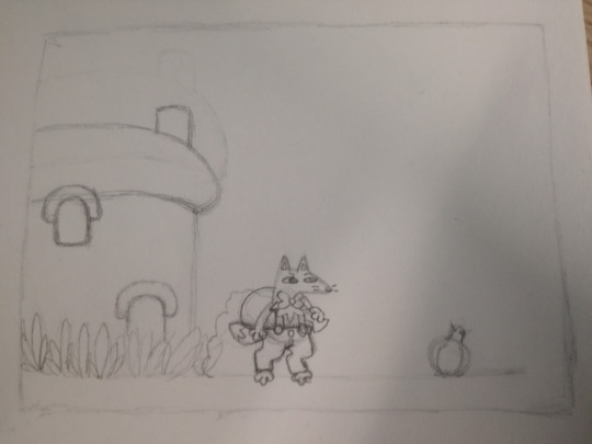
The first frame is by far the most detailed frame in the entire flipbook. This was done because the first frame was where almost all frames after it use as reference, from the area where the “floor” is in the animation to where the character is located. the box drawn around the picture itself was drawn as a general plan on where to put the drawing on the page. This general plan extended to the second frame too:
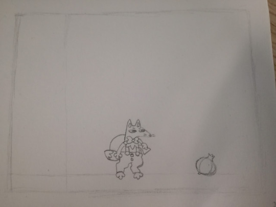
Like the first frame, the second frame also includes the box where all the drawings should remain inside. However, there are also two faint lines inside the box for planning purposes.The horizontal line inside the box is supposed to represent the floor while the line on the side is roughly where the animation may be obscured depending on how the flipbook frames are kept as a stack.
Future frames refer to previous frames, especially the first frame, as a means of reference as previously stated and ensure that drawings have some level of consistency. After a point for where the animation does start to move and differ from the first frame more significantly, the previous frames that are referenced change as to make sure the animation is consistent to the movement that’s being performed and not just the idle character. By the end of producing the animation, 38 frames of the 40 were used though the unused final frames remained in the stack as it was found that additional unused paper that remains in the stack after the final frame help the viewer flip through the pages with images on them more smoothly.
Overall, the flipbook was successful for what it was trying to achieve. The flipbook has a relatively smooth animation that manages to have the character move across the space, the character remains relatively consistent in appearance and movement throughout the animation and it’s clear what is happening in the animation. Moreover, it notably also includes a minor amount of anticipation before the character jumps, though it can only be deemed minor due to how few frames actually showcase this which itself is due to how few frames are in the entire animation. The anticipation would have been better seen had more frames been used before the jump, which in turn would mean more frames in the flipbook overall. If more frames were added it would also allow squash and stretch, follow through and exaggeration when the character jumps. With how much could change in the way the character moves provided more frames were added, it would be interesting to see how the movement would differ. In itself however, the character’s jumping works fine as it is so better showcasing more principles of animation are not necessary in regard to making the animation smoother. When creating the flipbook it was found that, even though less frames were used for aspects such as jumping and anticipation, the animation still works well and has a level of fluidity to it. This might be due to the lack of overall frames as previously mentioned and the fact that as a viewer you flip through the frames extremely quickly, which means that any extra frames aren’t necessary and would only serve to make the animation slower. The fact that one flips through quickly is also a positive as many of the mistakes in different frames go unnoticed by the viewer a lot of the time.
Although consistency is evident in the flipbook between how the character looks and the movement, there appears to be less consistency in regards to the onion. When animating the onion, less focus was placed on it when drawing as it’s less detailed than the character, which is a mistake on my part. The mistake was also caused because I failed to refer to only the first frame when drawing the onion even though it is a static object without movement throughout the animation, leading to any mistakes or inconsistencies drawn after the first frame to also be translated to other frames. Due to these oversights it appears to change size and shape a bit at points and almost looks like it’s moving on its own which wasn’t intentional. Moreover, after the character starts to prepare for the jump and mid-jump, due to not being able to use the first frame as a point of reference anymore, inconsistencies in the character’s appearance do start to develop. Finally, due to rushing the animation a bit by the end and due to beginning to run out of frames, the character was unable to pick up the onion and place it in his bag like I originally intended, which is a minor issue, though mainly I didn’t complete putting the background on the rest of the frames after the initial one. If I had to change my approach to making a flipbook in any way, my main one would be to cut out more paper to ensure I have more than enough frames, and I would also either make the animation less detailed or complicated to make sure I can add the background to more than just a single frame.
0 notes
Text
MED1435 Stop-Motion Studio Practice- CW1
The first part of our coursework for stop-motion focuses on stop-motion as a concept, how to use the equipment efficiently and experimenting with camera pans. Stop-motion as a form of animation is extremely versatile as one can use the practical effects of models and props in a way that can achieve effects that might not be able to be achieved through other forms of animation such as CGI.
Initially experimentation began with simple animations that showcase the principles of timing and slow in and slow out, starting with a coin “swinging” as though it were suspended on a string. In reality the coin was animated swinging by placing it flat and capturing images of it from above, moving it frame-by-frame in an arc-like fashion. The locations where the coin would be moving in-frame were roughly plotted beforehand and plotted in such a way that the higher the coin moves in the arc, the more frames there would be with coin placement near the top to create the impression of the movement slowing down. In contrast, as the coin moves further down the arc there are larger gaps in its placement across the arc in-between frames. Though plotting the coin placement in this manner was intended to achieve the effect of slow in and slow out and was achieved to a point, I felt that this effect in the animation could be vastly improved upon by adding more frames where the coin was closer together near the top of the arc to slow down the movement further.
The second and third animations created are very similar to each other, apart from the arcs used for plotting the movement and the elements being animated themselves. Both animations feature elements bouncing 3 times in an arc, though the second animation uses a coin and gradually bounces in increasingly smaller arc after first landing while the third animation doesn’t have the arc size subsequently decrease as much and uses a ball of blu-tac as the animated element instead of a coin. The second animation is supposed to showcase an object with some weight to it, hence the arc size decrease in the bouncing, and a lack of elasticity. The third animation is supposed to showcase squash and stretch using the malleability of the blu-tac to better show this.
The fourth animation done shows a plunger hitting a ball which then bounces from a wall and lands back in its original position. For this animation blu-tac was used to show squash and stretch like the third animation.
The fifth animation differs from the previous ones as it uses blu-tac and its malleability as a way to create an animation with metamorphosis, where one thing becomes another thing. For this animation I made a model of a cat become a teddy bear, with the mid-way point having it be a ball of clay. This effect was a achieved by creating two models and animating both of them becoming a ball, and then playing the frames of one of the animations in reverse.
The sixth and final animation contrasts massively with the previous animations, instead using toys and objects in a 3d space as the core focus. Further, the aim of the final animation was to experiment using a camera pan and apply ease-in and ease-out to a camera. In order to do this we had to first find out how much we had to tilt and turn the camera to get the desired final shot from the starting frame, and then after we had to divide the amount of turning and tilting of the camera frame-by-frame by the amount of frames we wanted overall. This was a process made significantly easier through software which performed the calculations and measurements for us. On top of that, the way the measurements had to be divided to allow ease-in and ease-out meant that the measurements couldn’t all be the same size or divided in the same way, but again this process was made much easier with software assisting us.
0 notes
Text
Med1444 Animation Production- Harmony Project 1 (Bouncing Animation)
For the first project we were to create in Harmony we had to produce an animation of a ball or some other object falling and bouncing and/or presenting a clear arc in the movement of its trajectory. In order to be successful at this task we must show a clear understanding on some of the principles of animation, especially in regards to squash and stretch and slow in and slow out. The main focus of the task was to study arcs and trajectories and how certain factors affect the way an object may fall and land.
The trajectory of an object is the way in which it falls or is thrown and how far and quickly it moves while in the air. An arc is a style of movement where something almost moves like it is on a pivot; motion is limited to movement in a circular motion around a single point. The trajectory of an object can be and often is an arc, however not all trajectories have to be arcs. Factors that affect the trajectories of an object can include the mass and volume of an object, speed of it falling or being thrown, the angle in which it leaves a static position and the general shape and aerodynamics of the object in question. Arcs, in comparison, are equal and consistent in the way it moves as, like previously stated, movement on an arc can be compared to movement on a pivot or a single point. Almost any natural movement is based around arcs.
When creating an animation such as an object bouncing it is important to keep factors in mind such as timing, easing and squash and stretch. All of these factors can affect the personality or characteristics assigned to an object in a given animation. Individually they serve somewhat different purposes to characteristic assignment however:
Timing is how quickly, slowly, smoothly or roughly an object moves. It is typically quite important to maintain a certain level of smoothness and naturalness in a movement but not always depending on the style or purpose of the animation, though it is always important to maintain a certain pace to a given movement. Depending on speed and timing, it can give a certain energy to characters or objects.
Easing is the way in which a slow movement will pick up speed upon leaving a static position and build a form of momentum, and will start to slow again when an object begins to lose momentum. The way in which an object eases communicates to an audience the speed in which an object is moving.
Squash and stretch can be considered a form of exaggeration much of the time. It is a method in which the speed of movement can be presented, the elasticity of an object shown and the firmness of an impact revealed if squash and stretch is used after an object collides with another on-screen element.The exaggeration is evident when squash and stretch is applied to objects with low elasticity, however it is still important to note that the level of squash and stretch used for objects such as these should still be limited to an extent as to clearly communicate the characteristics of the object successfully.
In Harmony we initially experimented with creating a ball moving and easing in and out of a movement through the use of key frames and having the program automatically calculate where the ball should move in-between frames to create a seamless movement. Afterwards we were tasked with creating an animation of a ball or any object of our choice falling and bouncing with a clear arcing movement using either the hand drawn method of using harmony or the auto-generated method. In my own project I decided to hand draw a bag of flour falling to the ground and tipping over, showing a clear arcing motion that way. A bag of flour isn’t something I could picture bouncing much, if not at all, even in animation, so this characteristic is evident in the lack of subsequent bouncing motion after impact and somewhat but not much of a squash and stretch on impact.
0 notes
Text
Med1444 Animation Production- Llandudno Trip (Shading)
During the trip we also covered the topic of shading and tone. Shading is often the main method used to make an object appear three-dimensional and a tone is how dark or light a shade is. When adding shading to an image it’s highly important to note not just the direction of the light source but also the nature of the material that the light is making contact with as different materials and shapes will reflect light differently. For this reason, while one can make a rough estimate on how an object will look in response to adding lighting and shading, it’s very important to study how a real object interacts with a light source as not all objects reflect light and should be shaded in the same way.

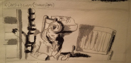
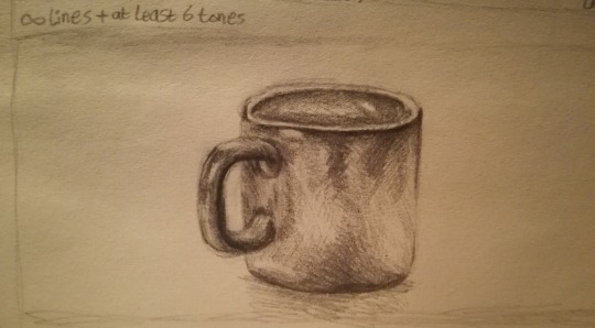
For experimenting I used a different amount of lines per image, a different amount of tones and didn’t limit myself to a single material to use, using both pencil and oil pastel. Overall all images fit within their restrictions however the level to which they were successful varies. Oil pastels as a material appear quite useful when intending to limit the amount of tones used as they don’t blend as easily as some other materials, however they use a thick layer of application that causes many smaller details in an image to be lost. Moreover it can be difficult at times to be precise with oil pastel application due to its nature as a material. These negative traits especially caused issues within the single tone drawing as application was inaccurate at times and lead to the overall image being hard to decipher with all the black used, though some of it was also a fault on my part as I shouldn’t have used as much shading on the image to begin with.
0 notes
Text
Med1444 Animation Production- Llandudno Trip (Lines)
The second key aspect of art we studied and experimented with after we focused colour was on lines and line art. In comparison to the use of colour, the use of lines is another way of defining a concept or a subject of focus in a piece of artwork and can also be used in a variety of methods to provide depth, atmosphere and definition, making it very similar to the ways colour can be used, though the approach one takes to grasp the same features that colour can provide is different when using lines. For example, in order to create a sense of depth in a piece and provide a foreground, background and midground, the hues used for elements in the foreground will possess more value than the hues used for elements in the background, which will be less saturated. When using only lines to create a piece however the approach one may take to achieve the same effect will differ, so to portray a far distant object in contrast to a near one one might decide to use more defined lines for closer objects and thinner, lighter lines for distant objects.

For experimenting with lines I did a set of observational drawings that use either an unlimited amount of lines, 10 lines or 5 lines. In order to capture much of the detail on the images I had to go over many of the lines either twice or more while keeping the pencil on the page so I don’t waste lines. Though I did simplify the images to make it easier to remain within the restrictions, the images may still be considered complicated drawings, especially in regards to imagining if the images were to be a single frame in an animation. Generally the images I experimented with lacked depth due to placing more focus on remaining in the restrictions than ensuring the lines give a sense of space. However, what can be observed from my experiments is that using less lines can and does often impact how simple the resulting image looks as more details are sacrificed in order to keep within the restrictions.
0 notes
Text
Med1444 Animation Production- Llandudno Trip (Colour)
During the 30th September to the 3rd October a trip was taken to Llandudno in order to study certain fundamentals of art that may be used to varying degrees and in various ways when animating. Such fundamentals included aspects such a colour, line, shading, perspective and composition. During the trip we also created experimental animations that incorporate some of the aspects we learnt.
The first of the aspects we experimented with was colour, of which also branches into several other components which are also important to note. The basic principles of using colour to note is that the juxtaposition of certain colours can affect the surrounding colours as well as the general atmosphere given by the piece, and that depending on the colours used and the placement of those colours can alter what the viewer’s eyes are drawn to in an image.

For experimenting with colour we were assigned oil pastels to use, which as a material can create vivid blocks of colour and, when compared with other materials such as paint, can blend to a minimal degree. On my experimental image I created an observational drawing of a group of buildings which caught my eye due to the contrasting colours that were so closely placed. Even with blending the colours on the blue house are still inaccurate to the faded blue of the actual building, though that may not necessarily be a negative if the aim of the drawing was to be to create a brightly coloured, high intensity piece. Evident in the above drawing are colours such as blue, grey, brown and red. The soft blue-grey and grey of the building in the foreground are of similar value and have little contrast, giving the house a general calm appearance, while the brown house in the background also incorporates a harsh and vivid red into its colour scheme and an almost black roof to contrast its other colours, giving it an intense atmosphere due to the juxtaposition of the contrasting colours. As the buildings have some degree of space separating them and as both the brown and blue buildings differ greatly in terms of colour but lack many cues in the image to compare and contrast and understand what building to focus on, the viewer’s eye isn’t focused to any building in particular. In this case though there is a perspective and understanding of a foreground and a background, the use of colour means that it doesn’t cause the viewer to more heavily favour viewing one aspect of the piece more than another.
Using colour eventually lead to the creation of an experimental animation that used minimal line art except for the first frame for planning/sketching purposes. The experiemental animation also used oil pastels and was a straight ahead animation. The purpose of creating the animation was to practice for a 360° pan animation that was to be done at a later date and as attempt to animate with the use of colour being the main component in constructing the frames as opposed to lines.The final animation used around 27 frames set to run at 24 fps and featured a zoom-in sequence of a duck on a path. The final animation was overall quite successful in terms of depicting a smooth motion, and from the use of creating an animation from using almost exclusively oil pastels I discovered that even if mistakes are made on a particular frame of an animation, once the frames are compiled and the animation is finalised mistakes are often easy to overlook or may not be noticed at all.
0 notes
Text
Med1444 Animation Production- Pixilation (Team OwO)
Pixilation is a form of animation where pictures are taken of a scene that includes a living subject. The pictures are then compiled in a way where the illusion of movement is applied, though unlike many other forms of animation the time in which individual frames of a pixilation are displayed can vary within a single completed piece. This can often lead to the flow of the animation to appear relatively rough and inconsistent. A similar form of animation to pixilation is stop-motion which also uses the compilation of photos to create the appearance of movement in media, however, stop-motion focuses on static objects such as subjects created from modelling clay rather than the living subjects within pixilation pieces. Pixilation may be superior in some regards to other forms of animation and media- for example it appears more easily accessible to novice animators who want to create a surreal finishing product with living subjects but lack the knowledge, experience or resources to be able to use CGI or any form of professional special effects. However, a drawback of such animation is the length to which disbelief can be suspended through surrealism or exaggeration is entirely dependent on the props, people and post-production effects used.
For our project we explored the theme of ‘A Bad Habit’. The theme itself allowed the exploration into several possible ideas which we initially mind-mapped as a group. Some of the ideas we thought about making our project on included smoking, swearing, talking over other people and being pessimistic. After the initial planning stages we narrowed down our ideas to simply swinging on chairs, chewing on pencils and talking over other people which we went on to create storyboards for. Each member of the group presented a single storyboard each of one of the three ideas before we ultimately decided upon the concept of pencil chewing. The basic plot for the animation was to have the subject of the animation (Judy) sit at a table and absent-mindedly chew on the end of their pencil, sharpening it, before choking on it and collapsing to the floor. When creating the frames for the animation itself the setting we used was the living room/kitchen of Isabella’s accomodation due to having curtains to block natural sunlight and create a more controlled lighting environment and also due to convenience. While Judy acted as the subject included in the animation, Isabella took control of the camera and I assisted with the creation and placement of the props, which were the pencils and pencil sharpenings. From there our group went on to compile the frames in Adobe Premiere, with Judy compiling the frames, adjusting the frame rate and adding the sound, myself finding the “pencil sharpen” sound effect used via Google and Youtube (credit: biketommy999, Youtube) and Isabella gave second opinions, input and criticisms throughout production.
Overall, we effectively accomplished working as a team and our project contains many of the principles of animation. Exaggeration was expressed through the gag included of sharpening the pencil by chewing it and staging was included through maintaining clear view of Judy at all times. Follow through was also evident by having Judy raise her arms before falling off her chair and timing can be seen through the adjusted frame rate in segments of the animation. In order to improve upon the completed project however, it may be beneficial to add music next time to add more impact of the animation to the audience and add more frames to allow the animation to be more smooth.
0 notes