
Don't wanna be here? Send us removal request.
Statistics
We looked inside some of the posts by haggsyy and here's what we found interesting.
Average Info
Notes Per Post
2
Likes Per Post
2
Reblog Per Post
0
Reply Per Post
0
Time Between Posts
6 days
Number of Posts By Type
Text
17
Last Seen Tumblr Blogs


Fun Fact
There were a total of 171.5 billion posts on Tumblr in 2019.
Text
Harvard Reference & Bibliography
References
- Week 5
Michael Powell. (1947). Black Narcissus. Available: https://www.theyoungfolks.com/review/36083/the-film-canon-black-narcissus-1947/. Last accessed 15/12/2019.
Michael Powell. (1946). A Matter of Life and Death/Stairway to Heaven. Available: https://stairwells.org/stairs-in-film-a-matter-of-life-and-deathstairway-to-heaven/. Last accessed 15/12/2019.
Johannes Vermeer. (1657-1659). https://en.wikipedia.org/wiki/Girl_Reading_a_Letter_at_an_Open_Window. Available: https://en.wikipedia.org/wiki/Girl_Reading_a_Letter_at_an_Open_Window. Last accessed 15/12/2019.
Tom Hunter. (1998). Woman Reading Possession Order. Available: https://www.saatchigallery.com/artists/tom_hunter.htm. Last accessed 15/12/2019.
-------------------------------------------------------------------------------------------
Bibliography
- Videos
- Week 5
https://www.bbc.co.uk/programmes/p00hqprn
https://www.youtube.com/watch?v=WZ7UwnfQ2nA
- Week 4
https://www.youtube.com/watch?v=Z6Dx-o3vfJY
https://www.youtube.com/watch?v=qfZm_lwJaD8
- Week 3
https://www.youtube.com/watch?v=7qFF2v8VsaA
- Week 2
https://www.youtube.com/watch?v=j_Sov3xmgwg
https://www.youtube.com/watch?v=fas0b3YRqDY
- Week 1
The Revenant (2015)
https://www.youtube.com/watch?v=LoebZZ8K5N0
Gravity (2013)
https://www.youtube.com/watch?v=_KJHRF6RlTQ
Birdman (2014)
https://www.youtube.com/watch?v=uJfLoE6hanc
Halloween (19978)
https://www.youtube.com/watch?v=xHuOtLTQ_1I
Harry Potter and the Deathly Hallows Part 2 (2011)
https://www.youtube.com/watch?v=ITqYqMNF4R8
Avengers (2012)
https://www.youtube.com/watch?v=XlxILSc5XhM
Inception (2010)
https://www.youtube.com/watch?v=8PhiSSnaUKk
- Websites
https://www.premiumbeat.com/blog/7-basic-after-effects-skills/
https://www.adobe.com/uk/products/premiere.html?gclid=CjwKCAiAsIDxBRAsEiwAV76N89eiqPaPPQY3Z-QwjjqV5Mx7uWS2QTW8zCgkZ2QW7-dht5I_hmMp4RoCT5EQAvD_BwE&sdid=88X75SKR&mv=search&ef_id=CjwKCAiAsIDxBRAsEiwAV76N89eiqPaPPQY3Z-QwjjqV5Mx7uWS2QTW8zCgkZ2QW7-dht5I_hmMp4RoCT5EQAvD_BwE:G:s&s_kwcid=AL!3085!3!385303419011!b!!g!!%2Badobe%20%2Bpremiere
https://filmglossary.ccnmtl.columbia.edu/term/deep-focus/
https://www.studiobinder.com/blog/shallow-focus/
https://digital-photography-school.com/shutter-speed/
https://digital-photography-school.com/aperture/
https://www.premiumbeat.com/blog/how-low-key-lighting-can-instantly-make-your-film-dramatic/
https://www.premiumbeat.com/blog/how-low-key-lighting-can-instantly-make-your-film-dramatic/
https://digital-photography-school.com/introduction-to-white-balance/
https://en.wikipedia.org/wiki/Syndics_of_the_Drapers%27_Guild
https://en.wikipedia.org/wiki/Martha_and_Mary_Magdalene_(Caravaggio)
- Books
Adobe After Effects 2019 Beginner Tutorial - Getting to know your workspace
Adobe Premiere Pro 2019 Beginner Tutorial - Your Workspace
Adobe Photoshop 2019 Beginner Tutorial - Masking
Canon EOS Rebel T5i/700D For Dummies
Color Correction Handbook: Professional Techniques for Video and Cinema (Digital Video & Audio Editing Courses)
Cinematography: Theory and Practice: Image Making for Cinematographers and Directors
Lighting for Cinematography: A Practical Guide to the Art and Craft of Lighting for the Moving Image
1 note
·
View note
Text
Digital Video Production
07/01/2020
Week 16
Video Rendered & Uploaded to Youtube & Feedback
This week, the promotional video has been completed and has been rendered at 1920 x 1080. Exporting the video via After Effects Media Encoder and using the export format of H.264 which is the standard format for exporting .mp4s, I turned on max render quality to make sure that the video is high quality and crisp. The video only took roughly 2-minutes to export fully which I then put on Youtube so people can few the video as well as easily be able to show the video to my client when I go and contact them during the week.
https://www.youtube.com/watch?v=u7eMx4sLJm8
youtube
Feedback
When the video was uploaded to Youtube. I called down to the YMCA to let them know that the video was finished and complete, I showed them the video and they were really happy with the video. After the staff seen the video, they put the video on their TV to show some of the people who have called in earlier that day and every one of their responses was positive saying feedback like “it's great”, “look there’s me!” & just the overall video with the music and clips put together. They are happy to see that the video is not overdone with fancy effects and transitions that would not make it seem natural and the YMCA image.
Below, you can see one of the comments that were left but one of the staff members in the YMCA saying thank you and saying I have been able to capture some moments through their projects.

To add more to this feedback, the same staff member, Ian, contacted me through WhatsApp to get permission from me to use my video on their social media like Facebook in which I responded straight away saying yes and mentioned that the video is now theirs and that they can use it for anything they want. This quick conversation can be seen below in the screenshot.

0 notes
Text
Digital Video Production
06/01/2020
Week 16
Colour Correction & Shot Correcting & Render
Getting closer to be able to render, all clips have been inserted and edited, one of the big checkpoints left to do it go to through each of the clip and do some colour correcting to make sure the colour is consistent throughout the video, fortunately, this did not take too long.
If you take a look below in the screenshot in fig 1, this is one of my shots, on the left side of the preview screen, that is the original, unedited raw shot and on the right is the colour corrected shot, the shot on the right is a lot less orange. This was done by increasing the blue levels to make the ground and wall lighter in colour which helps to reduce that unappealing orange filter.

[Fig 1]
In video 1 below, you can see physical evidence of the original and edited clip side by side and just how different the two clips seem. At first, I didn’t think it needed colour corrected, it was only after all my clips and edited was nearly finished that I saw that this clip especially didn’t match the rest of my video in terms of colour. As mentioned above, I increased the blue levels in the video to remove the orange “filter” and make it not only fit the rest of the video but look more natural and nice.
youtube
[Video 1]
In video 2 below, the colour correction is not as obvious as in video 1. The colour correction on this one is subtle and that is making the overall clip slightly brighter and making the man in the blue jacket’s face, less orange. The most obvious area to see this is the top left corner against the brick wall, the original clip is a bit too dark and makes the shot look dull whereas brightening the clip makes the clip more desirable and fit with the rest of the well-lit/even colour of the video.
youtube
[Video 2]
In video 3 below you can see, like the rest, an original clip and a clip that I have edited to fix. The original clip is a clip of children doing homework at a table and me doing a pan shot from right to left. The original clip itself is decent but it goes on for a bit too long and you can see too much of the background which kind of takes you away from the point of the shot. To resolve this, I zoomed & shortened the clip to only cover the kids at the start of the video, this helps fill the shot and keep the focal point on them. My only issue that occurred is on the zoomed-in the clip, there is a bit of dead space near the end of the shot besides the kid on the left.
youtube
[Video 3]
In video 4 below, this was correcting one of the bigger problems that I didn't realise until I got feedback from people I asked to preview my video before I showed my client to see if they could spot any issued that I missed because I have been working on it for soon long, a fresh pair of eyes could find any problems. The first and main issues that were pointed out to me was the opening and closing shot when filming them shots, I did not realise my tripod was not level, I was filming on a steep hill but I thought I levelled it out but this was not the case which I didn’t even see until it was pointed out to me. How I solved this issue is but rotating the clip to make the building level, making it seem like I did have my tripod level at the time. You can see a big difference in the video below, it looks more professional and makes it even fills the shot more, taking away with empty space on the side of the building.
youtube
[Video 4]
Black Bars
One of the bigger changes to the video is adding black bars to the top and bottom of the video. The main reason for this is that it helps make each shot more cinematic, looks a bit more professional. The other reason is that on certain shots, I ran into some aspect ratio issues where some clips were the wrong aspect ratio, they weren’t 16.9 and they were shots I couldn’t get again, so counter this, I have scaled those clips up slightly, making sure the sides meet the edges and having the black bars cover the space left by those shots.
Below is the screenshot in fig 2, you can see what the black bars will appear like so, not consuming too much of the screen. At the end of the video below, the last is the same kind of shot of below with a tilt shot of the YMCA, the last shot the bars will disappear to conclude the video as I have an animated logo of the YMCA come up and it will look better without the bars.

[Fig 2]
0 notes
Text
Digital Video Production
30/12/2019
Week 15
Feedback, New Music & Clips Readjustment
Music - I Won’t Go Back By John-Isaac
This week, I decided to change my music choice from “Cubic Z” to “I Won’t Go Back By John-Isaac”. The reason for this is that I showed a few people my video and almost all of them said that they weren’t a fan of the music choice and suggested that it should be changed which I have done. This new music blends the clips together better and helps to sync up clips to the audio easier. The music still has the qualities that I wanted, upbeat and inspiring and overall positive happy tone audio which is what I wanted originally from the start.
I found the music on an artist music website called Artlist.io and not from Youtube’s music library like the last song. The reason for this was I was not a big fan of Youtube’s music library and found this to suit the style of the video much better. The only problem, however, is Artist.io is a paid membership business which allows you to download the music and use it in your projects, even if it is for commercial use which is what I have done to obtain this music.
The song can be found by following the link below:
https://artlist.io/song/11529/i-wont-go-back
This new music, however, means that I needed to readjust the clips on my timeline to allow me to match up the clips to the music better. This new music is a lot easier to sync up to as the music has a lot more beats which I can use to change shot to help my transitions. In the screenshot below, this is me currently readjust one of the clips on the timeline, different order has a different effect when certain beats hit certain parts of a clip.
Some other feedback was adjusting some of the clips like either shortening a clip to match a beat in the music or moving a shot from part of the timeline to another to have some consistency. In this case, I have some basketball & football clips scattered throughout the video, they suggested that it should be all kept together as a section which I understand, saw what they meant because when I applied this change, I enjoyed and thought it already made the video better.

0 notes
Text
Digital Video Production
23/12/2019
Week 14
All Clips Inserted
This week, I finally was able to get all the shots I needed for my promotional video which means that I was able to finish inserting all my clips into my timeline, I had most of the shots but the last few shots needed I couldn’t get until mid-week last week.
During this week, I am going to display this video to some people and get their feedback to see if they can spot anything that I have missed or something that could be changed that I haven’t realised could work. Since I have been editing this for the past few weeks, I have gotten used to where my video is at this stage, I may think the video good but they may say it isn’t because of a certain reason. Before the deadline, I will get feedback to make any major or minor adjustments needed.

0 notes
Text
Digital Video Production
16/12/2019
Week 13
Editing & Syncing Music
This week, with most of my clips inserted into my project timeline and my music choice selected, I went through each clip on my timeline syncing the music to a certain part of each clip.
In fig 1 below, one that you would be familiar with over the past few weeks is the clip of pool balls being broken, the song audio beat is synced up to the moment the pool balls are broken, it helps make this clip more impactful and to tie in the visual and audio together instead of having the audio simply placed on top which sometimes can be obvious out of place if the music doesn't suit the editing style. This did involve shortening/lengthening certain clips to help sync this moment up, the green bar you see below in fig 1 is the audio sound waves, the dark green wave lines you see, you can see where it is constantly spiking but where I have paused it, the spikes go down as that is where the change of beat is. On the timeline, you can see a blue line, this is the moment where the beat drops, in the preview window, you can see it is paused mid-motion because I wanted to sync it up perfectly.

[Fig 1]
Below in fig 2, it is nearly the same process as in fig 1 but instead of syncing the audio to certain parts during a clip, this time I m mostly syncing each clip to a certain beat of the song to make it not only easier but have a more seamless transition between clips. When a certain beat hits, that beat is what causes the current clip to change to the next. If you look closely below in the audio timeline, each spike decrease and the end of each clip is where the beat hits. It helps to match the music into the video like I mentioned above with the pool balls, on certain clips, it does speed them up or decrease them, don't want a clip too short or too fast, there needs to be a balance while keeping the editing consistent.

[Fig 2]
0 notes
Text
Digital Video Production
09/12/2019
Week 12
Inserting Animation & Editing & Music
This week, I got the blackboard animation that I have been working on over the last few weeks in After Effects. I exported the file and inserted it into Premiere Pro to be inserted into the promotional video file, the file imported like normal but when I dragged the clip onto my timeline, I noticed that the animation wasn't the same aspect ratio as the rest of my clips. The clips that I shot on my camera are 16:9 whereas the animation clip had an aspect ratio of 3:4 meaning that the animation clip had the same height but not the same width. I was unable to fix this within Premiere as any adjustment would make the clip look stretched and lose quality. The only remedy was to take it back into After Effects, fix my composition by locking it to 16:9 and readjusting the scale & positioning of each layer which set me back about 30 minutes, it was my fault for not double-checking the composition size before I started the animation project, I didn’t realise the difference until I had already exported and seen it when compared against the other video clips.

[Fig 1
Music Choice - Cubic_Z - Youtube Free Audio Library
After looking and experimenting with different types of music, I have been experimenting with Non-Copyrighted Music that people around the world put on Youtube for anyone to use. The genre of music I wanted was there but none of the music that I found fit with the style of video that I am making. The music that I eventually came across and decided to use in my video is from Youtube’s free audio library and is called “Cubic_Z”, the song is 3:44 minutes long, more than long enough for my video, the genre that the song is categorised as “Dance & electronic | Happy.
Below in fig 2, the bottom-left section of the screenshot is where all of the visual & audio files are, ready to be edited and to be put into the timeline if I use them. You can see a highlighted audio clip, that is my music choice for the video as mentioned above. Above that section where you see the sound waves, the song has a lot of beats which you can see from the spikes, I plan on using those spikes in my video to help with transitions, I will be doing further experimenting on how I can use the audio effectively. At this stage, I have put the audio file into my timeline with the clips I am using so far as a rough guideline to see what ideas come to mind.

[Fig 2]
——————————————————————————————-
New Storyboards
Below in figs 3, 4, 5, 6, & 7 are my new storyboards for my YMCA promotional video. These storyboards are much more complete than the ones I have done previously, this time, I have written down what type of action is meant to be happening in each shot, now that I have a more solid plan on what I can film and what I can’t film. I added the black bars to each photo as experimentation that I will try later on when I finished getting all my shots and start editing
Each shot is listed with what shot type and angle I want with a short description of the action I want, just enough information to quickly understand what s needed when shooting at the time. At this stage, I can say this is my final versions of my storyboards, from this point onwards, this is what I have and will be shooting unless anything unexpected occurs of course.

[Fig 3]

[Fig 4]
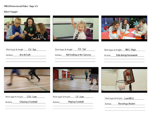
[Fig 5]

[Fig 6]

[Fig 7]
New Shot List
Below in fig 8 is my new shot list with the correct shots in the correct order and shots that will defiantly be in my promotional video. I cleaned the layout to make it easier to read and readjusted what shots are going to be in my video as before on the old shot list, it had shots that I wasn’t able to get, either time restraint or wasn’t given the opportunity etc.

[Fig 8]
0 notes
Text
Digital Video Production
02/12/2019
Week 11
Editing & Shot Retaking
Continuing to edit my promotional video, one of my key shots during the video is a blackboard that shows the history of the YMCA. After discussing with the one of the staff about clearing the board and redrawing it, this was quickly turned down as they mentioned it took them roughly 5-months to draw and they didn’t want to ruin that. As a workaround, I mentioned if I could flip the board to the other side as it is the same material as the front, again, this was turned down because the other side has a tuckshop menu price list for the youth club and they didn’t want to wipe it and redraw, even after my reassurance that it will be drawn back up exactly as before.
I had an idea and asked them if they had another blackboard that I could use to draw on, again, this was turned down because they did not have another, with that, I had to give up on that idea or think of another way. I thought that maybe I could use a whiteboard but I turned this idea down as it wouldn’t look nearly as appealing as the black makes the different colours on the board to stand out.
An idea came to mind, it was a suggestion from my tutor but I could take an image of the blackboard, like what you see below in fig 1, take it into Adobe Photoshop and mask out the parts of the board I want to animate. I could have each building come in at different intervals, I use a tool called the Lasso Tool to trace what I want, copy and paste what I’ve traced and then hide that layer by pressing the eye button where the layers are at the bottom right corner of the workspace. I go back to the original layer and trace the image again but this time, I right-click and use a feature called “Fill” and use “Content-Aware”, this will remove what I have traced, it will make it appear like nothing is there. In the image below, at the bottom of the board in the middle, you can see a blank spot on the blackboard, this is after I have used Content-Aware and removed a building that I will be later taken into Adobe After Effects to animate to experiment with. All that is left at this stage is to go round your copy and remove anything you don’t want that got caught in your trace earlier. Currently, I have done this to all the big buildings, arrows and logo that you see below, later, I may remove the smaller details if I plan to go ahead with this and if it fits in with my video.

[Fig 1]
Once I was finished with my layers in Photoshop, I didn’t export it, I saved it as a Photoshop file (.psd), this allows me to import the file into After Effects with the software retaining the files layer sizes. This allowed me to have access to each layer I created in Photoshop which lets me animate each layer individually, in the lower-left corner in fig 2, you can see all the layers in this file, each one with its own keyframe to start animating.
The bottom section of the screenshot beside the layers section is your timeline in After Effect, similar to the timeline in Premiere Pro. In this scenario, I have each layer come in after each other, the first layer to start animating is the first building on the top left, the next layer is the first arrow, the nex is the second building etc. Each layer starts off at a scale of 0%, it remains this way until I insert the keyframes in the positions I want them to appear. The first layer starts to scale up to 100% at under 1-second, I want the animation to be snappy so the layer scales up to 100% fast and to make it “bounce” in, I have used “Easy Ease” to have it scale in smoother, makes it look less bland. When one layer scales up to 100%, the next layer starts to scale up, in the timeline below, you can see white dots going down diagonally, this is the order in which they come into view, each layer comes in at the same speed to make it consistent.
Once I have finished adjusting my layers and keyframes to my liking, I will export the file to a “.mp4″ format and insert it into my YMCA Promotional Video Premiere file and do any other editing to the file to sync it into the video.

[Fig 2]
——————————————————————————————-
Shot Retaking
Below, you can see one of the shots that I decided to retake as the original and first retake wasn't to my liking, the original take of pool balls breaking, I didn’t have the eye-level shot centred, the lighting was acceptable but I wanted the white balance to be even with the rest of the video, the white balance in the original clip had a “Shade” white balance, too warm compared to the other shots I have.
The first retake of this shot, it was centred, lighting was good, white balance was a bit on the warm shade side, the only main problem was I didn’t switch the focus fast enough and this was caught after I left that time as I didn’t notice on the camera. The rack focus was perfect in the original clip, the first retake was out of sync. the video below of Pool Balls Breaking V3 is what I wanted, the plan is to have the camera focus on the hand and white pool ball, the person shoots the white ball at the red & yellow balls, at the moment of contact with the other balls, the camera switches focus (Rack Focus) to the coloured balls so now the colours balls are in focus while the background isn’t. I may slow the footage down slightly so you can see the transition better but still fast enough for a quick, sharp transition effect.
youtube
0 notes
Text
Digital Video Production
25/11/2019
Week 10
Editing, Adding Effects
This week, I am editing my opening & closing shots, the opening shot is a mid-close-up shot of the front of the YMCA building panning upwards, the closing shot is the same but panning downwards to conclude the video, the opening and closing clips are two separate shots, they are not reversed.
One of the first edits that I did these shots adds an effect called “Lens Flare”, the reason for this is these shots hold a common issue, if you look below in the Premiere Pro screenshot, in the top right corner of the clip on the left, the side of the YMCA, the sunlight hitting it is more over-exposed than I would of like. Instead of going back out to retake the shots, the lens flare helps me hide this over-exposure by making it look like the sun is hitting the camera lens when it really isn't. This effect is static meaning that for me to make it fit with the panning shot, I need to keyframe and manipulate the position that the lens flare effect covers to make it appear natural. The left clip in the screenshot is without the lens flare effect, the clip on the right has the lens flare effect, I believe this not only fixes my issue but makes the shot appear a lot warmer and filling instead of the bland flat effect like the clip on the left.

Removing Unwanted Clips
After last week of me visiting the YMCA and taking shots of inside & outside of the building, I went through each shot that I have taken to see what clips were good or bad, the clips I worthy are kept while the unworthy are put into a folder I call “Nope”. I am not deleting them in case some of the clips can be used later or for another purpose. Below you can see 8 clips that I have removed, some of them were either out of focus, bloopers or something random that I thought would look good for the video. Each time I am down filming, I am doing this process to lessen the number of clips I have to sort through and import into Premiere Pro to edit.

——————————————————————————————-
Emailing the YMCA
I emailed the YMCA to let them know what stage I am at with creating the promotional video and to let them know what I want to plan to get their permission ahead of time for them to prepare. One area that I want to film is their Mac room where they allow people to go in and do any work they have, unfortunately, this room is always closed and locked during the times I film, emailing them will give me a chance to have access to this room and have people do work.
Thanks to the email, I received word back that I am allowed to use that room, they did say however that the room is dark but they have accent coloured lights to make the room relaxing. I went down after class to check the room out and what they said was correct, they do have your normal room lights that does light the room up but the problem with that is the lights shine on the Mac computer screens which is something I am wanting to avoid. To combat this, I asked them if they had any softboxes that I could use, they did not, fortunately, the NRC has a small mobile one that I could borrow, the next day I received the softbox and went down and used it, I got the results I wanted, no light source reflections while not having the room too dark.
0 notes
Text
Digital Video Production
18/11/2019
Week 9
Entrepreneur Workshop & Interview
This week, there was an event happening on campus-based around Entrepreneurs. The event was for students to help plan their career paths and what possibilities and what being an entrepreneur is. The day was broken up into two sections, morning sessions is a short presentation and workshop that involved the students, the afternoon session was an interview with entrepreneur, Brian McConville.
During the day, my classmates & I went around the morning workshop filming the students doing various activities working together, as well as filming one of the event presenters. The goal of this is to edit the footage together to create a short, quick video to briefly showcase the event, something like a montage. In the afternoon, there was an Entrepreneur interview with Brian McConville, the interview was an hour-long, this was also filmed. The difference with this is that the camera is in a fixed positioned with the same camera shot and angle as the interviewer and intervene are in the same position throughout the interview.
This can relate back to what I am currently doing for my YMCA promotional video, I have to think about the kind of shots & angles used, the one problem is that I only have one shot to capture since it is happening live and its a one-day event. The end goal is to create three videos, the first video being the morning workshop montage, the second video is the interview and the last video being a combination of the two previous videos.
0 notes
Text
Digital Video Production
11/11/2019
Week 8
Gathering Clips & Starting Editing
This week marks the first week of me importing my first few sets of clips, I am not putting in any special effects, the most that I may do is increase or reduce the speed of a clip is need be. This week, I am focusing on inserting my clips, trimming them down to my liking, removing the audio as I will be having music play over the top. below is my first draft and there will be clips being added and removed over the upcoming weeks. The music choice right now is going to be something like the second promotional video that I found a few weeks ago, something upbeat, inspirational, positive etc.
I should mention that this project file and the clips are going to be saved on my external hard drive, this will allow me to not only work on this project during class on the computers but also at home on my laptop. I currently have the same version of Adobe programs that the computers in class have (Adobe 2019) so that don’t run into any compatibility issues that can sometimes happen between different versions. This allows me to have more time to edit as I can work on this when I am not in a class, I am only in class two days a week which is not a lot of time to edit, especially with the other work tasks involved with my other class. The biggest advantage is being able to work on this during Christmas when the campus is closed, it means I won’t be as stressed by having to get it finished too quickly, I can sort of taking my time to make sure the effects and clips are to my liking.

——————————————————————————————-
Shot Retaking
This week, down in the YMCA I got some more shots of the Health Hub section going about their daily activities. I mostly got new shots but at the same time, I took this opportunity to get some shots retaken as I was either unhappy with the first version or a new idea came into mind as a way to improve the shot. The clip you see below is the second version of pool balls being broken, the reason for this retake is that before I didn’t centre the shot and it didn’t look as nice off-set, I did try and centre it in post but this made the clip too grainy, it was better and easier to reshoot.
youtube
0 notes
Text
Digital Video Production
04/11/2019
Week 7
Gathering Video Clips for YMCA Promotional Video + Ideas
YMCA Footage
Over last week, I went down to the YMCA to start getting some video clips to try and start editing for my YMCA Promotional Video. I was unable to get all the shots I needed within the opening times of the YMCA. Some of the reasons were there weren’t enough people, one of my shots listed is going from an empty room to a busy room but for that, I need a lot of people, during this time, this was not possible. The other reason was the age group at that time is not what I wanted, what I want is teenage people, not only are they easier to work with but it is more what you usually see in the YMCA.
The clips I did get however did work but I am definitely going to go back and retake the shots to see if I can frame them better and light them up slightly to emphasis a focal point. Some of the shots that I shot can be found below, the “Pool Ball Break” & “YMCA Painted Board” I can reshoot. The shot of “Leader Speaking to People” I am unable to do, at least in that environment because, at that time, the YMCA was doing a limited-time event but besides that, it is not a massive inconvenience as I can work around it.
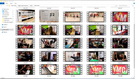
Below is a screenshot of some of the video clips that I filmed at the YMCA, you can see on the bottom right corner, there is three clips with the nearly the same thumbnails, that is because they are the same shot but with different methods to try and get a better shot. I will be going through each clip to see if they are what I am wanting in my film, any that is not, they are removed to make it easier for me to see later on what clips I have to use.
——————————————————————————————-
Pool Ball Break
This is one of the first shots I took when I visited the YMCA after getting my test shots. Like mentioned before, I decided to get more close-up shots to capture detail. The shot you see below is a quick Rack Focus shot of someone staring a Pool game and it is them breaking the balls, at the start, the video is focused on the person lining up their shot but as soon as the white ball hits the red & yellow balls, the focus quickly swaps to the coloured balls for a subtle effect. An idea that was suggested was using the breaking of the balls for a transition shot, as o what it transitions into, still needs to be planned.
An issue occurred that I didn’t notice until I left was that I didn’t centre the shot too well, in the video below, you can see the balls is offset to the left slightly and because the balls are vibrant against the blue table, it stands out clearly. Next time this will be reshot and fixed, as well as make sure the camera is not canted and is level as if you look closely in the video, the pool table looks as if it is on an angle, which doesn't appear even.
youtube
YMCA Painted Board
Below is one of the shots that was taken at the YMCA, the painted board is new, it was being created during one of my previous visits and last week was the first that I have seen it finished, it was created to celebrate the 175 years of the YMCA which you can see below in the video. The board itself is large but long, getting it all in one still shot is possible but you would be able to see the areas above and below the board which is not the most appealing to see, trying to get it at a Dutch Angle would make it hard to read the text. My next option was to do a slow Close-Up Pan-Shot, this did work although there are problems, the biggest issue is the shoot is too laggy, the reason for this is the video is required to be filmed at 25-FPS but as you can see, even a slow pan can cause jitteriness. Throughout my next visits to film, I plan on raising the FPS up to 50-FPS so that the camera can take in more frames a second, it will basically be twice as smooth which will look a lot smoother. I plan on borrowing a LED Panel to help highlight the board’s multiple colours, the YMCA’s ceiling light doesn’t give the board justice, they don’t highlight the vibrant colours.
youtube
Leader Speaking to People
Below is a Pan Shot of a leader giving a talk to some children, this group specifically is PAKT which, as stated before, are a subgroup of the YMCA. During this time, the YMCA was doing a limited-time event so unfortunately, I am unable to redo this shot, the only way is to recreate the shot in a different scenario.
The Pan Shot is to show off how many people were listening and in attendance to the leader to show the age groups of parents and kids together like what the PAKT name stands for. The issue that I ran into above with the low FPS for the pan shot wasn’t a problem for the Mid-Long-Shot High-Angle shot below which I feel the reason for this is that above. The camera was close-up focusing a large subjet whereas below, there is a lot of open space, there is no focus point specifically so you don’t notice the issue. This was shot with the kit lens for the 700D, 18-55mm lens to try and get as much of the room in the shot as I can as the 50mm, I was unable to do this as there were obstacles in the way that could not be moved.
youtube
——————————————————————————————-
YMCA Promotional Video Ideas
While editing some of the video clips, I realised that I do not have enough usable footage, I needed more shots but that is simple enough to work around as I visit the YMCA weekly. I went back to rewatch my inspiration promotional videos, the “Strada Eateria (Coffee Video) and the Outdoor Activity Centre to get some more ideas.
The first idea was at the end of the Strada Eaterie video for when the business’s logo shows up while the background is blurred out to emphasis the red logo against the grey background at 1:14. I want to replicate that kind of effect but with the YMCA logo, one idea was to have someone draw the YMCA logo on the blackboard, take it into Adobe After Effects to trace it, highlight it and make it appear as if it is coming out of the blackboard like in the promotional video.
The next idea was involving the blackboard again, as mentioned before, the blackboard below has some history of the YMCA, I asked if it could be wiped and drawn back on by was quickly rejected. The other side of the board is the same material so it could be possible to draw on that side of the board is flipped. If possible, I want to do a time-lapse of someone redrawing the history of the YMCA like on the original side but throughout the promotional video, keep cutting back to it, football is drawn on, the next shot is people playing football etc. It is as if it is happening in real-time to emphasis what the YMCA has created since it was founded many years ago.
One of the last times I visited, I got some footage of the Heath Hub playing football, I had the camera positioned in the corner to get everything in the shot, now that I have some more Close-Up shots, the Wide-Angle, Long-Shot of the football seems too out of place and empty. Next time, I plan on getting a close-up of some of them playing football, one idea is to have the camera closer to the ground and have people run past the camera with the ball to highlight the activity that they are playing.
0 notes
Text
Digital Video Production
21/10/2019
Week 6
Digital Storyboard & Shot List
Storyboard Template
This week, I started to assemble some of my storyboard & shot list to begin organising my video production, see if the shots I want to use will flow into each other. The other reason is to let me show my client what I have planned for the storyboard visually now as before, I have not been able to show them as I hadn’t taken enough photographs to start forming this.
In Fig 1 below, you can see the beginning of a storyboard in the six white boxes. I will be inserting photographs to represent the shot that I want to do for my promotional video. On one storyboard page, there are six shots, to reach my target of 1-minute minimum or 1 minute 30 seconds maximum, I should have somewhere around twenty-five shots which would be around five pages of storyboards. By doing this, it allows me to plan ahead of time, it needs to be professional so having a plan will help keep me on schedule for days I have limited time to film and to not miss any key shots. Under the white boxes is where you put brief details on the shots above them, just enough to let you know quickly what shot you need to have.
An example would be CU for Close-Up shot & low for Low Angle. Under that is the kind of action in the shot, so again, an example of this would be “Boy walks to the girl,” just enough for a general idea. You don’t need to have crazy detail as you don’t have space, and you may have limited time, keeping it brief helps increase the efficiency of your shoot.

[Fig 1]
Shot List Template
The image below (fig 2) is a screenshot of a shot list template that I will be filling in with each shot that I plan on using for my promotional video. The list is laid out to be easy to follow, the numbers on the left side, 1-29, are columns beside it is where you put down the name of the shot which its own name so that it is easy and quick to recognise. The column next is the scene in which that shot will take place like Scene 1, Scene 5, etc., next is where that shot is gonna be, outside in a field, inside a living room, etc. Next is the shot type, angle & movement to see how the shot is meant to be filmed and what motion is involved. After that is a short description of what happens in the shot, "the main character walks up to the door, walking away from the camera." After is what character is in the shot, main character, antagonist, pet, etc. Last of all is the lighting notes, High-Key/Low-Key. Each section is meant to be brief, enough information to understand straight away while on set to be as efficient as possible to manage my time and create less stress for the people involved and me, it will be planned out.

[Fig 2]
The Storyboard & Shot list will be updated over the next few weeks as to when shooting, I may come up with a shot that I think would work and use that isn’t what I planned beforehand. It basically means that I do not need to strictly follow my plan, I can experiment with new ideas and if I use them in my video, I just need to update the storyboard & shot list for my production.
-----------------------------------------------------------------------------------------------------------
Storyboard for YMCA Promotional Video
Below in fig 3, 4, 5 & 6 are the first versions of my storyboard for my storyboard, changes will be made on it as some scenes may not work as I plan or I find a better idea. As of now, these storyboards do not fully match-up to my shot list as I don’t have the photographs for all my shots but there are some substitutes that will still tell me what kind of shot I want.
An example of this is the 2nd shot on each storyboard, it is mant to be a blank blackboard progressively getting drawn on but it is a shot of the board already drawn on fully. shots like these will still tell me what kind of shot I need, looking at my shot list will further explain this. In these storyboards, there are some missing shots as I don’t have any reference images at this point but again, having my shot list will give me the same message, I am using the storyboards as rough outline, I am going to be mainly using the shot list as I want most of the video to be natural, without me having to tell them to do something which means that there is wiggle room for changes.

[Fig 3]

[Fig 4]

[Fig 5]
[Fig 6]
Shot List for YMCA Promotional Video
Below in fig 7, you can see the first version of my shot list, in the shot list, I have colour coded the different sections of the YMCA that I plan to film. Grey Bar being the outside of the YMCA Building, Yellow bars being the blackboard that I have talked about previously, Red bars being the people part of the youth club, Orange bars being the Health Hub people and the Green bars being the PAKT section. The reason why it is colour coded is t make it easier for me to quickly see what shots I need to take of each section, it helps to separate them.
As you can see, I have the blackboard listed multiple times to be planned in my video, an idea I had for it was throughout the video, it keeps cutting back to the blackboard but throughout the video, the board gets drawn on until eventually at the end of the video, the board is full.
This shot list will be updated over the next couple of weeks as there will most likely be some problems with me getting some shots which I have planned for any reason.

[Fig 7]
0 notes
Text
Digital Video Production
17/10/2019
Week 5
Pre-Production Practice Photographs of People & Another Room in the YMCA
This week, I went back down to the YMCA, not only to get more photographs of rooms I may use but also speak to the owners, it was to confirm that I wanted to choose the YMCA and go forward with the goal to making a promotional video for them.
I went over details such as the time frame I had to film, where I would like to shoot in the building, who to film and give them an overall idea of what way I wanted to put together the video. In a nutshell, to the people in the video, it will be as if I am not there, them going about their natural business like usual. The owners were more than happy to let me have free rein in terms of where I could shoot and when I could shoot, provided that there isn’t a meeting or private business happening.
During our talk, we did have a mixed agreement in terms of who I would be filming. I want to do a promotional video on the overall YMCA, various people of many ages, this, however, is what led to the problem of getting permission from the people, without it, I couldn’t film them for legal reasons. They suggested I focus on a small group of people like P.A.K.T (their subdivision group of after-school kids) to make it easier on me, however, I insisted I wanted to have a variety of people to show the range of people who come to the YMCA. This was when one of the leaders suggested that I join the YMCA program. This meant is that I wouldn’t need to get permission from people as I would be a YMCA member filming for the YMCA. When you sign up, you have to agree for the YMCA to take video & photograph of you for promotional purposes.
We have exchanged emails to keep in contact with each other and to let each other know if anything arises that could help me film or events that I am unable to make it. It makes it more convenient for both of us as before I would go down and hope that the owner is available which was unprofessional of me as it doesn’t give the owner time to plan and schedule me into her day.
-----------------------------------------------------------------------------------------------------------
Below in Fig 1 is a room that I was unable to get photographs the first time I went as it was being occupied and I couldn't interrupt. This section of the Health Hub branch of the YMCA, they are involved with a various range of ages like the main branch so I naturally want to engage them in the video. The space you see in Fig 1 with the orange chairs and sofa is one of the areas that they would meet at the start of the session and discuss what the plan is for the day.

[Fig 1]
Fig 2 is the same room but on the other side, its where they would chill out and discuss the day’s plan like in fig 2. However, the area in Fig 2, space is more open, which would make it easier for me to get better angles when filming, and there is more natural light coming in through the window. However, I will need to be careful with the over-exposure which you can see through the window, the ground is barely visible because the light is over-exposed.

[Fig 2]
Fig 3 is the sports hall of the YMCA, I did take photographs on my first visit, but since the gym is very open and empty, if I wanted to film in this room, I want to see what it looks like with people in the frame doing their natural activities to the camera. This example allows me to get a sense of what camera lens I should use and how I should frame it, this photograph was taken with the Canon 700D with the kit lens 18-55mm which allows me to have this wide shot at getting everything in the frame.

[Fig 3]
Fig 4, like Fig 2, is the same room but using the same camera and lens but zoomed in on specific targets. In this case, I've focused the camera on the person with the ball as in this scenario, the group is playing football, the ball is the most crucial target of the game, it would be natural for the camera to focus on the source of the goal. From this example, I have thought of ideas for this room, I would start with a wide shot like above in Fig 3 but quickly go into a zoomed-in, medium shot to capture the action, body language and facial expressions of the people concentrating/enjoying themselves. The lighting in the room is reasonably even, so I don’t have to worry too much about over-exposure or low-key lighting, I just need to remember that the light needs to match the rest of the video so I will be experimenting more with lighting to find out what works best overall.

[Fig 4]
0 notes
Text
Digital Video Production
14/10/2019
Week 5
Catch-up on Research for Blog
This week at the start of class, we used the first part of the day up until break catching up on our blogs or add anything that needs adding in terms of film language, more detailed research & examples etc.
After a break, we were introduced to a video of Martin Scorsese talking about the influence of Caravaggio on his own films in regards to light, shadows and realism. This led us to analyse the video about what points Scorsese made and then try and recreate old paintings and see what they could have looked like in real life for realism. We focused on doing a task as a class, on starting off, we began to do our own research to try and find paintings from artists like:
——————————————————————————————-
Task 1 - Martin Scorsese Talks about Caravaggio in BBC Video
- BBC Video - The Culture Shoe - Scorsese on Caravaggio
Martin Scorsese strongly admired Caravaggio for his use of lighting and staging of a scene. Scorsese mentions that the way Caravaggio uses a single light source to illuminate the scene, how the light is as colourful as black & white. Scorsese loves black & white, he misses it as it can bring out more detail and design style on certain subjects but he gets immersed by how Caravaggio uses the light to help illuminate the people in the painting which is called “Supper at Emmaus”, making them seem powerful, as Scorsese said, “it is as if they are living the life”, capturing the story.
During the interview, Scorsese mentions a piece of art called “Conversion on the Way to Damascus”. He talks about how the man is under the horse with his hands stretch out to the sides, displaying a sense of undignified, it makes the man appears weak and vulnerable because of the man’s body appearance and the way the horse is near on top of him as if the horse is about to stomp on him. The painting as Scorsese put it is caught in mid-motion. The scene isn’t caught at the start or end but mid-way through, your mind is instantly locked on to the scene, seeing what has happened and what is about to happen, you get immersed in it, it makes the painting seem realistic which wasn't the main feature during this time frame in 1601. Scorsese mentioned it is different from past paintings at that time, he compared it, not to another painting but modern staging in film, one of is last points is if Caravaggio was alive today, he would be an excellent film-maker, that is how much Caraggio influenced and inspires Scorsese.
The link to the interview - https://www.bbc.co.uk/programmes/p00hqprn
- Caravaggio Painting & Movies/Stills from Scorsese’s Movies Comparisons with Shot Types, Composition & Lighting
Scorsese takes a lot of inspiration from Caravaggio’s paintings for his use of light, shadows & staging. One of Scorsese’s films where you can see this is from his movie called “Mean Street” in 1973 in the bar scene. Below you can see the clip of the bar scene and there is going to be comparisons on how Scorsese used Caravaggio’s style/techniques.
- Bar Scene in Mean Streets (1973)
Throughout the video, you can see some of the points that Scorsese was making during the interview, his use of light and shadows to have the audience focus on certain subjects. Scorses’s biggest similarity to Carraggio is low-key dark scenes. He hasn’t made the scene high-key, in a bar at night, the lights would be down low, creating shadows against everyone and everything in the room, it helps make it more realistic as if that is what you would see if you were to walk into that bar. The red lightening helps create contrast between the background and foreground because of the limited colours, the shadows help make it clear, even in the low-key scene.
youtube
——————————————————————————————-
Task 2 - Analysis of two paintings, one of Caravaggio & one of Rembrandt & Recreation
- Photograph 1 - Recreation of The Wardens of the Amsterdam Drapers by Rembrandt in 1662
Fig 1 is a painting by Rembrandt in 1662 of six men sitting at a table reporting the year’s trade. Rembrandt positioned each person based on their relationship status.
The lighting in the painting would be Low-Key lighting based on the lack of light and brightness to the scene. I believe this was intentional based on the men’s clothing, the black drapes hats, along with the environment design. If Rembrandt decided to go with High-Key Lighting and make the frame bright, he would then have to change the environment design and men’s clothing which if he did, it would not match the current design style at that time.
The third guy from the left who has his hind upside down, Rembrandt positioned this intentionally to portray the sign of “You See?” as if he is showing the other members the results from the record book in front. It gives the audience a more realistic message because the guy is looking at a member beside him with his facial expression & body language as if he has sat back up with his other hand still holding part of the book. The Low-Angle position was intentionally done to make the table raised up on a platform which was done to correspond to the position of the picture above the fireplace.
Each member in the painting has been given their own position and their own personality, such personalities from the research are; the irony, good nature, bluff straight-forwardness, shrewd scepticism and dull tenacity. Each detail of the frame has been thought out to have its own purpose to show attention to the small detail like the hand and facial expressions.
Fig 2 below is our class recreating Rembrandt’s painting “The Wardens of the Amsterdam Drapers”. In our case, we set about to modernise it while still trying to keep the style of low-key lighting and the Eye Level, Mid-Long Shot framing. The biggest change we had while recreating the painting was the low-key lighting. In Fig 1, the overall lighting & colours in the painting are dull and bland, in ours, we have more vibrant colours and there are some small amounts of High- Key lighting seeping into the shot which you can see reflecting off the posters in the background. the third guy from left to right is me holding a LED Panel to shine warm High-Key Lighting into the scene for a subtle effect to help bring more life to the scene compared to the original painting.
http://www.visual-arts-cork.com/famous-paintings/syndics-of-the-clothmakers-guild.htm

[Fig 1]

[Fig 2]
- Photograph 2 - Recreation of Martha and Mary Magdalene by Caravaggio in 1598
Fig 3 below is a painting called Martha & Magdalene painted by Caravaggio in 1598. This painting is the second painting that, as a class, we decided to recreate, in this scenario, it didn’t require as many people but to me has more going on, one of the big features is we have modernised the painting.
Comparing the painting & photograph, we tried to make the lighting & framing as close as we can. In the painting, there is low-key lighting in the background where there are a lot of shadows but off to the left, there is a light source hitting the two people in the frame but the left side of their bodies being illuminated and the mirror reflecting the light source. We darkened the room, closed the blinds and had a LED panel Key Light positioned outside on the left of the frame so that we could recreate similar lighting to the painting.
In fig 4, how we modernised it, is by replacing the old fashioned mirror with a modern computer monitor with a mouse & keyboard, to get some sort of reflecting, we put an image of the painting we were recreating, not only for some humour but to represent the generation difference in terms of appearances. Besides the noticeable other modernised features like out clothes and background, the items on the table are the next change, in the painting, they used a small bowl and a letter. In contrast, we have used a sleek mug and modern smartphone device, again to show the changes between generations.
Now one of the ways our recreation could have been further improved is if Leah & I were positioned close together like in the painting to so more involvement between the two people like in the painting as ours appear to be distance apart, not connected to each other. I feel like Caravaggio positioned the two people that close is to make it seem like the women on the right is demonstrating/showing the other person the mirror. Caravaggio kept the painting framing compact so that the audience couldn't get distracted by the background which they can’t because nothing is in the environment beside a dark wall. Our framing, however, is a lot more open, which lets the audience get distracted and lose focus by the main topic of the framing.

[Fig 3]

[Fig 4]
——————————————————————————————-
Task 3 - A Matter of Life & Death + Black Narcissus
- Black Narcissus
Below in fig 5 is a screenshot from a scene from the film “A Matter of Life & Death”. The high-angle, mid-long shot of the valley below and the building to the left is obeying the rules of thirds. The building is on the left third of the frame allows us to see the environment/situation that the characters are in. The character ringing the bell echos throughout the valley create a mysterious sense of what is beyond the valley, how far will it travel, who will hear it. the size of the building and landscape compared to the character, it shows how large the scenery is and to show some fear/anxiety of the possibility of falling off the building down onto the valley from that height,

[Fig 5]
- A Matter of Life & Death
Below in fig 6 is a screenshot from the film “A Matter of Life & Death”. In this current shot, we have two characters sitting on a large, long staircase that makes the characters appear small as if they are in weak and insignificant, as if the characters don’t have any control over their fate of life & death. That being said, the characters have been positioned in the middle of the shot and in the middle of the stairs, as if they are in-between life and death, life being upwards towards the sky and death being downwards towards the ground. You can really see the sense of scale with the comparison being between the characters on the stairs, the statues on the right and the fact that this is a wide-shot, extreme-long shot where we can see the environment surrounding the focal point with the stairs disappearing into the distance remains unknown how long the stairs are.

[Fig 6]
——————————————————————————————-
Task 4 - Research of Johannes Vermeer’s work & Tom Hunter Photography
Below in fig 7 is a painting called “Girl Reading a Letter at an Open Window” painted by Johannes Vermeer between 1657-1659 and a photograph created by Tom Hunter in 1997 who was inspired by Johannes Vermeer. On the left is the painting by Vermeer whereas on the right is a recreation photograph by Tom Hunter.
The painting portrays a young blond girl at the window reading a letter. The girl’s small figure compared to the large emptiness of the room doesn’t create the most positive emotions, it is as if the girl is sad/depressed and she misses someone close to her. The letter that she is reading is a love letter that she has received which is either her planning or continuing a relationship. The girl standing at the open window with the large bare room suggests that she is confined and wants to be free from her living situation. The High-Key natural lighting coming from the open window can be seen as new opportunities are out there and if you take that extra step, you could achieve them.
The photograph on the right in fig 5 is Tom Hunter’s recreation of Vermeer’s work. Tom Hunter’s usual depicts groups of people who having house problems, this includes squatters, house tenants and caravan-dwellers but in a more positive bright light. The phonograph is based on a community in Hackney in East London although he did get his inspiration to create this from Vermeer’s work. Going back to Tom Hunter’s depiction, he has altered the painting by having a struggling young mother trying to take care of her child which is on the bed beside her while she is reading a letter which is what payments that need to be made. The rundown, bare room that she is in doesn’t indicate that she is not living life in luxury and is constantly struggling with finance.
Side-by-side, the who pieces of art are very similar with the exception of the time difference & lifestyles between the two, the arrangement of the character and props are nearly identical but with a modern twist. Vermeer & Tom Hunter have used the same type of light source, their only light source in their scenes is the natural light coming through the window to light the room. The window in the photograph is unable to open the same way as the window in the painting because the home design is several generations apart, the window in the photograph is safe as it decreases the chance of someone falling out the window as the window is smaller than the subject in the photograph.

[Fig 7]
1 note
·
View note
Text
Digital Video Production
07/10/2019
Week 4
Transition Masking & Promotional Video Scouting
This week, we started to look at mask transitioning in videos and how they can help smoothly change location/time of day depending on your video. A great tool we can use to get a smooth straight video shot is called the Digi-Slider. This allowed us to put the camera on top, screw it on and use a crack on the end of the rails to slowly crack the camera along at our desired speed and angle. A motor can be used to do the same thing, but the engine was too slow and was unnecessary to what we wanted, so we went back to doing it by hand on the equipment.
Alongside looking at & experimenting with Transitioning Masking, in preparation for our client promotion video, I started to look at promotional videos to get an idea of what kind of camera shots & angles to use in my own promotional video. A small problem occurred, any of the current YMCA/Youth Organisation videos, in general, were not up to power with what I wanted to use. To work around this, I researched and found a few promotional videos that had good lighting, how they shot their shots with their space, how they made use of Rack focus etc. Some of the promotional videos can be found below after the Mask Transitioning.
Static Mask Transition
Below, as you can see there is a short video based on Mask Transitioning with a static subject. In this case, I had someone stand in front of the camera to the side, they stayed static while the camera on the Digi-Slider was cranked across, this went on until the subject standing on the right went out of frame on the left side. I did this in two different locations so that it would be obvious in the finished video to show that we have gone from one location to the other, in our case, we went next door where its a different scenery and lighting which you can see below. The shot itself would be classed as a Horizontal Pan Shot because the camera is moving across the scene. In location two, the same was done in location one but I didn’t need to have a subject in front of the camera as the subject in location one is all I need to help do the transitioning as location two comes in after the subject comes into the frame. At the end of the video below, you can see what each clip looks like before they were edited in Adobe Premiere Pro to get an idea of what I filmed and where the masking started.
https://www.youtube.com/watch?v=90rvZItNU4E
youtube
Movement Mask Transition
Similar to the video above, I created another Mask Transitioning video but the change this time was from going from a static subject to a moving subject, the roles of the camera and subject are essentially switched, the camera remains still. In contrast, the subject is moving across the camera frame. I wanted to experiment with both types of masking to see which one I could possibly use in my own promotional video, one of the promotional videos below has done this with a moving subject which I feel will work in my own video. This video was easier to do, not just because this is my second attempt. Still, the subject was more natural to mask I had the subject stand further away and have a straighter line to follow, in this case, it was the subject’s leg, the leg had fewer key-points to mask round, so it was not only easier but was also faster to do. The video shows the subject walking across the screen, as the subject is doing this, the subject’s legs are the barrier in which is edited to be the transitioning mark, as the subject walks, the second location comes into the frame while location one is removed. Like the last video, at the end of this video, you can see what each of the clips looked like before being edited.
https://www.youtube.com/watch?v=YIcvKd7PWE4
youtube
Promotional Video Research & Analysis 1
At the start of this first promotional video of a coffee shop, it opens the scene cinematic by slowly opening the view frame until it stops near the top. The scene begins with the shop front with people casually walking out before it suddenly changes to the inside of the shop using mask transitioning, which I practised earlier. They use a person cycling across the frame to do this to have it seem like a natural effect as the street it was filmed on was busy, its to help blend it in smoothly. Once inside, there is a number of close-up shots that fade into enough that shows the process of how they make a coffee before focusing on the customers going about their business relaxing.
There is no music but just with the natural sounds of the machines and people creating the coffee and a customer flicking through a book to show that the coffee is a quiet/peaceful relaxing environment. This is however paired with upbeat music that is synced with the knife chopping, each chop the knife does, the beat of the music is synced. The upbeat music helps to show that it is a positive environment where you can work, talk and enjoy a cup of coffee, 0:33 in the video is an example of this where the guy is talking with the staff and appears cheerful and relaxed.
The video uses a lot of short, quick clips to show off a large amount of the cafe, the video demonstrates all the different kinds of customers that the cafe receives and what activities people get up to, from working to chatting to eating & drinking. The majority of it is close-ups to show the quality of the coffee-making process, the individual grains, the sandwich making, people’s facial expressions. Of course, there are mid-long-shots in there like at 0:35 of the old man sketching which also includes a slow-moving, shallow focus pan shot of the guy doing this to make the shot appear the camera is not interrupting the guy concentrating, sneak peeks of people.
At 0:26, it is a close-up shot of a guy working on his laptop with a drink in the same, not only does this help fill up the shot as, without it, it would be too empty, but with the drink in the frame, it is half full which is intentional as it allows the background to seep through the glass that the audience can see to tie the background and front together nicely.
At 0:30, the editor uses another mask transition, similar to at the start, they use it to change locations within the shop. even though the shop appears to be small inside, they use the mask transition for a smoother & snappier transition instead of doing a pan shot which, not only would it make the scene longer but would make the area appear bigger which wouldn’t match the rest of the video, they keep their scenes consistent. They use a series of close-up shots for the majority of the video to have this small shop feeling while maximising the frame with their depth of field. An example of this is at 0:41 where the camera is behind the counter at the coffee machines, its a shallow focus of the focus being on the couple in the background getting served. Again at 0:55 but instead the camera is outside facing the shop through the window but with the depth of field swapped so that the subjects, the couple closest to the camera is focused while the background isn’t, they are maximising the space while keeping the video compact.
They end the video with the music stopped, the only sound you can hear is the diegetic sounds of the shop filled with customers going about their business and the staff creating coffee. It helps to bring the video to a subtle, quiet close while keeping it professional by subtly displaying the coffee shop’s logo at the end. The background is blurred to emphasise the logo to make it stand out, especially with the bright red colour against the dark background colours.
https://www.youtube.com/watch?v=Z6Dx-o3vfJY
youtube
Promotional Video Research & Analysis 2
The video you see below is the second promotional video that I am analysis in hopes of getting inspiration for my own promotional video for my client. This video, compared to the coffee shop video above takes a slightly different route in terms of filming, they have made it seem as if they have captured the moment by filming as if they weren’t there, to begin with. The way I plan on filming the promotional video is going to be like the video below, as if I am not there, I want the people in the video to go about their daily business at the locations they are at to have a natural, true experience captured on film. The area in which the video takes place is nearly the opposite of the coffee video, the coffee video was mainly inside. In contrast, this video is mostly outdoors where people are hanging about together doing various physical activities, for my video, it will be mainly inside to have as much consistent, balanced high-key lighting as I can.
At 0:04, they start with a slight low-angle, wide moving shot of the “ Elmar's in the Valley”, this would be your establishment shot that is commonly seen at the start of films to show the location of the film. This could be ideal for the YMCA location as the outside of its building is well-kept and is reasonably modern looking, which I feel would be an excellent opening for the promotional video.
At 0:20, they have captured a child eating off a plate in a close-up with the shallow focus going on, the child is in focus when the background isn’t. Think of this, now instead of having a child eating, what about having someone doing arts & crafts or doing homework in a similar set-up, close-up shallow focused shot, this would work in the YMCA as their subgroup PAKT does this on a regular basis throughout the week. The child in the frame is not looking at the camera, it is as if he doesn’t notice the camera is there, which helps to show off his natural facial expressions when eating the food. The child is offset to the right, following the Rule of Thirds of always (if appropriate) having the subject positioned off-centred to show more of the background and the contents, in this case, it helps to show the food in front of the child as well as the adults in the background enjoying themselves.
At 0:31, they have changed their camera shot & angles to a much more open, high-angle wide shot of a large number of people talking to each other among multiple tables while waiters are walking by. The camera is positioned behind a set of railings, supposedly on a raised level of the building even though you notice the grey railings among the warm brown colours of the background. This is done intentionally to break up the background as there is a lot of brown going on with the tables and chairs, the grey railing gives nice contrast while not making it an eye-sore.
At 0:43, they have a low angled wide-shot of the gift shop, but with no people in the frame, it is to show how small the shop is while showing off the products, if people were in the frame, you wouldn't be able to see what was there. One idea that came from this for my video is that I could possibly have a section where I film an empty room that’s usually busy but then have it transition, maybe a mask transition into when the room is compact to show how popular and the range of people who come to the YMCA.
At 0:56, they have captured a group dancing having fun, the group are not professionals, you can see the girl with blonde hair get hit by the man in the white shirt’s hand by mistake, but both still have fun. This helps show the audience that you don’t have to be good at an activity to have fun, and if you mess up, you will not be made fun or criticised about it. The shot isn’t staged, it’s all-natural, which helps to display the naturalness of the activity and makes the people in the shot relaxed meaning they have more fun dancing.
At 1:30, they finished with an extreme-wide-shot panning down from above outdoors to show the large green area that the place has that can be used for a variety of activities. In my video, I would love to finish like this, but in the YMCA or RAOB, they don’t have a big outdoor area like this or anything similar. What could be done, however, for the YMCA at least is finished how the video started, outside the front of the YMCA but panning down for a nice ending.
I am not a big fan of their music selection in the video, it is a bit too repetitive, and in some scenes, they could have matched what was going on in the scene with the beat of the song, but they never did. An example of this would have been the guy playing the guitar at 0:53, his hand could have strung to the beat of the song but never did. This would have tied the song into the video a lot firmer, but they still did an excellent job of putting each shot together, I do like how the music slowly picks upbeat as the shots become faster/busier, its as if it's telling you there is a lot that goes on at this place. If I do the YMCA for my video, I want my music to be similar to this, but with a bit less repetitiveness, the quicked pace throughout the video is what I want to include to make it as if there isn’t enough time to show it all.
https://www.youtube.com/watch?v=qfZm_lwJaD8
youtube
0 notes
Text
Digital Video Production
04/10/2019
Week 3
Practice & Test Shots at Location 2 & 3 - PAKT House & YMCA
This week, I went to my second & third location, which happens to be another organisation called the YMCA with their subgroup, PAKT. The idea that I have for this client is to do an overall video to show the wide variety of ages that come to the YMCA, the photographs you can see below are from the main YMCA and the subgroup PAKT House. The YMCA building will be the main focus as that's where most activities and people gather whereas the PAKT House is where afterschool children gather on certain days during the week, they gather at the YMCA once a week.
I talked to the owner about my idea to possibly film a promotional video, and she was interested in the concept. I told her that I do not have everything planned out yet as I was there to practice and see for myself if it is an ideal location, she gave me permission to do so and to let her know of any updates and ask if I need anything. I was given free rein over where I can take photographs except for their offices as they have confidential information.
——————————————————————————————-
Below in Fig 1 is a wide-shot of a blackboard, it showcases the history of the YMCA which has been drawn on. I have been made aware that they will be adding to the board over the next coming weeks. By the time I film, I board should be fuller with more colour which may help reduce the flections that you can see from the lights above the board out of frame. When I came across this board, I thought of starting the video off or ending the video with this board as it would show what the YMCA is and what they have accomplished over 175+ years. My next meeting, I am going to ask the owner, can the blackboard could be wiped and have someone redraw the information back on for a time-lapse as having it already filled would make the video sequence appear bland and too static, having a time-lapse will make it more eye-catching and appealing to the audience.
Apart from the small issue of the light source reflection being visible, the High-Key lighting, in general, is fairly even and lights up each area of the board making each feature of the board easily visible & readable. I may play around with the camera angles to see if I can make it more memorising, maybe an extreme close-up low-angle of someone drawing on the board or an eye-level view high-angle for a time-lapse etc. However, if I get permission to wipe and redraw, I will make sure to do the writing and outlines more defined to make it stand out against the blackboard.

[Fig 1]
The next photograph below, Fig 2, is an area which, when people are present are where they can gather and socialise with other people. The available space can be used for presentations/meetings as a person can stand at the front while everyone is sitting on the seats. The open space contains low furniture, so getting a right angle on the area while not making it appear empty will be a challenge. The rips in the furniture bring another problem as the rips are not appealing and give off the appearance of the place is not taken care off which combined with the colours and the rest of the room, does not suit the theme. One way I can think of fixing this is covering the furniture with pullovers to hid the ripes although this would require every seat being covered to make everything appear that it fits in and meant to be there.
Like mentioned above in Fig 1, the high-key lighting is even, so I don’t need to worry about shadows or grain in the video, if anything, I need to watch for over-exposure. The ceiling lights above the frame hang down a bit and are bright, so if I capture the light sources, I will need to lower my Aperture to stop the over-exposure.

[Fig 2]
The next photograph below, Fig 2 is another area in which people in the YMCA can gather and socialise as like in the picture. The problems that I mentioned above about the ripped seats can be solved like in the image below in Fig 3 by having people positioned where the rips are to hide them so that they are not visible to the camera. I needed to test at least one photograph what the area would be like occupied with people, and so I asked them if they could sit where they are in Fig 3 and act casually like they would if I wasn’t there and it worked. The rips are hidden, and the open space is filled. Although, next time, instead of a wide-mid-long shot, I will have a mid-close-up chance so that the people in the frame don’t appear too distanced from the camera. Right now, your eyes tend to look around the frame with nothing to focus on, there is no focus point and too much going on in the background like the window behind them.
The lighting again is like what I mentioned above, the light is spread evenly, and I even get some excellent natural lighting coming in through the massive window behind them which, if the camera is positioned well, I can use to my advantage. I can use it to light up the areas in the room that the ceiling lights don’t fully reach to remove unnecessary shadows.

[Fig 3]
The image below is in the same place as the seats in Fig 1 except at the back of the room. This wide-shot photograph, combined with Fig 1, displays how large & open the place really is, this results in camera positioning availability, I will be able to get different angles and shots to see which works best to create what I want. This photograph was taken with the camera positioned in the corner to see how much of the space I can capture within the frame at once and plan what shots I can create using the space & objects in the room
During this visit, I focused too much on wide-shots with the 18-55mm lens and not focus enough on the close-up shots with the 50mm lens, on my next visit I will be focusing more on close-up shots. A shot that I will get next time is a shallow-focus, close-up shot of the pool table balls being broken, shots like this is what I want in my video combined with wide-shots like in Fig 3 to show variety and show the areas inside the YMCA that people can go into.
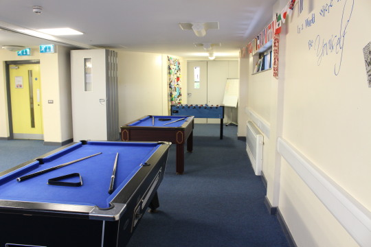
[Fig 4]
Fig 5 below is the biggest and most open room in the whole building, it is the sports hall that is used for various activities like sports & exhibitions etc. The Sports Hall is going to be the hardest to film when the YMCA is doing their sports activities as I need to make sure that the camera does not get damaged by their activities, activities like football or basketball where the ball could fly towards where I am with the camera and damaging the camera is not on my list as it is expensive equipment as well as if the camera breaks, its less time for me to get footage.
The High-Key lighting in the room, like the rest of the rooms, is spread evenly, the light sources don’t bloom too much meaning that over-exposure isn’t too bad, especially since the ceiling is so high, most of them won’t be in the frame. The only sections of the hall that aren’t too well lit are the two sides going down the room at the edge of the ceiling lines where the support beams start but that won’t be too bad as the camera will be focused on the people doing their activities so you won’t notice it.
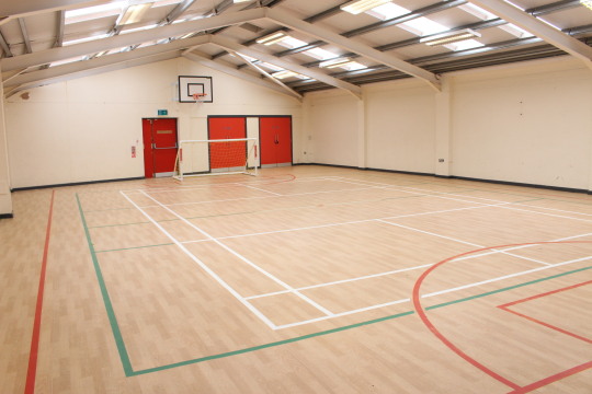
[Fig 5]
Below in Fig 6 is in the PAKT House, now the reason why there is only one photograph that I have put on this blog is that the house is not an ideal place to take pictures/film. I did get pictures of the other rooms, but they do need work in terms of tidiness & organisation as there are cables unmanaged and other problems that make the room unappealing to the camera. If fixed up, I feel like it can be the opposite, it can look appealing, not only in person but also to the camera.
Below in Fig 6 is one of the photographs that I feel appears nice, this is where the leaders store their puzzles & games that they use for the afterschool kid’s activities. The lighting in the PAKT house is very uneven, its almost the opposite of the YMCA building, low-key lighting with a lot of grain in the camera. There is a lot of bright colours however in each room, Fig 6 is a small example of this with the different coloured boxes and the painting on the wall behind them against the white painted wall which helps to emphasise the bright colours.

[Fig 6]
0 notes