Hamburgefonstiv is about typography, typefaces, foundries, type designers and more. Curated by Ana Ferreira, PT @wh0t.tumblr.com
Don't wanna be here? Send us removal request.
Photo


Zoom Pro (Grotesque) (2016-19) is a brutal yet friendly display sans serif typeface with six widths and six weights (36 styles total) speaking full Latin Plus. It has subtle yet distinguished calligraphic characteristics forming a bold personality, which is most evident in large sizes. Zoom Pro has many alternate glyphs and OpenType™ features making it highly adaptable and fun to use. Purchase any collection of Zoom Pro and receive the printed specimen free.
Testdrive and purchase @ the designers foundry. Download full Specimen PDF here. Designed by wir sind schoener
57 notes
·
View notes
Video
youtube
Mike Abbink (IBM), Tyler Smart (Sephora), and Leland Maschmeyer (Chobani) provide short overviews of the new typefaces that were commissioned by their corporations and describe their development and application. These talks were part of "Type Drives Culture," the second annual day-long Type Directors Club conference held at SVA Theatre in New York City on March 23, 2018.
Mike Abbink (IBM) — 03:00 Tyler Smart (Sephora) — 26:44 Leland Maschmeyer (Chobani) — 35:45
4 notes
·
View notes
Photo

Zoom Pro (Grotesque) (2016-19) is a brutal yet friendly display sans serif typeface with six widths and six weights (36 styles total) speaking full Latin Plus. It has subtle yet distinguished calligraphic characteristics forming a bold personality, which is most evident in large sizes. Zoom Pro has many alternate glyphs and OpenType™ features making it highly adaptable and fun to use. Purchase any collection of Zoom Pro and receive the printed specimen free.
Testdrive and purchase @ the designers foundry. Download full Specimen PDF here. Designed by wir sind schoener
10 notes
·
View notes
Photo

Zoom Pro (Grotesque) (2016-19) is a brutal yet friendly display sans serif typeface with six widths and six weights (36 styles total) speaking full Latin Plus. It has subtle yet distinguished calligraphic characteristics forming a bold personality, which is most evident in large sizes. Zoom Pro has many alternate glyphs and OpenType™ features making it highly adaptable and fun to use. Purchase any collection of Zoom Pro and receive the printed specimen free.
Testdrive and purchase @ the designers foundry. Download full Specimen PDF here. Designed by wir sind schoener
36 notes
·
View notes
Photo


Zoom Pro (Grotesque) (2016-19) is a brutal yet friendly display sans serif typeface with six widths and six weights (36 styles total) speaking full Latin Plus. It has subtle yet distinguished calligraphic characteristics forming a bold personality, which is most evident in large sizes. Zoom Pro has many alternate glyphs and OpenType™ features making it highly adaptable and fun to use. Purchase any collection of Zoom Pro and receive the printed specimen free.
Testdrive and purchase @ the designers foundry. Download full Specimen PDF here. Designed by wir sind schoener
38 notes
·
View notes
Photo
Zoom Pro (Grotesque) (2016-19) is a brutal yet friendly display sans serif typeface with six widths and six weights (36 styles total) speaking full Latin Plus. It has subtle yet distinguished calligraphic characteristics forming a bold personality, which is most evident in large sizes. Zoom Pro has many alternate glyphs and OpenType™ features making it highly adaptable and fun to use. Purchase any collection of Zoom Pro and receive the printed specimen free.
Testdrive and purchase @ the designers foundry. Download full Specimen PDF here. Designed by wir sind schoener


57 notes
·
View notes
Photo


Rampa Typeface
Built from scratch, for v10. Rampa is a bespoke typeface developed for Primavera BSS, born with the release of Primavera v10. Neither a grotesque nor a humanist font, Rampa is a contemporary yet friendly looking sans serif typeface—with moderate contrast and modern proportions—that plays on both sides of these styles. The key concept behind v10 branding and communication is a 20 degree acute angle, symbolising growth and evolution. Rampa was crafted to include this 20º angle throughout almost every glyph geometry, present sometimes on a shoulder, on an apex, a leg or even a terminal, to bring out a higher sense of relationship between all parts.
Beautifully designed and presented by Pedro Matos
28 notes
·
View notes
Photo

https://www.behance.net/gallery/36800741/NB-Akademie-StdPro-Sneak-Preview-(2016)
95 notes
·
View notes
Photo

https://typographica.org/on-typography/copyright-protection-of-typefaces/
811 notes
·
View notes
Photo


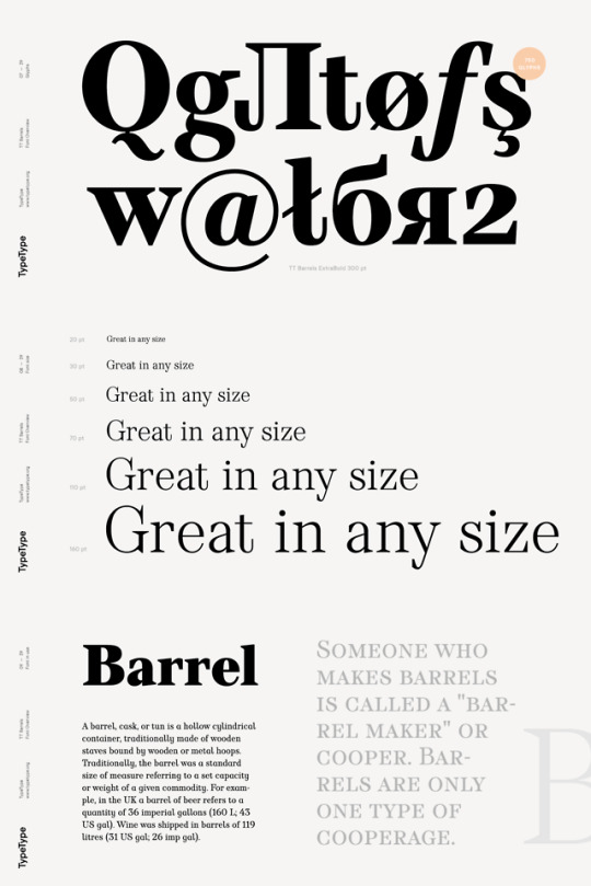
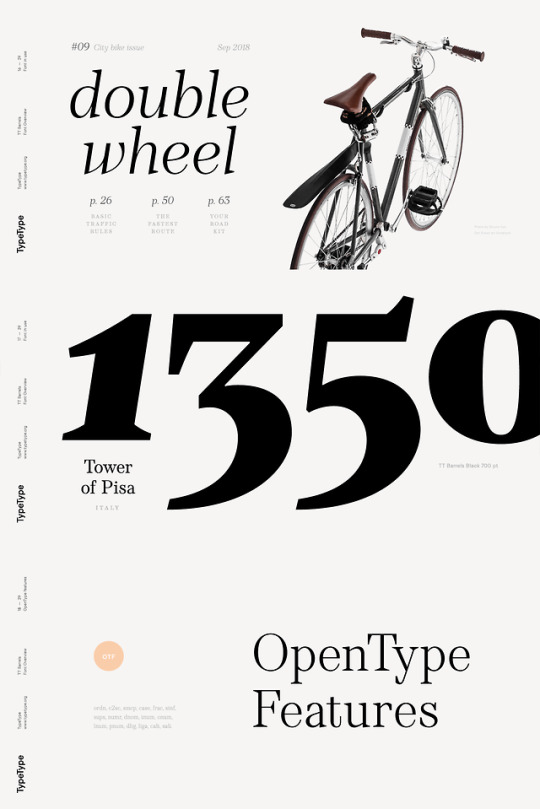
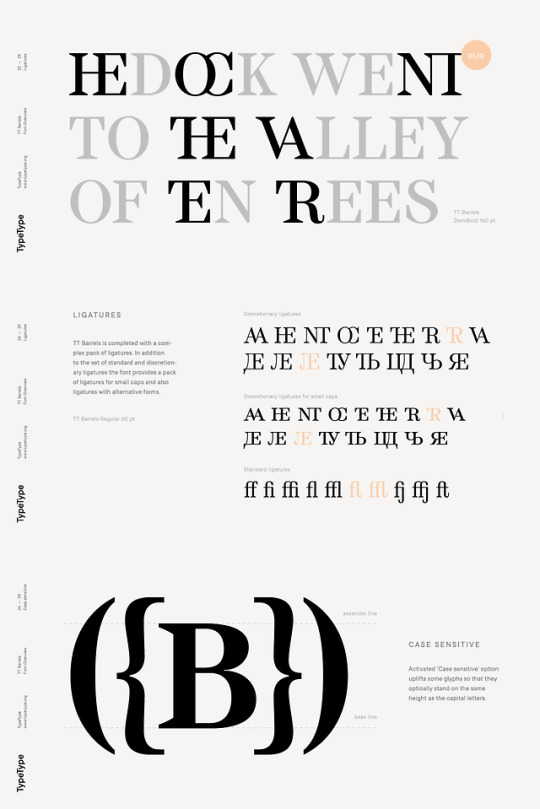
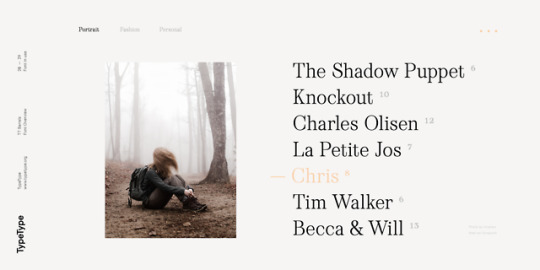
TT Barrels by TypeType
Release: September 18, 2018 Type Specimen here
TT Barrels is an elegant scotch style modern serif with strong industrial accents in its design.
TT Barrels consists of 12 fonts: Light, Regular, DemiBold, Bold, Extrabold, Black and the corresponding Italics.
Each outline consists of more than 750 glyphs and includes small capitals, ligatures (for Latin and Cyrillic alphabets), stylistic alternates, old-style figures, and many other useful features.
The TT Barrels project was born from a fictional technical assignment in which we tried to combine the technological effectiveness of industrial production used in engineering and the restrictions imposed by it with a beautiful scotch style serif. We decided to create a typeface that could be used to press letters on the metal body of a car, all while the typeface being elegant, and possessing sophisticated details that are typical of the classic text fonts of the late 19th and early 20th centuries.
In the process of designing and sketching, we reconsidered certain aspects and abandoned some of the requirements imposed by the technology of metal letter pressing, for example, from the extensive application of visual compensators, the decreased strokes contrast, and the hyperdeformation of individual letter elements to preserve a more pronounced rhythm of these elements. First of all, we wanted both to maintain the ease of reading for the entire text array and follow the rules of aesthetics of each letter in the typeface, while still leaving some influence of industrialism. In the end, this influence is best manifested in serifs, which are quite massive and have a technologically exaggerated wedge shape.
Available here

#antiqua#serif#wedge serif#industrial#old style figures#ligatures#true italics#multilingual#cyrillic#typetype#tt barrels#hamburgefonstiv#wh0t
314 notes
·
View notes
Photo


Fifty Type Specimens is a collection of postcards with stunning images of typography, for inspiration, correspondence, or display. Cards feature classic letterforms, pages from specimen books, and crops of gorgeous letters presented in a box with the feel of an old specimen book. Historic typefaces, selected by renowned designer Tobias Frere-Jones, are organized into four geographic categories by thumb tabs: Germany, France, United States, and the United Kingdom.
Order here!
Tobias Frere-Jones wrote on his beautiful blog:
Type specimens are curious things. They are books full of words, but the content of those words is largely (if not entirely) arbitrary, and even knowing the language is not altogether necessary. The narrative in these books is not in the words, but in the letters. Their stories of time and place are told by curves and joins and angles, the cadence of black and white. Type is relentlessly present, like the accent in speech or the color of soil. So it can’t help but speak about its origin while it charms us with beautiful form.
I’ve been collecting specimen books for about twenty-five years. The library now has about three hundred of them, ranging from the early nineteenth century to the present, and hailing from twenty countries. Working with Princeton Architectural Press’ Paul Wagner (Design Director) and Sara McKay (Paper & Goods Director), we looked for a way to tell some of the stories in these books. We imagined a set of postcards, working like excerpts or quotes from multiple storylines, carrying a narrative in a few words or in single letterforms. I’m very proud to say this project is now available, ready to (I hope) draw readers and designers into this rich history.
47 notes
·
View notes
Photo


BoldType™ Istanbul is a studio built in Istanbul in 2018. Creators of these fonts are Fatih Hardal and Muhittin Güneş. They have completed their education at Marmara University Faculty of Fine Arts. Later, they created the BoldType™ Istanbul studio to create font characters in Istanbul. They are also interested in typographic posters. Since 2018, they continue to work in typography and typefaces.
BoldType™ Istanbul — Modern (2018)
83 notes
·
View notes


